
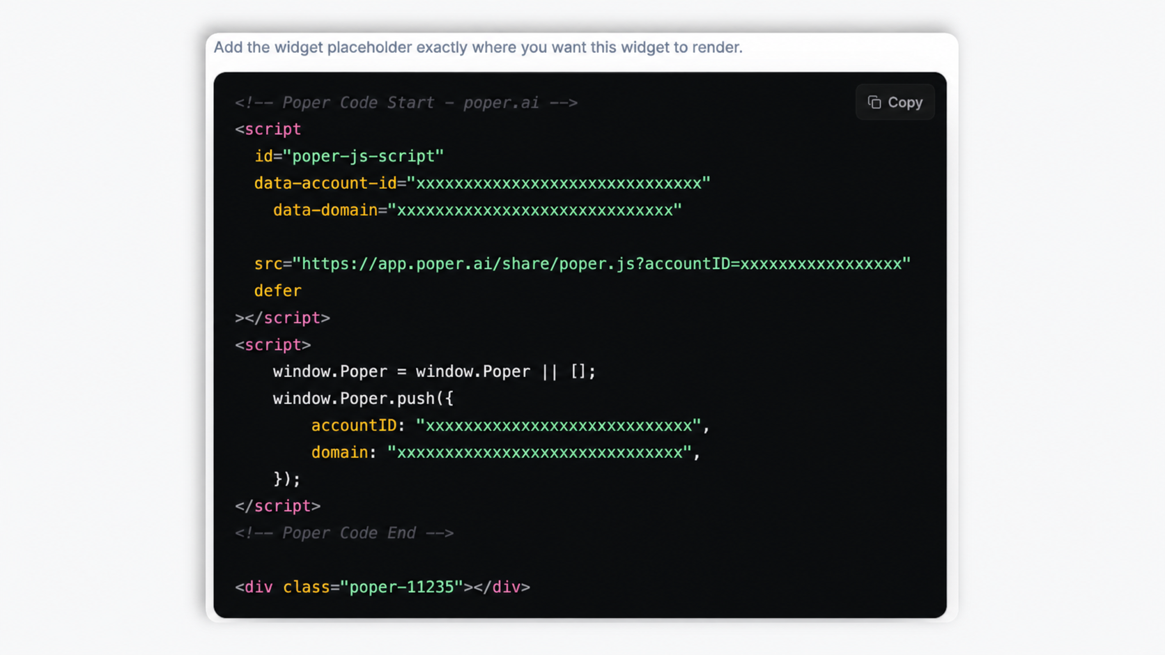
Company history
Replace dense paragraphs of company history with a scannable visual timeline. About-Us pages with timelines see longer dwell time and better story retention.
12 vertical and horizontal templates, fully responsive, fully brandable. Embed your About-Us history, product roadmap, event agenda, or portfolio in 90 seconds. No code.
Built for no-code website teams


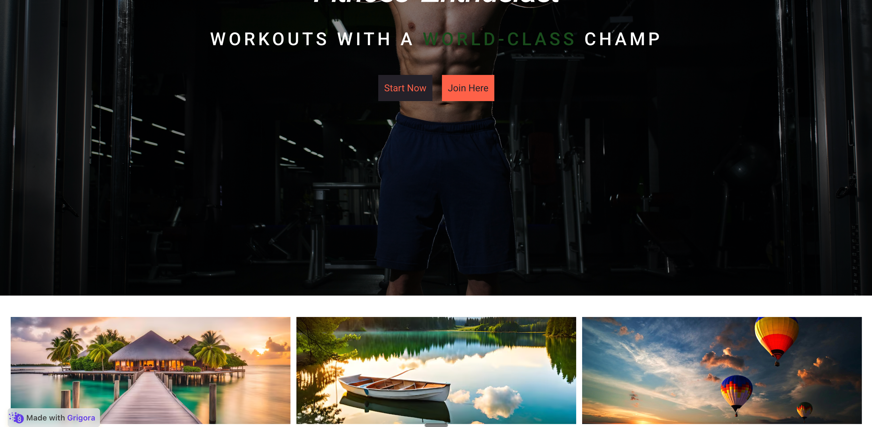
Live demo, not a screenshot. Add events, switch layouts, brand it. What you see here is what ships to your site.
Before and after Poper
Here is the widget embedded on a real page layout, before and after. Style it to match your brand, then copy one snippet to go live.
 Before
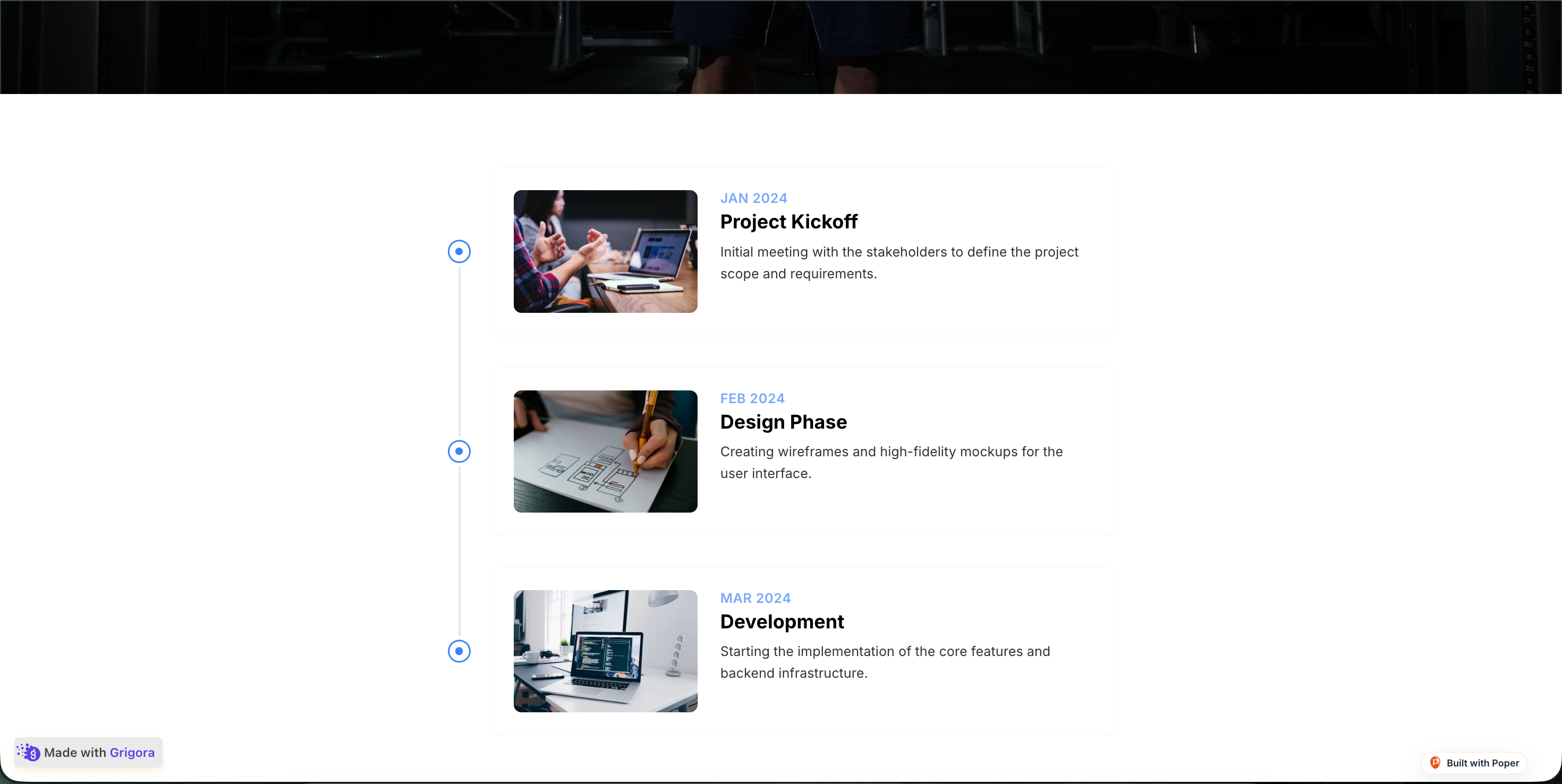 Poper widget live
Mockups for illustration. Style the widget to match your site and embed in 90 seconds.
How to use it
Three steps. Under two minutes. No developer needed.
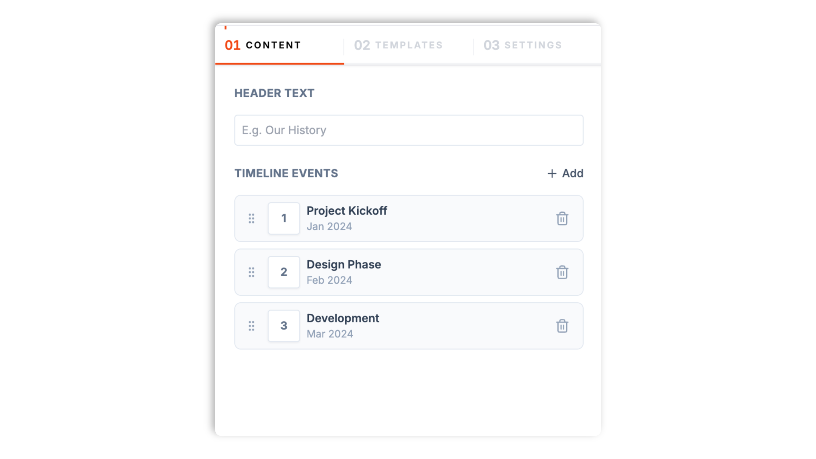
Enter each milestone with a date, title, short description, and optional image. Add as many events as your story needs and reorder them by drag and drop.
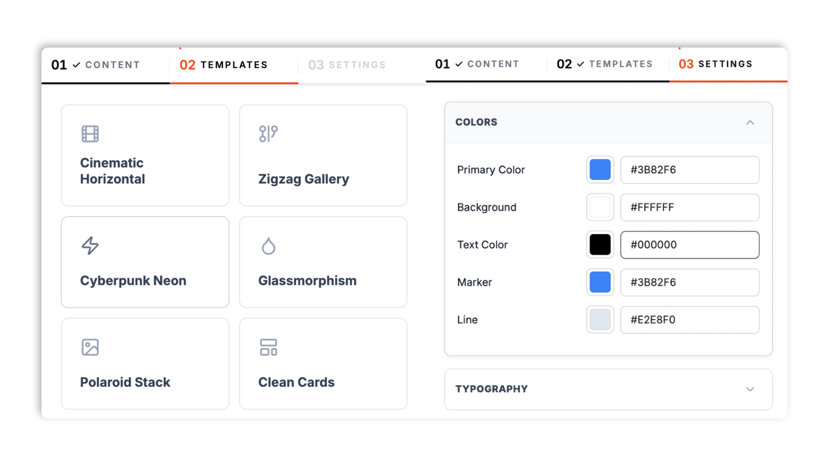
Choose from 12 templates including Simple Vertical, Cinematic Horizontal, Zigzag Gallery, Product Roadmap, Editorial, Glassmorphism, and Bento Grid. Match your brand colors, marker color, connector color, font, spacing, and corner radius.
Paste the Poper embed snippet into your site. Works anywhere your Poper embed snippet is supported.
Works everywhere
Drop-in install on WordPress, Shopify, Wix, Squarespace, Webflow, Framer, Ghost, and any HTML-friendly stack. No build step, no developer needed.
Plus 250+ other platforms via the embed snippet. If your site can render a <script> tag, it can render the Timeline Widget: Embed a Story Timeline on Any Website.
Six things that matter when you are picking a timeline widget for a real website, not 30 features no one uses.
Most timeline widgets pick one look and force you to live with it. Poper ships 12 distinct templates. Vertical templates (Simple Vertical, Minimal Focus, Editorial, Split Screen, Glassmorphism, Polaroid Stack, Cyberpunk Neon) suit About-Us history and resumes. Horizontal templates (Cinematic Horizontal, Clean Cards, Product Roadmap) suit roadmaps and agendas. There is also a structural Bento Grid. Switch templates in the builder without re-entering a single event.
Every milestone holds a free-text date (1999, April 1999, or Q2 2024 all work), a title up to 60 characters, a description up to 240 characters, and an optional image. Events render in the order you arrange in the builder.
Vertical templates stack cleanly on phones, and horizontal templates become a swipeable, snap-scrolling row so visitors never fight a sideways canvas.
Reorder events by drag and drop in the builder. The timeline renders exactly the order you set.
Pick from twelve fonts including Inter, Roboto, Poppins, Montserrat, Playfair Display, and Merriweather. The font applies across the whole timeline so it reads as part of your site, not bolted on.
Set the primary, background, text, marker, and connector colors, tune the gap between events, the card padding, and the corner radius, and choose a shadow preset. Brand the whole timeline to match your site.
Use cases
Four buyer types who get the most lift from embedding Timeline Widget: Embed a Story Timeline on Any Website on their site.
Replace dense paragraphs of company history with a scannable visual timeline. About-Us pages with timelines see longer dwell time and better story retention.

Show shipped, in-progress, and planned features in one horizontal flow. Customers stop emailing about ETAs because the roadmap answers it.

Version-tagged release notes in a clean vertical timeline. Customers can scan what shipped this week, this month, this quarter without leaving your site.

Map the five stages from discovery to advocacy with conversion percentages at each step. Marketing teams use it on positioning pages to show how the funnel actually performs.
Most timeline widgets ship a handful of looks and paywall the styling. Here is how the popular ones stack up.
| Recommended Poper | Elfsight Timeline | POWR Timeline | Common Ninja Timeline | |
|---|---|---|---|---|
| Poper workspace available | Limited (200 views/mo) | Limited (25 views/mo) | Limited | |
| Number of templates | 12 | A few | A few | A few |
| Vertical templates | ||||
| Horizontal templates | Paid only | |||
| Mobile responsive | Partial | |||
| Image per event | ||||
| Brand colors, fonts, spacing | Paid only | Paid only | Paid only | |
| Pricing for unlimited views | Plan details vary | Vendor pricing varies | Vendor pricing varies | Vendor pricing varies |
| Works alongside other Poper tools |
Comparison reflects external competitor positioning. Verify current details on each provider's site.
Marketers, product managers, and designers shipping timelines on real sites.
“We replaced a paragraph of company history with a Poper vertical timeline on our About page. Time-on-page went from 28 seconds to 71 seconds in the first month.”

“Our public product roadmap used to be a Notion page. Moving it to a Poper horizontal timeline cut support tickets asking about ETAs by half.”

“We entered our milestones once and clicked through templates until the Editorial layout fit our brand. The horizontal version turning into a clean swipeable row on phones was the deal-closer.”

Pricing
All plans are billed yearly. Each card shows the per-month equivalent. Start free, then upgrade only when you need more campaigns, websites, or AI credits.
Yearly billing · save up to 40%Essential lead capture for solo creators and growing businesses.
billed $180/year
Full engagement suite with A/B testing, gamification & unlimited leads.
billed $348/year
Unlimited everything with white-label, API access & advanced analytics.
billed $948/year
Prices shown for the 50k monthly visitor tier on yearly billing. A Free Forever plan ($0) and a custom Enterprise plan are also available. No contracts, cancel anytime.
Timelines are one of the oldest information design patterns in print, and one of the youngest on the web. They convert dense chronological narratives (company history, product roadmaps, event agendas, project case studies) into a scannable visual flow that visitors actually read. The catch: most embedded timeline widgets in 2026 ship a handful of looks, paywall the styling, and break horizontal scroll on phones. This guide walks through what actually matters when you choose a timeline widget for a real website in 2026: the vertical-versus-horizontal decision, the mobile UX trap of horizontal scroll, picking the right template for your content, and matching the timeline to your brand so it reads as part of the page rather than bolted on.
The default About-Us page is a wall of text: 'Founded in 2008, we grew from a two-person garage operation to 200 employees by 2018, expanded to Asia in 2021, and shipped our enterprise tier in 2024.' That paragraph contains four real milestones, but visitors process it as one undifferentiated block. Eye-tracking studies on About-Us pages consistently show users skim the first sentence and bounce. Replace that paragraph with a visual timeline and the same four milestones become four scannable cards with dates, headlines, and supporting images. Time-on-page typically rises Measure impact with your own analytics on About-Us pages after a timeline replaces a paragraph, and visitors actually retain the dates. For brand-sensitive companies (consulting, legal, healthcare, B2B SaaS) where the About-Us page is a credibility checkpoint, the timeline is one of the highest-ROI page changes you can make.
Vertical timelines win on About-Us pages, resumes, case studies, and any context where users are already scrolling vertically. They feel native to a long-scroll page and let event descriptions breathe with multi-line copy. Horizontal timelines win on product roadmaps, event agendas, and editorial storytelling pieces where the chronological sweep is the point. They also work as a hero element on landing pages because the lateral motion is visually distinctive. The mistake most teams make is picking horizontal because it looks fancier in design comps, then watching mobile traffic struggle with sideways scroll on a 375-pixel viewport. The right answer is always to pick the orientation by use case: if your users are reading a story top-to-bottom, go vertical. If they are scanning a sweep of events from start to end, go horizontal. And whichever you pick, verify the mobile collapse pattern works before shipping.
Horizontal timelines on desktop are gorgeous. Horizontal timelines on a phone are usability disasters when the implementation is naive. The default failure mode is a sideways scroll bar that requires awkward gestures, hides off-screen events, and breaks the page's vertical scroll rhythm. Users either miss half your timeline or trigger accidental browser-back swipes. The fix is a swipeable, snap-scrolling row of cards on small screens: each event becomes a card, a swipe advances to the next event, and the scroll snaps cleanly so a half-shown card never sits awkwardly in view. Poper's horizontal templates handle this with CSS scroll-snap, so the behavior is native to the browser rather than a heavy JavaScript carousel. Whichever widget you pick, test on a real iPhone and a real Android before shipping. The template that looks best in a Figma comp is rarely the one that performs best on the actual phones your visitors carry, which is why it helps to have 12 templates to choose from rather than one.
Poper ships 12 timeline templates, and the right pick follows from the content, not from which thumbnail looks best in the builder. Simple Vertical and Minimal Focus are the safe, clean defaults for an About-Us history or a resume, where the visitor is reading top to bottom and you want the dates and copy to breathe. Editorial and Split Screen lean into bold typography and large imagery for story pages that double as a brand statement. Glassmorphism, Polaroid Stack, and Cyberpunk Neon are styled templates for sites whose brand already has a strong visual identity, so the timeline matches rather than clashes. On the horizontal side, Cinematic Horizontal and Clean Cards suit event agendas and portfolio sweeps, while Product Roadmap is purpose-built for shipped, in-progress, and planned features. Bento Grid is the structural option when your milestones have mixed weight and you want a grid rather than a single rail. Because you can switch templates without re-entering events, the practical workflow is to enter your milestones once, then click through several templates and ship the one that fits the page.
A timeline widget that does not match your site reads as bolted on, and visitors notice. The Poper timeline gives you the controls to fix that without writing CSS. The Settings tab exposes five color controls: a primary color, a background color, a text color, a marker color for the dots on the rail, and a connector color for the line between events. It also gives you a gap control for the space between events, a padding control for the card interior, a corner-radius control, and a shadow preset. On top of that, a font picker offers twelve typefaces, including clean sans-serifs like Inter and Poppins and editorial serifs like Playfair Display and Merriweather, and the choice applies across the whole timeline. Available widget settings, so it looks like a section you designed rather than a third-party embed. Spend five minutes on these controls after you pick a template; it is the difference between a timeline that looks native and one that looks pasted in.
A timeline widget is an embeddable script that renders a chronological sequence of events (company history, product roadmap, event agenda, portfolio history) on your website. Each event includes a date, title, description, and optional image. The Poper timeline ships 12 templates across vertical and horizontal orientations.
Last fact-checked: . We re-verify every quarter.
Tutorial
A quick walkthrough of setting up and embedding this widget.
Tutorial video coming soon
Can't find the answer you're looking for? Chat with our support team.
Contact SupportPoper takes 90 seconds to embed and turns your history into a scannable visual flow.
Free plan available forever