
Product detail pages
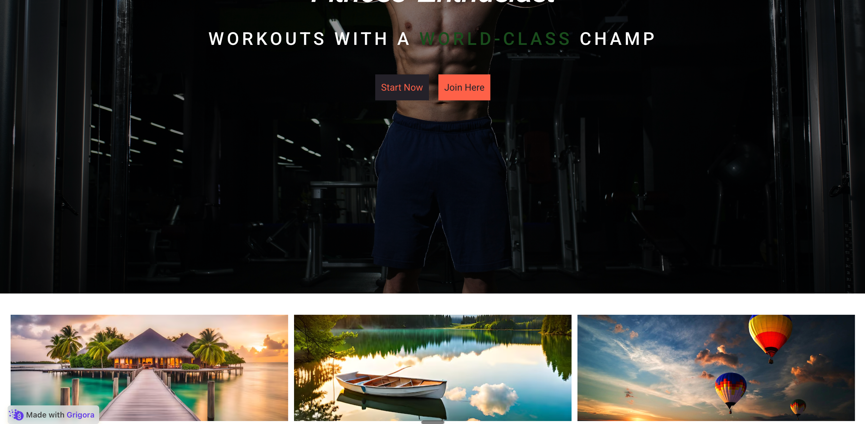
Replace a long scroll of product detail with Description, Specs, and Shipping tabs visitors can scan. Each panel holds a heading, copy, and an image so the section still looks designed.
Turn a long stack of sections into clean, switchable tabs. Eight layout templates, rich panels with images and stats, dark mode, and full brand styling. No code.
Built for no-code website teams


Live demo, not a screenshot. Add tabs, switch layout template, toggle dark mode. What you see here is what ships to your site.
Before and after Poper
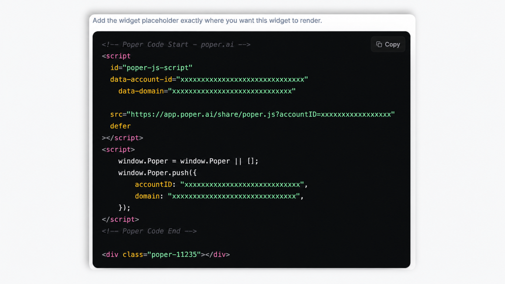
Here is the widget embedded on a real page layout, before and after. Style it to match your brand, then copy one snippet to go live.
 Before
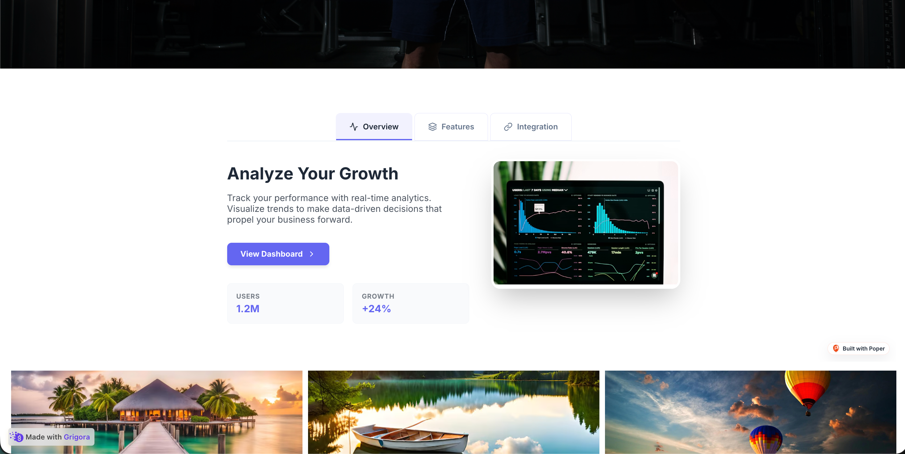 Poper widget live
Mockups for illustration. Style the widget to match your site and embed in 90 seconds.
How to use it
Three steps. Under two minutes. No developer needed.
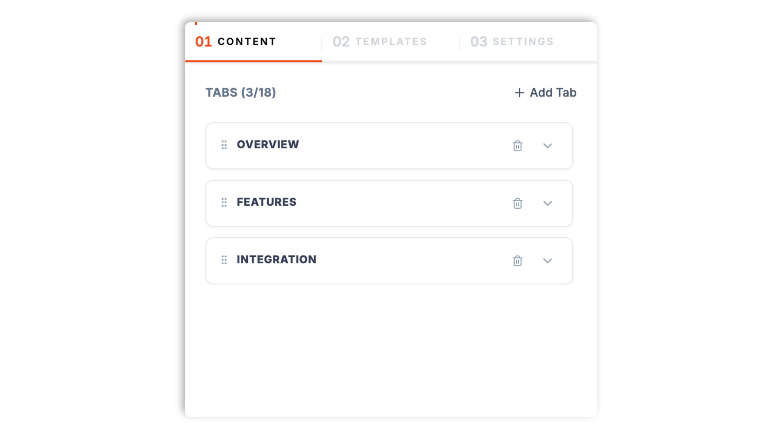
In the Content tab, add each tab with a title, an optional subtitle, and an icon. For each panel, set a heading, a description, an optional call-to-action, and an image. Reorder tabs by drag and add or remove tabs as needed.
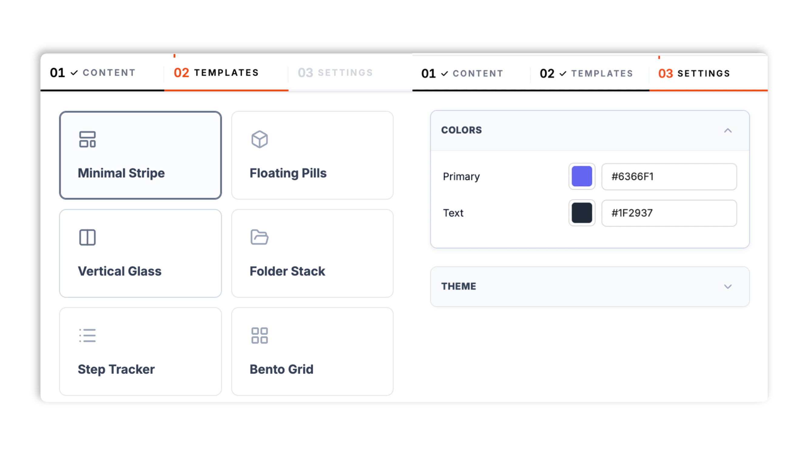
In the Templates tab, choose one of eight layouts: Minimal Stripe, Floating Pills, Vertical Glass, Folder Stack, Step Tracker, Bento Grid, Icon Dock, or Hero Split. In Settings, set the primary and text colors and toggle dark mode. The live preview updates as you tweak.
Paste the one-line snippet into your site. Works anywhere your Poper embed snippet is supported. Visitors click a tab to switch the panel.
Works everywhere
Drop-in install on WordPress, Shopify, Wix, Squarespace, Webflow, Framer, Ghost, and any HTML-friendly stack. No build step, no developer needed.
Plus 250+ other platforms via the embed snippet. If your site can render a <script> tag, it can render the Tabs Widget: Embed Tabbed Content Sections on Any Website.
What the tabs widget actually does, with no invented features.
Minimal Stripe, Floating Pills, Vertical Glass, Folder Stack, Step Tracker, Bento Grid, Icon Dock, and Hero Split. Each template is a complete look, from a clean underline stripe to a glassmorphism sidebar to a bento grid. Pick one in the Templates tab and your content reflows into it, no rebuilding required.
Each tab panel holds a heading, a description, an optional call-to-action, and an image. Build product detail sections, feature breakdowns, or process steps that look designed, not like a bare list.
Every tab gets its own label, an optional subtitle, and an icon so the tab strip reads clearly at a glance.
On the Minimal Stripe, Bento Grid, and Icon Dock layouts, add a small list of label and value stats to a panel.
Set the primary color and text color to match your site, then toggle dark mode for a dark-background palette. The tabs widget is responsive and adapts to mobile widths automatically.
Async-injected with scoped CSS that cannot bleed into your design system. Validate layout and LCP on your own page after embedding. Validate performance before and after embedding. after embedding.
Use cases
Four buyer types who get the most lift from embedding Tabs Widget: Embed Tabbed Content Sections on Any Website on their site.
Replace a long scroll of product detail with Description, Specs, and Shipping tabs visitors can scan. Each panel holds a heading, copy, and an image so the section still looks designed.

Group Overview, Features, and Integration into tabs on a marketing or pricing page. Use the Bento Grid or Icon Dock template and add stat items to each panel to highlight the key numbers.

Before, During, and After tabs let a service business explain each stage cleanly. The Step Tracker template gives the tab strip a numbered, step-by-step look that suits a process.

Quick start, Setup, and Examples tabs collapse several long-scroll articles into one tabbed block. The Vertical Glass template puts the tabs in a sidebar, which suits a docs-style layout.
Elfsight, POWR, and Common Ninja are widget platforms that include a tabs widget. Here is how Poper compares.
| Recommended Poper | Elfsight | POWR | Common Ninja | |
|---|---|---|---|---|
| Poper workspace available | Limited | Limited | Limited | |
| Tabbed content widget | ||||
| Multiple layout templates | 8 templates | Limited | Limited | Limited |
| Vertical sidebar tab layout | Paid only | Limited | ||
| Rich panels with image and call-to-action | ||||
| Per-tab icon | Limited | Limited | ||
| Dark mode toggle | Manual | Manual | Manual | |
| Branding behavior follows workspace permissions | Paid only | Paid only | Paid only | |
| Pricing | Plan details vary | Vendor pricing varies | Vendor pricing varies | Vendor pricing varies |
| Bundled with popups, forms, quizzes, more widgets |
Comparison reflects external competitor positioning. Verify current details on each provider's site.
Growth leads, PMs, and support-ops teams who organize content with Poper tabs.
“We moved our product page from one long scroll into Description, Specs, and Shipping tabs. The page feels half the length now, and the panels still look designed because each one has its own image.”

“The eight layout templates made this easy. We tried four of them with the same content and kept the Bento Grid because the stat items fit our feature panels perfectly.”

“We used the Vertical Glass template for our guides section so the tabs sit in a sidebar. Dark mode was a single toggle, which matched our docs theme without any custom work.”

Pricing
All plans are billed yearly. Each card shows the per-month equivalent. Start free, then upgrade only when you need more campaigns, websites, or AI credits.
Yearly billing · save up to 40%Essential lead capture for solo creators and growing businesses.
billed $180/year
Full engagement suite with A/B testing, gamification & unlimited leads.
billed $348/year
Unlimited everything with white-label, API access & advanced analytics.
billed $948/year
Prices shown for the 50k monthly visitor tier on yearly billing. A Free Forever plan ($0) and a custom Enterprise plan are also available. No contracts, cancel anytime.
A tabs widget looks like the simplest UI pattern on the web: click a label, see the panel. The real work is in the decisions around it. When does a stack of sections belong in tabs instead of one long scroll? How many tabs is too many? Which layout fits the content? This guide walks through what the Poper tabs widget actually does, how to fill each panel, how to choose among its eight layout templates, when tabs beat a long scroll or an accordion, and how to keep a tabbed block readable on a phone.
The Poper tabs widget is a styled tabbed-content block. You add a set of tabs, each with a title, an optional subtitle, and an icon, and each tab carries a content panel: a heading, a description, an optional call-to-action, and an image. On three of the layouts you can also add a short list of label and value stats to a panel. The presentation is driven by one of eight layout templates, and a Settings tab lets you set the primary and text colors and toggle dark mode. It is a no-code widget: you build it in the Poper builder, copy a one-line snippet, and paste it into your site. There is no markup to write and no app framework dependency.
The eight templates each give the same content a different look, so the choice is a design decision rather than a content one. Minimal Stripe is a clean tab strip with an underline indicator, the safe default for most pages. Floating Pills renders the tabs as rounded pills. Vertical Glass places the tabs in a sidebar alongside the panel, which suits documentation and longer content. Folder Stack styles the tabs like stacked file folders. Step Tracker gives the tab strip a numbered, sequential look, ideal for a process or a set of stages. Bento Grid arranges the panel in a grid-style layout. Icon Dock leans on the per-tab icons for a compact, icon-led strip. Hero Split pairs a prominent panel with the tab navigation for a hero-style section. Because switching templates reflows the same content, you can try several and keep the one that fits your page without rebuilding anything.
Tabs are not always the right answer. Choose tabs when visitors will actively switch between a handful of short, related-but-distinct panels: product detail sections, feature breakdowns, process stages. Choose an accordion when you have many items of which the visitor will open only one or two, such as an FAQ. Choose a long scroll when the content tells a single linear story that should be read in order, such as a case study or a narrative sales page. The common failure mode of tabs is using them for content that should be a long scroll: visitors see only the first tab, miss the rest, and the tab labels become decoration rather than navigation. A simple diagnostic: would a visitor realistically click any tab other than the first? If you are not sure, the content probably wants a long scroll, and the tabs widget is better spent on a page where each section is genuinely an alternative to the others.
A tabbed block works best with a small, scannable set of tabs. Two to six is the comfortable range; beyond that the tab strip gets crowded and visitors struggle to hold the options in mind. If you find yourself wanting ten tabs, that is usually a sign the content should be split across pages or moved into an accordion. The tab labels carry the navigation, so keep them short and concrete: a single noun or short phrase that tells the visitor exactly what is behind the tab. 'Specs' beats 'Technical information'. The optional subtitle can add a few words of context under the label, and the per-tab icon gives the strip a visual anchor. The clearer each label, the more likely a visitor is to explore beyond the first panel.
Most traffic is on a phone, so a tabbed block has to work in a narrow column. The Poper tabs widget is responsive and adapts to mobile widths automatically, but the content choices still matter. Keep the tab count low so the strip does not overwhelm a small screen. Keep panel headings and descriptions concise, since long copy that was comfortable on desktop becomes a wall of text on mobile. Images in the panel should be chosen so they still read at a small size. If your content genuinely needs a sidebar layout, the Vertical Glass template gives you that on larger screens; on a phone the same widget reflows to fit. Preview the widget at a narrow width before you embed, and trim anything that feels cramped.
A tabs widget is an embeddable, no-code block that organizes related content into clickable tabbed sections, with each tab activating a panel while the others stay hidden. The Poper tabs widget ships eight layout templates and gives each tab a title, subtitle, icon, and a rich panel with a heading, description, call-to-action, and image.
Last fact-checked: . We re-verify every quarter.
Tutorial
A quick walkthrough of setting up and embedding this widget.
Tutorial video coming soon
Can't find the answer you're looking for? Chat with our support team.
Contact SupportPoper takes 90 seconds to embed and ships eight layout templates, rich panels, and dark mode.
Free plan available forever