
Team bios
Front shows a portrait photo and name; back reveals the bio, role, social links, and a contact CTA. Compact way to show 8 to 24 people without scrolling forever.
Add 3D click or hover flip cards to your site in 90 seconds. Front and back content, 12 layouts, real CSS 3D, brandable, free with no code.
Trusted by 11,000+ brands


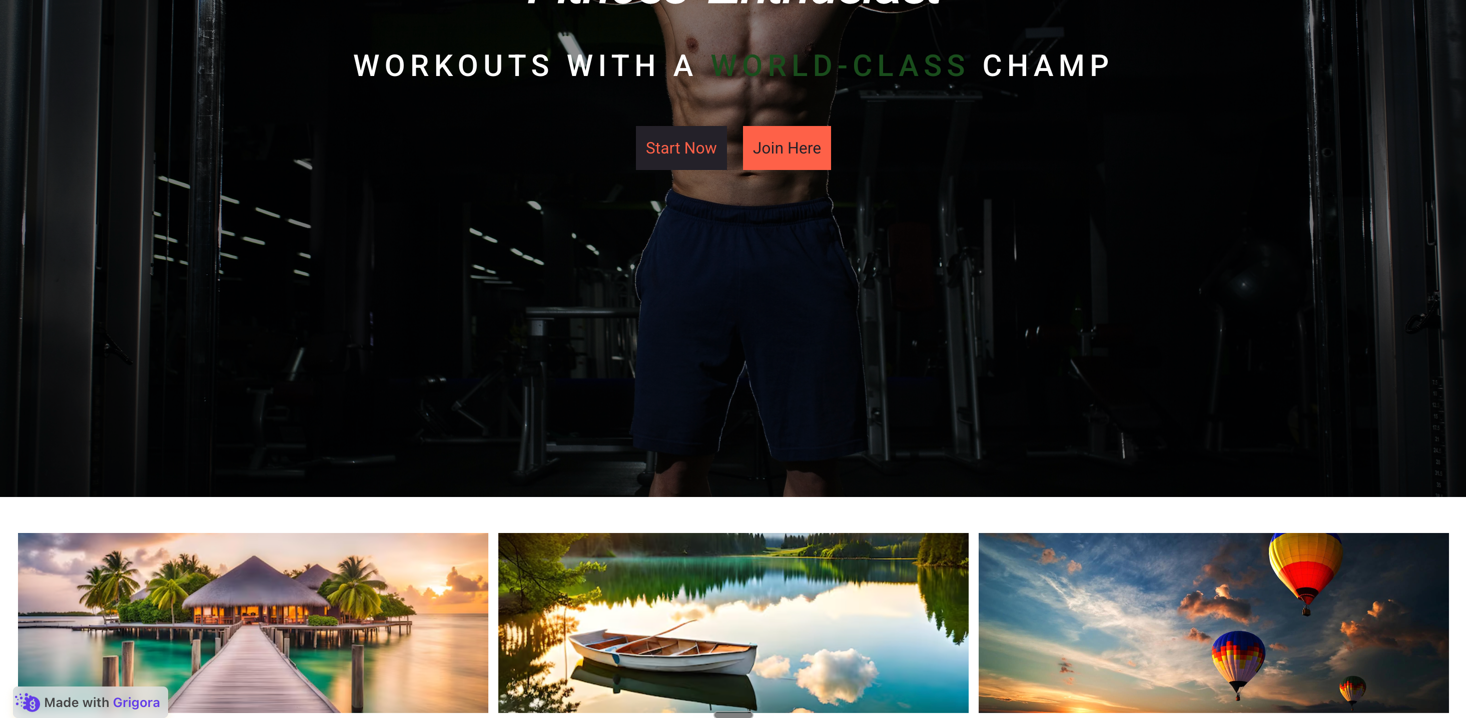
Live demo, not a screenshot. Click any card to flip it. Style it, brand it, embed it.
Before and after Poper
Here is the widget embedded on a real page layout, before and after. Style it to match your brand, then copy one snippet to go live.
 Before
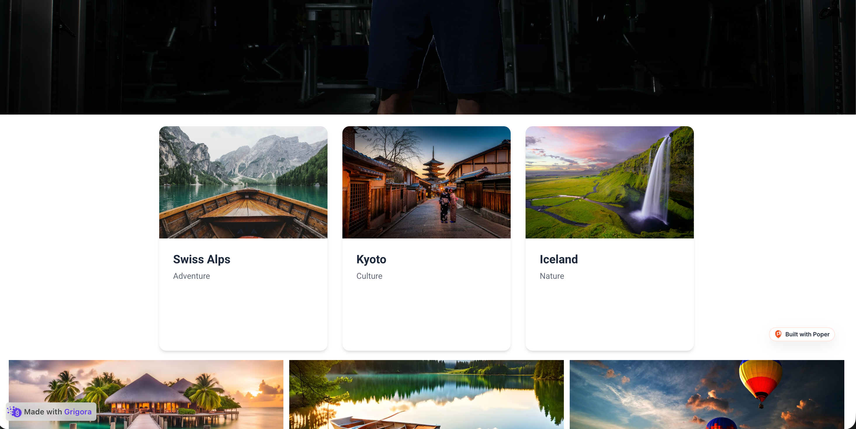 Poper widget live
Mockups for illustration. Style the widget to match your site and embed in 90 seconds.
How to use it
Three steps. Under two minutes. No developer needed.
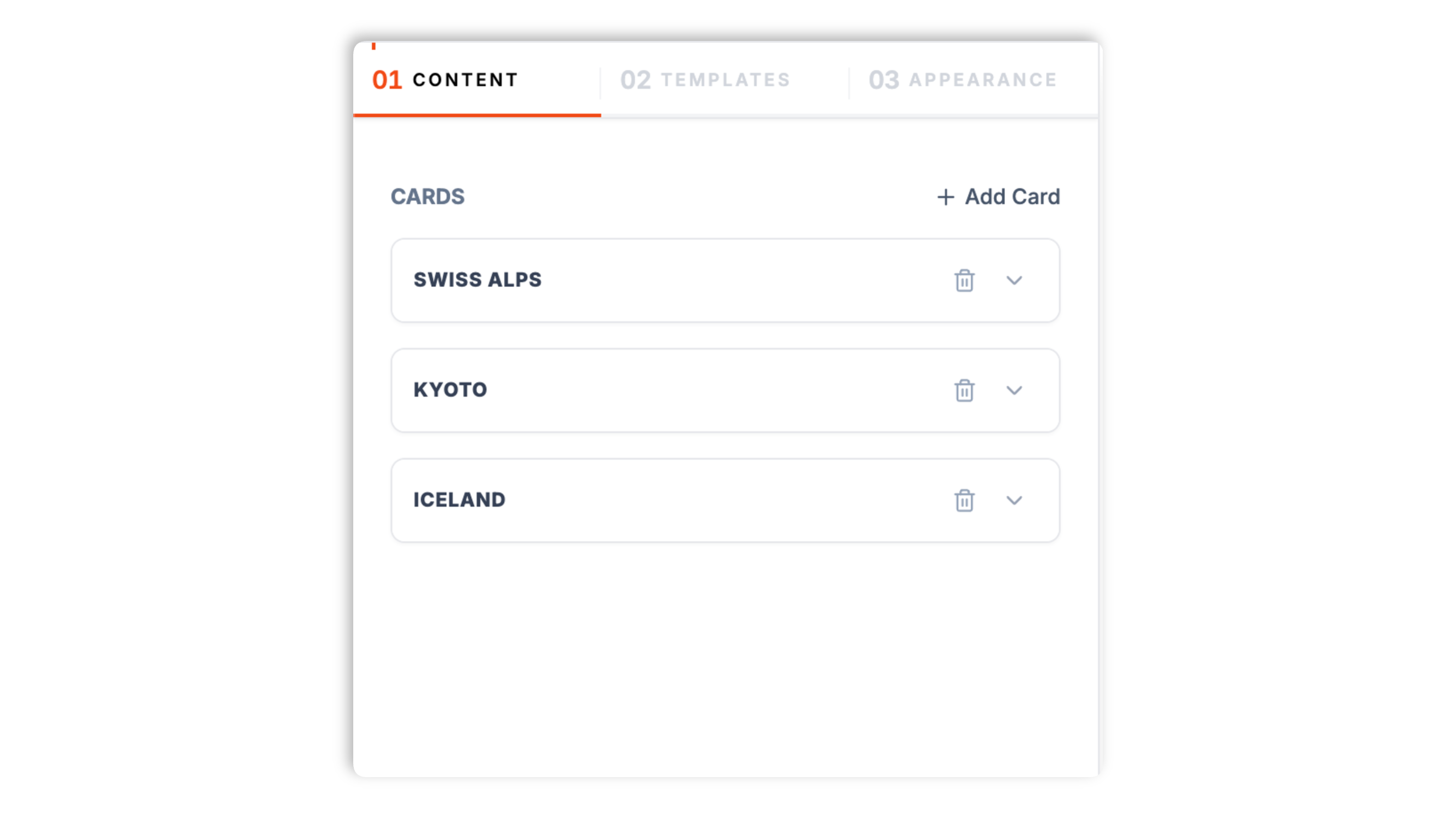
Open the Poper builder and fill in each card's front face (title, subtitle, image) plus the back face (a back title, description, and a button with a link). Start from one of 12 templates for features, teams, pricing, products, and more.
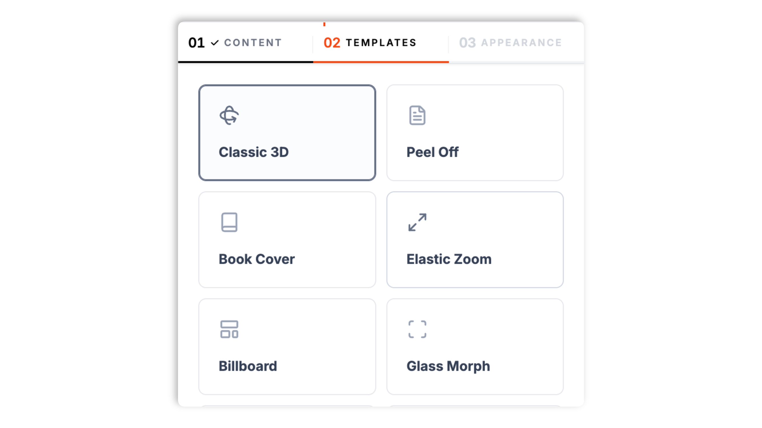
Choose one of 12 templates: Classic 3D, Peel Off, Book Cover, Elastic Zoom, Billboard, Glass Morph, Cyberpunk, Product Reveal, Poker Chip, Minimalist, Team Profile, or Pricing Flip. Set the flip trigger to click or hover, and the flip direction to horizontal or vertical.
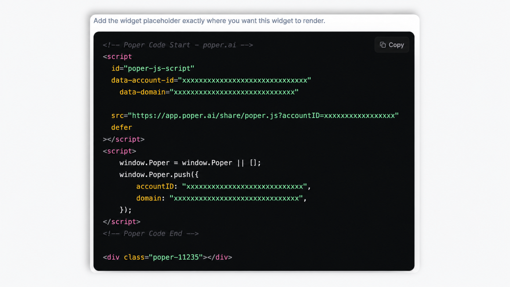
Paste the one line script tag into your site. Works on WordPress, Shopify, Wix, Squarespace, Webflow, Framer, Ghost, and any HTML stack. The CSS is scoped, so it never bleeds into your design system.
Works everywhere
Drop-in install on WordPress, Shopify, Wix, Squarespace, Webflow, Framer, Ghost, and any HTML-friendly stack. No build step, no developer needed.
Plus 250+ other platforms via the embed snippet. If your site can render a <script> tag, it can render the Flip Cards Widget: 3D CSS Reveal Cards With Click or Hover Triggers.
Six things that matter in a flip cards widget: real CSS 3D, click or hover, flip direction, brand match, flip speed, and a responsive grid.
Most flip card widgets are a 2D opacity crossfade dressed up to look like a flip. Poper uses real CSS transform-style: preserve-3d with perspective so the card has actual depth as it spins. Hardware accelerated, with no JavaScript animation loop. It looks premium on retina displays where flat fakes look obvious.
Choose how cards reveal: click to flip works on every device, including phones, while hover to flip suits desktop-led traffic. Set the trigger once and it applies to every card in the grid.
Set the flip direction so cards rotate side to side or top to bottom, whichever suits the layout.
Front and back background colors, text and accent colors, corner radius, and shadow intensity.
Dial the flip animation faster for a snappy reveal or slower for a more deliberate one. The flip is a pure CSS transform, so it stays smooth without a JavaScript animation loop on any reasonably modern device.
Cards arrange in a CSS grid that fits the available width and collapses gracefully on smaller screens, so the layout holds up from a wide desktop down to a phone with no manual breakpoint work.
Use cases
Four buyer types who get the most lift from embedding Flip Cards Widget: 3D CSS Reveal Cards With Click or Hover Triggers on their site.
Front shows a portrait photo and name; back reveals the bio, role, social links, and a contact CTA. Compact way to show 8 to 24 people without scrolling forever.

Front shows the tier name and headline price; back reveals the full feature list and a Subscribe CTA. Lets you keep pricing pages compact while still surfacing every detail on demand.

Front shows a single question; back reveals the full answer plus a related link. Engagement positive alternative to long accordion lists when answers are short and rewarding.

Front shows an icon and feature name; back reveals the longer detail, a screenshot, and a Try it CTA. Best for SaaS landing pages and product overview sections.
Most flip card tools ship one flat layout and a 2D crossfade. Here is how the popular ones stack up.
| Recommended Poper | Elfsight Flip Cards | POWR Flip Cards | Common Ninja Flip Cards | |
|---|---|---|---|---|
| Free plan available | Limited | Limited | Limited | |
| Real CSS 3D depth (not opacity crossfade) | ||||
| Distinct templates included | 12 | 1 | 2 | A few |
| Click trigger | ||||
| Hover trigger | ||||
| Horizontal and vertical flip direction | Limited | Limited | ||
| Adjustable flip speed | Limited | Limited | ||
| Front and back colors, radius, shadow | Limited | Limited | ||
| Per card image, title, text, and button link | Paid add-on | |||
| Pricing for unlimited cards | $15/mo (Starter, yearly) | $5/mo | $10/mo | Paid plans |
| Bundled with popups, forms, quizzes, more widgets |
Comparison reflects publicly listed pricing and features as of 2026. Verify current details on each provider's site.
Marketers and designers who switched from flat fake flip cards to Poper.
“Our feature page got a lot more engaging after switching from static cards to Poper flip cards. We used the click trigger so it behaves the same on phones as on desktop.”

“We use the Team Profile template for our about page, photo on the front, bio and a profile link on the back. It looks incredible and saves a lot of vertical space.”

“Real CSS 3D depth, not a 2D crossfade pretending to be a flip. Most flip card tools we tested were flat fakes. The Cyberpunk template matched our brand and the flip looks genuinely three-dimensional.”

Pricing
All plans are billed yearly. Each card shows the per-month equivalent. Start free, then upgrade only when you need more campaigns, websites, or AI credits.
Yearly billing · save up to 40%Essential lead capture for solo creators and growing businesses.
billed $180/year
Full engagement suite with A/B testing, gamification & unlimited leads.
billed $348/year
Unlimited everything with white-label, API access & advanced analytics.
billed $948/year
Prices shown for the 50k monthly visitor tier on yearly billing. A Free Forever plan ($0) and a custom Enterprise plan are also available. No contracts, cancel anytime.
Flip cards are one of the most engagement-positive UI patterns available to web designers in 2026. A well built flip card grid pulls visitors deeper into your content, because the flip itself is a tiny reward that rewards curiosity. But flip cards are also one of the easiest patterns to ship badly: 2D fakes that pretend to be 3D, hover-only triggers that behave awkwardly on touch devices, and back faces stuffed with information visitors actually need to scan. This guide covers what matters when you embed flip cards in 2026: real CSS 3D transform under the hood, the click versus hover trigger choice, accessibility considerations, the conversion impact versus static cards, and the specific UX situations where flip cards hurt more than they help.
A real 3D flip card is built from three CSS rules. First, the parent container gets perspective: 1000px (the higher the value, the flatter the rotation; the lower, the more dramatic the depth). Second, the inner card gets transform-style: preserve-3d so its children render as truly 3D objects rather than being projected back to flat. Third, the front and back faces get backface-visibility: hidden and the back face starts at transform: rotateY(180deg). On flip, you toggle a class that applies transform: rotateY(180deg) to the inner card; the front rotates out of view and the back rotates into view in one smooth GPU accelerated motion. This is fundamentally different from the opacity crossfade fakes most cheap flip card widgets ship: those animate opacity 1 to 0 on the front and 0 to 1 on the back, which looks fine in a low resolution thumbnail but obvious on retina. Poper uses the real 3D approach by default. You can switch the rotation axis from rotateY (horizontal flip) to rotateX (vertical flip) or use a small Z translation for a depth pop on hover.
Hover does not exist on touch devices. iOS and Android emulate a hover state on first tap (so a tap shows the hover state) and a second tap triggers the click, which means a hover-only flip card needs two taps on phones, and zero taps if the visitor leaves before the second tap. Click to flip avoids this entirely: a single tap or click flips the card the same way on every device. Hover to flip gives a slightly more discoverable, more delightful first interaction on a mouse-driven desktop. Poper lets you pick the trigger per widget. The practical rule: if a meaningful share of your traffic is on mobile, choose click to flip for predictable behaviour everywhere. If your audience is overwhelmingly desktop and the back content is a light reward (a fun fact, a punchline, a CTA), hover is a reasonable choice.
Flip cards reveal content behind an interaction, so think about the visitors who cannot or do not want to use that interaction the typical way. Keep the front face self-sufficient: a visitor should get the gist from the front without needing to flip, so do not hide essential information on the back. Prefer click to flip when accessibility matters, because a click is a far more reliable, universally available interaction than hover, especially for touch and for assistive technologies. Keep the back face content short and high-contrast so it is quick to read once revealed. And avoid flip cards entirely for content that must be scannable by everyone, such as legal, pricing, or safety information. Used for reward content with a click trigger and a clear front face, flip cards are an engaging pattern; used to hide required information, they add friction for everyone.
The appeal of flip cards is well understood in UX research: a micro-interaction creates a small variable reward, because the visitor does not know exactly what is on the back until they flip. That curiosity pulls people into the content and tends to lift how much of a card grid they actually explore, compared with a flat wall of static cards they skim past. The back face is also a natural home for a call to action: a visitor who has just chosen to flip a card has shown intent, so a button on the back catches them at an engaged moment. The caveat is restraint. Flip cards work when the flip is rewarding and optional. Put them on every section of the page, or use them to hide information the visitor genuinely needs, and the novelty turns into friction. Use them where exploration is the goal, not where scanning is.
Nielsen Norman Group has flagged flip cards as a borderline pattern for years for one specific reason: hidden content is unscannable. If your visitors are in evaluative mode (comparing pricing tiers, comparing features against a competitor), forcing them to flip every card to see the details adds friction. Use flip cards when the back face content is a reward (a fun fact, a punchline, a CTA), not when it is required information (specs, terms, safety details). Other anti patterns: too many cards in one grid (visual fatigue), and flip cards on accessibility-critical pages such as legal, financial, or healthcare where everyone must be able to scan the content. The right placement: feature explainer sections mid page, team pages, product highlight grids, and playful interactive sections. A weaker placement: dense comparison tables and anything a visitor needs to scan quickly. Note that flip cards are still a fine way to present pricing tiers when the front shows the tier and price and the back simply reveals the detail, which is exactly what the Pricing Flip template is for.
A flip cards widget is an embeddable script that displays a grid of interactive cards with two faces: a front face (title, subtitle, image) and a back face (a back title, description, and a button with a link). Visitors click or hover to rotate the card in 3D and reveal the back. Poper's version ships 12 templates and real CSS 3D using transform-style: preserve-3d and perspective.
Last fact-checked: . We re-verify every quarter.
Tutorial
A quick walkthrough of setting up and embedding this widget.
Tutorial video coming soon
Can't find the answer you're looking for? Chat with our support team.
Contact SupportPoper takes 90 seconds to embed and ships true CSS 3D with 12 templates.
Free plan available forever