
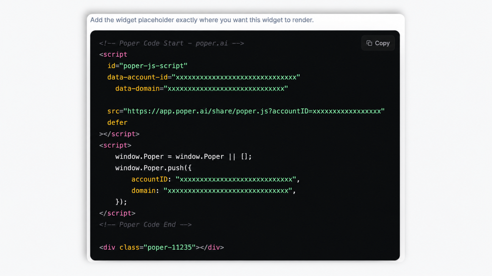
Long blog posts
Give 2,000-word guides a clickable outline so readers jump straight to the section they came for instead of scrolling past everything else.
The widget scans your page headings and builds a clickable outline with smooth-scroll jump links. 14 styles, manual mode when you want it. Use it on long articles, docs, and policy pages where the embed can scan the headings.
Built for builder website teams


Live demo, not a screenshot. Pick a layout, tweak the colors, embed it. What you see here is what ships to your site.
Before and after Poper
A long article before and after the Poper table of contents widget. The widget scans the page headings and builds a clickable outline with smooth-scroll jump links. Style it to match your brand, then copy one snippet to go live.
 Before
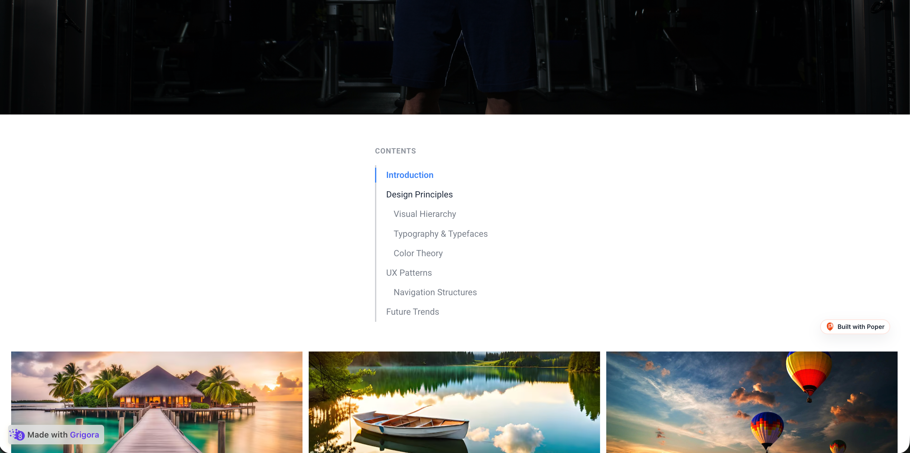 Poper widget live
Mockups for illustration. Style the widget to match your site and embed in 90 seconds.
How to use it
Three setup steps. Auto-detect or build it by hand.
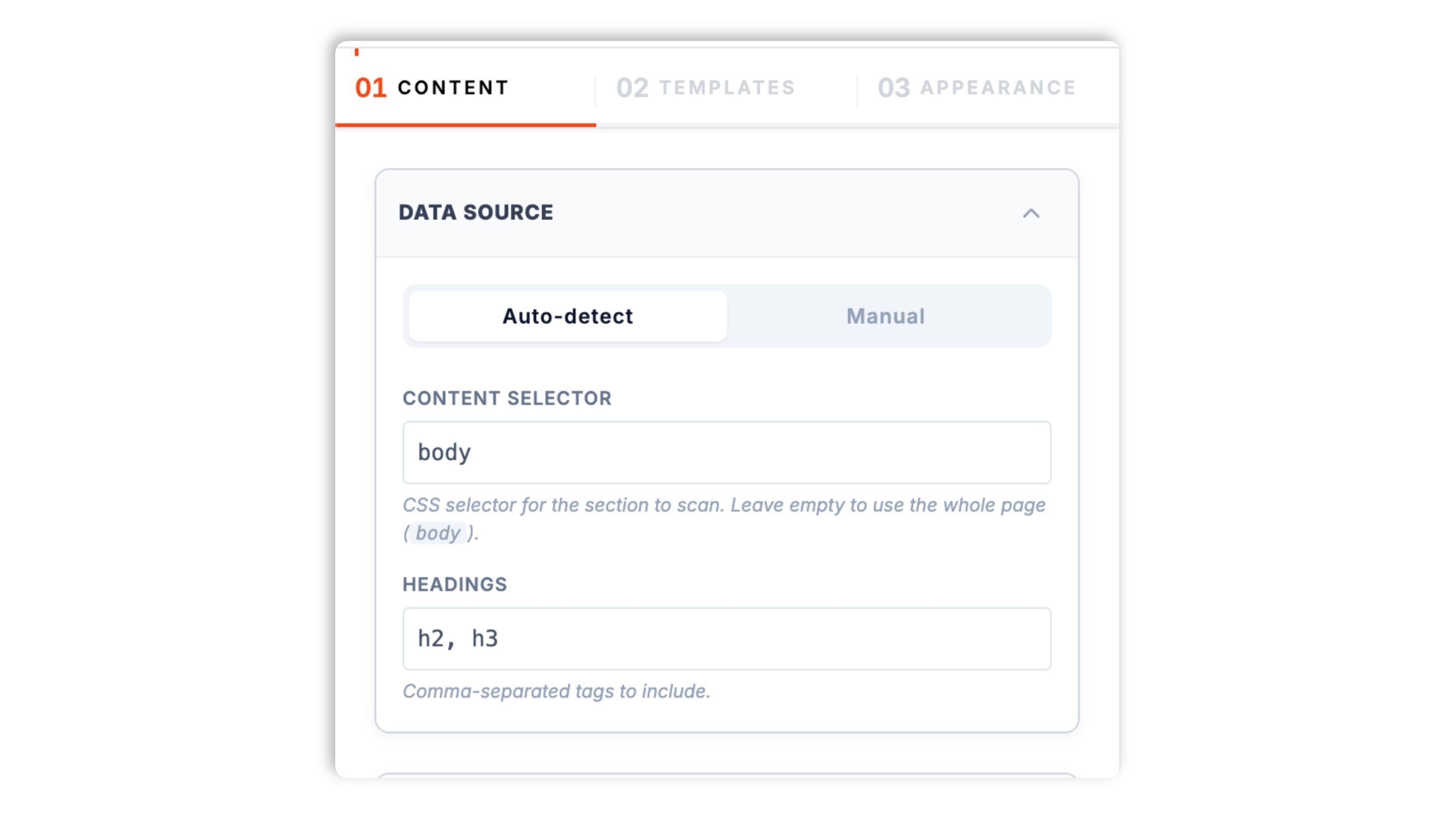
In auto mode the widget scans your page for headings and builds the outline for you. By default it picks up every H2 and H3, and you can change which headings it targets with a CSS selector. Or switch to manual mode and list the entries yourself.
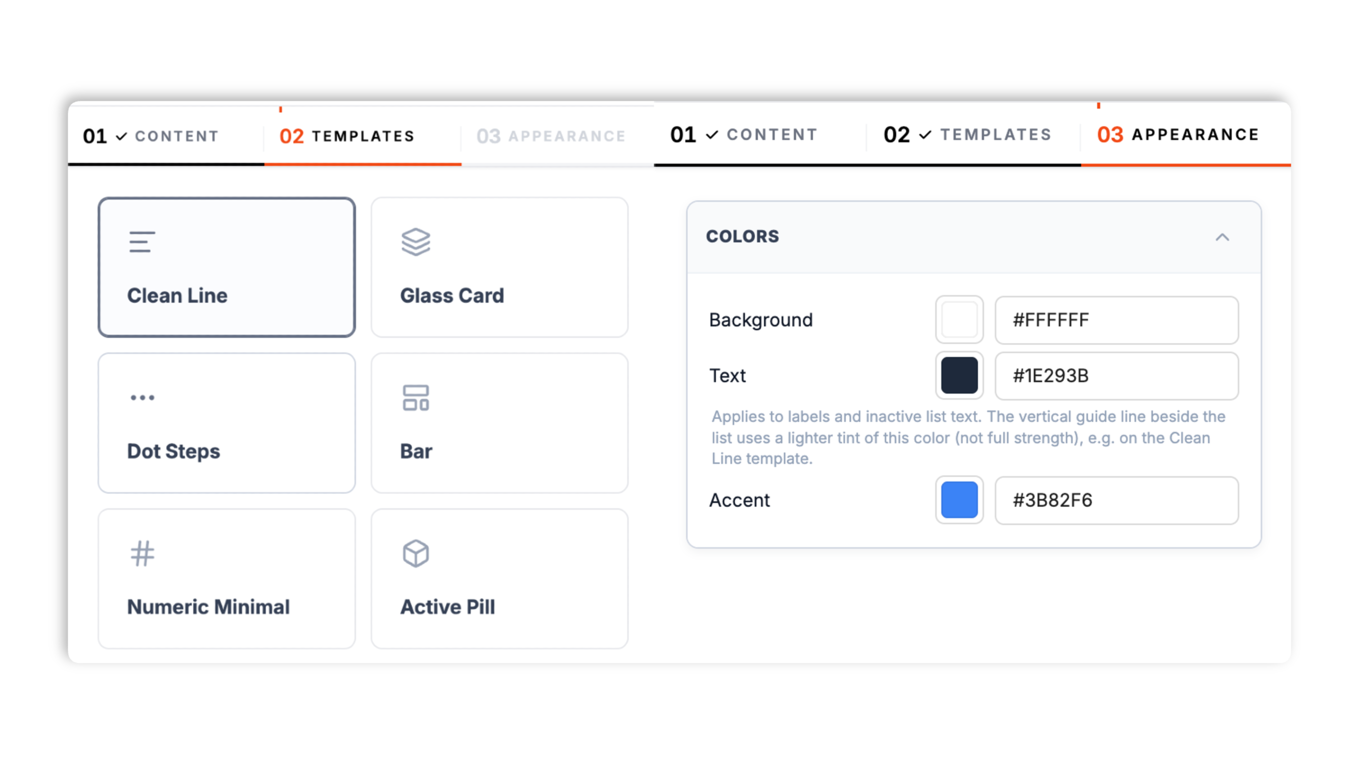
Choose from 14 layouts including Clean Line, Glass Card, Dot Steps, Active Pill, Sticky Bar, Numeric Minimal, Nested Tree, Timeline, Modern Tabs, and more. Set the background color, text color, and accent color; header-title rendering depends on the selected layout.
Paste the one-line script tag into a supported blog template, docs theme, or landing page. In auto mode the widget scans the available headings when it initializes, based on the selected mode, selector, and embed state.
Works everywhere
Drop-in install on WordPress, Shopify, Wix, Squarespace, Webflow, Framer, Ghost, and any HTML-friendly stack. No build step, no developer needed.
Plus 250+ other platforms via the embed snippet. If your site can render a <script> tag, it can render the Table of Contents Widget: Auto-Generate an In-Page TOC.
Six things that matter when you ship a TOC, not 30 features no one uses.
In auto mode the widget scans the available page headings when it initializes and assembles the table of contents. By default it targets H2 and H3 headings, and a CSS selector lets you change which headings it picks up or point it at a single article container so it skips your nav and sidebar. Any heading without an id gets one assigned automatically, so the jump links work even on pages that were never set up for anchors. Validate auto mode on each content template you plan to use.
Clicking an entry smoothly scrolls the page to the matching heading so readers move through long content without losing their place. Prefer an instant jump? Turn smooth scroll off in the content panel. The clicked entry highlights as the active section.
Clean Line, Glass Card, Dot Steps, Active Pill, Nested Tree, Timeline, Modern Tabs, and more, all built in.
Skip auto-detect and list the entries yourself with a built-in editor for control over the outline entries.
The widget normalizes heading levels and indents nested entries, so an outline with H2 and H3 reads as a clear hierarchy. The Nested Tree layout makes that structure explicit for documentation and reference pages with many sections.
Set the background color, text color, and accent color, and add a header title where the selected layout renders one. Each of the 14 layouts ships with its own tuned default palette, and you can override all three colors to match your page.
Use cases
Four buyer types who get the most lift from embedding Table of Contents Widget: Auto-Generate an In-Page TOC on their site.
Give 2,000-word guides a clickable outline so readers jump straight to the section they came for instead of scrolling past everything else.

API references, SDK docs, and knowledge bases benefit from a structured outline. The Nested Tree layout scales from a handful of headings to dozens without losing structure.

Help visitors jump straight to data retention, cookies, or a specific clause. Use manual mode to control the exact wording and order of every entry.

Longform research stays navigable with an outline that mirrors the Abstract, Methods, Results, Discussion structure. The Timeline layout suits chapter-by-chapter reading.
Most TOC tools ship one style or lock manual control behind a plugin. Here is how the popular widget builders compare.
| Recommended Poper | Easy Table of Contents (WP) | Elfsight TOC | Common Ninja TOC | |
|---|---|---|---|---|
| Poper workspace available | Limited views | Limited views | ||
| Auto-generates from page headings | ||||
| Configurable heading selector | Levels only | Levels only | Levels only | |
| Manual entry mode | Partial | |||
| Number of layout styles | 14 | Limited | Limited | Limited |
| Smooth-scroll jump links | ||||
| Nested hierarchy view | Partial | Partial | ||
| Use the Poper embed snippet in a supported page (no plugin required) | WordPress only | |||
| Pricing for unlimited use | Plan details vary | Free | Vendor pricing varies | Vendor pricing varies |
| Bundled with popups, forms, quizzes, more widgets |
Comparison reflects external competitor positioning. Verify current details on each provider's site.
Publishers, docs teams, and web engineers who switched to Poper.
“We use auto-detect TOC on our long guides and validate the generated outline when editors change section headings.”

“The Nested Tree layout was exactly what our docs needed. Dozens of headings, and readers can finally see the whole structure at a glance.”

“Manual mode let us word every entry on our privacy policy exactly how legal wanted it. The container selector kept our site nav out of the outline.”

Pricing
All plans are billed yearly. Each card shows the per-month equivalent. Start free, then upgrade only when you need more campaigns, websites, or AI credits.
Yearly billing · save up to 40%Essential lead capture for solo creators and growing businesses.
billed $180/year
Full engagement suite with A/B testing, gamification & unlimited leads.
billed $348/year
Unlimited everything with white-label, API access & advanced analytics.
billed $948/year
Prices shown for the 50k monthly visitor tier on yearly billing. A Free Forever plan ($0) and a custom Enterprise plan are also available. No contracts, cancel anytime.
A table of contents is one of the simplest ways to make a long-form article, documentation page, or policy page easier to read. A clear outline lets readers jump straight to the section they came for, gives them a map of what the page covers, and reduces the friction of scrolling through content they do not need. The wrong TOC ships one rigid style, goes stale every time content changes, or makes you hand-maintain a list of links. This guide walks through what actually matters when you add a table of contents widget in 2026: auto-detection versus manual mode, targeting the right headings with a CSS selector, choosing a layout, and the smooth-scroll behavior that ties it together.
The Poper table of contents widget supports two generation modes. In auto mode the widget scans the page DOM for heading tags and builds the outline at runtime, so the TOC is built from the headings available when the widget initializes. When content changes, validate the published page so the scanned outline still matches the headings Manual mode is the alternative: you list each entry yourself in a built-in editor, which gives you precise control over the exact wording and order. Auto mode is the right default for blog posts and documentation that change often. Manual mode is better for pages where you want the TOC label to differ from the on-page heading text, or for content where the headings are not structured the way you want the outline to read, such as a legal policy.
Auto mode is only as good as the headings it picks up. By default the Poper widget targets every H2 and H3 on the page, which is the right choice for most articles. Two controls refine that. First, you can change the heading selector itself: if your documentation goes deeper you can include H4, or you can narrow the outline to H2 only for a shallow summary. Second, you can give the widget a container selector so it scans a single element (your article wrapper) instead of the whole page, which keeps headings from your site navigation, sidebar, or footer out of the outline. The widget also normalizes the levels it finds, so if your article starts at H2 the outline still reads as a clean top-level list with nested children, rather than indenting everything one level too deep.
Each entry in the table of contents is a jump link to a heading on the page. The Poper widget handles the plumbing automatically: when it scans the page in auto mode, any heading that does not already have an id attribute gets one assigned, so the jump links work even on pages that were never set up with anchors. Existing ids are respected. Clicking an entry scrolls the page to the matching heading. By default that scroll is smooth, which keeps readers oriented as the page moves; you can switch it to an instant jump in the content panel if you prefer. The entry you click highlights as the active section so it is clear where you landed. This is a click-driven model: the active highlight reflects what the reader selected, rather than continuously tracking the scroll position.
The Poper table of contents ships 14 layouts so the same outline fits very different page designs. Clean Line and Numeric Minimal are restrained, typographic treatments that suit editorial articles and documentation. Nested Tree exposes the full heading hierarchy and is the strongest choice for reference docs with many sections. Sticky Bar is a compact horizontal bar of section links. Timeline and Modern Tabs lay the sections out horizontally for chapter-style or multi-section content. Glass Card, Active Pill, Dot Steps, Cyber HUD, Gradient Mask, Brutalist Block, Isometric Blocks, and Notebook Margin are bolder, brand-led styles for sites that want the outline to be a visual feature rather than a quiet utility. Every layout uses the same underlying outline data, so picking one is about visual fit, not a feature trade-off.
A table of contents earns its place on long pages where that a reader cannot see the whole structure at a glance. Blog posts above roughly 1,500 words benefit clearly: the outline lets a reader who arrived from search jump straight to the part that answers their query. Documentation and knowledge-base articles benefit even more, because readers often return to the same long page to find a specific procedure. Legal and privacy policies are a strong fit for manual mode, since the people reading them are usually hunting for one specific clause. The common thread is reader intent: when visitors come to a long page to find something specific rather than read top to bottom, an outline with jump links is the fastest way to get them there.
A table of contents widget is an embeddable script that generates a clickable outline of a page's sections. The Poper widget can auto-detect headings from the page DOM or use a manually entered list, and clicking an entry smoothly scrolls the page to that section.
Last fact-checked: . We re-verify every quarter.
Tutorial
A quick walkthrough of setting up and embedding this widget.
Tutorial video coming soon
Can't find the answer you're looking for? Chat with our support team.
Contact SupportPoper builds the outline from available page headings in auto mode.
Free plan available forever