SaaS customer logos
A trusted-by strip of customer logos under your hero is the single highest-impact social proof element on a SaaS homepage. Place it above the fold.
Upload your client and partner logos and embed a carousel, grid, or ticker strip in 90 seconds. Grayscale styling, pause-on-hover, available brand controlss. No code, Available widget settings.
Built for no-code website teams


Live demo, not a screenshot. Upload logos, pick a layout, brand it, embed it. What you see here is what ships to your site.
Before and after Poper
Here is the widget embedded on a real page layout, before and after. Style it to match your brand, then copy one snippet to go live.
 Before
 Poper widget live
Mockups for illustration. Style the widget to match your site and embed in 90 seconds.
How to use it
Three steps. Under two minutes. No developer needed.
Upload each logo image into the Poper builder. SVG, PNG, and other image files all work. Add up to 40 logos, give each a name and alt text, and reorder them by drag and drop.
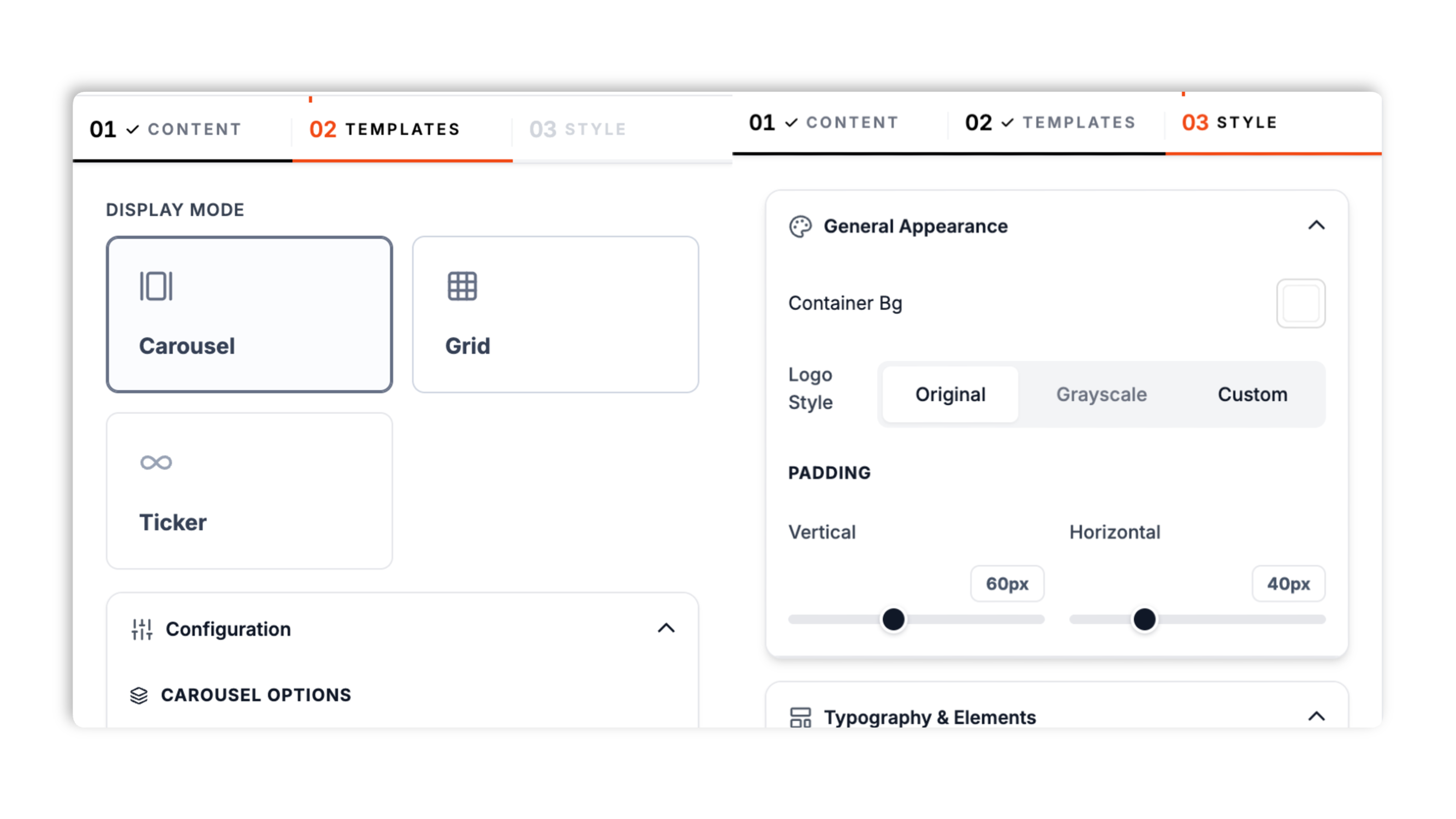
Choose from 3 layouts: Carousel, Grid, or Ticker. Set logo style to Original, Grayscale, or a Available widget controls. Tune logo size, spacing, padding, and the container background.
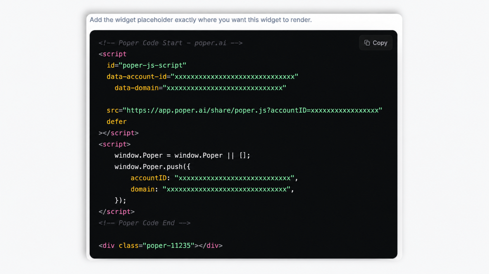
Paste the Poper embed snippet into your site. Works anywhere your Poper embed snippet is supported.
Works everywhere
Drop-in install on WordPress, Shopify, Wix, Squarespace, Webflow, Framer, Ghost, and any HTML-friendly stack. No build step, no developer needed.
Plus 250+ other platforms via the embed snippet. If your site can render a <script> tag, it can render the Logo Slider Widget: Add a Trusted-By Client Logo Strip to Any Site.
The things that matter when you are paying for a logo slider, not 30 features no one uses.
Three layouts cover every trusted-by placement. Carousel gives you navigation arrows, optional auto-slide with a delay control, and bullet pagination. Ticker scrolls continuously at an adjustable speed, in a left or right direction, and pauses when a visitor hovers it. Grid lays the logos out in a static block with separate desktop and mobile column counts. Switch between all three in the builder.
Set logo style to Original, Grayscale, or a Available widget controls. Grayscale is the industry-standard treatment for trusted-by strips because it stops clashing brand palettes from competing with your hero CTA. It is a CSS treatment, so your original logo files are never changed.
The continuous ticker pauses when a visitor hovers over it, so they can read a specific logo without chasing it.
Tune logo size, spacing between logos, container padding, and max width, with separate size and spacing values for mobile.
Add an optional header title and description above the strip, plus an optional call-to-action button with its own label, link, style (filled or outline), color, corner radius, and size preset. Match the whole block to your brand.
Carousel and ticker stay readable on phones, and Grid drops to your chosen mobile column count. Separate mobile size and spacing values keep logos from crowding on small screens.
Use cases
Four buyer types who get the most lift from embedding Logo Slider Widget: Add a Trusted-By Client Logo Strip to Any Site on their site.
A trusted-by strip of customer logos under your hero is the single highest-impact social proof element on a SaaS homepage. Place it above the fold.
Press mentions are credibility transfers. Show TechCrunch, Forbes, WSJ, and The Verge logos in a press strip to import their authority into your brand.
Show payment provider logos (Visa, Mastercard, Stripe, PayPal, Apple Pay, Google Pay, Klarna, Shop Pay) above your checkout button to reduce cart abandonment.
Conference and event sites use logo sliders for sponsor recognition. Available widget controls for Gold, Silver, Bronze.
Most logo slider widgets lock layouts or styling behind a paid tier. Here is how the popular ones stack up.
| Recommended Poper | Elfsight Logo Showcase | POWR Logo Slider | Common Ninja Logo Showcase | |
|---|---|---|---|---|
| Poper workspace available | 200 views/mo | 25 views/mo | Limited | |
| Carousel layout (arrows, auto-slide) | ||||
| Continuous ticker layout | ||||
| Static grid layout | ||||
| Grayscale and custom-tint logo styling | Paid only | Paid only | Paid only | |
| Pause-on-hover on the ticker | ||||
| Header text and call-to-action button | Limited | Limited | Limited | |
| Separate desktop and mobile sizing | Paid only | Limited | ||
| Logo cap | 40 logos | 10 logos | 10 logos | Varies by plan |
| Pricing for unlimited views | Plan details vary | Vendor pricing varies | Vendor pricing varies | Vendor pricing varies |
| Works alongside other Poper tools |
Comparison reflects external competitor positioning. Verify current details on each provider's site.
Marketers, agencies, and SaaS teams who switched from broken marquees to Poper.
“We replaced a hand-coded marquee with Poper's logo slider. The ticker layout with pause-on-hover looked right immediately, and we never touched code again to swap logos.”

“30+ partner logos in a single continuous ticker. The grayscale style unified the look across messy brand palettes. Ship time was under five minutes.”

“We use the carousel layout for tiered sponsors and the grid layout in the footer. Same widget, two placements, both branded to match the site.”

Pricing
All plans are billed yearly. Each card shows the per-month equivalent. Start free, then upgrade only when you need more campaigns, websites, or AI credits.
Yearly billing · save up to 40%Essential lead capture for solo creators and growing businesses.
billed $180/year
Full engagement suite with A/B testing, gamification & unlimited leads.
billed $348/year
Unlimited everything with white-label, API access & advanced analytics.
billed $948/year
Prices shown for the 50k monthly visitor tier on yearly billing. A Free Forever plan ($0) and a custom Enterprise plan are also available. No contracts, cancel anytime.
A logo slider is the single most-used social proof element on the modern web. Walk into any SaaS homepage, agency portfolio, or ecommerce checkout, and odds are you will see a horizontal strip of client, partner, or payment provider logos within the first viewport. The format works because it activates a behavioral principle Robert Cialdini named in Influence: social proof. When prospects see logos of brands they recognize, they import that recognition into their judgment of you. This guide walks through what actually matters when you choose and configure a logo slider widget in 2026: the trusted-by psychology backed by Spiegel and Northwestern research, the grayscale styling UX standard nobody documents, how to pick between the carousel, grid, and ticker layouts, how to size logos so the strip reads as confident rather than padded, and how a slider differs from the static customer logos wall you will see on bigger SaaS sites. The five sections below build on each other: start with why the format works, move through how to style and lay it out correctly, then how to size it for breadth, and finish with the format-versus-format decision that determines whether a slider is even the right call for your inventory and page goal.
Walk through Stripe, Vercel, Linear, Notion, Figma, Webflow, Plaid, and Anthropic's homepages. Every single client logo strip uses the same treatment: logos render in grayscale by default, fade to full color on hover. This is the industry standard, and it works for two reasons. First, color logos compete visually with your hero CTA (a strip of full-color brand marks pulls the eye away from the action you actually want visitors to take). Grayscale defuses that competition while still communicating the trust signal. Eye-tracking studies on landing pages consistently show that high-saturation elements pull the visitor's gaze regardless of where the page intends to direct attention; muting the logo strip to grayscale solves the problem without removing the social proof. Second, your client logos come from many different brand systems with clashing color palettes. A red logo next to a green logo next to a purple logo creates a visually noisy strip that reads as a circus tent, not a credibility statement. Rendering them in unified grayscale creates visual coherence the original mixed-color set cannot. The hover-to-color interaction adds delight without compromising the default state. It also serves a functional purpose: when a visitor pauses on a particular logo (the universal sign of curiosity), the color reveal rewards that micro-engagement and increases the odds of a clicks. Measure impact with your own analytics; in DIY builds you have to write the CSS filter rule by hand on every logo, deal with edge cases like logos that already include grayscale, and re-test on every browser. The pattern is so well-established that not using it now reads as either inexperience or a deliberate stylistic break, both of which carry brand cost.
The Poper logo slider ships three layouts, and they are not interchangeable. The Ticker layout scrolls all your logos continuously in one direction at a speed you control, and pauses when a visitor hovers it. It is the right pick above the fold when you have many logos and want a sense of motion and breadth without spending much vertical space. The Carousel layout shows a set of logos at a time with navigation arrows, optional auto-slide on a delay, and bullet pagination, which works well when you want visitors to step through tiered groups of partners deliberately. The Grid layout lays every logo out in a static block with desktop and mobile column counts you set, and it is the right pick on press pages, footers, and any context where motion would be a distraction. A practical rule of thumb: ticker for breadth above the fold, carousel for deliberate stepping, grid for calm static placement deeper in the page. You can switch layouts in the builder at any time without re-uploading logos, so test which one converts on your actual page rather than guessing from the builder preview.
Walk through Stripe, Vercel, Linear, Notion, and Figma's homepages. Every client logo strip uses the same treatment: muted, unified logos rather than full-color brand marks. The Poper logo slider offers this through the logo-style control: Original keeps each logo as uploaded, Grayscale renders the whole strip in unified gray, and additional widget controls. Grayscale works for two reasons. First, full-color logos compete visually with your hero CTA; a strip of saturated brand marks pulls the eye away from the action you actually want visitors to take, and muting the strip defuses that competition while still landing the trust signal. Second, your client logos come from many brand systems with clashing palettes, and a red logo next to a green one next to a purple one reads as visual noise rather than a credibility statement. Rendering them all in unified gray (or a single brand tint) creates coherence the original mixed-color set cannot. All three styles are CSS treatments applied at render time, so your original uploaded files are never altered. If a particular logo looks weak in grayscale, the Original or Custom option lets you keep it readable without changing the rest of the strip.
Two formats compete for the trusted-by job, and they are not interchangeable. A logo slider (this widget) auto-scrolls horizontally, fits in a single row above the fold, and showcases 5-50 logos in compact horizontal space. A customer logos wall is a static grid, fits 12-50 logos in a 3-5 row block, and lives further down the page (often as a dedicated section between the feature grid and the testimonials). The slider wins when you have many logos and limited vertical space, when you are above the fold, when motion adds energy to a calm hero design, and when you want to showcase breadth (many partners) without sacrificing first-viewport real estate. The wall wins when you have a few high-value logos you want to feature equally without motion, when you are deeper in the page where vertical space is no longer scarce, when you are pairing the logos with case study links or short quote pull-outs, and when you are targeting accessibility-conservative audiences (government, education, healthcare) where motion is best minimized regardless of WCAG technical compliance. Myour sites use both: a slider in the hero for breadth, a wall further down for depth, and individual logos embedded inline within case study cards for narrative emphasis. The composite pattern compounds the social proof effect across the page without ever feeling repetitive. If your logo set is under 8 brands, skip the slider and use a static row instead. Auto-scroll on a tiny set looks unconfident, like you are trying to pad the lineup, and visitors notice. The marquee should always feel like there are more logos than you can fit, never like there are fewer than you wish you had. A practical rule of thumb: marquee with 12 or more logos, static row with 5 to 11, and skip the strip entirely with under 5 (in which case place the logos inline with quotes from each customer instead). The right format follows from your logo inventory and page intent, not from what looks cool in the builder preview.
A logo slider widget is an embeddable script that displays a strip of client, partner, sponsor, or payment provider logos on your website. The Poper logo slider offers carousel, grid, and ticker layouts, with grayscale or custom-tint logo styling and pause-on-hover on the continuous ticker.
Last fact-checked: . We re-verify every quarter.
Tutorial
A quick walkthrough of setting up and embedding this widget.
Tutorial video coming soon
Can't find the answer you're looking for? Chat with our support team.
Contact SupportPoper takes 90 seconds to embed and ships Available widget settings.
Free plan available forever