
Hero rotator
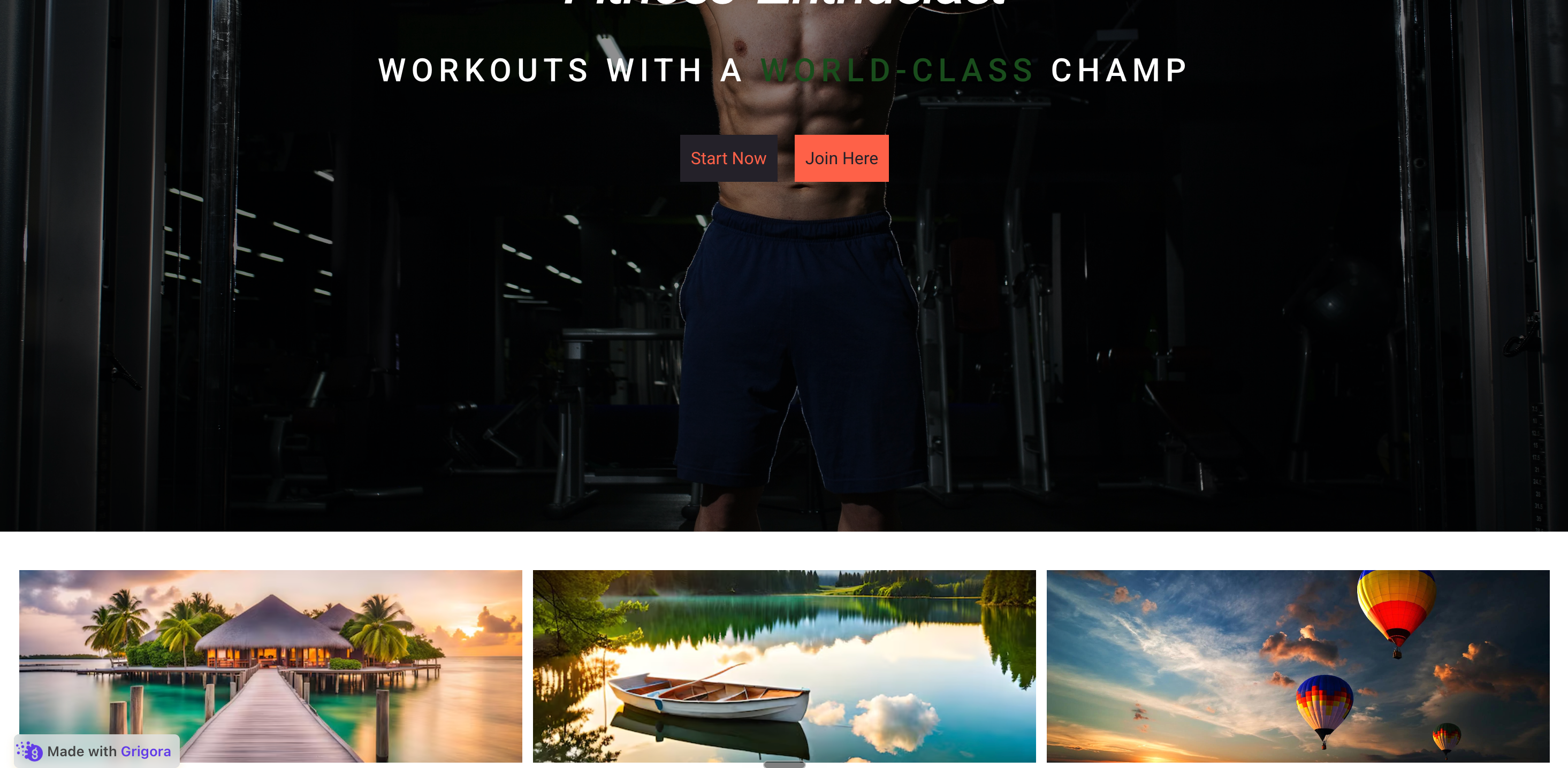
DTC and lifestyle brands rotate a few hero images at the top of the homepage. Add three to five slides, give each a title, and let autoplay or a swipe move between them.
Showcase products and portfolios with 3D, cinematic, and floating-stack effects. available widget settings, captions, and layout-dependent navigation controls.
Built for builder website teams


Live demo, not a screenshot. Style it, set rotation, embed it. What you see here is what ships to your site.
Before and after Poper
A page before and after the Poper image carousel. Add your images, pick one of eight layouts, and the carousel rotates them with autoplay, captions, and the navigation controls supported by the selected layout. Style it with the available controls, then copy the embed snippet.
 Before
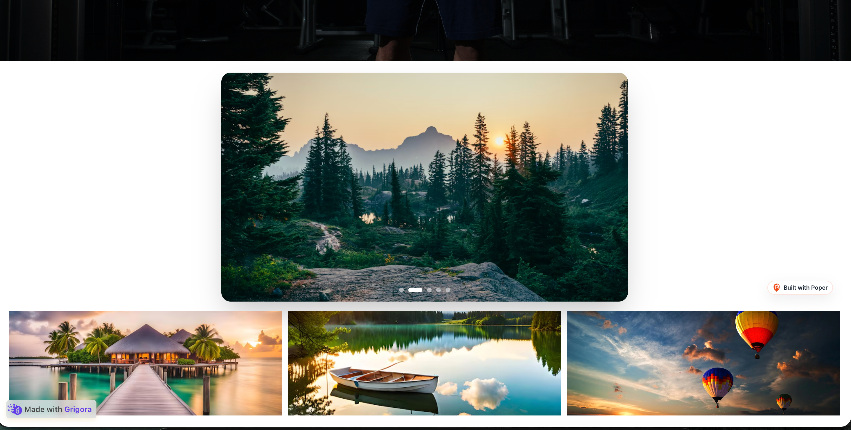 Poper widget live
Mockups for illustration. Style the widget to match your site and embed in 90 seconds.
How to use it
Measure impact with your own analytics, no JavaScript library to babysit.
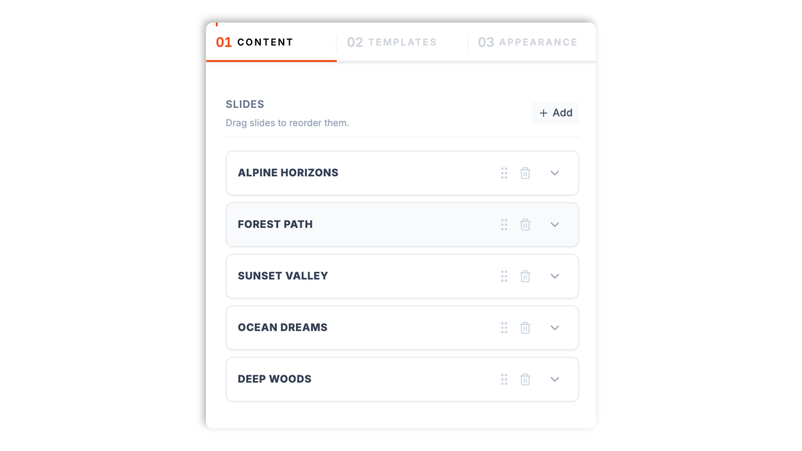
Add images in the Poper builder, drag to reorder them, and give each slide a title and a short description. The live preview updates as you go.
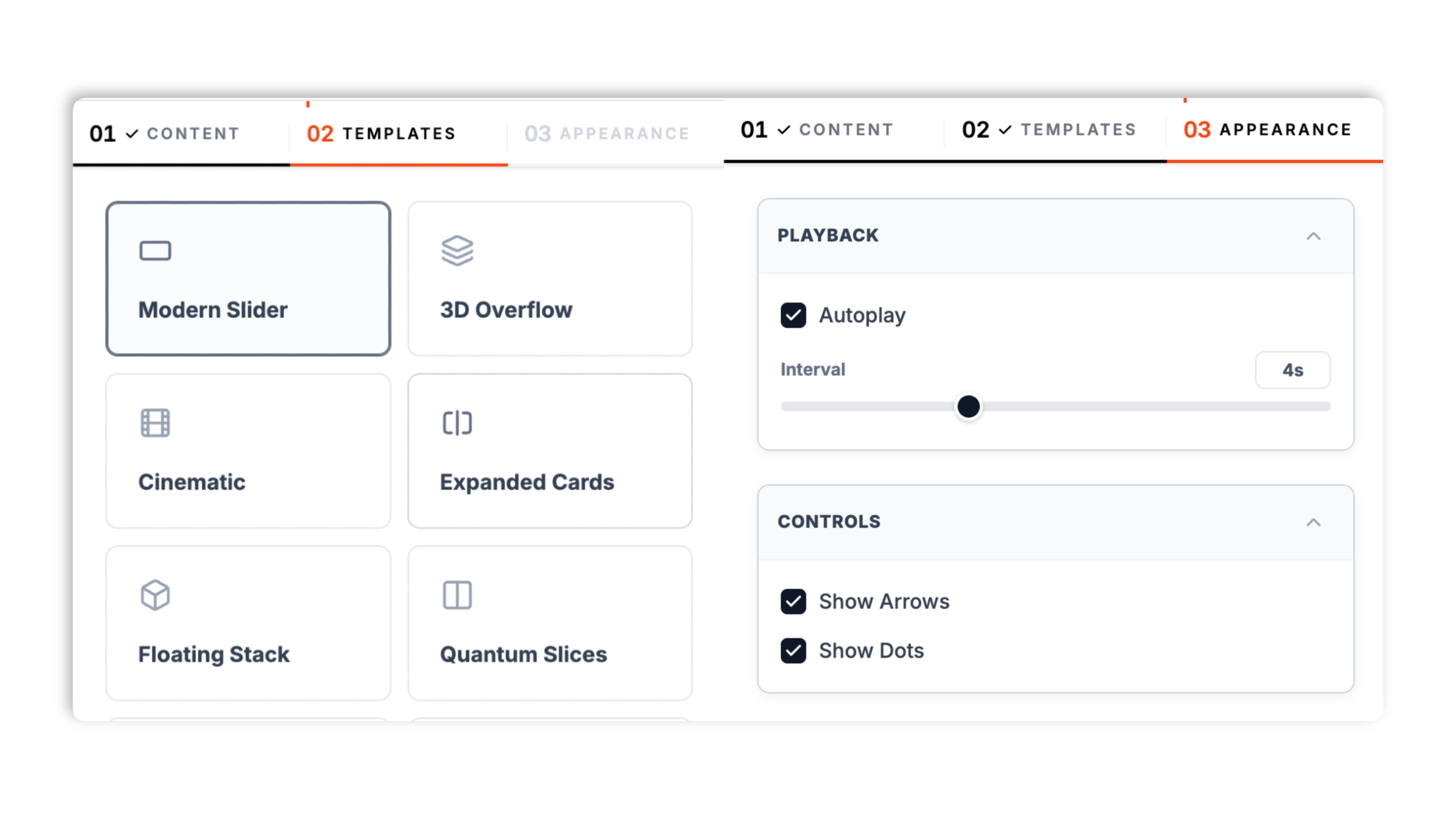
Choose from eight layouts: Modern Slider, 3D Overflow, Cinematic, Expanded Cards, Floating Stack, Quantum Slices, 3D Prism, and Circular Orbit. Turn autoplay on or off, set the interval, and use the navigation controls exposed by the selected layout.
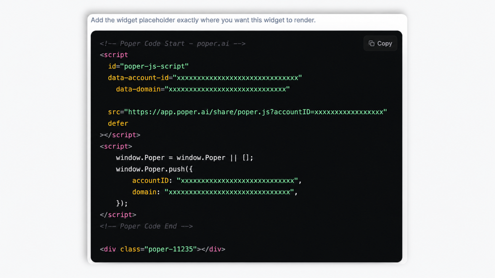
Paste the Poper embed snippet into your site. Works anywhere your Poper embed snippet is supported.
Works everywhere
Drop-in install on WordPress, Shopify, Wix, Squarespace, Webflow, Framer, Ghost, and any HTML-friendly stack. No build step, no developer needed.
Plus 250+ other platforms via the embed snippet. If your site can render a <script> tag, it can render the Image Carousel Widget: Hero Sliders, Product Galleries, Portfolio Carousels.
Six things that matter when you embed a carousel: layouts, autoplay, captions, not 30 features no one uses.
Most carousel widgets give you one slider and a couple of toggles. Poper ships eight distinct layouts: a clean Modern Slider, a 3D Overflow coverflow, a Cinematic slow-pan, Expanded Cards, a Floating Stack, Quantum Slices, a 3D Prism, and a Circular Orbit. Each one is a genuinely different presentation, so you pick the carousel that fits the content and the page rather than restyling a single generic slider.
Turn autoplay on or off, and set the interval in seconds. Pause-on-hover is available in supported layouts. Leave autoplay off when you want a purely manual carousel.
Show or hide navigation arrows and dot indicators where the selected layout exposes those controls. Each slide can carry a title and a short description, so a product or portfolio carousel can label what the visitor is looking at as it rotates.
Phone and tablet behavior depends on the selected layout; test the carousel on the target devices.
Set aspect ratio where the selected layout exposes that control.
The carousel adapts to the width it is given, from a desktop column to a phone viewport.
Use cases
Four buyer types who get the most lift from embedding Image Carousel Widget: Hero Sliders, Product Galleries, Portfolio Carousels on their site.
DTC and lifestyle brands rotate a few hero images at the top of the homepage. Add three to five slides, give each a title, and let autoplay or a swipe move between them.

Show a product from several angles in one slot. The 3D Overflow or Floating Stack layout makes browsing the shots feel tactile, and a square aspect ratio keeps each photo consistent.

Conference recaps, festival highlight reels, and brand activations. Rotate a set of event photos under the headline, with a title on each slide for context.

Studios and photographers present their best work in a cinematic carousel. The Cinematic layout adds a slow pan, and each slide can carry the project name and a short line.
Most carousel widgets ship one slider and charge per view. Here is how the popular options stack up.
| Recommended Poper | Elfsight Image Slider | POWR Slider | |
|---|---|---|---|
| Poper workspace available | Limited views | Limited views | |
| Number of distinct layouts | 8 layouts | Limited | Limited |
| 3D and cinematic effects | Limited | Limited | |
| Available widget settings | |||
| Per-slide title and description | Limited | Limited | |
| Layout-dependent arrows and dots | |||
| Touch swipe on mobile | |||
| Available widget controls | Partial | Partial | |
| Live preview while editing | |||
| Remove third-party branding | All plans | Paid only | Paid only |
| Bundled with popups, forms, quizzes, more widgets | |||
| Pricing for unlimited views | Plan details vary | Vendor pricing varies | Vendor pricing varies |
Comparison reflects external competitor positioning. Verify current details on each provider's site.
Marketers and designers who picked a carousel layout that fits their content.
“We swapped a plain slider for the 3D Overflow layout on our product pages. Browsing the angles feels tactile now, and setup was just adding the photos and picking a layout.”

“The Cinematic layout gave our portfolio carousel a slow pan that makes the work look considered. Per-slide titles meant every project got its name on screen.”

“Eight layouts to choose from meant I could match the carousel to the page instead of fighting one generic slider. Pause-on-hover keeps captions readable.”

Pricing
All plans are billed yearly. Each card shows the per-month equivalent. Start free, then upgrade only when you need more campaigns, websites, or AI credits.
Yearly billing · save up to 40%Essential lead capture for solo creators and growing businesses.
billed $180/year
Full engagement suite with A/B testing, gamification & unlimited leads.
billed $348/year
Unlimited everything with white-label, API access & advanced analytics.
billed $948/year
Prices shown for the 50k monthly visitor tier on yearly billing. A Free Forever plan ($0) and a custom Enterprise plan are also available. No contracts, cancel anytime.
A carousel is a strong pattern in some places and a weak one in others. Used well, for product photos, portfolios, and event recaps, it lets a visitor browse several related images in one compact slot. Used badly, as a homepage hero stuffed with unrelated messages, it tends to get ignored. This guide is honest about both. It walks through when a carousel is the right choice, how to pick a layout, how autoplay should behave, and how to add slides so the carousel earns its place on the page.
The clearest signal that a carousel fits is that the visitor wants to browse several images of one thing. A product shown from multiple angles, a portfolio of related work, a set of event photos, a sequence of hero variants for one brand: in all of these the visitor is in browsing mode and a carousel gives them a tidy way to move through the set. Where a carousel tends to disappoint is the opposite case, a homepage hero carousel where each slide carries a different, unrelated message. When teams reach for a carousel because the page felt empty, or because several stakeholders each wanted a slide, the result is usually that visitors notice the motion, read it as an ad, and tune it out. The honest rule is simple. If the slides are variations on one subject the visitor wants to explore, a carousel is a good fit. If each slide is a different message competing for attention, a single clear section usually does better. Choose the pattern based on what the content actually is.
The image carousel widget ships eight layouts, and the layout is a real design choice rather than a cosmetic one. A clean Modern Slider is the safe default for most content, a straightforward one-image-at-a-time carousel with arrows and dots. The 3D Overflow layout shows the neighbouring slides in perspective, which makes browsing a product's angles feel tactile. The Cinematic layout adds a slow pan across each image, which suits hero imagery and portfolio shots where you want the slide to feel alive. Expanded Cards, Floating Stack, and Quantum Slices each present the set as a more designed composition rather than a plain slider. The 3D Prism and Circular Orbit layouts are bolder, rotating the images in three dimensions for a product showcase or a striking hero. The practical approach is to try a few layouts against your real images in the live preview and pick the one that fits the content and the surrounding page, rather than choosing in the abstract. Each layout also sets sensible defaults for whether arrows and dots show and for the aspect ratio, which can be adjusted where the selected layout exposes those controls.
Autoplay is useful when the carousel is a secondary element a visitor may not think to interact with, such as an event recap or a set of hero variants. It is less useful, and sometimes counterproductive, when each slide carries text the visitor needs time to read, because a slide can advance before they have finished. The image carousel widget lets you turn autoplay on or off and set the interval in seconds, so you can match the behaviour to the content. Some layouts pause on hover when autoplay is on. A good default for most pages is to leave autoplay on with a comfortable interval of several seconds, or to turn it off entirely for a carousel where reading the captions matters. Navigation controls depend on the selected layout.
A carousel is only as good as the images and the labels on them. Each slide in the widget carries an image, a title, and a short description, and the order is whatever you set by dragging the slides in the builder. A few habits make the carousel work harder. First, keep the set focused. A product carousel of six clear angles beats one of fifteen near-duplicate shots, and a portfolio carousel reads better when it shows your strongest work rather than everything. Second, use the title and description deliberately. On a product carousel, the title can name the angle or the detail; on a portfolio, it can name the project; on an event recap, it can name the moment. Captions give the visitor context as the carousel rotates, so the images are not just decoration. Third, mind the aspect ratio. Setting the carousel to a single aspect ratio that suits the images, whether that is wide 16/9, square 1/1, or tall 9/16, keeps every slide consistent and avoids a jarring change in shape between slides.
Placement decides whether a carousel helps. It belongs where browsing a set of images is genuinely part of what the visitor is doing. On a product page, a carousel of product photos lets a shopper inspect the item, which is exactly the task they came to do. On a portfolio or an agency site, a carousel of work is the value proposition itself. On an event or recap page, a carousel of photos communicates the atmosphere better than a single image. In each of these the visitor wants variety of one subject, and the carousel delivers it without consuming a lot of vertical space. Where a carousel is usually the wrong call is anywhere the visitor needs one clear next step or one specific piece of information fast. A homepage hero whose job is to state what the company does and point to a single action is better as a focused section than as a rotating set of competing messages. The simple test is to ask whether the visitor benefits from seeing more than one image in that slot. If yes, a carousel fits. If they need one message and one action, give them that instead.
An image carousel widget is a slideshow component that displays multiple images in a single rotating or swipeable container, used for product galleries, portfolios, and hero sections. Poper ships eight carousel layouts, autoplay with pause-on-hover, and per-slide titles and descriptions.
Last fact-checked: . We re-verify every quarter.
Tutorial
A quick walkthrough of setting up and embedding this widget.
Tutorial video coming soon
Can't find the answer you're looking for? Chat with our support team.
Contact SupportEight layouts, autoplay with pause-on-hover, per-slide captions. Use the Poper embed snippet in a supported page free plan.
Free plan available forever