
SaaS vs competitor
Build a battlecard your reps link to and prospects self-serve. Compare your SaaS against 2-4 named rivals on the features your buyers ask about most, with tick/cross cells per row.
Embed product, plan, or feature comparison tables with 14 layouts (Brutalist, Glass, Hologram, Neon, Isometric, Swiss, Radar, more). Monthly/yearly billing toggle, responsive layout options, and available brand controls.
Built for no-code website teams


Live demo, not a screenshot. Add columns, switch layouts, brand it. What you see here is what ships to your site.
How to use it
Define the comparison, choose a layout, and embed where your Poper snippet is supported.
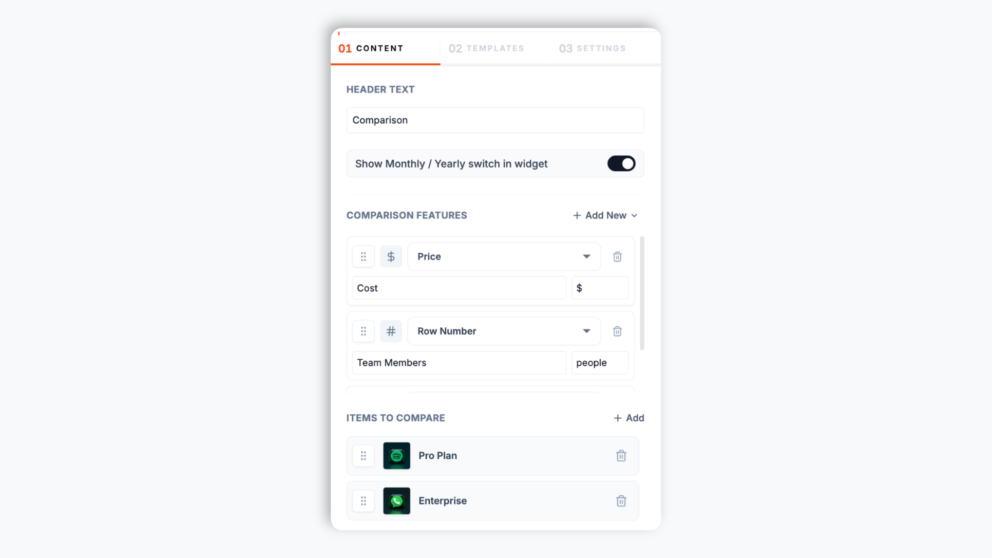
Open the Poper builder, name your columns (e.g. Pro Plan, Enterprise, or No-code, Pro, Business), then add the feature rows you want to compare. Pick a cell type per row: tick/cross, number, price, free text, rating, image, button, or payment label
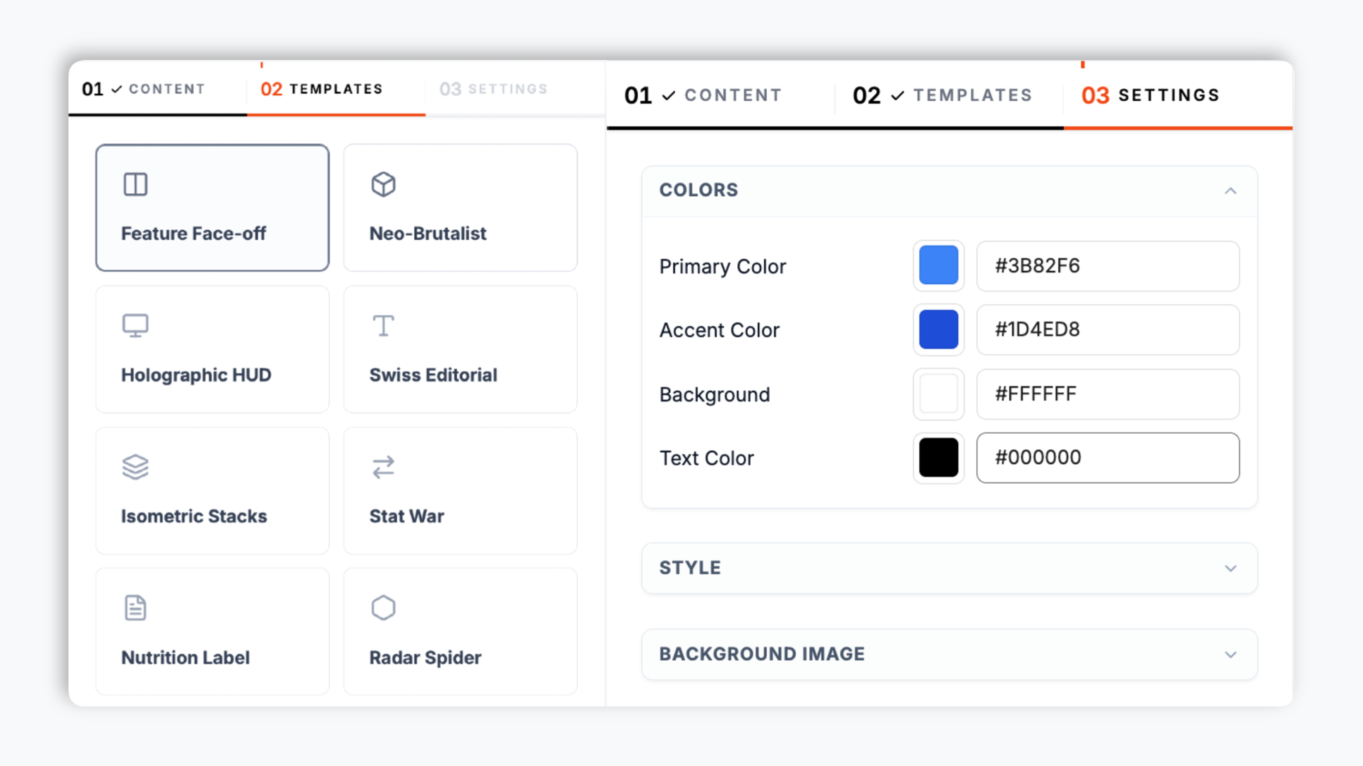
Choose Feature Face-off, Neo-Brutalist, Holographic HUD, Tech Spec Grid, Glass Overlay, Minimal Bars, and 8 more. Match your brand colors, accent, corner radius, padding, and shadow. Live preview updates as you tweak.
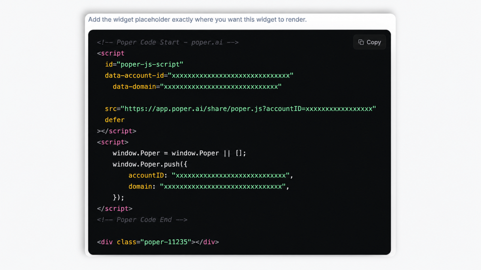
Paste the Poper embed snippet into your site. Works anywhere your Poper embed snippet is supported.
Works everywhere
Drop-in install on WordPress, Shopify, Wix, Squarespace, Webflow, Framer, Ghost, and any HTML-friendly stack. No build step, no developer needed.
Plus 250+ other platforms via the embed snippet. If your site can render a <script> tag, it can render the Comparison Table Widget: Side-by-Side Plan, Product, and Feature Tables.
Six things that matter when you are paying for a comparison table widget, not 30 features no one uses.
Most comparison widgets give you one boring HTML table. Poper ships fourteen full layouts: Feature Face-off (classic cards), Neo-Brutalist (high-contrast bold borders), Holographic HUD (sci-fi interface), Cyberpunk Duel (neon dark mode), Glass Overlay (frosted glass), Isometric Stacks (3D blocks), Swiss Editorial (clean typography grid), Radar Spider (polygon attribute chart), Nutrition Label (strict tabular), RPG Stats (character select), Tech Spec Grid, Stat War (diverging bars), Minimal Bars (clean progress), and Split View. Publish layout changes through your normal widget flow.
Each feature row picks its own cell type: tick/cross for yes/no, number, price, free text, star rating, image, button, or payment label Build a pricing matrix, a spec sheet, or a vendor scorecard with the same widget.
Primary color, accent, corner radius, padding, and shadow. The table can be styled to fit your site.
Holographic HUD, Cyberpunk Duel, Glass Overlay, and Split View ship dark by default.
For pricing comparisons, ship the monthly-yearly toggle out of the box. Each column holds a separate yearly value set, so the table swaps prices when a visitor flips the toggle. No JavaScript work, no second widget.
The table adapts between desktop and mobile view modes. Responsive layouts are available for smaller screens; test wide comparisons at mobile width before publishing.
Use cases
Four buyer types who get the most lift from embedding Comparison Table Widget: Side-by-Side Plan, Product, and Feature Tables on their site.
Build a battlecard your reps link to and prospects self-serve. Compare your SaaS against 2-4 named rivals on the features your buyers ask about most, with tick/cross cells per row.

Phones, cameras, laptops, mattresses. Buyers comparing models want a clean spec-row layout (camera, storage, battery, weight) so they can scan A vs B vs C without leaving your product page.

The classic No-code / Pro / Business decision matrix with tick / cross cells per feature and a monthly-yearly billing toggle. Each tier shows price, seats, and storage at a glance.

Affiliate review sites and analyst pages comparing 4+ vendors. Capability rows by vendor columns, scored with 1-to-5 star rating cells and tick/cross marks.
Comparison widgets vary by layout count, cell types, and billing-toggle support. Verify competitor details before publishing your own comparison.
| Recommended Poper | Elfsight Comparison | POWR Comparison | Common Ninja Comparison | |
|---|---|---|---|---|
| Poper workspace available | 200 views/mo | Limited | ||
| Distinct layouts included | 14 | 1 | 2 | A few |
| Cell types per row | 8 | Limited | Limited | Limited |
| Monthly / yearly billing toggle | Paid only | |||
| Star rating cells | ||||
| Brand color, radius, shadow controls | Limited | Limited | ||
| Built-in dark layouts | Paid only | Manual | ||
| Mobile responsive view | ||||
| Pricing depends on your Poper plan | Plan details vary | Vendor pricing varies | Vendor pricing varies | Paid plans |
| Bundled with popups, forms, quizzes, more widgets |
Comparison reflects external competitor positioning. Verify current details on each provider's site.
Marketers, founders, and affiliate publishers who switched from hand-coded HTML tables to Poper.
“We swapped our hand-coded pricing comparison for the Poper Neo-Brutalist layout. The available color controls helped the table fit the rest of the pricing page.”

“Our affiliate review site needed a vendor scorecard, not just checkmarks. The 1-to-5 star rating cells let us score each tool per capability without writing a line of code.”

“The monthly-yearly billing toggle was the deal-breaker. This kept our comparison in one place for annual prices. Poper holds both value sets in one widget.”

Pricing
All plans are billed yearly. Each card shows the per-month equivalent. Start free, then upgrade only when you need more campaigns, websites, or AI credits.
Yearly billing · save up to 40%Essential lead capture for solo creators and growing businesses.
billed $180/year
Full engagement suite with A/B testing, gamification & unlimited leads.
billed $348/year
Unlimited everything with white-label, API access & advanced analytics.
billed $948/year
Prices shown for the 50k monthly visitor tier on yearly billing. A Free Forever plan ($0) and a custom Enterprise plan are also available. No contracts, cancel anytime.
Comparison tables are useful when a visitor needs to evaluate products, pricing plans, or vendors side by side. Search queries containing vs or than usually have commercial intent, but the table still needs to be accurate and easy to scan. This guide walks through what actually matters when you choose and configure a comparison table widget in 2026: layout choice by buyer intent, picking the right cell type per row, mobile UX of wide tables, and where to place a comparison so it helps visitors decide.
Queries containing comparison intent (vs, than, compare, alternative, best for) often come from visitors who are close to a decision. Google's quality guidance favors comparison content when it is genuinely helpful, factually accurate, and not just a one-sided pitch. A practical comparison page usually combines a 3-5 column table near the top with honest framing that includes tradeoffs and legitimate weaknesses. The widget gives you the table surface; your team still owns the research and substantiation behind every claim.
Side-by-side display helps visitors compare options without switching between product pages or holding details in memory. The practical implication for a SaaS pricing page or DTC product compare page: display a focused set of options side by side and keep feature row labels short so they stay readable while users scan across the value columns. For most pages, three to five options are easier to read than a very wide table.
A comparison table can highlight the option you want visitors to evaluate first, for example a Pro plan, an Editor's Choice product, or a recommended bundle. Use that pattern carefully: the highlighted option should be a real offer with a clear reason to recommend it, not a fake column added only to steer choice. In Poper, you can use accent colors and button cells to make the recommended column easier to spot while keeping the rest of the table factual.
A comparison table is only as clear as its cells. A row that should read as a simple yes or no does not belong in free text, and a price does not belong in a number column. Poper gives each feature row its own cell type so the table communicates fast: tick/cross for binary capabilities (a green check or a grey cross), number for countable quantities (seats, GB, projects), price for currency values with an optional yearly variant, free text for short qualifying notes, star rating for scored comparisons on review and analyst pages, image for logos or product shots, button for a per-column call to action, and payment label for checkout pages. The practical rule: pick the most constrained cell type that still expresses the value. Binary rows should be tick/cross (instantly scannable), scored rows should be star ratings (comparable at a glance), and only genuinely open-ended values should be free text. A table that follows this discipline is dramatically faster to read than one where every cell is a sentence.
Wide comparison tables are hard on mobile. The takeaway for layout choice: keep the number of product columns focused, keep feature row labels short so they do not wrap awkwardly on a 375px phone, and test your embed at mobile width before you ship. Layouts like Minimal Bars, Tech Spec Grid, and Nutrition Label hold up best on narrow screens because their cell content is compact; the more decorative layouts are better suited to desktop-heavy traffic.
A comparison table widget is an embeddable script that renders a side-by-side comparison of products, pricing plans, or features on your website. Poper's version ships 14 layouts, eight cell types per row (tick/cross, number, price, text, rating, image, button, payment label), and a built-in monthly/yearly billing toggle.
Last fact-checked: . We re-verify every quarter.
Tutorial
A quick walkthrough of setting up and embedding this widget.
Tutorial video coming soon
Can't find the answer you're looking for? Chat with our support team.
Contact SupportBuild a comparison table with 14 layouts, eight cell types, and a built-in billing toggle.
Free plan available forever