
FAQ pages
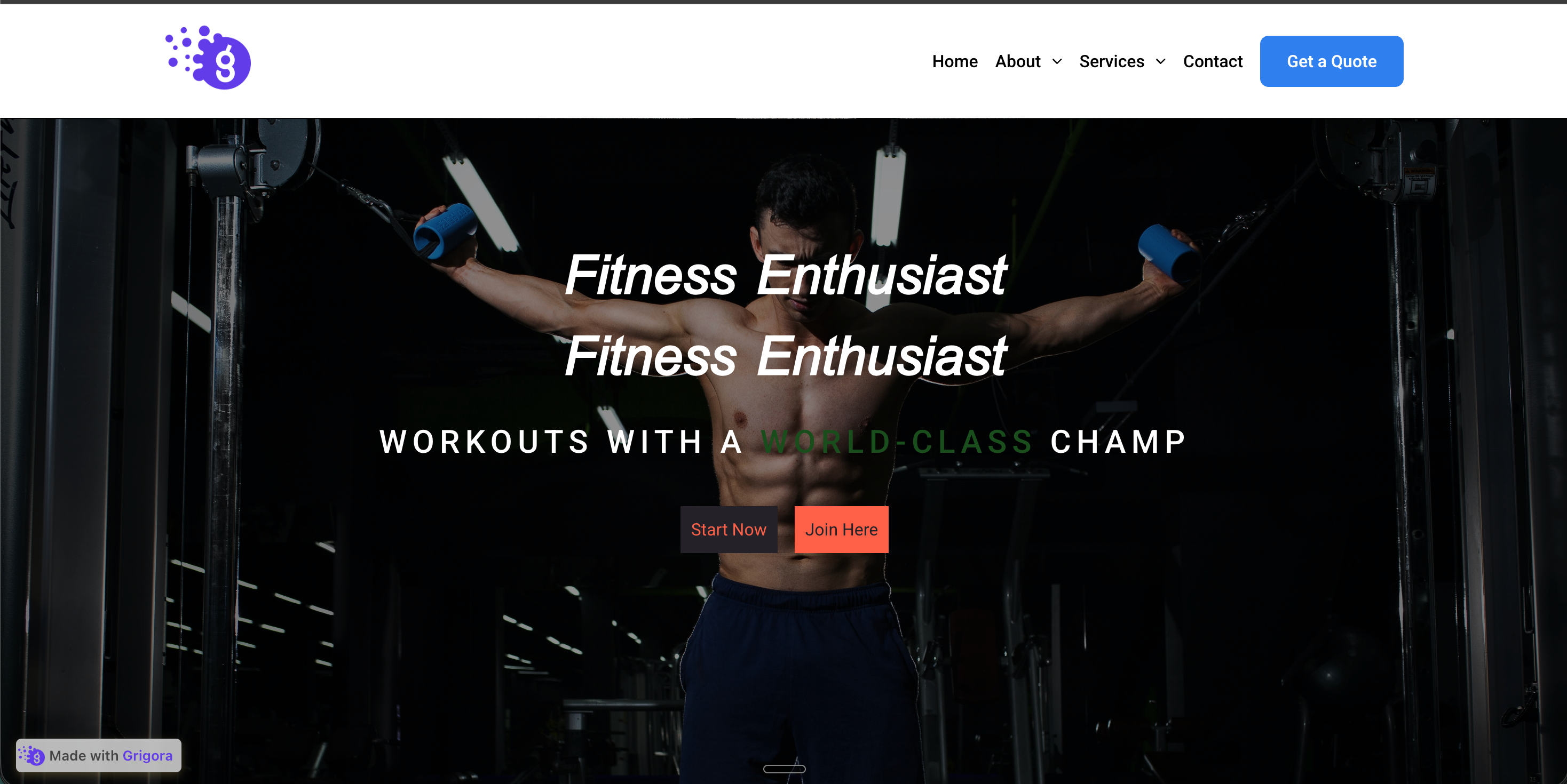
Stack six to thirty common questions on a single page with each answer collapsed by default. Visitors scan headers, expand the one they care about, and keep scrolling. Cuts pre-purchase objections without padding the page with text walls.
Embed collapsible content sections with native button headers, keyboard support, category headings, and six ready-made layouts.
Built for no-code website teams


Live demo, not a screenshot. Add sections, switch layouts, recolor it. What you see here is what ships to your site.
Before and after Poper
The Poper accordion widget uses real HTML button headers, so each section can be reached and toggled from the keyboard. Configure your sections in the builder and embed the same accordion on your own site.
 Before
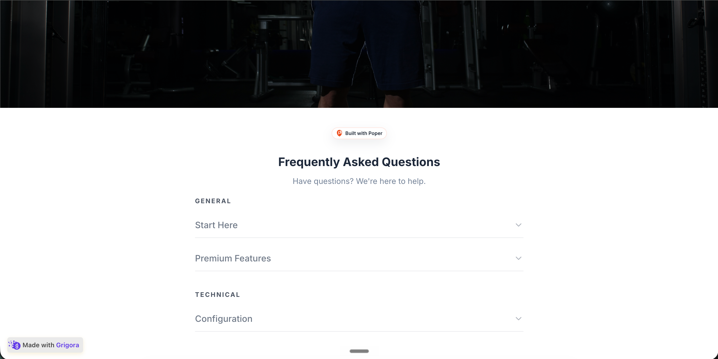 Poper widget live
Mockups for illustration. Style the widget to match your site and embed in 90 seconds.
How to use it
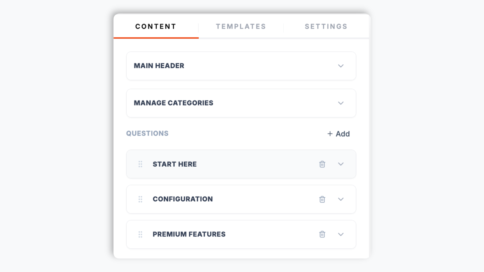
Add sections, choose a layout, and embed where your Poper snippet is supported.
Add section headers in the Poper builder, then write the body text for each panel. Reorder sections, add new ones, and group them into categories like Features, Specs, Shipping, and Warranty so visitors can scan groups.
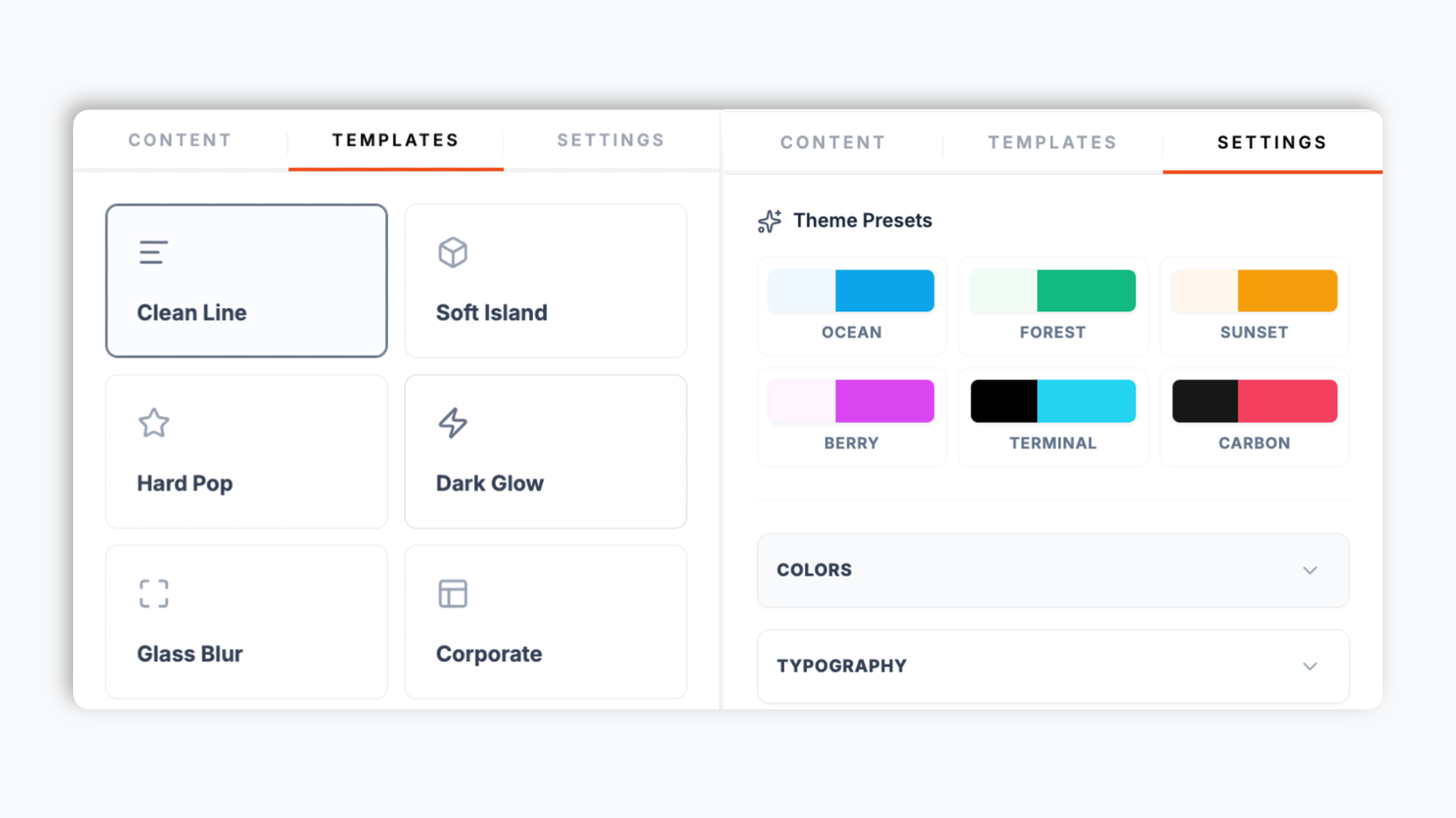
Choose from six ready-made layouts: Clean Line, Soft Island, Hard Pop, Dark Glow, Glass Blur, and Corporate. Match your brand with accent, title, text, and background colors, set the title and description font sizes, and switch on dark mode. Live preview updates as you tweak.
Paste the one-line snippet into your site. Works anywhere your Poper embed snippet is supported. The widget uses native button headers for the expand and collapse controls.
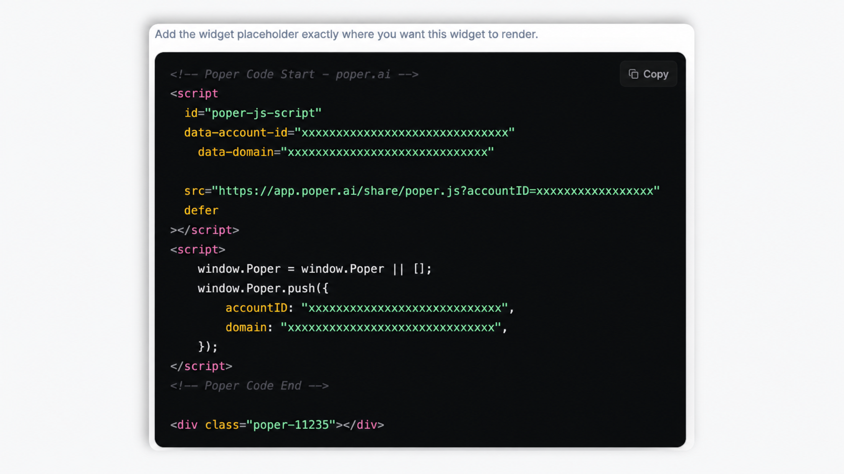
Works everywhere
Drop-in install on WordPress, Shopify, Wix, Squarespace, Webflow, Framer, Ghost, and any HTML-friendly stack. No build step, no developer needed.
Plus 250+ other platforms via the embed snippet. If your site can render a <script> tag, it can render the Accordion Widget: Embed Collapsible Content Sections on Any Website.
Six things that matter when you are picking an accordion widget in 2026, not 30 features no one uses.
Most accordion widgets treat the header as a styled div, so it cannot be reached or toggled with a keyboard. Poper renders every section header as a real HTML button element. That means Tab can reach each header and Enter or Space toggles the panel open and closed, no extra config. Validate the final embed on your live page if you have a formal accessibility review.
Visitors can expand any combination of sections at once, ideal for documentation chapters, FAQs, and comparison sections where readers cross-reference content. Mark individual sections to start open by default so the most important panel is visible the moment the page loads.
Group sections into categories and visitors see category headings to scan groups.
Clean Line, Soft Island, Hard Pop, Dark Glow, Glass Blur, and Corporate. Switch any time.
Every header is a real button, so it can be reached with Tab and toggled with Enter or Space. Pair the widget with your own accessibility testing if your site needs strict pattern coverage.
Validate CLS, LCP, accessibility, and privacy behavior on your own page after embedding.
Use cases
Four buyer types who get the most lift from embedding Accordion Widget: Embed Collapsible Content Sections on Any Website on their site.
Stack six to thirty common questions on a single page with each answer collapsed by default. Visitors scan headers, expand the one they care about, and keep scrolling. Cuts pre-purchase objections without padding the page with text walls.

Description, Specifications, Reviews, Shipping, Returns, Warranty in tidy collapsible sections beneath the buy button. Visitors find the answer they need without scrolling past three screens of marketing copy. Helps organize pre-purchase support answers.

Group SaaS pricing-tier features into expandable categories (Core features, Analytics and reporting, Integrations and API, Security and compliance) so the comparison reads light and visitors expand only the categories they care about.

Self-service help center articles grouped by topic (Account and Billing, Integrations, API and Developer, Getting started, Troubleshooting, Security and Privacy). Link visitors to the relevant section near your accordion. Helps visitors find support answers.
Most accordion widgets vary widely in keyboard behavior, grouping, and layout options. Here is how the popular ones stack up.
| Recommended Poper | Elfsight Accordion | POWR Accordion | |
|---|---|---|---|
| Poper workspace available | Limited (200 views) | Limited (25 plays) | |
| Real button headers (keyboard-operable) | Partial | Partial | |
| Tab + Enter / Space to toggle sections | Partial | ||
| Open-by-default per section | Paid only | ||
| Category category grouping | Paid only | ||
| Optional FAQPage schema | |||
| Ready-made layout presets | 6 layouts | Paid only | Paid only |
| Available color, size, and dark-mode controls | Paid only | Paid only | |
| Pricing for unlimited views | Plan details vary | Vendor pricing varies | Vendor pricing varies |
| Bundled with popups, forms, quizzes, more widgets |
Comparison reflects external competitor positioning. Verify current details on each provider's site.
Conversion leads, engineers, and support directors who switched from broken accordions to Poper.
“We moved our product spec sections from a long scroll into a Poper accordion. The page reads so much lighter now, and visitors expand exactly the sections they care about instead of bouncing off a wall of text.”

“The thing that sold us was that the section headers are real buttons. Our keyboard-only testers could open every panel with Tab and Enter. Most accordion widgets we tried before could not even be opened without a mouse.”

“We grouped our help-center articles into categories and the accordion gives visitors category headings to scan groups.”

Pricing
All plans are billed yearly. Each card shows the per-month equivalent. Start free, then upgrade only when you need more campaigns, websites, or AI credits.
Yearly billing · save up to 40%Essential lead capture for solo creators and growing businesses.
billed $180/year
Full engagement suite with A/B testing, gamification & unlimited leads.
billed $348/year
Unlimited everything with white-label, API access & advanced analytics.
billed $948/year
Prices shown for the 50k monthly visitor tier on yearly billing. A Free Forever plan ($0) and a custom Enterprise plan are also available. No contracts, cancel anytime.
An accordion widget looks like the simplest UI pattern on the web: click a header, the panel expands, click again, it collapses. The most common implementation failure is the header itself, which some off-the-shelf widgets render as a styled div that a keyboard user can never reach or open. SEO teams also ask whether content collapsed by default is still visible to crawlers. This guide walks through what the Poper accordion widget actually does: how it differs from a dedicated FAQ widget, why a real button header matters, how multi-open panels and the open-by-default flag shape a page, and when the accordion's optional FAQPage schema is worth turning on.
It is worth being explicit about how an accordion widget differs from an FAQ widget, because the two share the expand-collapse interaction but solve different problems. An FAQ widget is purpose-built for question-and-answer pairs. An accordion widget is general purpose: section headers can be feature names, spec categories, chapter titles, policy clauses, or support topics, anything where collapsible organization helps scan time. Poper's accordion also exposes an optional FAQPage schema toggle for the case where every section in the accordion genuinely is a question. The right rule of thumb: pick the dedicated FAQ widget when the whole page is a Q-and-A and rich-result eligibility is the goal, pick the accordion widget for everything else where collapsible organization is the goal, and turn on the accordion's FAQ schema only when the headers really are questions.
The key SEO requirement for accordion content is that the panel content should be present in the rendered page markup rather than fetched only after a click. Poper's accordion renders panel content into the page and uses CSS to show or hide each panel as the visitor toggles it. That means crawlers and visitors can access the same content, and opening a section does not need a network request. If accordion content is important for ranking, test the final page with your SEO tooling after publishing.
Poper's accordion widget lets visitors expand any combination of panels at once. This multi-open behavior is the right fit for documentation pages where readers cross-reference setup, troubleshooting, and example sections together, for long-form policy pages where the visitor wants to keep their place across multiple clauses, and for FAQ and comparison sections where two or more answers need to be visible side by side. The one layout lever worth thinking about is the open-by-default flag on each section. Leaving everything collapsed gives the page a clean, scannable look and lets the visitor choose what to read, which is usually right for long FAQs and reference pages. Marking one or two sections to start open is useful when there is a single most-important answer (a shipping policy, a headline pricing question, a getting-started step) that you want visible the moment the page loads, before the visitor does any work. The practical rule: collapse the long tail, but start your single most-important section open.
Poper ships both an accordion widget and a dedicated FAQ widget, and the difference is mostly about intent and structured data. The FAQ widget is purpose-built for question-and-answer entries. The accordion widget is general purpose: section headers can be feature names, spec categories, chapter titles, policy clauses, or support topics, anything where collapsible organization helps scan time. There is overlap: the accordion widget also exposes an optional FAQPage schema toggle, so when every section in your accordion genuinely is a question, you can turn that on and Poper injects FAQPage JSON-LD describing each question and its answer. Only enable it when the content really is question-and-answer, because Google's structured-data guidelines expect FAQPage markup to match visible question-and-answer content on the page. For a product spec accordion, a documentation hub, or a policy page where the headers are not questions, leave the schema off and let the win come from cleaner organization and a better scan experience. A reasonable rule of thumb: reach for the dedicated FAQ widget when the whole page is a Q-and-A and rich-result eligibility is the goal, reach for the accordion widget for everything else, and use the accordion's optional FAQ schema only on the genuine question-and-answer case.
An accordion widget is an embeddable script that organizes content into collapsible expand-and-collapse sections, where each header toggles a panel of content. Poper's accordion widget renders every section header as a real HTML button so it is keyboard-operable, lets visitors expand any combination of panels at once, supports category grouping, and offers six ready-made layouts.
Last fact-checked: . We re-verify every quarter.
Tutorial
A quick walkthrough of setting up and embedding this widget.
Tutorial video coming soon
Can't find the answer you're looking for? Chat with our support team.
Contact SupportUse real button headers that work with mouse, touch, and keyboard by default.
Free plan available forever