The complete guide to embedding LinkedIn recommendations on a personal brand or agency website
LinkedIn recommendations are the most credible third-party recommendation format available to consultants, freelancers, B2B sales reps, executive coaches, and agency leadership in 2026. Unlike anonymous reviews on niche directories, LinkedIn recommendations come from named professionals with a headline, a stated relationship, and a public profile a prospect can check. Embedding LinkedIn recommendations on a personal brand site or agency about page is one of the highest-leverage trust interventions a consultant or sales-rep marketer can ship, and the effect compounds as the recommendation count grows. This guide walks through what actually matters when you choose and configure a linkedin recommendation widget in 2026: the post-2015 LinkedIn API restriction history that explains why every credible widget uses manual import, why the official LinkedIn Profile Badge does not actually display recommendations and is not a substitute, how to collect more specific and useful recommendations from past clients, how to match one of the eight layouts to the page it lives on, and the etiquette of collecting, displaying, and refreshing LinkedIn recommendations without violating platform terms or sounding self-promotional. The guide is opinionated where it matters because vague advice in this space wastes inbound inquiries.
04
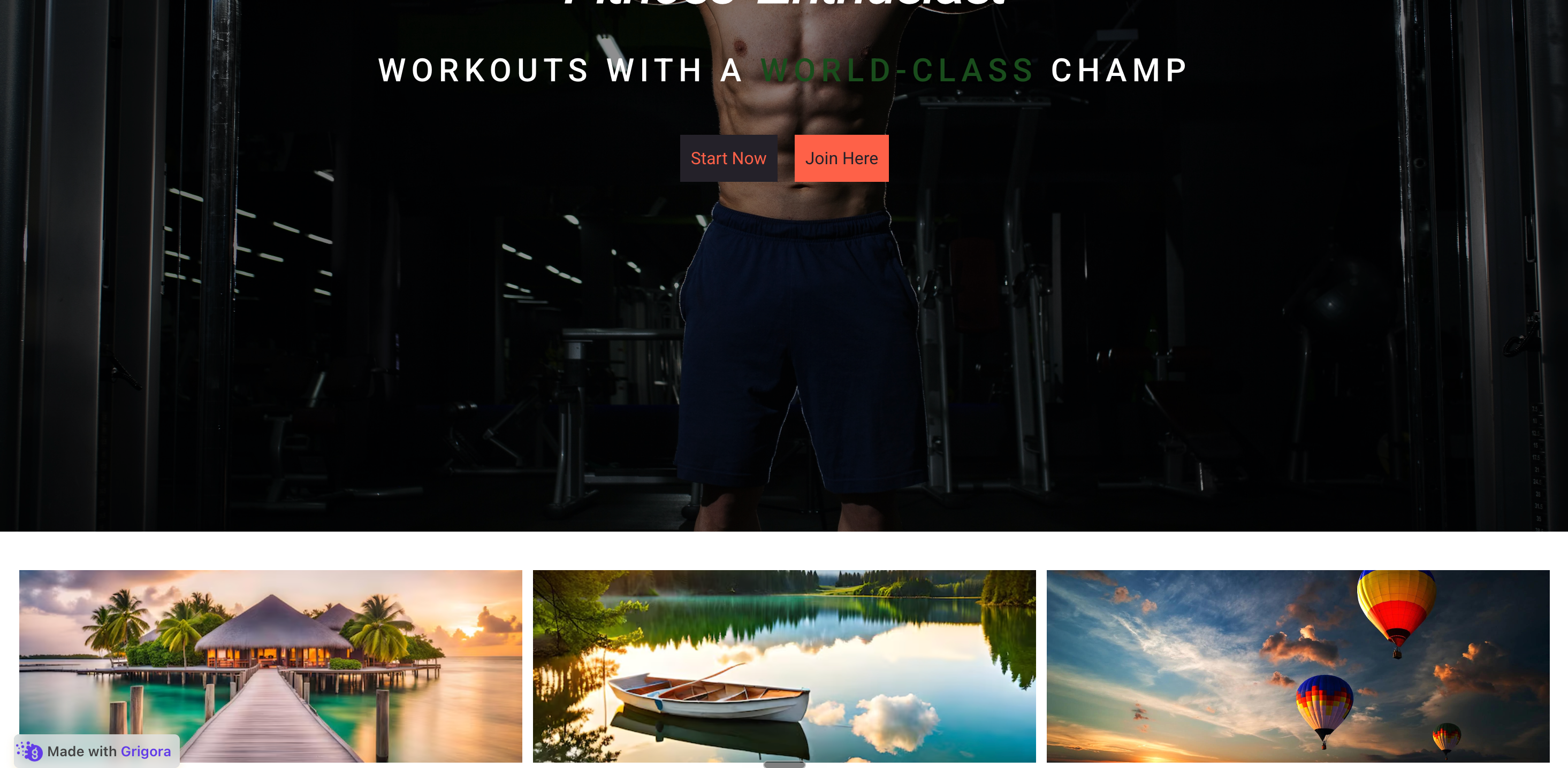
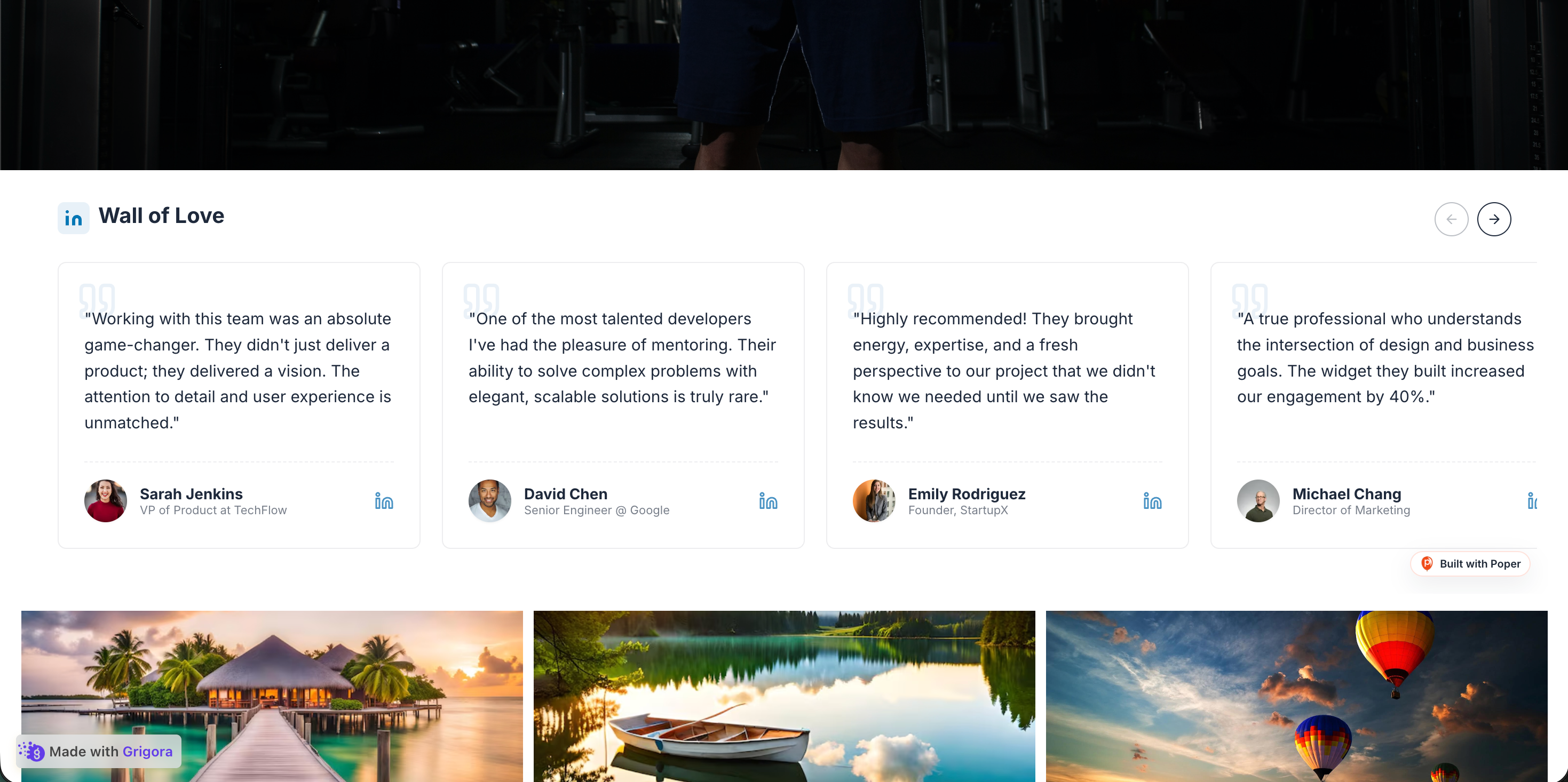
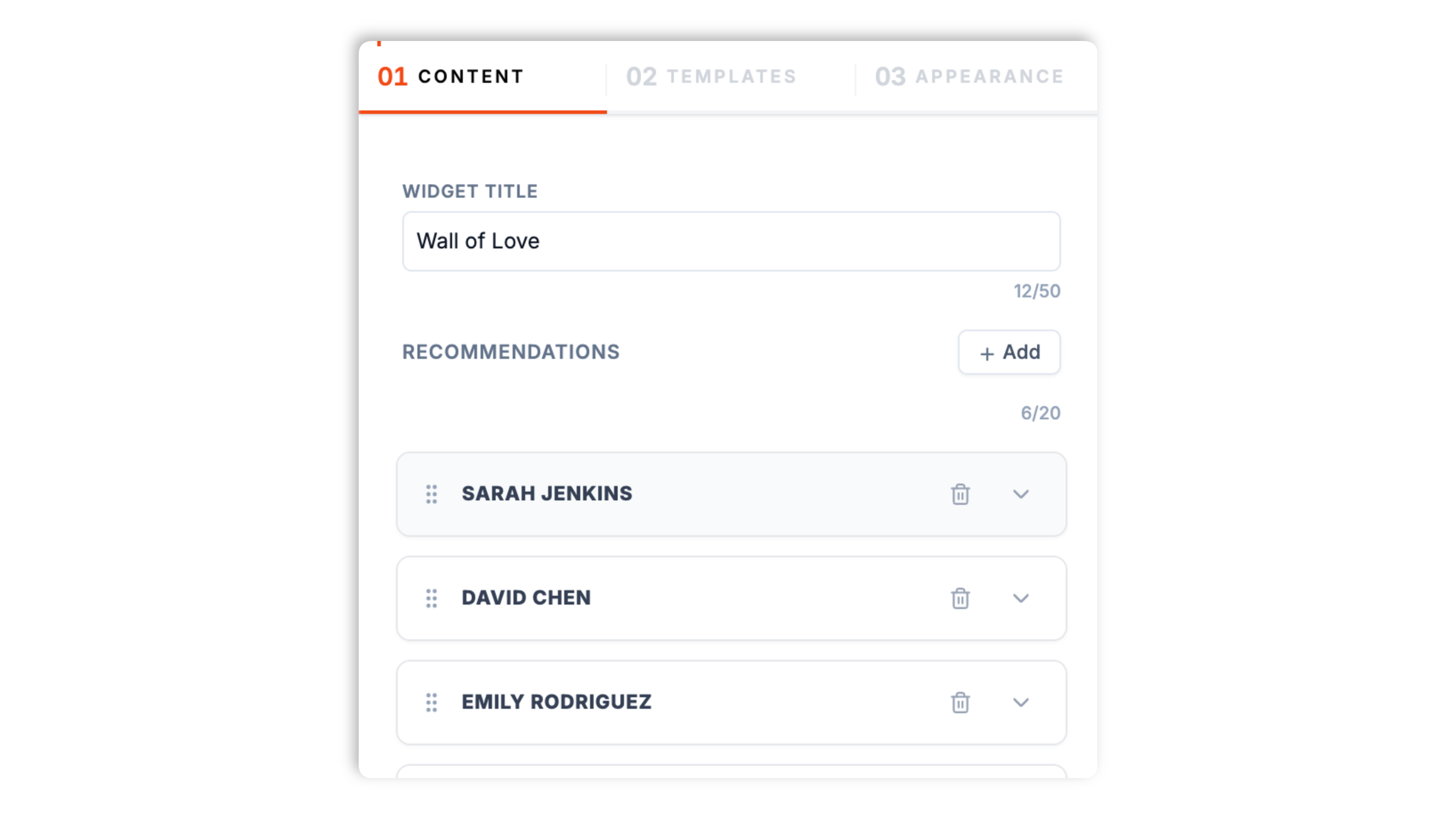
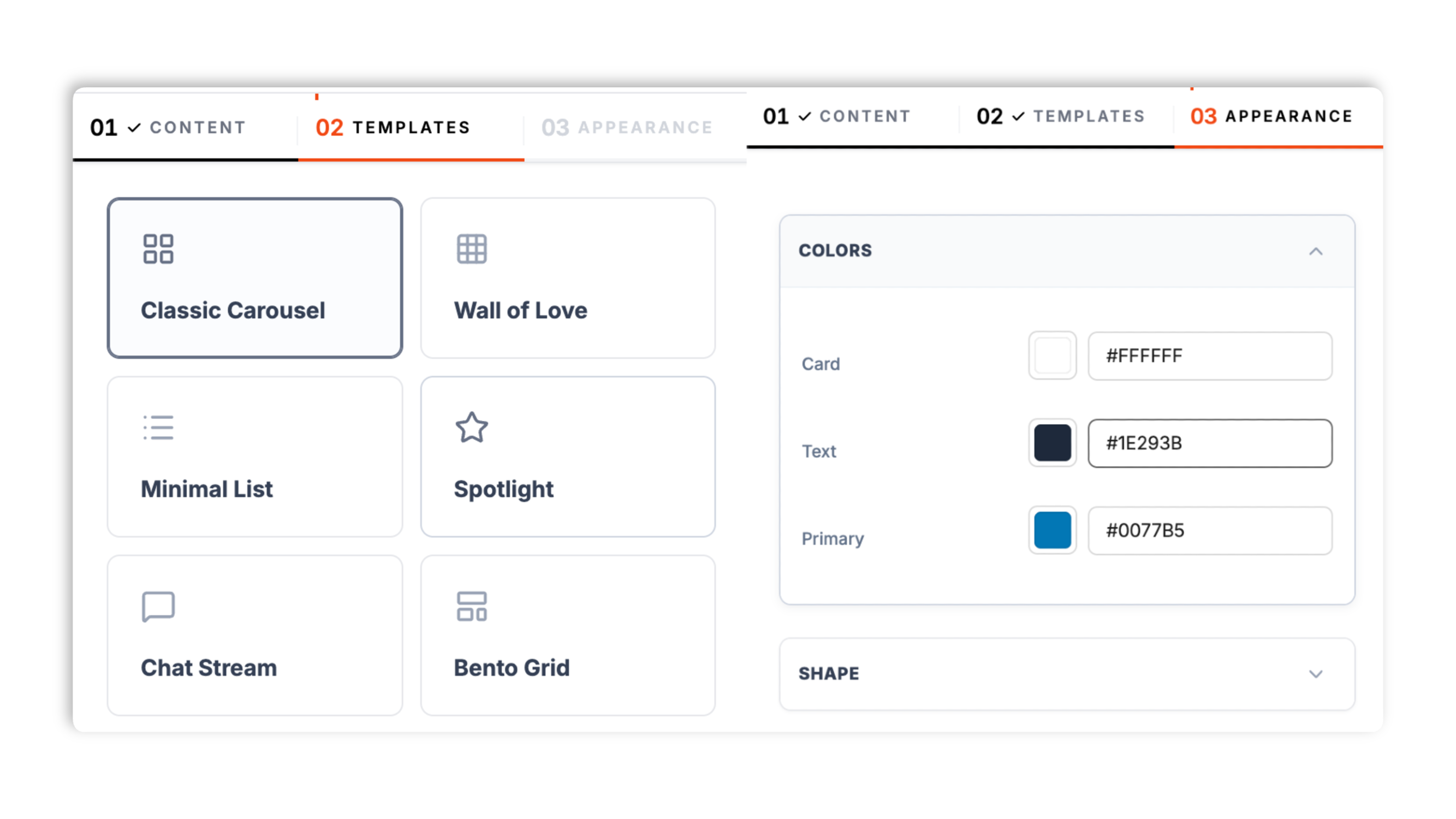
Layout choice: matching one of the eight layouts to the page
The widget ships eight layouts, and the right one depends on the page and the size of your recommendation set. The Spotlight layout features one recommendation at a time with arrows to move between them, which suits a homepage section where you want a cold visitor to absorb one strong recommendation rather than evaluate ten at once. The Wall of Love layout presents the full set as a card grid, which is the strongest choice on an about page, where prospects do their depth evaluation and the volume of recommendations is itself a trust signal beyond the content of any single quote. The Classic Carousel and Infinite Marquee layouts rotate through the set in a compact horizontal band, which is useful on a page with limited vertical room, such as a one-page personal site, where you do not want the social proof section to consume a lot of scroll. The Minimal List, Chat Stream, Bento Grid, and Stacked Deck layouts each present the same recommendations a different way, from a clean stacked list to a conversational stream to a tiled grid, so you can match the visual rhythm of the rest of the site. Each widget can also show an intro card with a section title, a subtitle, and a star rating, which works as a header above any of the layouts. The practical approach is to preview a couple of layouts against your real recommendations, then pick the one that fits the page and the count rather than choosing on aesthetics alone. The wrong layout in the wrong place wastes a trust signal that took weeks of relationship work to collect.