

In today's mobile-first world, a non-responsive popup is more than just a minor annoyance—it's a conversion killer. If your popup looks great on a desktop but is broken, cut off, or impossible to close on a phone, you're frustrating visitors and losing valuable leads. Learning how to make a popup responsive is an essential skill for any developer, marketer, or website owner. For more on why mobile optimization is crucial, check out Mobile Responsive Popups: Why They Matter.
This ultimate guide will cover the core methods for ensuring your popups look and function perfectly on every device. We'll explore:
Manual Coding Techniques using CSS for full control.
Platform-Specific Solutions for WordPress and website builders.
Using a Dedicated Popup Builder like Poper with a mobile editor for the easiest and most powerful approach.
Why is a Responsive Popup Non-Negotiable?
User Experience (UX): Over half of all web traffic comes from mobile devices. A popup that users can't easily read or close creates a frustrating experience and can cause them to abandon your site entirely.
Conversion Rates: A well-designed mobile popup is easy to interact with, making it far more likely to convert visitors into subscribers or customers.
SEO: Google penalizes sites with "intrusive interstitials" on mobile. A broken or non-responsive popup that covers the content can be flagged, potentially harming your search rankings.
Brand Perception: A polished, professional experience on all devices builds trust in your brand.
Step 1: Switch to the Mobile Editor
First things first, head into your Poper dashboard and either create a new popup or open an existing one to edit. Once you’re in the editor, look at the top right corner. You’ll see two icons: one for Desktop and one for Mobile.
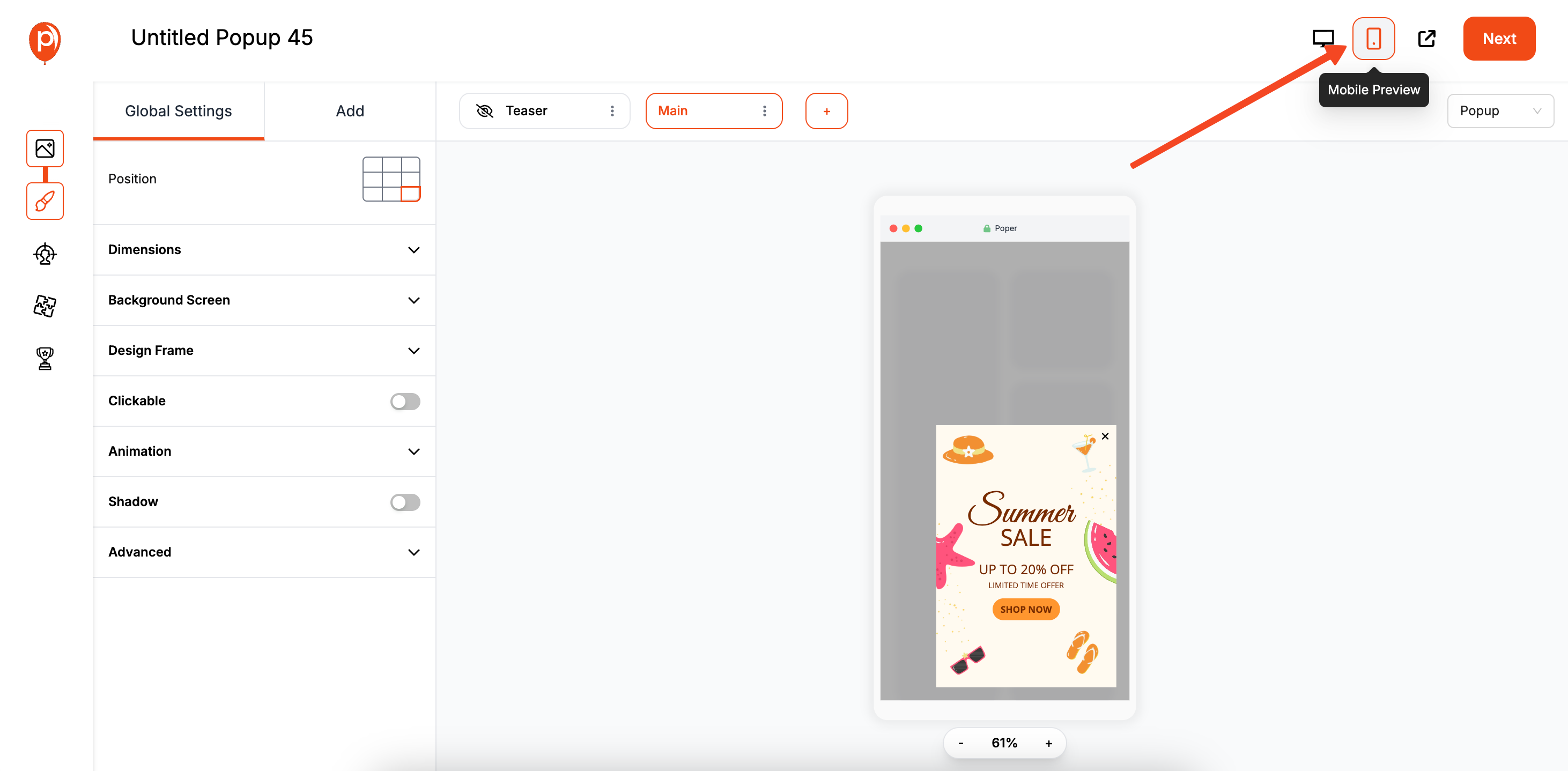
Click the Mobile icon to switch your canvas to a mobile preview. This instantly shows you how your campaign currently looks on a smaller screen, which is the essential first step to making improvements.
Step 2: Customize Your Mobile-Only Design
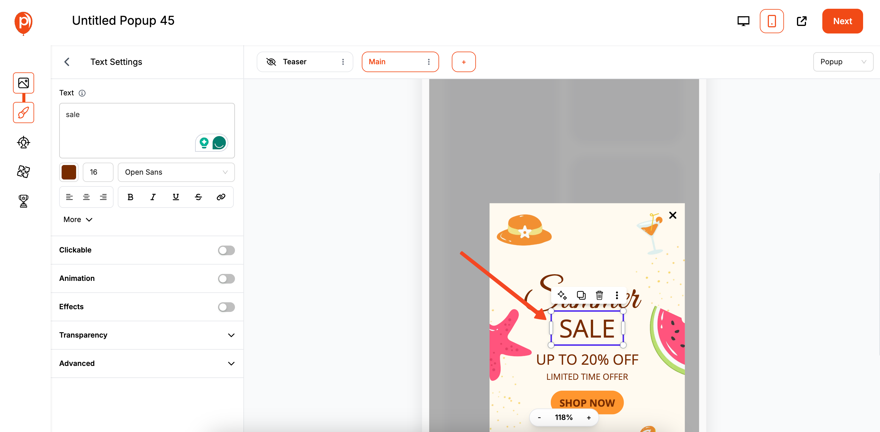
Now that you’re in the mobile view, you can edit your campaign freely. Drag elements, resize text, change images, or adjust spacing. The best part? Any changes you make here only apply to the mobile version. Your desktop design will remain exactly as you left it.
This is your chance to optimize for a better user experience. For example, if you have a lead form with fields side-by-side on desktop, you can stack them vertically for mobile. This makes the form much easier to fill out with a thumb on a narrow screen. If you're looking to create high-converting lead forms, see our guide on how to create website forms.
Step 3: Preview on a Real Device
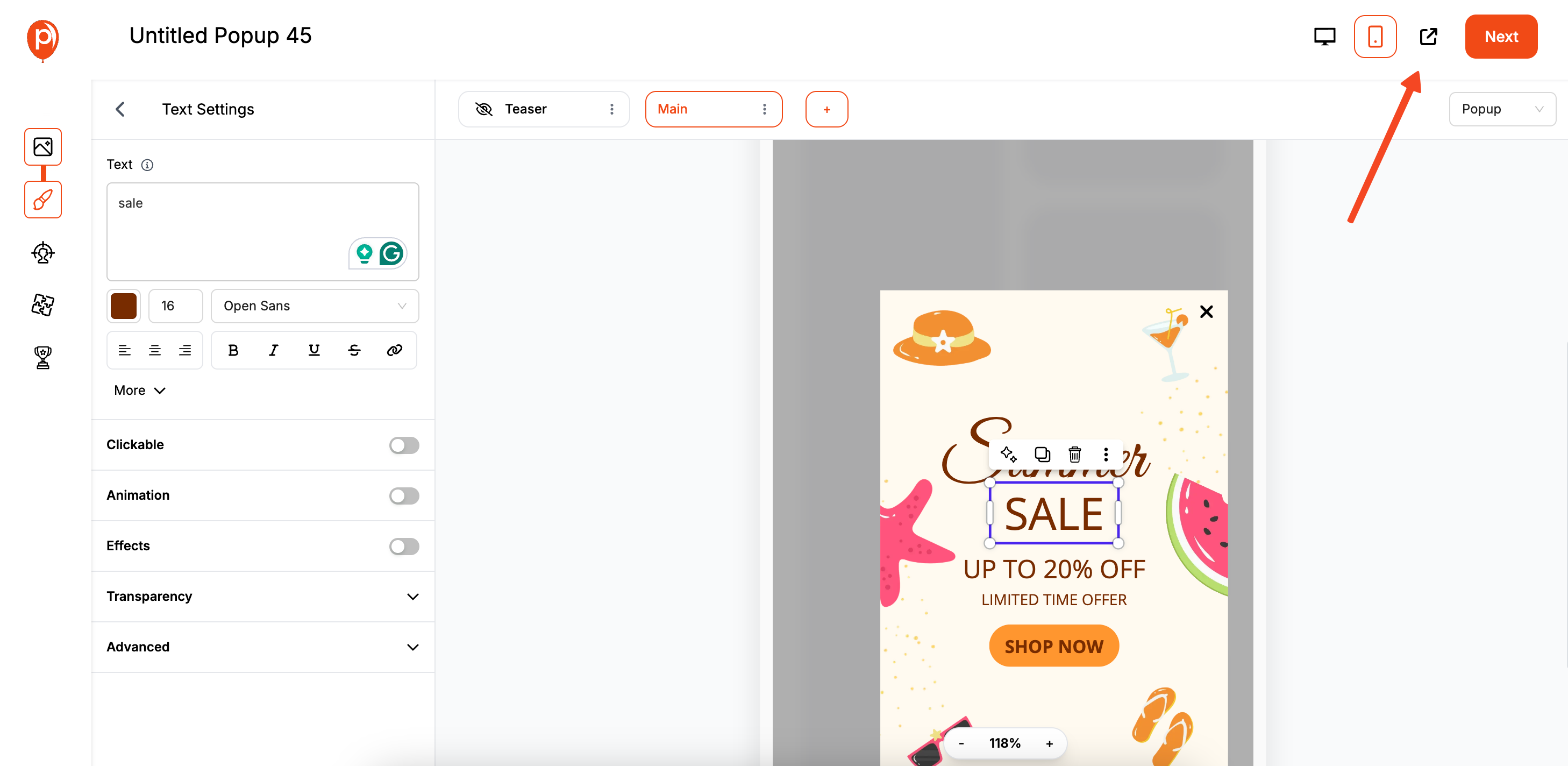
The editor gives you a great preview, but nothing beats seeing your work on an actual phone. To do this, click the Preview button in the top right corner. We’ll generate a unique preview link that opens in a new tab. If you'd like to experiment or run an A/B test on popup performance, consider learning how to open a popup on button click for more interactive campaign ideas.
You can open this same link on your smartphone to see exactly how your visitors will experience the popup. This is my recommended final check to catch any small layout issues and ensure everything looks perfect.
Our Built-In Safety Net: Automatic Scaling
I also built a fallback feature into Poper just in case. If you happen to create a popup that is still a bit too large for a particularly small mobile device, our system will automatically scale it down proportionally.
This ensures your popup always fits within the viewport and never appears broken or cut off. It’s a little safety net I added so you can launch your campaigns with confidence, knowing they’ll look great for every single visitor.
The Manual Code Approach (Using HTML & CSS)
For developers who want granular control, making a popup responsive is achieved primarily with CSS. If you're implementing popups on a specific platform like WordPress, check out our tutorial on how to add popup in WordPress Elementor for a platform-specific approach.
Step 1: Start with a Solid HTML Structure
Your HTML should be simple and semantic.Generated html
Step 2: Use CSS Media Queries (The Core of Responsiveness)
Media queries are CSS rules that apply styles only when certain conditions are met, such as the screen width. This is how you create different layouts for desktop and mobile. For popups in React and JavaScript frameworks, see how to make a popup in React and how to make a popup in JavaScript.
Here is a "desktop-first" example where we define desktop styles and then override them for smaller screens.Generated css
/* --- Default (Desktop) Styles --- */
.popup-overlay {
    display: none; /* Hidden by default */
    position: fixed;
    top: 0; left: 0;
    width: 100%; height: 100%;
    background: rgba(0,0,0,0.7);
    z-index: 1000;
    display: flex; /* Using flexbox for easy centering */
    justify-content: center;
    align-items: center;
}

.popup-content {
    background: #fff;
    padding: 30px;
    border-radius: 8px;
    width: 500px; /* Fixed width for desktop */
    max-width: 90%; /* Safety net */
    position: relative;
}

.close-popup-btn {
    position: absolute;
    top: 10px; right: 15px;
    font-size: 28px;
    /* other styles */
}

/* --- Media Query for Mobile Devices --- */
@media (max-width: 600px) {
    .popup-content {
        width: 90%; /* Switch to percentage width on smaller screens */
        padding: 20px;
    }

    .popup-content h3 {
        font-size: 1.2rem; /* Reduce font size for mobile */
    }

    .popup-content p {
        font-size: 0.9rem; /* Reduce font size for mobile */
    }

    .cta-button {
        width: 100%; /* Make button full-width for easy tapping */
        padding: 15px;
    }
}
Step 3: Apply Key Responsive CSS Properties
Use max-width: Instead of a fixed width, using max-width: 500px allows the popup to shrink on smaller screens while preventing it from becoming too large on desktops.
Use Relative Units: Use percentages (%), viewport width (vw), or rem units for widths, padding, and font sizes instead of fixed pixels (px) where possible.
Use Flexbox or Grid: Use display: flex; justify-content: center; align-items: center; on your overlay to easily center the popup both vertically and horizontally, which works well on all screen sizes.
Fluid Typography: Use the clamp() CSS function for font sizes (font-size: clamp(1rem, 4vw, 1.5rem);) to make text scale smoothly with the screen size.
Best Practices for Responsive Popups
Regardless of the method you use, follow these best practices:
- Keep your design simple and focused on your goal.
- Minimize friction for mobile users (avoid tiny buttons or close icons).
- Test your popup across real devices and browsers.
- Avoid popups that block the entire screen on mobile unless absolutely necessary.
- For more tips on popup best practices, see Popup Practices: 11 Best Practice Examples.
Simplify for Mobile: Less is more. Mobile users have less screen space and often less patience. Get straight to the point.
Check Tap Targets: Ensure buttons, form fields, and close icons are large enough and have enough space around them to be easily tapped with a finger without accidental clicks.
Optimize Images: Use compressed images or consider removing them entirely for the mobile version of your popup to improve loading speed.
Consider Mobile-Specific Triggers: A 5-second delay might be fine for desktop, but for mobile, you might want a longer delay or a scroll-based trigger to ensure the user is engaged first.
Always Test on Real Devices: An emulator or editor preview is good, but nothing beats testing on actual iOS and Android phones to see how your popup looks and feels.
Conclusion
In 2024 and beyond, a mobile-first approach is no longer optional. To make a popup responsive, you need to think beyond simply making it fit on a smaller screen. The goal is to create an optimized experience that is just as effective and user-friendly on a phone as it is on a desktop. For inspiration and to explore how responsive popups are utilized across industries, check out our article on mobile popup design.
Manual coding with CSS gives developers ultimate power and is a fundamental web skill.
Platform-specific tools in WordPress and website builders offer convenient, integrated solutions.
Dedicated platforms like Poper, with features like a separate mobile editor, provide the most powerful and user-friendly path for marketers to create truly optimized, high-converting popups for every single visitor, regardless of their device.
By prioritizing a responsive design, you ensure your popups help, rather than hinder, your efforts to grow your business. To further maximize popup conversions, you may also want to review our actionable guide on how to increase popup conversion.
Frequently Asked Questions (FAQ)
What is a CSS media query?
A media query is a feature in CSS that allows you to apply styles only when certain conditions are met, such as when the browser's viewport (the visible area of the webpage) is above or below a specific width. It's the primary tool for creating responsive designs.
My popup's text is too small to read on my phone. How do I fix it?
You need to set a larger font size specifically for mobile screens using a media query. For example: @media (max-width: 600px) { .popup-content p { font-size: 16px; } }.
Why is my popup getting cut off on the side of my mobile screen?
This usually happens because the popup has a fixed pixel width (e.g., width: 500px;) that is wider than the mobile screen. To fix this, use a percentage-based width or a max-width inside a media query (e.g., width: 90%; max-width: 500px;).
Is it better to have a separate mobile design for a popup, or is a responsive one enough?
A responsive design is the minimum requirement. However, a separate, dedicated mobile design (as offered by tools like Poper or some website builders) is superior. It allows you to fundamentally change the layout and content for a better mobile user experience, which often leads to higher conversion rates.
How do I handle images in responsive popups?
Make sure your images are fluid by setting max-width: 100%; and height: auto; in your CSS. This ensures they will scale down proportionally to fit their container without becoming distorted. For mobile, consider using smaller image files or hiding decorative images entirely to improve load times.
