
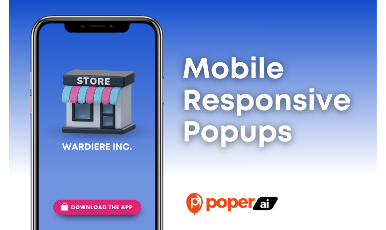
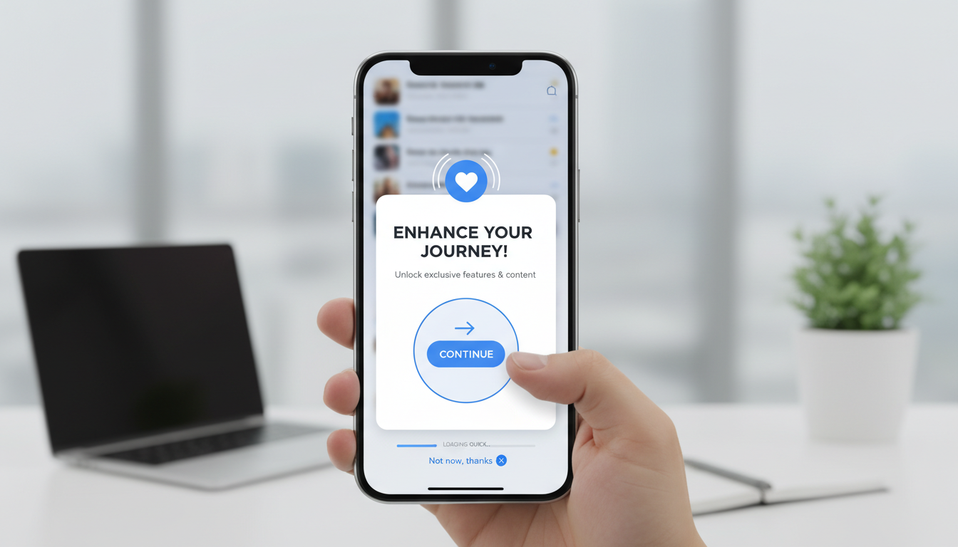
In the realm of digital marketing, the responsiveness of popups across various devices can dramatically impact user engagement and conversion rates. Mobile responsiveness in popups is crucial as a significant portion of internet traffic comes from mobile devices. Ensuring that popups are optimized for mobile screens enhances user experience by providing content that is easy to navigate and interact with on smaller screens.
Mobile-first design is not just a technical strategy; it's a way of looking at design that puts user experience above all else, ensuring accessibility and functionality across all devices.
Marc Davis, UX Designer
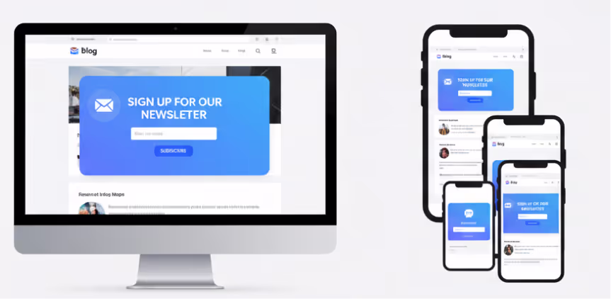
Mobile popups, when designed with responsiveness in mind, can significantly improve the user experience by adapting to the user's device, ensuring that all elements are visible and interactive without the need to zoom or scroll horizontally. This adaptability leads to better engagement rates as users are more likely to interact with content that is easy to access and understand.
Understanding Mobile Responsiveness
What Does Mobile Responsive Mean in the Context of Popups?
Mobile responsiveness refers to the design approach where a popup is crafted to provide an optimal viewing experience—easy reading and navigation with a minimum of resizing, panning, and scrolling—across a wide range of devices, from desktop computers to mobile phones. For popups, this means ensuring that they adapt in size and layout to fit the screen on which they are displayed, without losing functionality or aesthetic appeal.
The Difference Mobile Responsiveness Makes
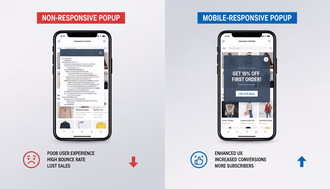
The implementation of mobile-responsive popups can significantly affect a site’s user engagement and retention rates. Popups that are not optimized for mobile devices can lead to frustration, higher bounce rates, and lost conversion opportunities. Conversely, well-designed responsive popups facilitate a smoother user experience, making it easier for users to interact with the content, whether it’s signing up for a newsletter or taking advantage of a promotion.
The Impact of Mobile Responsive Popups
Effects on User Engagement and Conversion Rates
Mobile responsive popups are crucial for maintaining user engagement on mobile devices. They adjust automatically to fit the device's screen size and orientation, which enhances the user experience and increases the likelihood of engagement. A well-optimized mobile popup can dramatically improve conversion rates by presenting offers and calls to action in a non-disruptive manner, tailored to the context of mobile browsing.
Case Studies: Success Stories of Mobile Responsive Designs
Several case studies highlight the effectiveness of mobile-responsive popups. For instance, a retail company implemented mobile-optimized exit-intent popups and saw a 20% increase in captured leads, which translated to a noticeable lift in sales. Another example involves a travel site that used timed discount popups on mobile, which doubled their bookings from mobile users compared to the previous non-responsive design.
Design Principles for Mobile Responsive Popups
Essential Features of a Mobile Responsive Popup
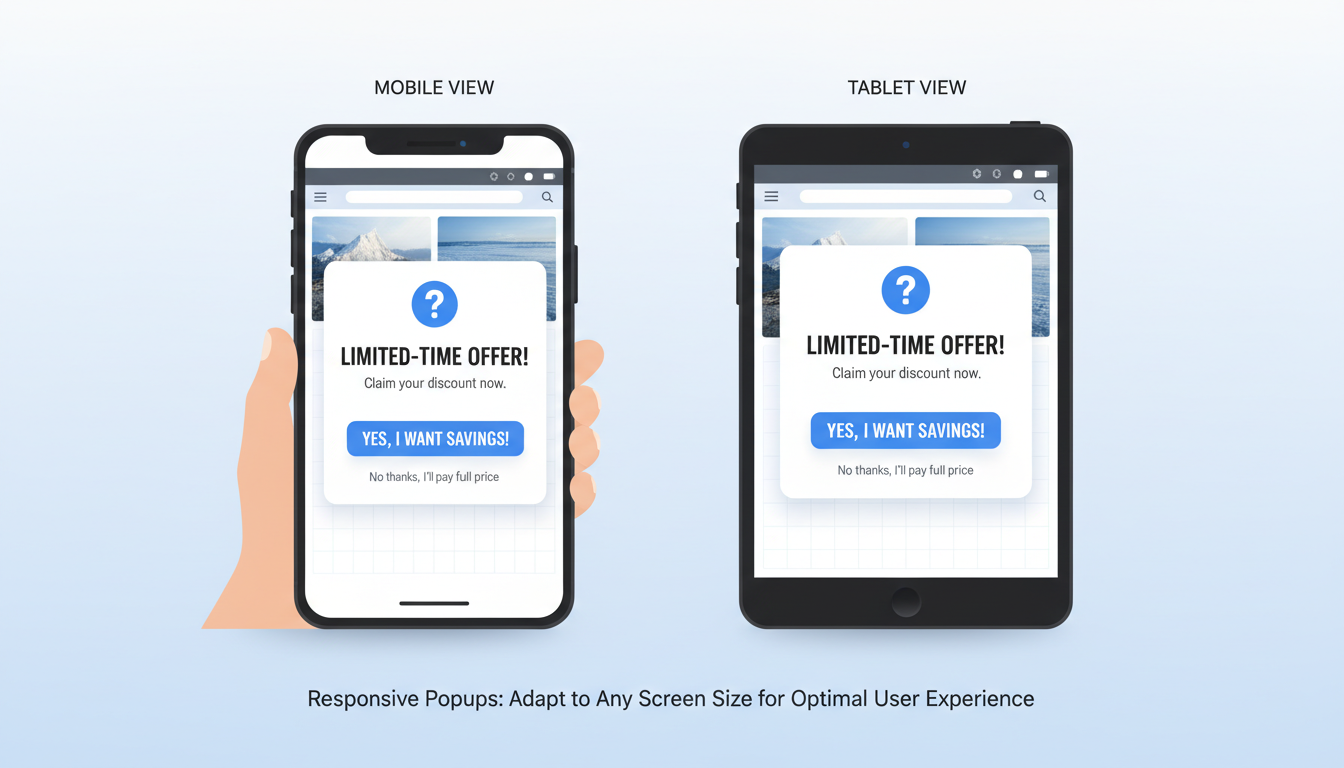
When designing popups for mobile devices, it's crucial to ensure they adapt seamlessly to different screen sizes. Key features include fluid layout grids, scalable images, and responsive font sizes. This adaptability ensures that the popup is legible and functional, regardless of the device.
Best Practices for Visual and Interactive Elements
Visual simplicity is vital for mobile popups. Use clear, concise messaging and large, easy-to-tap buttons to enhance user interaction. It’s also important to maintain adequate spacing for touch targets to prevent accidental clicks, which can frustrate users and lead to higher bounce rates.
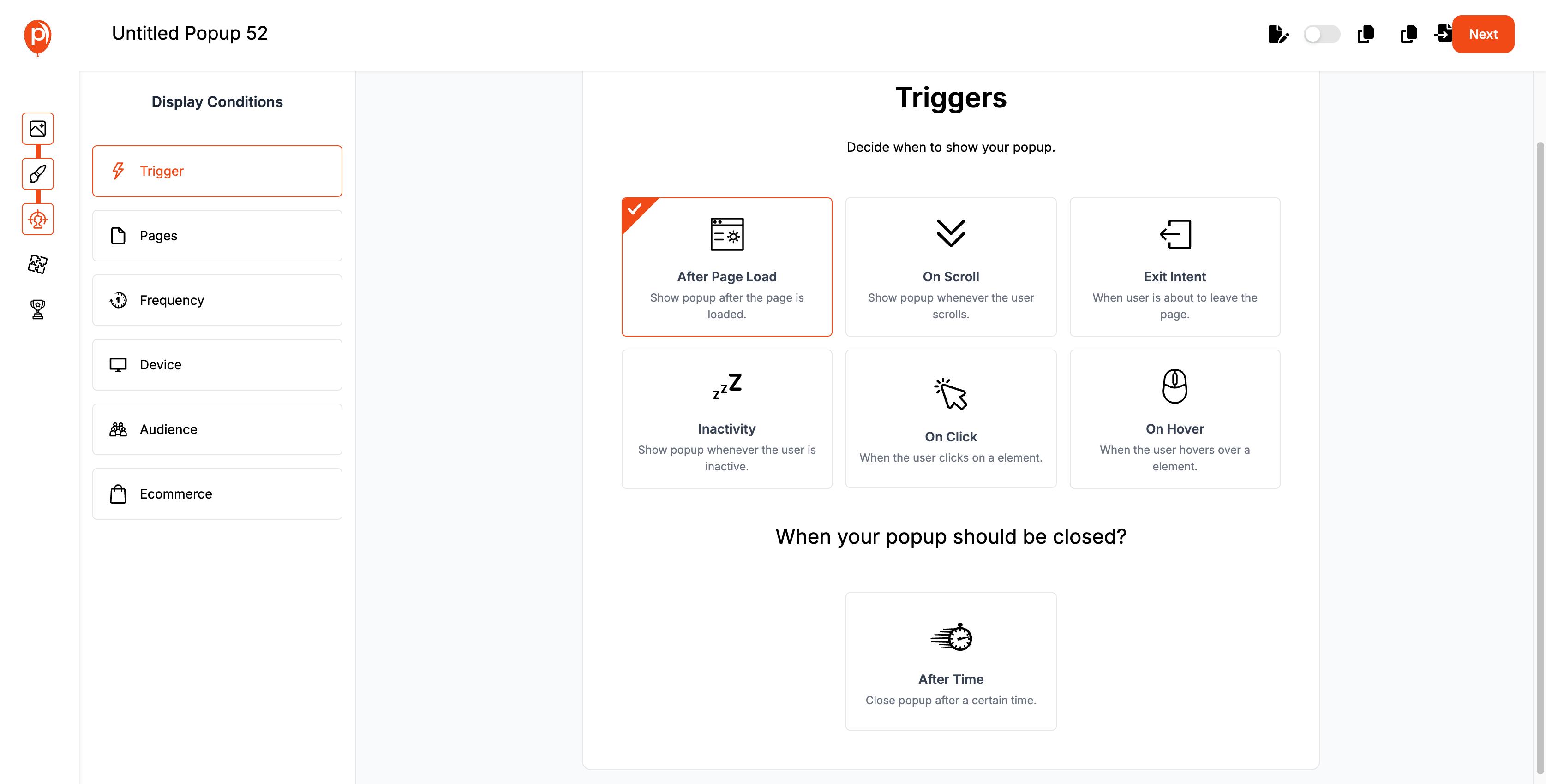
Building Mobile Responsive Popups with Poper
Overview of Poper’s Mobile Responsive Features
Poper provides an intuitive platform that supports the creation of mobile-responsive popups. These features include automatic scaling of images, text, and buttons to fit various mobile screens and orientations. Poper also ensures that all elements within the popup are touch-friendly, enhancing the user experience on mobile devices.
Choose a Starting Point
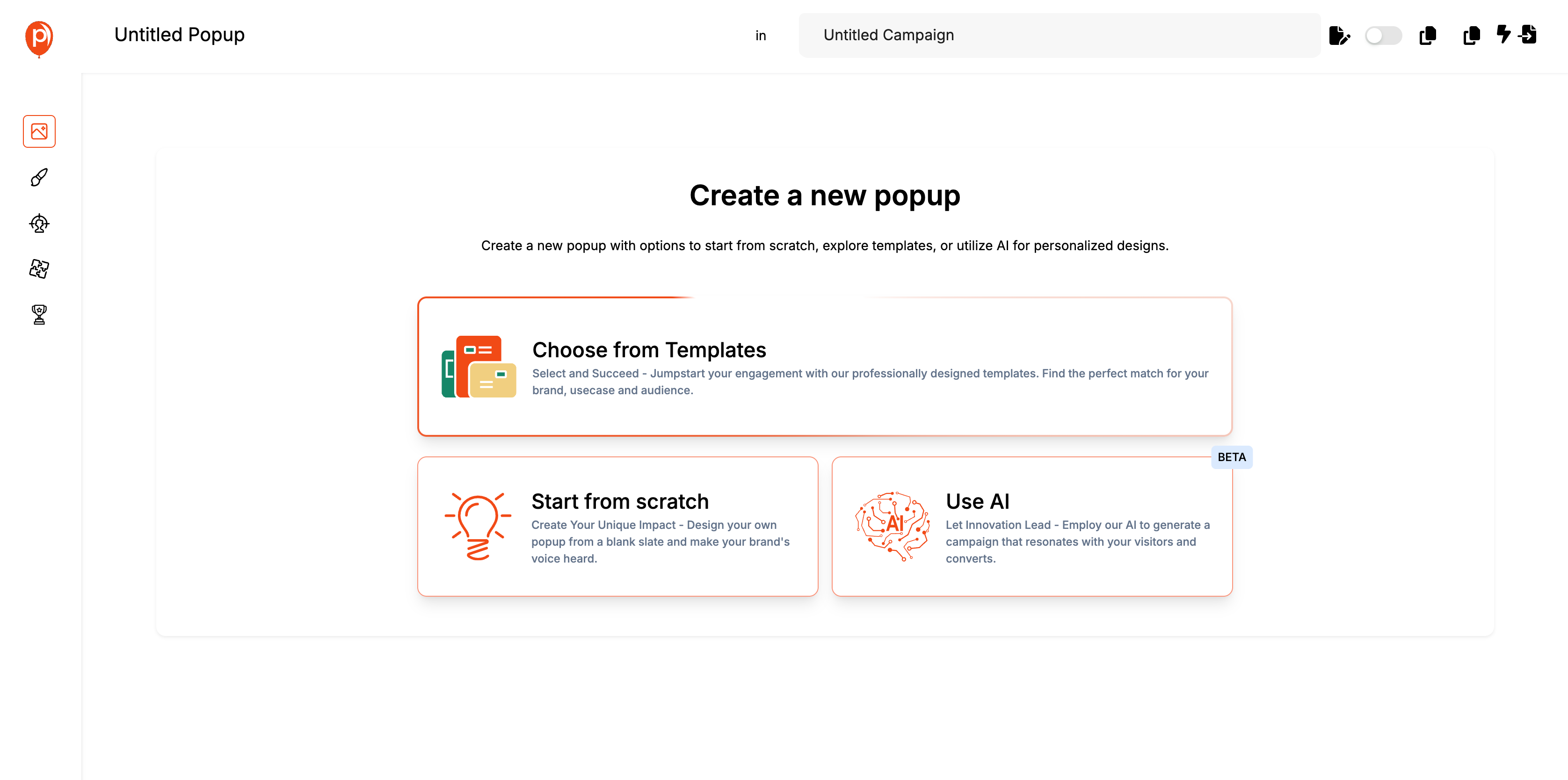
Poper offers multiple entry points for creating your popup:
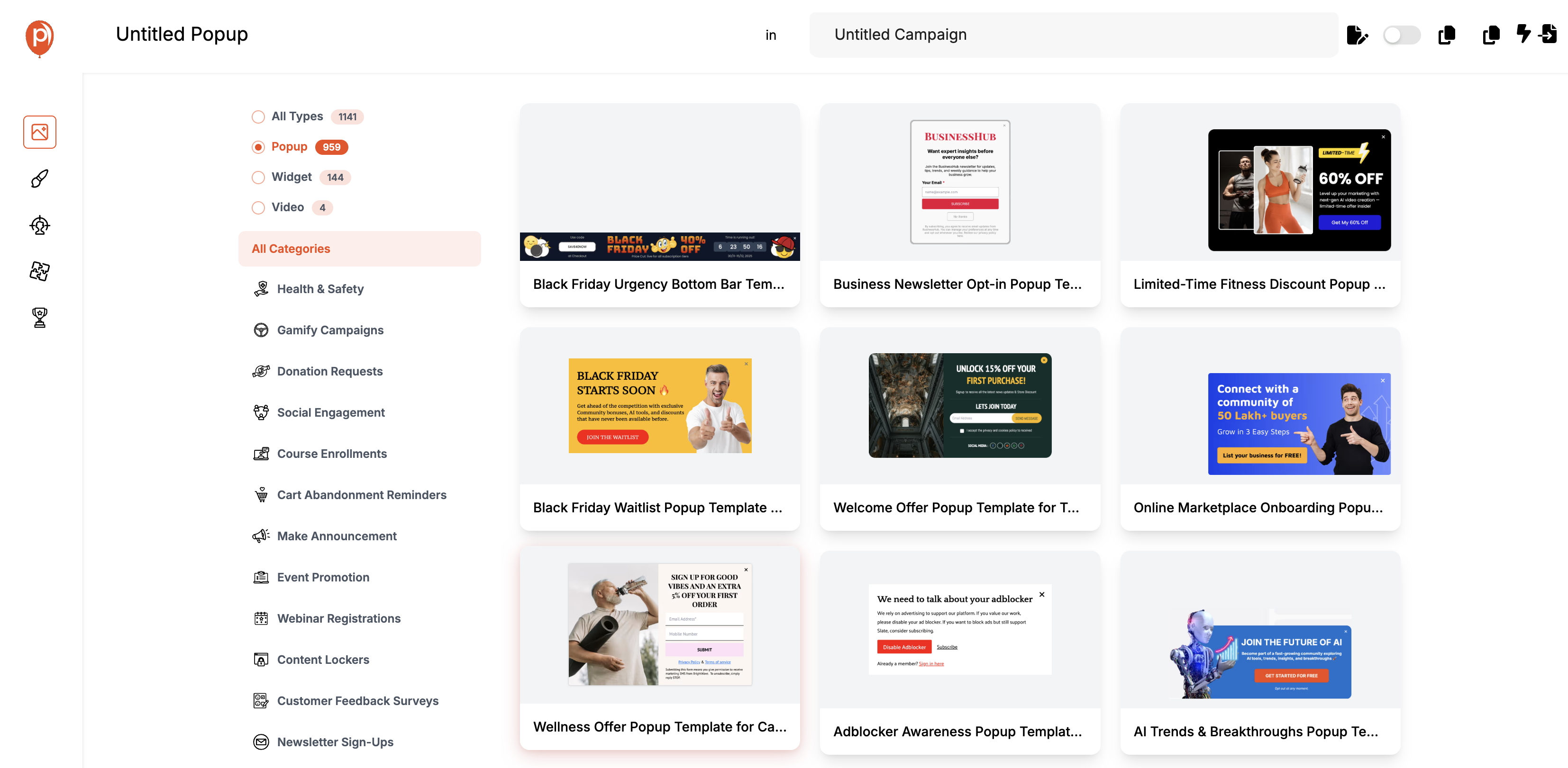
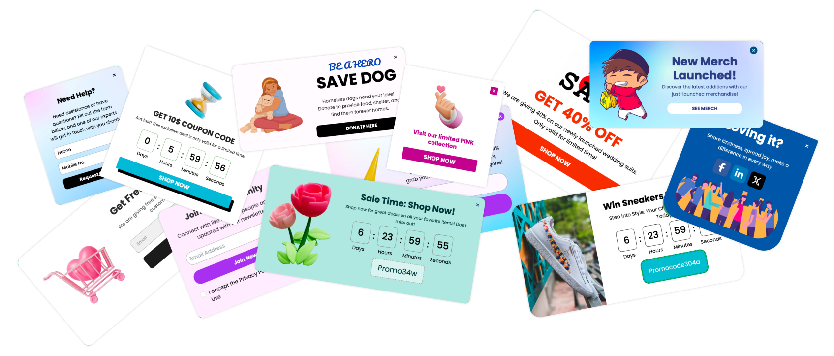
Templates: Select from a range of professionally designed templates tailored for different events and promotions such as sales, product launches, or general announcements.
Start from Scratch: For those who want complete control over the design, starting from scratch allows you to build a unique popup that perfectly matches your brand’s voice.
Utilize AI: Leverage Poper’s AI capabilities to generate designs based on your specific inputs, ensuring a high conversion rate and a strong user engagement.
Customize Your Popup
Once a template is chosen or a new design is initiated, customization is key to making the popup your own:
Visual Elements: Adjust visual elements such as colors, fonts, and images to align with your branding.
Content: Tailor the messages to be clear and concise, ensuring they are compelling for mobile users who prefer quick reads.
Calls to Action: Place strong, visible calls to action that are easy for mobile users to interact with.
Set Display Triggers
Poper allows you to define when and how your popups appear to visitors, increasing their effectiveness:
Timing: Set popups to appear after a certain duration on the page, or immediately upon page load.
Behavioral Triggers: Use triggers like scroll depth, exit intent, or inactivity to capture attention at the right moment.
Scheduling: Opt for popups to show during specific times or dates, which is ideal for timely promotions or events.
Testing and Publishing
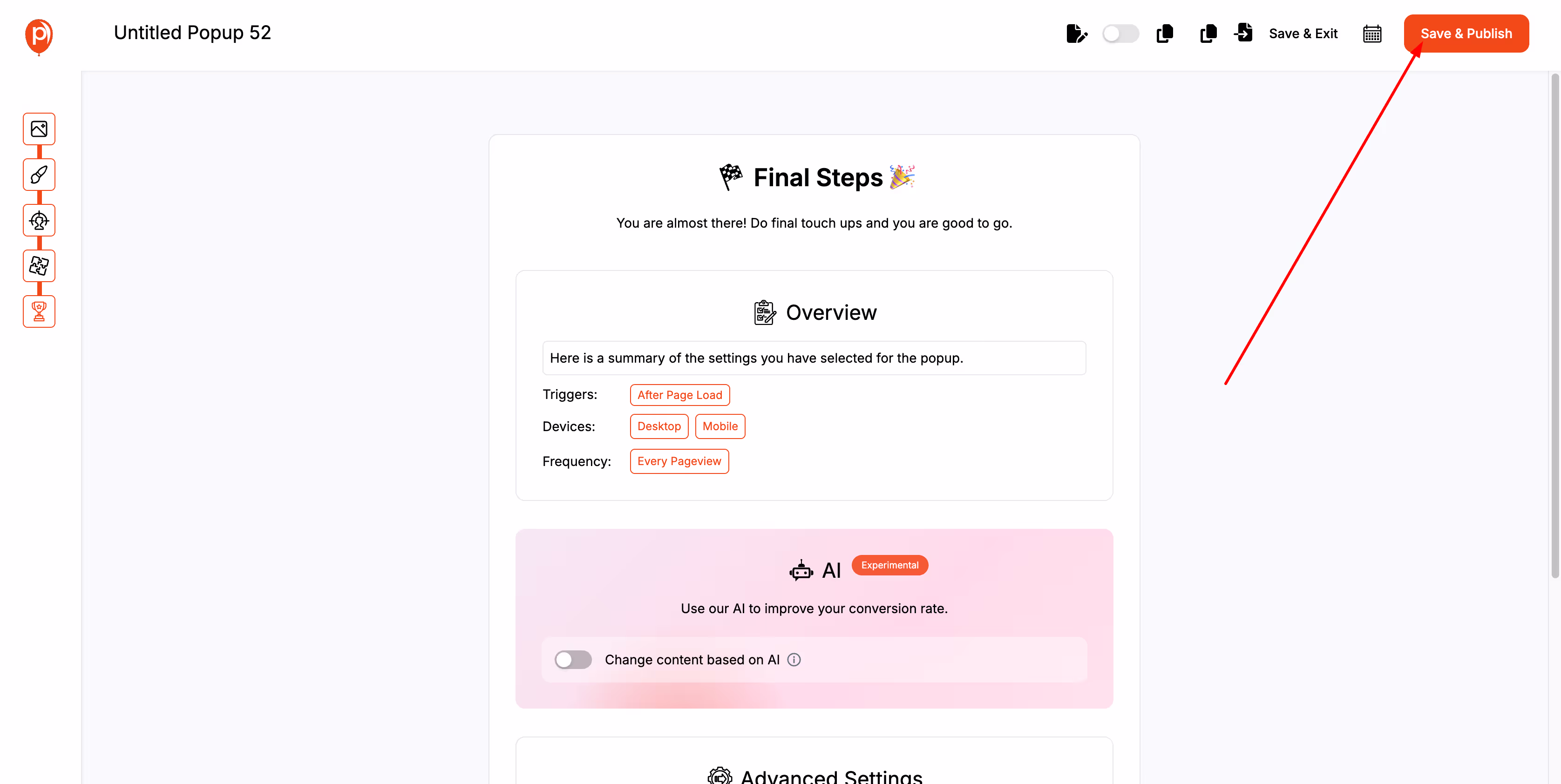
Before going live, it’s crucial to ensure your popup looks and functions as intended:
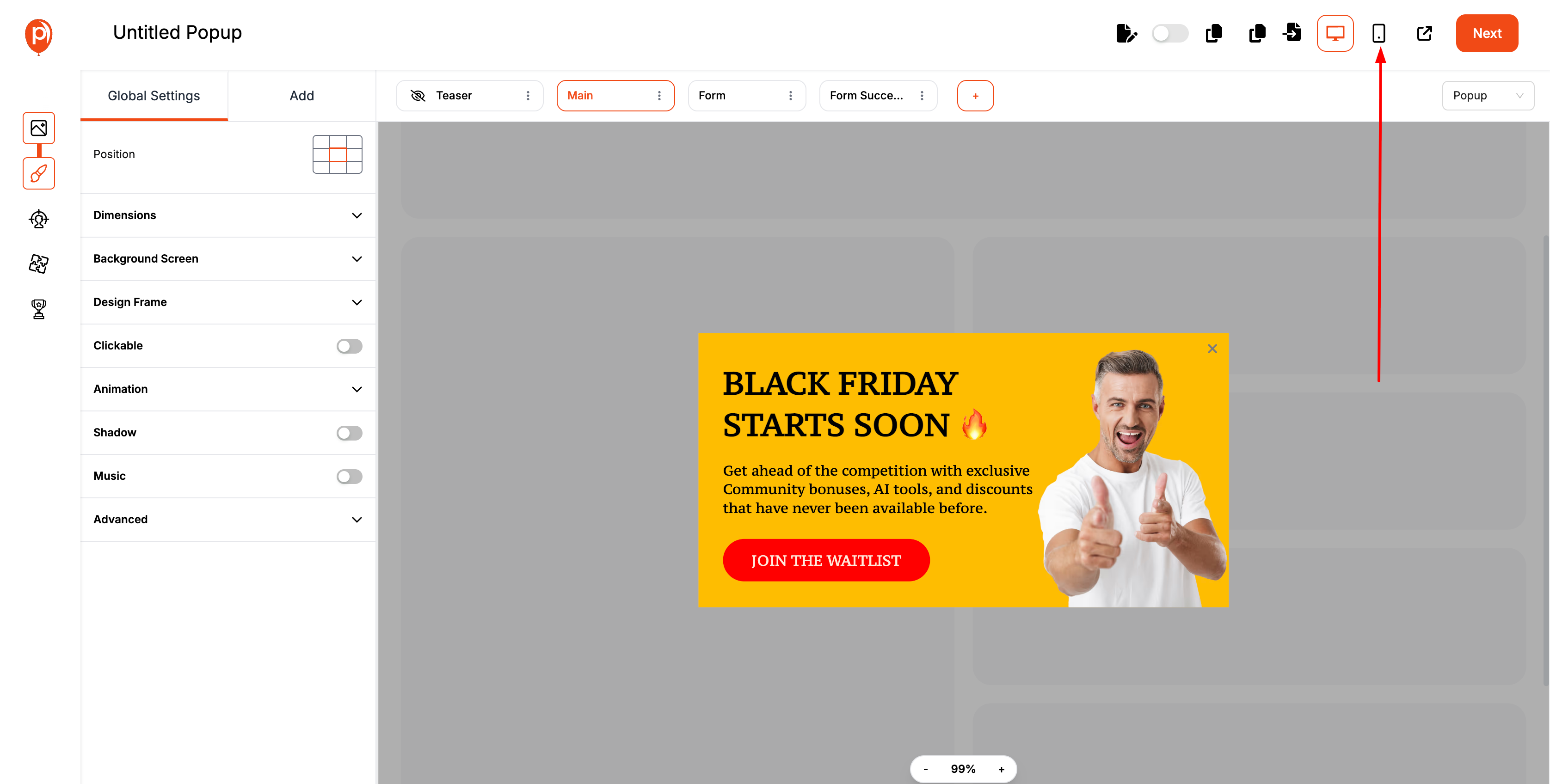
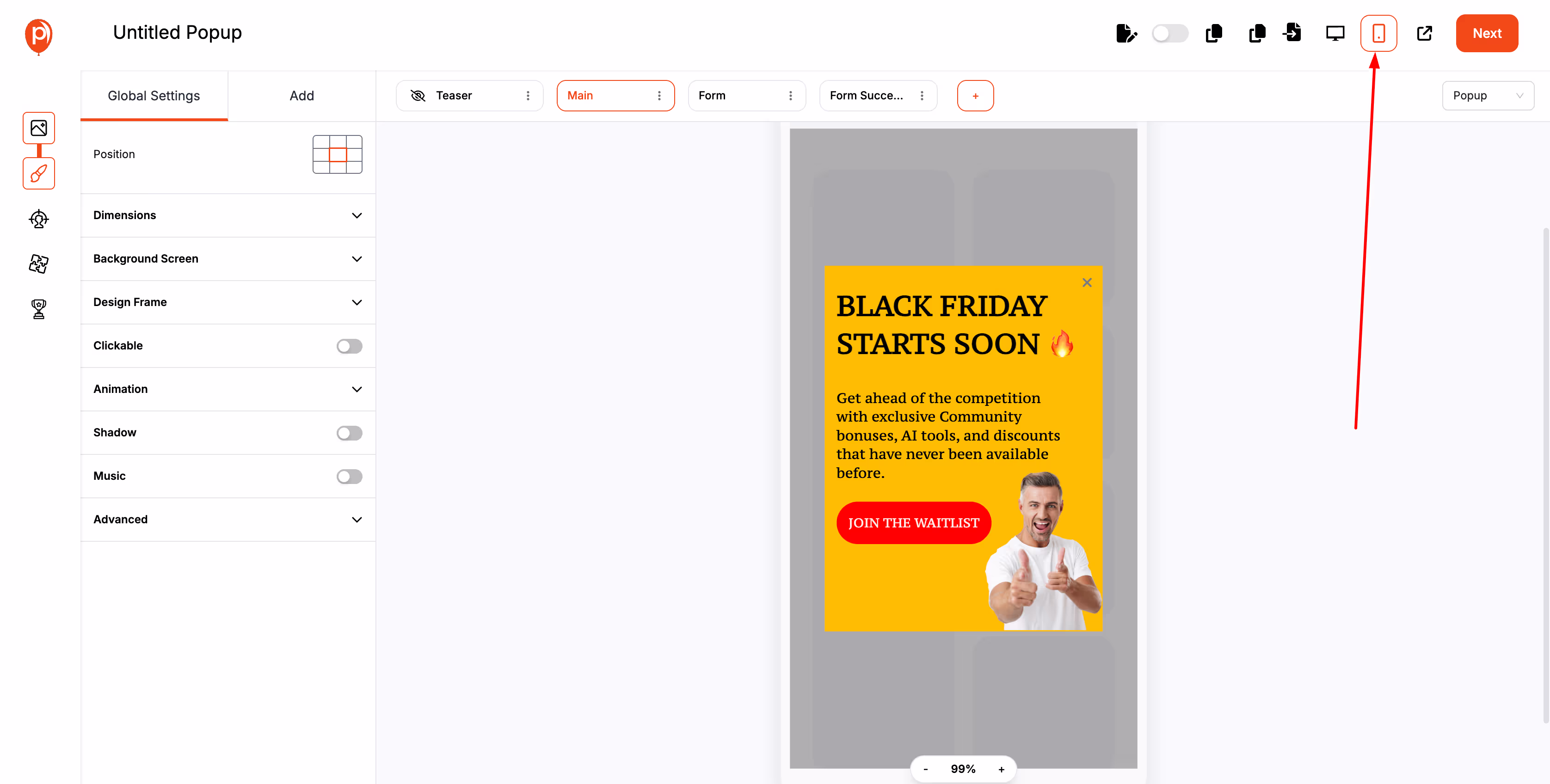
Preview on Mobile Devices: Use Poper’s preview feature to see how your popup will look on different mobile devices, ensuring readability and usability.
Save and Publish
A/B Testing: Implement A/B testing to compare different versions of your popup to determine which performs better in terms of user engagement and conversion rates.
By following these steps in Poper, you can create mobile responsive popups that not only look great but also perform well, driving engagement and conversions effectively on mobile devices.
User Experience Design for Mobile Popups
How to Optimize User Flow on Mobile Devices
Optimizing user flow in mobile popups involves ensuring that each popup is a natural part of the user's journey, not a disruption. Techniques include triggering popups based on user actions or points of engagement rather than time spent on the page. This strategy ensures that popups appear when users are most likely to be receptive to the message, improving the overall user experience.
Ensuring Fast Load Times and Smooth Interactions
Fast load times are critical for maintaining user engagement, especially on mobile devices where users expect quick interactions. Optimize images and scripts in popups to minimize load times. Additionally, ensure that interactions within the popup, such as form submissions or button clicks, are smooth and error-free to maintain the fluidity of the user experience.
Content Strategies for Mobile Popups
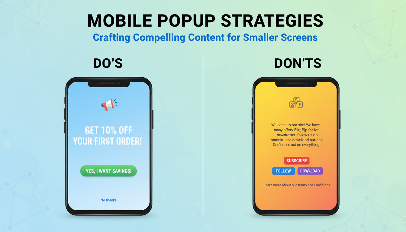
Crafting Compelling Content for Smaller Screens
Creating effective content for mobile popups means understanding the constraints and opportunities of smaller screens. Key strategies include using concise messaging that delivers value quickly and leveraging eye-catching visuals that are optimized for mobile display. The goal is to communicate your message efficiently without overwhelming the user with too much text or complex imagery.
The Do’s and Don’ts of Mobile Popup Messaging
Do: Use clear, action-oriented language that prompts immediate response.
Don’t: Overload the popup with excessive text or multiple calls to action that can confuse the user.
Do: Make sure all buttons and interactive elements are large enough to be easily tapped with a finger.
Don’t: Ignore the aesthetic alignment of your popup with the overall design of your mobile site, as consistency enhances user trust and brand perception.
Testing and Optimization
How to Test the Effectiveness of Your Mobile Popups
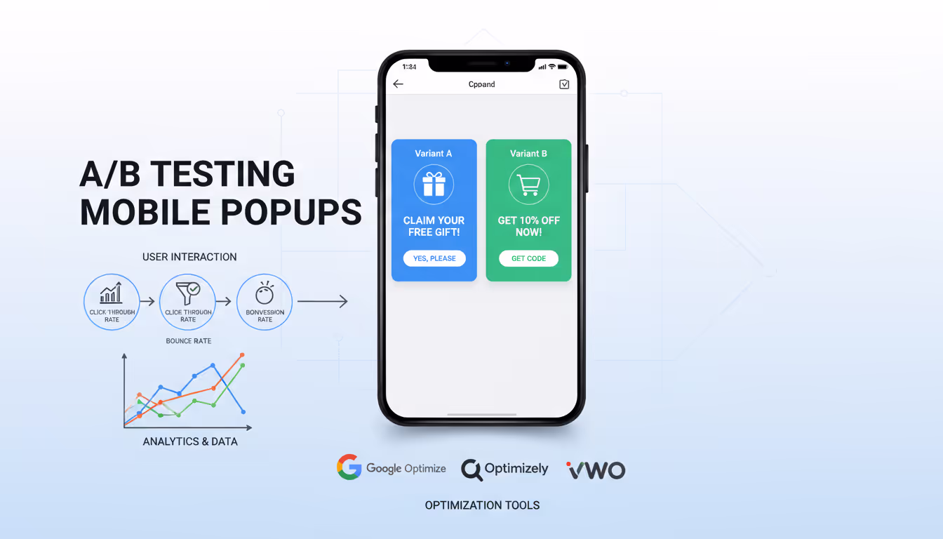
Testing mobile popups is crucial to understand their effectiveness and impact on user behavior. Begin with A/B testing different versions of your popup to see which design, message, or placement gets the best response. Use analytics tools to track metrics such as click-through rates, conversion rates, and bounce rates associated with the popup.
Tools for A/B Testing Mobile Responsive Popups
Several tools can streamline the A/B testing process for mobile popups. Platforms like Google Optimize, Optimizely, and VWO offer robust testing frameworks that allow you to create and compare different versions of your popups in real-time. These tools also provide detailed analytics to help you make data-driven decisions about which elements perform best.
Advanced Techniques in Mobile Popup Design
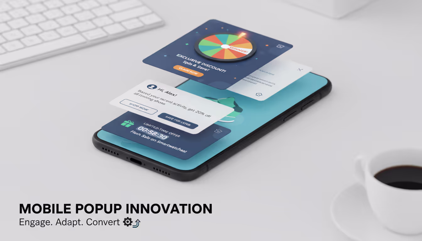
Using Animation and Dynamic Content to Engage Users
Incorporating animation and dynamic content into mobile popups can significantly enhance user engagement. Animations can attract the user's attention without being intrusive, especially when they are smooth and well-timed. Dynamic content, which changes based on user behavior or demographics, can make popups more relevant and engaging.
Adaptive vs. Responsive Popups: Which to Choose?
When designing for mobile, you can choose between adaptive and responsive approaches. Adaptive popups are designed specifically for different devices at specific breakpoints, whereas responsive popups automatically adjust to fit any screen size. Both strategies have their merits, but responsive design tends to be more flexible and cost-effective in maintaining consistency across devices.
Future Trends in Mobile Popup Technology

Predictions for the Evolution of Popup Technology
The future of mobile popup technology is likely to be shaped by advancements in AI and machine learning, enabling even more personalized and contextually relevant experiences. As AI becomes more sophisticated, we can expect mobile popups to dynamically adjust content and timing based on real-time user behavior and preferences, enhancing effectiveness and user satisfaction.
The Role of AI in Enhancing Mobile Popup Effectiveness
AI's role in mobile popups is expanding from simple analytics to proactive content customization. AI algorithms can analyze user data to predict the best moments for popup engagement and tailor messages to individual users' interests and behaviors. This not only increases the relevance of popups but also boosts the likelihood of conversion by offering a more personalized experience.
FAQs
How Often Should Mobile Popups be Displayed to Users?
Determining the frequency of mobile popups involves balancing visibility and user experience. A good rule of thumb is to display popups based on user engagement cues, such as time spent on a page or interaction with specific content. Overexposure can lead to annoyance and decreased effectiveness, so it's crucial to tailor frequency based on analytics and user feedback.
What are the Most Effective Types of Mobile Popups?
The effectiveness of mobile popups often depends on the context and the goal. Exit-intent popups, discount offers, and subscription forms are typically effective. Interactive popups, like quizzes or polls, can also significantly engage users and provide value, making them effective for both user engagement and data collection.
How Can Mobile Popups be Personalized for Individual Users?
Personalization can be achieved by integrating data analytics and user behavior tracking into your popup strategy. Use information like browsing history, purchase patterns, and previously interacted content to tailor popups that resonate with each user. This approach not only enhances the user experience but also improves the conversion rates of your popups.
Conclusion
Mobile responsive popups are essential in today’s mobile-first world where a significant portion of web traffic comes from mobile devices. Their ability to adapt and provide a seamless user experience regardless of device type helps maintain engagement and conversion rates.

