
Introduction to Website Welcome Messages
When someone lands on your website, your welcome message becomes your brand’s handshake. It’s that first interaction that tells visitors whether they’re in the right place, whether you understand their needs, and whether it’s worth their time to stay.
A website welcome message is a short, personalized note or statement displayed when a user first visits your website. It could appear as a hero section headline, a popup, or even a chatbot greeting — but its purpose remains the same: to make users feel acknowledged, valued, and guided.
A website welcome message is a personalized greeting shown to new visitors when they land on a website. It helps brands create a positive first impression, guide user actions, and increase engagement. A great welcome message is short, clear, emotionally warm, and aligned with the visitor’s intent — whether it’s encouraging them to explore, sign up, or make a purchase.
Why It’s the First and Most Powerful Touchpoint
In the digital world, you have just 7 seconds to grab attention. That’s all it takes for a visitor to decide whether to stay or bounce. Your welcome message is not just text; it’s a psychological anchor that tells users:
“You’re in the right place.”
“We value your presence.”
“Here’s how to get started.”
Whether you run a SaaS platform, eCommerce site, or blog, a well-crafted welcome message helps bridge the gap between a cold visit and a warm interaction.
The Psychology of First Impressions in Digital Experiences
Humans are wired to make snap judgments. According to studies in behavioral psychology, the brain forms an impression in less than 50 milliseconds of viewing a page. This means your visuals, copy, and tone must instantly communicate trust and relevance.
Let’s look at how perception forms during those critical first moments:
| Psychological Trigger | User Perception | Desired Brand Effect |
|---|---|---|
| Visual appeal | “This looks professional.” | Builds credibility |
| Personal tone | “They understand me.” | Creates emotional connection |
| Simplicity | “This is easy to navigate.” | Reduces cognitive load |
| Relevance | “This matches what I need.” | Encourages conversion |
When combined, these triggers create a sense of comfort and curiosity — the perfect mix that encourages visitors to take the next step instead of leaving.
In short, a welcome message isn’t just an introduction. It’s your brand’s way of saying “We see you, we understand you, and we’re here to help.”
It’s not decoration — it’s strategy.
The Purpose and Power of a Welcome Message
A website welcome message is much more than a friendly “hello.” It’s the first strategic step in converting casual visitors into loyal users. The tone, design, and timing of this message can decide whether someone explores your site or exits immediately.
Think of it as your digital reception desk — it sets the mood, communicates brand intent, and guides users to take meaningful actions.
Building Trust and Credibility from the First Second
When a user visits your website for the first time, they’re asking silent questions:
Can I trust this brand?
Is this relevant to me?
Will I find what I need here?
A thoughtful welcome message answers all these questions subconsciously. For example:
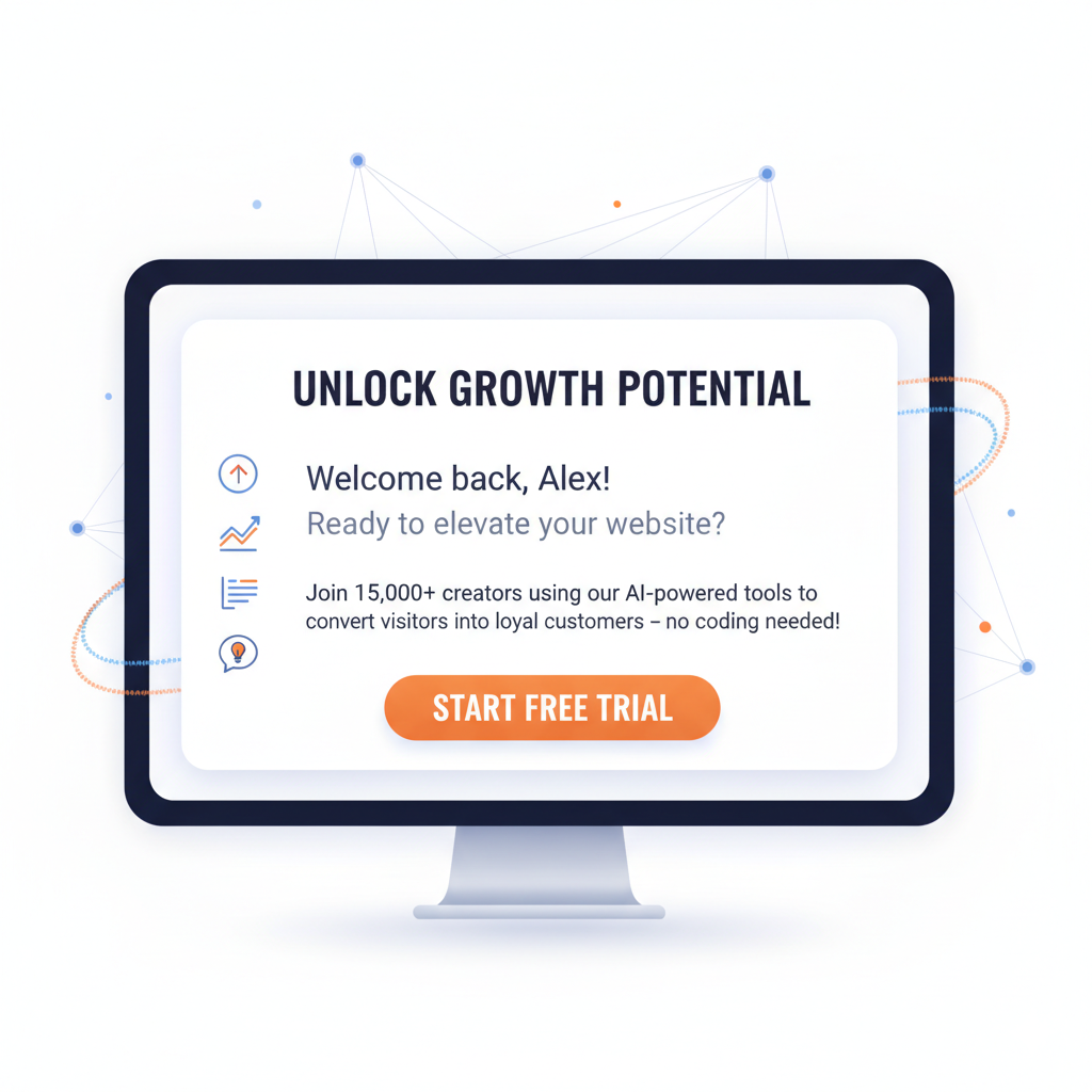
“Welcome to Poper — your AI-powered engagement partner. Let’s make your website unforgettable.”
This kind of line doesn’t just greet — it builds instant credibility by defining who you are and what you do in one breath. It makes users feel they’re in capable hands.
According to research by Nielsen Norman Group, users leave a website within 10–20 seconds if they don’t find clarity or value. A compelling welcome message helps break that exit cycle by offering immediate direction and emotional assurance.
Reducing Bounce Rates with Relevance and Clarity
One of the biggest reasons visitors bounce is confusion. They don’t know what to do next.
A well-designed welcome message provides clarity, helping users understand your purpose or the next logical step — whether it’s exploring your products, signing up, or learning more.
Example:
Bad: “Welcome to our website.”
Good: “Welcome to Poper! Create your first interactive popup in under 2 minutes.”
The difference? The second one is specific, time-bound, and benefit-driven — three key ingredients that reduce friction and increase engagement.
Here’s a quick comparison:
| Message Type | User Reaction | Result |
|---|---|---|
| Generic Greeting | “Okay, but what do I do next?” | High bounce rate |
| Purposeful Greeting | “That sounds useful — let’s try it.” | Increased clicks & retention |
Encouraging Engagement, Signups, or Purchases
Your welcome message isn’t just to greet — it’s to guide behavior. Depending on your website goals, it can prompt users to:
Sign up for a newsletter
Explore pricing or features
Play a gamified popup
Claim a discount or free trial
The key is intent alignment. If your message aligns with what users came looking for, conversions happen naturally.
For instance:
For SaaS: “Start your free 14-day trial and engage visitors smarter.”
For eCommerce: “Hey there! Enjoy 10% off your first purchase.”
For Blogs: “Welcome, reader! Join 50k others who get weekly insights.”
When personalized and timed right, such welcome messages set expectations, reduce decision fatigue, and encourage micro-conversions — the small steps that lead to big results.
5 Types of Website Welcome Messages
Not all visitors are the same — and neither should your welcome messages be. The way you greet users can vary based on where they land, what they’re doing, or what kind of experience you want to deliver.
Let’s explore the most effective types of website welcome messages, each serving a unique purpose and moment in the user journey.
Homepage Hero Message

Your homepage hero message is the first thing users see when they land on your site. It’s usually part of the hero banner and sets the tone for everything that follows.
This message should instantly answer three key questions:
Who are you?
What do you offer?
Why should they care?
Example:
“Boost engagement and conversions with Poper — the AI-powered onsite engagement platform trusted by 10,000+ businesses.”
A clear, confident hero message like this helps users understand your value proposition in seconds. Keep it bold, benefit-driven, and visually aligned with your brand identity.
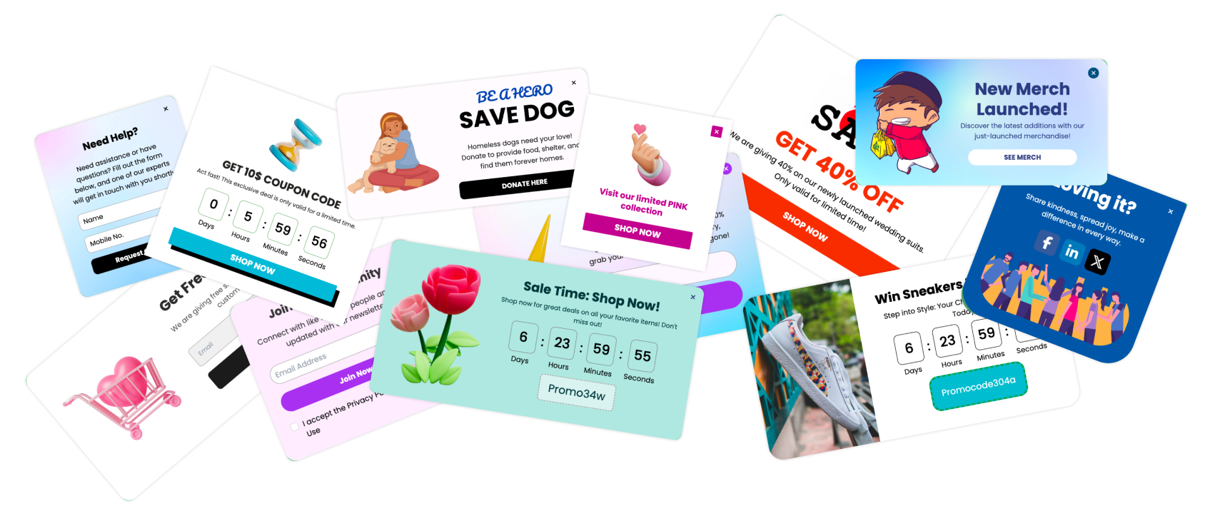
Popup or Slide-In Welcome Message

Popups are powerful — when used correctly. A popup welcome message appears after a few seconds, on scroll, or when a user shows exit intent. It’s perfect for capturing attention and encouraging immediate action.
For instance:
“Hey there! New to Poper? Try our free plan and launch your first popup in minutes.”
Or
“Welcome back! Here’s 10% off just for revisiting.”
With tools like Poper, you can easily design timed, scroll-based, or behavior-triggered welcome popups that match your visitor’s intent and behavior.
Tip: Always offer value — a discount, a guide, a free tool — not just a “hello.”
Chatbot Greetings and Conversational Welcomes

A chatbot welcome message can instantly create a human-like interaction. Instead of static text, it invites users into a two-way conversation.
Example:
“👋 Hi there! I’m Popi, your AI assistant. Want help creating your first popup?”
Chat-based greetings are highly effective for SaaS, support-heavy businesses, and eCommerce stores where users may have questions before converting.
Why it works: It feels personal, interactive, and responsive — key traits that reduce hesitation and boost trust.
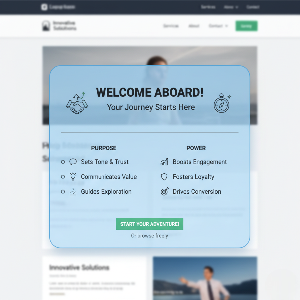
Onboarding Welcome Screens (for SaaS or Apps)

If your platform involves signups, your onboarding welcome message is crucial. It’s the user’s first experience inside your product.
Example:
“Welcome to Poper! Let’s set up your first engagement campaign — it takes less than 3 minutes.”
A good onboarding message should:
Highlight the first success step (quick win)
Be visually guided (progress bar, checklist)
Offer reassurance (“You’re doing great!”)
This ensures users don’t feel lost or overwhelmed right after signing up.
Personalized Dynamic Messages

Personalized welcomes are the secret sauce of high engagement. They adapt based on the visitor’s location, source, or behavior.
Examples:
“Welcome back, Karan! Ready to create your next popup?”
“Hey there, visitor from Bengaluru! Here’s a 20% local launch offer.”
“Coming from Google? Here’s our top tools for engagement.”
With dynamic content personalization (which Poper supports), you can show relevant greetings to each visitor segment — improving both engagement and conversion rates dramatically.
| Type | Best For | Example Message | Trigger |
|---|---|---|---|
| Homepage Hero | Branding & clarity | “Engage visitors with Poper’s AI tools.” | Immediate |
| Popup/Slide-In | Conversions | “Grab 15% off your first plan.” | Timed/Exit |
| Chatbot | Conversations | “Need help? Let’s get started.” | User interaction |
| Onboarding | SaaS products | “Welcome! Let’s launch your first campaign.” | Post-signup |
| Personalized | Returning visitors | “Welcome back! Here’s what’s new.” | Behavioral targeting |
Key Elements of a High-Converting Welcome Message
A great welcome message isn’t written by accident. It’s carefully crafted — every word, color, and design choice has a purpose. To turn casual visitors into loyal fans, your message needs to balance clarity, emotion, and usability.
Let’s break down the core elements that make a welcome message truly high-converting.
Headline That Grabs Attention
The headline is your hook. In a few words, it must tell users why they should care. A strong headline is:
Clear: Avoid jargon.
Benefit-driven: Focus on what users gain.
Emotionally appealing: Tap into curiosity or aspiration.
Examples:
“Make Every Website Visit Count.”
“Turn Visitors into Customers — Instantly.”
“Ready to Engage Smarter? You’re in the Right Place.”
These lines are short, punchy, and aligned with user intent. The goal is not to describe your product — but to ignite interest in it.
Personalized or Segmented Message Tone
A welcome message that feels personal outperforms a generic one every single time. Using personalization tokens (like name, location, or behavior) helps create a more human experience.
Example:
“Welcome back, Priya! We’ve added 3 new popup templates just for you.”
Segmented messages also work wonders:
For first-time visitors: “Welcome! Let’s help you create your first campaign.”
For returning users: “Glad to see you again. Continue where you left off?”
When users feel seen and understood, they engage more.
Supporting Subtext or Offer
Once the headline grabs attention, the subtext delivers context.
It tells users what happens next or what value they’ll get.
Example:
“Join 10,000+ marketers using Poper to engage users and boost conversions — no coding needed.”
If your message includes an offer (discount, free trial, or download), place it here clearly. Avoid long paragraphs — keep it short and direct.
Clear and Visible CTA
A call-to-action (CTA) is where interest turns into action. It’s the bridge between attention and conversion.
Your CTA should be:
Visible: Use contrasting colors.
Actionable: Start with verbs (e.g., “Start,” “Join,” “Get”).
Aligned with intent: Match it to user motivation.
Examples:
“Start Free Trial”
“Explore Templates”
“Claim Your Offer”
Never leave visitors wondering what to do next — make the next step obvious.
Visual or Animation Elements That Enhance Engagement
Visuals make your welcome message memorable. Whether it’s a subtle animation, a friendly illustration, or brand-aligned color palette, design can amplify emotional connection.
Use:
Brand colors to reinforce identity.
Icons or animations to guide attention.
Whitespace to make the message breathable.
However, don’t let design overpower purpose. Clarity always beats creativity if you’re forced to choose.
Here’s a quick checklist:
| Element | Purpose | Example |
|---|---|---|
| Headline | Grabs attention | “Engage visitors in seconds.” |
| Subtext | Adds clarity or offer | “Free tools to grow your business.” |
| CTA | Drives action | “Start Free Trial” |
| Personalization | Builds connection | “Hey Rahul, welcome back!” |
| Visual Design | Reinforces trust | Clean layout, brand colors, icons |
Crafting the Perfect Tone and Language
A welcome message is not just what you say — it’s how you say it. The tone and language you use can make visitors feel instantly connected or completely turned off. Think of it like a first conversation — your words set the mood for the entire relationship.
Let’s break down how to craft a tone that speaks directly to your audience and drives action.
How Tone Differs for B2B vs B2C Audiences
Your audience determines your tone. A B2B website visitor expects clarity and authority, while a B2C visitor seeks warmth and emotion.
| Audience Type | Tone | Example |
|---|---|---|
| B2B | Professional, concise, trustworthy | “Streamline your marketing workflow with automated engagement tools.” |
| B2C | Friendly, relatable, energetic | “Hey there! Ready to boost your website engagement with a fun twist?” |
For B2B, focus on logic and results. For B2C, focus on experience and feeling.
But remember — no matter your audience, authenticity wins.
Balancing Warmth, Professionalism, and Clarity
Great welcome messages balance friendliness with focus.
You want to sound human and approachable — not stiff or overly corporate.
Example:
❌ “We provide engagement solutions to optimize user interactions.”✅ “Welcome! Let’s make your website more engaging — starting today.”
The second version is shorter, warmer, and direct. It feels like a conversation, not a brochure.
Tip: Read your message out loud. If it doesn’t sound like something a real person would say, rewrite it.
Using Emotional and Conversational Triggers
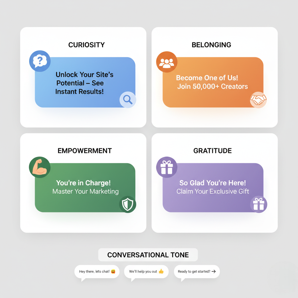
Emotion drives decision-making — even in business. A powerful welcome message subtly uses emotional cues to connect with visitors.
Some effective triggers include:
Curiosity: “See how your site could convert better — instantly.”
Belonging: “Join 10,000+ marketers already using Poper.”
Empowerment: “Take control of your engagement strategy.”
Gratitude: “Thanks for visiting — here’s something special for you.”
A conversational tone also helps. Use simple words, contractions (“you’re,” “we’ll”), and friendly phrases (“let’s get started”) to sound approachable.
Avoiding Robotic or Generic Messaging
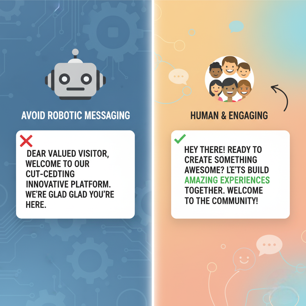
The worst thing your welcome message can be is forgettable. Phrases like “Welcome to our website” or “We’re glad you’re here” add no value.
Instead, aim to make it specific and meaningful.
For example:
“Welcome to Poper! You’re just one step away from creating stunning onsite engagement experiences.”
Avoid:
Overly formal greetings (“Dear valued visitor”)
Overused buzzwords (“cutting-edge,” “innovative”)
Long-winded introductions
Human beats corporate every time.
Quick Checklist: Perfecting Tone and Language
| Element | Ideal Approach | Example |
|---|---|---|
| Greeting | Friendly, natural | “Hey there!” or “Welcome aboard!” |
| Tone | Conversational and confident | “Let’s create your first popup together.” |
| Emotion | Subtle but present | “Excited to have you here!” |
| Language | Simple and clear | Avoid jargon and complex terms |
| Authenticity | Be yourself, not your competitor | “We’re here to help you grow.” |
In essence: The perfect tone is human, confident, and warm. It bridges the gap between your brand and your visitor — turning a passive hello into an active connection.
Best Practices for Crafting the Perfect Welcome Message
Personalize the Experience
Address visitors by name when possible or tailor the message based on their source or behavior. Personalization increases engagement and helps users feel seen.Keep It Short and Clear
Avoid long paragraphs or cluttered messages. A concise message communicates warmth and clarity while maintaining attention.Maintain Brand Voice
The tone of your welcome message should reflect your brand identity. A playful brand can use humor, while a corporate brand should remain professional but friendly.Offer Value Quickly
Tell users what’s in it for them. Highlight benefits, discounts, or unique features they can explore immediately.Guide Users with a CTA
Always include a next step: “Start Free Trial,” “Explore Templates,” or “Subscribe for Updates.” CTAs direct intent into action.Use Visuals Wisely
Icons, emojis, or relevant images can enhance the appeal of your message and make it more engaging.Test and Optimize
Run A/B tests to see which messages drive better results. Continuously refine based on analytics.Respect User Context
Avoid intrusive popups. Ensure welcome messages appear at the right time and in the right place—after a few seconds, upon scroll, or after engagement.
Conclusion
A well-crafted website welcome message goes beyond a simple greeting—it’s the first bridge between your brand and your audience. Whether it’s a friendly “Hey there!” or a value-driven offer, your welcome message sets the tone for the user’s entire journey. By focusing on clarity, personalization, and timing, you can transform casual visitors into loyal users.
FAQs
What makes a good website welcome message?
A clear, personalized, and value-driven message that aligns with brand voice and encourages users to take the next step.
Should I use popups for welcome messages?
Yes, but use them wisely. Timed or behavior-based popups perform best without feeling intrusive.
How long should a welcome message be?
Ideally 1–3 short sentences. Just enough to greet, inform, and guide.
Can I use humor in my welcome message?
If it fits your brand tone, humor can make your message more memorable and human.
How do I measure the success of a welcome message?
Track engagement metrics such as click-through rates, conversions, and time on site.