The right guidance at the right moment can turn any new user into a confident user.
Tutorial popups are on screen guidance elements that teach users how to perform tasks inside a product. They simplify onboarding, reduce confusion and help users understand features quickly.
A tutorial popup is an instructional interface element that guides users through tasks using tooltips, highlights or step based prompts. It improves onboarding by reducing friction, showing the next action clearly and helping users learn features faster. Tutorial popups work best during first time onboarding, new feature launches and complex workflows.
Types of Instructional Elements
| Element Type | Purpose |
|---|---|
| Tooltip | Gives short, precise instructions |
| Highlight | Draws attention to a specific area |
| Modal | Explains a task or feature in detail |
| Step Sequence | Guides users through multiple actions |
Why they are effective
Instant clarity through simple instructions
Shortened learning curve with visual cues
Higher activation because users reach their goals faster
Lower support load thanks to self service learning
Better engagement driven by interactive guidance
A well crafted tutorial popup improves onboarding, reduces friction and helps users explore your product with confidence.
4 Types of Tutorial Popups
Tutorial popups come in different formats depending on the type of guidance a user needs. Each format plays a unique role in helping users understand features, complete tasks and move confidently through your product.
1. Step Based Walkthroughs
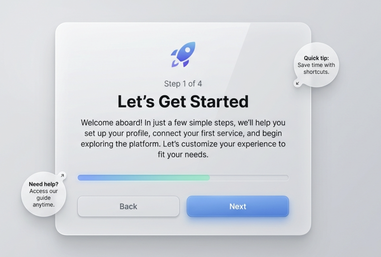
Step based walkthroughs guide users through a multi step process in a clear sequence. Each step appears one at a time and instructs the user on what to do next.
They are ideal for explaining complex operations or onboarding flows that require more than one action.
Why they are useful
Break large tasks into smaller, doable steps
Give users a clear sense of progress
Reduce confusion during long workflows
2. Tooltip Guides
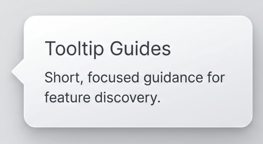
Tooltip guides are small, focused instructional bubbles that appear near specific UI elements. These guides offer short, simple instructions that explain the purpose of a button or feature.
Ideal for
Quick explanations
Feature discovery
Subtle hints without interrupting the user
3. Highlight Popups
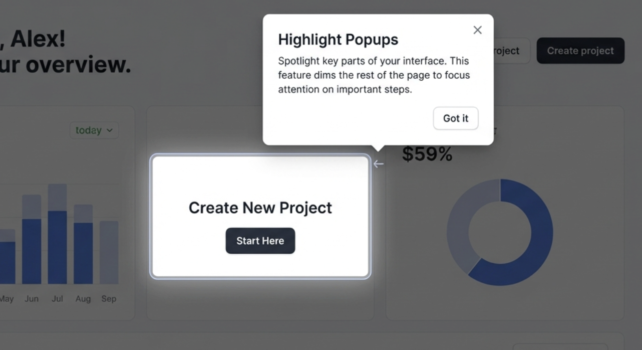
Highlight popups visually spotlight an area of the screen while dimming the background. This makes the guided element stand out clearly and directs user focus.
Best used for
Drawing attention to new features
Prompting users to click a specific part of the interface
Eliminating visual distractions
4. Educational Modals
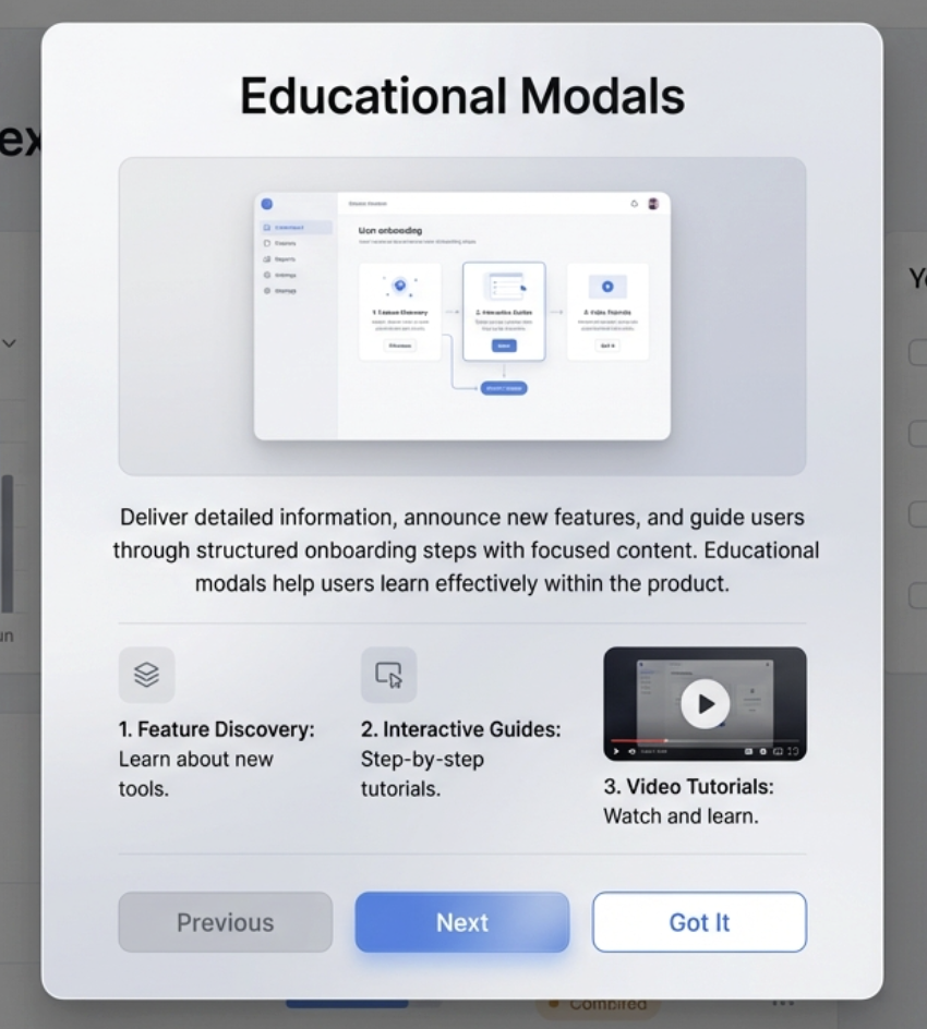
Educational modals appear at the center of the screen and provide more detailed information. They often contain images, short videos or step explanations.
Great for
Feature announcements
In depth tutorials
Presenting key onboarding steps in a structured format
When to Use Tutorial Popups
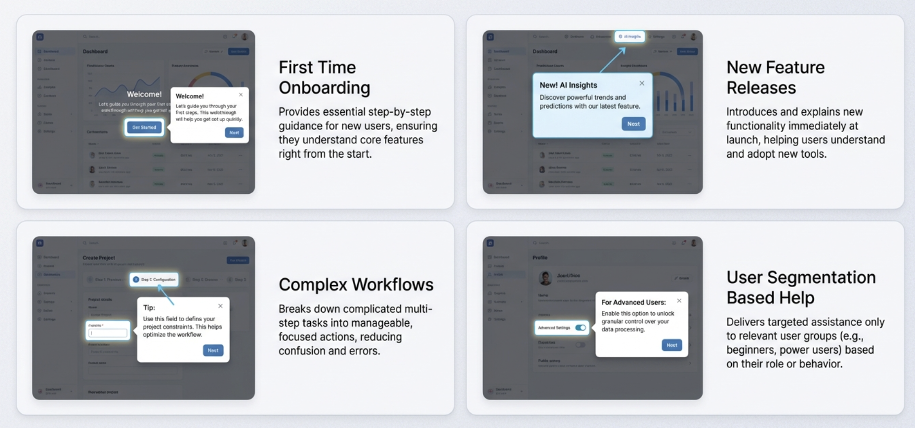
Tutorial popups work best when they solve a real need at the right moment. Placing them with intent ensures users learn smoothly instead of feeling interrupted.
First Time Onboarding
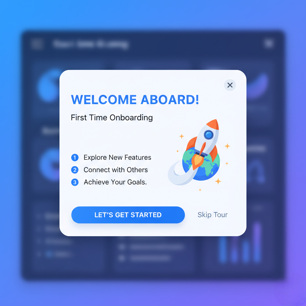
First time onboarding is the most important moment for guided tutorials. New users often feel unsure, so showing them exactly what to do helps them move forward with confidence.
A simple step guide or tooltip sequence can reduce drop offs and speed up activation.
New Feature Releases
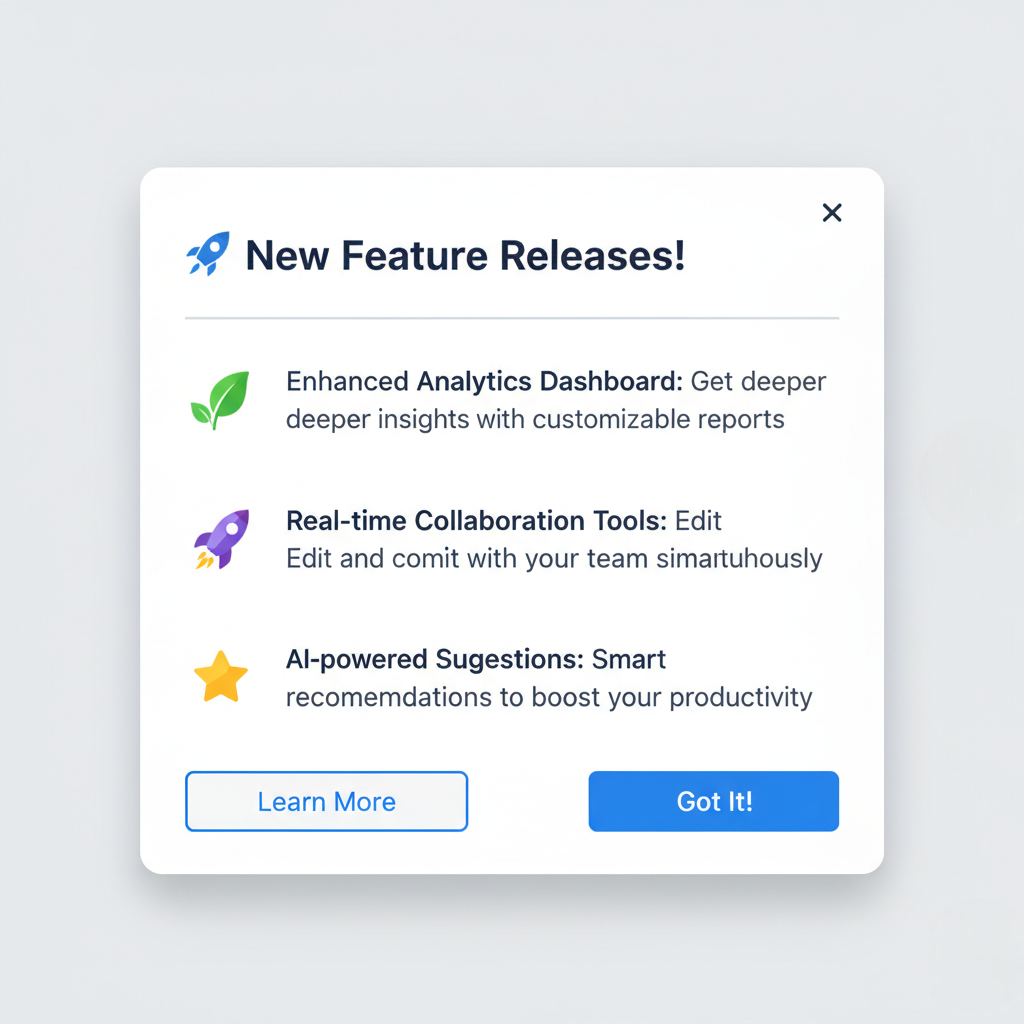
Whenever you introduce a new feature, users need help understanding what it does and why it matters. Tutorial popups can highlight the new element, explain its purpose and guide users through the first action.
This increases feature adoption and prevents confusion.
Complex Workflows

Some tasks require multiple steps or interactions across different parts of the interface.
Tutorial popups help break down complex workflows into easy actions, ensuring users never feel lost.
This is especially useful in products with dashboards, editors, analytics or multi step setup flows.
User Segmentation Based Help
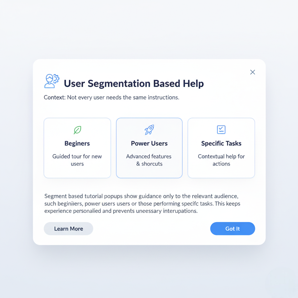
Not every user needs the same instructions.
Segment based tutorial popups show guidance only to the relevant audience, such as beginners, power users or those performing specific tasks.
This keeps the experience personalised and prevents unnecessary interruptions.
Core Elements of an Effective Tutorial Popup
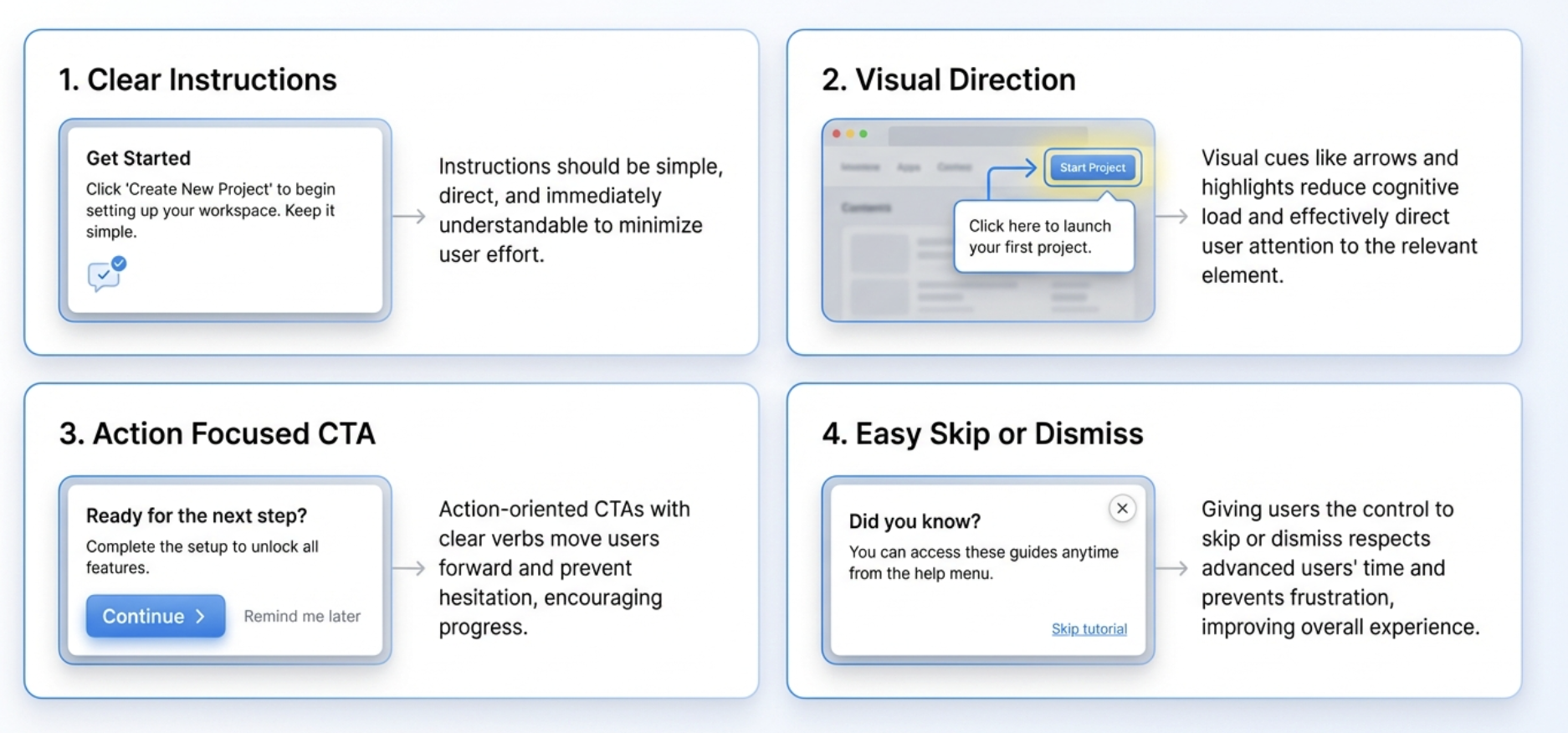
A powerful tutorial popup is built with clarity, guidance and user control. Each element plays a key role in helping users understand what to do without feeling overwhelmed.
Clear Instructions
Users should immediately understand what the popup wants them to do.
Short, simple and direct instructions work best.
Avoid long paragraphs. Focus on telling users the next action in plain language.
Visual Direction
Icons, arrows, highlights or outlined borders help users see exactly where to click or look.
Visual cues reduce cognitive load and make the path forward obvious.
This is especially important when guiding users through complex interfaces.
Action Focused CTA
A tutorial popup must include a clear CTA that moves the user forward.
Examples include Continue, Try it now or Next step.
A focused CTA maintains flow and ensures users do not pause or hesitate.
Easy Skip or Dismiss
Not everyone wants a guided experience.
Providing a Skip or Dismiss option shows respect for user autonomy and prevents frustration.
This also helps advanced users move at their own pace without unnecessary steps.
UX Best Practices
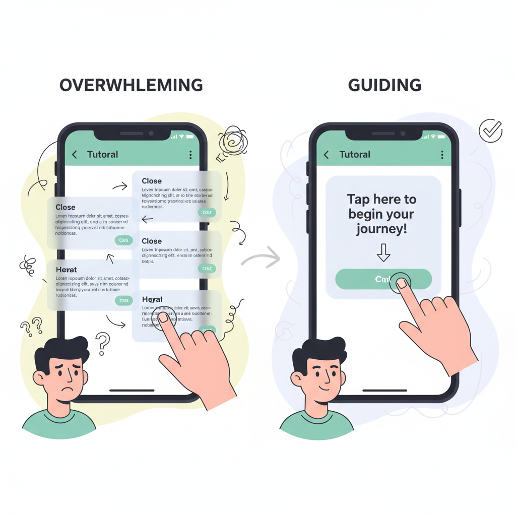
Tutorial popups perform best when they guide without overwhelming. Following proven UX principles ensures users feel supported rather than interrupted.
Timing and Frequency
A tutorial popup should appear exactly when the user needs it, not sooner and not later.
Triggering it too early causes confusion and triggering it too often creates irritation.
Smart timing based on actions, intent and behavior leads to a smoother learning experience.
Non Intrusive Placement
The popup must not block important interface elements.
Place it near the feature being explained so users can see both the instruction and the action area clearly.
Subtle, well placed popups improve guidance without breaking the user’s flow.
Accessibility Considerations
Tutorial popups should be readable, keyboard friendly and usable for everyone.
Large fonts, high contrast colors and proper focus states help make the tutorial accessible.
Clear labels and predictable behavior ensure all users can follow the instructions easily.
Maintaining User Control
Users should always feel in control of the experience.
They should be able to pause, skip, dismiss or revisit tutorials whenever they want.
Empowering users with control builds trust and reduces frustration.
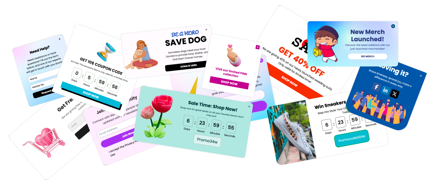
Popular Tutorial Popup Templates
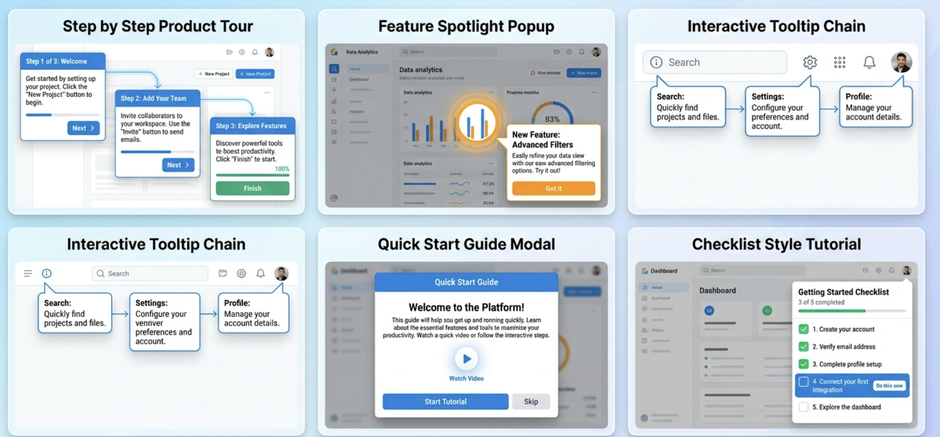
Different products need different styles of guidance. These common templates help teams deliver effective tutorials without starting from scratch.
Step by Step Product Tour
A guided sequence that walks users through the most important features of the product.
Each step introduces one action, making onboarding simple, structured and easy to follow.
Feature Spotlight Popup
A popup that highlights a single feature and explains what it does.
Ideal for product updates, hidden features or tools that users often miss during onboarding.
Interactive Tooltip Chain
A chain of connected tooltips that guide users across multiple interface elements.
This format feels light and natural while still offering complete direction across a workflow.
Quick Start Guide Modal
A modal that introduces the product basics in a condensed manner.
It can contain text, visuals or a checklist that helps users start using the product in minutes.
Checklist Style Tutorial
A tutorial that presents a list of tasks users need to complete.
Each completed item gives a sense of progress and motivates users to finish the onboarding flow.
How to Create Tutorial Popups in Poper
Poper makes it easy to build powerful tutorial popups without coding. You can create guided flows, highlight features and trigger tutorials based on real user behavior.
Selecting a Tutorial Popup Template
Creating effective blog subscription popups with Poper.ai is simple and fast. Using Poper’s intuitive editor and customizable templates, you can build eye-catching, high-converting subscription popups in just a few steps.
Log In to Poper.ai
Start by signing in to your Poper.ai account and accessing your dashboard. Click “Create Popup” to begin designing your popup.
After that, Start by choosing a template from Poper’s collection.
You can select step tours, tooltips, highlights or modals depending on the type of guidance your users need.
The template gives you a ready foundation so you focus only on the content.
Adding Steps and Tooltips
Add the steps you want your users to follow.
Keep each step clear and goal driven so the user knows exactly what to do next.
Setting Triggers Based on User Behavior
Triggers decide when the tutorial popup should appear.
Poper lets you show tutorials based on first visit, button clicks, page views, scroll depth, device type and more.
Behavior based triggers ensure users see the tutorial only when it is actually relevant.
Publishing and Testing the Flow
Preview the tutorial to check every step, placement and instruction.
Once everything looks correct, publish it live.
You can test the flow with different devices and segments to make sure the experience stays smooth for all users.
Measuring Tutorial Popup Performance
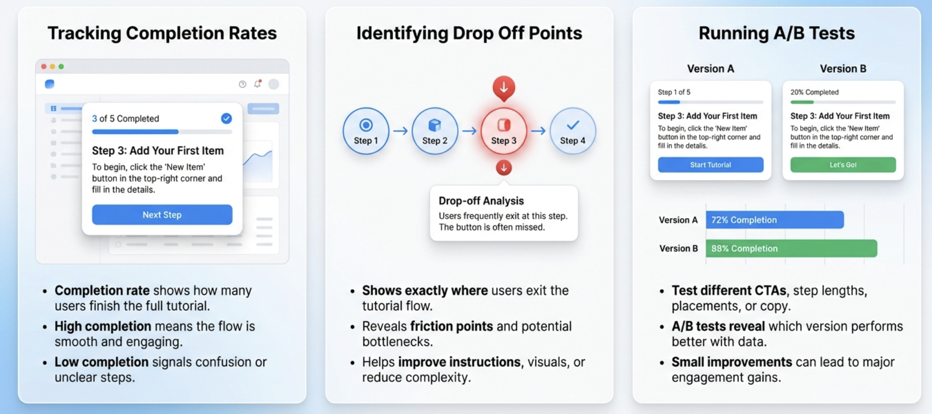
Tracking performance ensures your tutorial popups actually help users instead of slowing them down. Measuring engagement and completion gives you clear insight into what is working and what needs improvement.
Tracking Completion Rates
Completion rate tells you how many users finish the entire tutorial.
A high completion rate indicates the flow is smooth and helpful.
A low rate signals confusion, too many steps or unclear instructions.
Identifying Drop Off Points
Analyzing where users exit the tutorial helps you understand friction points.
You can see exactly which step causes confusion and fix it by simplifying instructions, improving visuals or reducing complexity.
Running A B Tests
A B testing different versions of your tutorial helps you find the most effective approach.
You can test shorter steps, new placements, different CTAs or updated copy.
Small changes often lead to large improvements in user engagement and onboarding success.
Common Mistakes to Avoid
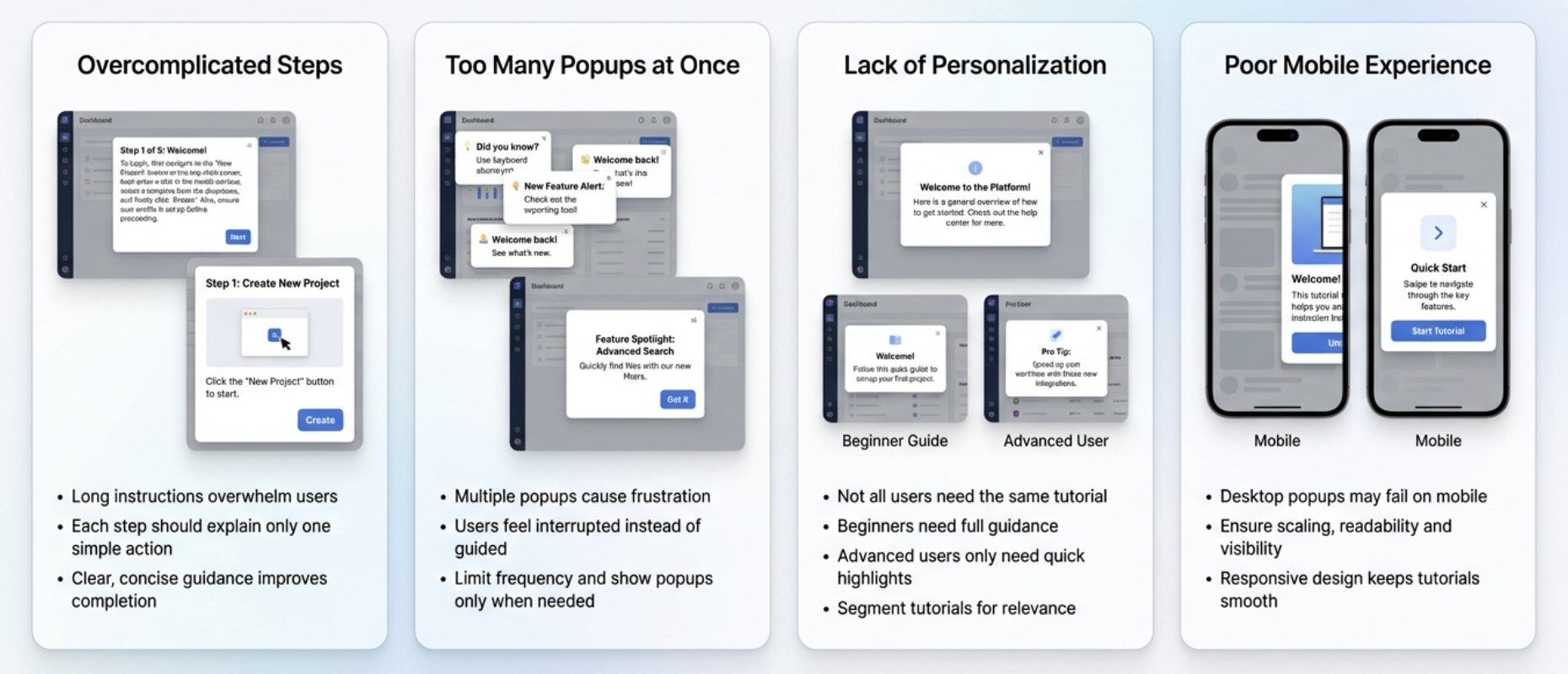
Even well intentioned tutorials can backfire if not designed thoughtfully. Avoiding these mistakes ensures your tutorial popups stay helpful rather than annoying.
Overcomplicated Steps
Too many instructions or long text blocks overwhelm users.
Each step should focus on one simple action.
Clear and concise guidance always leads to better completion rates.
Too Many Popups at Once
Showing multiple popups in a short time creates frustration.
Users feel interrupted rather than guided.
Limit the frequency and ensure every popup serves a purpose.
Lack of Personalization
Not all users need the same tutorial.
Beginners may need a full walkthrough while advanced users require only feature highlights.
Segment your audience to provide the right guidance to the right person.
Poor Mobile Experience
A popup that works on desktop may break on mobile if not optimized.
Ensure your tutorial popups scale well, stay visible and remain easy to follow on smaller screens.
Responsive design keeps the experience smooth across all devices.
FAQs
What is a tutorial popup
A tutorial popup is an on screen guide that teaches users how to complete a task inside a product. It uses steps, tooltips or highlights to simplify onboarding and feature discovery.
How many steps should a tutorial have
Most effective tutorials have between three to seven steps. Shorter flows reduce friction and help users complete the onboarding with ease.
How can Poper help create tutorial popups
Poper allows you to create step tours, tooltips, highlights and modals without coding. You can add steps, set triggers, highlight elements and publish guided experiences easily.
How do I prevent users from feeling annoyed
Keep the tutorial short, offer a skip option, use behavior based triggers and show popups only when needed. This ensures users stay in control.
What are the best templates for beginners
Beginners perform best with a step by step product tour, a quick start guide modal or an interactive tooltip chain. These formats offer clarity without overwhelming the user.
