
Design is not just what it looks like and feels like — design is how it works for everyone.
Popups are one of the most powerful engagement tools in modern web design. They help businesses capture leads, highlight offers, and guide user journeys. But there’s a hidden truth many brands overlook — if your popups aren’t accessible, they aren’t truly effective.
Inaccessible popups can frustrate users with disabilities, block essential site navigation, and even make your website non-compliant with global accessibility laws. In contrast, accessible popups create seamless experiences that everyone — including users with visual, auditory, motor, or cognitive impairments — can interact with comfortably.
The best part? Accessibility improves the experience for everyone, not just people with disabilities.
Here’s how:
| Accessibility Feature | Benefit for All Users |
|---|---|
| High contrast text | Easier reading in bright light |
| Keyboard navigation | Faster browsing for power users |
| Clear focus indicators | Better orientation during interactions |
| Proper ARIA labels | Improved SEO and screen reader compatibility |
| Dismissible popups | Reduced annoyance and higher engagement |
Accessible popups lead to lower bounce rates, higher engagement, and more conversions, simply because they respect the user’s comfort and autonomy.
Understanding Accessibility Principles in Popup Design

Popups are meant to grab attention, but when designed without accessibility in mind, they can unintentionally block access for a significant part of your audience. Whether it’s a hidden close button, unreadable contrast, or keyboard traps, the result is the same — frustration.
To truly create inclusive experiences, designers must understand the core principles of accessibility and how they apply specifically to popup design. Let’s break it down.
What “Accessibility” Means for Interactive Elements Like Popups
Accessibility ensures that all users, including those with disabilities, can perceive, understand, navigate, and interact with your popups.
This means accounting for:
Visual impairments (color blindness, low vision, total blindness)
Hearing impairments
Motor disabilities (difficulty using a mouse)
Cognitive challenges (attention or memory difficulties)
Example:
A user with low vision should be able to read your offer popup clearly. A keyboard-only user should be able to open and close it smoothly. And a screen reader should describe it accurately.
The POUR Framework — The Foundation of Accessibility
At the heart of accessibility lies the POUR framework, developed under the WCAG guidelines. Every accessible popup should follow these four principles:
| Principle | Meaning | Popup Application |
|---|---|---|
| Perceivable | Users can see and understand the content | Provide proper color contrast, readable fonts, and ARIA labels for images and buttons |
| Operable | Users can interact with all functions | Ensure popups can be navigated using a keyboard or assistive technology |
| Understandable | Content is easy to follow and use | Keep popup messages clear, short, and action-driven |
| Robust | Works across various devices and tools | Make popups compatible with browsers, screen readers, and mobile environments |
Common Accessibility Barriers in Popups
Even experienced designers often miss subtle accessibility issues in popup implementation. Below are some of the most frequent barriers:
Focus Traps — When a popup appears, users who rely on a keyboard should not lose focus or get “stuck” without a way to exit.
Unreadable Text Contrast — Light gray text on a white popup background might look elegant but fails for users with low vision.
Hidden or Non-Descriptive Close Buttons — A tiny “x” without an ARIA label can make closing the popup impossible for screen reader users.
Auto-Triggered Popups — Unexpected interruptions can confuse or overwhelm users with cognitive sensitivities.
Lack of Responsive Behavior — Popups that overlap or overflow on smaller screens break usability for mobile users.
Why Accessible Popups Enhance Both UX and SEO Performance
Accessibility doesn’t just improve usability — it improves everything:
Better UX: Clearer design, improved readability, and logical flow lead to happier users who stay longer.
SEO Boost: Search engines reward accessible, user-friendly experiences. WCAG-aligned pages often rank higher due to lower bounce rates and better engagement metrics.
Brand Reputation: Accessible brands earn trust and loyalty, showing they care about all customers.
Data shows:
Websites that prioritize accessibility experience a 20–30% increase in engagement metrics because users can interact freely and without friction.
Key Challenges in Popup Accessibility

Popups are meant to engage users, not exclude them. Yet many websites unintentionally create accessibility barriers that make interacting with popups difficult, confusing, or even impossible for some users.
Let’s explore the most common challenges in popup accessibility — and what you can do to overcome them.
1. Keyboard Navigation Issues and Focus Loss
One of the biggest accessibility failures in popup design is ignoring keyboard users.
Many people with motor disabilities, temporary injuries, or power-user preferences navigate websites using only a keyboard — typically the Tab, Enter, and Escape keys.
Here’s the problem:
When a popup appears, if the keyboard focus isn’t managed properly, users might:
Get trapped inside the popup with no way to close it.
Lose focus entirely and tab through hidden elements behind the popup.
Be unable to reach the “Close” button or CTA without a mouse.
How to Fix It:
Use focus trapping — ensure focus stays within the popup until it’s closed.
Make sure Shift + Tab cycles backward correctly.
Restore focus to the original page element once the popup is dismissed.
Always allow users to close popups with Esc or a visible “Close” button.
2. Screen Reader Misinterpretation or Modal Overlap
For visually impaired users, screen readers translate web elements into audible information. But when popups aren’t coded properly, screen readers can misinterpret them — reading hidden background content or skipping over the popup entirely.
Common Problems:
Popups lack ARIA attributes like
aria-modal="true"oraria-hidden="true".Screen readers don’t announce when a popup appears.
Overlapping modals cause confusion, as readers can’t determine the active one.
How to Fix It:
Add proper ARIA roles (
role="dialog",aria-labelledby,aria-describedby).Hide background content with
aria-hidden="true"when a popup is active.Use live regions (
aria-live="polite") for dynamic content updates.
3. Poor Contrast Ratios and Low Visual Clarity
Even beautifully designed popups can be unreadable if they lack sufficient color contrast.
Users with low vision or color blindness struggle when text and background colors don’t meet accessibility standards.
According to WCAG 2.1, the minimum acceptable contrast ratio is:
| Text Type | Minimum Contrast Ratio |
|---|---|
| Normal Text | 4.5 : 1 |
| Large Text (18pt+) | 3 : 1 |
| UI Elements (buttons, icons) | 3 : 1 |
Example:
Light gray text on a pastel background may look “modern,” but it fails accessibility and frustrates readers.
Solution:
Use tools like Poper’s Popup Color Contrast Checker to test your popup’s text, buttons, and backgrounds instantly. It shows you:
The exact color contrast ratio
Whether it meets WCAG AA or AAA standards
Live suggestions to adjust your colors
4. Mobile Accessibility Problems
Popups that look perfect on desktop can break completely on mobile screens.
Common issues include:
Popups covering essential content
Buttons that are too small or too close together
Difficulty closing popups due to missing touch targets
Overlapping modals or content that doesn’t resize properly
How to Fix It:
Use responsive design principles — popups should adapt fluidly to smaller screens.
Ensure all tappable elements have a minimum target size of 48x48px (per WCAG).
Keep popups centered and avoid full-screen overlays that block navigation.
Test on real devices, not just emulators.
Designing Visually Accessible Popups

A popup’s purpose is to capture attention — but not at the cost of usability. A visually accessible popup doesn’t scream for attention; it gently guides it. It ensures that every user, regardless of visual ability, can see, understand, and interact with the message without effort.
Inaccessible visuals — like low contrast text, tiny fonts, or bright animations — can instantly alienate users. In contrast, visually accessible design feels calm, clear, and inclusive.
Here’s how to design popups that look stunning and stay compliant with accessibility standards.
1. The Importance of Color Contrast
Color contrast is one of the most overlooked yet essential factors in accessibility.
Without enough contrast between text and background, users with visual impairments or color blindness can struggle to read or identify elements.
According to WCAG 2.1, here are the required color contrast ratios:
| Element Type | WCAG AA Standard | WCAG AAA Standard |
|---|---|---|
| Normal Text (below 18pt) | 4.5 : 1 | 7 : 1 |
| Large Text (18pt and above) | 3 : 1 | 4.5 : 1 |
| Icons and UI Components | 3 : 1 | 4.5 : 1 |
2. Using Poper’s Popup Color Contrast Checker
To make this process effortless, Poper offers a free tool — the Popup Color Contrast Checker — built specifically for popup and widget designers.
How it helps:
Instantly tests your popup’s text and background contrast.
Detects whether your design meets WCAG AA or AAA compliance.
Offers real-time suggestions to fix color mismatches.
Displays live previews so you can visually confirm improvements.
Example Use Case:
If your popup headline uses #999999 text on a #FFFFFF background, the tool will instantly flag it as non-compliant. You’ll get suggestions like #4A4A4A for AA compliance — ensuring both readability and design consistency.
By using this tool before publishing, you guarantee your popups are visually accessible, legally compliant, and user-friendly.
3. Choosing Accessible Fonts and Typography
Typography plays a huge role in accessibility. Even the best color contrast won’t save unreadable text.
Best Practices:
Use clean, sans-serif fonts (like Inter, Roboto, or Open Sans).
Maintain a minimum text size of 16px for body text.
Avoid text in all caps for longer sentences — it reduces readability.
Maintain sufficient line spacing (1.5x the font size) for clarity.
Never overlay text on busy backgrounds or moving animations.
4. Avoid Relying on Color Alone
Designers often use color to convey meaning — for instance, red for errors and green for success. But not all users perceive colors the same way.
To make popups inclusive:
Combine color cues with text or icons.
Use symbols or labels for confirmation and error states.
Example: Instead of just red text for “Error!”, use a red warning icon and text like “Error: Please enter your email.”
5. Maintain Clear Visual Hierarchy
Visual hierarchy helps users understand which part of your popup deserves their attention first.
Structure your popup like this:
Headline — Clear, descriptive, large enough to stand out.
Body Copy — Concise explanation or message.
Call to Action (CTA) — High contrast button with descriptive text.
Close/Dismiss Option — Always visible and easy to find.
Example of hierarchy done right:
| Element | Accessibility-Friendly Example |
|---|---|
| Headline | “Get 10% Off Your Next Purchase” (18px, #000000 on #FFFFFF) |
| Body | “Subscribe to our newsletter to unlock your discount instantly.” (16px, #444444 on #FFFFFF) |
| CTA | “Subscribe Now” (white text on #007BFF button, ratio 6.1:1) |
| Close Button | Clearly labeled “Close popup” with aria-label and visible outline when focused |
Timing, Triggers, and Motion Control
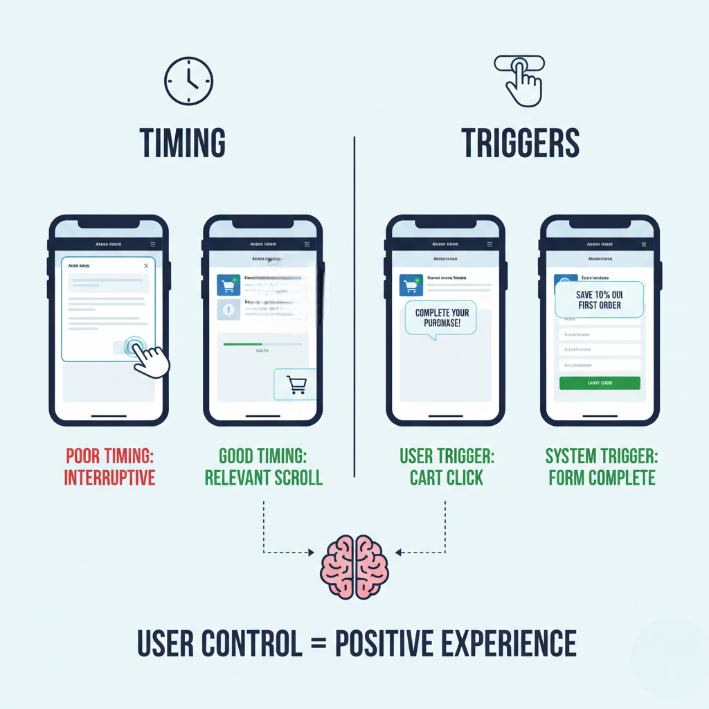
Popups are all about timing. A perfectly timed popup can boost engagement and conversions, while a poorly timed one can frustrate users, disrupt their flow, and alienate visitors with cognitive or sensory sensitivities.
The secret to accessible popup timing lies in control — the user’s control. Your popup should appear when and how the user is ready, not when your system decides it.
Let’s explore how to design popups that engage without overwhelming, using smart triggers, balanced timing, and motion sensitivity best practices.
1. The Problem with Auto-Triggered Popups
Auto-triggered popups that appear instantly on page load are one of the most common accessibility violations.
They can:
Disrupt users navigating with screen readers.
Confuse users who haven’t finished processing the page content.
Startle users with motion sensitivity.
Cause frustration for those using keyboard-only navigation.
The Accessible Alternative:
Let popups be triggered by intent-based actions — like clicking, scrolling, or showing exit intent.
For instance:
Display a discount offer after the user scrolls 50% down a page.
Show a newsletter signup popup after 15 seconds of engagement.
Use exit-intent triggers for cart reminders or lead capture.
This approach ensures users are mentally ready to interact, reducing annoyance and improving conversion rates — a win for accessibility and UX.
2. User-Controlled Triggers and Consent
An accessible popup should never hijack a user’s experience. Instead, it should respect their journey.
Best Practices for User-Controlled Triggers:
Avoid forced interactions. Don’t block page content until users close or act on the popup.
Offer a visible close button (top-right or bottom corner) with a clear label (
aria-label="Close popup").Include “Don’t show again” options for repetitive popups.
Delay the popup until the user demonstrates engagement — clicks, scrolls, or idle time.
These small adjustments can drastically reduce frustration for all users, especially those with attention or sensory challenges.
3. Motion Sensitivity and Animation Control
While animations can make popups engaging, they can also cause discomfort for users with vestibular (motion-related) disorders. Fast or flashing animations may even trigger nausea or headaches for sensitive users.
WCAG 2.1 (Guideline 2.3) advises against animations that:
Flash more than 3 times per second.
Move rapidly without user consent.
Cannot be paused, stopped, or hidden.
Accessible Animation Guidelines:
| Good Practice | Example |
|---|---|
| Subtle, smooth transitions | Fading in a popup gently |
| Limited duration | Under 0.3 seconds |
| No flashing effects | Avoid strobe or slide bounce |
| Provide “Reduce Motion” option | Respect system-level motion settings |
4. Pause, Stop, and Dismissibility
Users must always have control over popups that move, animate, or auto-advance.
According to WCAG 2.2.2, if content updates automatically (like a carousel or timer), users must be able to:
Pause the motion,
Stop it completely, or
Dismiss it with a single, easy action.
How to Apply This:
Add visible “Pause” or “Close” icons.
Don’t hide dismiss buttons in hover-only states.
Let keyboard users close the popup with the Esc key.
5. Balancing Attention with Accessibility
Engagement doesn’t mean disruption. The key is to design popups that invite interaction instead of demanding it.
Here’s a simple approach:
Subtle Motion + Smart Timing = Accessible Engagement.
Instead of full-screen overlays, use corner popups or slide-ins that complement the page flow.
Keep popup text concise — under 50 words for readability.
Use aria-live="polite" to inform assistive tools of popup appearance without cutting off ongoing narration.
Mobile Accessibility and Responsive Popup Design

“Accessibility on mobile isn’t optional — it’s where most of your users live.”
In 2025, more than 65% of all web traffic comes from mobile devices. Yet, mobile accessibility remains one of the most neglected aspects of popup design.
Popups that work perfectly on desktop can turn into frustrating obstacles on mobile — overlapping important content, becoming impossible to close, or requiring precision taps that many users can’t manage easily.
Let’s explore how to make every popup work perfectly on mobile — with accessibility leading the way.
1. The Unique Challenges of Mobile Accessibility
Unlike desktops, mobile users deal with limited screen space and finger-based navigation.
Here’s where accessibility often breaks:
Popups that block full screens and make background content unreadable.
Tiny buttons or links that are hard to tap.
Text that overflows or becomes unreadable due to scaling issues.
Popups that don’t resize when the keyboard opens (especially on forms).
Each of these issues frustrates users and increases bounce rates.
The Fix:
Design popups that are responsive, flexible, and prioritize ease of interaction over visual flashiness.
2. Finger-Friendly Design: Size and Spacing
On mobile, fingers replace cursors — which means every interactive element needs enough space to be comfortably tapped.
According to WCAG 2.5.5, touch targets should be at least 48x48 pixels, with adequate spacing between them.
Best Practices for Touch Accessibility:
Make buttons large and distinct.
Leave at least 8–10px of spacing between tappable elements.
Avoid placing CTAs too close to the popup’s edges.
Ensure scroll gestures don’t interfere with popup dismissal.
3. Responsive Typography and Readability
Text that’s readable on desktop may be too small or cramped on mobile. Always use responsive typography, so text scales smoothly across devices.
Checklist for Readable Text on Mobile Popups:
✅ Minimum font size: 16px for body text
✅ Line spacing: 1.5x font size
✅ Avoid justified text (creates uneven spacing)
✅ Keep popup copy concise — 40–60 words max
✅ Test in both portrait and landscape modes
4. Avoid Overlapping and Off-Screen Elements
Poorly coded popups sometimes extend beyond mobile screens — hiding essential buttons or text.
This is a major accessibility issue, especially for users relying on screen magnifiers or smaller devices.
To Fix This:
Use percentage-based widths instead of fixed pixels.
Keep popups centered or bottom-aligned for easy reach.
Ensure close buttons are always visible and accessible.
Add horizontal scrolling only when absolutely necessary.
5. Mobile-First Layout Principles
When designing for accessibility, mobile-first isn’t just a buzzword — it’s a survival tactic.
Start your popup layout for the smallest screens first, then scale up. This ensures essential content stays visible and actionable, even in tight spaces.
Mobile-First Design Principles for Popups:
Keep only one core message per popup.
Stack content vertically — headline, message, CTA.
Avoid multiple columns or side-by-side layouts.
Use bold, large CTAs that are easy to tap.
Limit entry and exit animations to subtle fades or slides.
6. Mobile Preview and Accessibility Testing
Even the best-designed popup needs real testing. Accessibility issues often reveal themselves only on actual devices.
Testing Steps:
Test popups on multiple devices — Android, iPhone, and tablets.
Try navigating using VoiceOver (iOS) or TalkBack (Android).
Use tools like Google Lighthouse or Axe DevTools to check mobile accessibility.
Verify that all interactive elements are reachable via keyboard focus (for Bluetooth keyboard users).
Building Accessible Popups with Poper
Creating accessible popups can sound technical or time-consuming, especially when you start thinking about things like ARIA labels, focus traps, and WCAG compliance.
But with Poper, accessibility becomes automatic — not an afterthought.
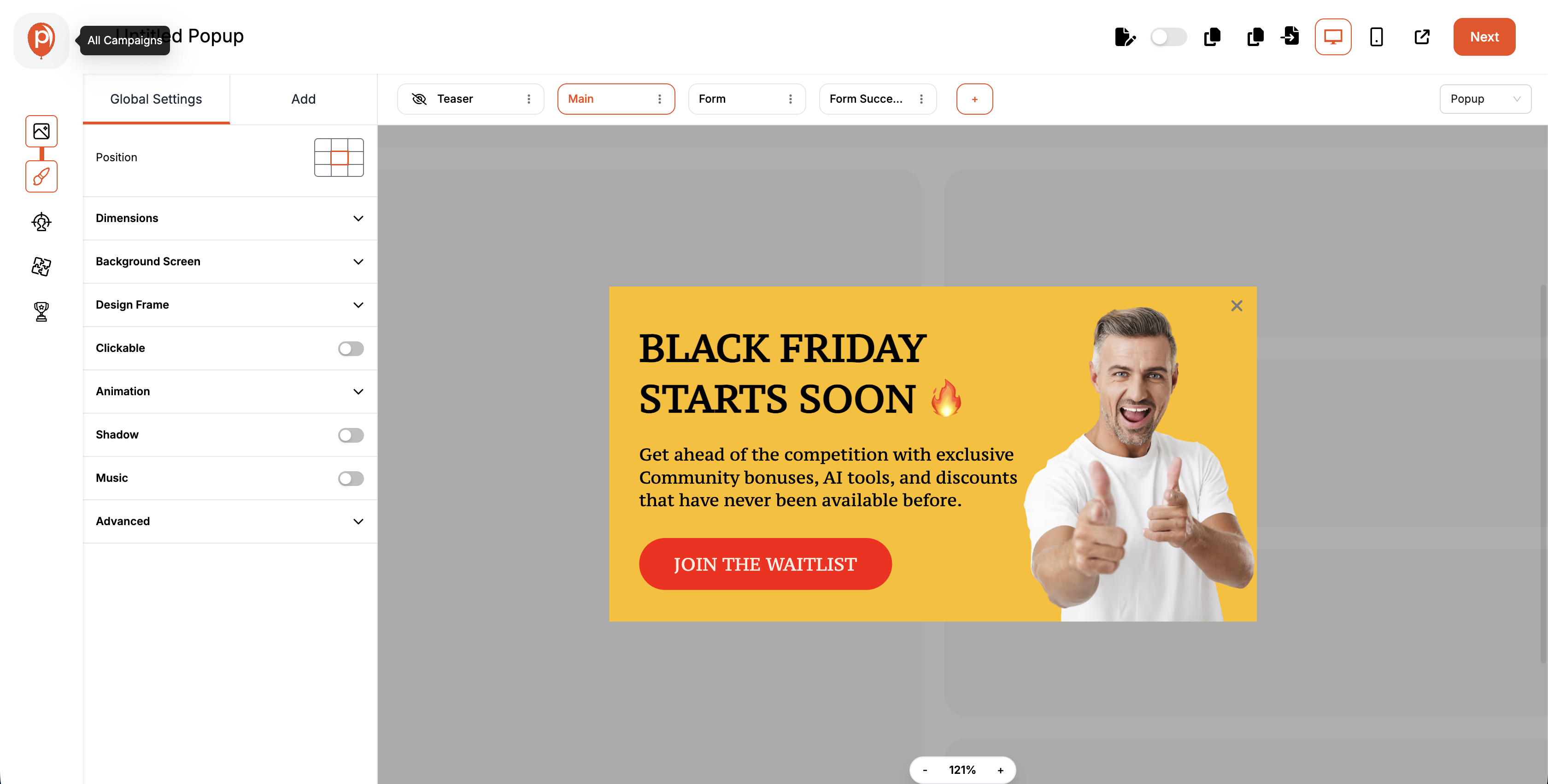
Step-by-Step: How to Build an Accessible Popup in Poper
Building an inclusive popup with Poper is simple. Here’s a step-by-step guide:
Step 1: Log in to Your Dashboard
Visit Poper and log into your account. From your dashboard, click “Create Popup.”
Step 2: Choose a Template
Select templates which are designed with built-in accessibility rules — high contrast, visible close buttons, and logical tab order.
Step 3: Add Clear Headings, Text, and Alt Descriptions
Write concise, readable content. Add descriptive button labels (like “Subscribe Now” instead of “Click Here”).
Step 4: Test Your Color Choices with the Popup Color Contrast Checker
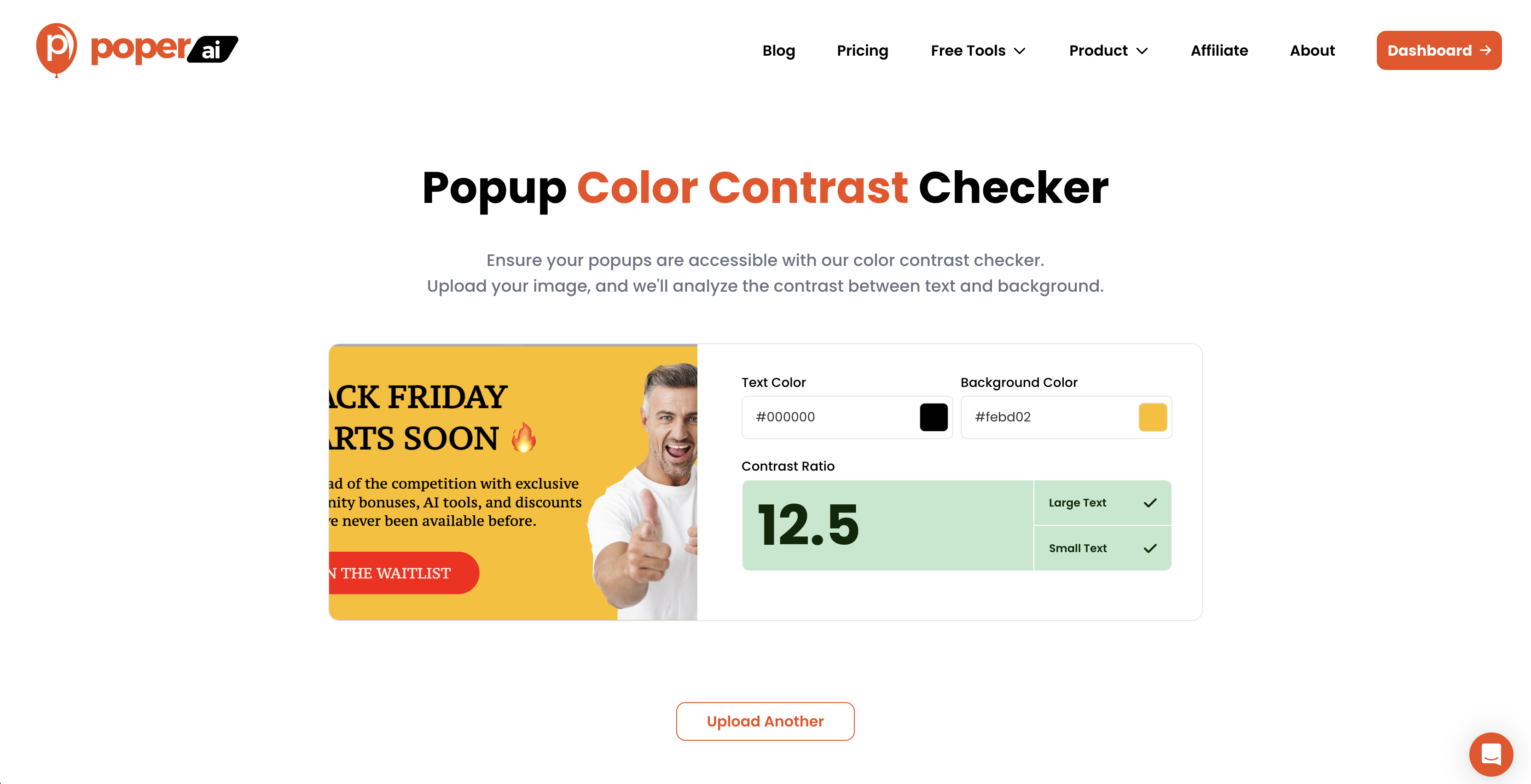
Use the free Popup Color Contrast Checker tool to test your background and text combinations.
It will instantly tell you whether your colors meet WCAG AA or AAA standards — and provide suggestions to fix any issues.
Step 5: Configure Triggers and Motion Responsibly
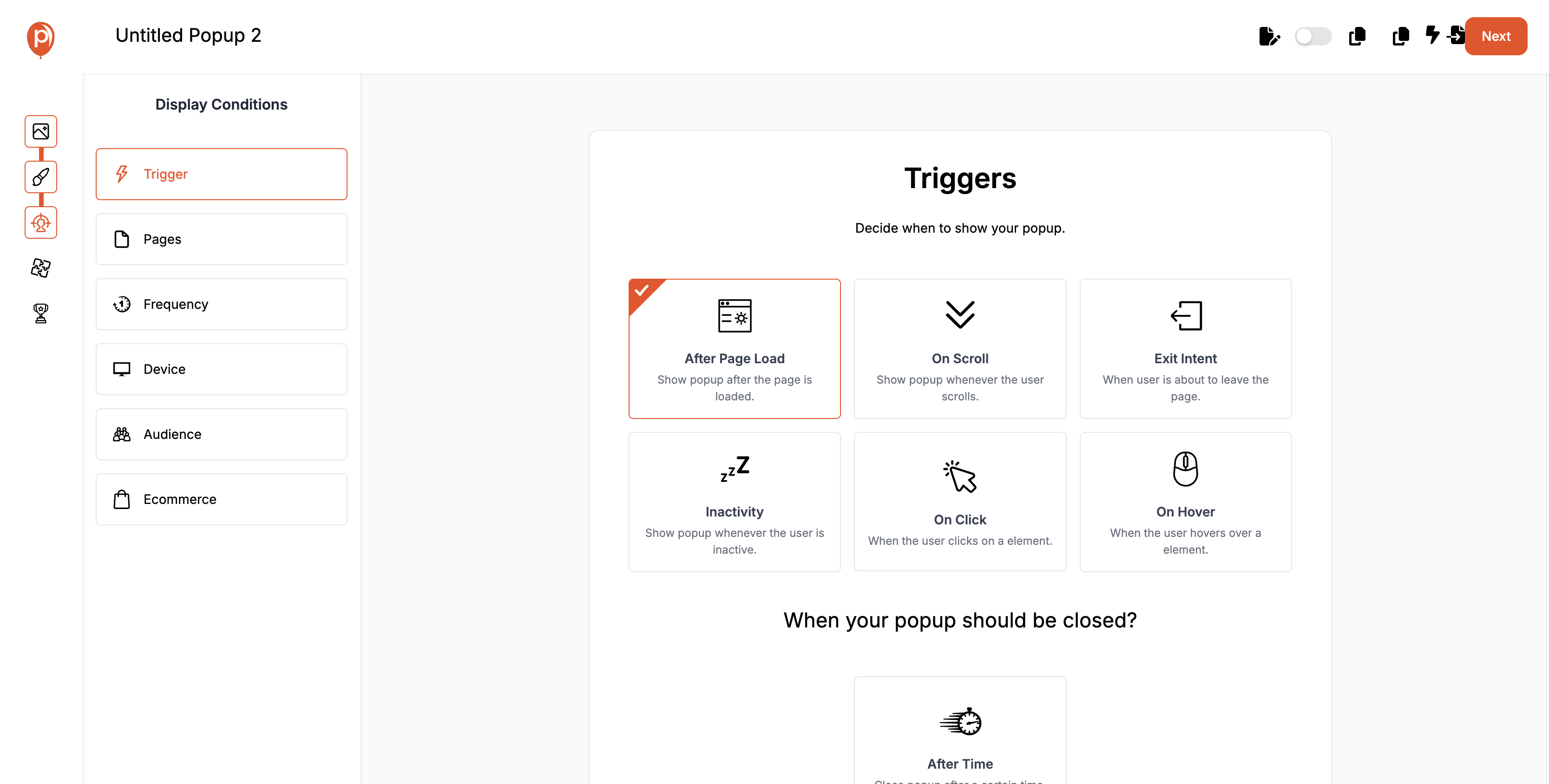
Set user-friendly triggers (scroll, delay, exit intent) instead of instant page-load popups.
Poper’s Smart Trigger System ensures your popup appears at the right time without disrupting assistive technologies.
For motion control, toggle “Reduced Motion Mode” to make animations smoother and accessible to users with motion sensitivity.
Step 6: Preview Accessibility in Live Simulation
Before publishing, use Poper’s Live Accessibility Preview to test your popup in real time — including keyboard navigation, color contrast, and mobile touch accessibility.
Step 7: Publish and Track Accessibility Performance
Once you publish, Poper’s analytics show not just engagement metrics (CTR, conversions) but also usability insights, helping you see how users interact with your popups across devices.
Summary
We’ve reached the final section of our deep dive into Accessibility in Popup Design — and by now, one thing should be clear: accessibility is not about limitation; it’s about inclusion, empathy, and effectiveness.
Popups, when designed responsibly, can be both powerful and pleasant — guiding users, enhancing engagement, and converting ethically. But only when every user, regardless of ability, can see, read, navigate, and interact with them.
FAQs: Accessibility in Popup Design
What makes a popup accessible?
An accessible popup is one that everyone can use — including people who rely on keyboards, screen readers, or high-contrast settings.It includes proper color contrast, visible and labeled close buttons, ARIA attributes, and smooth motion controls.
How can I test my popup’s color contrast easily?
Use Poper’s free Popup Color Contrast Checker.
Simply enter your background and text colors, and it instantly tells you if your popup meets WCAG AA or AAA standards — plus shows how to improve readability.Can accessibility really improve conversion rates?
Absolutely.
Accessible popups lead to better engagement, longer dwell time, and lower bounce rates.
When users can comfortably interact with your content, they’re more likely to convert — it’s that simple.How often should I test popup accessibility?
Ideally, before every major design update or campaign launch.
For ongoing projects, quarterly reviews are recommended to ensure accessibility remains intact after design or content changes.
With Poper, accessibility checks happen automatically during every edit.
✅ Next Step:
Start building your first accessible popup today with Poper and test it using the Popup Color Contrast Checker.

