

“The most effective popup isn’t the one that shouts the loudest — it’s the one that appears at the right moment, in the right way, without breaking the browsing experience.”
Slide in popups are a modern, subtle, and highly effective way to engage website visitors without interrupting their journey. Unlike traditional full-screen popups that abruptly block content, slide ins gently appear from the edge of the screen, allowing users to continue browsing while still noticing the message. They are built on the principle of micro commitment, meaning they encourage action without forcing it, resulting in higher engagement rates and improved user satisfaction.
A slide in popup is a small, non intrusive on page message that slides into view from the bottom or side of the screen without blocking website content. It engages users softly using smart triggers like scroll depth, time delay, or exit intent and improves conversions without harming the user experience.
This makes slide in popups ideal for ecommerce, SaaS, blogs, and online service brands that want conversions with minimal disruption.
Benefits of Slide In Popups

Slide in popups are designed for conversion without confrontation. They blend into the browsing flow, appearing only when the user is already engaged, curious, or evaluating. This subtlety is what makes them more effective than full screen popups in many scenarios.
Better UX Compared to Full Screen Popups
Full screen popups interrupt.
Slide ins coexist with ongoing browsing.
They don’t block reading, navigation, or scrolling, which leads to:
Less frustration
Less immediate dismissal
Better message visibility
Longer engagement time
Instead of forcing attention, they earn it.
Improved Engagement and Higher CTR
Because slide ins appear contextually and respectfully, users are more receptive to interacting with them.
Reasons they convert better:
They feel like useful add ons
They appear at natural decision points
They offer value without pressure
This leads to significantly higher click through rates compared to traditional popups.
Mobile Friendly and SEO Safe
Slide in popups are ideal for mobile, where full screen popups can feel aggressive and intrusive.
Why mobile users love slide ins:
Minimal content overlap
Thumb friendly position
Smooth gestures and visibility
Doesn’t trigger accidental closes
Additionally, because they don’t block the page visually, they remain compliant with Google’s mobile intrusive interstitial policy, protecting both rankings and user experience.
Works Across All Website Types
Slide ins are not limited to ecommerce. They can be used across multiple verticals, including:
| Industry | Use Case |
|---|---|
| Ecommerce | Offers, recommendations, shipping deals |
| SaaS | Trial nudges, onboarding, upgrades |
| Blogs | Content upgrades, lead magnets |
| Online services | Quote request, consultation CTA |
| Education & coaching | Free lessons, webinar signup |
Their versatility makes them suitable for both direct conversion goals and awareness or engagement goals.
How Slide In Popups Work

Slide in popups function through behavior driven triggers, smooth motion, and contextual placement, making them feel naturally integrated rather than forced. Unlike traditional popups that demand immediate attention, slide ins quietly suggest action while allowing the user to stay in control.
Here’s how they work step by step.
Trigger Based Activation
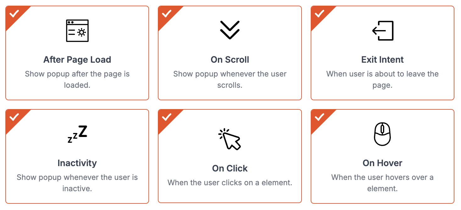
Slide ins don’t appear randomly — they’re triggered based on real user behavior, which increases their relevance and effectiveness. Common triggers include:
Scroll depth: When a user has consumed enough content
Time on page: After evaluating interest
Exit intent: When cursor moves toward close or back
Inactivity: When user pauses or hesitates
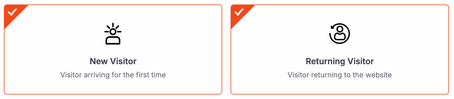
Return visit: Familiar users get relevant guidance
These triggers ensure timing feels natural, not forced.
Device and Page Specific Behavior
Slide in popups can behave differently depending on device type and page content. This ensures that messaging matches intent and screen space availability.
Examples:
Mobile users may see a slimmer bottom slide in bar
Desktop users might see a corner slide in card
Blog readers get content upgrades
Checkout users get incentives
Smooth Animations That Avoid Disruption
Animation matters. A slide in popup typically enters using gentle, smooth motion — not a sudden jump. This draws attention without shocking the user.
Key animation characteristics:
Slides up or sideways from screen edge
No vibration, flashing, or loud effects
Presents itself slowly enough to be noticed, not startled
The result is calm visibility, which builds trust and leads to more conversions.
How the Flow Feels to a User
| Stage | User Action | Slide In Response |
|---|---|---|
| Browsing | Reading or exploring | Popup stays hidden |
| Engaged | Scrolls or stays longer | Popup slides in smoothly |
| Interested | Reads or hovers over popup | CTA becomes appealing |
| Converts | Clicks CTA | Popup closes, funnel continues |
Slide ins enable choice, instead of enforcing action — and that difference is what users appreciate.
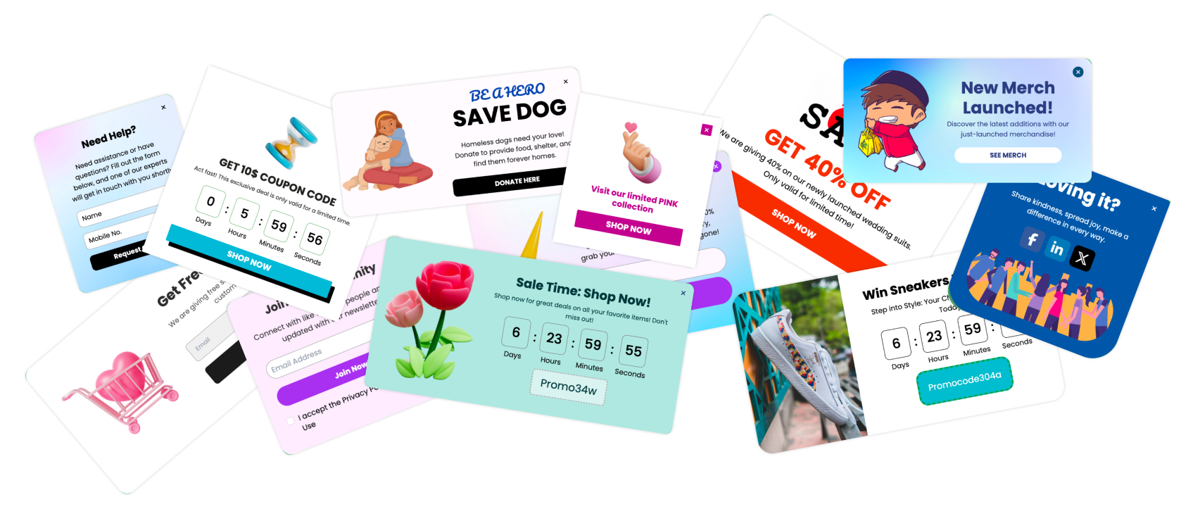
Best 11 Slide In Popup Types (With Examples and Use Cases)
Below are the 11 highest converting slide in popup variations used across ecommerce, SaaS, education, digital products, and content websites. Each type is paired with examples and recommended use cases so you can apply them directly to your website.
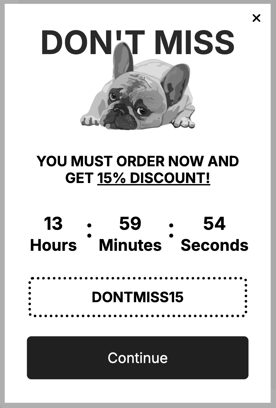
1. Discount or Offer Slide In

This version displays a time sensitive or value based offer without interrupting browsing.
Example message:
“Limited offer: Get 10 percent off today only.”
Best for:
Product pages
Checkout pages
Seasonal sale campaigns
Why it works:
It rewards buyers who are already showing intent.
2. Exit Intent Slide In Discount

When users move toward exiting the page, instead of an intrusive modal, a subtle corner slide in appears.
Example message:
“Before you go — would a small discount help?”
Best for:
Checkout abandonment
Price sensitive visitors
Why it works:
It softens the offer instead of screaming it last minute.
3. Lead Magnet Slide In

This helps convert readers and researchers into subscribers or leads by offering valuable gated content.
Examples:
Ebook
Swipe file
Checklist
Case study
Webinar
Example message:
“Want the PDF version of this guide — free download.”
Best for:
Blogs
SaaS content hubs
Online coaching sites
4. Free Shipping Slide In

Ecommerce conversion booster that removes a common checkout barrier.
Example message:
“Free shipping on orders above ₹699 / $49”
Best for:
Cart and product pages
Clearance sales
Bundling upsells
Why it works:
Shipping cost is one of the top reasons users bounce.
5. Gamified Slide In CTA
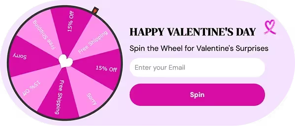
Brings fun and curiosity into the funnel.
Example mechanics:
Spin and win
Scratch reveal
Mystery gift
Example message:
“Play and win your surprise offer.”
Best for:
Young audiences
Festive campaigns
Viral growth
6. Product Recommendation Slide In

Shows items based on user interest, browsing history, or cart items.
Example message:
“You may also like these best sellers.”
Best for:
Fashion
Electronics
Beauty and lifestyle
Multi category stores
7. Trial or Demo Slide In for SaaS

Encourages users who show buying research intent.
Example message:
“Need help picking a plan — try free demo.”
Best for:
Pricing pages
Feature comparison pages
8. Social Proof Slide In

People trust people — not ads.
Examples:
Testimonials
Reviews
Recent sales notifications
“5 Users purchased in the last hour”
“4.9 rated by 12,000 customers”
Best for:
Conversion uncertain pages
Checkout confidence building
9. Back in Stock or Price Drop Slide In

Triggers purchase with FOMO and relevance.
Example message:
“Your saved item is back — hurry, limited stock.”
Best for:
Returning users
Wishlist visitors
Email remarketing traffic
10. Content Upgrade Slide In

Turns readers into subscribers by offering extra value.
Example message:
“Want the full strategy toolkit — download now.”
Best for:
Blogs with 1k plus word posts
Tutorial and how to content
11. Support or Help Slide In

Shows human like guidance without forcing chat windows open.
Example message:
“Need help choosing — chat or ask a quick question.”
Best for:
Complex products
Pricing / comparison pages
Onboarding journey
When to Trigger Slide In Popups
Even a perfectly designed slide in popup will fail if it shows up too early, too late, or at the wrong stage of the user journey. Timing isn’t a technical detail — it’s the conversion lever. Below are the smartest and most proven trigger points that balance user experience with engagement.
Scroll Depth Trigger
This trigger activates when a user scrolls a specific percentage of the page, usually 30 to 60 percent.
It ensures the popup shows only to users who are genuinely interested and actively reading.
Best use cases:
Lead magnets
Content upgrades
Mid page product offers
Ideal scroll percentage:
| Content Type | Scroll Trigger |
|---|---|
| Short landing page | 30 to 40 percent |
| Long blog article | 50 to 70 percent |
| Product description page | 35 to 55 percent |
Exit Intent Trigger
This trigger activates when a user tries to leave — without the aggression of a modal popup.
Use it for:
Discount offers
Cart recovery
SaaS trial push
Exit intent slide ins are less annoying because they appear outside the content frame.
Returning Visit Trigger
Shows slide ins only when the visitor comes back, which indicates familiarity and intent.
Examples:
“Welcome back — still interested?”
“Pick up where you left off”
Great for ecommerce, SaaS onboarding, and high ticket products.
Timer Delay Trigger
Appears after a specific number of seconds on the page, helpful for warming up the visitor before proposing value.
| Website Type | Ideal Delay |
|---|---|
| Ecommerce | 5 to 8 seconds |
| SaaS | 8 to 15 seconds |
| Blogs | 20 to 40 seconds |
Inactivity Trigger
If the user stops scrolling, reading, or clicking, it’s a sign of hesitation or distraction.
This is the ideal moment to offer help or value.
Example message:
“Still deciding — want a quick comparison?”
Why Timing Matters More Than Placement
Bad timing is the biggest reason popup strategies fail.
Smart triggering makes slide ins feel like assistance, not interruption.
Slide In Copywriting Techniques
Slide in popups rely on short, persuasive, value packed messaging. Unlike full screen popups, you don’t have space to convince — you must hook, clarify, and motivate within seconds. Copy should be conversational, helpful, and action oriented.
Here’s how to write slide in copy that gets clicks and conversions.
Use Curiosity Driven Micro Copy
Curiosity increases engagement without feeling pushy.
Add small open loops that spark interest:
Examples:
“Want to see something interesting?”
“You might like this…”
“Quick question for you”
“A little gift for your visit”
Curiosity encourages users to self initiate interaction.
Lead With Benefits, Not Features
Users don’t care what something is — they care why it matters.
Bad example:
“Download our ebook”
Improved version:
“Learn the full strategy in one downloadable PDF”
Replace statements with outcomes.
Copywriting Technique Cheat Sheet
| Goal | Technique | Examples |
|---|---|---|
| Hook | Curiosity | “A tiny surprise for you” |
| Clarity | Benefit focus | “Get the PDF version” |
| Trust | Micro reassurance | “No credit card required” |
| Action | Intent CTA | “Start free trial” |
Common Mistakes to Avoid
Slide in popups are naturally user friendly, but many websites unintentionally reduce their effectiveness because of poor execution. Avoiding the mistakes below ensures your slide ins remain helpful, contextual, and high converting.
| Mistake | Result | Fix |
|---|---|---|
| Long text | Low engagement | Use 2 line micro copy |
| Full popup styling | Feels intrusive | Keep compact design |
| Early trigger | Annoying | Use behavior timing |
| Non mobile optimized | High close rate | Use responsive layout |
| Generic messaging | Low conversions | Personalize offers |
How to Create Slide In Popups in Poper
Poper offers ready-made slide in templates, advanced targeting rules, personalization features, and real-time analytics, making it a powerful tool for both beginners and advanced marketers. Here is the exact step-by-step process to create your first high converting slide in popup using Poper.
Step 1: Select a Slide In Template
Open Poper.ai, and on the dashboard, click "+Create New" and choose a template, tailored for:
Offers and discounts
Lead magnets
Social proof
Recommendations
Support and onboarding
Time limited campaigns
Choosing the right template saves setup time and ensures optimized layout.
Step 2: Customize Text, Visuals, and Branding
Use the drag and drop editor to modify elements such as:
Headline
Subtext
CTA button
Background color
Images or icons
Branding theme and typography
Step 3: Configure Triggers and Targeting Rules
This is the most important part for performance.
You can set rules like:
Scroll depth
Timer delay
Exit intent
Inactivity
Returning visitors
Page specific targeting
Device specific variations
Poper also allows frequency control to avoid annoyance.
Step 4: Publish and Track Analytics
Once everything is ready, simply publish your slide in popup with a single click.
Poper provides analytics including:
Impressions
Click through rate (CTR)
Conversion numbers
Device based performance
Time based performance
Conclusion
Slide in popups have become one of the most effective onsite engagement tools because they combine visibility with respect for user experience. They don’t block content, they don’t disrupt reading, and they don’t create frustration. Instead, they appear exactly when the user shows interest, offering value at the perfect moment.
With the right message, design, and targeting rules, slide ins can help you:
Increase conversions effortlessly
Reduce bounce and abandonment
Boost signups and sales
Personalize user engagement
Improve overall website UX
When paired with Poper’s powerful targeting and personalization, slide ins become an unstoppable conversion tool for ecommerce, SaaS, education, blogs, and service based businesses.
Frequently Asked Questions
Are slide in popups better than regular popups
Yes. Slide ins are less intrusive, more user friendly, and appear without blocking content, leading to better engagement and lower bounce rates.
Do slide ins affect user experience
They improve UX when used correctly because they provide helpful information without interruption. Timing and relevance are the key.
What is the best placement for slide in popups
Bottom right delivers the highest conversion rate for most use cases, while bottom center is great for sitewide announcements.
How many times should slide ins trigger per session
Ideally once per session unless user behavior indicates strong reconsideration intent. Frequency control protects user trust.Can slide in popups be personalized
Yes. With Poper, you can personalize based on viewed products, location, cart history, session count, device type, and more, which significantly improves conversions.