

“The most powerful engagement is the one that invites curiosity instead of demanding attention.”
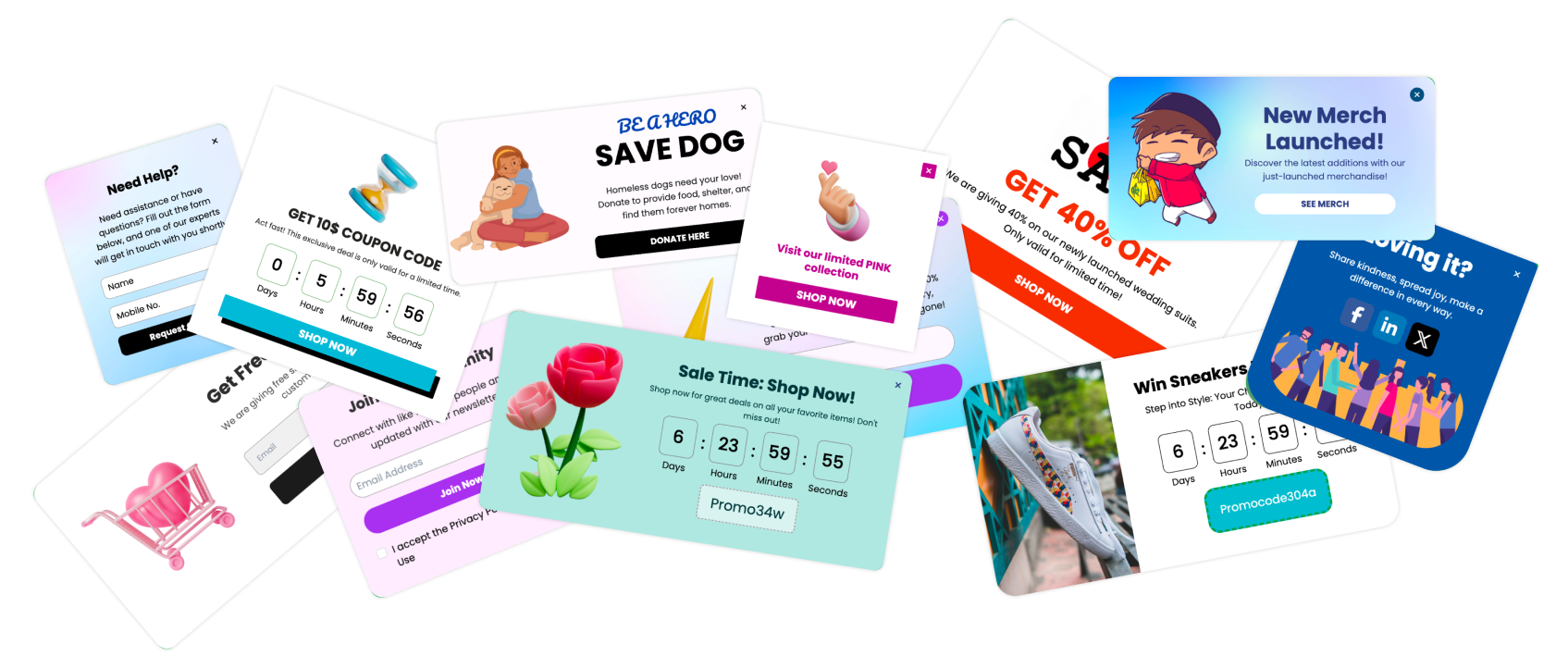
Popup teasers are becoming one of the smartest ways to engage users without disrupting their browsing flow. Unlike intrusive popups that suddenly block the screen, teasers are small, subtle elements — like tiny badges, bubbles, or icons — that sit quietly in a corner until the user chooses to interact with them.
A popup teaser is a small, non intrusive visual element that sits at the edge of a webpage and expands into a full popup only when the user clicks or taps it. Unlike traditional popups that interrupt the browsing flow, teaser popups boost engagement by inviting curiosity and giving users full control over when the interaction happens.
Examples of teaser formats include:
Small corner badges
Floating chat bubbles
Mini discount buttons
Slide up micro bars
Hover based triggers
Why Popup Teasers Matter

Popup teasers have become a vital part of modern onsite engagement because they offer the perfect balance between visibility and subtlety. Instead of interrupting users, teasers wait for user intent. This single shift creates a massive difference in engagement quality, user satisfaction, and conversion rates.
Let’s break down why popup teasers matter more today than ever.
Curiosity Driven Actions
Humans are naturally curious — especially when something feels exclusive, hidden, or rewarding. Popup teasers tap into that instinct with small hints like:
“Unlock your offer”
“See recommendations”
“Tap to save”
“Click to get 10 percent off”
These short cues generate micro curiosity, which leads users to open the popup willingly.
And when a user chooses to open something, they’re far more likely to convert.
Teasers trigger the “What’s inside?” impulse — a powerful driver of engagement.
Better UX and Higher Engagement
Traditional popups interrupt.
Teasers invite.
Inline and floating teasers respect the user’s reading flow by staying out of the way until needed.
Benefits for UX:
No blocked content
No break in reading rhythm
No instant annoyance
No decision fatigue
This results in happier users and improved engagement metrics like:
Lower bounce rate
Longer session time
Higher interaction rate
When users stay in control, website experience feels cleaner and more human.
Perfect for Mobile Users
Mobile users dislike sudden popups more than desktop users because overlays cover the entire screen. Teasers, however, are:
Small
Sticky
Thumb friendly
Easy to tap
Non intrusive
This makes them perfect for mobile first audiences, where attention spans are short and frustration builds fast.
Teasers let mobile users browse freely while still noticing your offer.
Why Teasers Work in Modern, Distraction Free Design
Most modern sites now follow clean, minimal UX.
Popup teasers fit perfectly into this philosophy because they:
Use minimal space
Maintain clean layouts
Blend seamlessly with design
Align with user centered principles
They match the behavior of modern users who:
Expect smooth interactions
Hate interruptions
Want control over their experience
Popup teasers are the evolution of popups — smarter, softer, and far more aligned with today’s UX standards.
How Popup Teasers Work

Popup teasers operate on a beautifully minimal concept: show a tiny, enticing preview that expands into a full popup when the user interacts with it. This makes engagement feel natural, smooth, and user driven.
Here’s exactly how they work behind the scenes.
Floating Badges, Bubbles, and Buttons
The most common type of teaser is a floating element that sits quietly in a low distraction area such as:
Bottom right corner
Bottom center
Side edges
Floating slightly above the footer
These elements may appear as:
Circular discount badges
Chat bubbles
Gift icons
Small CTA buttons
Minimal tabs or labels
They stay visible but unobtrusive, gently nudging the user without demanding attention.
Examples of floating teaser styles:
| Teaser Type | Appearance | Purpose |
|---|---|---|
| Discount bubble | Circular badge with percent off | Opens discount popup |
| Chat bubble | Small message or icon | Opens chat or support |
| Gift icon | Wrapped gift graphic | Opens gamified popup |
| Button teaser | Rectangular CTA | Opens lead form or offer |
This is the foundation of teaser based engagement.
Slide In or Slide Up Teaser Strips
Another powerful format is the slide up teaser — a small bar that appears at the bottom edge of the screen. It doesn’t cover content, just suggests something useful.
Slide in teasers often highlight:
Free shipping
Limited time offers
Lead magnets
Recommendations
Help prompts
Example:
A thin bar slides up with text:
“Get 10 percent off your first order. Tap to reveal.”
Users can ignore it or tap to explore more — full control, zero friction.
How Teasers Expand Into Full Popups
Here’s where the magic happens.
When the user clicks, taps, or hovers (desktop only), the teaser instantly expands into a full popup.
The expansion is usually:
Smooth
Fast
Clean
Micro animated
This transition keeps the experience fluid and delightful.
Expansion examples:
A discount bubble grows into a full offer popup
A chat bubble opens a chat window
A content upgrade teaser reveals a lead form
A gift icon unfolds into a wheel spin popup
The full popup only appears when the user initiates it — which dramatically increases conversion quality.
Trigger Logic: Scroll, Time, Exit, Inactivity
Popup teasers don’t always appear instantly. Smart triggers decide when they show up so they feel perfectly timed.
Common teaser triggers include:
Scroll depth: Only show after the user reaches 30 percent or 50 percent
Time delay: Appear after 5 to 15 seconds of engagement
Inactivity: Show when the user stops scrolling for a moment
Intent signal: Appear when the user moves toward the back button or tab switch
Return visit: Only show teaser to returning users
Key Elements of a High-Converting Teaser

Not all teaser popups are equally effective. The highest converting teasers are designed with simplicity, clarity, and curiosity in mind. They catch the eye without interrupting, spark interest without pressure, and deliver value the moment they’re opened.
Below are the essential ingredients every high performing teaser must have.
Clean Visuals and Minimalism
Teasers work best when they blend with the UI but still stand out enough to be noticed. Avoid clutter, heavy shadows, or large shapes.
A good teaser should be:
Small
Simple
Neatly aligned
Lightweight
Visually calm
Users must feel like the teaser belongs on the page — not like it's trying too hard.
Good examples of minimalist teaser designs:
| Style | Description |
|---|---|
| Small circular badge | Perfect for discounts or rewards |
| Thin sticky bar | Works well for shipping or offers |
| Floating chat bubble | Ideal for support or conversation |
| Tiny icon button | Best for lead magnets or feedback |
Minimalism = higher acceptance and better CTR.
Strong Icon or Micro Visual
The icon is the “visual hook” — it draws the eye and shapes the intent.
Examples include:
Gift box (great for gamification)
Tag with percentage symbol (for discounts)
Bell icon (notifications or reminders)
Message bubble (for chat or announcements)
Star icon (for reviews and NPS)
Icons help users know exactly what to expect when they click.
Tip: Use icons that match your brand style for consistency.
Value Hint Text
Your teaser needs a short, powerful hint that tells the user why they should click.
Examples of strong value hint text:
“Tap to save”
“Get offer”
“Unlock discount”
“See recommendations”
“Download guide”
“Need help?”
Value hints work because they promise a reward without being pushy.
Smooth Opening Animation
The transition from teaser → full popup should feel modern and elegant.
No harsh jumps or slow animations.
Ideal animations:
Quick fade
Soft zoom in
Slide up
Scale expansion
This makes the interaction feel intentional and premium.
11 Best Popup Teasers (With Real Examples)
Popup teasers come in many forms — each designed to serve a specific purpose, audience, or moment in the user journey. Below are the 11 best high converting popup teasers, along with real world examples and ideal use cases so you can apply them instantly.
1. Discount Teaser Badge

A small floating badge that shows a percent off, coupon, or limited time offer.
Why it works:
Users love deals, but they don’t want aggressive interruptions. A subtle discount teaser lets them explore the offer when they choose.
Teaser example:
A small bubble reading “Get 10 percent off” sits at the bottom right.
When clicked, it opens a full popup with a coupon code.
Best for:
Ecommerce, D2C brands, seasonal promotions.
2. Free Shipping Teaser

A subtle sticky bar or badge suggests a free shipping offer — one of the strongest motivators in ecommerce.
Teaser example:
A bottom strip:
“Enjoy free shipping today. Tap to see details.”
Clicking expands into full eligibility terms or a limited time countdown.
Best for:
Any online store with a shipping threshold or free shipping campaign.
3. Lead Magnet Teaser

Ideal for blogs and content heavy sites.
A tiny teaser invites users to download a useful resource.
Teaser example:
A floating bubble saying:
“Download the free guide”
Opening the full popup reveals:
PDF
Checklist
Workbook
Toolkit
Ebook
Best for:
Blogs, SaaS content marketing, coaching, education.
4. Product Recommendation Teaser

A teaser that opens a personalized suggestion popup.
Teaser example:
A button labeled:
“See recommendations”
Upon clicking, users see personalized products based on browsing behavior.
Best for:
Ecommerce, marketplaces, fashion, electronics.
5. Recently Viewed Items Teaser

Perfect for returning users or visitors comparing multiple products.
Teaser example:
A small tab:
“Your viewed items”
Opening it reveals items they previously checked.
Best for:
Stores with high comparison behavior like fashion, furniture, electronics.
6. Cart Abandonment Teaser

This teaser appears when users show exit intent or pause near the top of the page.
Teaser example:
A small bubble:
“Your cart has 2 items”
Clicking opens an incentive popup like:
Extra discount
Free shipping
Reminder
Add ons
Best for:
Ecommerce with high cart abandonment rates.
7. Gamified Teaser (Wheel / Giftbox)
")
One of the most engaging teaser types.
A gift or wheel icon hints at a fun reward.
Teaser example:
A glowing gift icon labeled:
“Tap to try your luck”
Opens a spin the wheel popup offering:
Discounts
Free gifts
Prizes
Coupons
Best for:
Fashion, beauty, consumer brands, festive sales.
8. NPS or Feedback Teaser

A small icon invites users to rate their experience or submit feedback.
Teaser example:
A smiley icon saying:
“Rate your visit”
Opening reveals a full NPS survey or feedback form.
Best for:
SaaS platforms, service sites, dashboards, support pages.
9. Chat / Support Teaser

The classic but essential teaser — a chat bubble that opens live chat or support.
Teaser example:
A message icon reading:
“Need help?”
Opens:
Live chat
Bot support
FAQ popup
Contact form
Best for:
SaaS, ecommerce, finance, travel, education.
10. Social Proof Teaser

A teaser that hints at real user activity.
Teaser example:
A small toast or badge:
“200 people bought this today”
Clicking opens full social proof details.
Best for:
High velocity or trending products.
11. Content Upgrade Teaser

Perfect for blog posts.
It appears as a small teaser offering a bonus related to the content.
Teaser example:
“Get the PDF version of this article”
Opening reveals a popup offering the downloadable file.
Best for:
Blogs, marketing sites, coaching, email list building.
Design Best Practices

Popup teasers must be designed with precision. Since they rely on subtlety, the way they look and behave dramatically affects whether users engage or ignore them. Great teaser design blends visibility with elegance, ensuring users feel invited, not interrupted.
Below are the core design principles that make popup teasers high converting and user friendly.
Minimal, Non Intrusive Designs
Teasers should be visually light. Their entire purpose is to stay subtle until the user chooses to interact.
Design rules:
Small size
Simple shapes
Clean edges
Minimal text
No distracting animations
Avoid:
Large floating boxes
Blinking icons
Heavy drop shadows
Colors that clash with your site
The goal is to spark curiosity — not demand attention.
High Contrast Icon or Badge
Even though teasers are subtle, they must still stand out enough to be noticed instantly. High contrast helps achieve that without making the teaser intrusive.
Good examples:
White icon on a dark bubble
Bright badge on a muted page
A clean outline icon with subtle glow
Contrast ensures visibility without breaking design harmony.
Consistent Branding
A teaser should feel like an extension of your website, not a foreign widget.
Brand matching elements:
Colors
Font family
Icon style
Button shapes
Micro animations
When teasers match your brand, they build trust and look more professional.
Avoid Overlapping Navigation or CTAs
Placement is everything. If your teaser appears over:
A chat widget
A cookie banner
A floating CTA
Bottom nav bar (mobile)
…it instantly becomes annoying.
Use placement logic like:
Bottom right for desktop
Bottom center for mobile
Side left for blogs
Inline positioning for content upgrades
Poper allows custom placements to avoid conflicts.
Mobile Friendly Sizing
Mobile users have less screen space and higher sensitivity to interruptions.
Your teaser must be:
Small
Thumb friendly
Non blocking
Responsive
Lightweight
Best mobile formats:
Small circular badge
Thin sticky bar
Mini icon teaser
Tiny tab on the side
Good mobile design = higher engagement and lower frustration.
Why Good Design Matters
A well designed teaser:
Attracts clicks without being loud
Boosts curiosity
Preserves UX flow
Feels native and trustworthy
Increases conversions naturally
Teasers are “micro UI elements.” Their small size makes every design detail extremely important.
How to Create Popup Teasers in Poper
Building popup teasers inside Poper is simple and highly customizable. Whether you want a discount badge, a help bubble, a content upgrade teaser, or a gamified teaser, Poper gives you full control over design, behavior, and targeting.
Here’s a step by step guide to creating high converting teaser popups in Poper.
Step 1: Log In to Poper.ai
Start by signing in to your Poper.ai account and accessing your dashboard. Click “Create Popup” to begin designing your Teaser popup.
Step 2: Choose a Teaser Enabled Template
Poper offers templates built specifically for teaser style engagement.
These templates support:
Floating badges
Sticky teaser bars
Icon based micro teasers
Slide up or slide in teaser triggers
Select a template based on your goal:
Lead magnet
Discount popup
Product recommendations
Feedback form
Gamification popup
Chat or support popup
Step 3: Customize the Icon, Badge, or Bubble
Your teaser’s visual cue is the first thing users notice.
Inside Poper’s editor, you can customize:
Enable the teaser.
Icon (gift, discount tag, chat bubble, star, etc)
Shape (circle, rounded square, bar, tab)
Size
Color
Border style
Placement (corner, bottom center, side left)
Step 4: Add the Full Popup Content
When users click the teaser, the real value is revealed.
This is where you set up the full popup layout.
Options include:
Discount or coupon popup
Lead capture form
Product recommendations
Social proof popup
NPS feedback form
Help and support popup
Gamified popup (wheel or mystery box)
You can fully customize content, images, colors, CTAs, and branding.
Step 5: Set Scroll and Behavior Triggers
Poper allows advanced behavior targeting to ensure your teaser appears at the right moment.
Trigger types include:
Scroll depth (ex: show after 40 percent)
Time on page (ex: after 10 seconds)
Inactivity
Exit intent
On specific pages only
On mobile or desktop only
New vs returning visitors
Based on UTM parameters
These triggers make your teaser feel smart and perfectly timed.
Step 6: Publish and Test Across Pages
When your teaser is ready, publish it with a single click.
Test how it appears on:
Homepage
Product pages
Blog posts
Checkout pages
Mobile screens
Tablets
Different browsers
Small adjustments (like sizing or placement) can greatly improve performance.
Step 6: Track Performance in Poper Analytics
Poper gives real time performance insights for every teaser.
You can track:
Teaser views
Teaser clicks (open rate)
Full popup conversions
CTR
Engagement time
Device based performance
Page level performance
You can also run A/B tests to improve:
Teaser designs
Icon choices
Value hints
Popup layouts
Timing logic
CTA copy
This ensures your teasers constantly improve and convert at higher rates.
Common Mistakes to Avoid
While popup teasers are one of the most user friendly engagement tools, misusing them can make them feel distracting, confusing, or ineffective. Avoiding these mistakes ensures your teasers stay subtle, helpful, and high converting.
Here are the most common errors brands make — and how you can prevent them.
Making the Teaser Too Big
A teaser should never look like a mini popup.
Oversized teasers kill the subtlety that makes them effective.
Avoid:
Large rectangles
Huge icons
Teasers that cover content
Obvious “ad like” designs
Remember:
The teaser should gently whisper “click me,” not shout it.
Using Unclear or Confusing Icons
Icons are the strongest visual cue in teaser design.
If the icon doesn’t make sense, users will ignore it.
Avoid:
Random symbols
Icons with no meaning
Decorative shapes that don’t imply value
Good icon choices:
Tag symbol → discount
Gift → surprise reward
Document → lead magnet
Message bubble → chat
Star → feedback
Bell → announcement
Clarity drives clicks.
Showing Too Many Teasers on One Page
Multiple teasers create clutter and overwhelm the user.
Choose one primary goal per page.
Examples to avoid:
Two discount teasers
A chat teaser + a feedback teaser + a recommendation teaser
Stacking badges in one corner
Best practice:
One teaser per page (max two if absolutely necessary).
Weak Benefit Messaging
A teaser without a clear value hint won’t get clicked.
Examples of weak messages:
“Click here”
“Open me”
“More info”
Strong value based messages:
“Get 10 percent off”
“Download free PDF”
“See recommended products”
“Rate your experience”
Clear value = higher engagement.
Not Optimizing for Mobile
On mobile, space is limited. Bad teaser design can block navigation or overlap key CTAs.
Avoid:
Large teaser bars
Full width badges
Icons that cover product images
Teasers placed near bottom nav bars
Best mobile placements:
Bottom center sticky bar
Bottom right floating bubble
Small corner badge
Overly Aggressive Animations
Animations should be smooth, subtle, and quick.
Avoid:
Flashing
Pulsing
Shaking
“Jumping” motions
Excessive glowing
Instead use gentle:
Fade in
Slide in
Soft scale up
This preserves the calm, user controlled feel.
Measuring Performance
To maximize the impact of popup teasers, you need to analyze how users interact with them and optimize based on real data. Teasers may look small, but their performance insights are incredibly powerful. With the right metrics and testing, you can turn a tiny teaser into a conversion engine.
Here’s exactly what to measure and how to optimize teaser performance over time.
Track Open Rate, CTR, and Conversions
Teasers have two layers of performance:
Teaser open rate
Popup conversion rate
Track both to understand the full story.
1. Teaser Open Rate
How many users clicked or tapped the teaser.
A high open rate means:
Good icon
Strong value hint
Proper placement
Good curiosity design
2. Popup CTR (Click Through Rate)
Actions taken inside the expanded popup.
3. Final Conversion Rate
Percentage of visitors who completed the goal (signup, purchase, form submission).
Together, these metrics show how well your teaser attracts AND converts.
Use Heatmaps to Identify the Best Placement
Heatmaps reveal where users:
Scroll
Slow down
Click
Hover
Drop off
For teasers, placement is crucial.
A heatmap helps you decide:
Which corner has highest visibility
Whether to place the teaser bottom right or bottom center
Whether mobile users interact more with a sticky bar
Whether content heavy pages need an inline teaser
Better placement = higher open rate.
Run A/B Tests on Icons, Copy, and Triggers
Small variations can make huge improvements.
A/B test:
Visuals:
Icon style
Shape (circle vs rounded square)
Size
Color
Copy:
“Get offer” vs “Unlock offer” vs “Tap to save”
Discount value
Lead magnet message
Triggers:
Appearing after 5 sec vs 10 sec
Showing after 20 percent scroll vs 40 percent
Desktop only vs mobile first
Example result:
Changing “Get discount” to “Tap to save 10 percent” increased open rate by 23 percent.
Analyze Device Level Performance
Teasers behave differently on desktop vs mobile.
On desktop:
Users notice floating teasers more
Hover based teasers may perform better
On mobile:
Sticky bottom bars outperform corner badges
Teaser size matters more
Simple icons convert better
Review device performance separately to identify optimization opportunities.
Monitor Engagement Time Around Teasers
This tells you whether users slow down near the teaser area or scroll past quickly.
If users skip the teaser without noticing, try:
Adjusting color contrast
Changing the icon
Slightly increasing size
Moving to a different position
If users hover or pause near the teaser but don't click:
Improve the value hint text
Increase clarity
Adjust the message to feel more helpful
Use Poper Analytics for Real Time Insights
Inside Poper, you can track:
Teaser impressions
Teaser clicks
Popup opens
Final conversions
Page performance
Device breakdown
Audience segmentation
A/B test results
These insights help you fine tune your teaser for maximum conversions.
FAQs
What is a popup teaser?
A popup teaser is a small visual element like a badge, bubble, or icon that sits on a webpage and expands into a full popup only when the user clicks or taps. It boosts engagement without interrupting browsing.
Are teaser popups better than regular popups?
Yes. Teasers outperform traditional popups because they give users full control, reduce frustration, and increase conversion quality. They feel natural and user friendly.
Do popup teasers work on mobile?
Absolutely. Teasers are one of the most mobile friendly engagement tools. They take minimal screen space, are easy to tap, and don’t disrupt the experience.
