

“The best user experience is the one that never breaks a user’s flow.”
Inline popups are transforming how websites engage visitors by offering contextual, helpful, and truly non-intrusive interactions. Instead of appearing as overlays that cover the screen, inline popups blend naturally into the page — becoming part of the reading or shopping experience rather than interrupting it.
Inline popups are embedded engagement elements that appear naturally within a webpage’s content instead of blocking the screen like traditional popups. They enhance user experience by providing context-aware messages, product suggestions, or signup options right inside the flow of the page, making engagement effortless, seamless, and distraction free.
Inline popup example placements:
| Inline Position | Ideal Use Case |
|---|---|
| Inside blog paragraph | Newsletter CTA or recommended tools |
| Below product title | Similar or complementary product boxes |
| During checkout | Reassurance messages or add-ons |
| Inside onboarding screens | Feature tips or guidance |
Why Inline Popups Work

Inline popups are effective because they align with how users naturally browse. Instead of appearing suddenly or blocking the screen, they slip into the reading path like a natural part of the page. This subtlety creates trust, boosts engagement, and keeps users from feeling pressured.
Let’s explore why inline popups consistently outperform traditional overlays in terms of user satisfaction and conversions.
The Psychology Behind Non Interruptive Engagement
Inline popups work because they respect human attention. Users dislike being stopped abruptly, especially when they’re deeply focused. Traditional popups break concentration and trigger resistance.
Inline popups, on the other hand:
Work with user attention, not against it
Show up naturally inside content that users already trust
Feel like suggestions, not interruptions
This creates a sense of voluntary engagement, which leads to higher conversions and lower annoyance.
How Inline Elements Follow Natural Scroll Patterns
Inline popups appear as a user scrolls, meaning they fit into the natural momentum of browsing. Users engage more when they have already shown intent by scrolling or spending time on a page.
Inline popups appear:
After a specific scroll depth
Between content sections
After the user reaches high-intent zones (product details, pricing, long reads)
This makes engagement feel perfectly timed.
Example:
A user reads a blog post about “email marketing.” Halfway through the article, an inline popup appears:
“Want 10 ready-to-use email templates? Download now.”
Key Benefits of Inline Popups
Inline popups have become one of the most powerful engagement tools because they combine usability and conversion in a way that feels natural. Unlike overlays that grab attention aggressively, inline popups guide users gently, helping them take action without leaving their browsing flow.
Below are the core benefits that make inline popups a game changer for modern websites.
Enhance UX with Embedded, Content-Aligned CTAs
Inline popups fit directly into the layout of a page, so they never feel intrusive. They appear where the user is already paying attention — inside sections that matter.
This makes engagement feel:
Smooth
Relevant
Context-aware
Helpful rather than salesy
Inline popups act like supportive suggestions inside the content users are consuming.
Example:
In a blog about skincare routines, an inline popup showing
“Recommended moisturizers for dry skin”feels natural and valuable.
Improve Conversions Without Interrupting the User Journey
Inline popups convert better because users approach them willingly. They don’t interrupt or demand immediate action. Instead, they sit within the browsing flow and allow users to act when they’re ready.
This leads to:
Higher click-through rates (CTR)
Better engagement quality
Longer session durations
Lower bounce rates
Since they don’t block anything, users don’t rush to close them — they actually read them.
Mobile-Friendly and SEO-Safe
Inline popups are inherently mobile-friendly because they don’t take over the screen. They scale smoothly across devices and adjust to the content flow.
Mobile benefits include:
No intrusive overlays
No blocked navigation
Perfectly aligned with scroll behavior
Faster load and better core web vitals
How Inline Popups Function

Inline popups work because they behave like native elements on your page. Instead of appearing as overlays, they are embedded directly inside the content structure, making interactions smooth, natural, and context driven.
To understand their power, let’s break down exactly how inline popups operate behind the scenes.
Inline Placement Inside Content Blocks
Inline popups are inserted within the page layout itself. They sit between paragraphs, below headings, or inside product sections.
This placement makes engagement feel natural because users encounter them while consuming content, not when forced to pause their browsing.
Examples of inline placements:
| Inline Position | When It Works Best |
|---|---|
| Between paragraphs | Blog posts and long guides |
| Below product description | Upsells and recommendations |
| Midway in pricing pages | Feature highlights or savings prompts |
| Inside onboarding steps | Tooltips and feature instructions |
This layout-focused approach is the core reason inline popups feel like part of the content experience, not a distraction.
Trigger Logic: Scroll Depth, Engagement Time, and Page Context
Inline popups are often displayed based on real user behavior. Instead of appearing instantly, they show only after certain signals, such as:
Reaching a specific scroll depth
Spending time on a section
Pausing during reading
Entering high-intent zones
Finishing a part of content
These triggers ensure that the popup feels timely and relevant.
Example:
At 40 percent scroll, an inline popup appears in a blog:
“Download a PDF version of this guide.”
5 Types of Inline Popups
Inline popups aren’t one-size-fits-all. They come in different formats depending on the goal — lead generation, product promotion, feedback collection, or social proof.
What makes inline popups so effective is how each type blends into the user’s journey without breaking flow.
Let’s explore the most powerful types of inline popups you can use to elevate engagement, conversions, and user experience.
1. Inline Signup or Newsletter Forms

These forms appear naturally inside blog posts, guides, or resource pages, making them perfect for capturing leads without forcing a decision.
Why they work:
They show at the exact moment user interest is highest
They feel like part of the content
They encourage frictionless signups
Example:
After a helpful blog section, an inline form appears:
“Enjoying this guide? Get more tips in your inbox.”
2. Inline Product Recommendation Blocks

These popups help users discover more relevant items — especially on product pages, category pages, and shopping guides.
Common recommendation styles include:
“You may also like”
“Frequently bought together”
“Best sellers in this category”
“Complete the look”
Why they’re powerful:
Users browsing product content already show buying intent. Inline recommendations increase AOV and conversions without overwhelming them.
3. Inline NPS or Feedback Boxes

Perfect for SaaS, apps, and service-based businesses.
These popups allow visitors to leave quick ratings or feedback without leaving the page.
Best use cases:
Onboarding flows
Help center articles
Feature pages
Pricing sections
Example prompt:
“Was this page helpful? Rate your experience.”
This makes feedback effortless, boosting response rates significantly.
4. Inline Discount or Offer Sections

Instead of flashing discounts on the screen, inline offers appear subtly inside content blocks, increasing trust.
Examples of inline offers:
“Get 10 percent off this bundle”
“Limited time deal on the tools mentioned above”
“Special offer for readers of this guide”
Why they convert well:
Users don’t feel manipulated — they feel rewarded at the right moment.
5. Inline Social Proof Elements

These help build trust and credibility by showcasing real reviews, testimonials, or purchase activity directly inside relevant sections.
Examples:
Customer testimonials
Star rating blocks
“Recently purchased” notifications
“Trusted by 10,000 users” badges
Placed inside product or pricing pages, these inline elements dramatically reduce hesitation and bounce rates.
Summary Table: Types of Inline Popups
| Type | Primary Goal | Best Placement |
|---|---|---|
| Inline Signup Forms | Lead generation | Blogs, guides, resources |
| Product Recommendations | Sales and AOV | Product pages, categories |
| Inline Feedback Boxes | UX improvement | SaaS pages, help docs |
| Inline Offers | Boost conversions | Landing pages, mid-article |
| Social Proof Elements | Build trust | Pricing, product, checkout |
Best Use Cases
Inline popups work best when strategically placed in moments where users are already engaged, curious, or close to making a decision. When aligned with intent, they guide users naturally and deliver maximum value — all without breaking flow.
Below are the most effective use cases where inline popups consistently improve conversions, lead generation, and user experience.
Blog Posts and Content Pages to Convert Readers
Blogs are one of the best places to use inline popups because readers are already invested in the content. Inline elements help capture attention without interrupting their reading rhythm.
Great inline popup types for blogs:
Newsletter signup forms
Content upgrades (PDFs, templates, checklists)
Product or tool recommendations
Social proof snippets
Example:
After a section in a marketing guide:
“Want the full version with worksheets? Download it here.”
This feels like a natural bonus, not an interruption.
Product Pages to Suggest Similar or Related Items
Inline recommendations on product pages help users discover more items while they’re actively exploring a product.
Examples:
“Frequently bought together”
“You might also like”
“Top rated in this category”
“Customers also viewed”
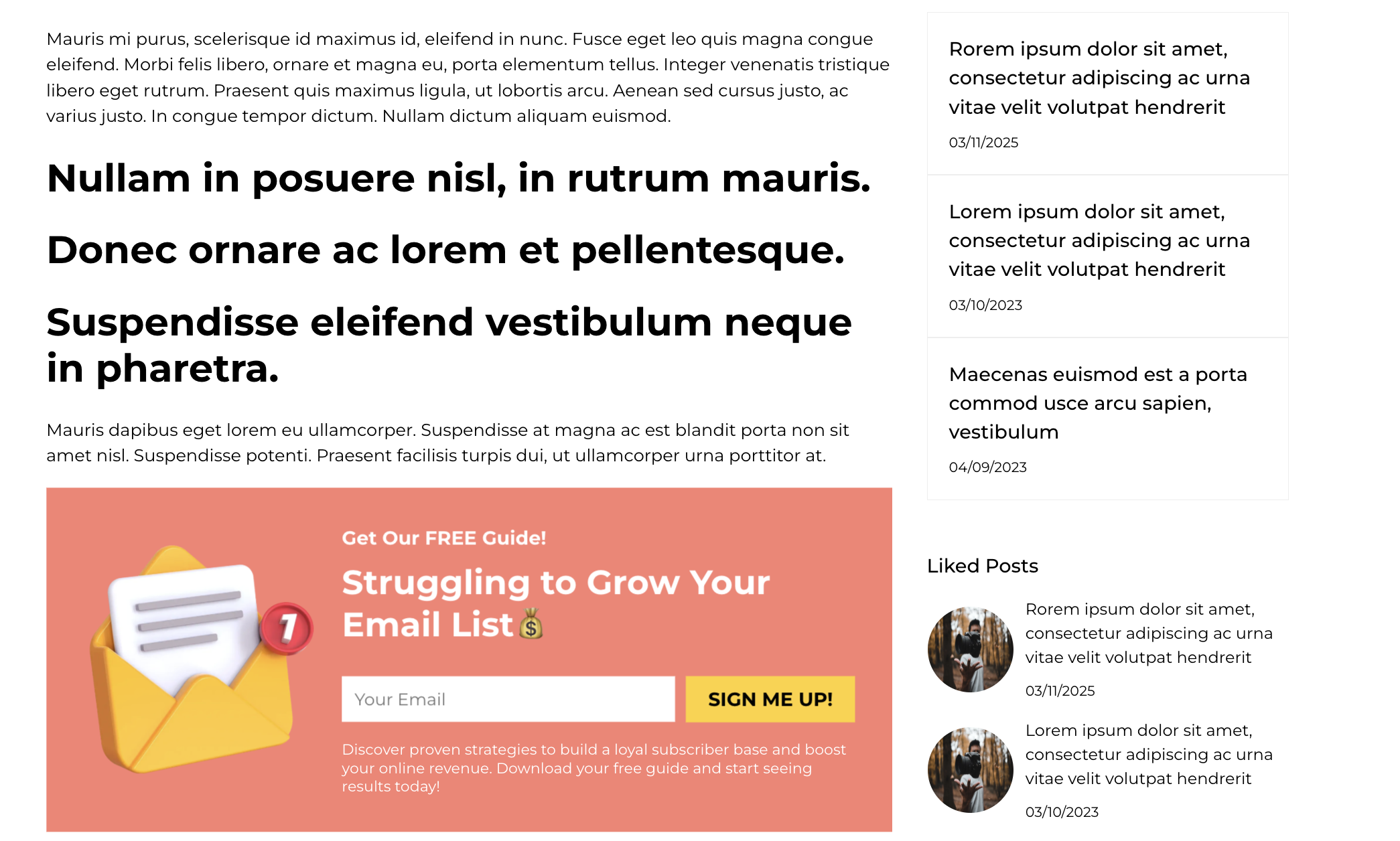
How to Create Inline Popups in Poper
Creating inline popups inside Poper is simple, intuitive, and entirely no code. Whether you want to add inline signup forms, product recommendations, offers, or social proof, Poper gives you complete control over design, behavior, and personalization.
Here is a clear, step by step guide on how to create high converting inline popups inside Poper.
Step 1: Log In to Poper.ai
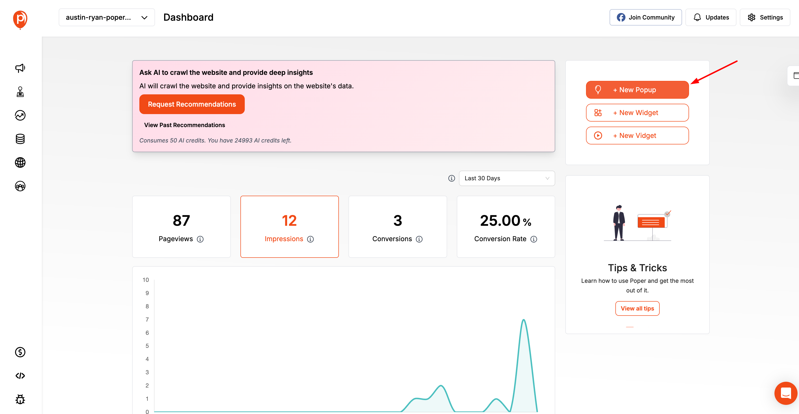
Start by signing in to your Poper.ai account and accessing your dashboard. Click “Create Popup” to begin designing your Inline popup.
Step 2: Choose an Template
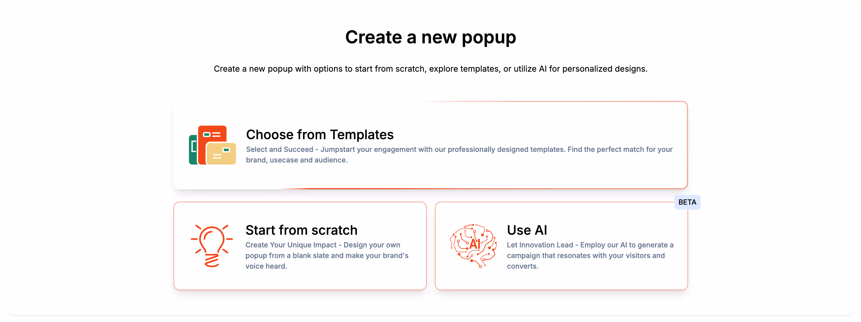
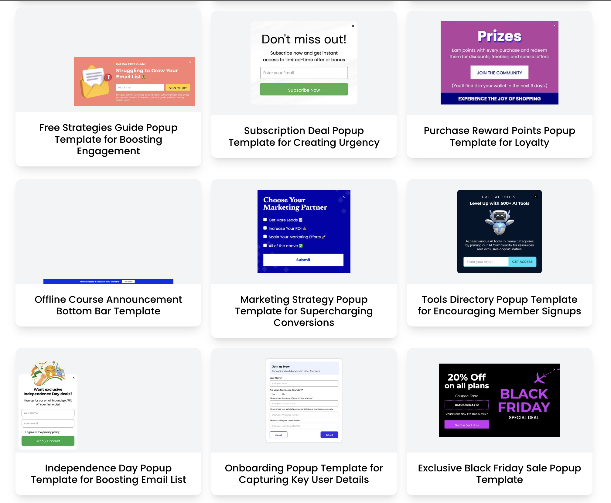
Poper offers ready-made templates that can be used as embedded inline elements within your website content. You can choose from templates such as:
Forms
Product boxes
Testimonials
Offers
NPS or feedback boxes
Each template is structured to fit naturally inside your site layout.
Step 3: Convert it to an inline popup
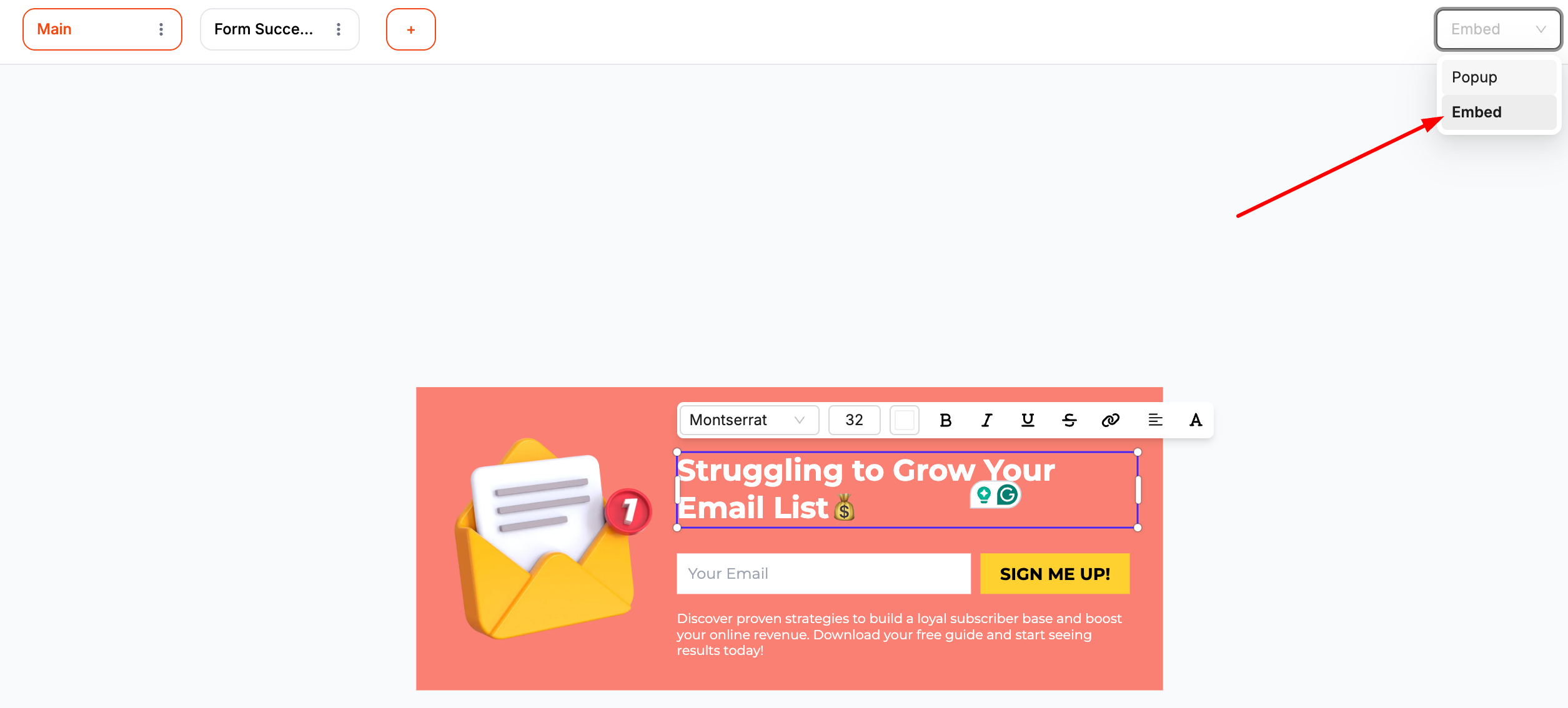
After selecting a template, in the top-right corner of the editor, you will find an option that allows you to switch formats. To turn the template into an inline embed, simply click the dropdown and select “Embed.”
Step 4: Customize the Layout, Colors, and Text
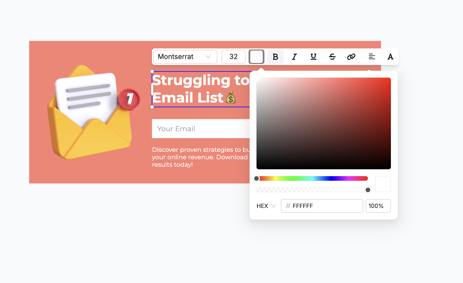
Once you select the template, Poper lets you customize every element without coding.
You can adjust:
Font style and sizes
CTA button text
Colors and background
Borders and spacing
Product images or visuals
Icons and small graphic elements
This ensures your inline popup looks native, not forced.
Step 5: Choose Your Embed Position
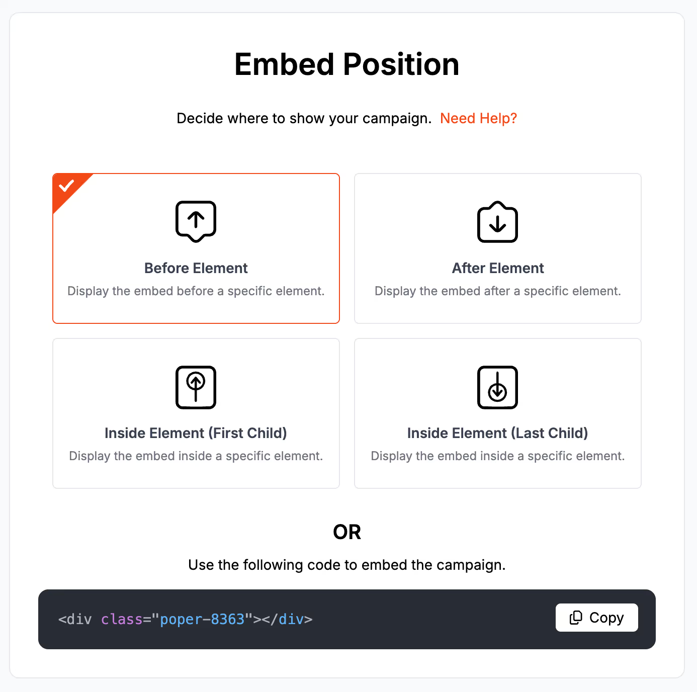
You can choose exactly where the campaign should appear on your page. Poper provides multiple placement options:
Before Element – Displays the embed before a specific element on your page.
After Element – Displays the embed after a specific element.
Inside Element (First Child) – Inserts the embed as the first child within a chosen element.
Inside Element (Last Child) – Inserts the embed as the last child within that element.
You can select whichever placement fits best with your content.
Alternatively, you can copy the provided embed code snippet and manually place it anywhere in your site’s HTML:
<div class="poper-XXXX"></div>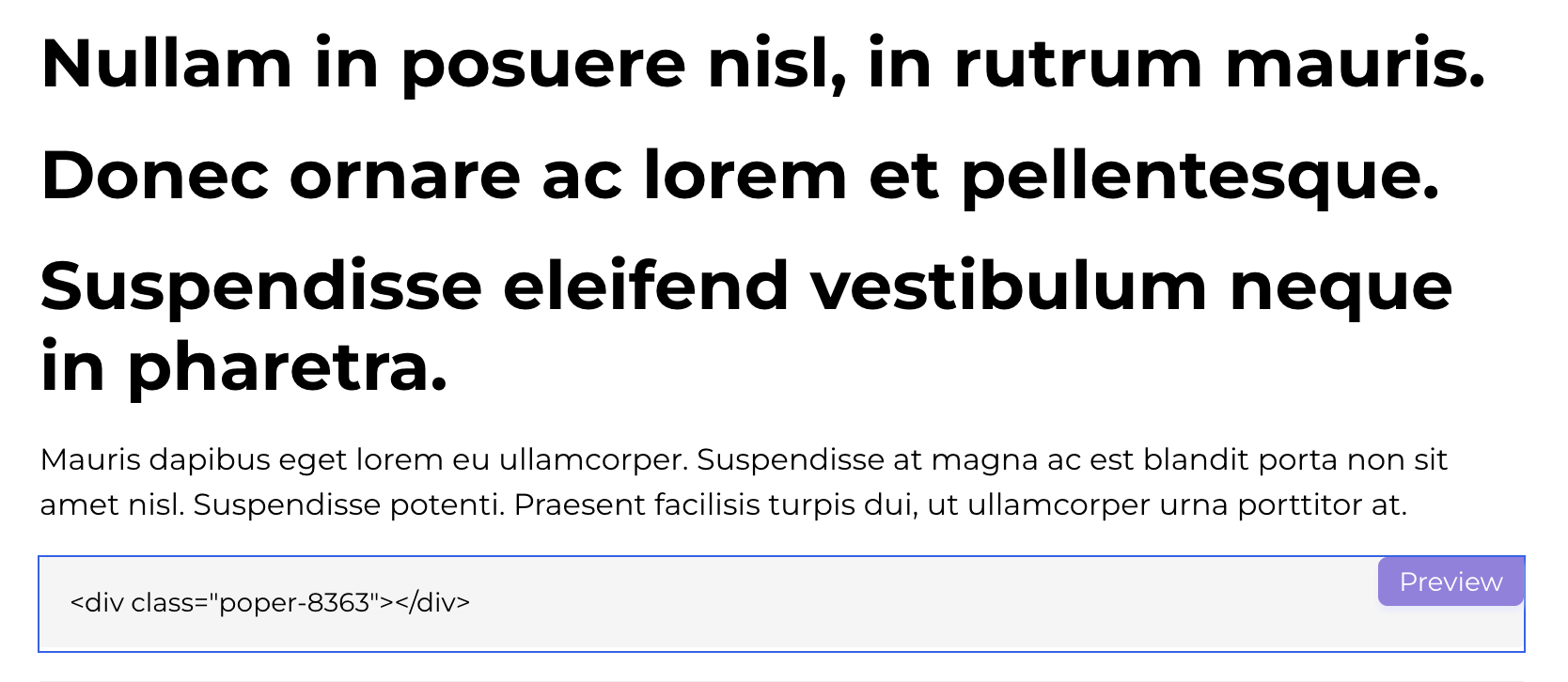
This gives you full control over exactly where the campaign should appear.
Step 6: Add Personalization (Optional but Powerful)
Inline popups become incredibly effective when personalized.
Inside Poper, you can add dynamic elements such as:
Recently viewed products
Category based recommendations
Personalized greetings
Location relevant offers
Return visitor messages
Example:
If a user previously viewed shoes, the inline popup can show:
“Recommended for you based on what you viewed earlier.”
This is where inline popups feel truly smart.
Step 7: Publish and Embed Into Your Page
Once everything looks perfect, publish the popup and place it inside your content.
You can:
Embed inline popups inside your blog posts
Insert them into product descriptions
Add them between sections on landing pages
Place them in tutorials or onboarding screens
Step 8: Track Performance Inside Poper Analytics
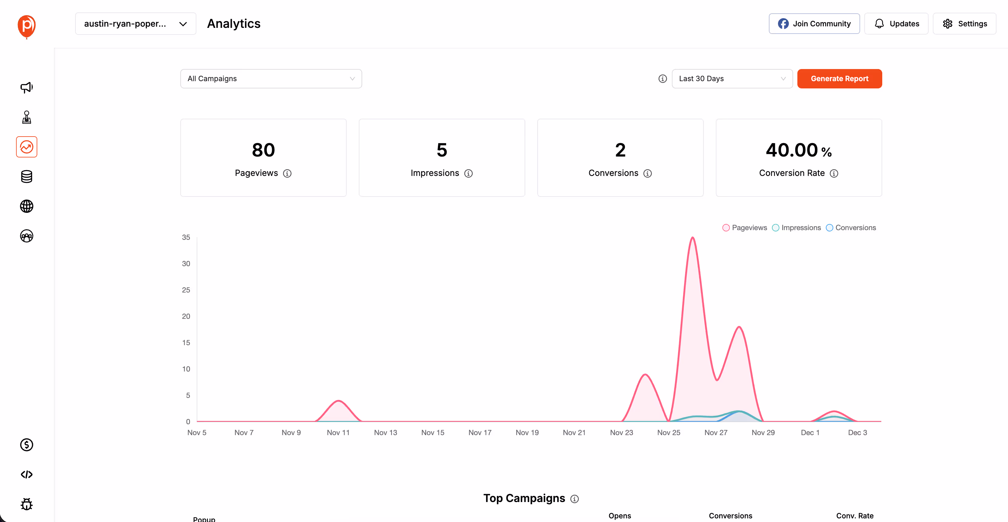
Every inline popup automatically tracks:
Views
Clicks
CTR
Engagement time
Placement performance
You can see what is working and optimize it further.
You can also A/B test:
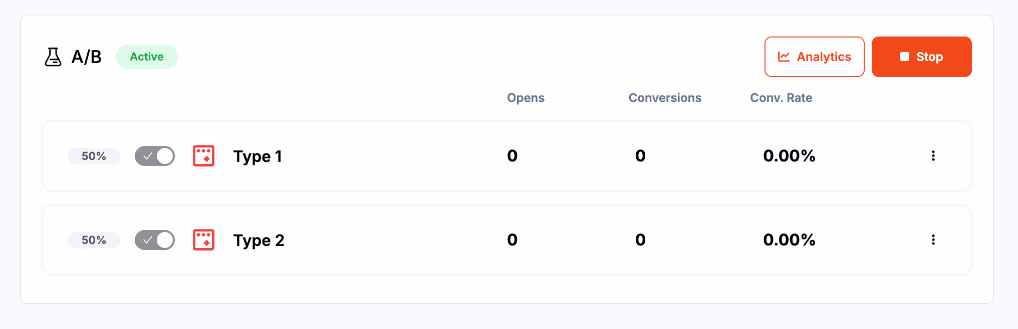
Copy
CTA style
Layout
Triggers
Visuals
Common Mistakes to Avoid
Inline popups are powerful because they feel natural and non intrusive. But if misused, they can easily lose their charm and end up harming the user experience rather than enhancing it. To ensure your inline popups always perform at their best, avoid these common mistakes.
Adding Too Many Inline Popups on a Single Page
Inline popups are subtle, but placing too many in one page ruins that subtlety.
Too many inline elements create visual clutter and make the content feel heavy or sales driven.
Avoid:
Adding one after every few paragraphs
Stacking multiple recommendations together
Overloading product pages with unrelated suggestions
Better approach:
Use one or two strategically placed inline popups that feel natural and valuable.
Poor Placement That Disrupts Reading Flow
Inline popups must feel like a smooth part of the content.
Placing them abruptly or in awkward positions can break the reading rhythm.
Worst placement examples:
Right after a headline
In the middle of a sentence or tight paragraph
Between two related product specs
Before the user has shown interest
Best placement examples:
After a section break
After a clear pause in content
Below product descriptions
Midway through longer articles
Placement is everything for inline popups — the right spot makes them irresistible.
Unclear or Weak CTAs
Even if users notice your inline popup, they won’t take action unless the CTA is:
Direct
Clear
Value focused
Easy to understand
Avoid vague CTAs like:
“Submit”
“Click here”
“Continue”
Use friendly and benefit oriented CTAs like:
“Download the checklist”
“Get the discount”
“See similar products”
“Save my spot”
Good CTAs guide users, not confuse them.
Mismatch With Website Branding
Inline popups should look like they belong to your site.
A common mistake is using designs that clash with your fonts, colors, or content style.
Problems caused by poor branding:
Lower trust
Reduced professionalism
Broken visual harmony
Less engagement
Always match your inline popup with your brand identity:
Same font family
Same color palette
Similar spacing
Matching icons or product images
This consistency builds trust instantly.
Treating Inline Popups Like Overlays
Inline popups are meant to be calm and blended.
Adding heavy animations, huge graphics, or aggressive colors turns them into mini overlays — defeating the purpose.
Avoid:
Flashy borders
Loud animations
Oversized CTAs
Full width blocks that dominate the screen
Keep them elegant and light.
Not Testing or Updating Inline Popups
Many brands set up inline popups once and never revisit them. This leads to stagnation and performance drop.
You should regularly test:
Different designs
Placement variations
New offers
Updated CTAs
Seasonal content
Audience based personalization
Small changes can significantly increase CTR and conversions.
Frequently Asked Questions
Are inline popups better than traditional popups?
Yes. Inline popups keep the page experience intact by blending into content, avoiding interruptions, and offering value in a natural, user friendly way.
Do inline popups impact SEO?
Inline popups are SEO safe because they do not block content or cover the screen. Google only penalizes intrusive overlays, not clean embedded elements.
Can inline popups show product recommendations?
Absolutely. They’re perfect for showing related items, bundles, trending products, or personalized suggestions based on user behavior.
Are inline popups suitable for mobile users?
Yes. They adapt beautifully to mobile because they don’t interrupt the screen. With responsive design, inline popups feel native on smaller devices.
How do I track the performance of inline popups?
Use analytics tools like Poper to track views, clicks, engagement, scroll depth, conversions, and A/B test results. Heatmaps also help reveal ideal placement.