
Sometimes, a smaller ‘yes’ is far more valuable than a complete ‘no.’ That’s the real magic of a downsell.
When visitors abandon their carts or exit your website without completing a purchase, it doesn’t always mean they’re uninterested — sometimes, they just need a better reason to stay. Downsell popups are that gentle nudge — the final, persuasive touch that can turn hesitation into conversion.
If you’ve ever seen a popup offering a discount, a smaller package, or an extended trial right when you’re about to leave a page, that’s a downsell popup in action. It’s not about hard-selling — it’s about smart-selling.
Downsell popups are targeted messages that appear when users hesitate to purchase or are about to leave your site. Their goal is simple: convert a “no” into a “maybe” or “yes” by presenting a slightly less demanding offer.
For example, if a customer rejects a $49 plan, a downsell popup might offer a $29 starter version or a 10% discount to keep them engaged. This approach keeps users within the funnel, even if at a smaller price point, rather than losing them completely.
The Purpose and Psychology of Downselling

A downsell isn’t about selling cheaper; it’s about selling smarter. When a visitor decides not to buy, it doesn’t always mean they don’t want your product — it could mean your offer doesn’t yet align with their current mindset, need, or price comfort. This is where downsell popups come in. They bridge the gap between interest and conversion by understanding the psychology behind hesitation.
Turning “No” into “Yes”
When a user is about to exit, they’re typically saying:
“I’m not sure yet.”
“This seems too expensive.”
“Maybe later.”
A downsell popup gives them a reason to reconsider, right before they’re gone.
For instance:
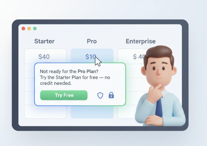
A SaaS platform might trigger a popup saying: “Not ready for the Pro plan? Try our Starter plan for free — no credit card needed.”
An e-commerce site could show: “Hey, take 10% off before you go. It’s on us!”
These subtle moments of persuasion often make the difference between losing a visitor and gaining a customer.
Why it works:
Downsells take advantage of micro-moments — those split seconds when users are emotionally engaged but logically hesitant. A small nudge, like a better price or lighter commitment, helps convert that emotional interest into a confident “yes.”
| User Intent | Perceived Barrier | Downsell Solution |
|---|---|---|
| Interested but unsure | Price seems high | Offer smaller plan or discount |
| Comparing options | Overwhelmed by features | Present a simpler version |
| Hesitant to commit | Fear of risk | Provide trial or money-back guarantee |
When to Use Downsell Popups
Even the most beautifully designed popup won’t convert if it appears at the wrong time. The true power of a downsell popup lies not only in what it says — but when it says it. The goal is to catch users in that perfect decision window, right before they leave or abandon their purchase.
Let’s explore the ideal moments to trigger downsell popups and how timing impacts conversion.
Exit-Intent Triggers

An exit-intent downsell popup activates when the system detects that a visitor’s cursor is moving toward the close or back button. This moment — often just 1–2 seconds before they leave — is your last chance to re-engage them.
For example:
A popup that says, “Wait! How about 10% off your first order?”
appears when a user is about to exit the checkout page.
This works well because the visitor has already shown interest — they’re at the final step. All they need is a small incentive to stay.
Why exit-intent popups perform best:
They appear at the right emotional moment — when users are on the fence.
They feel contextually relevant, not intrusive.
They offer a clear trade-off — “get something before you go.”
| Trigger Type | Best For | Example Downsell Offer |
|---|---|---|
| Exit-Intent | Cart Abandonment | “Leaving already? Here’s 10% off your order.” |
| Exit-Intent | SaaS Cancellation | “Pause instead of cancel — keep your data safe.” |
| Exit-Intent | Pricing Page | “Try the Starter Plan for free, no credit card needed.” |
Cart and Checkout Scenarios

Cart and checkout pages are gold mines for downselling opportunities. This is where most users drop off — often because of price hesitation, hidden fees, or lack of trust.
Downsell popups can save these sales by presenting softer alternatives, like:
A smaller package with fewer features.
A discount coupon applied automatically.
A trial offer instead of a full purchase.
Examples:
“Too soon for the Premium Plan? Try the Basic version for just $9/month.”
“We noticed you didn’t check out. How about free shipping on your order?”
When to trigger:
After inactivity for 15–30 seconds on the checkout page.
When users remove items from their cart.
When they scroll back to the top (a sign of hesitation).
| Scenario | User Behavior | Downsell Trigger Example |
|---|---|---|
| Cart Page | Removes an item | Offer 10% off if they complete checkout now |
| Checkout Page | Idle for 20 seconds | Offer free shipping or extended warranty |
| Pricing Page | Scrolls back up | Show a “Lite” or “Starter” plan |
Designing Effective Downsell Popup
A downsell popup must do two things at once — grab attention and build trust. Most websites fail at this balance. They either look spammy or feel too sales-driven. But when designed thoughtfully, a downsell popup feels more like a friendly offer than a forced pitch.
Let’s explore how to design downsell popups that are visually appealing, emotionally persuasive, and conversion-focused.
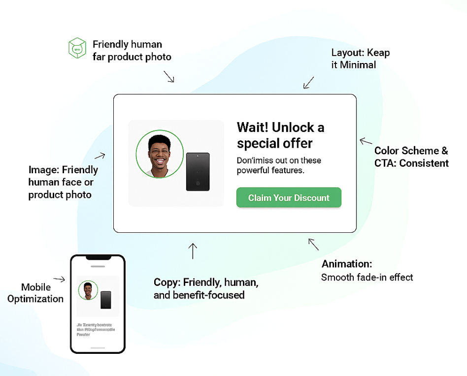
Visual Design and Layout
Design is the first impression your popup makes. A clean, consistent, and brand-aligned layout instantly signals trust and professionalism. Users decide in under 3 seconds whether to engage or dismiss a popup — so your design has to do a lot of work fast.
Here’s what to keep in mind:
- Clean design: Avoid clutter. Use brand fonts, colors, and a clear visual hierarchy.
- Mobile responsiveness: Ensure your popup looks great on all devices. A clunky mobile experience is an instant turn-off.
- Visual consistency: The popup should feel like part of your website, not a third-party ad.
| Element | Best Practice | Example |
|---|---|---|
| Layout | Keep it minimal and distraction-free | Simple two-column design: image on left, offer + CTA on right |
| Color Scheme | Use brand colors but ensure CTA stands out | CTA in contrasting color (e.g., green on a white background) |
| Images | Use one high-quality visual, not multiple | Product photo or friendly human face |
| Animations | Use subtle entry effects | Fade-in or slide-up; avoid bouncing popups |
| Mobile Optimization | Ensure popup scales perfectly | Test both portrait and landscape views |
For instance:
“Wait! Want 10% off before you go?”[Yes, I’ll Take It]
Copywriting and CTA Tips
Visuals grab attention — but words close the deal. Great downsell popup copy speaks like a human, not a marketer. It should feel empathetic, concise, and relevant to the user’s current mindset.
The Golden Rule:
Focus on benefits, not features.
Instead of “Get 3 months free access,” try “Save $30 instantly when you sign up today.”
Tone:
Friendly, conversational, and understanding.
Avoid pushy or guilt-inducing language (“Don’t leave us!” sounds desperate).
Use phrases like “We understand” or “Here’s something easier.”
Effective Copywriting Structure:
| Popup Element | Purpose | Example Text |
|---|---|---|
| Headline | Grab attention with empathy or value | “Still deciding? Here’s a little help!” |
| Subheadline | Add context or explain benefit | “Enjoy 10% off your first purchase — no strings attached.” |
| CTA Button | Encourage clear, action-oriented click | “Yes, I’ll Take the Offer” or “Try Starter Plan Free” |
Example:
“Hey Karan, before you go — how about 15% off your selected plan?”
Best Downsell Offer Ideas
Downsell popups are only as strong as the offer they carry. You could have perfect timing and great design, but if the offer doesn’t strike emotional or practical value — users won’t care. The key is to craft offers that lower friction, add perceived value, and respect the user’s intent.
1. Discount Offers

Discounts are the most common and instantly effective downsell strategy — because they speak the universal language of savings.
When users hesitate due to price sensitivity, a small discount can be that final push they need to commit.
Examples that convert:
“Still thinking? Here’s 10% off if you complete your purchase in the next 10 minutes.”
“Wait! Use code SAVE15 for instant savings.”
“Grab free shipping — only available before you leave.”
Why it works:
It leverages the fear of missing out (FOMO) and the urgency effect — users feel they’ll lose a deal if they leave.
Best Practices for Discount Downsells:
| Strategy | Example | Result |
|---|---|---|
| Time-Limited Offer | “Extra 10% off for the next 15 mins” | Creates urgency |
| Conditional Discount | “Buy 2, get 1 at 50% off” | Increases average order value |
| Personalized Coupon | “Hey Alex, save 10% on your cart!” | Increases engagement & CTR |
2. Product Substitutions or Lite Versions
Sometimes, it’s not about the price — it’s about the commitment.
Maybe your premium plan feels overwhelming, or your customer just wants to “test the waters.”
That’s where product substitutions or lite versions shine. They keep users in your ecosystem, even at a smaller scale.
Examples:
SaaS: “Not ready for the Pro Plan? Try the Starter Plan for free.”
E-commerce: “Too many items? Save one for later — and enjoy a discount on the rest.”
Course Creator: “Enroll in the Mini Course version at half the price.”
3. Value Add-ons and Bonuses

Sometimes, the best downsell isn’t lowering the price — it’s increasing the value.
Instead of cutting cost, add something extra to make the deal irresistible. This works especially well for brands that want to maintain premium positioning without discounting.
Examples:
“Complete your purchase now and get a free bonus item.”
“Upgrade today and enjoy an extra 7 days free.”
“Sign up now and receive exclusive onboarding support.”
Why it works:
It taps into reciprocity — users feel they’re getting more than expected, which creates emotional satisfaction.
| Type | Example Add-on | Impact |
|---|---|---|
| E-commerce | Free gift with purchase | Boosts perceived value |
| SaaS | Bonus feature or trial extension | Increases conversion |
| Online Course | Free eBook or mini-module | Adds credibility |
How to Create a Downsell Popup in Poper
Creating a downsell popup in Poper is fast, no-code, and deeply customizable. Whether you’re a marketer, store owner, or SaaS founder, Poper makes it effortless to design, trigger, and optimize popups that recover lost sales — without ever feeling intrusive.
This section walks you through the step-by-step process of building a high-performing downsell popup inside Poper.
Log In to Poper.ai
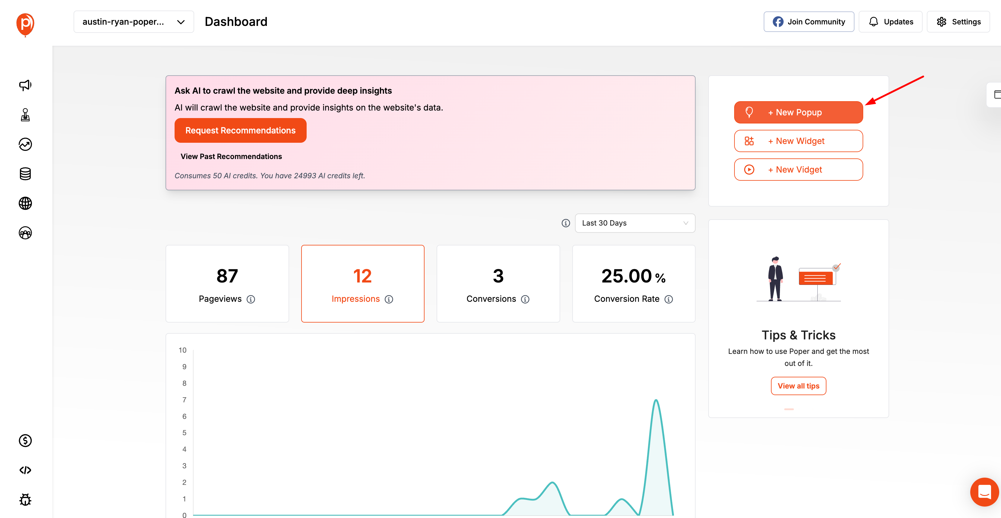
Start by signing in to your Poper.ai account and accessing your dashboard. Click “Create Popup” to begin designing your subscription popup.
Choosing the Right Template
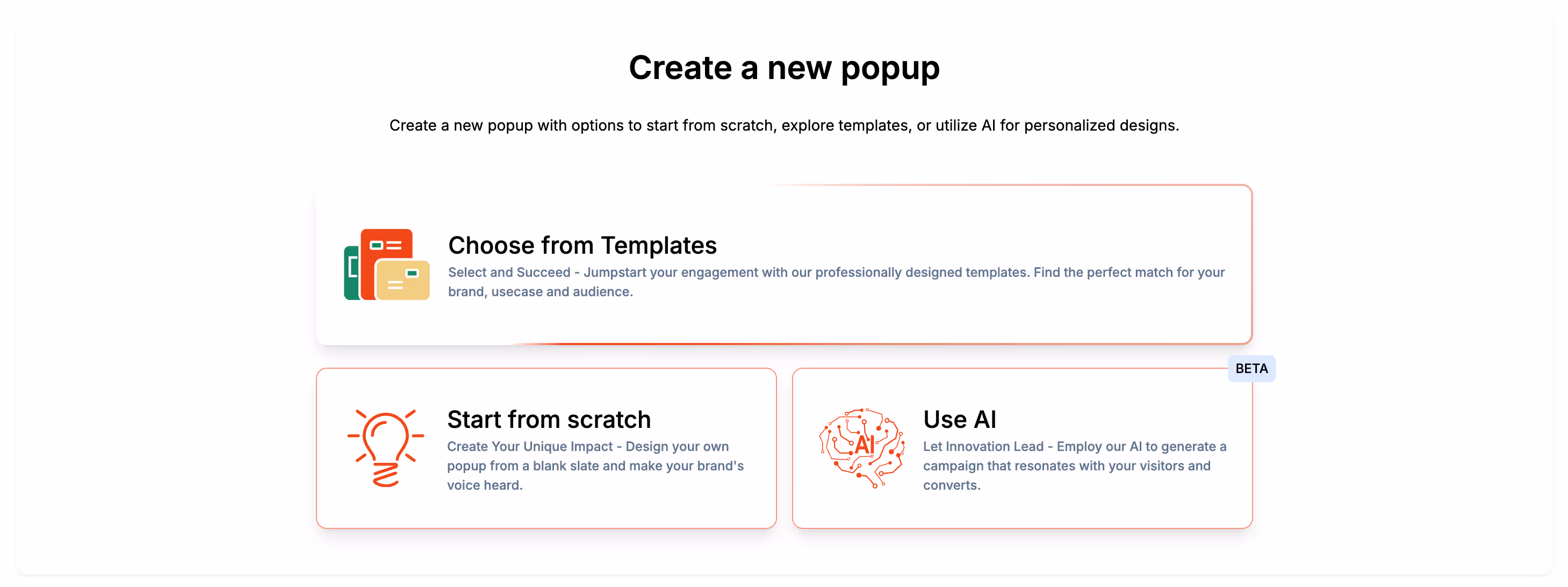
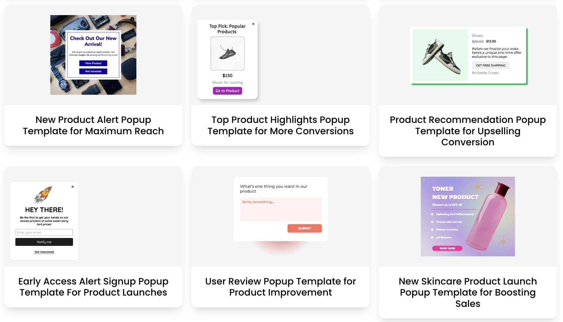
Poper offers a wide range of ready-to-use templates specifically designed for downselling scenarios — such as exit-intent offers, abandoned cart recovery, discount offers, and trial extensions.
How to pick the best one:
Select Template → Downsell / Retention.
Use a design that matches your intent (e.g., discount-based, free trial, or upgrade downgrade).
| Template Type | Best For | Example Offer |
|---|---|---|
| Exit-Intent Offer | Cart Abandonment | “Before you go — take 10% off!” |
| Lite Version Offer | SaaS Pricing | “Try Starter Plan instead of Pro.” |
| Value Add-on Offer | E-commerce | “Free gift if you checkout now!” |
Customizing Content and Design
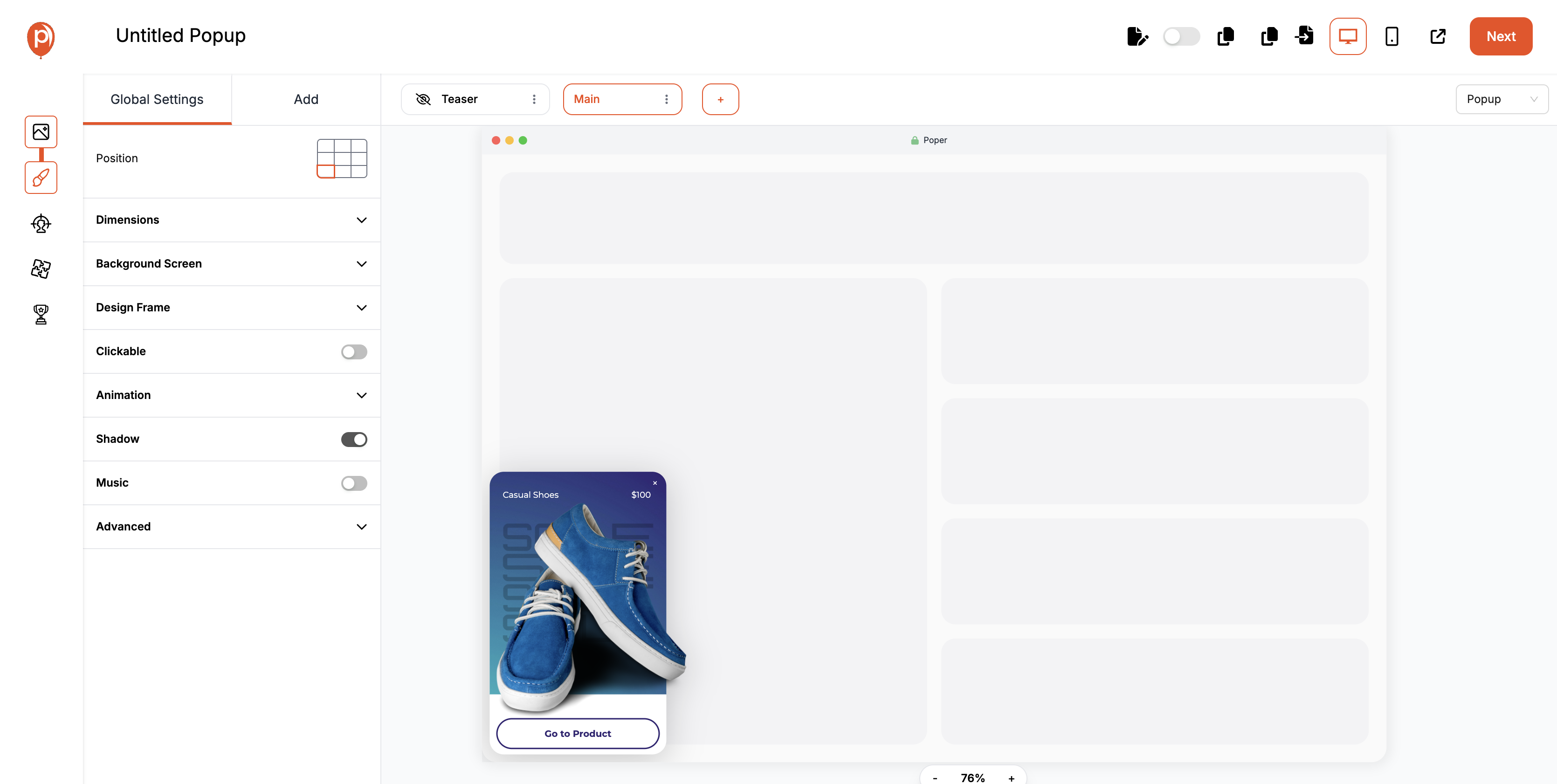
Your downsell popup should feel on-brand, personalized, and clear.
In Poper, you can fully customize visuals, layout, copy, and animations — no design skills needed.
Steps to customize:
Edit the headline (keep it empathetic and benefit-driven).
Add subtext explaining the offer.
Customize the CTA button — make it large and contrast-colored.
Insert your brand logo, color palette, and images.
| Element | Copy Example | Tips |
|---|---|---|
| Headline | “Still thinking? Here’s 10% off!” | Make it emotional + direct |
| Subtext | “Your discount expires in 10 minutes — don’t miss it.” | Add subtle urgency |
| CTA Button | “Yes, Apply My Discount” | Use active voice |
| Exit Option | “No thanks, I’ll pay full price.” | Keeps UX transparent |
Setting Triggers and Targeting Rules
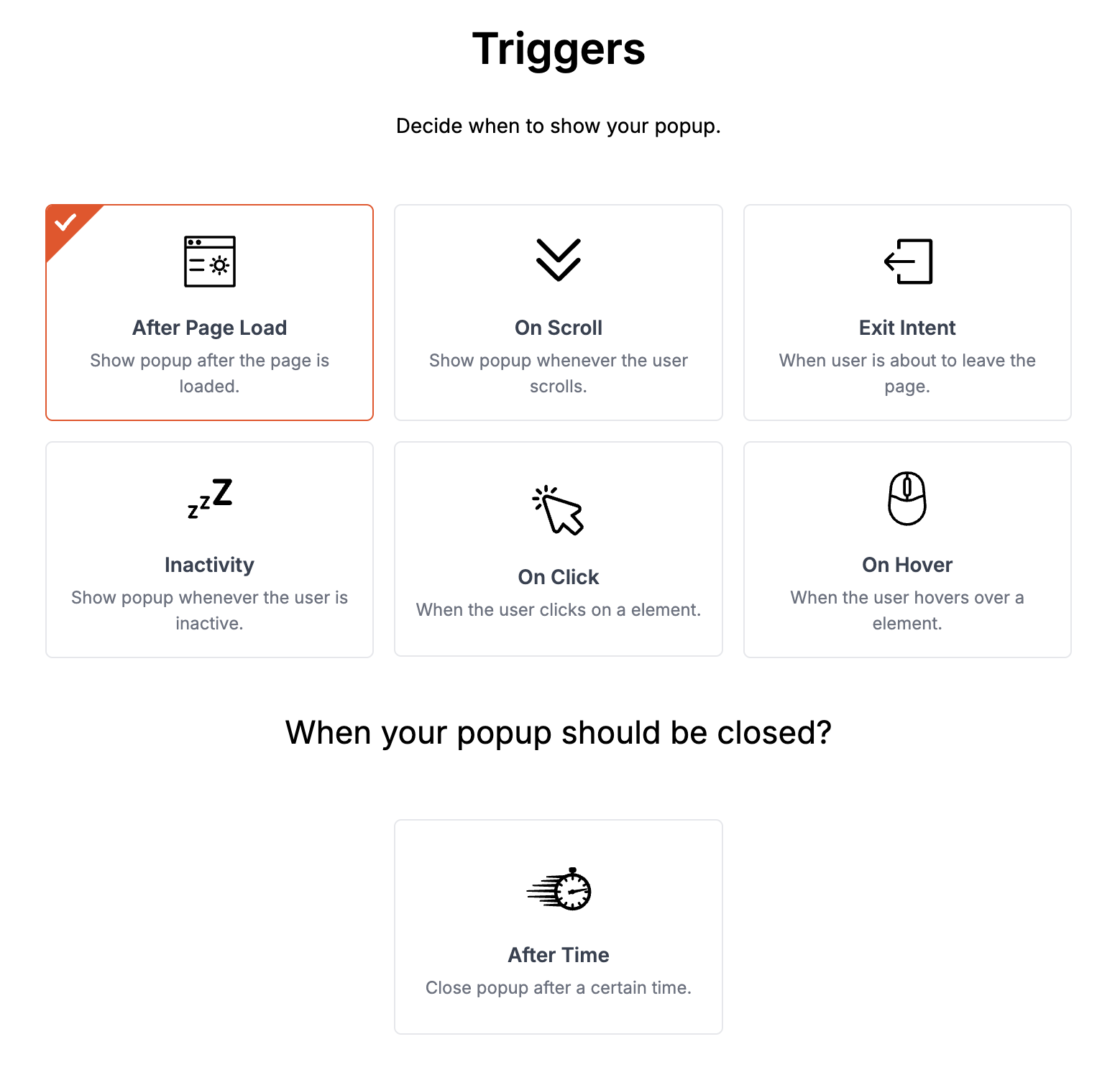
Now comes the science behind the popup — when and to whom it appears.
In Poper, you can set behavior-based triggers to ensure your popup shows only at moments of genuine hesitation.
Recommended Trigger Settings:
Exit-Intent: Show when the user moves the cursor toward the top of the page.
Time on Page: Trigger after 30–45 seconds of inactivity.
Scroll Depth: Display when users scroll 70% or more (indicating high intent).
Cart Behavior: Show when users add an item but don’t proceed to checkout.
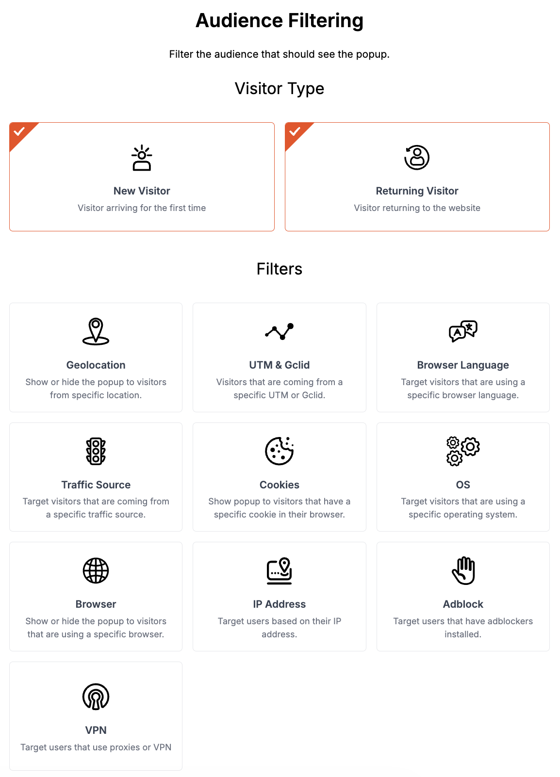
Targeting Options:
- New vs. returning visitors: Tailor offers based on user history.
- Page-specific targeting: Displaying unique offers on product pages versus checkout pages.
- Device type: Showing different layouts for desktop and mobile users.
Device-based targeting (Desktop/Mobile).
Page-specific targeting (show only on cart or pricing pages).
UTM/Referrer targeting (perfect for running campaigns).
Example layout:
Measuring Performance
You can’t improve what you don’t track. Every successful downsell popup strategy is driven by consistent measurement, analysis, and refinement. Whether your goal is to reduce cart abandonment, improve conversions, or re-engage hesitant users, knowing what’s working — and what’s not — is essential.
Key Metrics to Track
Each downsell popup has its own conversion story. To uncover it, you need to watch these essential metrics:
| Metric | What It Means | Why It Matters |
|---|---|---|
| Views (Impressions) | Number of times your popup appeared | Measures visibility and reach |
| CTR (Click-Through Rate) | % of users who clicked on your popup CTA | Indicates how compelling your message and design are |
| Conversion Rate | % of users who completed the intended action | Direct measure of success |
| Bounce Rate Reduction | % decrease in users leaving without interaction | Reflects engagement effectiveness |
| Exit Rate After Popup | How many users still left after seeing your popup | Helps identify weak offers or poor timing |
| Average Order Value (AOV) | Tracks purchase value changes post-downsell | Shows if downsell impacts revenue quality |
Real-Life Examples and Case Studies
Downsell popups aren’t just theory — they’re proven, practical tools used by top-performing businesses across industries to recover lost sales and nurture hesitant buyers. Whether it’s an e-commerce store rescuing abandoned carts or a SaaS platform reducing churn, the results speak for themselves.
Let’s look at a few real-world examples and case studies that show how smart downsell strategies can boost revenue without being pushy.
E-commerce Example: Recovering 25% of Abandoned Carts

Brand Type: Mid-size online apparel store NazarBatika
Challenge: High cart abandonment rate (over 72%) due to price hesitation and checkout friction.
Solution: Implemented a Poper downsell popup that appeared when users tried to leave the checkout page.
Popup Message:
“Wait! Complete your order now and get free shipping + 10% off — valid for the next 10 minutes!”
Trigger Used: Exit-intent + 20-second inactivity timer
Offer Type: Discount + urgency
Results After 30 Days:
| Metric | Before | After | Improvement |
|---|---|---|---|
| Cart Abandonment | 72% | 54% | ↓ 25% |
| Conversion Rate | 3.1% | 6.8% | +119% |
| Average Order Value (AOV) | ₹2,200 | ₹2,480 | +13% |
SaaS Example: Recovering Churned Users with a “Pause Plan” Downsell

Brand Type: Subscription-based SaaS tool Grigora
Challenge: Users canceling subscriptions due to budget constraints.
Solution: Introduced a “Pause Your Plan” downsell popup that appeared when users clicked “Cancel Subscription.”
Popup Message:
“Not ready to cancel? You can pause your plan for 30 days — no data loss, no extra charge.”
Trigger Used: Button-triggered (on Cancel action)
Offer Type: Retention downsell (non-financial)
Results After 60 Days:
| Metric | Before | After | Improvement |
|---|---|---|---|
| Churn Rate | 12.8% | 8.1% | ↓ 36.7% |
| Monthly Retention | 75% | 87% | +16% |
| Support Tickets | 310 | 198 | -36% |
Online Course Example: Upsell Recovery via Free Mini-Module

Brand Type: Educational platform selling premium courses
Challenge: Low conversions from landing page visitors.
Solution: Added a downsell popup offering a free mini-course when users hesitated to buy the full course.
Popup Message:
“Not sure yet? Get our Free 1-Hour Mini Course — see if it’s right for you!”
Trigger Used: Exit-intent + Scroll-depth (60%)
Offer Type: Free value-based downsell
Results After 45 Days:
| Metric | Before | After | Improvement |
|---|---|---|---|
| Landing Page Conversion | 2.5% | 5.9% | +136% |
| Lead Capture Rate | 18% | 33% | +83% |
| Course Sales (after email nurturing) | +28% overall | — | — |
Conclusion
At its core, a downsell popup is not a desperate attempt to make a sale — it’s a strategic move to preserve relationships, recover value, and respect hesitation. It’s how modern businesses turn lost opportunities into loyal customers.
When done right, downsell popups don’t annoy — they assist. They don’t undervalue your product — they reframe it in a way that fits your user’s mindset. From e-commerce discounts to SaaS “pause plans” and free trials, downsells allow brands to stay human, persuasive, and considerate at the same time.
FAQs
What is the best time to trigger a downsell popup?
The best time is when the user shows signs of exit intent or hesitation — like moving the cursor to close the tab, staying idle for 30 seconds, or removing an item from their cart. Tools like Poper help you detect these behaviors automatically.
Do downsell popups hurt user experience?
No — not when they’re timely, relevant, and respectful. Avoid interrupting users too early. Instead, focus on contextual moments where the offer feels like help, not intrusion.
Can I use the same downsell popup for all products or pages?
You shouldn’t. Personalization drives conversions. Create page-specific popups — like discounts for checkout pages, lite plans for pricing pages, and free guides for blog readers.
How often should I change my downsell offers?
Update your offers every 3–4 weeks or after analyzing conversion data. A/B testing is your best friend — keep rotating offers, copy, and visuals to prevent “banner fatigue.”