

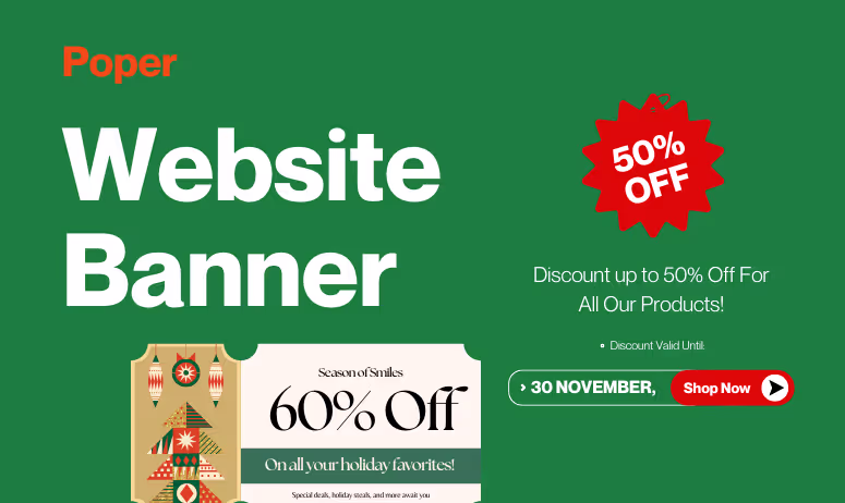
“A well-placed banner isn’t just a design element — it’s a conversation starter between your brand and your visitor.”
In today’s fast-paced digital world, where attention spans are shrinking and competition is just a click away, website banners remain one of the most effective tools to communicate, engage, and convert visitors. Whether you want to announce a sale, highlight a product, share an update, or guide users toward an action — a banner does it instantly, visually, and powerfully.
A website banner is a prominent visual section or element on a web page designed to attract attention and deliver a specific message — such as a sale announcement, signup offer, or company update.
Banners can be static or dynamic, informational or promotional, and are strategically placed to nudge visitors toward desired actions. They can appear above the fold (header), within content (inline), or as floating elements that remain visible as users scroll.
How banners improve conversions:
Guide user journey: Direct users from awareness to action with contextual cues.
Increase time-on-site: Engaging banners capture curiosity and encourage scrolling.
Promote offers dynamically: Automatically show relevant banners based on triggers like cart value or visit frequency.
Reduce bounce rate: Well-placed banners create connection before users exit.
Here’s a quick look at how banner goals align with business outcomes:
| Banner Objective | Business Benefit |
|---|---|
| Announce limited-time deals | Increases short-term revenue |
| Encourage newsletter signups | Builds email list for retargeting |
| Highlight free shipping | Reduces checkout drop-offs |
| Promote new features | Boosts product adoption |
Understanding the Purpose of a Banner
Before designing or adding a banner to your website, you need to understand why it exists.
The best-performing banners are not created to fill space — they’re built to serve a goal, guide a user, or spark an action.
Whether it’s promoting a flash sale, announcing a product update, or reminding users of free shipping, every banner must align with a clear business objective and fit seamlessly into the user journey.
Driving Conversions vs. Sharing Announcements
Broadly, banners fall into two core categories based on purpose: conversion-driven or information-driven.
| Banner Purpose | Goal | Example Message |
|---|---|---|
| Conversion-Driven | Encourage immediate action | “Get 25% off your first order!” |
| Information-Driven | Share updates, events, or alerts | “We’re now shipping worldwide.” |
Conversion banners are designed to trigger measurable outcomes — clicks, signups, or purchases. They’re perfect for limited-time deals, product launches, or seasonal campaigns.
Informational banners, on the other hand, build trust by keeping users informed and connected to your brand story.
Supporting Brand Identity and Consistency
Every banner a visitor sees shapes how they perceive your brand.
That’s why your banners should feel like a natural extension of your design language, not a random interruption.
Here’s how banners reinforce brand identity:
Use your brand colors and typography consistently.
Keep messaging tone aligned with your overall voice — playful, professional, or minimalist.
Avoid design overload; simplicity communicates confidence.
Use visuals that complement your product or message, not distract from it.
| Weak Banner | Strong Banner |
|---|---|
| “Hurry! Big Sale!” in clashing colors | “Celebrate Summer — 20% Off Sitewide 🌤️” in brand tones |
| Generic stock photo | Branded image or illustration |
| Too many CTAs | One clear, bold action |
Using Banners to Build Urgency and Trust
The best banners don’t just look appealing — they evoke emotion.
Whether it’s excitement, exclusivity, or reassurance, emotional triggers are what turn browsers into buyers.
Two emotions drive banner success: urgency and trust.
Urgency: Pushes action through time or scarcity.
Examples:- “Only 3 hours left to grab your deal.”
- “Limited seats available — register now.”
“Only 3 hours left to grab your deal.”
“Limited seats available — register now.”
Trust: Builds long-term loyalty through reassurance.
Examples:- “Free returns. No questions asked.”
- “Over 10,000 happy customers.”
“Free returns. No questions asked.”
“Over 10,000 happy customers.”
Balance both and you get banners that not only sell — they make users feel safe about buying.
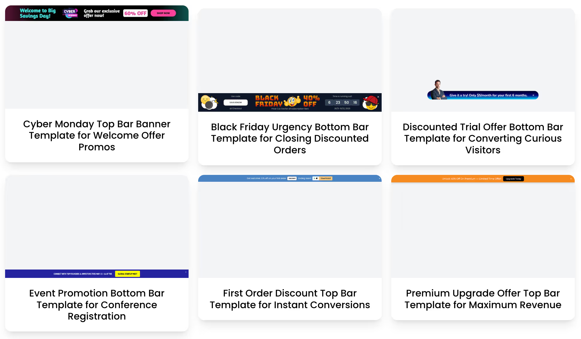
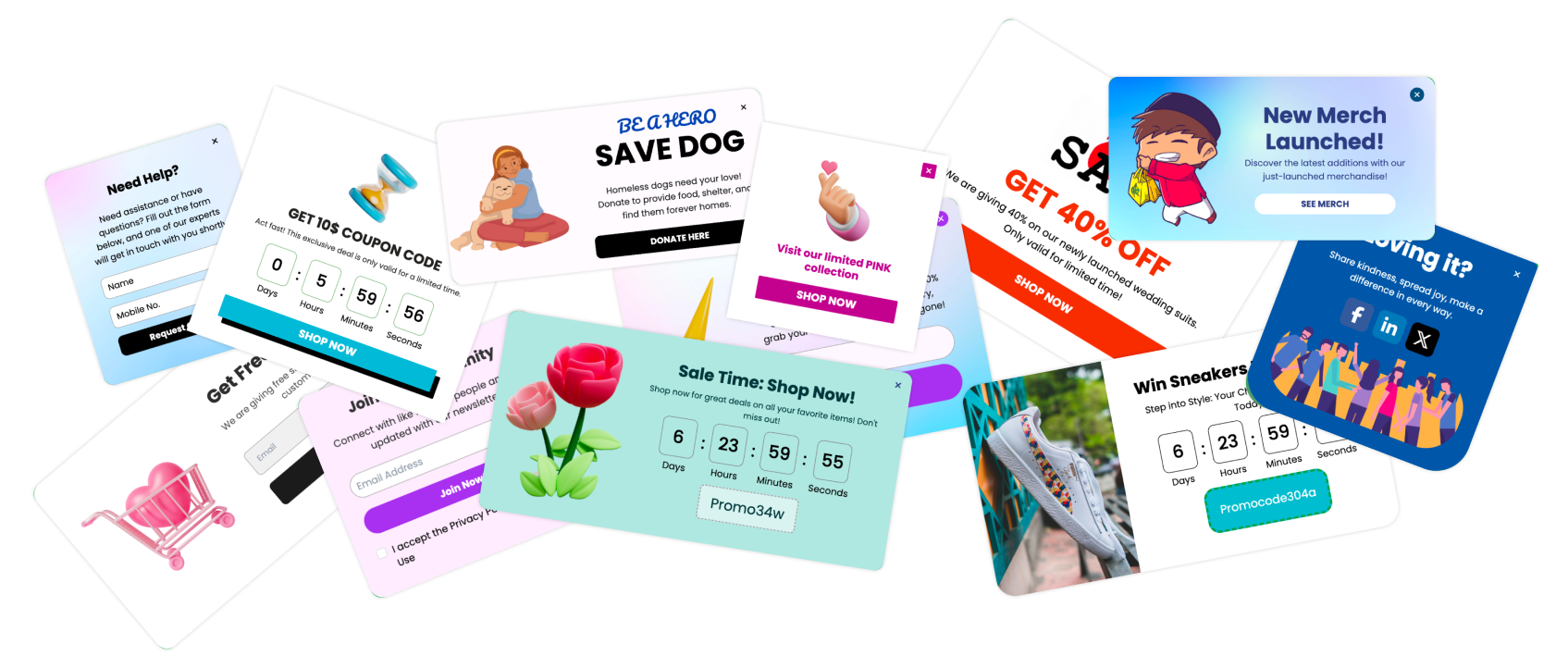
5 Types of Website Banners
Different banners serve different moments in the user journey. Some grab attention the moment a visitor lands, others guide mid-scroll decisions, and a few help seal the deal right before exit.
Knowing which banner type to use — and where to place it — is the secret to maximizing conversions without cluttering your design.
Let’s break down the most effective banner types you can use, with examples and when to deploy them.
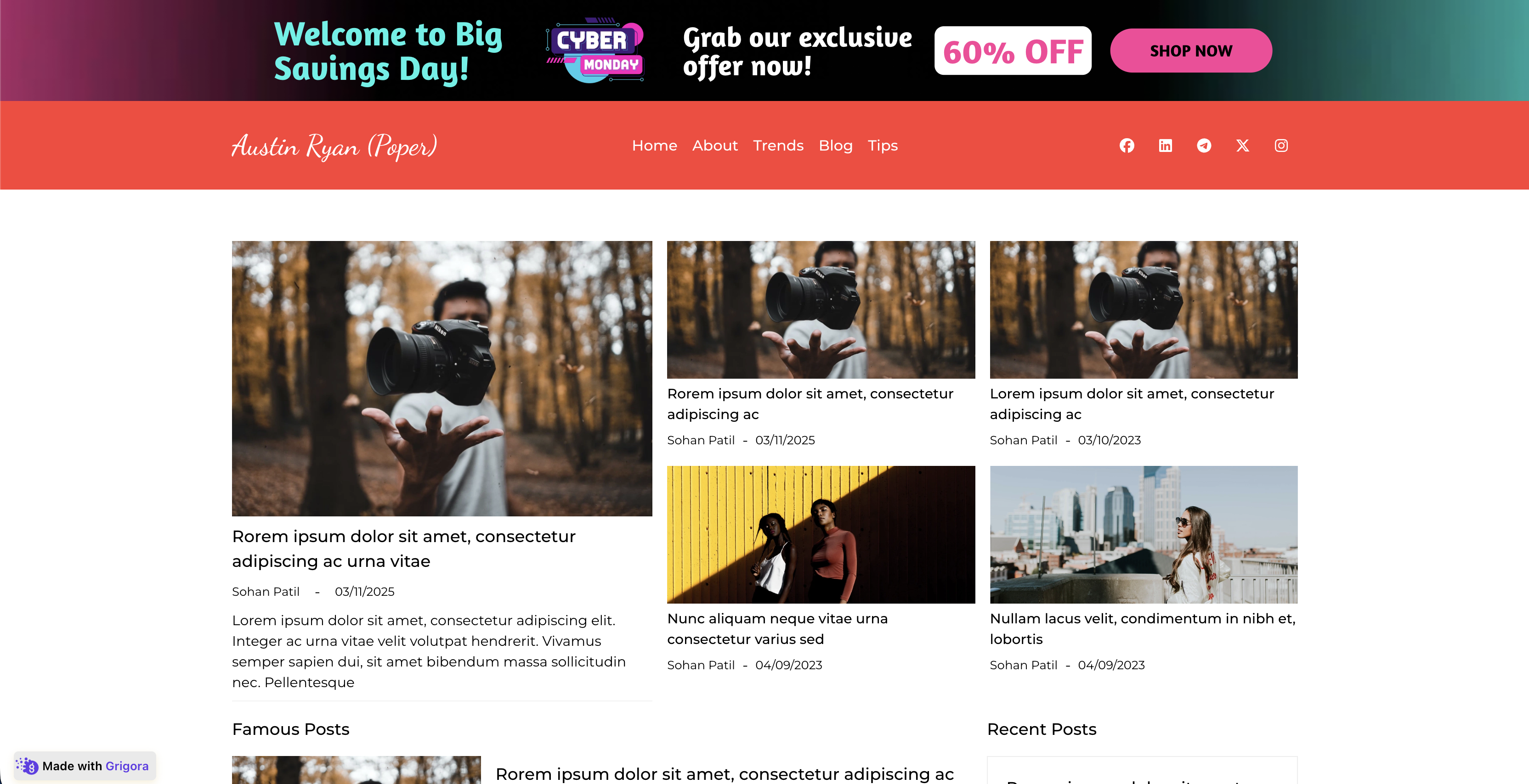
Header and Hero Banners

The header banner (also known as the hero banner) is the first thing users see — the visual handshake of your website.
It usually spans the top section and delivers your core message or promotion instantly.
Why it works:
Immediate visibility — it’s the first thing users notice.
Sets tone and mood for the page.
Ideal for brand storytelling or key offers.
| Use Case | Example | Goal |
|---|---|---|
| E-commerce | “End of Season Sale — Up to 50% Off!” | Drive sales |
| SaaS | “Boost Conversions with Poper — Start Free Today” | Encourage signups |
| Blog | “Join 10,000+ readers getting weekly insights” | Grow newsletter list |
Floating and Sticky Banners

Floating banners stay visible even when users scroll. They often appear at the top, bottom, or corner of the screen, maintaining gentle visibility without interrupting the browsing experience.
Sticky banners are ideal for ongoing announcements or important updates like sales, cookie policies, or shipping details.
| Example | Best For |
|---|---|
| “Free shipping on orders above ₹999 — Shop Now” | Driving consistent conversions |
| “We use cookies to improve your experience.” | Legal compliance |
| “Support our mission — Donate Today” | Nonprofits or campaigns |
Why they convert:
They keep key information in sight at all times — perfect for mobile users who scroll fast.
Sidebar and Inline Banners

Sidebar banners live on the side of your content — subtle but strategic. They work well for secondary CTAs, such as promoting related products or upcoming events.
Inline banners, on the other hand, blend directly within the page content (like between blog paragraphs or sections). They feel organic and non-intrusive.
| Banner Type | Placement | Goal |
|---|---|---|
| Sidebar Banner | Right/left column | Promote add-ons or related articles |
| Inline Banner | Inside content | Capture attention naturally while reading |
Example:
Inline: “Enjoying this post? Try Free to Increase Conversions.”
Sidebar: “Get 30% Off for Early Access — Limited Time.”
Exit-Intent and Scroll-Based Banners

Exit-intent banners are your last chance to convert a visitor before they leave.
When the user shows signs of exit (like scrolling up quickly or moving toward the close button), an exit banner appears with an irresistible offer.
Scroll-based banners appear once users have engaged deeply — usually after 60–70% of page scroll — signaling strong interest.
| Type | Trigger | Example |
|---|---|---|
| Exit-Intent | User tries to leave page | “Wait! Don’t go — Here’s 10% off your order.” |
| Scroll-Based | User scrolls halfway down page | “You’re loving this! Grab your free demo now.” |
These are the most behavior-aware banners, and they convert 2–3x higher than static ones.
Seasonal, Sale, and Countdown Banners

Nothing triggers action faster than a limited-time banner.
Seasonal banners tap into emotional timing — festivals, holidays, or special events — to make offers feel relevant and urgent.
Examples:
“🎉 Diwali Offer: Flat 25% Off All Plans — Ends Midnight!”
“New Year Sale: Start 2026 with 50% Off Subscriptions.”
“Countdown: Offer Ends in 02:14:36.”
| Banner Type | Emotion Triggered | Conversion Focus |
|---|---|---|
| Seasonal Banner | Festivity, relevance | Brand connection |
| Sale Banner | Urgency, excitement | Instant action |
| Countdown Banner | Scarcity, fear of missing out | High-converting urgency |
Banner Design Essentials

A banner’s design can make or break its performance. You have just a few seconds — sometimes less — to catch your visitor’s eye, communicate a message, and inspire action. That’s not just design work; that’s conversion craftsmanship.
Whether it’s a promotional offer or a subtle announcement, your banner should blend clarity, contrast, and conversion psychology. Let’s walk through the essentials of designing banners that perform — not just decorate.
Choosing the Right Size and Format
The first step in banner design is getting the dimensions right.
Your banner should fit the layout perfectly — large enough to capture attention but not so big it disrupts usability.
Here’s a breakdown of standard banner sizes and where to use them:
| Banner Type | Common Size (px) | Best For |
|---|---|---|
| Header Banner (Hero) | 1920 × 600 | Homepage, Landing Page |
| Sticky/Floating Banner | 728 × 90 (desktop) / 320 × 50 (mobile) | Announcements or offers |
| Sidebar Banner | 300 × 250 | Product pages or blog sidebars |
| Full-Width Strip | 1920 × 120 | Site-wide updates or sales |
| Inline Banner | 600 × 200 | Inside blog or article content |
Typography and Visual Hierarchy
Text makes your banner meaningful — but only if it’s readable and strategically placed.
The best banners use visual hierarchy — arranging text so the eye flows naturally from the main message to the CTA.
Key Rules for Banner Typography:
1 main headline: Short, bold, and benefit-driven (max 8 words).
1 supporting line: Clarify the offer or value proposition.
1 CTA button: Clear and visible.
Example structure:
Headline: “Grow Your Sales 2x Faster.”
Subtext: “Try Poper’s AI-powered engagement tools free for 14 days.”
CTA: “Start Free Trial.”
| Element | Font Size | Tip |
|---|---|---|
| Headline | 24–36px | Bold and contrasting |
| Subtext | 16–18px | Neutral tone, supporting clarity |
| CTA Button | 16–20px | Always in strong, legible text |
Avoid: All caps everywhere, too many fonts, and overcrowded copy. Simplicity always wins.
Color Psychology and Contrast
Color isn’t just about aesthetics — it’s about emotion and behavior. The right color combination can influence perception and click decisions instantly.
| Color | Psychological Effect | Best Used For |
|---|---|---|
| Red | Urgency, excitement | Flash sales, limited offers |
| Blue | Trust, reliability | SaaS or service promotions |
| Green | Success, positivity | Checkout, progress indicators |
| Yellow | Optimism, attention | New arrivals, announcements |
| Black/Dark Grey | Sophistication, focus | Premium offers or luxury brands |
Using CTAs (Calls to Action) That Convert
A banner without a CTA is like a road with no destination.
Your CTA is the conversion trigger — it tells the user what to do next.
Best Practices for Effective CTAs:
✅ Use action verbs — “Start,” “Get,” “Claim,” “Try.”
✅ Keep it short — 2 to 5 words max.
✅ Highlight the benefit — not just the action.
✅ Make it look clickable — use buttons, not plain text.
Examples of high-performing banner CTAs:
“Get My Discount”
“Start Free Trial”
“Unlock Early Access”
“Claim Your Offer”
“Upgrade Now and Save 20%”
Best Practices for Mobile-Responsive Banner Design
More than 70% of web traffic is mobile — yet many banners still break on smaller screens.
Your design must not just shrink but adapt.
Checklist for Mobile-Friendly Banners:
✅ Keep the text short — no more than 2 lines of copy.
✅ Use vertical or square layouts for easier reading.
✅ Avoid hover effects (not supported on touch).
✅ Ensure CTAs are thumb-accessible (bottom of screen ideal).
✅ Test on multiple screen sizes before publishing.
| Desktop Version | Mobile Version |
|---|---|
| Wide hero with large text | Compact block with vertical layout |
| Hover-trigger CTA | Tap-trigger CTA |
| Centered visuals | Stacked for scroll flow |
Placement and Timing

Even the best-designed, most persuasive banner can fall flat if it’s shown at the wrong place or the wrong moment. Placement and timing are where strategy meets psychology.
Your goal isn’t to show banners more often — it’s to show them more intelligently. That’s the difference between annoying users and inspiring them.
Above-the-Fold vs. Below-the-Fold Banners
The fold (the visible part of the page before a user scrolls) determines what gets attention first.
Above-the-Fold Banners:
These appear at the very top — perfect for urgent, universal messages like flash sales, free shipping, or limited-time offers.
Below-the-Fold Banners:
These work best for contextual engagement — nudging users after they’ve already explored some content.
| Placement Type | When to Use | Best For |
|---|---|---|
| Above-the-Fold | Homepage, landing pages | Awareness, time-sensitive deals |
| Below-the-Fold | Blogs, product pages | Content-aligned offers, upsells |
When to Display Banners — Entry, Scroll, or Exit
Timing is everything in engagement marketing. Showing a banner too early feels pushy; too late, and the user might already be gone.
Here’s a quick breakdown of banner timing strategies that work best:
| Timing Type | Trigger Action | Best Used For |
|---|---|---|
| On Entry | When user first lands on page | Announcements, limited offers |
| On Scroll | After 40–70% page scroll | Engagement-based offers |
| On Idle | When user stops interacting for a few seconds | Re-engagement or reminders |
| On Exit Intent | When cursor moves toward close button or back navigation | Cart recovery, last-minute offers |
Frequency Capping and Avoiding User Fatigue
One of the biggest mistakes in CRO is overexposure.
Showing the same banner repeatedly not only annoys visitors but also reduces its impact dramatically.
Frequency capping limits how often a banner appears to the same user.
| User Behavior | Recommended Frequency |
|---|---|
| First-time visitor | 1 banner per session |
| Returning visitor | 1–2 banners per day |
| Converted user | None (exclude via targeting rules) |
Why it matters:
Prevents user fatigue.
Increases clickthrough by keeping engagement fresh.
Improves brand trust — users don’t feel bombarded.
Identifying High-Impact Pages for Banner Visibility
Not all pages are created equal. Some are prime real estate for conversions, while others are better suited for brand reinforcement.
High-performing banner zones include:
Homepages: For big announcements, seasonal offers, or brand introductions.
Product Pages: For upsells (“Add accessories to your cart!”).
Blog Pages: For soft lead capture banners.
Checkout Pages: For reassurance or urgency (“Free shipping ends tonight!”).
Pricing Pages: For trial offers or guarantees.
| Page Type | Banner Type | Purpose |
|---|---|---|
| Homepage | Hero or floating | Announce major campaigns |
| Product Page | Sticky or inline | Promote add-ons or discounts |
| Blog | Inline | Capture email leads or offer guides |
| Checkout | Exit intent | Recover potential drop-offs |
| Pricing | Floating | Reinforce urgency or social proof |
Adding Banners Easily with Poper
Gone are the days when adding banners meant hours of CSS tweaking or hiring developers for every seasonal update. With Poper, you can create and launch beautiful, responsive, and behavior-driven banners in just a few clicks — no coding, no plugins, no hassle.
Whether you want to announce a sale, promote a product, collect leads, or display personalized offers, Poper’s intuitive interface and AI automation make it simple and effective.
Why Use Poper for Banners — No-Code Simplicity + AI Power
Traditional banner tools stop at design — Poper goes further.
It helps you design, target, automate, and measure everything from one dashboard.
Here’s why businesses love using Poper for banners:
| Feature | Benefit |
|---|---|
| No-Code Setup | Launch banners without touching your site’s code. |
| Smart Triggers | Show banners based on scroll, exit, cart value, or time delay. |
| AI Personalization | Display unique banners per user — based on location, device, or past visits. |
| Built-in A/B Testing | Test different messages, visuals, or CTAs automatically. |
| Real-Time Analytics | Track impressions, clicks, and conversions at a granular level. |
| Responsive Design | Optimized for all screens automatically (mobile, tablet, desktop). |
Step-by-Step: How to Create and Add a Banner Using Poper
You don’t need a developer. You just need 5 minutes.
Here’s exactly how you can create your first banner using Poper.
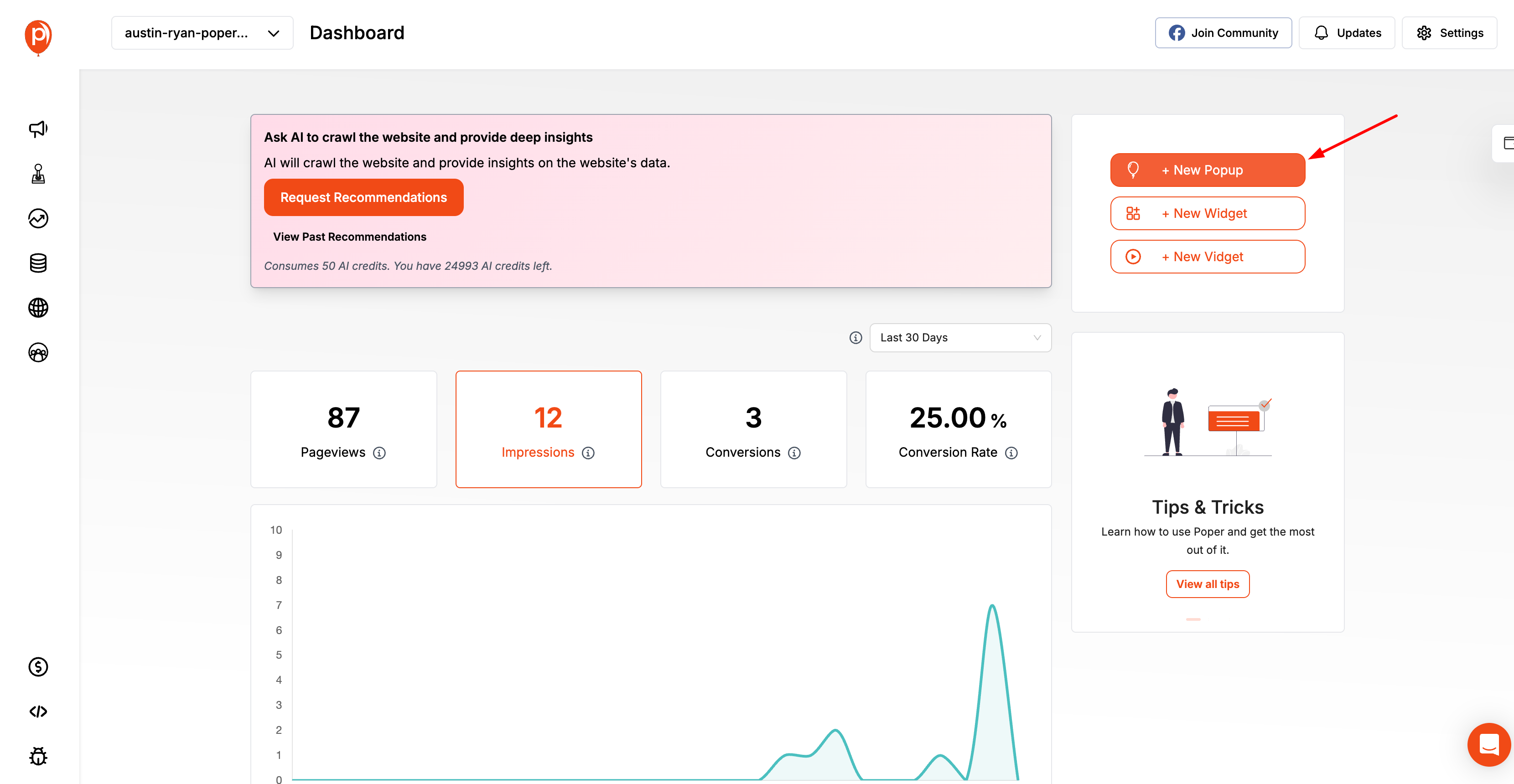
Step 1: Log in to your Poper dashboard
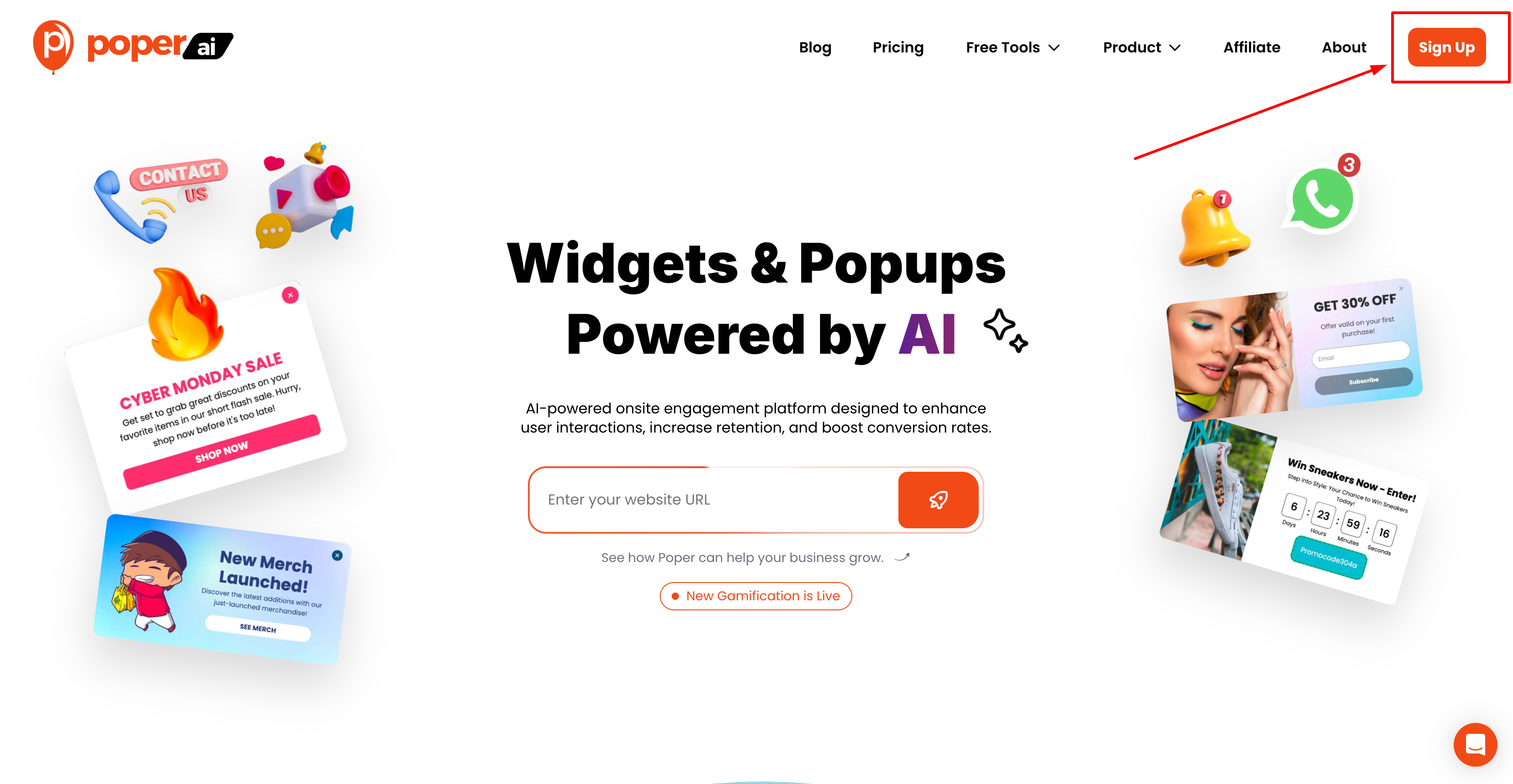
Head to poper and log in (or sign up if you’re new).
You’ll land on a clean, intuitive dashboard with all your campaigns in one place.
Step 2: Click “Create Popup” and select the “Banner” layout
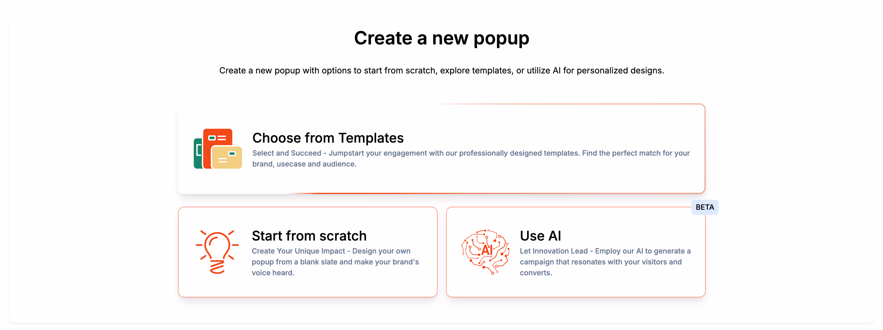
Poper supports multiple popup types — modals, sidebars, widgets, and more — but for this tutorial, select Banner.
You can choose between:
Top Sticky Banner
Bottom Floating Banner
Full-Width Announcement Bar
Inline Banner
Each template is pre-optimized for conversions and mobile responsiveness.
Step 3: Customize text, visuals, and CTA
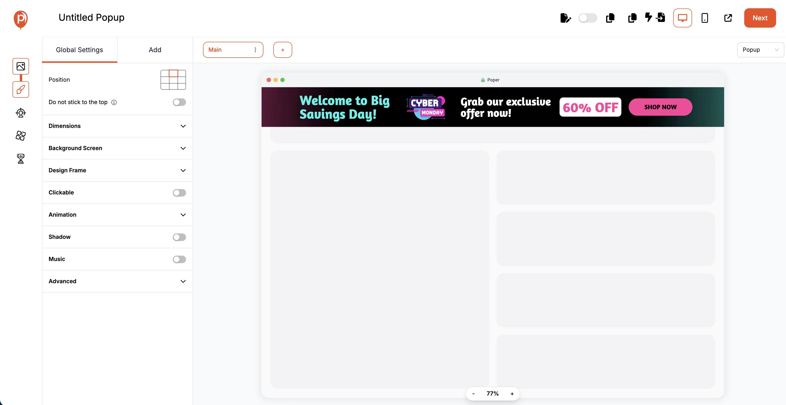
Use Poper’s drag-and-drop editor to design your banner. You can:
Change headline, colors, fonts, and background images
Add icons, emojis, or graphics
Insert buttons with your custom links
Example:
Headline: “🎉 Big News! Flat 30% Off All Plans”Subtext: “Limited time only — Upgrade today.”CTA Button: “Claim Offer”
Step 4: Choose placement (top, bottom, floating, etc.)
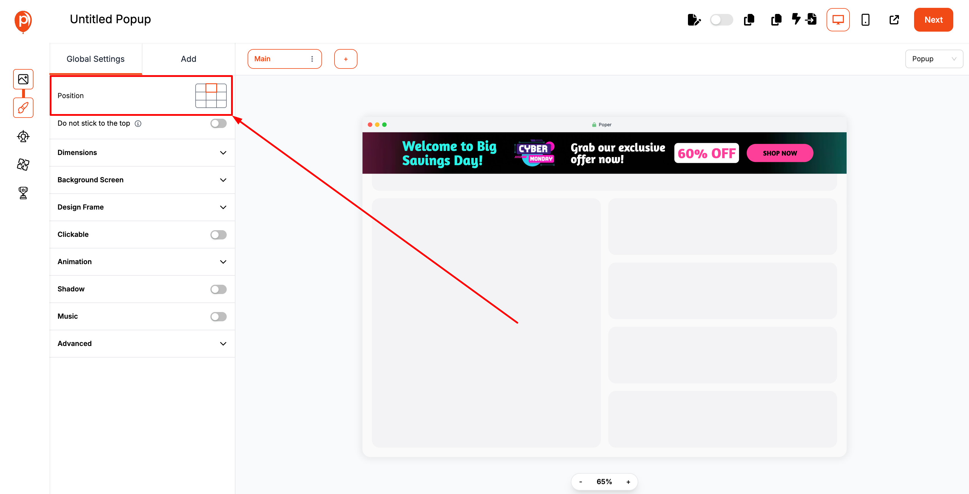
Placement is key to visibility and user comfort.
Poper lets you select from:
Top bar (announcement-style)
Bottom bar (non-intrusive offers)
Floating banners (sticky across scrolls)
Inline (embedded within content)
You can preview how each looks on mobile and desktop — in real time.
Step 5: Set trigger (on load, scroll, or exit intent)
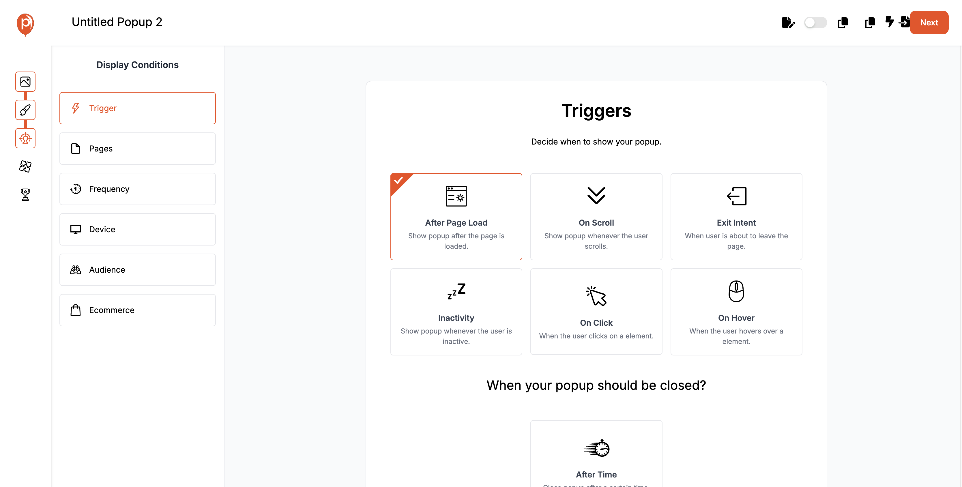
Here’s where Poper gets smart.
You can set behavioral triggers that decide when your banner should appear.
| Trigger Type | When It Shows | Best Use Case |
|---|---|---|
| On Page Load | Immediately after page opens | Announcements |
| On Scroll | After user scrolls 60% of page | Content engagement |
| On Exit Intent | When user tries to leave page | Recover drop-offs |
| On Timer | After X seconds | Attention control |
Example:
Show a top banner 5 seconds after landing on the homepage,
but an exit-intent banner only for checkout abandoners.
Step 6: Preview, publish, and track performance
Once ready, preview your banner in multiple screen modes.
Then hit “Publish” — and it’s live instantly on your site.
Poper generates a lightweight script you can embed once on your website — after that, every new campaign auto-syncs without editing code again.
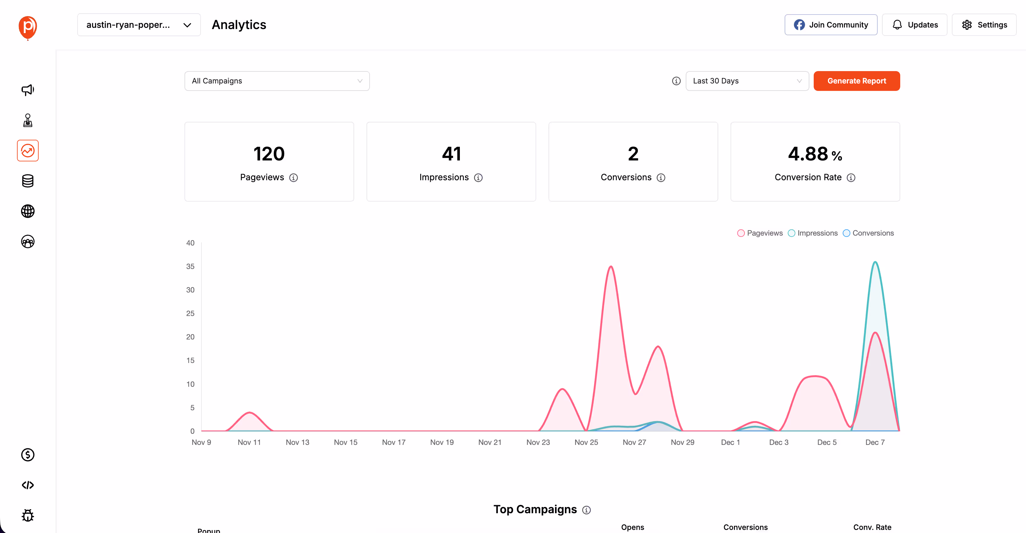
Then, use the Poper Analytics Dashboard to monitor:
✅ Impressions
✅ Clicks
✅ CTR
✅ Conversion rate
And for deeper analysis, integrate directly with Google Analytics, Shopify, or Grigora for unified reporting.
Tracking Banner Performance
Banners may look simple on the surface, but behind every click lies a world of insights. Tracking how your banners perform is crucial not just for understanding results — but for improving them over time.
The truth is, even a small lift in click-through rate (CTR) or engagement can translate into massive gains in revenue or leads.
And with Poper, analyzing your banner’s impact is effortless, detailed, and — most importantly — actionable.
Key Metrics to Monitor (CTR, Conversions, Engagement Time)
To optimize effectively, you need to focus on the right KPIs, not vanity metrics.
Here’s a quick guide to the most important banner performance metrics:
| Metric | What It Measures | Why It Matters |
|---|---|---|
| Impressions | How many times the banner was displayed | Tracks visibility and audience reach |
| CTR (Click-Through Rate) | % of users who clicked the banner | Indicates relevance and copy effectiveness |
| Conversion Rate | % of users who completed the desired action | Measures business impact |
| Engagement Time | How long users stayed after seeing the banner | Reflects user experience quality |
| Close Rate | % of users who dismissed the banner | Identifies message fatigue or poor timing |
Common Mistakes and Optimization Tips
Banners can skyrocket engagement or silently kill user trust. The difference lies in strategy and subtlety. Even the smallest misstep — like overusing animations or repeating the same offer — can make users tune out completely.
Let’s uncover the most common banner mistakes and how to fix them with data, design principles, and Poper’s AI-powered automation.
Overloading Banners with Text
Your banner is not a billboard on a highway — it’s a quick visual cue.
Many brands make the mistake of cramming too much information into a small space.
Why it hurts:
Users don’t read walls of text.
Important CTAs get lost.
Visual overload decreases retention.
| Bad Example | Optimized Example |
|---|---|
| “Welcome to our biggest summer sale ever! Enjoy amazing discounts on over 50 categories for the next 3 days. Click here to explore all deals.” | “Summer Sale! Up to 50% Off — Ends Soon. Shop Now.” |
Using Distracting Animations or Clashing Colors
Animations can draw attention — or cause instant irritation.
Overly flashy effects or mismatched color palettes are the fastest way to lose credibility.
Why it hurts:
Feels “spammy” or outdated.
Distracts from the actual message.
Hurts accessibility for sensitive users.
Fix:
Use subtle fade-ins or gentle movement.
Maintain high contrast between background and text.
Stick to your brand’s color palette for consistency.
| Don’t Do This | Do This Instead |
|---|---|
| Flashing red banner with spinning text | Calm gradient with smooth fade-in effect |
| Comic Sans font in neon colors | Clean sans-serif font in brand colors |
Ignoring Mobile Experience
More than 70% of web traffic happens on mobile — yet many banners still break layouts or block content on small screens.
Why it hurts:
Unresponsive designs frustrate users.
CTA buttons become hard to tap.
Inconsistent UX across devices reduces conversions.
Fix:
✅ Use responsive layouts (Poper does this automatically).
✅ Keep CTAs thumb-accessible — usually near the bottom.
✅ Test banners across multiple screen sizes before publishing.
Conclusion
A banner isn’t just a visual add-on to your site — it’s a conversion instrument.
When designed with intent, placed strategically, and powered by smart triggers, it can boost engagement, increase conversions, and even strengthen your brand identity.
But the key is balance.
A banner should feel like part of the user journey, not an interruption. It should speak value, not demand attention.
Users today demand experiences that feel relevant, respectful, and rewarding.
Static, one-size-fits-all banners simply can’t deliver that.
The next wave of onsite engagement is:
✅ Predictive — anticipating user needs before they act.
✅ Adaptive — adjusting layout, tone, and timing automatically.
✅ Data-Driven — learning and improving continuously.
FAQs
How can I design a banner that doesn’t look intrusive?
Keep it minimal. Use clear spacing, soft animations, and one CTA. Set scroll or exit triggers instead of instant popups.
What is the ideal size for a website banner?
For desktop, go with 1920×600 (hero) or 728×90 (sticky).
For mobile, 320×50 or 300×100 works best.How often should I update my website banners?
Refresh banners every 2–4 weeks or with each new campaign.
