
A few years ago our team wrote its first real vs article. It compared our product to a competitor twice our size, and I remember arguing that we should not publish it at all. Why would we hand a rival free publicity on our own blog? We shipped it anyway, and within a quarter it was our highest converting page.
Not our homepage, not our pricing page, a comparison article. That one page changed how I think about vs articles, and it is the reason I am writing this guide.
Since then we have written, rewritten, and reviewed dozens of vs articles, both for ourselves and with customers who embed our widgets on their comparison pages. In this post I want to share the exact process we use to write vs articles that actually rank, and more importantly, that turn readers into buyers.
Because a vs article that ranks but does not convert is just a nicely formatted gift to your competitor.
Why Vs Articles Win the Moment That Actually Matters
The search behind a vs article is one of the highest intent queries a person can type. Nobody searches "Notion vs Asana" for fun. They are choosing, usually this week, sometimes today. And the data says that choice is made earlier than most of us assume.
Forrester's Buyers' Journey Survey, covered by Digital Commerce 360, found that 92 percent of B2B buyers begin their journey with at least one vendor already in mind, and 41 percent start with a single preferred favorite. In other words, buyers use comparison content to confirm a leaning they already have. Your vs article is often the page where that confirmation happens, or where it quietly falls apart.
It goes further. Research published by 6sense found that the vendor on the buyer's day one shortlist wins the deal about 80 percent of the time. And Gartner survey reported that 61 percent of B2B buyers now prefer a completely rep-free buying experience.
Put those together and the conclusion is simple. If buyers decide alone, and they decide early, then your comparison articles are doing the job your sales team used to do. Writing vs articles is not a content tactic anymore. It is sales enablement for buyers who refuse to talk to sales.
How I Pick the Matchup Before Writing a Word
The biggest mistake I see is treating every vs article as the same assignment. There are really three matchups, and each needs a different approach.
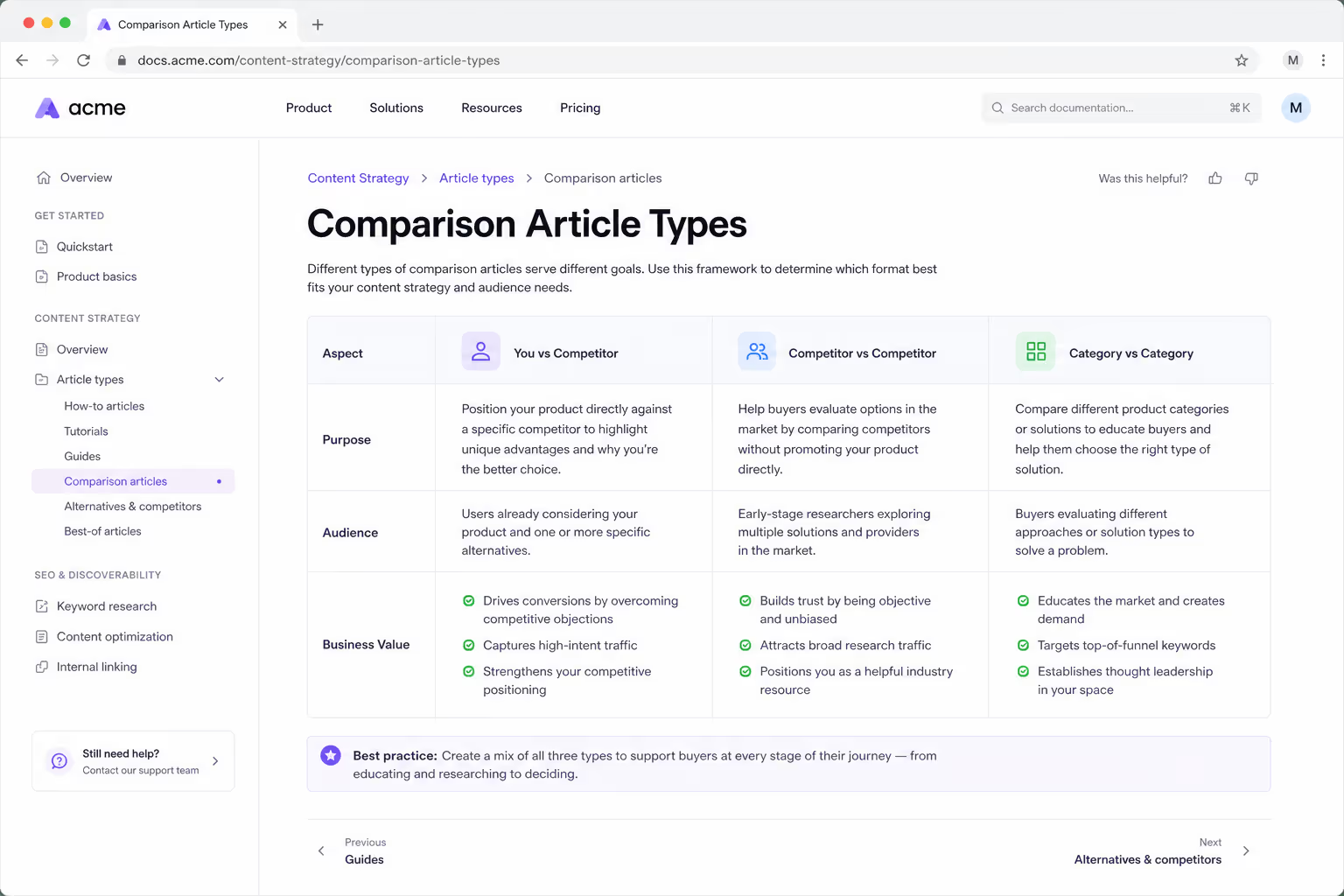
The first is "you vs a competitor." This is the classic comparison article, and you should write one for every rival your prospects mention on sales calls. If people are already searching "your brand vs competitor," someone will rank for it. I would much rather that page be ours than a third party affiliate site with outdated screenshots.
The second is "competitor vs competitor," where you are not in the matchup at all. These vs articles look strange at first, but they are quietly brilliant. You get in front of buyers who are actively comparing tools in your category, you demonstrate expertise without sounding defensive, and you earn the right to say "by the way, here is a third option." We have seen these comparison articles convert surprisingly well precisely because readers do not expect a pitch.
The third is "category vs category," like "popups vs embedded forms." These vs articles catch buyers a step earlier, while they are still choosing an approach rather than a vendor. They rarely convert as fast, but they build topical authority that helps every other comparison article on your site rank. When I plan a quarter of vs articles, I aim for a mix of all three, anchored by the matchups our sales conversations mention most.
The Structure of a Vs Article That Ranks
Long form still matters here. Ahrefs' roundup of content marketing statistics notes that longer, more thorough articles keep earning disproportionately more backlinks and long tail rankings than thin pages. But length alone does not make a vs article good. Structure does. Here is the skeleton we use for every comparison article we publish.
Give the Verdict in the First Screen
Readers of vs articles are impatient, and they should be. So we open every comparison with a short verdict box: who each product is best for, in two or three sentences. It feels counterintuitive to "give away" the answer, but it builds instant trust, and it keeps the reader scrolling to understand the reasoning. Hiding the verdict at the bottom is essay thinking, and a vs article is not an essay.
Put a Real Comparison Table Above the Fold
Every strong vs article has a comparison table near the top. Not a feature dump with forty rows, but a focused table covering the eight to twelve things buyers actually weigh: pricing, core features, integrations, support, and the honest dealbreakers.
The table is what people screenshot and paste into Slack when they pitch the decision internally, so treat it as the most shareable asset in your comparison article. On our own site we build these with our Comparison Table widget, which keeps the styling consistent and lets us update a spec in one place when a competitor changes pricing.
Compare by Use Case, Not by Feature List
After the table, the body of the vs article should be organized around jobs, not features. Sections like "Which is better for a small e-commerce team" beat sections like "Feature comparison" every time, because they mirror the sentence the buyer has in their head.
Under each use case, name a winner and explain why in plain language. A vs article that refuses to pick winners reads like it was written by a lawyer, and readers can smell it.
Honesty Is the Conversion Strategy, Not a Risk
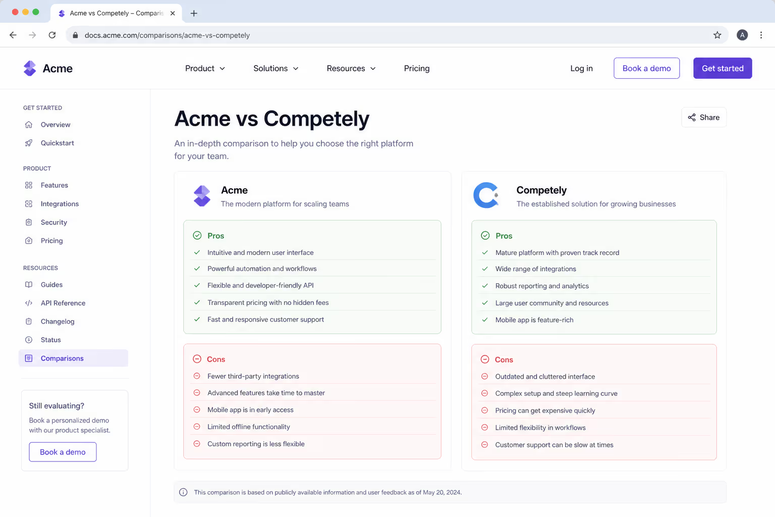
Here is the part most teams get wrong. When you write vs articles about your own product, you must concede real points to the competitor. Not fake weaknesses like "we care too much about customers." Real ones. Their mobile app is better. Their free plan is more generous. Whatever is true.
This feels dangerous and it is actually the whole trick. Remember, Forrester's data shows buyers arrive at your comparison article to confirm a preference. If they catch you shading the truth on one row of the table, they discount the entire page and, fairly or not, the entire product.
If they see you concede two points and still make a confident case, the vs article earns something a feature list never can: credibility. We concede points in every comparison article we publish, and those honest sections are consistently where people highlight and share.
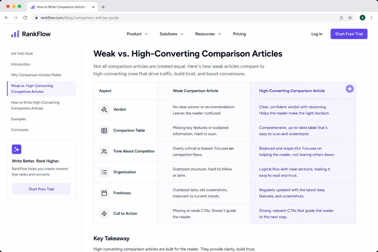
To make this concrete, here is how I would summarize the difference between the vs articles that die on page four and the ones that rank and convert.
| Element | Weak Vs Article | Vs Article That Ranks and Converts |
|---|---|---|
| Verdict | Buried in the conclusion, or missing | Clear "best for" verdict in the first screen |
| Comparison table | Forty-row feature dump, all checkmarks | Focused table of 8 to 12 criteria buyers actually weigh |
| Tone about competitor | Dismissive, every row favors the author | Concedes real strengths, then argues the tradeoff |
| Organization | Feature by feature | Use case by use case, with a named winner per section |
| Freshness | Published once, never updated | Reviewed on a schedule, dated, updated when pricing changes |
| Call to action | Generic "sign up" banner | Contextual next step tied to the reader's use case |
How I Turn Vs Article Readers Into Pipeline
Ranking is only half the assignment. The reader of a comparison article is minutes from a decision, so the page needs conversion paths that match that urgency. On our own vs articles we do three things.
First, the comparison table itself links out. Every row that names us a winner links to the relevant feature page, and the verdict box links to a trial with the competitor's name in the UTM so we can measure which vs articles actually drive signups.
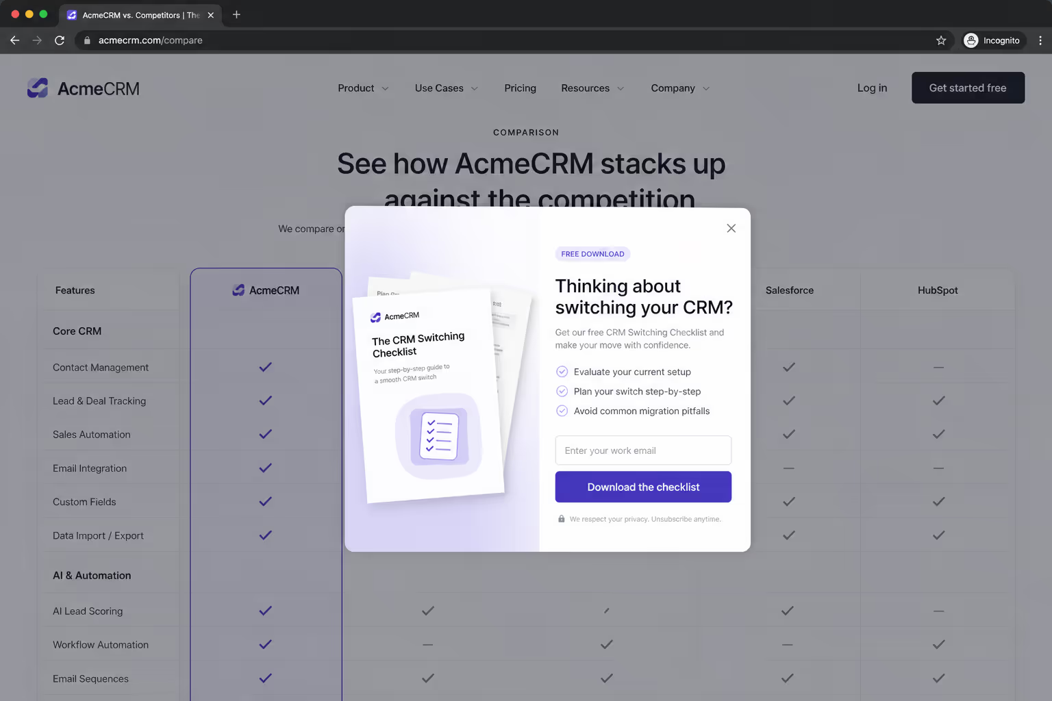
Second, we add an exit intent popup that only fires on comparison articles, offering a one page "switching checklist" in exchange for an email. Someone leaving a vs article without clicking is not a lost visitor, they are a lead who needs one more touch. Third, we keep a small sticky bar with a low commitment CTA, something like "See the live comparison," because the worst thing a high intent page can do is make the next step hard to find.
If you run your comparison pages on a platform like ours, all three of those pieces, the embedded comparison table, the exit intent popup, and the sticky bar, are widgets you can drop in without touching code. But the principle matters more than the tooling: match the CTA to the intent, and instrument every vs article so you know which matchups print money.
The Mistakes That Kill Most Vs Articles
Before you go write yours, let me save you from the failures we have already paid for. These are the patterns I see most often when auditing comparison articles that rank poorly or convert worse:
Publishing one vs article and stopping, instead of covering the full set of matchups buyers search for
Letting pricing and screenshots go stale, which readers treat as lying by neglect
Writing the whole comparison article without ever using the competitor's product
Refusing to name winners, so the reader leaves with the same question they arrived with
Skipping the comparison table because "our differences are nuanced" (they never are to the buyer)
The last one deserves a sentence more. Nuance belongs in the body of the vs article. The table is where you respect the reader's time, and readers reward pages that respect their time.
Wrapping Up
Vs articles are the closest thing content marketing has to a closing call. Buyers arrive with a favorite, they research alone, and the shortlist they form before talking to anyone decides 80 percent of deals.
Writing comparison articles that are honest, structured around use cases, anchored by a real comparison table, and wired with intent matched CTAs is how you make sure the vendor they confirm is you.
Start with the matchup your sales team hears most, give the verdict early, concede what is true, and update the page like it is a product, because it is. Do that for every serious competitor you have, and your vs articles will quietly become the hardest working pages on your site. Ours did, and we almost never published the first one.



