
The global cart abandonment rate hit 70.19% in 2026, based on a Baymard Institute meta-analysis of 49 separate studies. Roughly one in four of those exits traces back to a single fear: shoppers do not trust the site with their card data. That is the exact gap trust badges at checkout are built to close, and the data on how well they work is far more specific than most stores assume.
Trust badges at checkout lift conversions when they sit beside the payment field and stay few. Recognized security and payment seals win, self-made graphics and badge clutter quietly lose sales.
Why Checkout Trust Is a Conversion Variable, Not Decoration
Treat trust as a measurable input, not a feeling. When a shopper hesitates over a card form, the doubt is concrete: is this page secure, and will this company honor the order.
Security doubt is not the only reason carts die, but it sits near the top. Baymard's 2026 breakdown of why US shoppers abandon checkout, excluding the unavoidable "just browsing" group, ranks the leading causes like this.
| Reason for abandoning checkout | Share of shoppers | Can a trust badge help? |
|---|---|---|
| Unexpected extra costs (shipping, taxes, fees) | 48% | Partly, via free-shipping and returns badges |
| Site wanted account creation | 26% | No, this is a flow problem |
| Did not trust site with card data | 25% | Yes, directly |
| Could not see total cost up front | 21% | Partly |
| Unsatisfactory return policy | 18% | Yes, via guarantee and returns badges |
| Website had errors or crashed | 17% | No |
| Too few payment options | 13% | Yes, via payment-provider marks |
Read that table closely. Four of the seven top reasons, covering security, returns, hidden costs, and payment choice, are objections that the right trust badges at checkout can answer at the moment of doubt. That is why a small graphic earns its place beside the pay button.
The placement effect is measurable too. Research summarized in 2026 reports that putting a security seal near the checkout button cut abandonment by as much as 32% in tested stores. The badge works because it shows up at the exact second the fear peaks.
Add Trust Badges To Your Checkout Without Touching Code
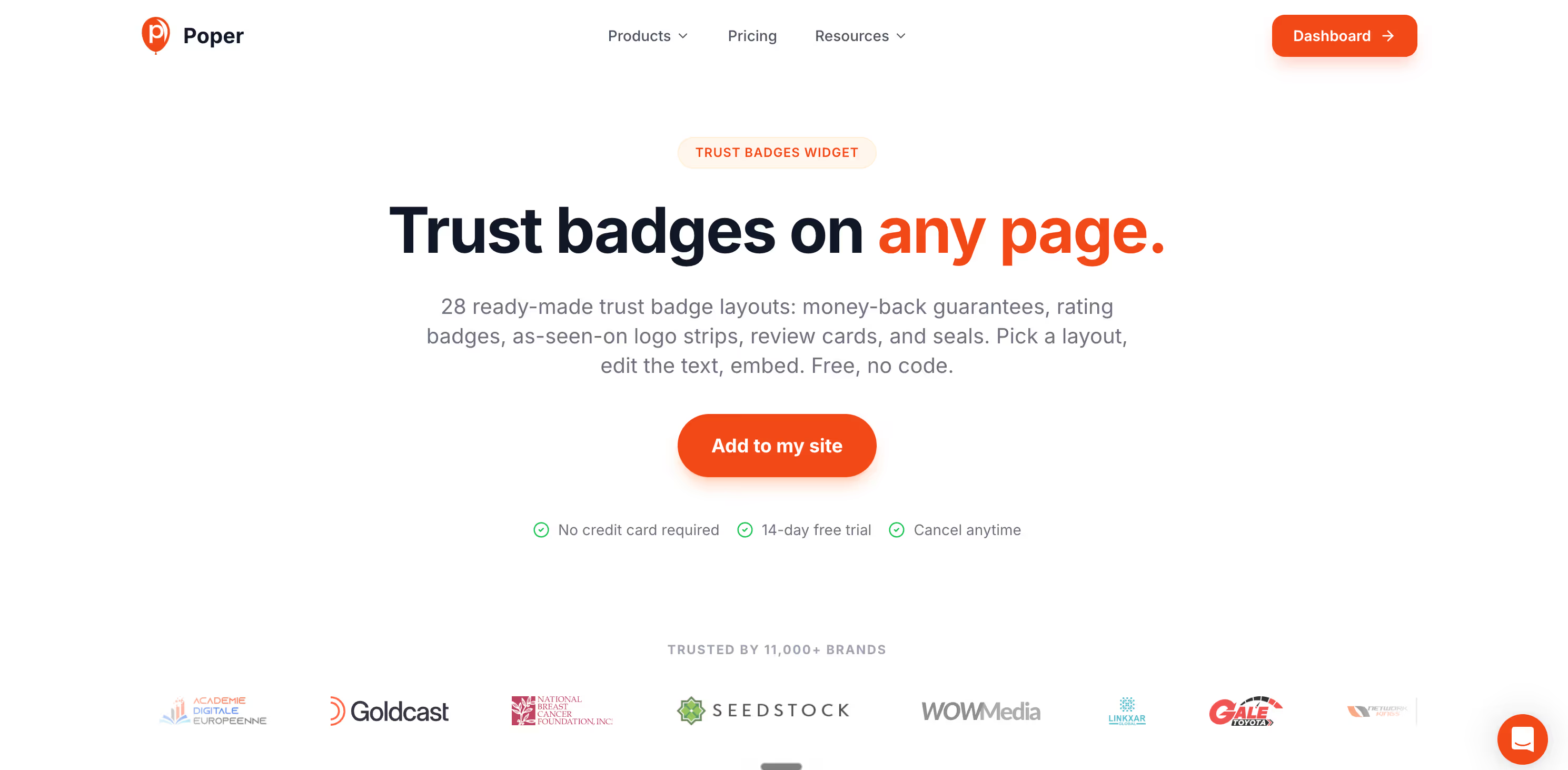
Poper's trust badges widget puts a recognized security seal, card logos, or a returns guarantee right beside the payment fields. Paste one snippet into your site, then place and restyle the badge row from the drag and drop editor. No theme file edits, no developer ticket.
<script id="poper-js-script" data-account-id="YOUR_ACCOUNT_ID" src="https://app.poper.ai/share/poper.js" defer></script>Which Trust Badges at Checkout Actually Move the Number
Not all badges carry equal weight. Shoppers respond to recognizable security and payment marks far more than to generic graphics a store designed itself. The table below ranks the common badge families by the conversion signal recent reporting attributes to each.
| Badge type | What it signals | Relative impact | Best placement |
|---|---|---|---|
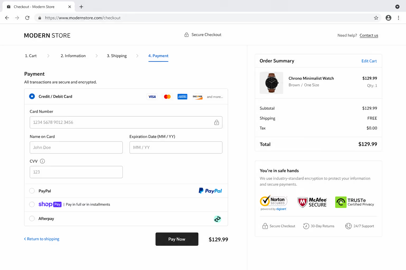
| SSL / security seals (Norton, McAfee) | Data is encrypted and the site is scanned | Strongest single lift | Beside the card field |
| Payment-provider marks (Visa, Mastercard, PayPal) | A trusted third party stands behind the transaction | High | Under the card field |
| Money-back / guarantee badges | Risk sits with the seller, not the buyer | Moderate to high | Near the pay button |
| Free-shipping and returns badges | No hidden cost or commitment trap | Moderate | Cart summary |
| Self-made "100% Secure" graphics | Little, no third party verifies them | Low, can read as filler | Avoid |
The pattern is consistent across recent reporting: third-party recognition beats self-declaration. A badge a shopper already trusts elsewhere carries that trust onto your page. A graphic only your design team has ever seen does not.
If you have to choose a starting set, this priority order reflects what the data rewards most:
One recognized SSL or security seal, matched to your provider.
The real payment-provider logos you accept.
One guarantee or returns badge that maps to a genuine policy.
A free-shipping badge, only if free shipping is actually offered.
Placement Decides Whether Trust Badges at Checkout Get Seen
A badge the buyer never notices cannot reassure anyone. Position is the lever most stores get wrong, burying seals in the footer where the doubt never lives.
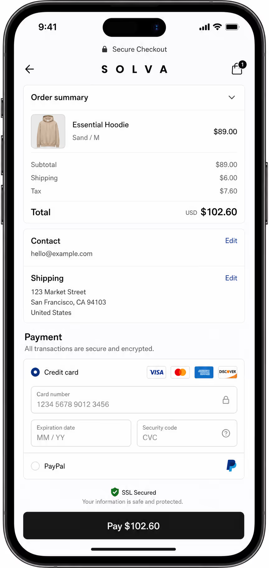
Put trust badges at checkout where the hesitation actually happens:
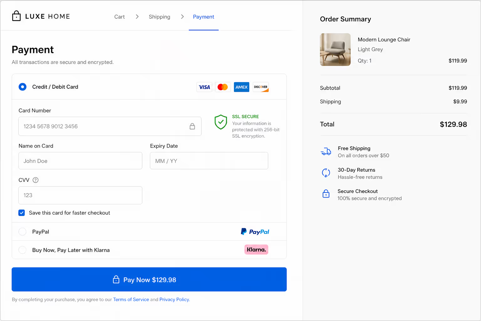
Directly beside the card-number field, where security doubt peaks.
Adjacent to the final "Place order" or "Pay now" button.
In the cart summary, before the shopper commits to checkout.
Near any field asking for personal or billing data.
Proximity is the whole game. The 32% abandonment reduction cited earlier came specifically from seals placed near the checkout button, not scattered site-wide. A trust badge two scrolls away from the payment form is decoration. The same badge beside the form is reassurance.
Here is how the main checkout zones compare for badge placement.
| Placement zone | Visibility at decision point | Recommended badges |
|---|---|---|
| Beside card field | Highest | SSL / security seal |
| Under pay button | High | Payment marks, guarantee |
| Cart summary | Medium | Free shipping, returns |
| Product page | Medium | Guarantee, social proof |
| Site footer | Low | Optional reinforcement only |
The Clutter Trap: When More Trust Badges Lower Conversion
More is not safer. Stacking every badge you can find signals the opposite of confidence. It reads as a store trying too hard to be believed.
A wall of badges does not multiply trust. It multiplies suspicion. Past three or four marks, each new badge buys doubt, not confidence.
Recent analysis found that using more than three or four distinct badge types can cut conversion by 5% to 8% through "badge bloat," where the clutter itself looks like desperation. The discipline is simple:
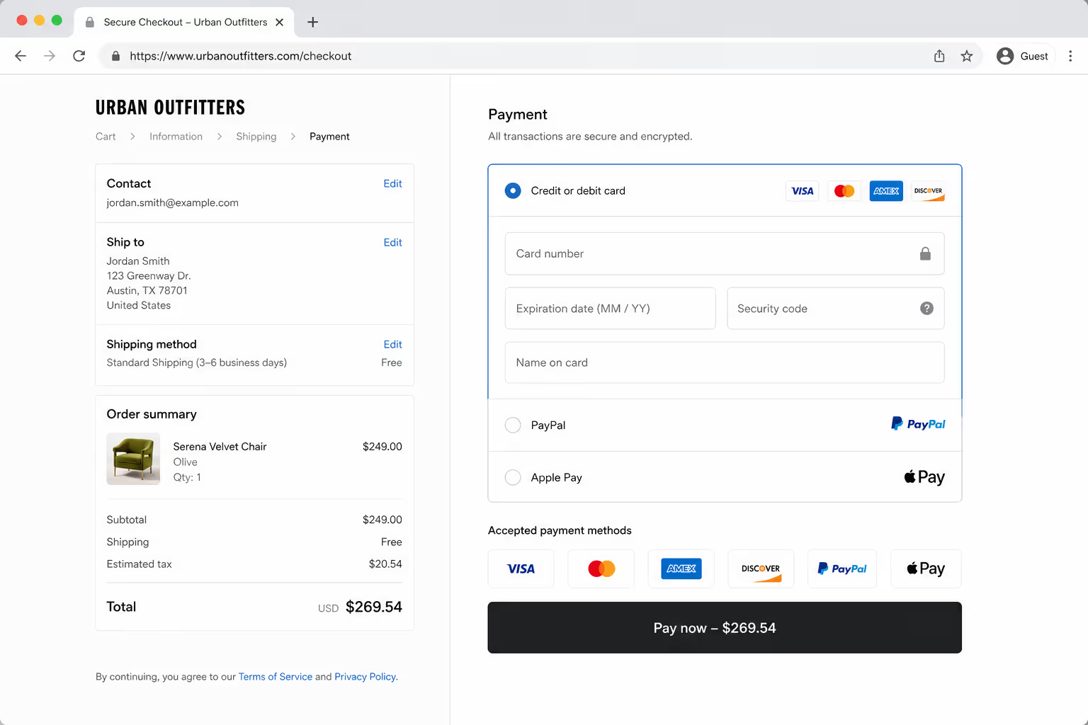
Pick one recognized security seal, Norton or McAfee, whichever your provider supports.
Show the payment-provider logos you genuinely accept.
Add one guarantee or returns badge that matches a real policy.
Stop. Remove anything self-made or unverifiable.
Three honest, recognized trust badges at checkout outperform a dozen generic ones, and they load faster, which matters on mobile where most carts now live.
Mobile and Desktop Weigh Trust Badges Differently
Screen size changes how a shopper reads a checkout. On mobile, the card field and pay button often sit on separate scroll positions, so a badge that works on desktop can vanish on a phone.
Plan placement per device rather than assuming one layout serves both.
| Factor | Desktop | Mobile |
|---|---|---|
| Badge visibility | Multiple badges fit near the form | One or two badges max before clutter |
| Best position | Right of card field | Directly under card field |
| Load cost | Low concern | High, heavy badge images slow checkout |
| Primary fear | Card security | Card security plus tiny-text doubt |
The takeaway is restraint on small screens. A single recognized security seal under the card field usually beats a row of four squeezed badges that push the pay button below the fold.
Test One Badge Variable At A Time
The testing rules above only hold if you can change a single thing and watch what happens. Poper lets you place the badge row, control exactly where it shows, and run two versions against your own checkout traffic.
How To Test Trust Badges at Checkout Without Fooling Yourself
Treat badges like any other conversion change: prove it, do not assume it. The 15% to 30% average lift is an average, and your store can land anywhere in that range.
Run a clean test:
Change one variable at a time, badge presence, type, or position, never all three.
Measure checkout completion rate and revenue per visitor, not just clicks on the badge.
Let the test reach statistical significance before you call it. Small samples lie.
Segment by device, since mobile and desktop shoppers weigh trust signals differently.
Track the right metrics so a "win" is real and not noise.
| Metric | Why it matters | Watch for |
|---|---|---|
| Checkout completion rate | Direct measure of trust friction | Movement of 1 point or more |
| Revenue per visitor | Catches lifts that raw conversion hides | Does it move with completion rate |
| Mobile vs desktop split | Effects often differ by device | A win on one, a loss on the other |
| Page load time | Heavy badges can slow checkout | Any rise after adding image badges |
A 2026 UX analysis put it plainly: trust is a variable you can move and measure, not a feeling you hope for. The stores that win treat each badge as a hypothesis with a number attached.
A 30-Day Plan To Roll Out Trust Badges at Checkout
If you are starting from a bare checkout, sequence the work so each step produces data you can act on.
Days 1 to 3: Baseline your current checkout completion rate and revenue per visitor, split by device.
Days 4 to 7: Add one recognized security seal beside the card field. Nothing else.
Days 8 to 17: Run the test to significance. Record the lift or drop.
Days 18 to 21: Add payment-provider marks under the card field. Test again.
Days 22 to 27: Add one guarantee or returns badge if returns rank as an abandonment reason for you.
Days 28 to 30: Audit for badge bloat. Cut anything that did not earn its lift.
This order isolates each badge so you learn which one actually moved your number, instead of dumping all of them in and guessing.
What This Means for Your Stack
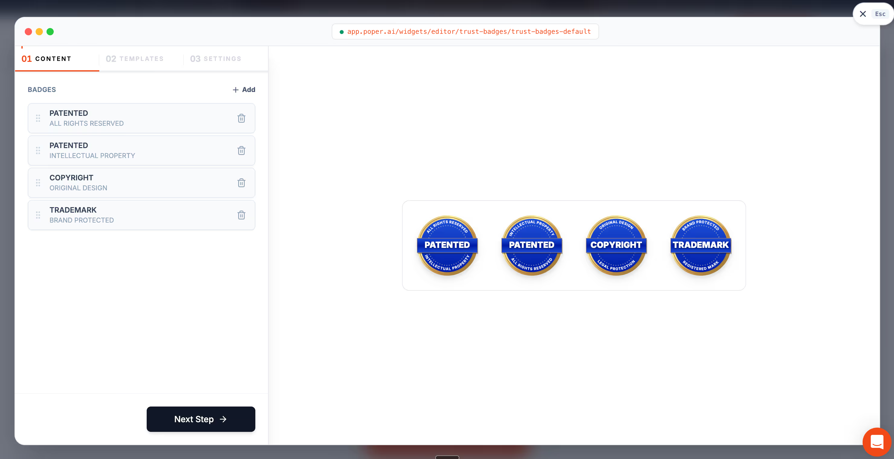
If you want recognized trust badges at checkout without hand-editing theme files, Poper's Trust Badges widget drops verified security, payment, and guarantee marks beside your payment fields on Shopify, WooCommerce, Webflow, Wix, or any site in under two minutes. Because it is no-code, you can move a badge from footer to checkout button and A/B test the position without a developer in the loop.
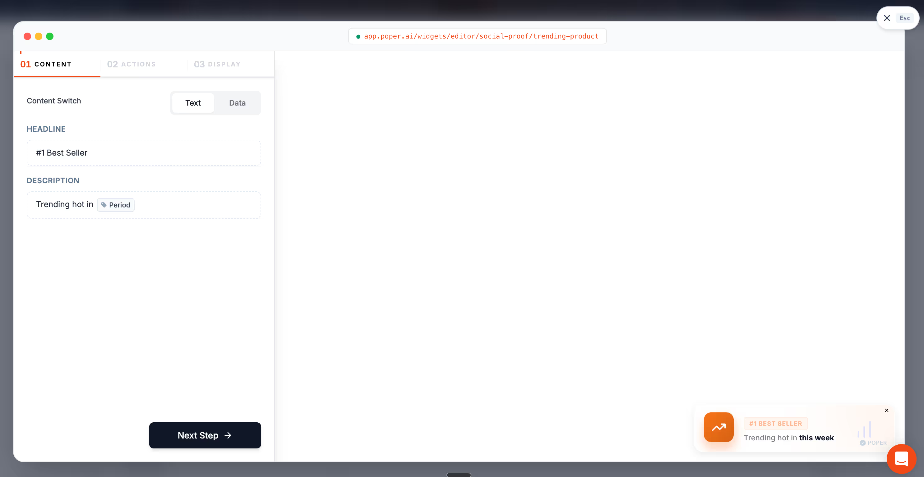
Pair it with Poper's Social Proof widget for live purchase notifications, and you cover both halves of checkout trust: the site is secure, and other people are buying. For the extra-cost objection that tops the abandonment table, a free-shipping progress bar nudges shoppers past the threshold instead of away from it. All three render at the decision point, which is the only place trust signals reliably pay off.
The Bottom Line
Trust badges at checkout work, but only on the terms the data sets. Use recognized third-party seals, place them beside the payment field, keep the set to three or four, plan for mobile separately, and test the impact rather than assuming it.
Skip the self-made graphics and the badge pile-up. Both quietly cost you the conversions you added the trust badges to win.
Put A Few Honest Badges Where The Doubt Peaks
You have the shortlist and the placement map. Build the badge row in Poper, sit it beside the card field, and keep the count restrained. The same snippet also gives you 160+ other widgets, from FAQ accordions to social proof notifications, if you want to keep tightening the page after this.
Create Your Free Poper AccountFree plan, no credit card required.


