
A few months ago I sat with a store owner who could not understand why her traffic was healthy but her sales were flat. We opened her top product on a phone, and the answer was staring at us. The first photo was a plain white pack shot, the swipe gesture felt sticky, and by the third image most people had clearly given up. That little gallery was doing almost none of its job, and it is exactly why I care so much about getting the product image carousel ecommerce experience right.
So in this post I want to walk you through what we changed and why it worked. A product image carousel is the single most looked at element on a product page, yet most stores treat it as an afterthought.
I will show you the patterns that quietly move the add to cart button, the mistakes that kill a good product image carousel ecommerce setup, and how you can copy the whole approach on your own site this week.
Why the Product Image Carousel Carries So Much Weight
Shoppers cannot touch or hold anything online, so the images do the selling. That is not a soft opinion, it is how people actually behave. Research shows that 75% of online shoppers rely on product images to decide whether to buy, which means your product image carousel is carrying most of the persuasion on the whole page.
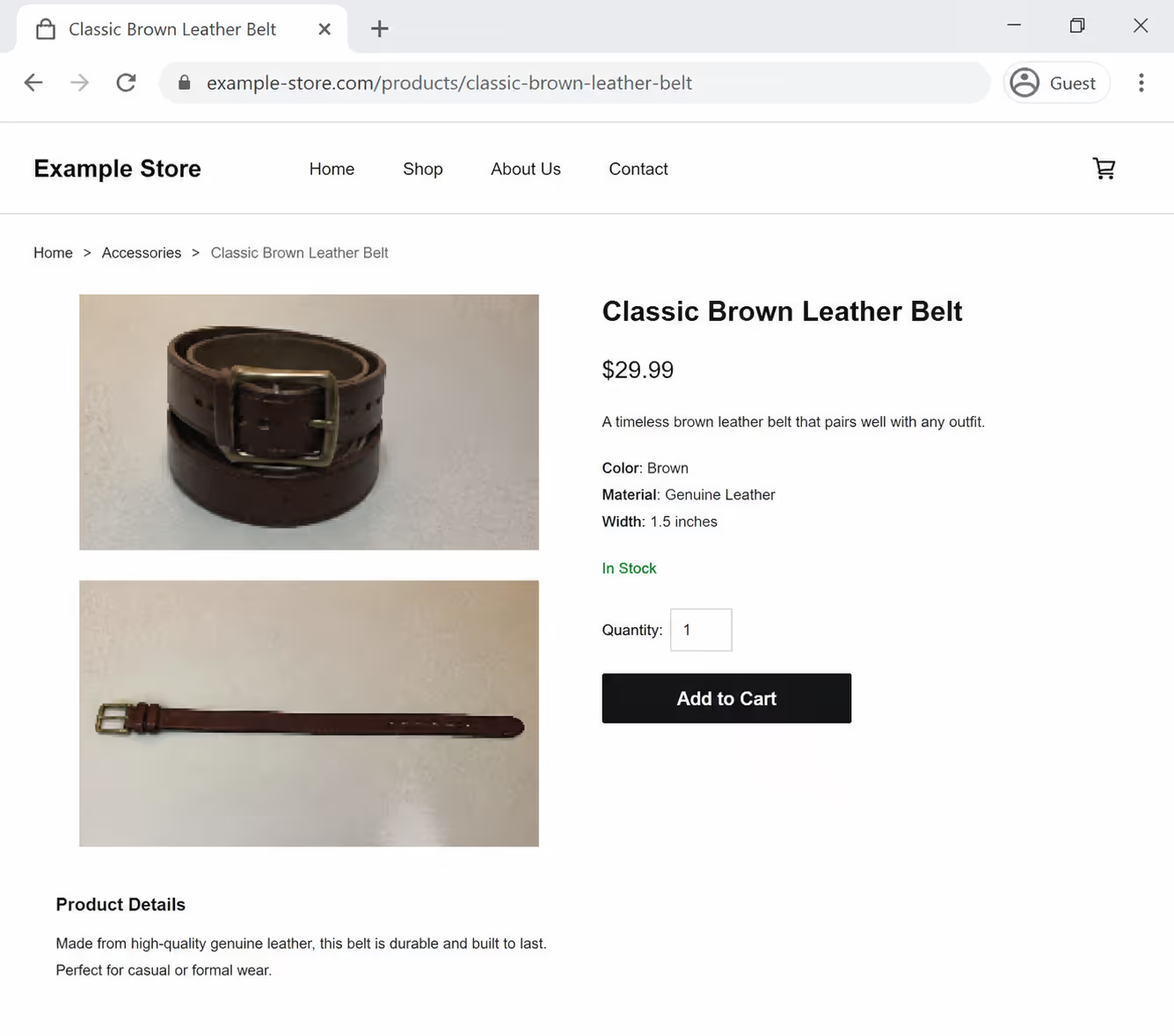
The quality bar matters too. The same photography research found that high resolution product photos convert about 94% better than low resolution ones, and professional grade shots lift conversion by roughly 33% on average. When your product image carousel ecommerce gallery is sharp, zoomable, and complete, you are not decorating the page, you are removing the doubt that stops a purchase.
There is real money hiding in this. The average add to cart rate across ecommerce sits around 7% to 8%, while the best product pages reach 10% to 15%. A big part of that gap is how well the product image carousel answers the questions a shopper has before they ever read a word of copy.
Drop A Real Product Carousel Onto Any Product Page
You do not have to fight your theme gallery to get sharp, zoomable photos. Build the carousel in Poper's editor, then paste one script tag into your site and embed it wherever the gallery belongs.
<script id="poper-js-script" data-account-id="YOUR_ACCOUNT_ID" src="https://app.poper.ai/share/poper.js" defer></script>The Image Order That Actually Sells
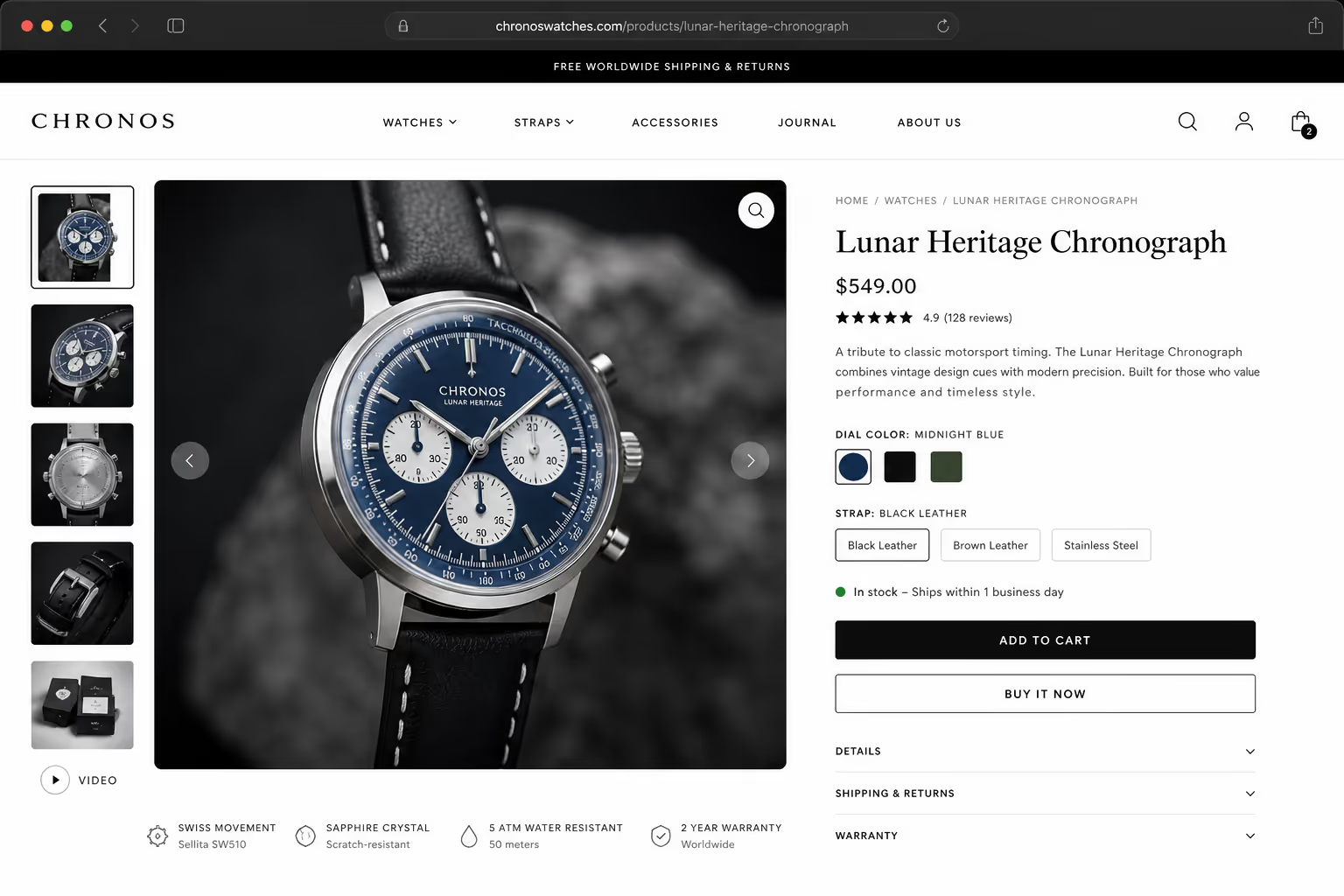
The order of your images is a decision, not an accident. Most stores lead with a bare studio shot because it feels clean, but a bare shot rarely creates desire. A strong product image carousel ecommerce sequence tells a small story: this is the product, this is it in real life, this is the detail you were worried about, and this is the proof it works.
I usually coach people to think in four beats. The hero image shows the product clearly. The lifestyle image shows it in use or in scale, so the shopper can picture owning it. The detail image handles the one objection buyers always have, whether that is fabric, ports, size, or finish. The proof image closes the loop with packaging, results, or the product next to a familiar object for scale.
How many images should sit in the carousel? Around four to eight is the sweet spot for most catalogs, and aggressive fashion sellers like SHEIN push eight to twelve with fabric close ups and scale comparisons. The goal is not to overwhelm, it is to make sure the product image carousel answers every silent question before the shopper has to ask it.
The Mobile Problem Nobody Watches
Here is the uncomfortable truth. Most of your buyers are on phones, and most product image carousels were designed on a big desktop screen where everything feels fine. Baymard Institute found that 62% of mobile ecommerce sites have mediocre or worse product page UX, and the image gallery is one of the biggest offenders.
On mobile, a product image carousel ecommerce gallery has to feel like a native swipe, not a fight. The swipe needs momentum, the images need to load fast, and there must be clear dots or a counter so people know more photos exist. When shoppers cannot tell there is a second or third image, they simply never see it, and all that photography budget goes to waste.
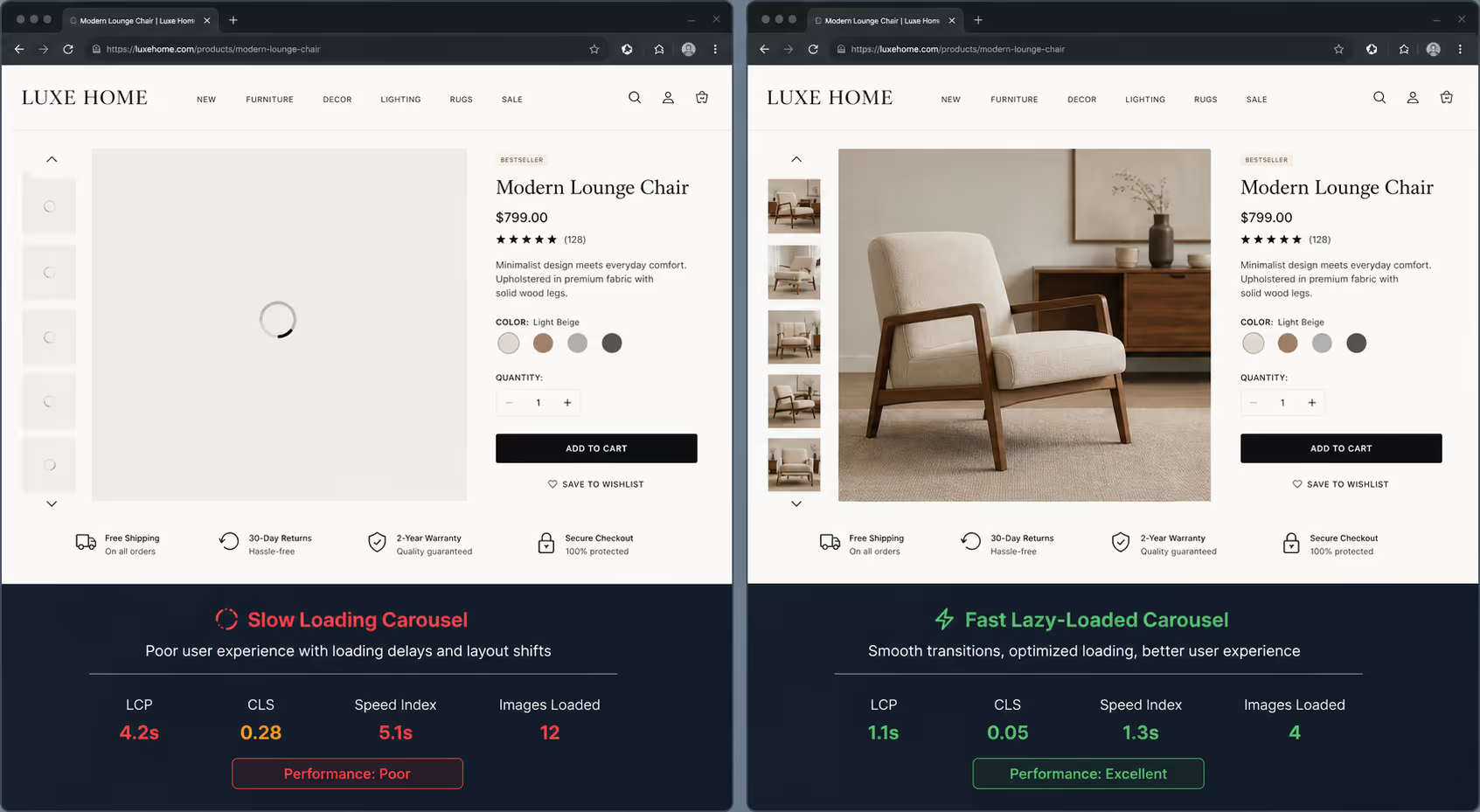
Speed is part of the experience here. Heavy, uncompressed images make the carousel stutter on a phone, and a stuttering gallery reads as a low quality store. A smooth, lazy loaded product image carousel keeps the momentum going, and momentum is what carries a shopper toward the add to cart button.
Interactive Images: The Underused Lever
If you want the sharpest jump in add to cart, look at interactive imagery. A 360 degree view lets shoppers spin the product the way they would turn it over in a store, and the numbers are striking.
We also support a 360 degree view widget, if you ever decide to have one.
You do not always need a full spin to win, though. Even a simple zoom on hover, a short looping video clip inside the product image carousel, or a tap to enlarge gesture gives the shopper that sense of control. Control builds confidence, and confidence is what turns a browser into a buyer. A modern product image carousel ecommerce setup should feel explorable, not static.
Flat Gallery vs Real Product Image Carousel
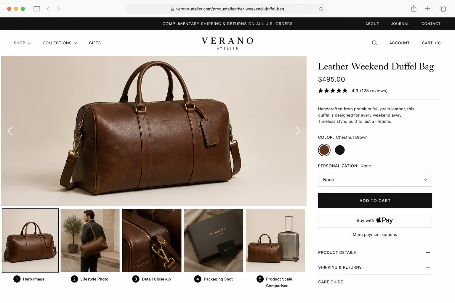
To make this concrete, here is a side by side look at the plain gallery most stores ship versus a considered product image carousel. The numbers below are a realistic example built from the benchmark ranges above, so you can see how the pieces stack up for product image carousel ecommerce results.
| Element | Flat Default Gallery | Optimized Product Image Carousel |
|---|---|---|
| First image | Plain white pack shot | Hero shot with clear context |
| Image count | 2 to 3 photos | 4 to 8 story-driven photos |
| Mobile swipe | Sticky, no counter | Smooth swipe with dots |
| Interactivity | None | Zoom, video, or 360 view |
| Load behavior | All images at once | Lazy loaded, compressed |
| Typical add to cart | ~7% | 10% to 15% |
Nothing in that table requires more traffic or a bigger ad budget. The only real change is treating the product image carousel as a sales tool instead of a photo dump. That mindset shift is the whole game for product image carousel ecommerce performance.
Build The Optimized Gallery Without Touching Theme Code
Everything in the optimized column of that comparison is a setting, not a rebuild. Poper's Image Carousel widget gives you the ordering, the mobile swipe, and the zoom in a drag and drop editor.
How to Fix Your Carousel This Week
You do not need a redesign to get most of this. Start by reordering your existing photos into that hero, lifestyle, detail, proof sequence, because reordering costs nothing and often moves the needle first. Then audit the gallery on an actual phone, not a browser resized on your laptop, so you feel the swipe the way a customer does.
From there, tighten the mechanics with a short checklist you can run on any product image carousel ecommerce page:
Compress every image so the carousel loads fast and never stutters on mobile.
Add clear dots or a counter so shoppers know more photos exist.
Include at least one lifestyle shot and one scale or detail shot.
Enable zoom or tap to enlarge so people can inspect the product.
Test a short video or 360 view on your best selling item first.
Run that list on your top five products before touching the long tail. Those pages get the most traffic, so a better product image carousel there returns the fastest, and the wins fund the rest of the work.
Building It Without a Developer
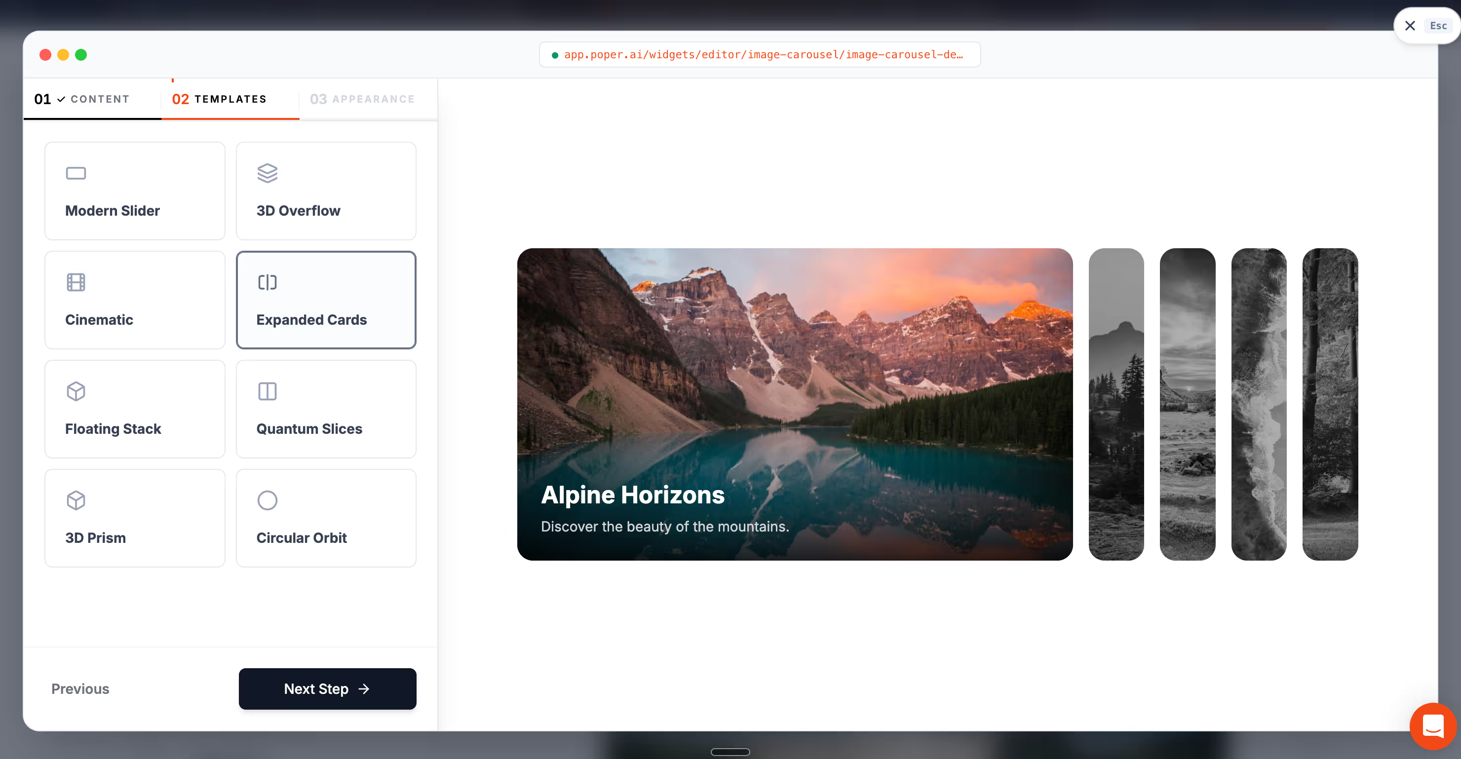
The reason a lot of stores never fix this is that the default theme carousel is hard to change. That is where a no code widget helps. With Poper's Image Carousel widget, you can build a fast, swipeable, mobile friendly product image carousel and drop it onto any site in a couple of minutes, whether you are on Shopify, WordPress, Webflow, or a custom build.
Because it sits on top of your existing page, you can restyle and reorder the gallery without wrestling your theme code, and you can pair it with other Poper widgets like a size chart or a before and after slider to answer even more buyer questions in one place. That flexibility is what makes it realistic to keep improving your product image carousel ecommerce experience over time instead of shipping it once and forgetting it.
The takeaway is simple. Your product image carousel is not a gallery, it is the most persuasive salesperson on the page, and it is working every hour of every day. Give it a clear image order, a smooth mobile swipe, a little interactivity, and fast loading, and you will watch your add to cart rate climb.Treat the product image carousel ecommerce experience with the same care you give your ads, and it will quietly pay you back long after the campaign ends.
Treat the product image carousel ecommerce experience with the same care you give your ads, and it will quietly pay you back long after the campaign ends.
Sources
Rebuild The Gallery On Your Best Selling Product First
Take the product page that gets the most traffic, rebuild its gallery as a Poper image carousel, and embed it today. Restyle it whenever the photos change, and repeat the same setup across the rest of your catalog when you are happy with it.
Create Your Free Poper AccountNo developer, no theme edits, no credit card.


