
I still remember the call. A founder shared her screen, opened her pricing page, and just sat there scrolling. She had three plans, a long wall of features, and no clear idea which one she would pick herself. I thought to myself, if the person who built the page cannot choose, her visitors have no chance.
That moment is where my obsession with product comparison table conversion really started, because a table is the exact spot where a confused visitor either becomes a customer or quietly clicks away.
So in this post I want to walk you through a real story. We rebuilt one messy feature list into a clean product comparison table, and conversion climbed by about 27%. I will show you what changed, why it worked, and how you can copy the same product comparison table conversion playbook on your own site this week.
The Page That Was Quietly Losing Sales
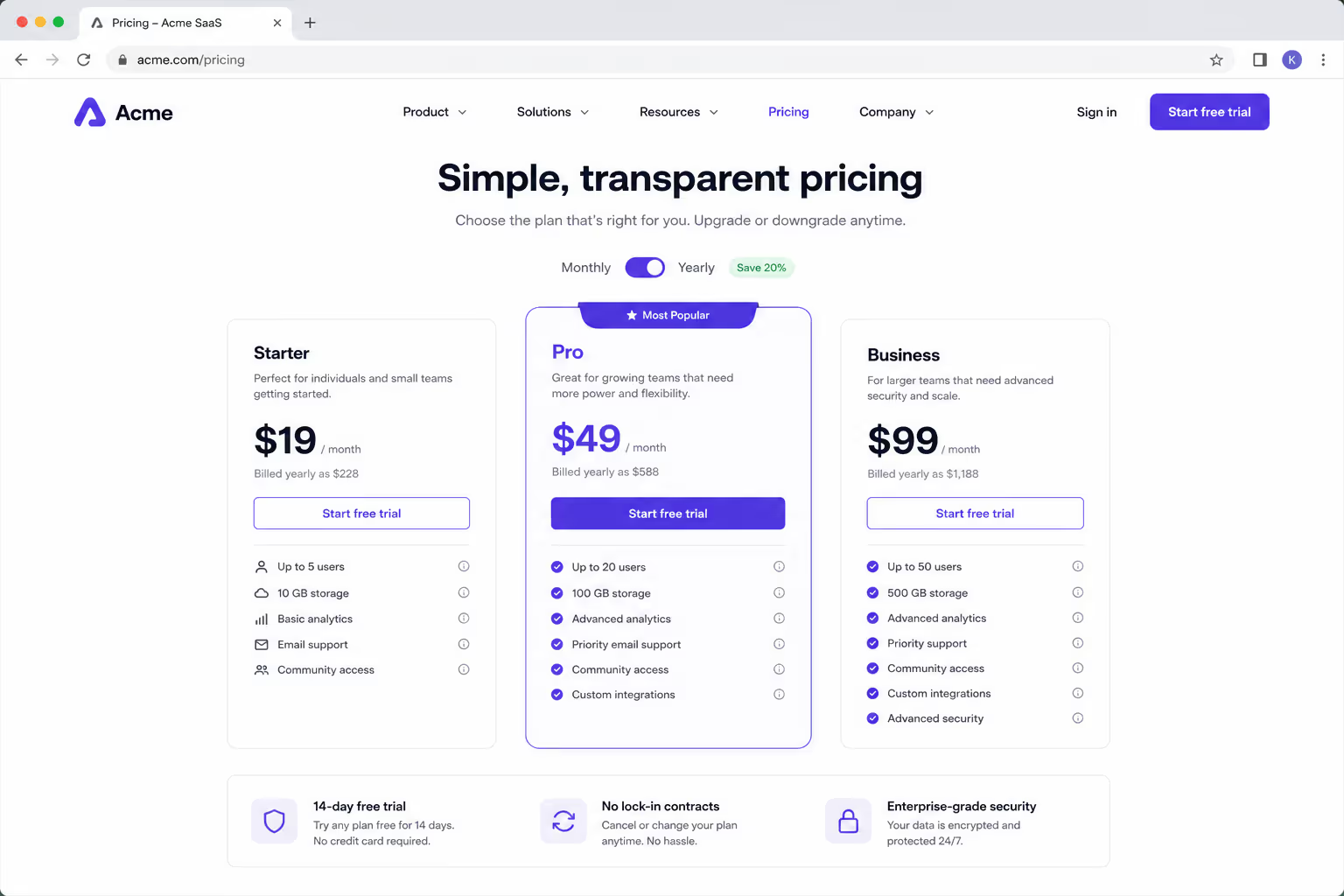
The page looked fine at a glance. It had nice colors, a friendly headline, and plenty of detail. The problem was that all of that detail arrived as one long, flat list. Every feature sat at the same visual weight, so nothing stood out and no plan felt like the obvious answer.
When we watched session recordings, the pattern was painful. People scrolled up and down the same section three or four times, hovered near the buttons, and then left. That back and forth is the visible shape of decision fatigue, and it is the silent enemy of product comparison table conversion.
We were not alone in this. In a review of ecommerce experiments, product page tests were found to drive roughly 12% to 28% conversion growth when they clean up how choices are presented. That range told us the upside was real, and a better product comparison table was the fastest way to reach for it.
What a Product Comparison Table Actually Changes
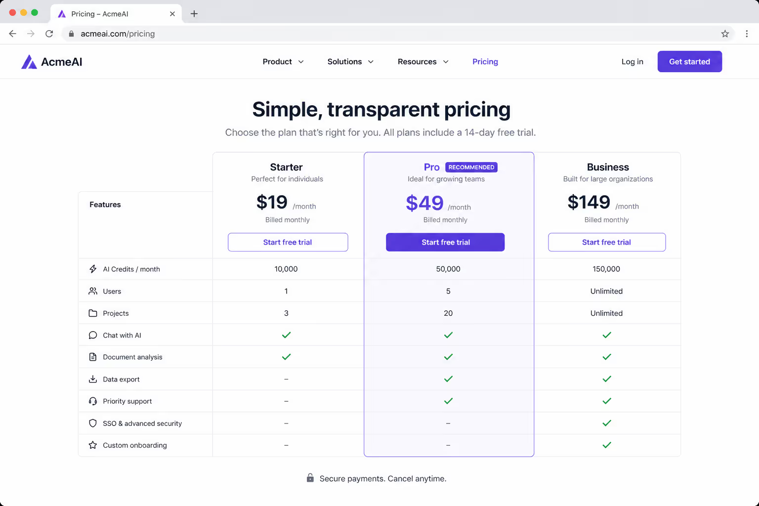
A product comparison table does one quiet job very well. It lines up the options side by side so the reader can compare them in seconds instead of holding every detail in their head. That shift, from remembering to simply seeing, is the heart of product comparison table conversion.
When choices sit in a shared grid, the eye can scan across a single row and spot the difference that matters. Price, seats, support, delivery time, whatever the deciding factor is, it becomes visible instead of buried. A good product comparison table turns a research chore into a two second glance.
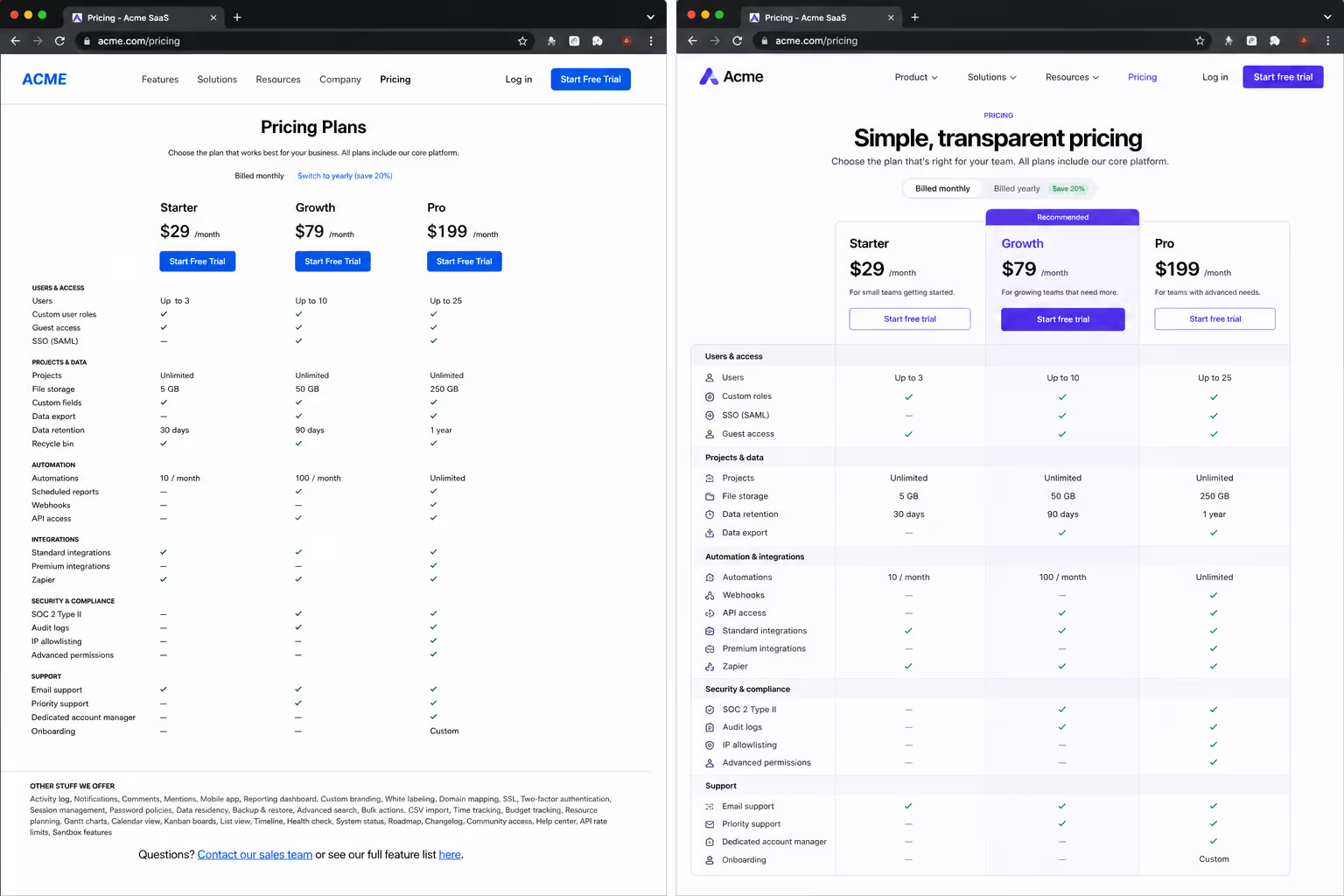
There is also a trust effect. Laying out the trade offs openly, including the limits of the cheaper plan, tells the visitor you are not hiding anything. That honesty is a big reason product comparison table conversion tends to beat a page full of one sided marketing copy.
The 27% Story, Broken Down
Here is the part everyone asks about. The numbers below are a realistic example built from the same product page range I mentioned above, so you can see how a 27% product comparison table conversion lift actually adds up month to month.
| Metric | Before (Flat List) | After (Product Comparison Table) |
|---|---|---|
| Monthly visitors | 20,000 | 20,000 |
| Conversion rate | 2.6% | 3.3% |
| Sales per month | 520 | 660 |
| Extra sales | Baseline | +140 |
| Relative lift | Baseline | +27% |
Nothing about the traffic changed. Same visitors, same ads, same product. The only real difference was that we replaced a flat feature dump with a focused product comparison table, and that single change moved conversion by 27%.
When you run the math on 140 extra sales a month, the case for product comparison table conversion pays for itself almost immediately.
Why the Product Comparison Table Moved Conversion So Much
The first reason is clarity of pricing. Companies that show clear, side by side pricing tend to convert 15% to 25% higher than those who hide it, according to a pricing table analysis. Visible pricing removes the friction of guessing, and that alone lifts product comparison table conversion.
The second reason is trust through transparency. That same 2026 analysis reported that hiding prices behind a "contact us" wall can drop conversion by 23% to 40%. A product comparison table does the opposite. It puts the numbers in the open, which is exactly what modern buyers now expect.
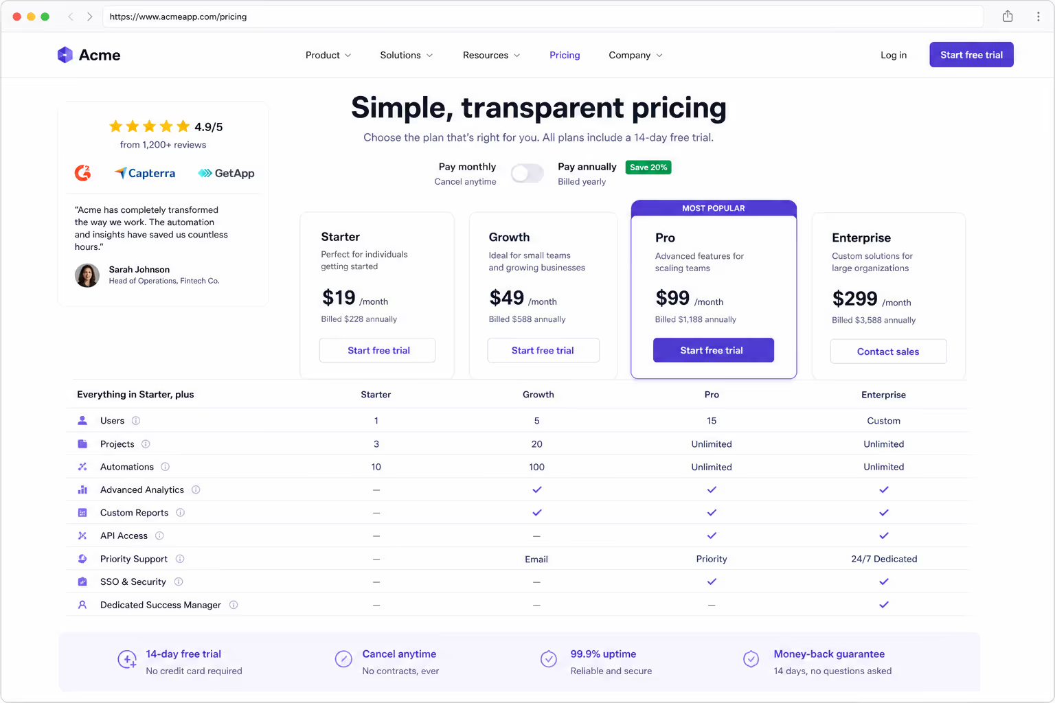
The third reason is social proof sitting right next to the choice. In the experiment review, leading with reviews and ratings rather than raw features drove around 11% to 14% higher conversions. When we added a small star rating row into the product comparison table, the recommended plan felt safe to pick, and product comparison table conversion climbed again.
The last reason is focus. We cut the feature count in each column down to the handful that actually change the decision. Less noise meant faster choices, and faster choices are what product comparison table conversion is really made of.
How to Build Your Own High Converting Product Comparison Table
You do not need a big redesign to get this. You need a tight, honest product comparison table and a little discipline about what to leave out. Here is the exact sequence we follow to protect product comparison table conversion every time.
Cap it at three or four columns, because a fifth option usually just steals attention from your recommended plan.
Anchor one column as the clear favorite with a simple label like "Most popular" so the eye has a home base.
Show only the five to eight features that truly change the decision, and hide the long tail behind a link.
Add one row of proof, such as star ratings or a short "best for" line, so the safe choice feels obvious.
Repeat the button at the bottom of every column, so nobody has to scroll back up to buy.
Follow those five moves and you will already be ahead of most pages online. Each one removes a small piece of hesitation, and removing hesitation is the whole game behind product comparison table conversion.
The Mistakes That Quietly Kill Product Comparison Table Conversion
The most common mistake is treating the table like a spec sheet. When every attribute gets equal weight, you rebuild the exact decision fatigue you were trying to solve, and product comparison table conversion falls flat. Choose the rows that matter and cut the rest.
The second mistake is ignoring the phone. A table that looks great on a laptop and turns into a squashed mess on mobile is a broken table. That matters even more now, since a case study saw a mobile first rebuild of a pricing comparison lift mobile conversion by 34%. If your product comparison table does not collapse into clean cards on a small screen, you are leaving real money on the table.
The third mistake is dishonesty. If your table quietly hides the weak spots of a plan, sharp buyers feel it, and trust drops. Honest trade offs are what make product comparison table conversion durable rather than a one week bump.
Building Your Product Comparison Table in Poper Without Code
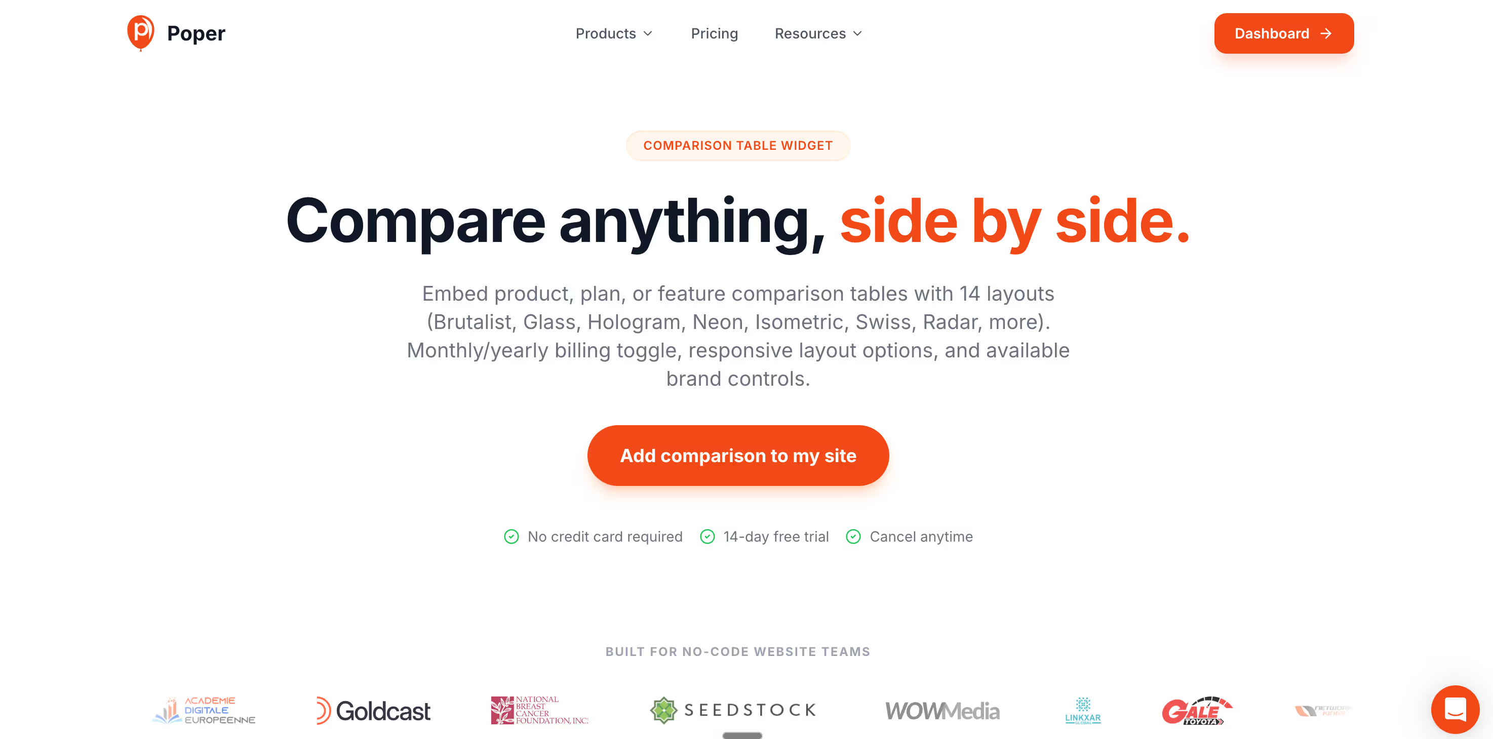
This is where I get to be a little biased, because we built Poper to make exactly this easy. Our no code Comparison Table widget handles the fiddly parts of product comparison table conversion for you, including highlighted columns, sticky headers, and a clean collapse into cards on mobile. You can drop it onto any site in under two minutes, with no developer needed.
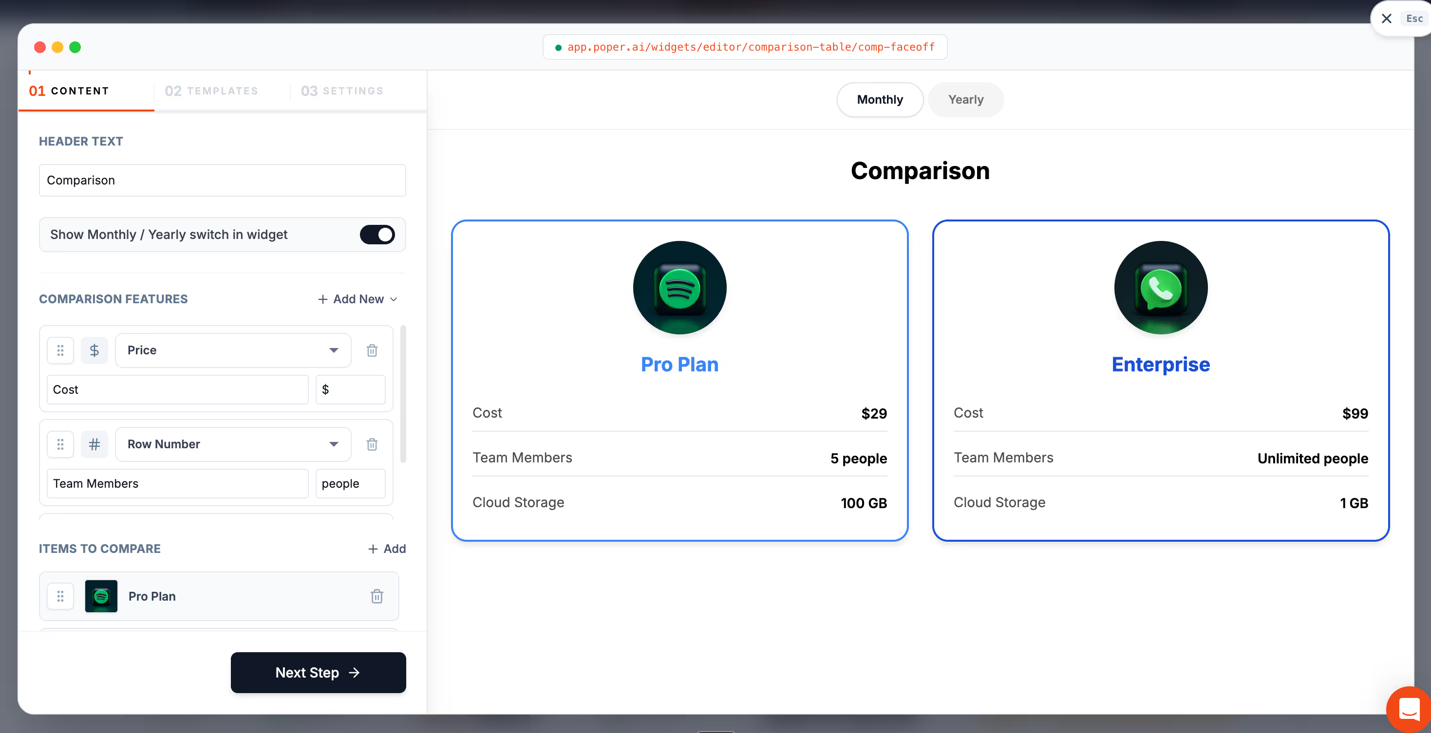
If you want a head start on layout, our roundup of comparison table design examples shows 20 patterns you can copy, from anchored pricing grids to two product head to head layouts. Pick the one that fits your product, fill in your own numbers, and you have a real shot at the same product comparison table conversion lift we saw in this story.
The big lesson from that founder call is simple. Her visitors were never confused about her product, they were confused by her page. The day we gave them a clean product comparison table, the choice became obvious, and conversion followed. Build yours with the same care, keep it honest, and let the table do the selling for you.



