A founder I advise, Daniel, runs a small detailing business and was proud of his shiny new booking page. Traffic was healthy, ads were running, and yet his calendar stayed quiet. When we looked at the numbers together, the picture was brutal: roughly a third of the people who started a booking simply walked away. That was the day he learned that online booking page conversion is not about how the page looks, it is about how it feels to move through.
I want to share what we found, because Daniel is not alone. Almost every owner I talk to has a booking page that leaks, and most of them have no idea where the leak is. So let me walk you through why your booking page has that 30% drop-off, and the fixes that actually move online booking page conversion in the right direction.
Why a 30% Drop-Off Is Normal, and Still Unacceptable
Here is the uncomfortable truth. A 30% drop-off on a booking page is not a freak result, it is the baseline. A funnel study that tracked over 12 billion user sessions found that the average multi-step funnel now loses between 60% and 90% of users before they finish. A booking page is a multi-step funnel, so weak online booking page conversion is the default unless you fight for it.
The travel world shows just how deep the leak runs. Industry data puts the share of travelers who start a booking but never complete it at around 81%. That is not a typo. Four out of five booking attempts evaporate, which is exactly why online booking page conversion deserves your attention more than another round of ad spend.
The good news is that the same research points to the cause. SiteMinder's Changing Traveler Report found that 52% of travelers abandon a booking because of a bad digital experience, not because they changed their mind. That means most of your lost bookings are recoverable. Improving online booking page conversion is mostly about removing friction you put there by accident.
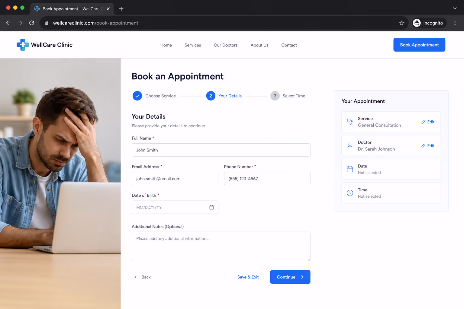
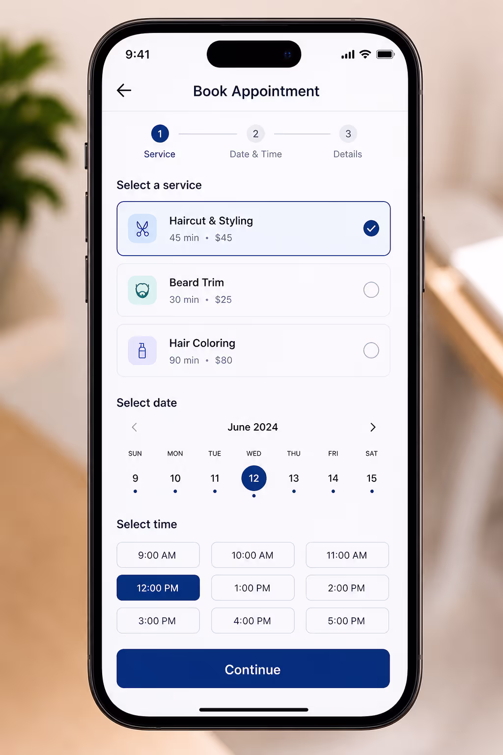
Fix One: Cut the Form Down to the Bone
The single biggest drag on online booking page conversion is a form that asks for too much. Every extra field is another tiny reason to quit. Research on checkout forms shows that each additional field reduces completions by roughly 3% to 5%, and those small losses stack up fast.
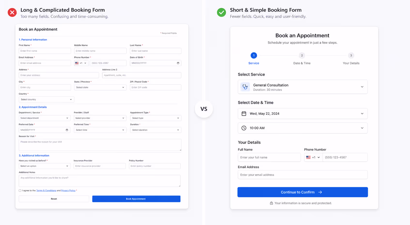
The case studies here are hard to ignore. Expedia earned an extra $12 million in annual profit simply by removing one optional "Company" field from its form. Imagescape went further and cut its form from 11 fields down to 4, which lifted conversions by 120%. If you want better online booking page conversion this week, count your fields and delete every one you do not truly need before the appointment happens.
Ask yourself a simple question for each field: do I need this to confirm the booking, or do I just want it? Name, contact detail, and the chosen slot are usually enough. Everything else can wait until later. Trimming the form is the fastest, cheapest way to raise online booking page conversion, and it costs you nothing but a few minutes of editing.
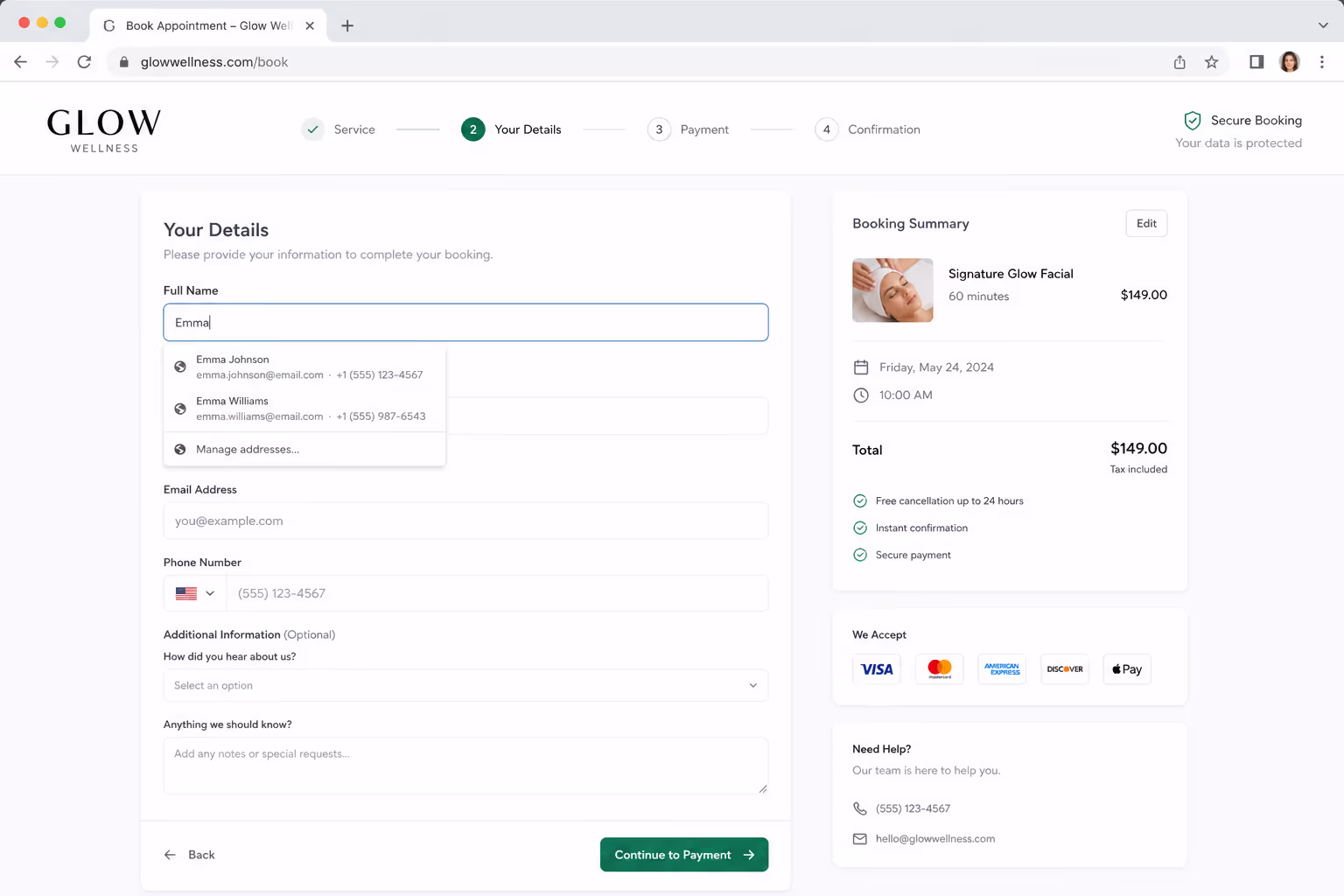
Fix Two: Stop Forcing Account Creation
Nothing kills online booking page conversion faster than a wall that says "create an account to continue." People came to book a time, not to manage a password. When you block them, many simply leave.
The data backs this up plainly. In checkout research, 24% of shoppers abandoned because they were forced to create an account, and 22% left because the process felt too long or complicated. A booking page suffers the exact same way. Let people book as a guest, and your online booking page conversion will climb without any other change.
If you genuinely want repeat customers to have an account, offer it after the booking is confirmed, not before. Let the booking succeed first, then invite them to save their details for next time. That order protects online booking page conversion while still giving you the relationship you wanted.
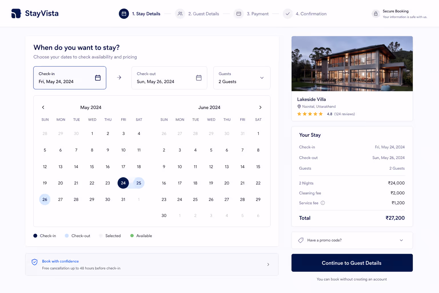
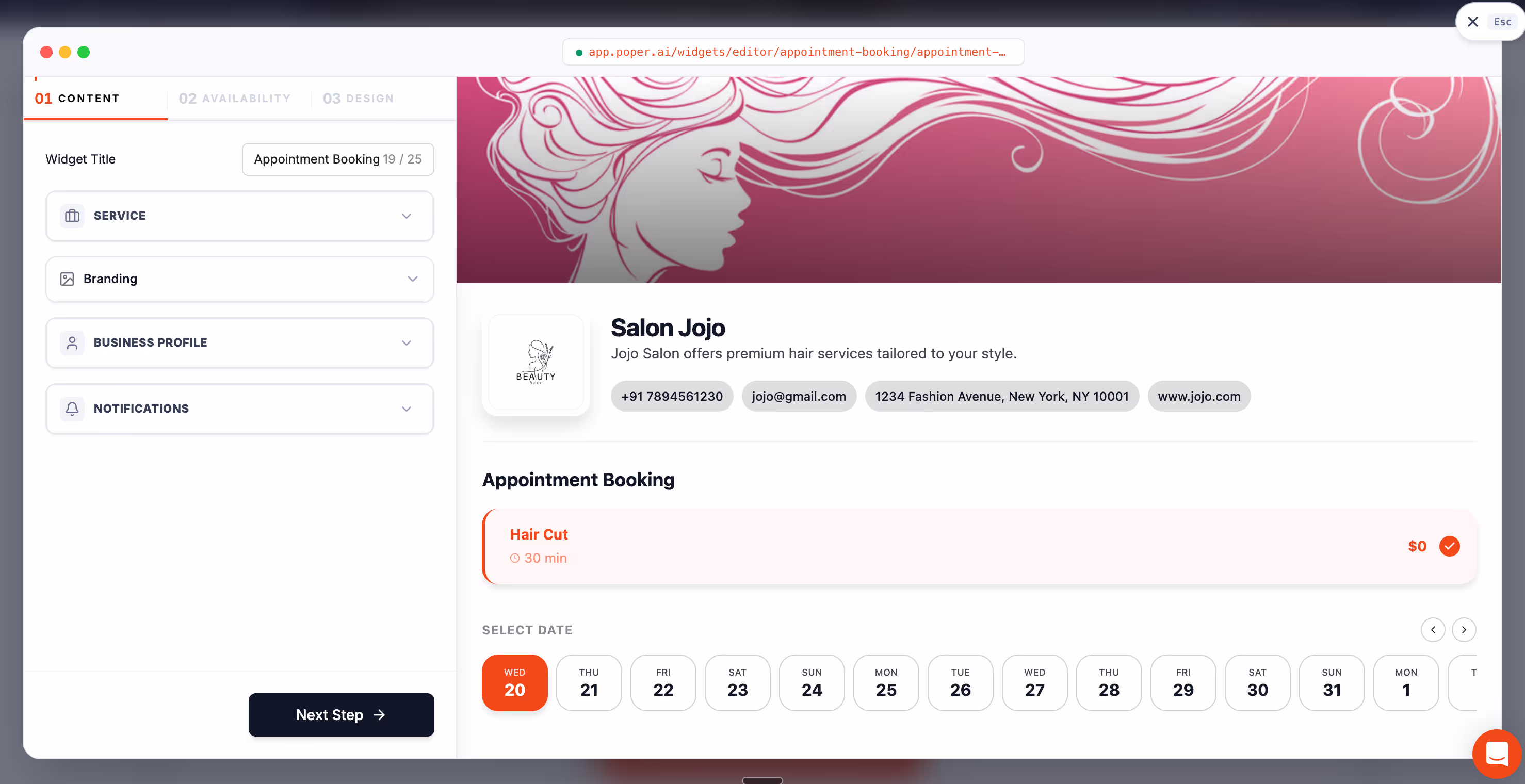
Fix Three: Show Real Availability, Not “Contact Us”
One pattern I see again and again is a booking page that hides the calendar behind a form or a "request a callback" button. That delay quietly destroys online booking page conversion, because the visitor's intent is highest in the first few seconds and you are spending it on a waiting game.
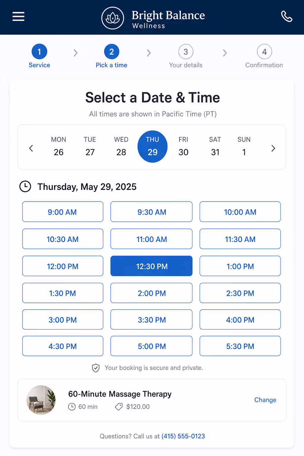
When someone can see open slots immediately, the decision becomes concrete instead of vague. They are no longer deciding whether to reach out, they are picking between Tuesday at 3pm and Thursday at 11am. That shift from "should I" to "which one" is one of the strongest levers for online booking page conversion you have.
So put the live calendar front and center. Show actual times, mark them clearly, and let the visitor commit in one motion. A page built around visible availability protects online booking page conversion in a way no clever headline ever will.
Fix Four: Make the Page Fast and Mobile-First
Most of your booking traffic is on a phone, and a page that feels clumsy on mobile is a page with poor online booking page conversion. Buttons that are too small, calendars that need pinching, and slow loads all push people away before they ever pick a time.
Speed is part of the experience too. If a page takes too long to respond, the visitor assumes the booking itself will be painful. Payment autofill is one quiet win here, since supporting it can cut completion time by 30% to 50%, and faster completion lifts online booking page conversion directly.
Treat the phone as the main screen, not an afterthought, and the numbers follow.
The Fixes Side by Side
To make this easy to act on, here is how each fix maps to the drop-off it solves and the effort it takes. Start at the top, since the cheapest fixes usually deliver the largest gains in online booking page conversion.
| Fix | Drop-off it solves | Effort |
|---|---|---|
| Trim the form fields | Visitors quitting a long, tedious form | Low |
| Allow guest booking | Visitors blocked by forced account creation | Low |
| Show live availability | Visitors losing interest during a "contact us" delay | Medium |
| Optimize speed and mobile | Visitors frustrated by a clumsy phone experience | Medium |
None of these fixes is glamorous, and that is the point. Strong online booking page conversion comes from removing small frictions one by one, not from a single redesign. Checkout UX research found that combining field reduction with flow optimization delivered conversion increases of up to 35.62%, which tells you the compounding effect is real.
How Poper Helps Your Online Booking Page Conversion
I will be straight about where our tool fits. Poper is an AI-powered engagement platform, and our Appointment Booking Widget exists to remove the exact frictions that hurt online booking page conversion. You can embed a no-code booking widget on any page in under two minutes, on WordPress, Shopify, Webflow, Wix, or Squarespace.
With Poper you can show live availability right on the page, keep the form short, and let visitors book as guests so nothing blocks the moment of intent. You can also use our targeting rules to surface the booking option when interest is highest. Every one of those choices is built to protect online booking page conversion instead of leaking it.
So here is my closing thought for you, the same one I gave Daniel. Your 30% drop-off is not a verdict, it is a to-do list. Trim the form, drop the account wall, show real slots, and respect the phone. Do those four things and watch your online booking page conversion climb week after week. Daniel did, and his quiet calendar finally started to fill.