
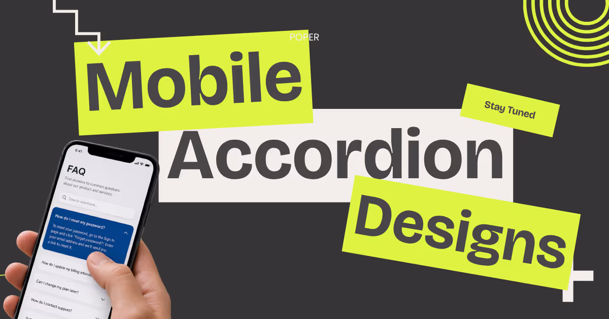
I had a call last month with a founder who could not figure out why her FAQ page was bleeding mobile users. Desktop conversion looked fine. Mobile dropped 40% on the same page. We opened the site on her phone, and within ten seconds the problem was obvious.
Her mobile accordion design forced users to reach for a tiny chevron in the top right of each row, two thumbs of stretch away from where any human actually holds a phone.
That is the story of bad mobile accordion design. It looks fine on a desktop preview, gets approved in Figma, and quietly kills engagement once it ships to real phones.
I want to walk through what good mobile accordion design looks like in 2026, the patterns that respect thumb users, and the small specifics that separate a smooth mobile accordion design from one that frustrates every visitor who lands on it.
I will also share how we approach mobile accordion design when we build the Poper Accordion Widget, because every rule we are about to discuss is something we had to enforce at the code level before we trusted the widget on real client sites.
Why Mobile Accordion Design is its own Discipline
Desktop accordion design and mobile accordion design look like the same component, but they are not the same problem. A desktop user has a precise pointer, a wide screen, and no fatigue from holding a device. A mobile user has a thumb, a narrow viewport, and tired hands. That is the entire reason mobile accordion design needs its own playbook.
The traffic numbers force the issue. Statista's quarterly tracking puts mobile at roughly 60% of global web traffic, with regions like Africa at 79% and Asia at 72%. If you skip mobile accordion design, you are skipping most of your audience. That is not a hypothetical. That is the median visitor on a typical site.
The behaviour data makes it worse. Research repeatedly cited by mobile UX teams shows that 75% of mobile interactions are thumb driven, with most users holding the phone in one hand. Your mobile accordion design has to assume a single tired thumb, not a precise mouse cursor.
The Thumb Zone is the foundation of Mobile Accordion Design
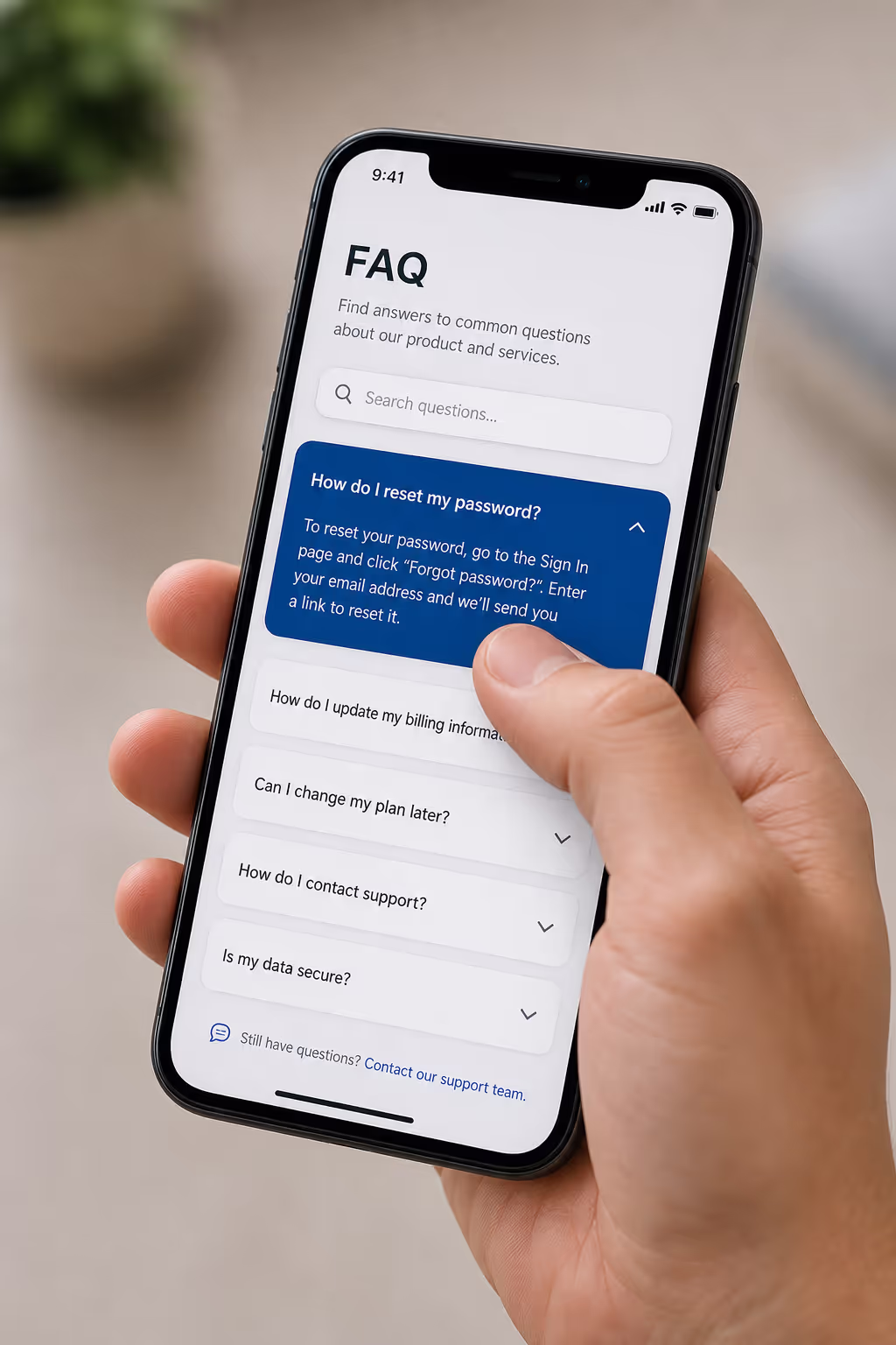
Every conversation about mobile accordion design starts with the thumb zone. The thumb zone is the area of the screen a user can reach without changing their grip. It splits roughly into three bands. The natural zone sits in the bottom centre. The stretch zone sits at the top and far corners. The hard zone is the top edge of a large phone, which most users cannot reach at all in one-handed use.
Nielsen Norman Group's touch target research is clear on what this means in practice. Tap accuracy in the natural zone reaches 96%, while accuracy in the stretch zone drops to 61%. That is a 35 point gap that no amount of clever animation will fix. If your mobile accordion design puts the tap target outside the natural zone, you are losing more than a third of taps before the user even sees the answer.
The fix in mobile accordion design is simple but rarely done. Make the entire header row tappable. Do not anchor the tap target to a small chevron. Do not require precision from a thumb. The whole header, including the title, padding, and icon, should fire the expand action. A 2024 ergonomics study cited across UX literature reported that 73% of mobile users experience thumb strain in normal use. A mobile accordion design that demands precise taps multiplies that strain across every interaction.
Tap target size: The number that decides your Mobile Accordion Design
If I could enforce only one rule of mobile accordion design, it would be the tap target size. 44 by 44 CSS pixels is the standard. The Material Design specification, updated through 2025, recommends 48 by 48 device independent pixels. A safe mobile accordion design rounds up to 48 pixels of vertical height per header row, with no exceptions for visual minimalism.
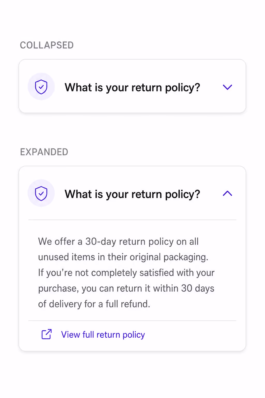
In real terms, that means your mobile accordion design needs at least 12 pixels of vertical padding above and below the header text, with the text itself sitting around 16 to 18 pixels. The icon on the right should not steal hit area from the title. It should sit inside the same tappable container, not replace it.
The cost of getting this wrong is measurable. NN/G's mobile UX work has shown that hidden or hard-to-reach menus can drop task completion by 21%. A mobile accordion design with cramped targets sits in the same category. Users feel the friction even when they cannot name it.
6 Mobile Accordion Design examples worth borrowing
Theory matters, but pattern recognition matters more. Below are six mobile accordion design examples I keep returning to when I audit a page. Each one solves a specific thumb-zone, animation, or content-density problem instead of just looking nice in a screenshot.
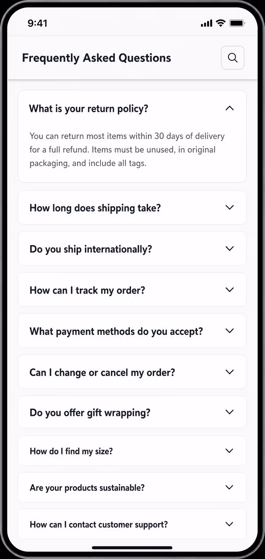
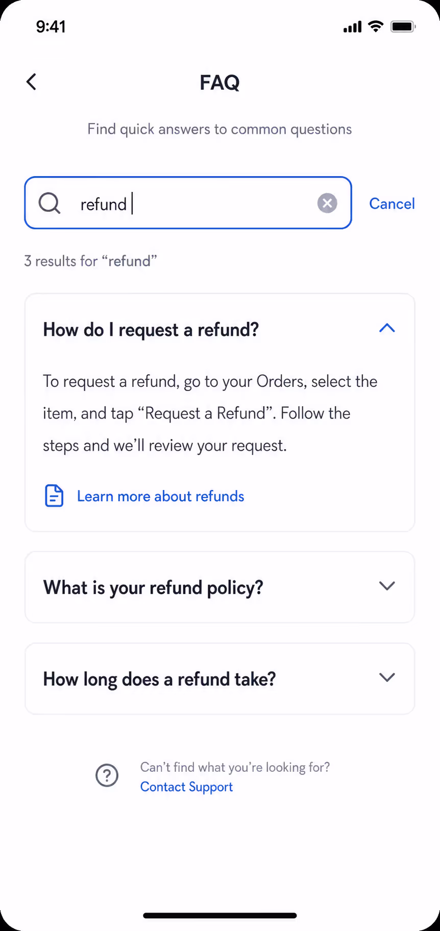
1. Bottom-anchored chevron FAQ accordion
Most mobile accordion design puts the chevron in the top right of the header. That position lives in the stretch zone for a one-handed user. A better pattern drops the chevron to the bottom right of the header row, closer to the natural thumb arc. The whole header still fires the expand, but visitors who do aim at the icon land inside the comfortable zone.
2. Full-row tappable specification accordion
This mobile accordion design example removes the precision problem entirely. The entire header row, including the title, icon, padding, and any small label, behaves as one 56-pixel tap target. Product detail pages benefit most because spec headers are short and visitors scan many rows in sequence. No mis-taps, no zoom, no second attempt.
3. Single-open onboarding accordion with scroll-into-view
For setup guides and step-by-step content, this mobile accordion design forces single-open mode and pairs each expand with a smooth scroll that lands the active header just under the top of the viewport. Users never lose the panel they just opened below the fold, which is the most common complaint with sequential mobile accordion design.
4. Sticky-header section accordion for long lists
When a single panel holds dense content like a course module or a policy section, this mobile accordion design pins the section header at the top of the viewport while the user scrolls through expanded content. The visitor always knows which section they are inside. Collapse the panel and the sticky header releases on its own.
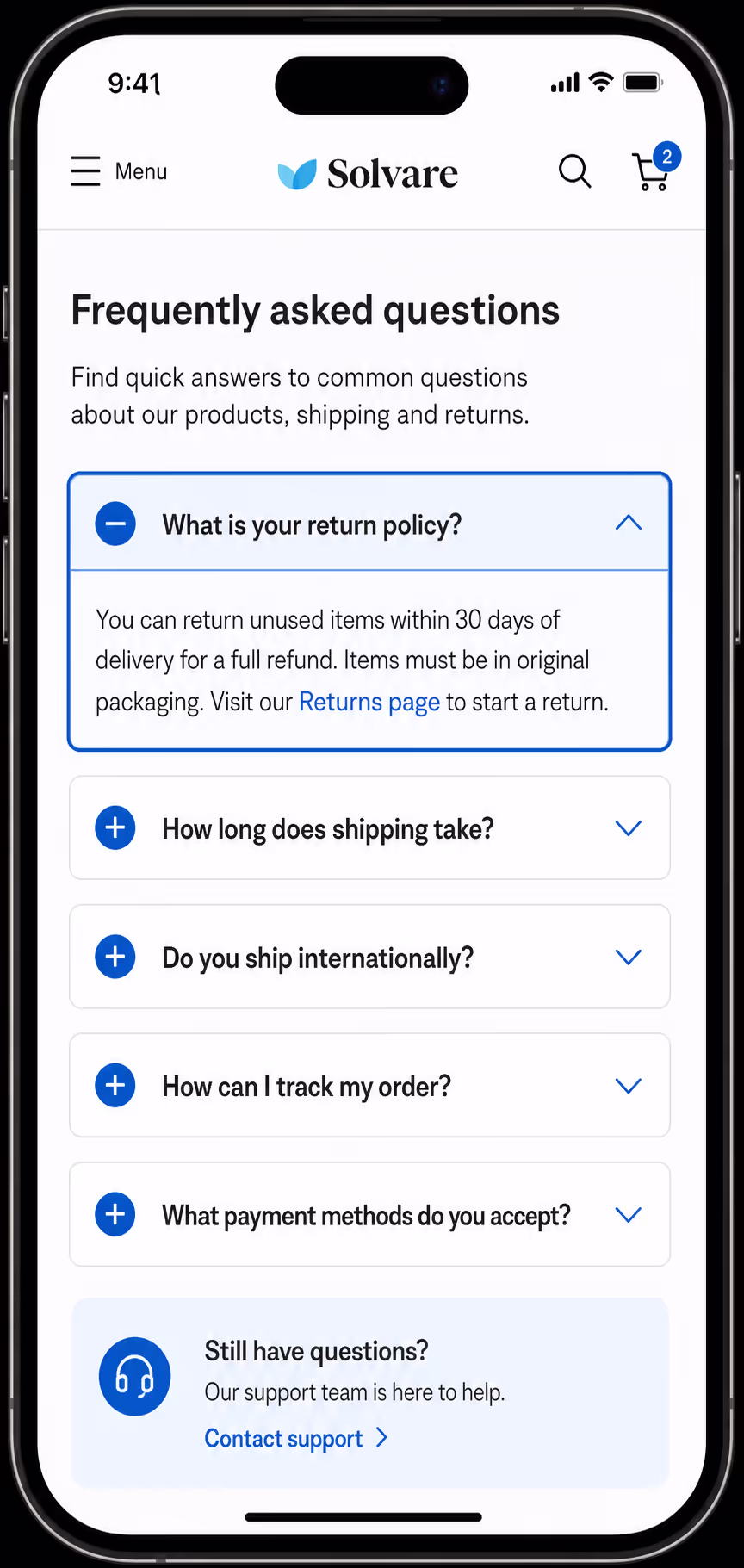
5. Search-activated FAQ accordion
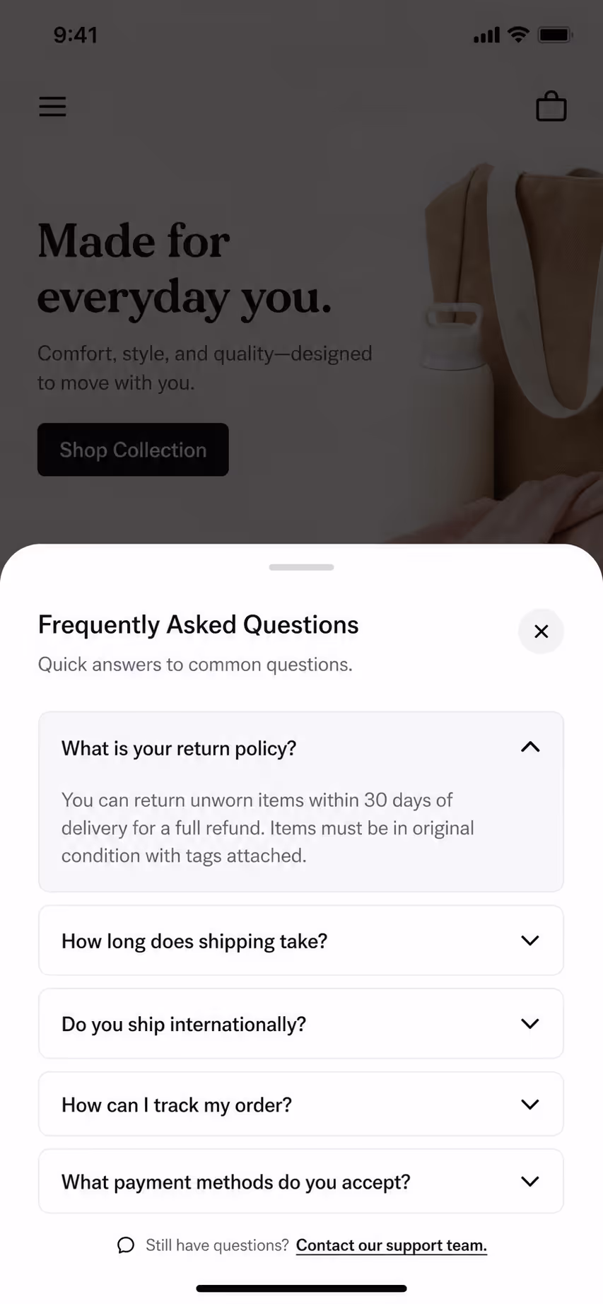
A search field at the top of the accordion lets visitors type a question and auto-expands the matching panel. This mobile accordion design example is built for help centers and long FAQ pages where scrolling through 30 rows on a phone is the friction. The search bar earns its space because it removes a real cost, not because it looks modern.
6. Bottom-sheet mobile menu accordion
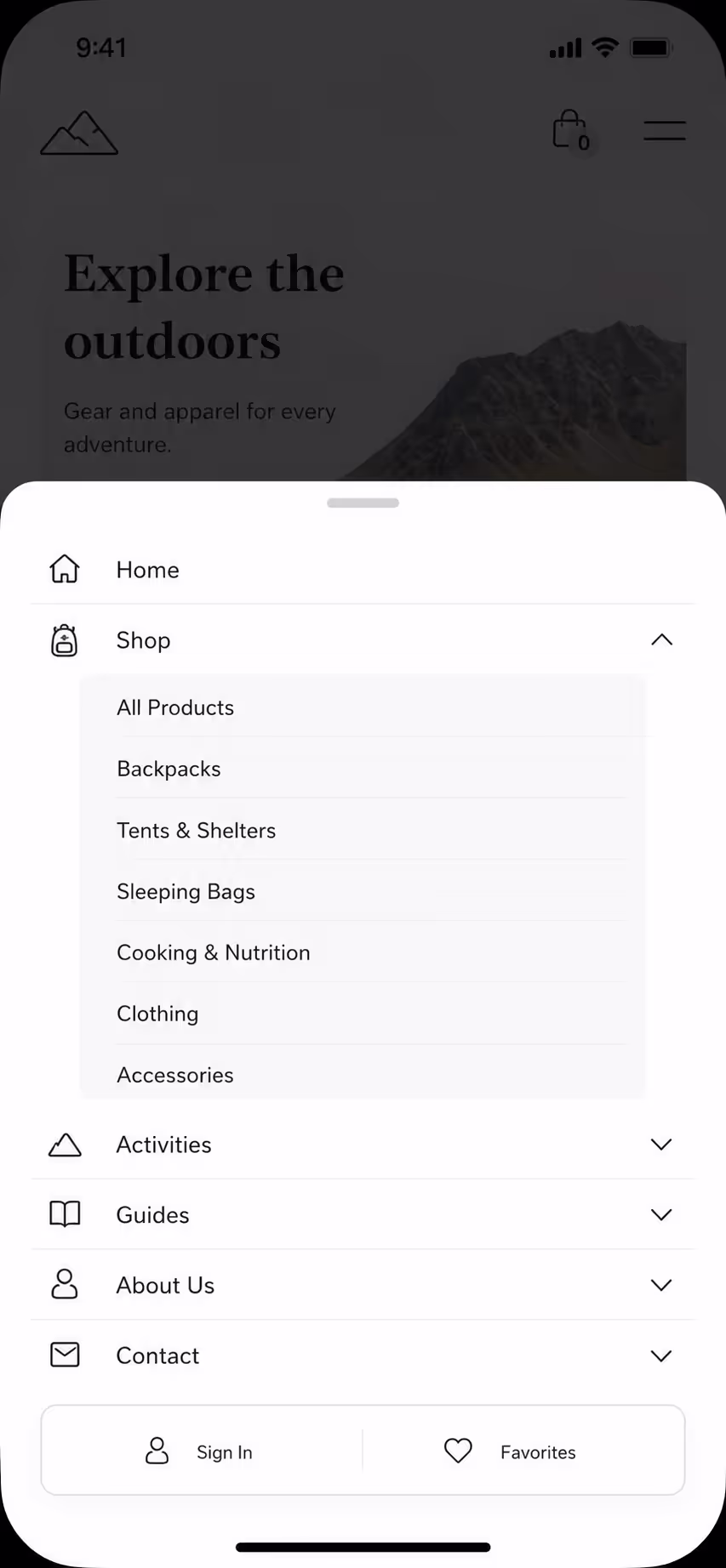
For navigation, this mobile accordion design opens from the bottom of the screen rather than the top. Every header sits inside the natural thumb zone by default. Sub-sections expand inline, top-level labels stay short, and the close handle sits at the very bottom edge where the thumb already rests. This is the cleanest mobile menu pattern I have shipped in 2026.
Animation timing in Mobile Accordion Design
Animation is where mobile Accordion either feels premium or feels broken. The window of acceptable expand and collapse timing is narrow. Anything under 150 milliseconds feels jarring. Anything over 400 milliseconds feels sluggish. The sweet spot for mobile accordion design is between 200 and 300 milliseconds, using an ease-out curve so the panel decelerates as it settles.
The other piece is reduced motion. WCAG 2.2 guidance on animation from interactions expects sites to respect the prefers-reduced-motion media query. A mobile accordion that ignores this setting will fail accessibility audits and will trigger discomfort for the users who need that setting. The fix is one CSS block. Every modern mobile accordion design should ship with it.
I also push teams to avoid auto-collapse on scroll. Some mobile accordion design patterns close panels when the user scrolls away. It feels clever in a demo. In practice it punishes users who scroll back to re-read an answer. Keep panels open until the user closes them.
One panel open versus many in Mobile Accordion Design
The single most argued question in mobile accordion design is whether to allow multiple panels open at once. There is no universal answer, but there is a useful rule. If the content inside each panel is independent and the user might want to compare two answers, allow multiple panels open. If the content is a sequence or a guided flow, force single-open mode so the user is never lost.
For FAQs, I lean toward allowing multiple open. For product specifications grouped by category, I lean toward single-open. The principle behind good mobile accordion design is that the user, not the component, should decide what stays visible.
Whichever mode you choose, the mobile accordion design must scroll the newly opened panel into view. On a small screen, opening a panel below the fold means the user sees nothing happen. The expand has to be paired with a scroll-into-view call that lands the header just under the top of the viewport.
Icons, Chevrons, and Visual Affordance in Mobile Accordion Design
Mobile accordion design lives or dies on visual affordance. A user has to know, before tapping, that a row will expand. The cleanest pattern is a chevron on the right that rotates 180 degrees when the panel opens. Plus and minus icons also work, with the icon swapping on state change. What does not work in mobile accordion design is removing the icon entirely. Users will not test rows by tapping if there is no signal that anything will happen.
The icon size in mobile accordion design should be at least 24 pixels for visibility, but the surrounding tappable area should still be 48 pixels. The icon is a hint. The header is the trigger. Mixing those two roles is the most common mistake.
Content density inside an opened panel
Good mobile accordion design does not stop at the header. The content inside the panel matters just as much. On a narrow viewport, a wall of text inside an expanded panel feels punishing. Mobile accordion design should keep panel content to short paragraphs of two to four sentences, with generous line height and a left and right padding that matches the header.
If the panel content needs a list, use a short list with three to five items. If it needs comparison, use a small table that scrolls horizontally rather than a wide table that breaks the layout. Mobile accordion design is unforgiving to content that was written for desktop and then crammed into a phone column.
Performance and the hidden cost of mobile accordion design
The last piece of mobile accordion design that teams skip is performance. Every accordion needs JavaScript to manage state, and many teams add a heavy library to do something that needs maybe 30 lines of native code. A bloated mobile accordion design can add 50 to 200 kilobytes of JavaScript that the user must download on a 4G connection before any interaction works.
According to a web.dev guidance update on third party JavaScript, unnecessary script weight is one of the top three contributors to mobile bounce. A lean mobile accordion design should rely on the HTML details element where possible, with a thin CSS animation layer, and reserve JavaScript only for state synchronisation and analytics.
This is why we ship the Poper accordion as a small bundle. We learned the hard way that a feature-rich mobile accordion design that ships slowly is worse than a simple mobile accordion design that loads instantly.
A quick checklist for your mobile accordion design
Before any mobile accordion design goes live, I run through a short check. Tap targets are 48 pixels or larger. The entire header row is tappable. The expand animation runs between 200 and 300 milliseconds. Reduced motion is respected. The newly opened panel scrolls into view. Icons rotate or swap to confirm state. Panel content is short and well padded. Total component weight stays under 20 kilobytes of JavaScript.
Run that checklist on your current mobile accordion design and you will find at least two things to fix. That is normal. Mobile accordion design is one of those components where the defaults across most CMS themes and component libraries were written for desktop first, then resized for mobile, never rethought for thumb users.
Where mobile accordion design is heading next
Looking at how teams are building in 2026, I see two shifts. The first is a move toward sticky headers inside long mobile accordion design layouts, so the user always knows which section they are inside even after scrolling deep into expanded content. The second is voice and search activation, where the mobile accordion design opens the right panel based on a search query at the top of the list. Both shifts push mobile accordion design from a passive component to an active part of the page experience.
If you take only one thing from this, take this. Mobile accordion design is not a styling problem. It is an interaction problem that happens to look like a styling problem. Solve the thumb zone, the tap targets, the animation, and the content density, and your mobile accordion design will quietly outperform the version your competitors are still shipping.

