
I once sat with a client who loved her homepage carousel. She had five beautiful slides, each with a different offer, and she was proud of every one. So I asked her a simple thing. Could she tell me what was on slide four without looking?
She could not, and she had built it. That little moment is where the whole image carousel vs grid conversion question really comes alive for me, because if the owner cannot remember slide four, her visitors will never see it at all.
So in this post I want to walk you through the image carousel vs grid conversion debate the way we actually think about it on our team. I will show you what the data says, when a grid wins, the one time a carousel still makes sense, and how you can test image carousel vs grid conversion on your own traffic this week.
Why We Almost Always Reach for a Grid
Let me start with our honest bias. When we plan a page, we reach for a grid first and treat the carousel as the exception. The reason is simple. A grid shows every option at once, and a carousel hides most of them behind slides that the visitor has to click to reach.

That difference is the heart of image carousel vs grid conversion. A grid lets the reader scan the whole set in one glance, so the choice happens fast. A carousel asks the reader to do work first, and most people simply will not do it.
When visibility goes up, action tends to follow. That is why our default answer to the image carousel vs grid conversion question leans so heavily toward the grid, especially on pages where people are choosing between several things.
What the Data Says About Carousels
This is not just our opinion, the recent research backs it up. In, the homepage carousel is openly falling out of favor as more teams accept that visitors scroll right past a rotating banner. That trend is a big part of why image carousel vs grid conversion keeps tilting toward the grid.
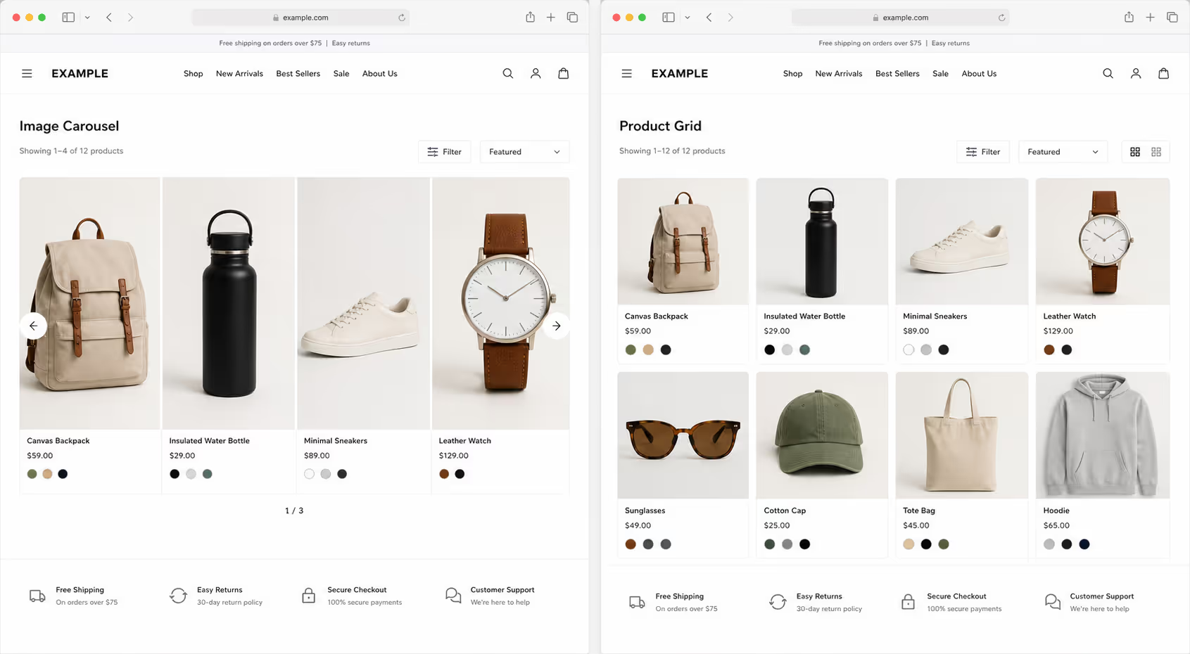
Carousels also fight banner blindness. A rotating block at the top of a page looks like an ad, so people skip it on reflex. A review of carousel design notes that the first slide grabs the overwhelming majority of the few clicks a carousel earns, and every slide after it drops off sharply. Whatever you place on slide three is, for most visitors, invisible.
For online stores the picture is even clearer. One analysis argues that image carousels are almost always a bad idea for ecommerce, because they push products out of view instead of putting them in front of buyers. Every one of these findings pushes image carousel vs grid conversion in the same direction.
Image Carousel vs Grid: The Real Trade-Offs
I do not want to pretend a carousel is always wrong, because it is not. The right call in the image carousel vs grid conversion debate depends on whether your reader is choosing between options or looking closely at one thing. Here is the way we lay out the trade-offs on our team.
| What Matters | Image Carousel | Grid |
|---|---|---|
| Visibility | One slide shows, the rest hide | Every item stays in view |
| Engagement | Clicks pile onto slide one | Attention spreads across items |
| Best Job | One product, many angles | Many products or choices |
| Mobile | Swipe fatigue, easy to miss | Natural vertical scroll |
| Conversion Risk | High, it needs a click first | Low, it needs no click |
Read that table top to bottom and the pattern is hard to miss. On almost every row that touches conversion, the grid carries less risk. That is the quiet truth behind image carousel vs grid conversion.
When the Grid Wins the Conversion
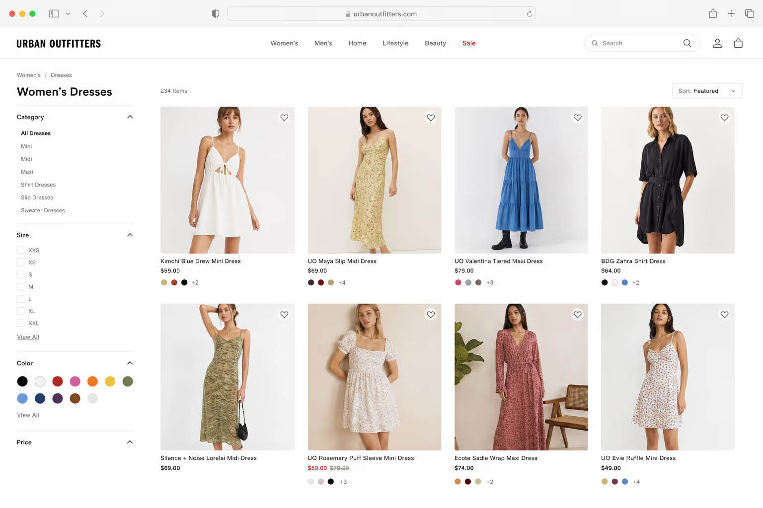
For any page where the visitor is picking between options, we treat the grid as the safer bet. Category pages, feature galleries, testimonial walls, and portfolios all reward showing the full set at a glance, and that is exactly where image carousel vs grid conversion favors the grid.

A grid is not automatically perfect, though. A cluttered grid can overwhelm people just like a wall of text can. So we keep a few simple habits in mind to protect image carousel vs grid conversion when we build one.
Keep the first screen to a scannable number of tiles, then let the reader scroll for more.
Give every tile the same size and shape, so the eye reads the whole set as one group.
Lead with your strongest items, since attention is heaviest in the top rows.
Make each tile an easy tap target on mobile, where most of your traffic now lives.
Get those right and the grid quietly outperforms, because it never asks the visitor to work before seeing the goods. That ease is what keeps winning the image carousel vs grid conversion race for us.
The One Time We Still Use a Carousel
Now for the fair exception, because it really does matter. There is one place where a carousel beats a grid, and that is a single product with several photos. In a product gallery, the visitor has already picked one item and wants to see it from more angles, so clicking through the carousel is exactly what they came to do.
That is a completely different job from a homepage banner. Here the carousel is not fighting for attention against other tasks, it is serving an intent the visitor already has. So our rule for image carousel vs grid conversion is short and easy to remember. Use a carousel when the reader is deep inside one thing, and use a grid when the reader is still choosing between many.
Most conversion failures we see come from breaking that one rule. A team drops a carousel where a grid belonged, and the numbers quietly slip. Respect the difference and image carousel vs grid conversion stops being a guessing game.
How to Test Image Carousel vs Grid on Your Own Site
Benchmarks point the way, but your own audience gets the final vote. Before you commit either layout, run a clean test so image carousel vs grid conversion is settled by your real numbers, not by a hunch.
Pick one high-traffic page and choose a single goal, like product clicks, add-to-carts, or sign-ups.
Build two versions, your current carousel and a grid holding the same items.
Split traffic evenly and let it run until each version reaches a few hundred conversions, so the result is not just noise.
Compare the real conversion rate, not vanity clicks, and keep the winner.
Most stores that run this test watch the grid win on discovery pages, which matches the wider move away from homepage carousels. It helps to know that even 58% of desktop product lists still score "mediocre or worse" in Baymard's benchmark, so a tidy grid already puts you ahead of most competitors on image carousel vs grid conversion.
Building Both in Poper Without Code

The good news is that you do not need a developer to act on any of this. When the job calls for breadth, our Photo Gallery widget lays your images into a clean, responsive grid that stays scannable on a phone. When you truly need depth on one product, our Image Carousel widget gives you a swipeable gallery for multiple views of the same item.

Both embed in under two minutes, so you can run a real image carousel vs grid conversion test instead of arguing about it in a meeting. If you want more layout ideas, our roundup of comparison table design examples shows more ways to lay out choices clearly.
The lesson from that founder and her forgotten slide four has stuck with me. Her visitors were never going to see the offers she buried, and no amount of pretty design could fix that. The day we swapped her carousel for a grid, every offer stood in the open and the choice got easy. That is the whole story of image carousel vs grid conversion. Show people everything, ask them to work less, and let the clearer layout do the selling for you.



