

I still remember the first time we shipped a floating action button on a mobile landing page and watched the heatmap light up around it. People were tapping it instantly, almost before they had read anything else on the screen. That little circle followed the thumb everywhere it went, and it felt like magic.
A few weeks later, on a different site, we added the exact same pattern and watched it backfire. So I want to walk you through what we have learned, because the floating action button mobile pattern is one of those tricks that either quietly wins you conversions or quietly costs them, and the difference comes down to a handful of decisions.
This is not a design-trend rant. It is a practical look at when that hovering button helps a real visitor on a real phone, and when it just gets in the way of the thing they came to do.
What a Floating Action Button Actually Does on Mobile

A floating action button is a small, persistent button that stays pinned to the screen while the rest of the page scrolls underneath it. On mobile it usually sits in a bottom corner or along a bottom bar, so the visitor can tap the most important action from anywhere on the page without scrolling back up to find it.
That persistence is the whole point. Mobile now drives roughly 70% of all web visits, yet mobile still converts at only 2% on average compared to 3.4% on desktop, according to Contentsquare's 2026 Digital Experience Benchmark.
A big slice of that gap is friction. On a small screen, the call to action scrolls out of view fast, and every extra scroll back to find it is a chance for the visitor to give up. A floating action button keeps the action one thumb-tap away, which is exactly the friction it was built to remove.
Why the Thumb Zone Makes This Pattern Work
The reason a bottom-anchored button feels so natural is physical, not stylistic. Most people hold a phone in one hand and drive the whole experience with a single thumb. That thumb has a comfortable arc, and the easiest, most reachable part of the screen is the bottom and lower-center area. A guide from Diverse Website Design lays this out clearly, recommending a minimum 44-pixel touch target and placing primary actions inside that natural thumb arc so people are not stretching across the glass to tap them.2
When you put your most important action where the thumb already rests, you are removing physical effort, not just visual searching. That is why a well-placed floating action button on mobile so often outperforms the same button buried in the page. You have moved the action to the easiest spot on the entire device.
When a Floating Action Button on Mobile Earns Its Place
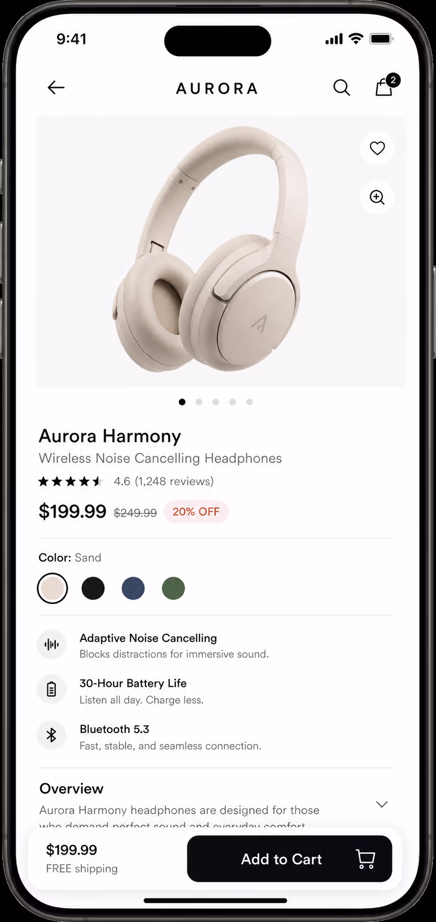
The pattern shines when there is one clear, repeatable action you want the visitor to take at any moment. On a product page, that is "Add to Cart." On a service page, it might be "Book a Call." On a long article, it could be "Get the Guide." If the action is the same no matter where the reader is on the page, a persistent button is a gift to them.
The data backs this up strongly on mobile specifically. One e-commerce case study from Convertica, found that adding a sticky call to action drove a 252.9% increase in mobile order completion, while the desktop version of the same test showed no meaningful change at all.
That split is the key insight: the floating pattern is a mobile lever first and foremost. Conversion Rate Experts saw a similar story, where a sticky button that followed the visitor and snapped them back to the order form lifted sales by 25% and revenue per visitor by 22%.
To make the call easy, here is how I think about it as a simple fit test.
| Good fit for a mobile floating action button | Poor fit |
|---|---|
| One dominant action repeated down a long page | Several equally important actions competing for the tap |
| Product, booking, or lead-capture pages | Dense content where every pixel of reading space matters |
| Pages where the main CTA scrolls out of view quickly | Short pages where the CTA is always visible anyway |
| High mobile traffic share | Audiences that convert mostly on desktop |
When a Floating Action Button Hurts Mobile UX
Now the other side, because this is where I see good teams trip. The same button that lifts conversions on one page can quietly tank the experience on another, and the symptoms are easy to miss if you are only watching the click count.
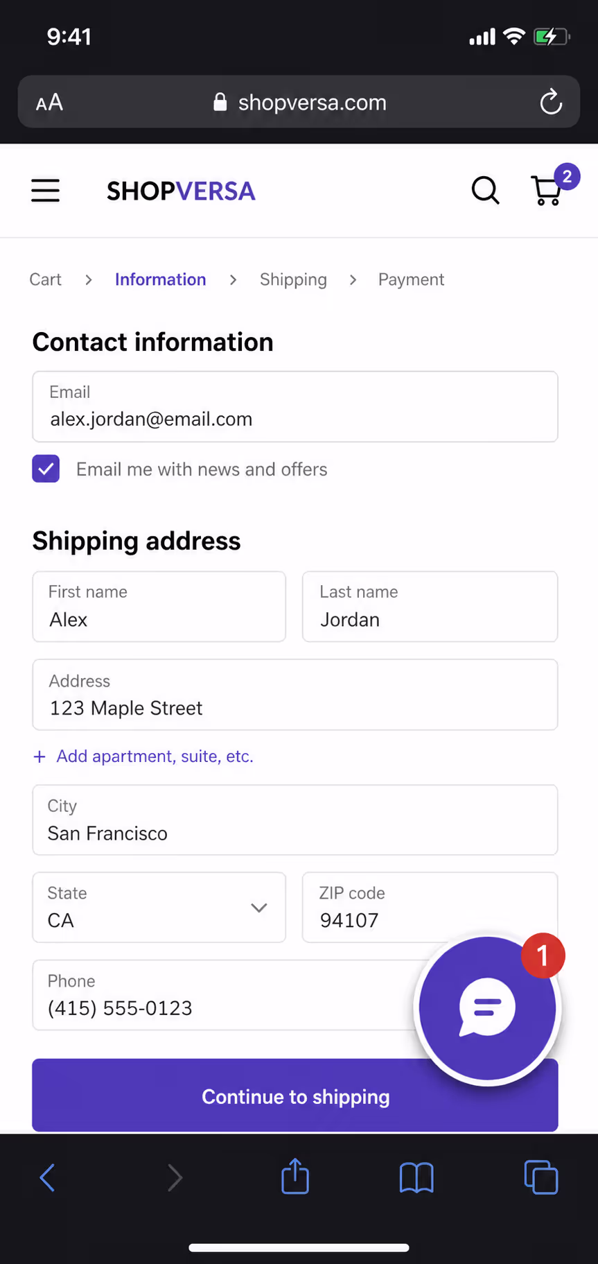
The most common mistake is letting the button cover content. On a small screen, a circle in the corner can sit right on top of a price, a form field, or the last line of a paragraph. The visitor cannot read or tap what is underneath, and they have no idea what they are missing. If your floating action button mobile placement hides anything the reader needs, it is costing you more than it earns.
The second mistake is stacking too many floating elements. A chat bubble, a back-to-top arrow, a cookie banner, and a floating CTA all fighting for the same bottom corner turns a clean screen into a cluttered mess. When everything floats, nothing stands out, and the visitor learns to ignore the whole zone.
The third is using the pattern when there is no single action worth following the reader around. If your page genuinely has three or four equally weighted next steps, forcing one of them into a permanent floating button just confuses the hierarchy. A floating action button is a spotlight, and a spotlight only works when it points at one thing.
How We Set Up a Floating Action Button on Mobile
When the fit is right, the execution still has to be careful. Over the years we have boiled our setup down to a short checklist that keeps the button helpful instead of annoying.
Keep the tap target at least 44 pixels and leave breathing room around it so nobody fat-fingers the wrong thing.
Anchor it in the lower portion of the screen, inside the natural thumb arc, not floating awkwardly in the middle of the content.
Give it one job and one label, written as a clear action like "Add to Cart" or "Book Now."
Make sure it never covers prices, form fields, or key text, and test it on the smallest phone you can find.
Let it appear only after the original CTA scrolls away, so it feels like a helpful reminder rather than constant pressure.
That last point matters more than people expect. A button that fades in once the reader has scrolled past the hero feels like a courtesy. A button that is glued to the screen from the first millisecond feels like a salesperson standing too close.
Making the Floating Action Button Mobile-Friendly With Poper
This is the part where the right tool saves you a lot of guesswork. With Poper's Button widget, we can set a floating action button on mobile without touching code, control its position so it stays in the thumb zone, and size the tap target to stay comfortable on small screens. Because it is no-code, we can also turn it off on desktop, where the data shows it adds little, and keep it only where it actually pays off.
The other thing I lean on is testing. Placement and timing are easy to get wrong by feel, so we pair the button with A/B testing and compare it against a normal in-page CTA on live mobile traffic.
If you want to go deeper on getting the position itself right, our guide on CTA placement above the fold walks through how to decide where any button belongs before you make it float.
Final Thoughts
A floating action button on mobile is not a hack you sprinkle on every page. It is a focused tool for one situation: a single, repeatable action on a page where the visitor would otherwise lose sight of it. Used that way, it removes real friction for the thumb and lifts mobile conversions in a way desktop rarely sees. Used carelessly, it covers content, clutters the screen, and trains people to ignore the very corner you wanted them to tap. Pick the pages where it fits, keep it out of the way of everything else, and let the data tell you whether it stays.
References
Contentsquare, "2026 Digital Experience Benchmark: Engagement," 2026.


