
I still remember the afternoon a founder friend called me, a little frustrated, because his shiny new pricing page was not converting. He had built this enormous grid with every single feature his product could possibly do, forty rows of checkmarks, and he could not understand why people kept bouncing.
When I looked at it, the problem was not the product at all. He had built a giant feature matrix when what his visitors actually needed was a simple comparison table. That one afternoon is the reason I love talking about the feature matrix vs comparison table question, because the two look almost identical and yet they do very different jobs.
So let us slow down and sort this out together. In this guide, I want to walk you through the real difference between a feature matrix and a comparison table, when each one wins, and how to pick the right pattern so your visitors actually make a decision instead of quietly closing the tab. By the end, the whole feature matrix vs comparison table debate should feel obvious rather than confusing.
What We Actually Mean by "Feature Matrix" and "Comparison Table"
Before we can settle the feature matrix vs comparison table conversation, we need clean definitions, because a lot of people use the two words as if they mean the same thing. They do not.
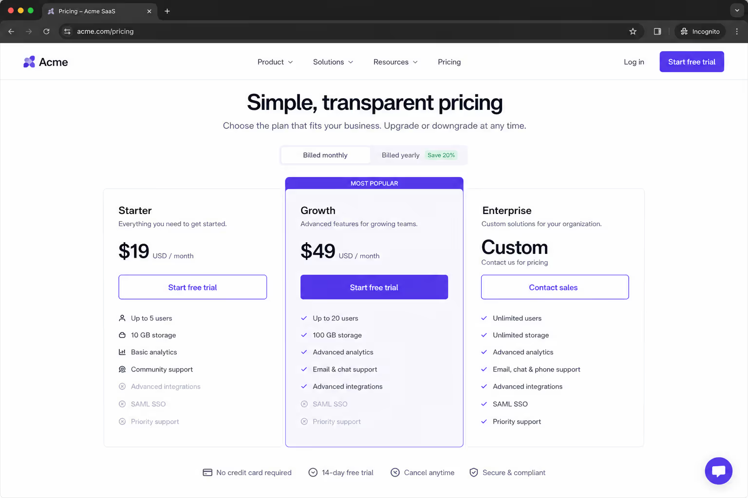
A comparison table is a decision tool. You put two, three, or four options side by side and you show the handful of attributes that matter for a choice: price, plan name, key benefits, and a clear call to action. The goal is speed. You want a visitor to glance, understand the trade-off, and pick.
The Nielsen Norman Group notes that comparison tables work best when people have relatively few alternatives to weigh, and that once you exceed about five items you should add filters to narrow things down.
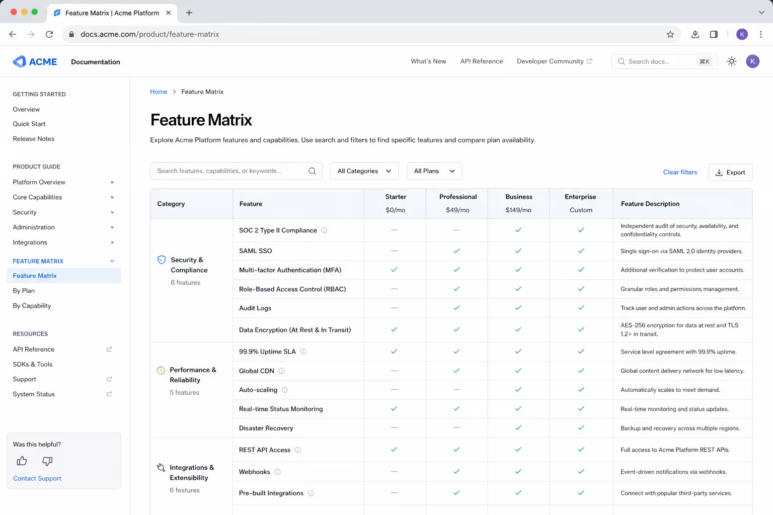
A feature matrix is a reference tool. It is the exhaustive grid, every feature crossed against every plan or every competitor, often thirty or forty rows deep. It is not built for a fast gut decision. It is built for the careful buyer who wants to verify one specific capability before they commit. Think of it as documentation that happens to live on a marketing page.
Here is the simplest way I explain the feature matrix vs comparison table split to my own team: a comparison table helps someone choose, and a feature matrix helps someone confirm. Both are useful. They just serve different moments in the buying journey.
Feature Matrix vs Comparison Table: The Core Differences
Rather than bury this in paragraphs, let me lay the feature matrix vs comparison table difference out in a table, because honestly this is exactly the kind of decision a table is built for.
| Dimension | Comparison Table | Feature Matrix |
|---|---|---|
| Primary job | Help the visitor decide quickly | Help the visitor verify a specific detail |
| Number of options | Best with 2 to 4 columns | Handles many columns and long lists |
| Rows shown | Only the attributes that drive the choice | Every feature, including the small ones |
| Reader mindset | Scanning, wants a fast answer | Researching, wants completeness |
| Best placement | Pricing page, product page, landing page | Docs, deep plan page, sales enablement |
| Risk if misused | Feels thin for a high-consideration buy | Overwhelms and causes decision paralysis |
When I see teams get the feature matrix vs comparison table choice wrong, it is almost always the same mistake my founder friend made. They reach for the feature matrix because it looks thorough and impressive, and they forget that most visitors are not researchers, they are choosers. A dense grid signals effort, but effort is not the same as clarity.
When the Comparison Table Wins
The comparison table wins whenever the visitor is close to a decision and just needs a nudge. Pricing pages are the classic example. Someone who has read your homepage and clicked "Pricing" is not looking for a research project. They want to know which plan fits them, and they want that answer in seconds.
Speed matters more than most of us admit. The global average ecommerce conversion rate sat at roughly 2.5% according to data compiled by Smart Insights, and a big chunk of the visitors you do not convert simply could not decide fast enough. A tight comparison table removes that friction. It puts the trade-off right in front of the reader so the choice feels easy.
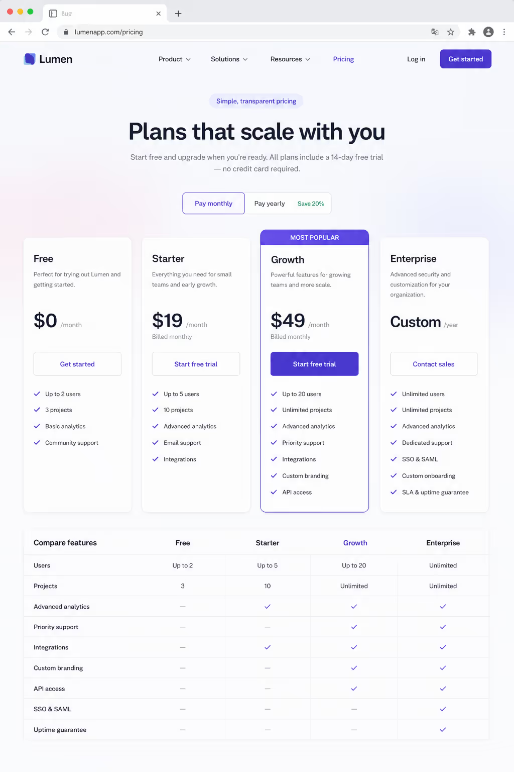
Comparison tables also shine on product pages where a shopper is choosing between a few models. A three-column table of "Standard, Plus, Pro" with price, the two or three differences that matter, and a buy button will almost always outperform a wall of specs. The research team at Contentsquare found that fragmented, hard to scan comparison experiences push shoppers to abandon the journey entirely, which is the last thing you want near a checkout.
So use a comparison table when the audience is warm, the options are few, and the moment calls for a decision. That is the sweet spot where a comparison table earns its keep.
When the Feature Matrix Wins
Now, the feature matrix is not the villain in the feature matrix vs comparison table story. It just belongs later in the journey. The feature matrix wins when your buyer is high-consideration, spends real money, and needs to tick boxes before they can say yes.
Imagine a mid-size company evaluating your software. The person championing you internally has to prove to their boss that you support single sign-on, audit logs, and a specific integration. A clean comparison table will not answer those questions. This is where the full feature matrix does its best work. It lets that champion search, confirm, and build their internal case without emailing your sales team.
The comparison table is for the person deciding today. The feature matrix is for the person who already decided and now has to defend that decision to someone else.
Feature matrices are also gold for sales enablement and documentation. Baymard Institute usability research on comparison tools makes the point that the biggest problem with big comparison grids is rarely the visual design. It is missing or inconsistent data. If a matrix has holes, users abandon it and sometimes abandon the whole site. So if you are going to publish a feature matrix, the price of admission is complete, accurate, consistent information in every single cell.
The Trap: Using a Feature Matrix When a Table Would Win
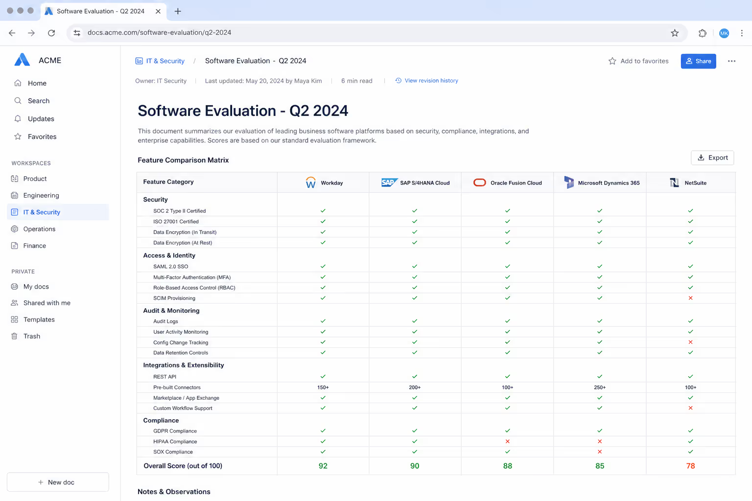
Here is the failure mode I see most often, and it is worth its own section in any honest feature matrix vs comparison table discussion. Teams default to the giant matrix because it feels safe and comprehensive, and they slam it onto a page meant for a quick decision.
The result is decision paralysis. A LogRocket analysis on when feature comparison charts hurt UX puts it plainly, that these charts often do more harm than good with uninformed or emotionally driven buyers, and can confuse people or even send them to a competitor.
When you show someone forty rows and they only care about three, you have made them do your editing for you. Many will simply leave.
If you are unsure which side of the feature matrix vs comparison table line your page sits on, ask one question. Is this visitor trying to decide, or trying to verify? Deciders get a comparison table. Verifiers get a feature matrix. Get that one answer right and most of the design questions resolve themselves.
You Do Not Have to Choose Just One
Some of my favorite pages use both, and this is the part of the feature matrix vs comparison table conversation that people miss. You lead with a simple three-column comparison table for the 80% of visitors who just want to choose, and then you offer an expandable "Compare all features" view for the 10% who need the full feature matrix.
This layered approach respects both audiences. Contentsquare and Nielsen Norman both recommend collapsing the deep detail behind a "Show more" control so a top-level comparison stays clean while the exhaustive matrix is one click away. The scanner gets speed. The researcher gets depth. Nobody gets overwhelmed.
A few small habits make either pattern work harder:
Keep product names, prices, and the call to action fixed to the top so they stay visible as the reader scrolls a long feature matrix.
Highlight the differences and hide identical rows, since users consistently prefer seeing less noise and more signal.
Group related rows into categories instead of one alphabetical list, which makes any comparison table or matrix far easier to scan.
How to Build Both Without Touching Code
When my team needs either pattern live on a site quickly, we reach for Poper's Comparison Table widget. It is a no-code, embeddable widget that drops onto WordPress, Shopify, Webflow, Wix, or any other platform in about two minutes, which means you can ship a clean comparison table today and layer in a fuller feature matrix view later without waiting on a developer.
What I like most for this exact feature matrix vs comparison table problem is the flexibility. You can keep a tight, decision-focused comparison table on your pricing page, then use the same builder to publish a deeper feature matrix on a dedicated plan page.
Because it is responsive out of the box, your matrix does not collapse into a mess on mobile, which is where more than half of ecommerce traffic now lands. If you want to pair it with other trust elements, Poper's wider library of over 150 widgets, from a Pricing Table to review carousels, lets you build the whole decision experience in one place.
My Simple Rule for the Feature Matrix vs Comparison Table Question
Let me leave you with the rule I actually use. If the page exists to help someone choose, build a comparison table and keep it to the few attributes that decide the sale. If the page exists to help someone verify and defend a purchase, build a feature matrix and make every cell complete. And when you can, offer both, with the simple table first and the full matrix tucked one click behind it.
The whole feature matrix vs comparison table debate really comes down to matching the pattern to the mindset. My founder friend swapped his forty-row grid for a clean three-column comparison table with the matrix hidden behind a toggle, and his conversions climbed within the week.
Nothing about his product changed. He just stopped asking choosers to do a researcher's job. Do that, and the feature matrix vs comparison table choice stops being a headache and starts being a quiet advantage.
References
Nielsen Norman Group, "Comparison Tables for Products, Services, and Features." nngroup.com
Contentsquare, "Comparing products: UX design best practices to avoid fragmented journeys." contentsquare.com
Baymard Institute, "4 Ways to Optimize the Comparison Feature for Scanning." baymard.com
LogRocket, "When feature comparison charts hurt UX, and what to use instead." blog.logrocket.com



