

I have closed more developer tutorials than I have ever finished, and it is almost always for the same small reason. The writing was fine. The advice was probably solid. But the code was painful to look at, so I bounced.
That little moment is exactly why I care so much about how to display code snippets nicely, because the snippet is usually the part a developer reads first and trusts most.
So in this guide, I want to walk through how to display code snippets nicely in a way that feels calm, clean, and genuinely helpful. Not clever. Not flashy. Just code that a tired engineer can scan at 11pm and actually use.
We built Poper for moments like this. Our no-code Code Snippet widget lets you drop a polished, syntax-highlighted block onto any site in a couple of minutes. But before we get to setup, I want to share the thinking I use whenever I decide how to display code snippets nicely on a page.
Why Readable Code Snippets Quietly Win Trust
Developers read far more code than they write, so a snippet is not decoration. It is the proof. When the proof is hard to read, the whole page loses credibility, even if every word around it is correct.
The audience is huge, too. In the Stack Overflow Developer Survey, technical documentation was the single most used learning resource, with roughly "68%" of developers reaching for docs in the past year. Those docs live or die on their code blocks.
Research backs the instinct. A study on developer views of code readability found strong agreement that "Code Length and Understandable Goal" are reliable predictors of how readable people judge code to be. In plain English, short and clearly purposeful snippets read better. That is the first rule I follow when I figure out how to display code snippets nicely.
What "Nicely" Actually Means for a Code Block
When people ask how to display code snippets nicely, they often picture a fancy theme. But "nicely" is really about respect for the reader's eyes and time.
A nicely displayed snippet does four quiet jobs. It is easy to read, easy to copy, easy to scan on a phone, and easy for a screen reader or a search crawler to understand. Miss any one of those and the snippet starts working against you.
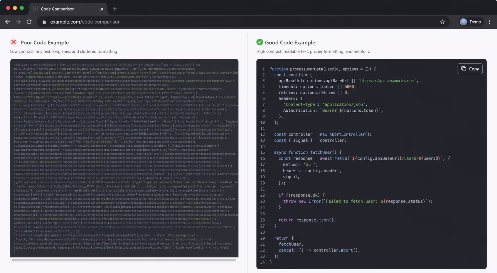
Here is the contrast I keep in my head when I decide how to display code snippets nicely versus how most blocks actually ship.
| The Habit | Sloppy Version | Nicely Displayed Version |
|---|---|---|
| Theme contrast | Dim gray comments on dark gray | Every token clears 4.5:1 contrast |
| Copying | Manual highlight and drag | One-click copy button |
| Long lines | Cut off with no scroll | Soft wrap or keyboard-reachable scroll |
| Markup | Code pasted as an image | Real text in semantic tags |
| Length | 80 lines of unrelated setup | The 8 lines that matter |
Start With a Syntax Theme That Passes Contrast
The fastest way to display code snippets nicely is to pick a theme people can actually read. Syntax highlighting helps, and a ACM study on meaningful highlighting found it measurably improves how learners comprehend code. Color is doing real work here, not just looking pretty.
But highlighting only helps if the colors are legible. This is where most dark themes fall down. Designers fade comments to a soft gray that looks elegant on their own monitor and quietly drops below readable contrast for everyone else.
The scale of this problem is bigger than most of us assume. The WebAIM Million report found low contrast text on 83.6% of home pages, the most common accessibility failure on the web. Code blocks, with their dim comments and pale line numbers, sit right in that danger zone.
So when I set up how to display code snippets nicely, I test the faded colors hardest. The Web Content Accessibility Guidelines ask for a contrast ratio of at least 4.5:1 for normal text. Run your comments, keywords, and strings against the code background, not against white. If a token fails, swap the theme.
Make Every Snippet Easy to Copy and Reach
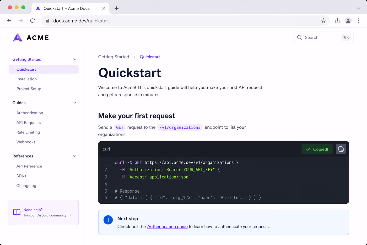
Nobody wants to highlight code with a mouse and pray they grabbed the right lines. A copy button is the smallest change with the biggest payoff when you display code snippets nicely.
Keyboard access matters just as much. Long lines force horizontal scrolling, and by default that scroll is a mouse-only gesture. Keyboard users, and the screen reader users who depend on them, simply cannot reach the clipped code.
When I plan how to display code snippets nicely, I keep this short checklist nearby:
Add a visible one-click copy button to every block.
Wrap code in real, semantic tags so structure is announced, not guessed.
Make any scrollable block reachable and operable with the keyboard.
Show a quick "Copied" confirmation so people trust the click worked.
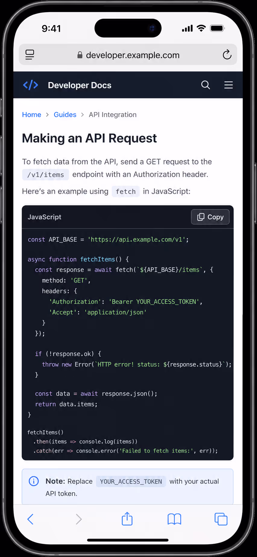
Never ship code as a screenshot, because nobody can copy a picture.
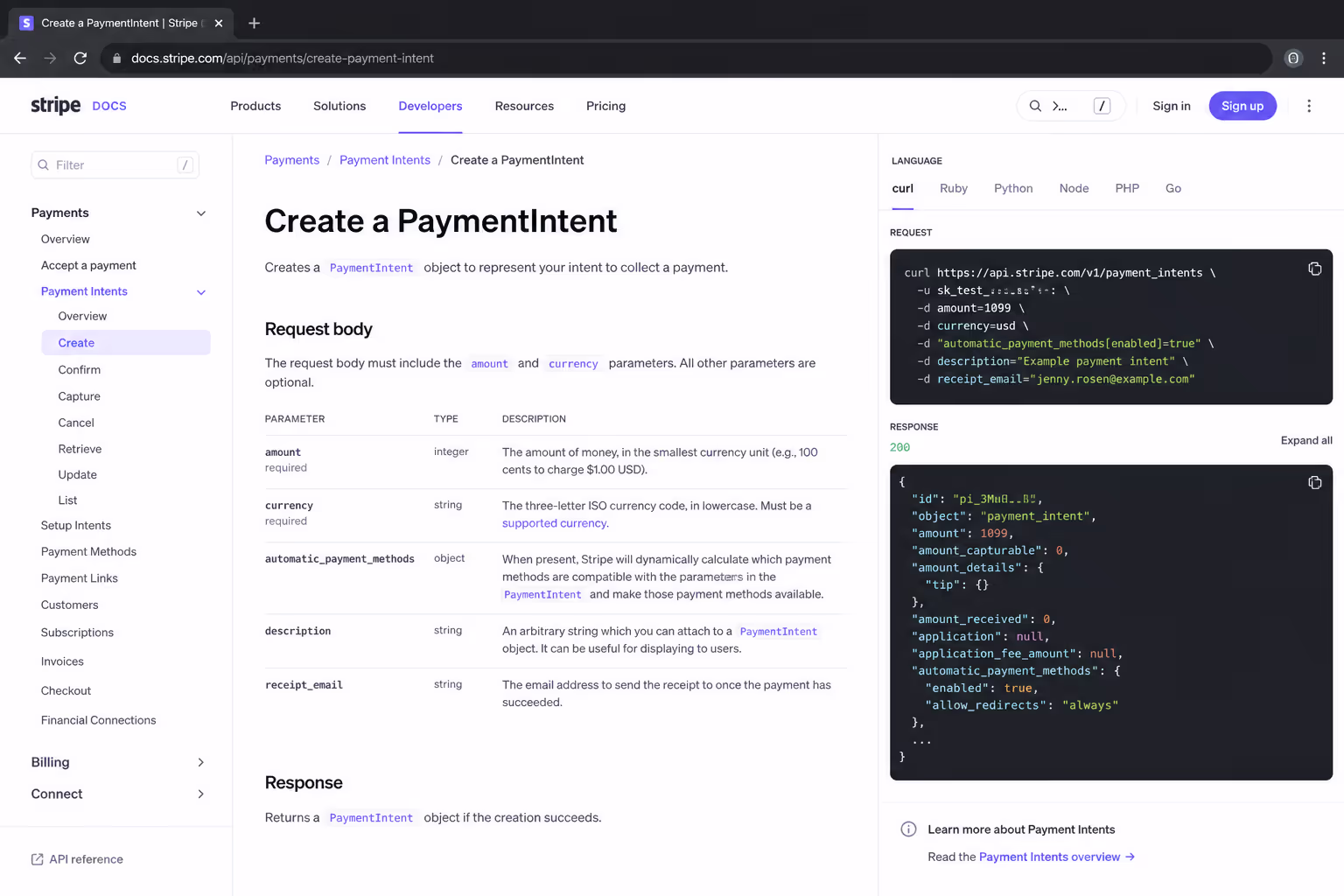
That last point is the one I see violated most. A screenshot looks crisp, but it is unreadable to a crawler, invisible to a screen reader, and impossible to paste. It is the opposite of displaying code snippets nicely.
Keep Snippets Skimmable on a Phone
A lot of people read tutorials on their phone during a commute or a coffee break. If your block demands a pinch and a sideways drag for every line, you have lost them. Mobile is where good intentions about how to display code snippets nicely usually break.
I keep lines short on purpose. Roughly 60 to 80 characters per line reads comfortably and survives small screens. When a line has to run long, I let it wrap softly instead of clipping it into a hidden scroll.
Font choice helps too. A clean monospace font with generous line height makes a block breathe. Cramped, tiny code is the fastest way to make a reader give up, no matter how good the underlying snippet is.
Trim the Snippet to Only What Matters
The best trick for how to display code snippets nicely has nothing to do with styling. It is deletion. A reader does not need your full file. They need the three or four lines that prove the point.
This loops back to that readability study, where shorter and clearly purposeful code scored higher with developers. When I cut a 40-line block down to the 8 lines that matter, readability jumps before I have touched a single color.
The most readable snippet is rarely the prettiest one. It is the shortest one that still proves the point.
If a reader needs the full context, I link to a repository or a gist below the block. The page stays clean, and the people who want the deep version still get it.
How to Display Code Snippets Nicely Without Writing Code
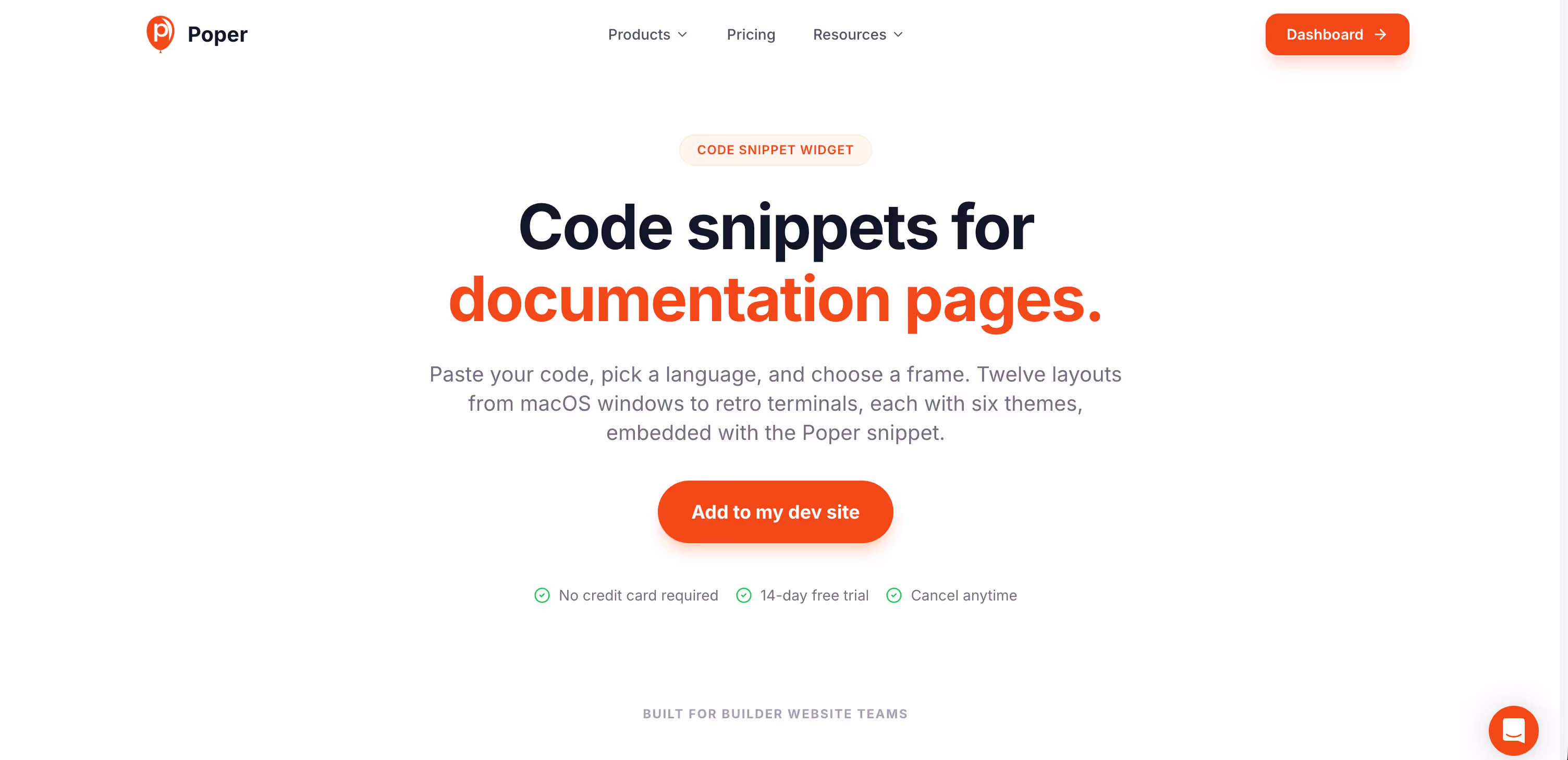
You can do all of this by hand, but it is fiddly, and it tends to break the next time you change themes. This is exactly the gap our Code Snippet widget fills, so you can display code snippets nicely without maintaining a pile of CSS.
With Poper, you paste your code, pick a readable theme, and the widget handles syntax highlighting, the copy button, and responsive behavior for you. Because it is no-code, it works on WordPress, Webflow, Shopify, and any other platform, and you can update a snippet later without redeploying anything.
I like pairing it with our other content widgets too. A Table of Contents widget helps long tutorials stay navigable, and that combination is how I display code snippets nicely inside docs that people actually finish.
Final Take
Learning how to display code snippets nicely is not about chasing a trendy theme. It is about respect. Readable contrast, a real copy button, short lines, clean markup, and ruthless trimming all add up to a block a developer trusts on sight.
Start with one snippet on your most-read page. Give it a high-contrast theme, a copy button, and only the lines that matter. Once you see how much smoother it reads, displaying code snippets nicely stops feeling like polish and starts feeling like the baseline. If you want a head start, our Code Snippet widget gets you there in about two minutes.
References
Stack Overflow, "Developer Survey: Developers".
Piantadosi et al., "Assessing Consensus of Developers' Views on Code Readability," arXiv.