Red beats green by 21%. That single A/B test, run by HubSpot's Performable team, is still the most-quoted proof that CTA button color drives conversion. It is also more than a decade old, and the people who ran it never claimed red was the winner - they said the red button won because it was the only red thing on the page. So before you repaint every button on your site, it is worth asking what 12 years of testing has actually settled.
Quick Take: There is no universally best CTA button color. Contrast against the surrounding page, not the specific hue, is what reliably moves conversion. Test contrast, not color theory.
The most-cited button color test is older than you think
The "red button" study gets repeated as settled science. The detail that gets dropped is the explanation. As Poper, reviewing the same test, put it: the red button likely won because the rest of the page, the logo, the layout, the supporting design, was green. Red was the one element that broke the pattern.
UserTesting reached the same read in a analysis: users were "much more likely to click a CTA button that strongly contrasted with the background," and the red button succeeded because it "was one of the only red objects on the page." The hue was incidental. The visual break was the cause.
That distinction matters because it flips the takeaway. The lesson was never "use red." It was "make the button interrupt the page."
What the tests proved versus what marketers heard
A dozen years of published color tests cluster around a few claims. Here is what each one actually demonstrated, once you separate the result from the headline.
| The claim | What the test actually showed | The real lever |
|---|---|---|
| Red converts better than green | Red won on a green-dominant page | Contrast with the page |
| Orange is the highest-converting color | Orange won where it broke the surrounding palette | Contrast with the page |
| Blue builds trust and converts | Blue performs when it stands out, not because it is blue | Contrast plus brand fit |
| There is a single best button color | No test has reproduced one across sites3 | Context and audience |
VWO, which builds the testing platform many of these experiments run on, is blunt about it in their guide: "I'm not here to suggest that orange has better conversions than red, or green is the color you should stick to for your CTA button." Their recommended hypothesis is that "the button color should be in stark contrast to your background colors because it catches visitors' attention at first glance."
Why contrast beats color

Contrast is measurable in a way that color preference is not. The Web Content Accessibility Guidelines set a 4.5:1 minimum contrast ratio for text, and a high-contrast button clears that bar while also doing the conversion job, it makes the next action the most visually obvious element on the screen.
Nielsen Norman Group frames the primary button the same way. In an piece on button states, they note that primary buttons should have "the most visual emphasis to grab user attention and direct them to an important or common action," and that an enabled button needs "high contrast between the button and the rest of the design."
The button does not need to be a special color. It needs to be the loudest color on the page, and nothing else should compete with it.
This is why two sites can run the "same" test and get opposite winners. A blue button wins on a warm-toned page and loses on a blue-toned page. The variable was never the button. It was everything around it.
How to actually test CTA button color
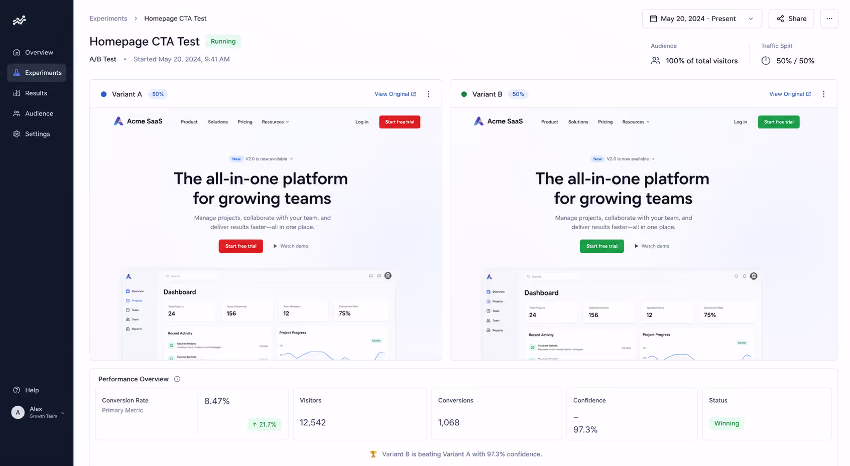
If you want a result you can trust - and reuse - test the principle, not the paint. A defensible CTA button color conversion test looks like this:
Audit the page first. List every dominant color already on the page. Your button should not be one of them.
Pick contrast, not a favorite. Choose a hue that breaks the surrounding palette and clears the 4.5:1 ratio against its immediate background.
Change one variable. Hold copy, size, and placement constant. If you change color and copy together, you learn nothing about either.
Run to significance. The original HubSpot test gathered more than 2,000 visitors before calling it.1 Underpowered tests produce the conflicting "best color" folklore in the first place.
Re-test after a redesign. A winning button color conversion result expires the moment you change the surrounding page.
Color choices that fail for reasons unrelated to hue
Plenty of CTA button color conversion failures have nothing to do with whether you chose red, green, or orange. They are contrast and clarity problems wearing a color costume:
A button that matches a nearby badge, banner, or section background — so it reads as decoration, not an action.
A gradient or pastel that drops below 4.5:1 against its background and disappears on bright screens.
Two competing buttons in the same loud color, so neither wins the eye.
A brand-palette button that blends into a brand-palette page — common on sites with a single dominant color.
Fixing any of these will lift conversion. As OptinMonster put it, "any color change that increases the visibility of your call to action button should increase your conversions."2 The reverse is also true: a color change that reduces visibility will cost you, regardless of the hue.
What this means for your stack
Poper's Button widget lets you set button color, contrast, size, and copy without code, then swap variants in seconds - which is the part most teams get stuck on. Pair it with built-in A/B testing so you are comparing a high-contrast variant against your current button on live traffic, not arguing about color theory in a design review.
If your page already leans on one dominant color, that is exactly where a contrast-first button pays off. Browse the full Poper widget directory to see how the button sits alongside popups, forms, and other conversion elements that should never out-shout your primary CTA.
Conclusion
Twelve years of A/B tests did not crown a best CTA button color - they proved that contrast, context, and clarity decide conversion, and that color is just how you deliver contrast.
The red button never beat green because it was red. It won because it was different. Build your CTA button color conversion strategy around standing out, test one variable at a time, and re-check it whenever the page changes.
Sources
OptinMonster, "Which Color Button Converts Best? (Research-Backed Answer)," updated November 2025. https://optinmonster.com/which-color-button-converts-best/
OptinMonster, 2025 (analysis of the HubSpot/Performable red-vs-green test). https://optinmonster.com/which-color-button-converts-best/
UserTesting, "How Color Impacts Conversion Rates and UX," January 2025. https://www.usertesting.com/blog/color-ux-conversion-rates
VWO, "Call to Action Buttons: The Ultimate Guide," updated April 2026. https://vwo.com/blog/call-to-action-buttons-ultimate-guide/
Nielsen Norman Group, "Button States: Communicate Interaction," April 2025. https://www.nngroup.com/articles/button-states-communicate-interaction/