
I have a confession. For years I shipped code blocks with no copy button, and I told myself readers could just select the text by hand. Then I watched a few people try it on a phone, fighting to drag a selection across ten lines of code without grabbing the line numbers or half the paragraph below. It was painful to see.
We added one small copy button, and the complaints stopped overnight. That little button is one of the highest-value, lowest-effort upgrades you can make to a technical page, and getting it right comes down to a handful of copy code button best practices that I want to share.
None of this is complicated. It is just easy to overlook, because the button feels too minor to think about. It is not.
Why the Copy Button Matters More Than It Looks
The whole reason people read a technical post is to use the code, which means the copy action is the real conversion on the page. Every bit of friction between wanting the snippet and having it in their clipboard is friction on your most important interaction.
This matters most on mobile, which now makes up around 70% of all web visits according to Contentsquare's 2026 Digital Experience Benchmark.1 Selecting text by hand is hard enough on a desktop. On a small screen it is genuinely frustrating, and a frustrated reader is a reader who closes the tab.
A copy button turns a clumsy drag-and-select into a single tap, which is exactly the kind of friction you want to remove where most of your traffic lives.
Put the Button Where the Eye Already Is
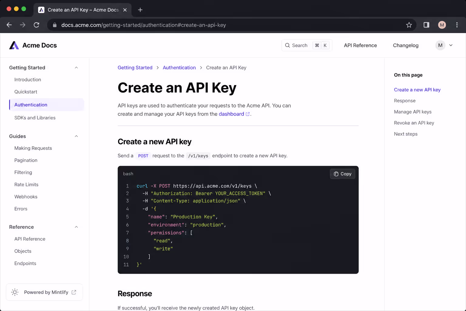
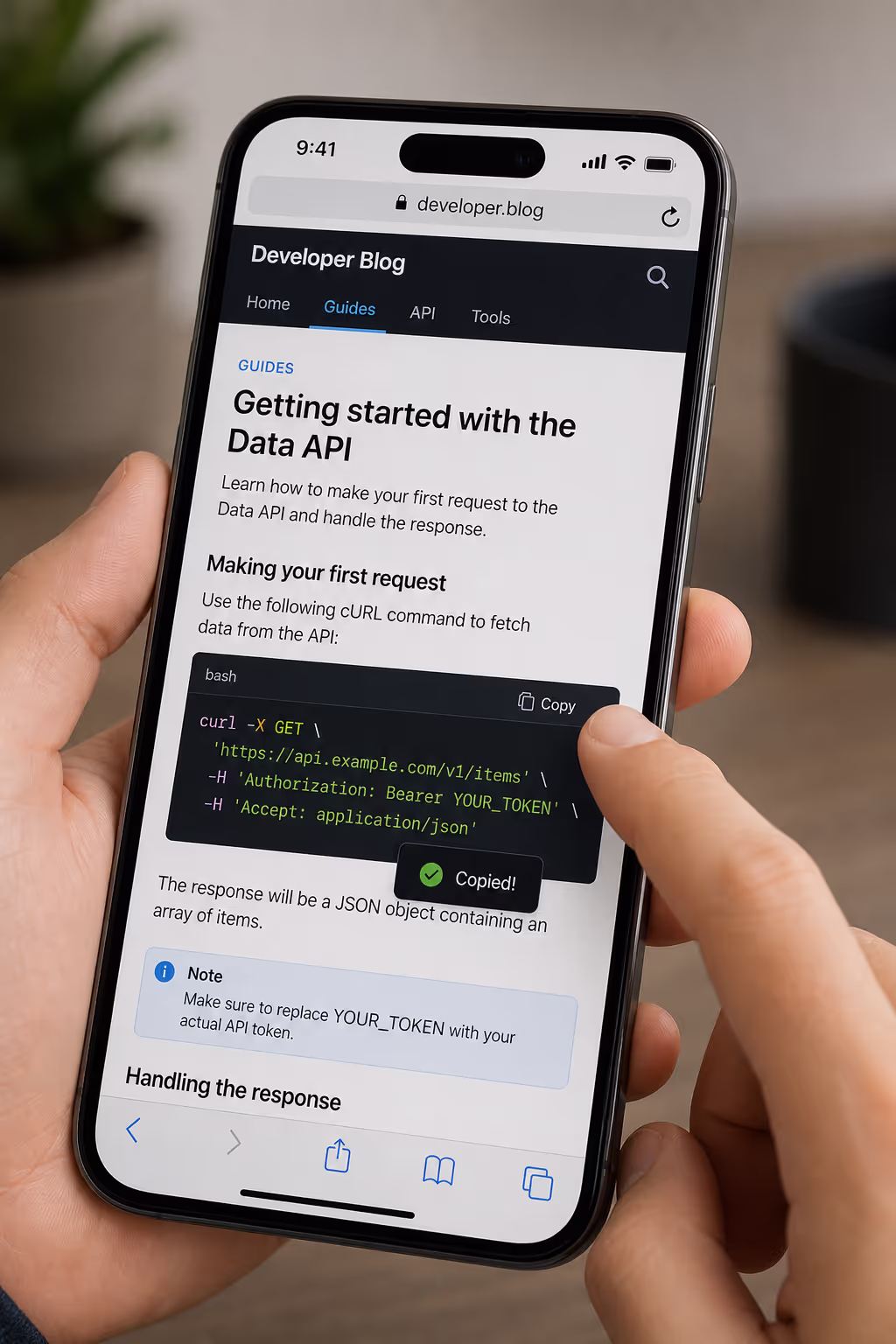
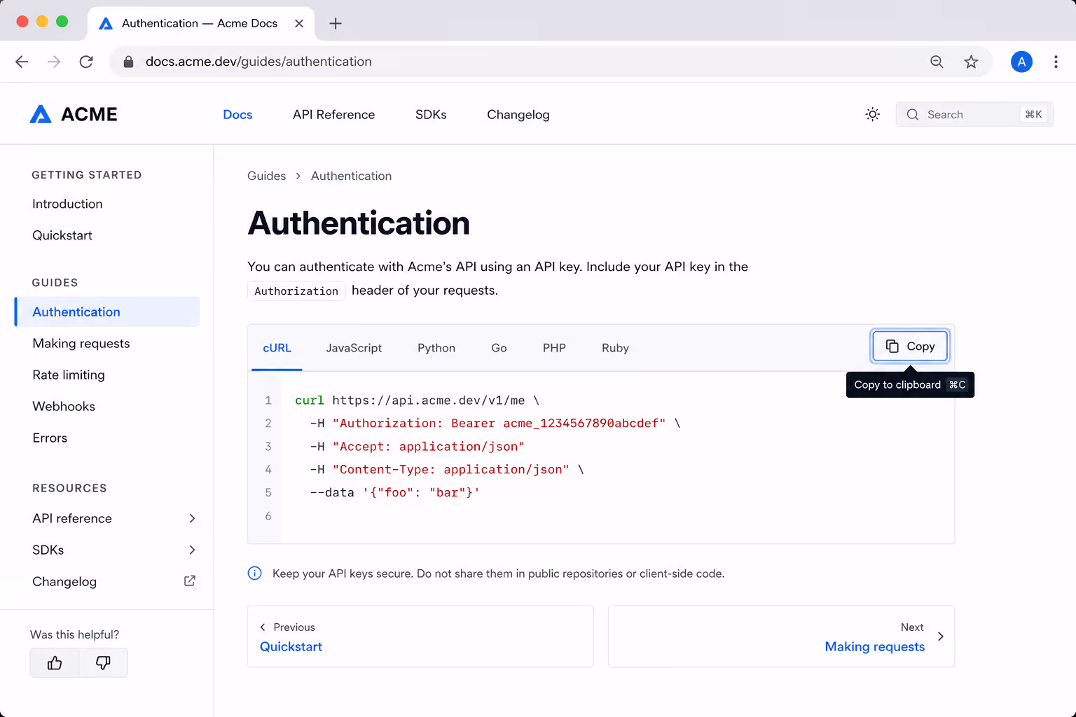
The first of the copy code button best practices is placement. The button should sit as close to the code as possible, almost always in the top-right corner of the block, so there is no doubt about what it copies.
Design systems are consistent on this point: HashiCorp's Helios and PatternFly both anchor the copy control directly to the content it acts on, because visual distance between the button and the code creates confusion about what will actually land in the clipboard.23
If you have several code blocks on a page, each one needs its own button. A single shared button somewhere on the page forces the reader to figure out which block it belongs to, and that defeats the purpose. Keep one button per block, pinned to that block, and the meaning is obvious.
Always Confirm the Copy Happened
Here is the practice people skip most, and it is the one that matters most. When someone taps copy, nothing visible happens by default. The text quietly goes to the clipboard, but the reader has no idea whether it worked, so they tap again, and sometimes again, never sure. You have to close that loop.
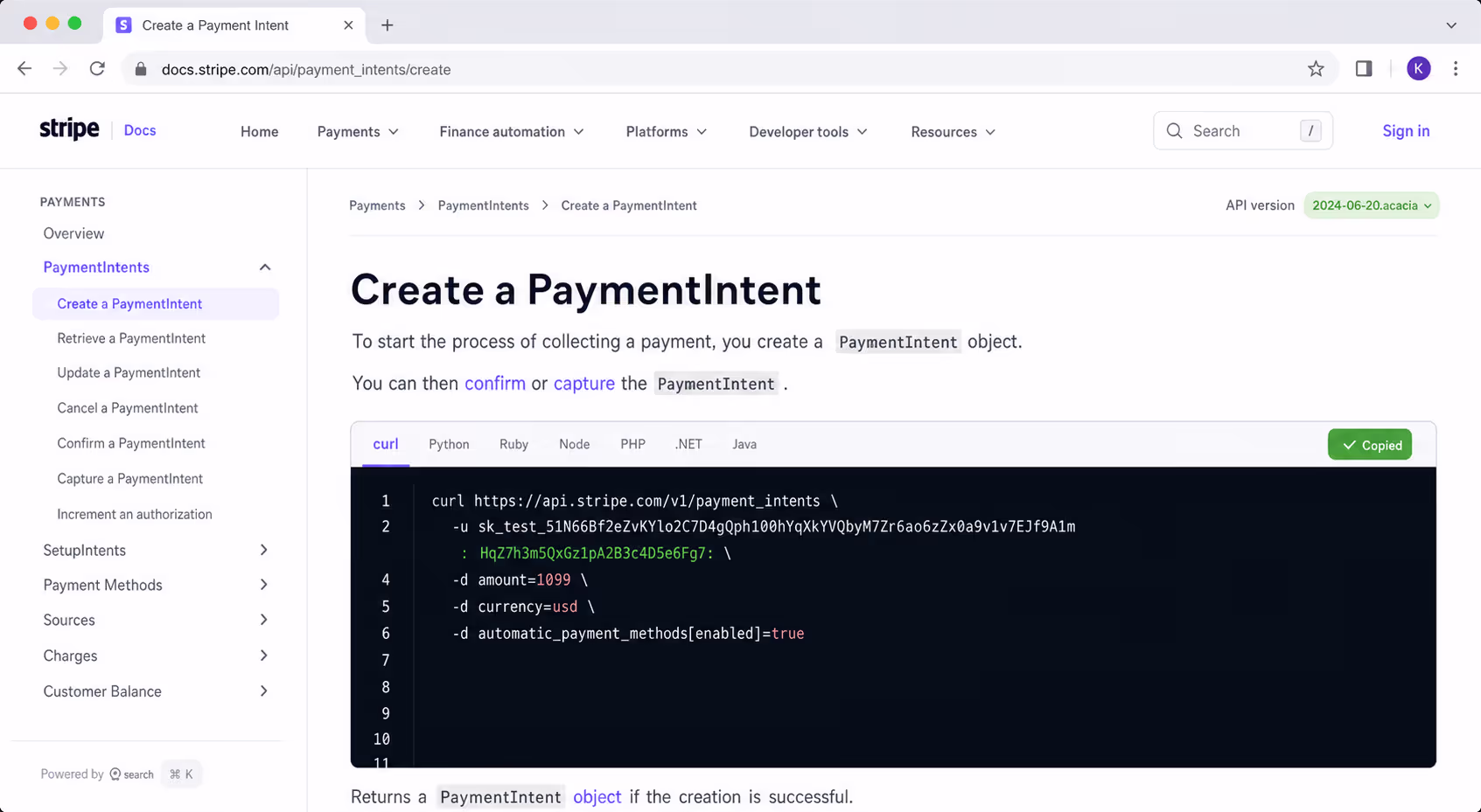
The standard pattern is to change the button the instant it is clicked. The icon swaps to a checkmark, or the label flips from "Copy" to "Copied," for a second or two before returning to normal. Helios ships its copy button with exactly these success and error states, and PatternFly updates its tooltip from an invitation to copy into a confirmation of success once the click lands.
| Button state | What the reader sees | Why it matters |
|---|---|---|
| Idle | A clear "Copy" label or copy icon | Invites the action and says what it does |
| Success | A checkmark or "Copied" for one to two seconds | Confirms the copy so nobody taps twice |
| Error | A brief error state or message | Tells the reader to try again instead of assuming it worked |
That momentary confirmation is the difference between a button that feels reliable and one that feels broken. It costs almost nothing to build and it removes all the second-guessing.
Make the Button Accessible, Not Just Visible
An icon-only copy button is a classic accessibility trap. To a sighted reader it clearly means copy. To a screen reader it can be completely silent, announced as nothing more than "button," because an icon carries no text. This is not a rare problem. The 2026 WebAIM Million report found empty buttons on 30.6% of the top one million home pages, making them one of the most common accessibility failures on the web.
The fix is simple. Give every icon-only copy button an accessible label, such as an aria-label of "Copy code to clipboard," so assistive technology can announce it. Design systems treat this as non-negotiable: Helios and PatternFly both require a text label or an aria-label whenever the button is icon-only, and will flag an error without one. Make sure the button is reachable and operable by keyboard too, because plenty of developers, the exact audience for your code, navigate that way.
A Few Smaller Touches That Add Up
Once the big three are handled, placement, feedback, and accessibility, a few finishing details separate a good copy button from a great one.
Be specific when there is room: "Copy" is fine on a code block, but "Copy email" or "Copy command" removes all doubt elsewhere.
Copy clean text. Strip line numbers, prompt characters, and trailing whitespace so what the reader pastes actually runs.
Keep the tap target comfortable, at least 24 by 24 pixels, so a thumb does not miss it on mobile.
Do not hide the button behind a hover state only. Hover does not exist on touch screens, so a copy button that appears only on mouseover is invisible to most of your visitors.
That last point trips up a lot of otherwise careful designs. A button that fades in on hover looks elegant on a laptop and simply does not exist on a phone, which is where most readers are.
The No-Code Way to Get All of This
If wiring up clipboard logic, success states, and aria-labels for every snippet sounds like a lot to maintain, that is because it is. A hosted widget bakes the copy code button best practices in by default. Poper's Code Snippet widget renders a code block with a built-in copy button, confirmation feedback, and an accessible label already handled, so you get the whole pattern without writing or maintaining the JavaScript.
It also pairs naturally with the rest of your technical content. If you are still deciding how to get code onto the page to begin with, our guide on how to embed code snippets in a blog post walks through the five methods and which one fits your setup.
Final Thoughts
The copy button is tiny, and that is exactly why it gets ignored, but it sits on the single action your readers came to take. Put it right next to the code, confirm the copy the moment it happens, give it a label a screen reader can announce, and never hide it behind hover.
Follow those copy code button best practices and you remove friction from your most important interaction, on the device where most of your readers actually are. It is a small button, and it earns its place every single time.
References
Contentsquare, "2026 Digital Experience Benchmark: Engagement," 2026.
WebAIM, "The WebAIM Million: The 2026 Report on the Accessibility of the Top 1,000,000 Home Pages," February 2026.