Comparing vendor strengths and weaknesses is now the number one thing B2B buyers ask an AI chatbot to do - 41% of software research prompts, ahead of basic product lookups. That single data point explains why comparison table design examples are worth studying closely: the comparison is the decision, and your table is where you either win it or lose it on the page.
Quick Take: A comparison table does not exist to list features. It exists to make one option feel like the obvious choice - layout, hierarchy, and restraint do that work, not more columns.
Why the comparison table quietly closes the sale
Buyers decide before they ever talk to you. In 6sense's B2B buyer research, 44% of buyers prefer a self-directed path - demos, docs, and comparisons - before any sales contact. The table on your page is often the last artifact they read before shortlisting.
Most of those tables are bad. Baymard Institute's product-list benchmark rated 58% of desktop and 78% of mobile experiences as "mediocre or worse," and comparison layouts sit squarely inside that failure zone - dense, unscannable, and impossible to parse on a phone.
The fix is not more data. It is a design that respects how a stressed buyer actually reads - top to bottom, one recommended column, and only the attributes that change the decision.
Ship A Comparison Table Without Writing The Markup
Everything in the examples below is a layout decision, not an engineering project. Poper's comparison table widget gives you the highlighted column, the sticky label column, and the mobile card collapse as settings, then goes live with a single script tag.
<script id="poper-js-script" data-account-id="YOUR_ACCOUNT_ID" src="https://app.poper.ai/share/poper.js" defer></script>The 20 comparison table design examples
Below are 20 comparison table design examples. Each one pairs a short note on what the layout does with an image of the pattern in action - treat them as blueprints to copy, not screenshots to admire.
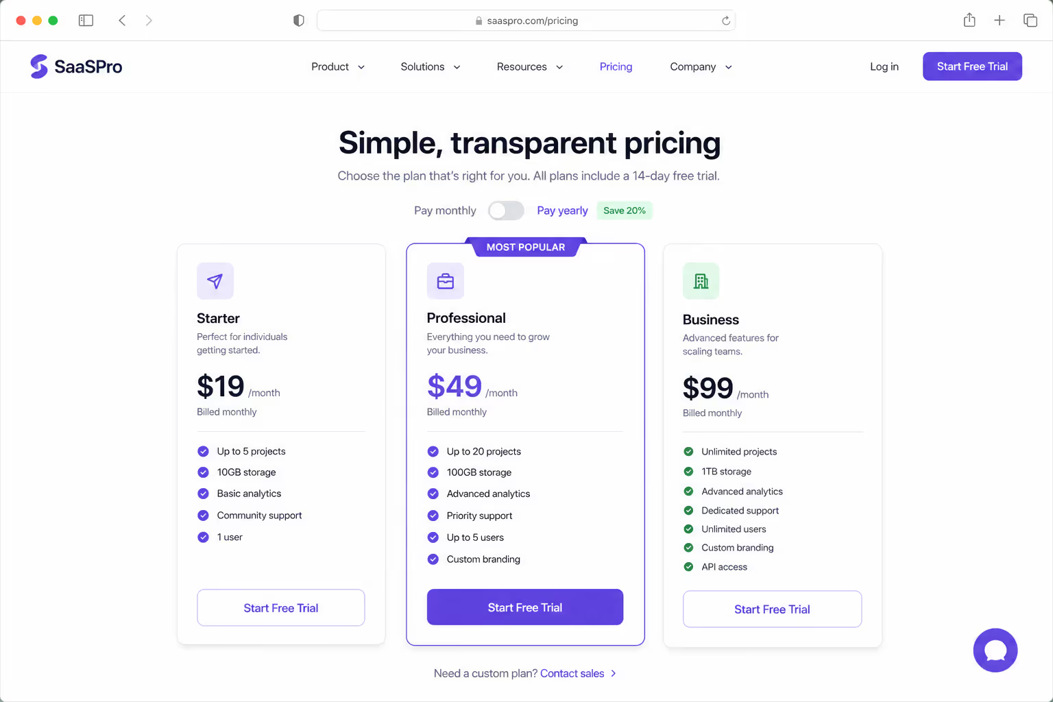
1. Three-tier pricing grid with a highlighted middle plan
The default SaaS pattern - three columns, the middle one visually anchored as the recommendation.
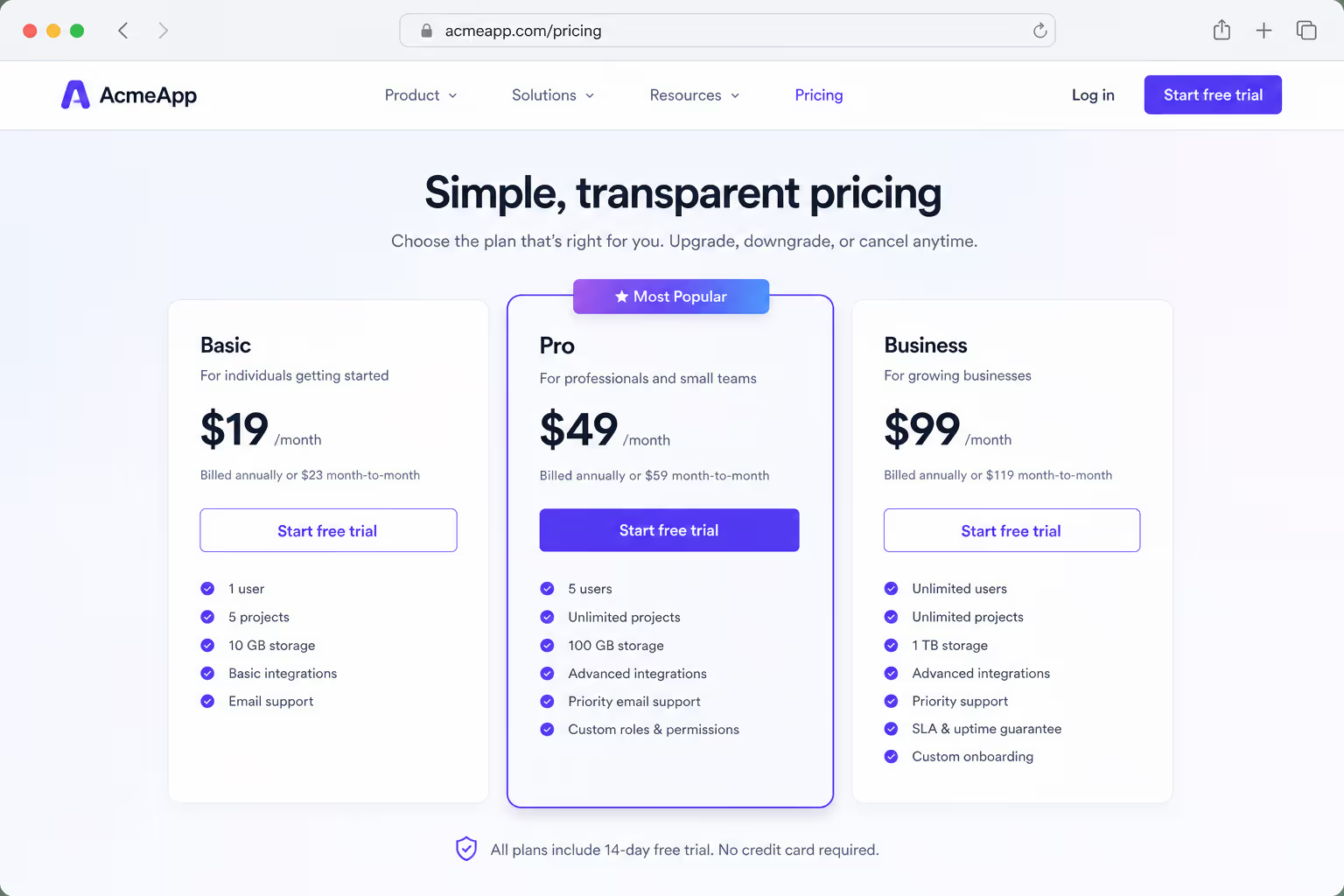
2. "Most popular" ribbon anchoring one column
A label does the steering — the eye lands on the tagged plan first.
3. Checkmark-and-cross matrix for binary features
When features are yes-or-no, symbols scan faster than words.
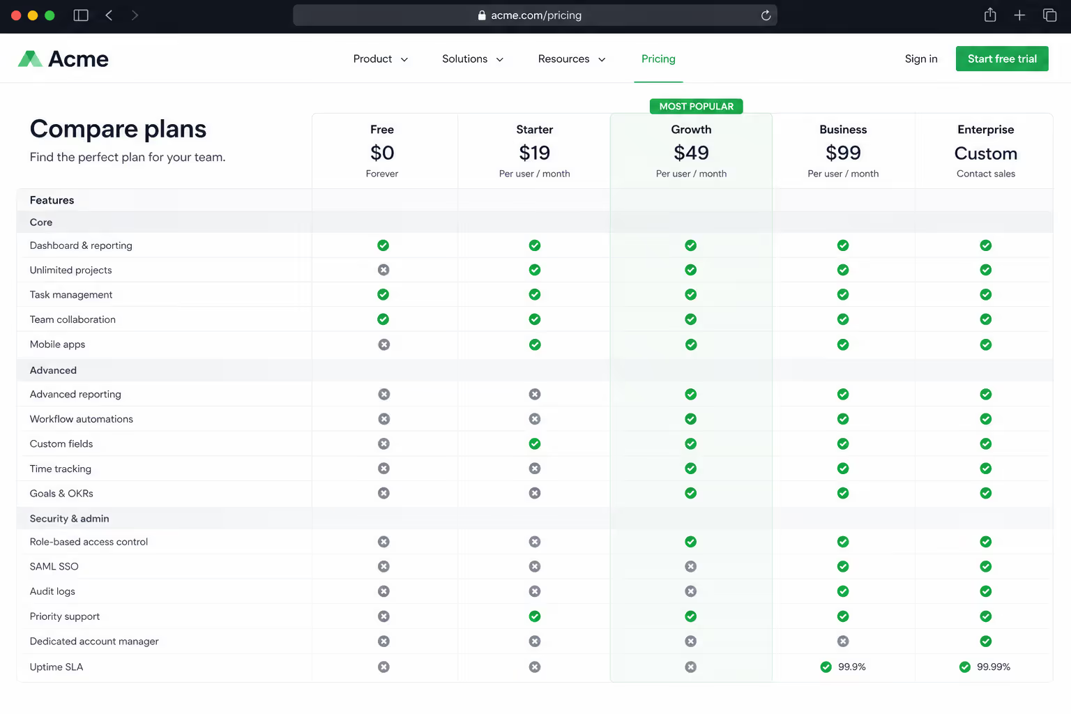
4. You-versus-competitor two-column layout
On a switch page the buyer has already narrowed to two - so show two.

5. Star-rating row for subjective attributes
Ratings translate soft qualities into a scannable score.
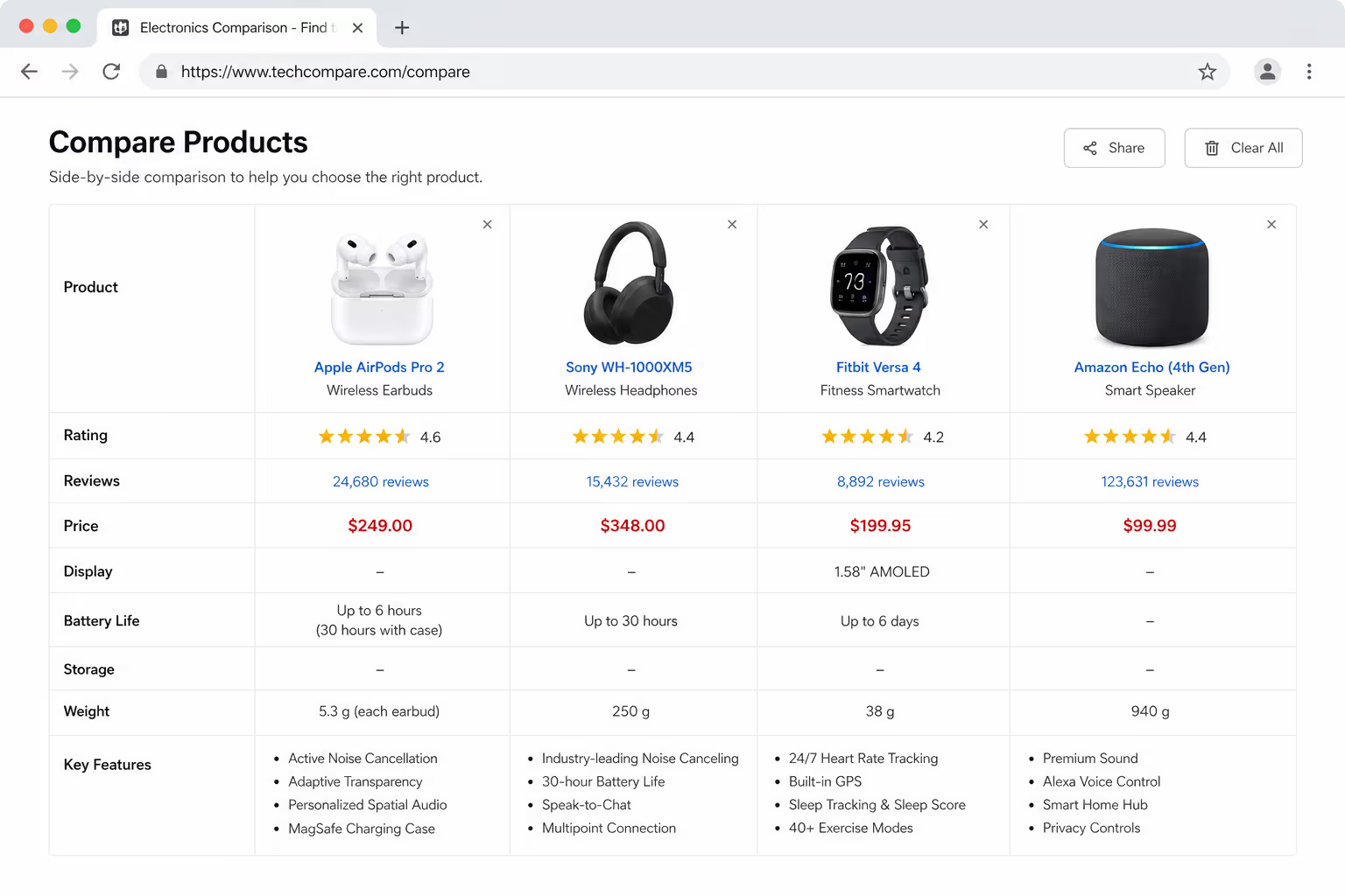
6. Product-image header for ecommerce catalogs
Photos as column headers make retail comparisons visual, not textual.
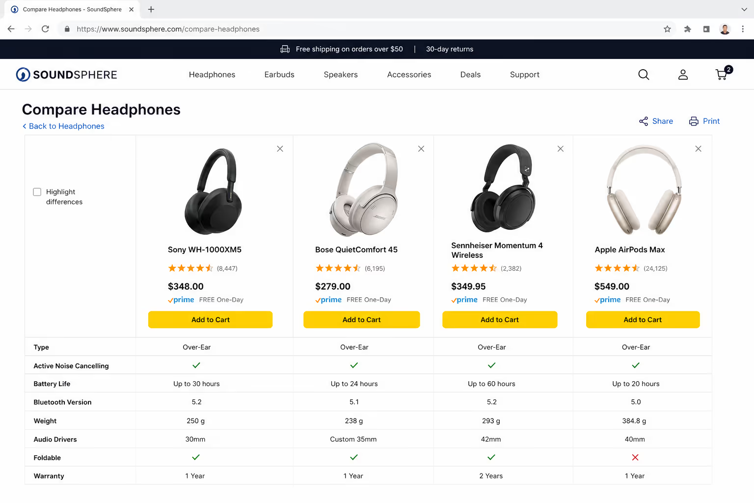
7. Add-to-cart button repeated in the footer row
The action lives at the bottom, so nobody scrolls back up to buy.
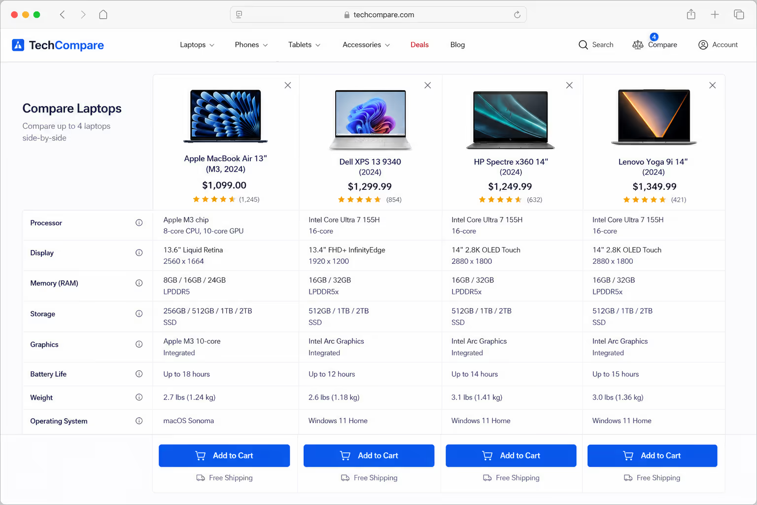
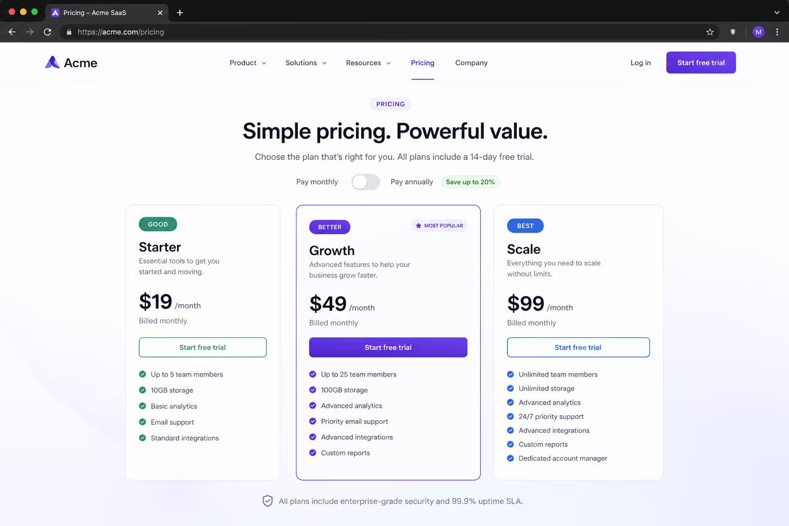
8. Color-coded good, better, and best
A ranked label in each cell signals tiering without a legend.
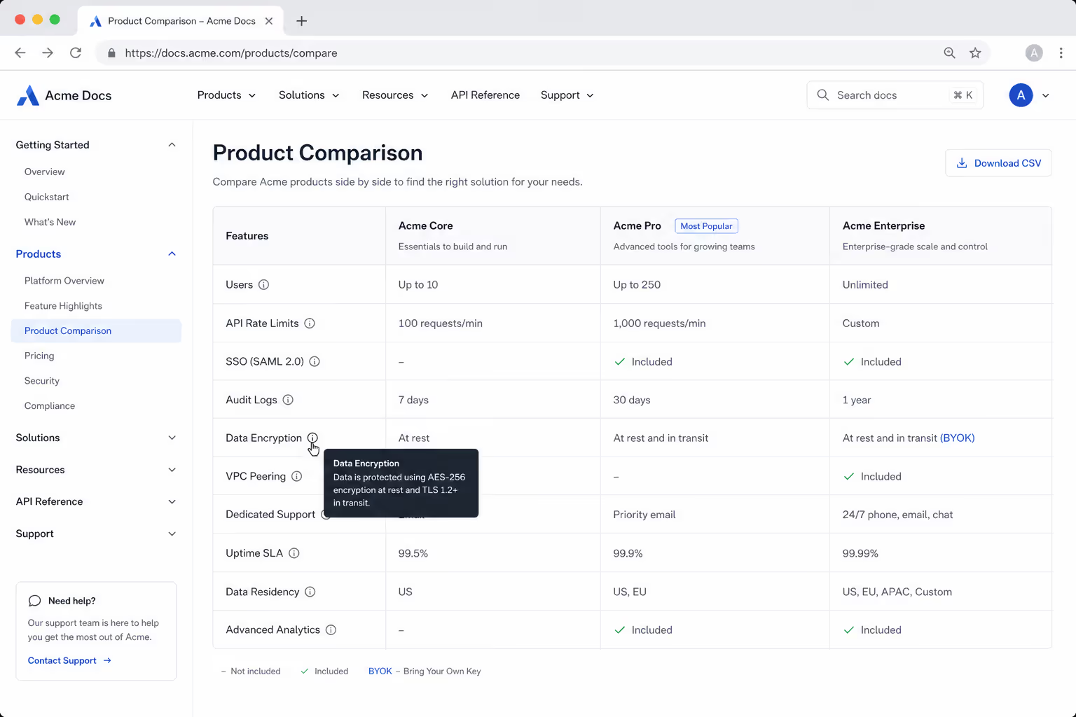
9. Tooltip icons explaining jargon inline
A question-mark marker keeps cells short while defining terms on hover.
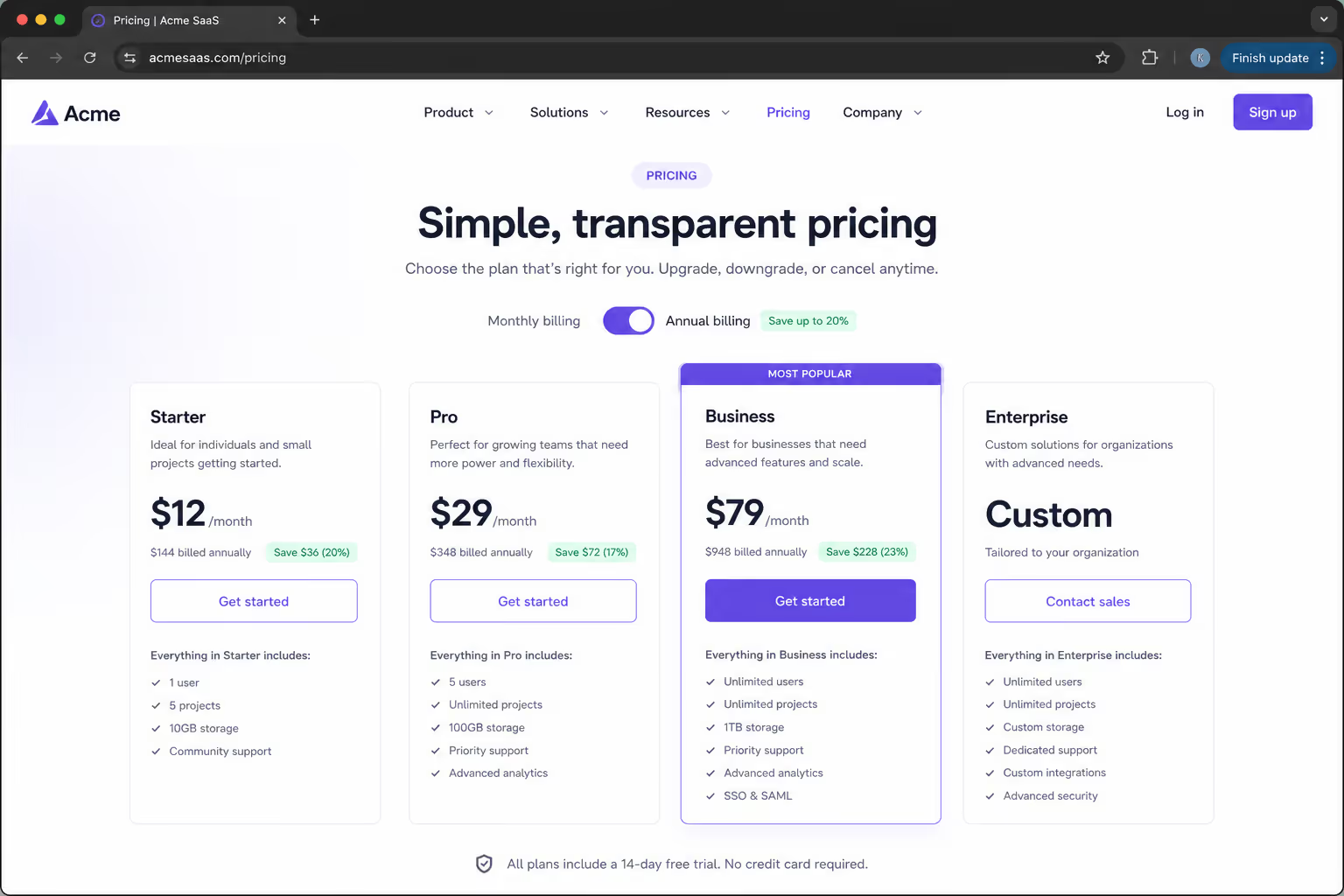
10. Monthly-versus-annual toggle
Both billing options side by side, with the savings made explicit.
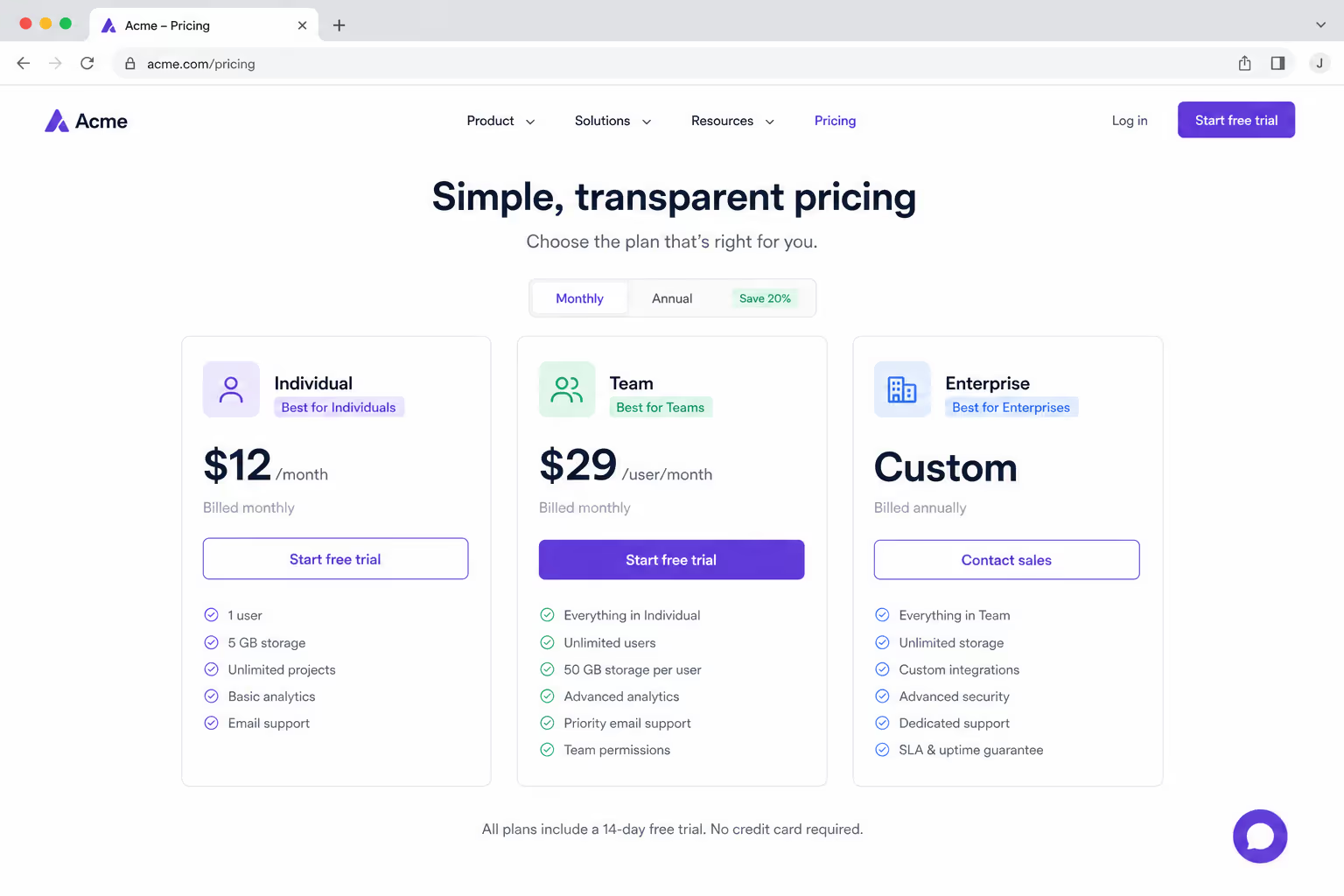
11. "Best for" persona label under each plan
A one-line persona routes each visitor to their column fast.
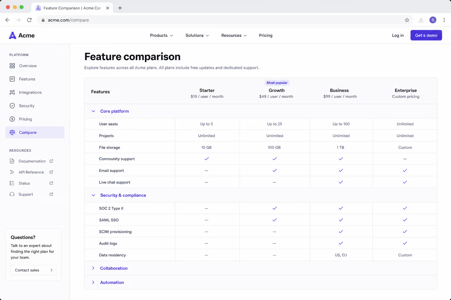
12. Expandable feature groups for enterprise plans
Group headers let long matrices collapse to the section a buyer needs.
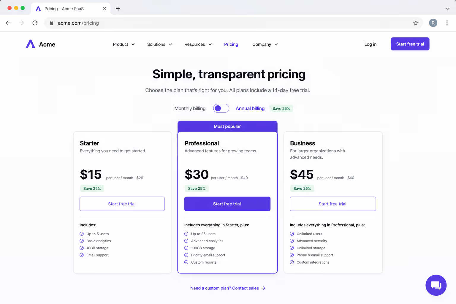
13. Savings badge on the annual column
A badge cell turns the yearly plan into the obvious value pick.
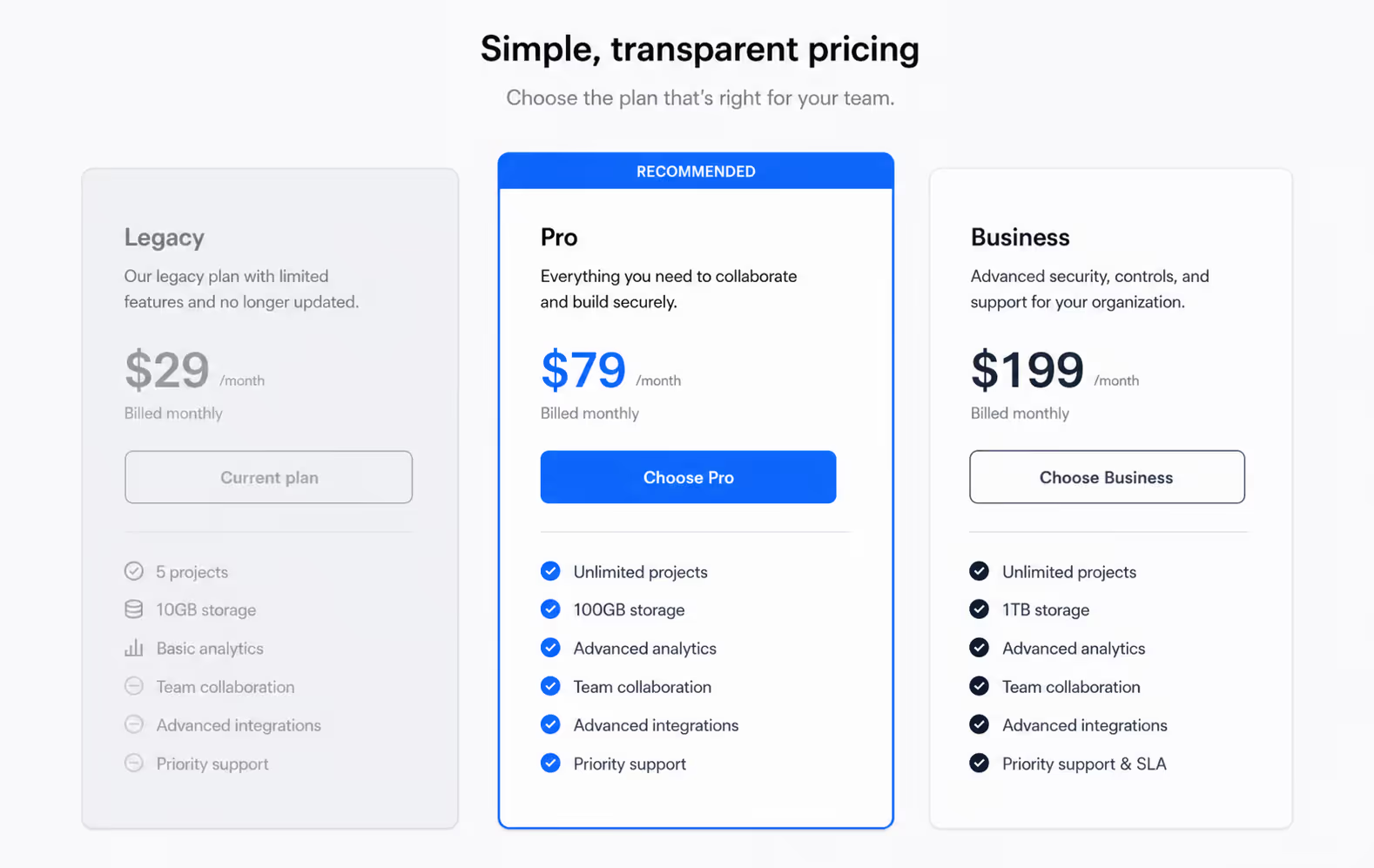
14. Greyed-out cells to de-emphasize a weaker plan
Muting the legacy column steers attention to the plan you want sold.
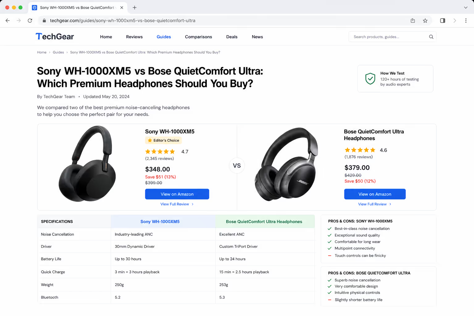
15. Two-product "this or that" head-to-head
The buying-guide default — one row per decision factor, two contenders.
16. Sortable columns for price and rating
Marketplace and directory tables let the reader re-rank on their own priority.
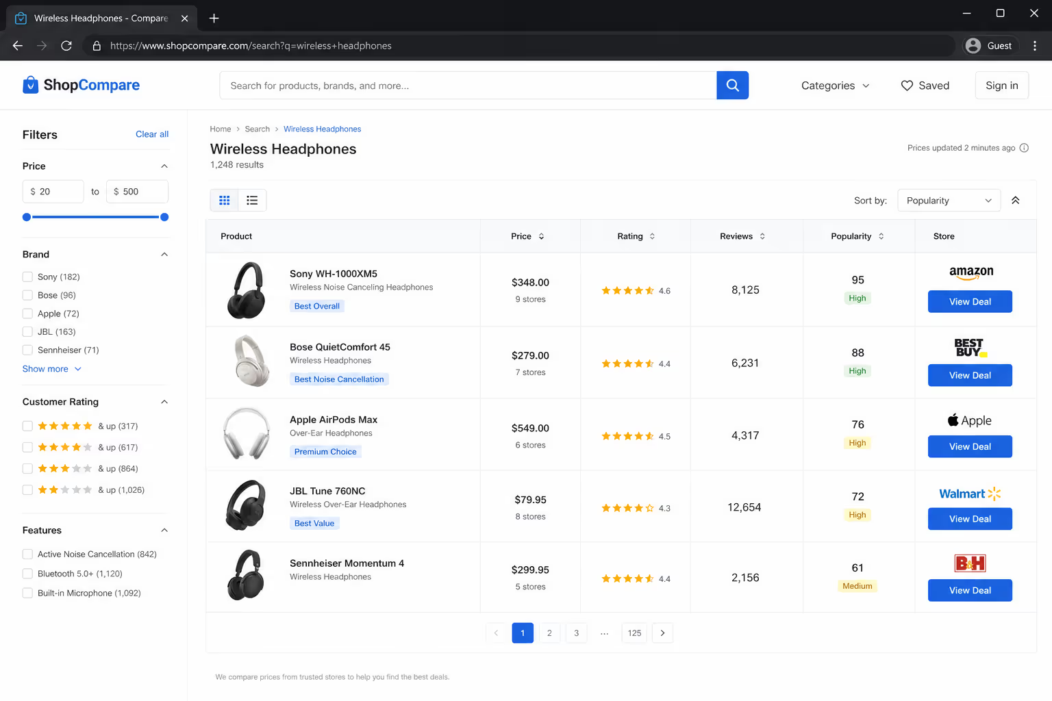
17. Filterable table that hides irrelevant rows
A filter control trims a large catalog to only what the buyer asked for.
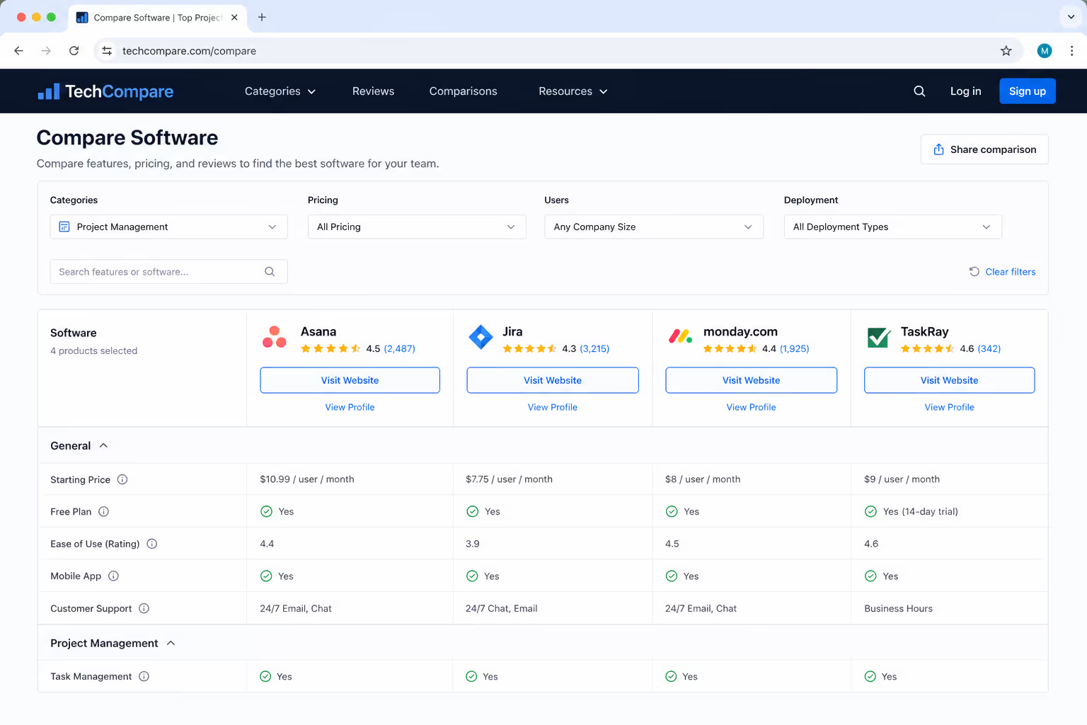
18. Sticky first column for wide feature matrices
Pinning the label column keeps context as the buyer scrolls sideways.
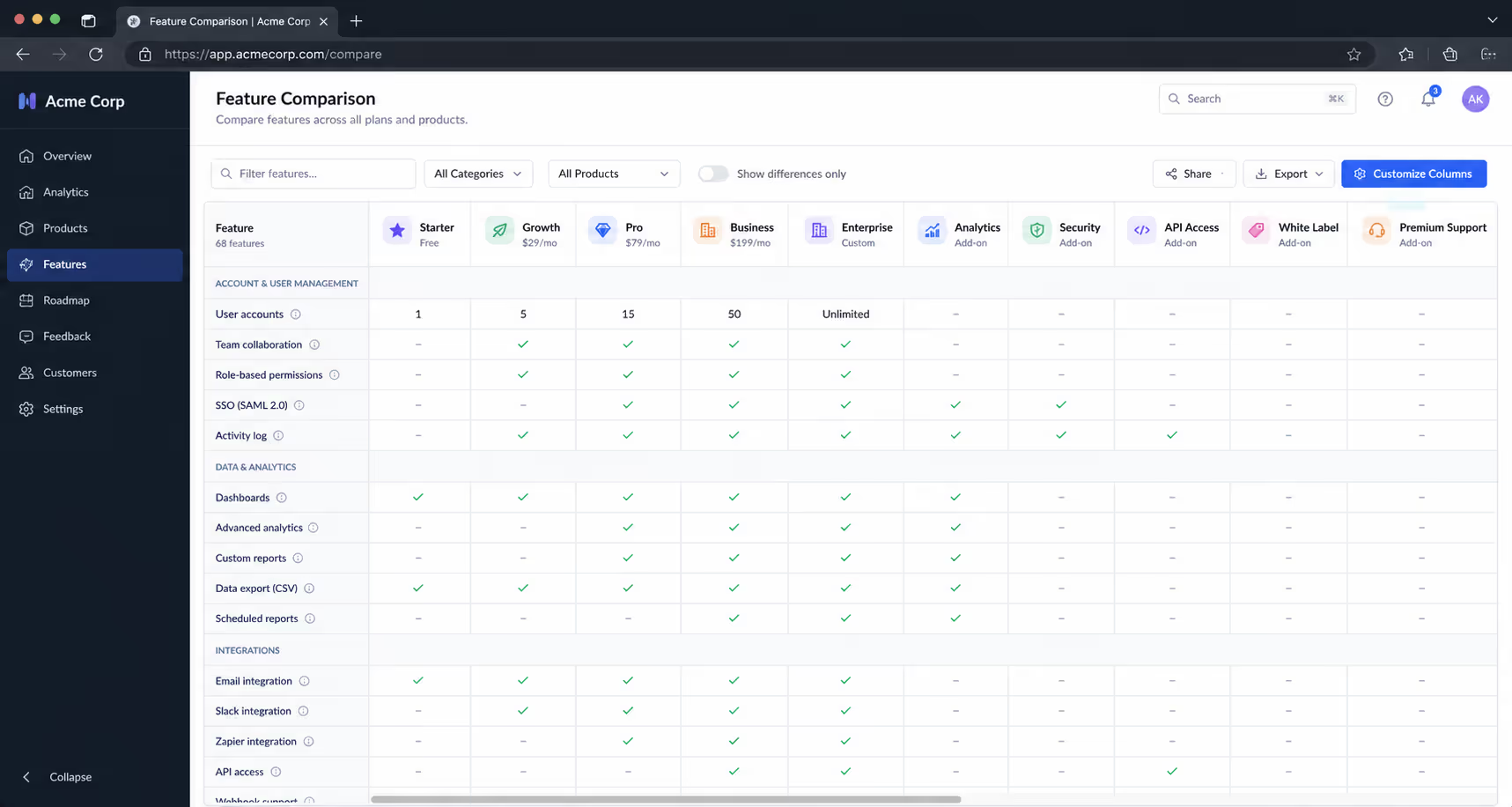
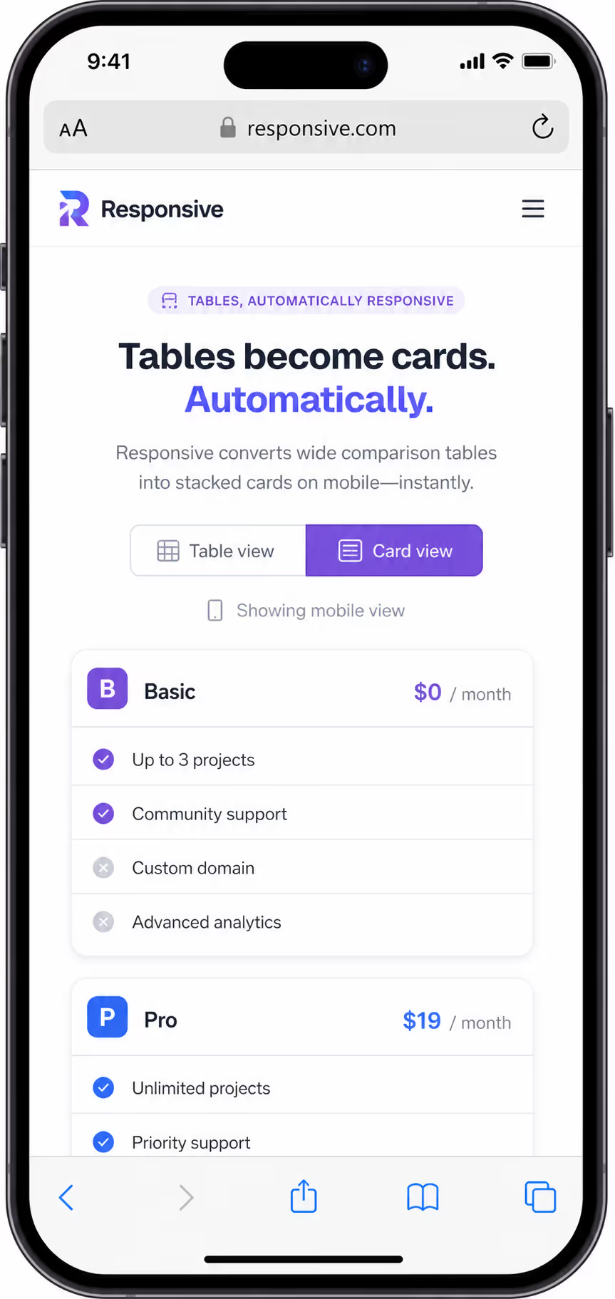
19. Collapsed-to-card layout for mobile
Below roughly 600px the grid restacks into one card per option.
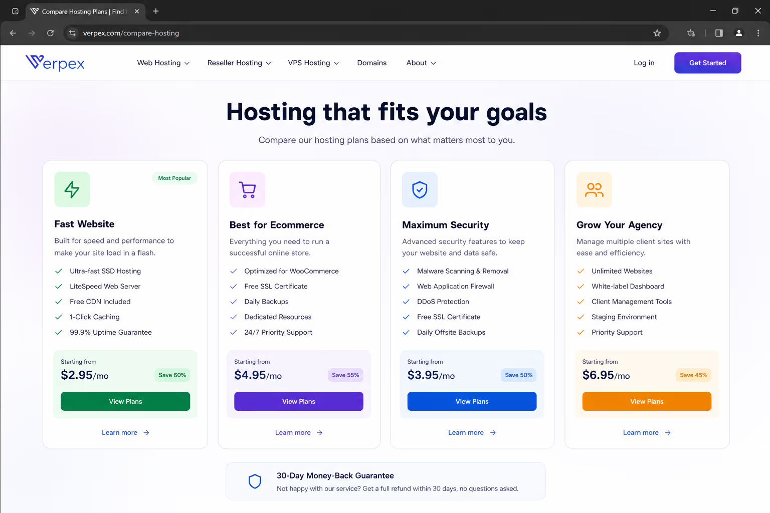
20. Outcome-focused hosting and service tiers
Frame rows as outcomes the buyer wants, not internal spec names.
Notice the through-line across all 20 comparison table design examples: every strong pattern reduces work for the reader. The weak ones — the other 80% Baymard flags — simply dump more cells on the screen and hope the buyer sorts it out.
Turn Any Of These 20 Patterns Into A Live Table
Pick the example that fits your buyer, then rebuild it in the drag and drop editor. Columns, badges, tooltips, and the recommended plan highlight are all editable settings, so you can ship the pattern the same afternoon you choose it.
Build Your TableWorks on Shopify, WordPress, Webflow, Wix, and plain HTML.- 1Add the comparison table widget and set your columns, capping the table at four
- 2Mark one column as recommended and put a best for line under it
- 3Paste the embed snippet into your site, then check the card view on a phone
SaaS pricing tables: anchor one plan, cap the features
The best SaaS comparison table design examples share a discipline most teams skip they show restraint. A pricing-table analysis found the conversion sweet spot is three to four tiers, with roughly five to eight features surfaced per column and the rest tucked behind a toggle; transparent, on-page pricing tracked 15% to 25% higher conversion than gated pricing.
Copy this sequence for a pricing comparison:
Cap the table at four columns - a fifth tier usually cannibalizes the recommended plan.
Anchor the middle column with a "Most popular" ribbon and a slightly taller card.
Show five to eight decision-driving features; hide the long tail behind "compare all features."
Add a monthly-versus-annual toggle and a savings badge to nudge the yearly commitment.
Repeat the call-to-action button in the footer so the buyer never scrolls back up.
Ecommerce product tables: images first, specs second
Retail comparison tables fail for the opposite reason - they lead with numbers no shopper understands. The strongest ecommerce comparison table design examples put the product photo in the header, keep three to four products side by side, and reserve the grid for attributes that actually differ.
Use these rules for a product comparison:
Thumbnail plus name as each column header, so scanning is visual, not textual.
Only comparison-worthy specs - drop any row where every product is identical.
A persistent add-to-cart button in the final row of every column.
A short "best for" line under each product to translate specs into a use case.
B2B feature and vendor tables: pick the attributes, not the winner
Feature-comparison tables can backfire. LogRocket's UX analysis warns that when a table lists every attribute with equal weight, it manufactures decision fatigue instead of resolving it - the reader stalls. The job is to prioritize the handful of attributes that move the decision and let secondary detail collapse.
A comparison table that lists everything decides nothing — the design win is in what you choose to leave out.
For a vendor or "you versus them" table, order the rows by what the buyer cares about - not by what flatters you - and use tooltip icons to explain jargon inline rather than bloating the cells. On a switch page, a clean two-column head-to-head almost always outperforms a five-column matrix, because the buyer has already narrowed the field to you and one rival.
Mobile: the table that becomes cards
A comparison table that works on desktop and breaks on a phone is a broken table - and, per Baymard, that is 78% of them. The reliable pattern is progressive collapse: below roughly 600px, the table restacks into one card per option, with a sticky first column or a horizontal scroll hint so feature labels never disappear off-screen.
Test the mobile view first, not last. If a buyer cannot line up two options without pinch-zooming, none of the desktop polish matters.
What this means for your stack
You do not need a developer to ship any of these comparison table design examples. Poper's no-code Comparison Table widget handles the hard parts - responsive card collapse, sticky headers, and highlighted columns - and embeds on any site in under two minutes. Pair it with the Pricing Table widget when the comparison is a tiered plan grid, and you get the anchored-middle-column pattern out of the box.
Because both widgets are responsive by default, the mobile-to-card behavior - the step most hand-built tables get wrong — is already handled for you.
Conclusion
The best comparison table design examples all do less, not more. They cap the columns, anchor one recommendation, cut the rows that do not change the decision, and collapse cleanly on mobile.
Buyers now run the comparison themselves, often through an AI assistant, before you ever hear from them - so the table is not a support asset, it is the pitch. Design it to make one choice obvious, and it will close on your behalf.
Sources
Baymard Institute, "Product List UX Best Practices". baymard.com
LogRocket, "How to design feature comparison tables that simplify decision-making". blog.logrocket.com
Give Buyers A Table They Can Decide From
You have the patterns. Poper gives you the builder: 160+ embeddable widgets including comparison and pricing tables, plus popups you can trigger on scroll depth or exit intent when a visitor stalls on the pricing page.
Create Your Free AccountOne snippet install, no developer required.