
Last spring I sat behind a friend while she shopped on her own website. She had a chat widget installed, she was proud of it, and yet she never once noticed it. It sat in a corner, the wrong color, popping open three seconds after every page load like a door slamming. That afternoon taught me something I now repeat often. A chat tool only works when the design around it works, and that is exactly what chat widget design best practices are meant to fix.
So in this guide I want to walk you through how my team thinks about this. We will cover where the widget should sit, when it should speak, and how it should sound. None of it is complicated. By the end you will have a clear checklist of chat widget design best practices you can apply to your own site this week.
Why Chat Widget Design Best Practices Matter So Much
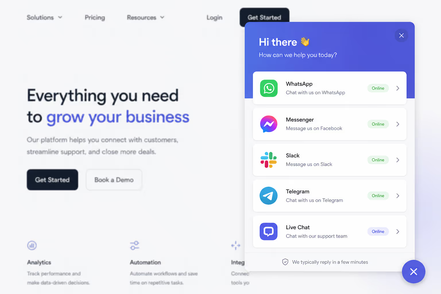
People expect chat now. A report from Nextiva found that 85% of customers expect to see a chat option when they land on a website. When the widget is missing, or buried, or annoying, you are not just losing a feature. You are falling short of a basic expectation.
The upside is real money. Chat conversations convert at 10% to 20% on average, far ahead of traditional website forms at 2% to 3%, based on benchmark data. That gap is the reason chat widget design best practices deserve real attention instead of a five minute setup and a shrug.
Here is the mindset shift I ask every new teammate to make. The widget is not decoration. It is a tiny conversation surface, and every design choice either invites a reply or quietly kills one.
Placement: Where the Widget Should Live
Placement is the first of the chat widget design best practices because nothing else matters if people cannot find the thing. The standard spot, and the one I still recommend, is the bottom-right corner on desktop. It is visible, it is expected, and it stays out of the way of your main content.
Mobile is a different story, and most teams forget this. A Tidio study found that 73.6% of all chats now happen on mobile. So your chat widget design best practices must treat the small screen as the primary screen, not an afterthought.
| Design factor | Desktop | Mobile |
|---|---|---|
| Position | Bottom-right corner | Bottom-center or bottom-right |
| Launcher size | 56 to 64 pixels | 48 to 56 pixels, thumb-reachable |
| Scroll behavior | Fixed, never blocks content | Must not cover the sticky cart or checkout button |
| Open state | Floating panel | Full screen or near full screen |
The biggest mistake I see is a launcher that hides the "add to cart" or checkout button on a phone. That single overlap can cost you a sale, so test every key page on a real device. Good chat widget design best practices always protect the actions that make you money.
One more placement note. Keep the launcher color high in contrast against your background. My friend's invisible widget was a pale gray button on a white site. Contrast is not a style choice here. It is part of being found.
Give Desktop And Mobile Their Own Launcher Position
Poper's All in One Chat lets you set the corner, the offset and the launcher size separately for desktop and mobile, so the button stops sitting on top of your add to cart or checkout control. One line of code installs it on WordPress, Shopify, Webflow, Wix or plain HTML.
<script id="poper-js-script" data-account-id="YOUR_ACCOUNT_ID" src="https://app.poper.ai/share/poper.js" defer></script>Triggers: When the Widget Should Speak
Timing separates helpful chat widget design best practices from annoying ones. A widget that opens itself the instant a page loads feels like a salesperson grabbing your arm at the door. A widget that waits for the right moment feels like help.
The data is firmly on the side of patience and intent. Freshworks reported that sites using proactive chat invitations convert 40% higher than sites that only wait for the visitor to click first. Even better, visitors who engage with a proactive invitation are 6.3 times more likely to make a purchase. The trick is choosing the right trigger.
Trigger on Intent, Not on Arrival
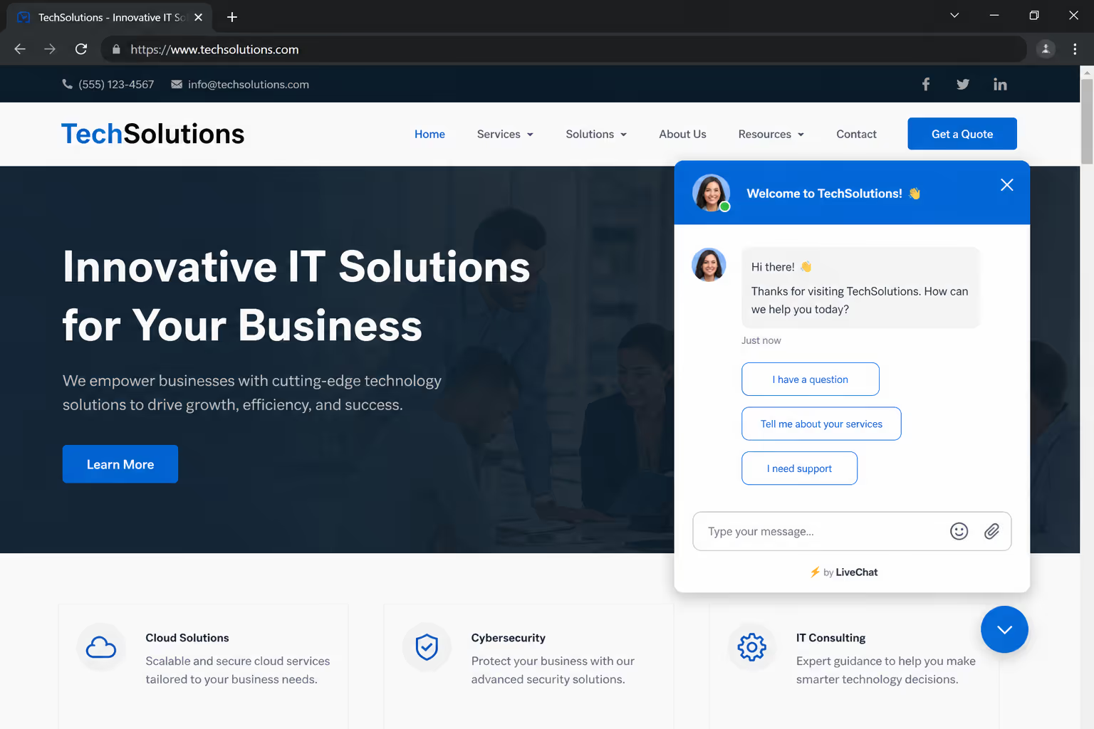
I never auto-open a chat the moment someone arrives. They have not read anything yet, so there is nothing useful to say. Instead, the strongest chat widget design best practices tie the invitation to a signal that the visitor actually needs help.
Good signals include time spent on a pricing page, a second visit to the same product, a scroll to the bottom of a long article, or an exit-intent move toward the back button. Each of those says the person is thinking hard about something, and a well-timed message can carry them over the line.
Match the Trigger to the Page
Context is everything. On a checkout or pricing page, a proactive nudge after 20 or 30 seconds works well, because hesitation there usually means a real question. On a blog post or an about page, I leave the widget quiet and reactive, since an interruption mid-read just feels rude.
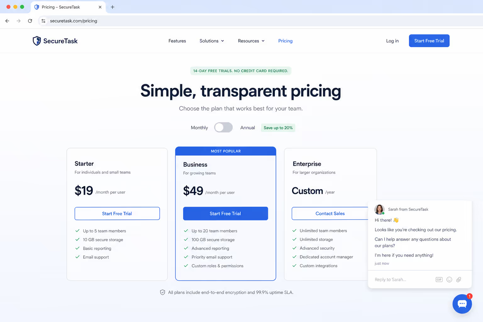
This page-by-page thinking is one of the chat widget design best practices that separates a polished setup from a noisy one. The same trigger can be smart on one URL and a mistake on another.
Match the Trigger to the Page
When someone does open the chat, speed is the next battle. Which-50 benchmark data shows customer satisfaction peaks at 84.7% when the first response lands within 5 to 10 seconds. If you cannot answer that fast, your chat widget design best practices should at least show an honest expected wait time or a quick automated greeting, so silence never feels like being ignored.
Make The Chat Speak On Intent, Not On Arrival
Every trigger described in this section is a setting in Poper rather than a developer ticket. Configure these five and your launcher stays quiet while people read, then steps in where hesitation actually happens.
- Time delay on pricing and checkout pages, so a stalled visitor gets a nudge
- Scroll depth on long articles, so the invitation waits until someone reaches the end
- Exit intent for the move toward the back button
- Second visit targeting for people returning to the same product
- Page rules and frequency capping, so the same greeting never fires everywhere or twice
Tone: How the Widget Should Sound
Placement gets the widget seen and triggers get it opened, but tone decides whether the visitor actually replies. This is the most overlooked of the chat widget design best practices, and it costs nothing to fix.
I write every chat prompt the way I would talk to a customer standing in front of me. "Hi, I am Sara from the team. Stuck on anything with pricing?" reads as human. "Welcome! How may we assist you today?" reads as a script. People answer humans far more often than they answer scripts.
Three small tone rules guide our chat widget design best practices. Keep the greeting short, because a long paragraph in a tiny window feels heavy. Use a real name and a real face photo, since a named agent feels accountable. Ask one specific question instead of a vague offer, because "Need help?" invites a no while "Question about shipping?" invites a real answer.
Tone also covers your automated replies. A bot can carry the first message, and that is fine. Chatbots now handle around 80% of routine questions at roughly 30% lower cost. Just make sure the bot sounds friendly and hands off cleanly to a person, so the warmth of your chat widget design best practices survives the automation.
Common Mistakes That Break Good Design
A few habits quietly undo all the careful work. The first is the instant pop-up I mentioned earlier. Opening the panel before the visitor has read anything is the fastest way to get the widget closed and ignored for the rest of the session.
The second is leaving the widget online when nobody is staffing it. An empty chat that promises help and then goes silent damages trust more than having no chat at all. Strong chat widget design best practices include an offline mode that collects an email instead of pretending an agent is there.
The third is ignoring mobile entirely. A widget that looks tidy on a laptop but blocks the checkout button on a phone is failing the 73.6% of users who chat from mobile. The fourth is sound. An audio ping on every message feels aggressive, so let the visit stay quiet unless the user opts in.
Fix those four issues and you are already ahead of most sites. Chat widget design best practices are mostly about removing friction, not adding flash.
How Poper Helps You Apply These Practices
I will be honest about what we build. Poper offers an All-in-One Chat widget that routes conversations from WhatsApp, Messenger, Slack, Telegram, and more into a single button on your site. It is designed so the chat widget design best practices in this guide are the default, not a project.
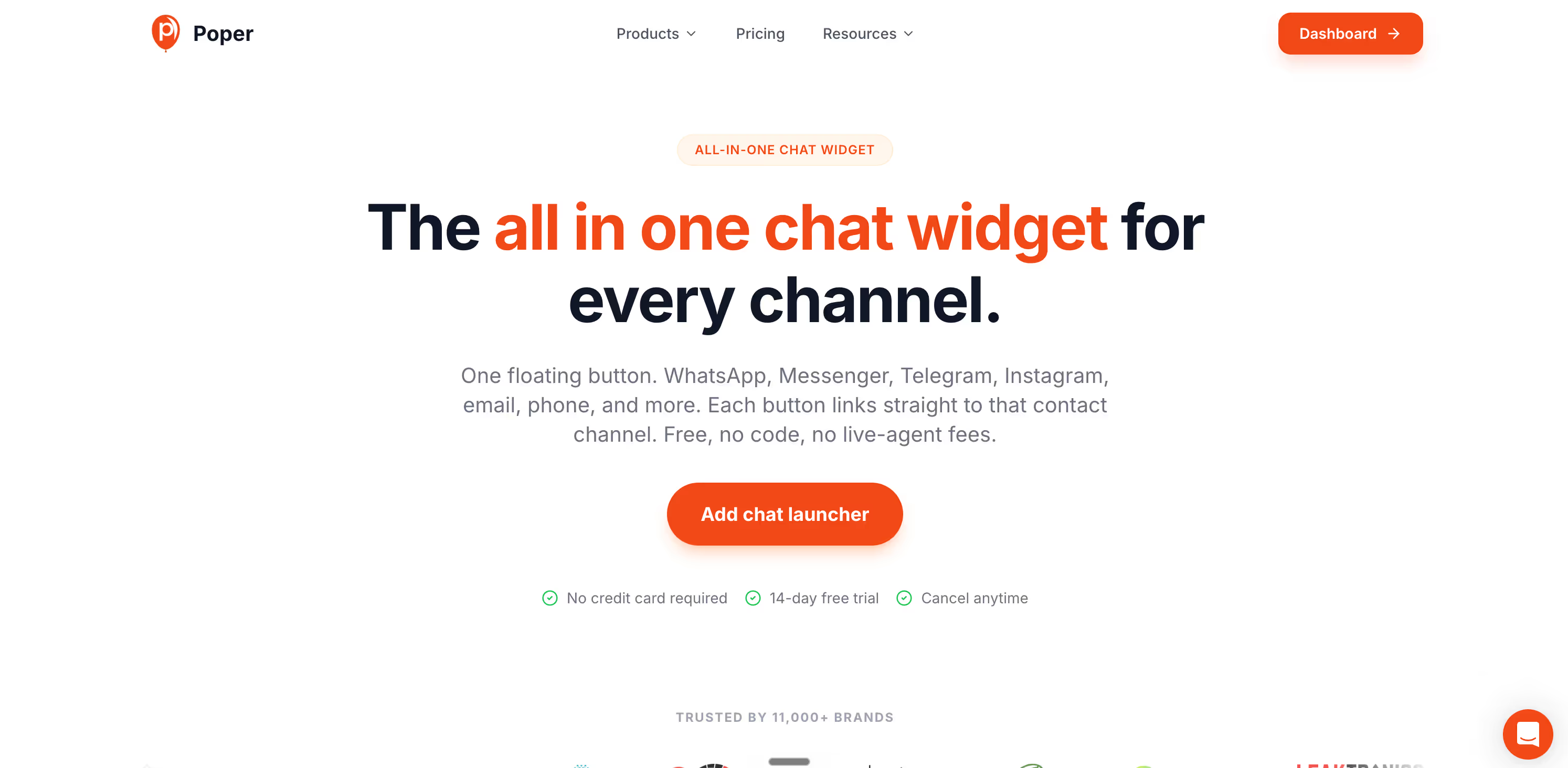
You control placement for desktop and mobile separately, so the launcher never sits on top of your checkout button. You set smart triggers based on time, scroll depth, exit intent, and specific pages, which means the widget speaks on intent instead of on arrival. You write the greeting and pick the agent name and photo, so the tone stays human.
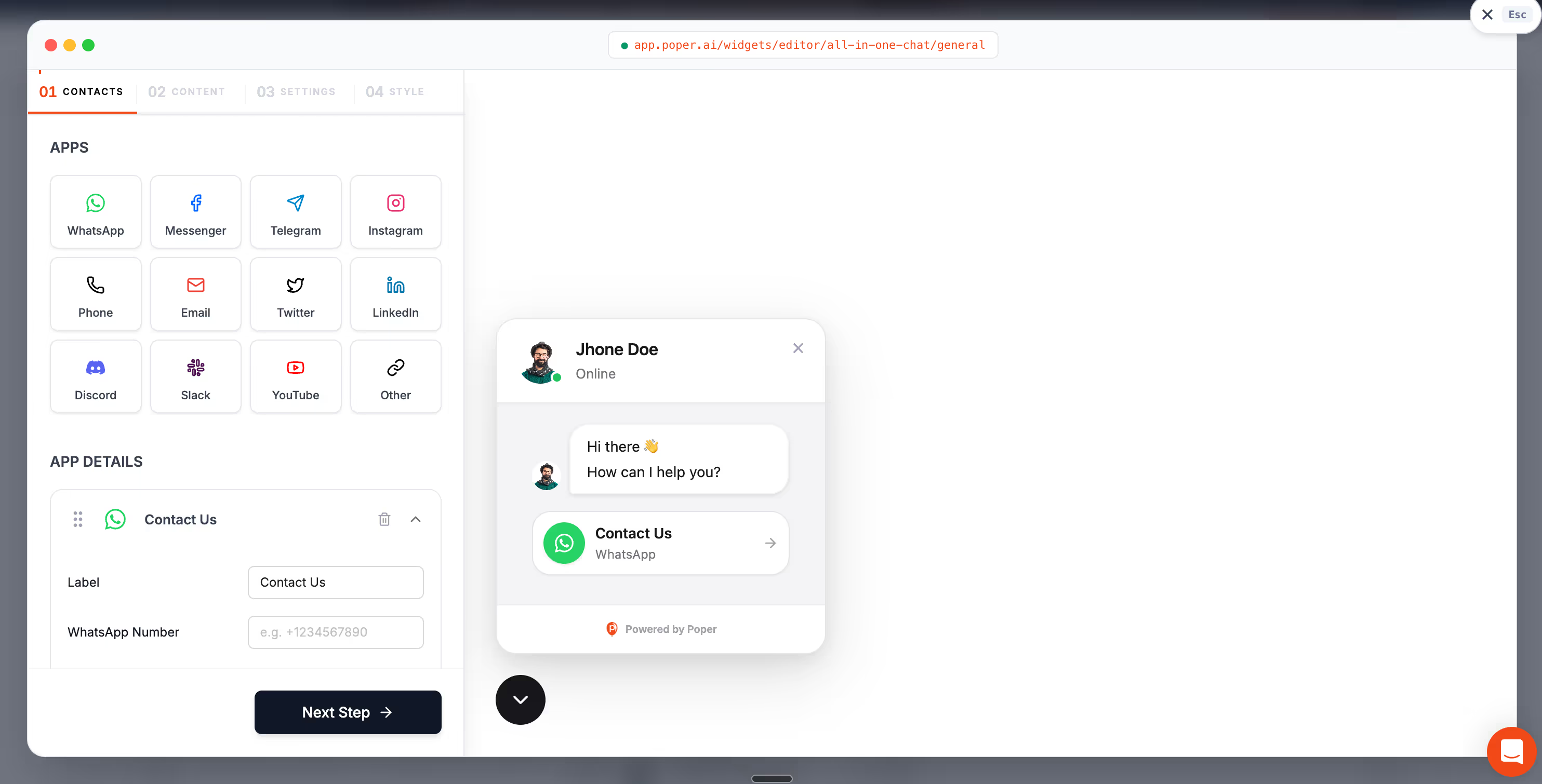
It all embeds on WordPress, Shopify, Webflow, Wix, or any other platform in under two minutes with no code. That means you can put these chat widget design best practices to work today rather than booking a developer for next month.
So here is my closing thought. A chat widget is one of the smallest elements on your site, yet it carries some of the highest intent traffic you will ever get. Treat placement, triggers, and tone as the three pillars of your chat widget design best practices, get each one right, and that quiet button in the corner will start doing real work for you.
Put The Three Pillars To Work This Week
You have the design rules. Poper gives you the surface to run them on: an All in One Chat widget that pulls WhatsApp, Messenger, Slack and Telegram into one button, intent based triggers, your own greeting and agent name, plus A/B testing and a conversion dashboard so you can see which invitation earns replies.
Start Building FreeFree plan, no credit card required. Installs in minutes on any platform.


