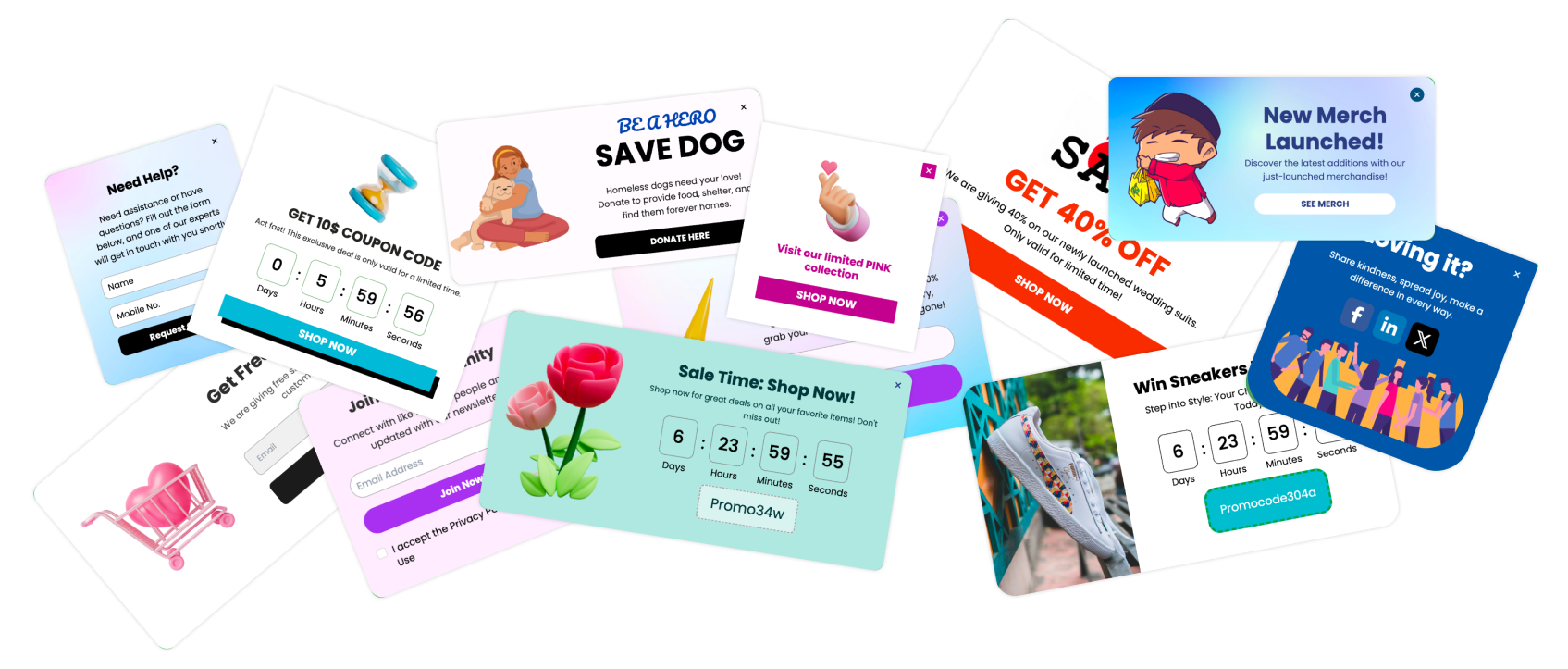

A single word change on a button can swing your conversion rate by 10% to 30%. That is the entire case for caring about button microcopy examples: the words on a button are the cheapest variable you control, and "Submit" - the default label sitting on most forms - is one of the worst performers you can ship. It signals effort and obligation, exactly the feeling you do not want a visitor to have at the moment they decide to click.
Quick Take: Button text that names what the visitor gets beats generic labels like "Submit" or "Sign Up." Swapping in benefit-led microcopy can lift clicks 10-30% with no redesign.
Why “Submit” Quietly Costs You Clicks
The word on a button frames the trade the visitor is about to make. "Submit" describes the work they do for you. Benefit-led copy describes what they get back. That reframe is small in characters and large in outcome.
Testing data backs this up. Benefit-oriented verbs consistently outperform obligation-oriented ones - "Get Started" beats "Register," "Claim Your Spot" beats "Sign Up," and "Unlock Full Access" beats "Subscribe." The mechanism is the same every time: the button answers the visitor's silent question, "what is in this for me?"
This is why button microcopy examples are worth collecting and stealing. You are not guessing at clever wording - you are matching a proven pattern to your own offer.
Generic Labels Versus Benefit-Led Microcopy
The fastest way to improve a button is to find the generic label and replace it with one that states the outcome. Here is a side-by-side of common defaults and the stronger button microcopy examples that tend to beat them.
| Generic label | Benefit-led replacement | Why it works |
|---|---|---|
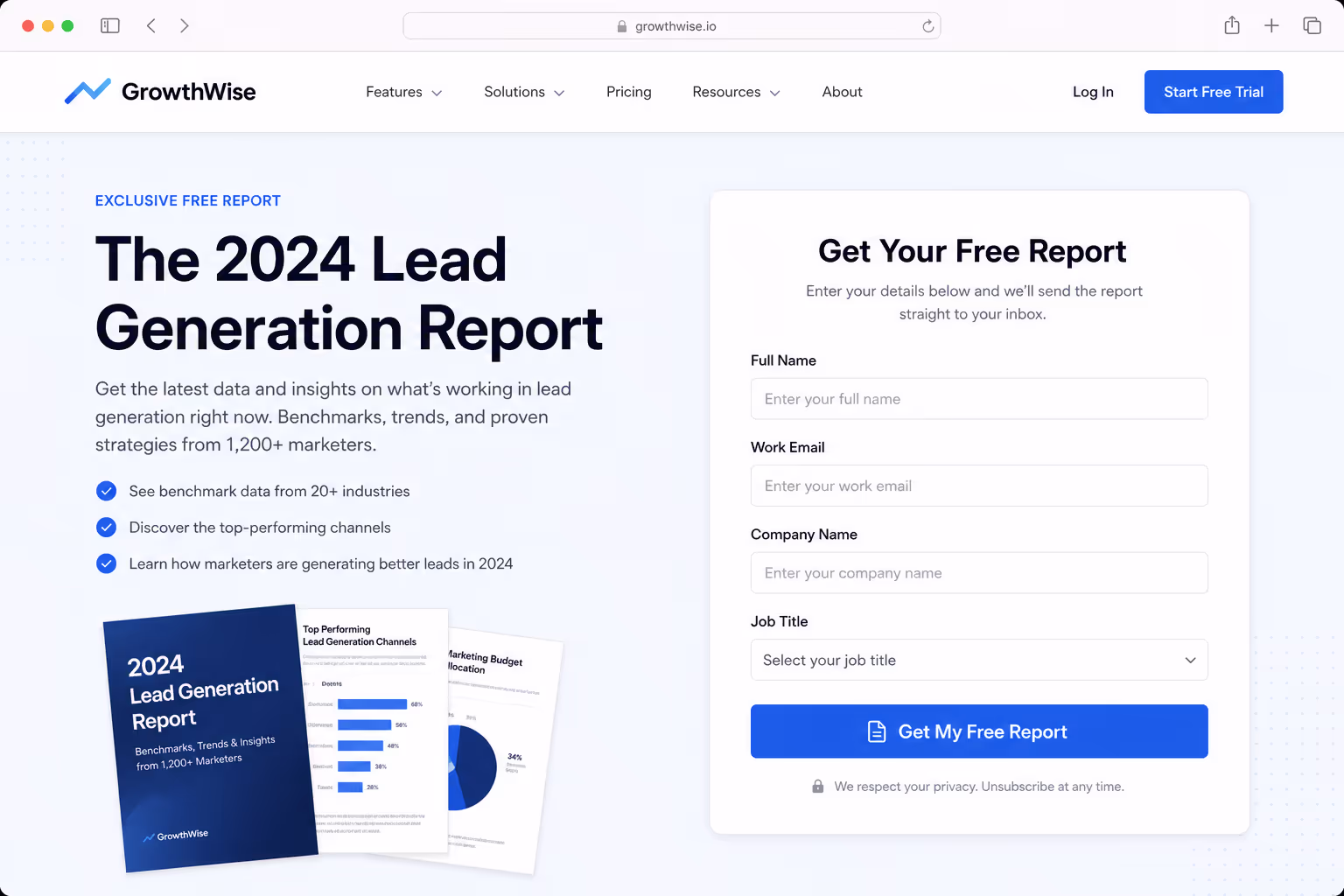
| Submit | Get my free report | Names the reward, not the chore |
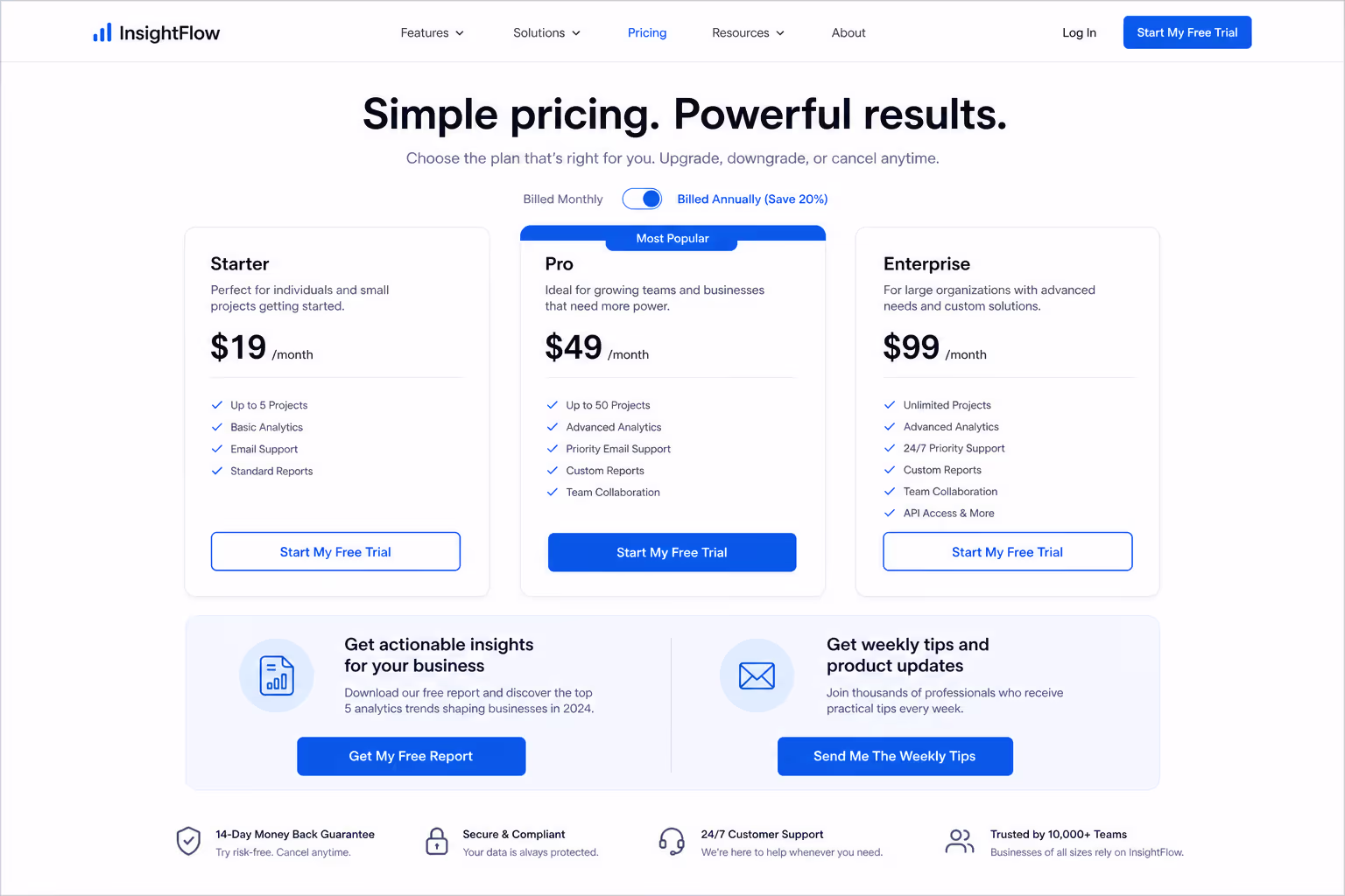
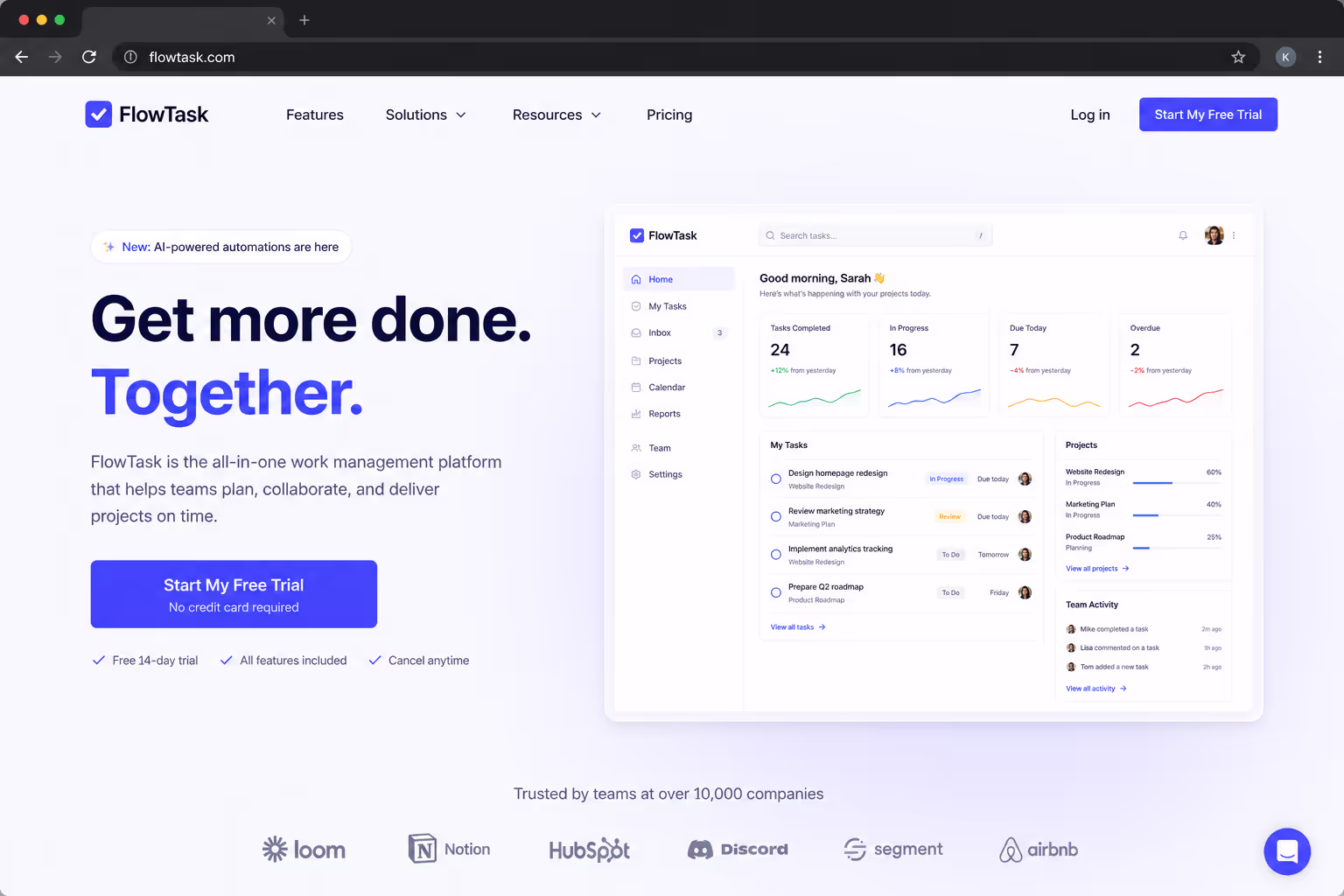
| Sign Up | Start my free trial | Adds "free" and a first-person frame |
| Register | Save my seat | Implies scarcity and ownership |
| Subscribe | Send me the weekly tips | Sets a clear expectation of value |
| Buy Now | Add to cart - free shipping | Removes a known objection at the click |
| Download | Download the 12-page guide | Specifics lower perceived risk |
| Contact Us | Book a 15-minute call | Tells the visitor exactly what happens next |
None of these are clever for the sake of it. Each one trades a vague command for a concrete promise — and the first-person voice ("my," "me") consistently tests well because it puts the visitor in the driver's seat.
The Microcopy Under the Button Matters As Much as the Label
Button microcopy examples are not limited to the words inside the button. The tiny line of text directly beneath it - the "doubt remover" - often does more work than the label itself.
In a 2025 case study, Nomad Cooks added objection-killing microcopy under its CTA and lifted conversion 124%, from 9.5% to 21.3%. A separate test on Augmentive added social proof directly under the button and saw a 68% conversion lift. Same button, same offer - the only change was the reassurance sitting one line below.
Common doubt removers worth testing under your button:
"No credit card required" - kills the fear of a hidden charge.
"Cancel anytime" - removes the fear of being trapped.
"Setup takes 2 minutes" - counters the fear of effort.
"Join 12,000+ marketers" - supplies social proof at the decision point.
"30-day money-back guarantee" - shifts the risk back onto you.
The button label earns the click; the line beneath it removes the last reason not to.
Button Microcopy Examples by Goal

The right wording depends on what the click is for. Matching the label to the funnel stage matters more than chasing a universally "best" word - because a top-of-funnel newsletter and a bottom-of-funnel checkout are asking for very different levels of commitment.
Lead magnet: "Get the free template," "Send me the checklist." Name the asset and the price (free).
Free trial: "Start my free trial," "Try it free for 14 days." Lead with "free" and a time frame.
Demo or sales call: "Book a 15-minute demo," "See it in action." Set the time cost and the payoff.
Checkout: "Place my order," "Complete secure checkout." Reassure on security at the riskiest step.
Newsletter: "Send me the weekly tips," "Keep me posted." Describe the value, not the act of subscribing.
Notice that none of these are longer than five words. Microcopy stays short - you are sharpening the existing label, not writing a sentence on a button.
How To Test Your Button Microcopy
Button text is the ideal A/B test because it isolates one variable cleanly. A disciplined test of button microcopy examples looks like this:
Start from the generic label. Find every "Submit," "Sign Up," and "Buy Now" on your highest-traffic page.
Write one benefit-led challenger. State the outcome in the visitor's voice — "Get my," "Start my," "Send me."
Change only the words. Hold color, size, and placement constant so the copy is the only difference.
Add a doubt remover, then test it separately. The line under the button is its own variable, not part of the label test.
Run to significance. CTA benchmarks vary widely by industry, so judge against your own baseline, not a blog's average number.
The reason this works is that microcopy is reversible and cheap. If the challenger loses, you revert in seconds - there is no design debt, no developer ticket, and no downside beyond the test itself.5
What This Means for Your Stack
Poper's Button widget lets you edit the label, the doubt-remover line, color, and size without touching code - then swap variants in seconds and run them against each other with built-in A/B testing. That is the whole point of treating button microcopy as a lever: the change should take a minute, not a sprint.
The same logic applies to every clickable element on your site. Browse the full Poper widget directory to see how buttons sit alongside popups, forms, and other conversion elements where the same benefit-led wording carries over.
Conclusion
The best button microcopy examples all do one thing: they replace a command with a promise. "Submit" tells the visitor about the work; "Get my free guide" tells them about the reward.
You do not need a redesign to capture that lift - you need to find your generic labels, rewrite them in the visitor's voice, add a line of reassurance underneath, and test one change at a time. It is the cheapest conversion win on the page, and it is sitting on every button you already have.