
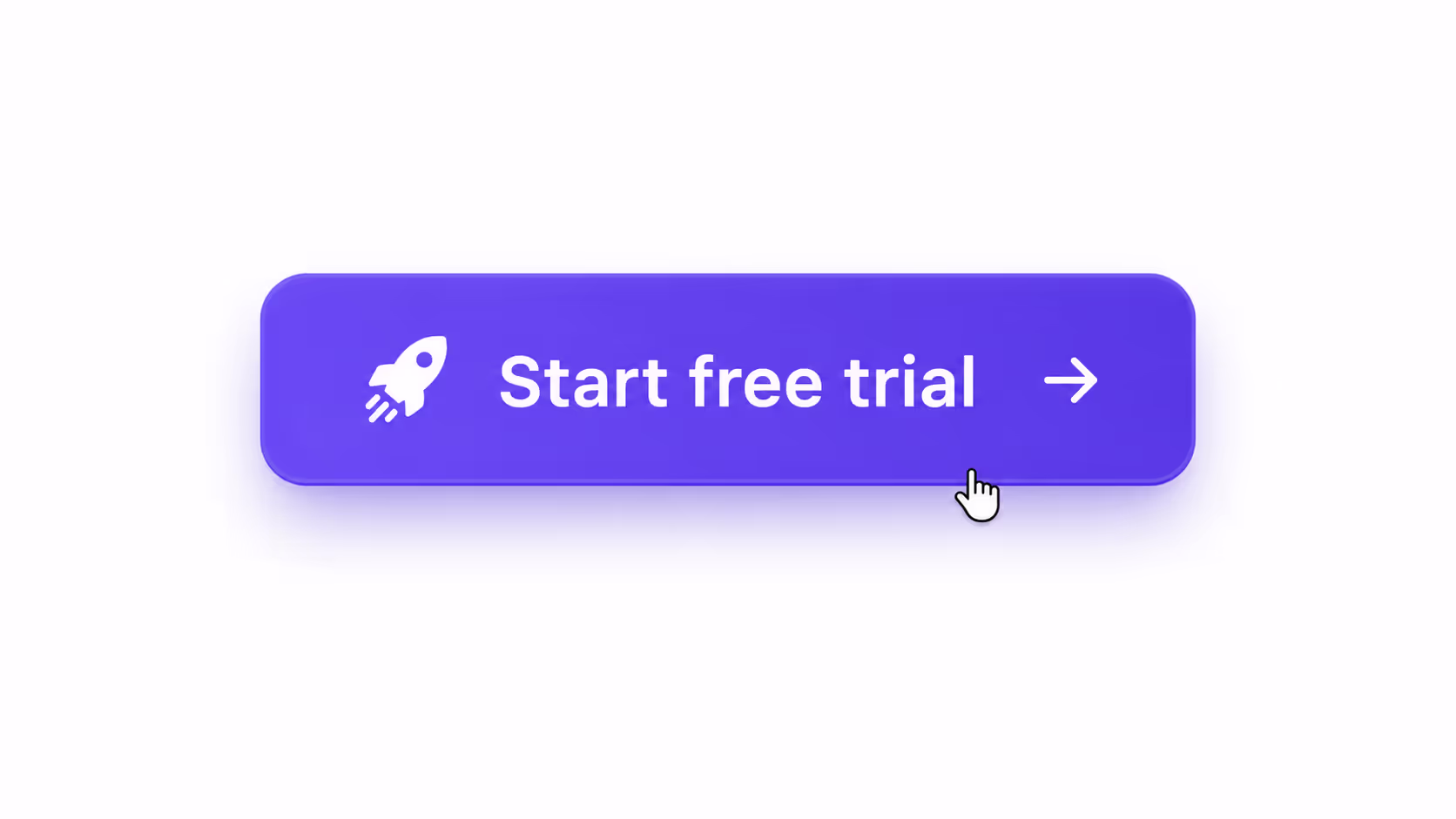
Single-CTA pages convert at 13.5%, while pages with three or more competing buttons fall to 10.5%, according to 2026 conversion data. That gap is the entire argument for treating CTA button design as a measurable discipline rather than a styling afterthought. The 31 examples below are numbered one by one and grouped by the single variable each isolates - copy, color, size, placement, and count.
Quick Take: The best CTA button design wins on contrast, first-person copy, and one clear action per screen - not on a magic color. Test one variable at a time, and measure the lift.
Why CTA button design moves revenue
A button is the last thing a visitor touches before becoming a lead or a customer. Small changes compound there because the traffic is already qualified - you are converting intent, not creating it.
The numbers are blunt. Personalized CTAs convert 202% better than generic ones, and cutting a page down to a single primary CTA has lifted conversions by as much as 266% in documented tests. Few other on-page changes return that much for that little work.
The catch is that most teams change five things at once and learn nothing. Good CTA button design is a sequence of isolated A/B tests - one variable, one hypothesis, one statistically significant result - repeated until the button stops improving.
The Data Behind Each Change
Before the examples, here is what the 2024-2026 record actually shows when each variable is tested on its own. Use this table to decide which test to run first — sort by the size of the prize.
| Change tested | Typical measured impact |
|---|---|
| Reduce to one primary CTA per screen | +266% conversions; 13.5% vs 10.5% page rate |
| Generic copy → personalized CTA | +202% conversion rate |
| AI behavioral personalization vs generic | +231% (B2B SaaS) |
| High-contrast color swap (winning test) | +49% average lift |
| Mobile tap target ≥48×48px + 16px spacing | +49% tap-through |
| First-person copy ("Get my…") vs "Submit" | +30-40% |
Read the table as a priority list. Copy and count sit at the top because they move the most and cost the least — they need no new design assets at all.
Copy: The highest-leverage Variable in CTA button design
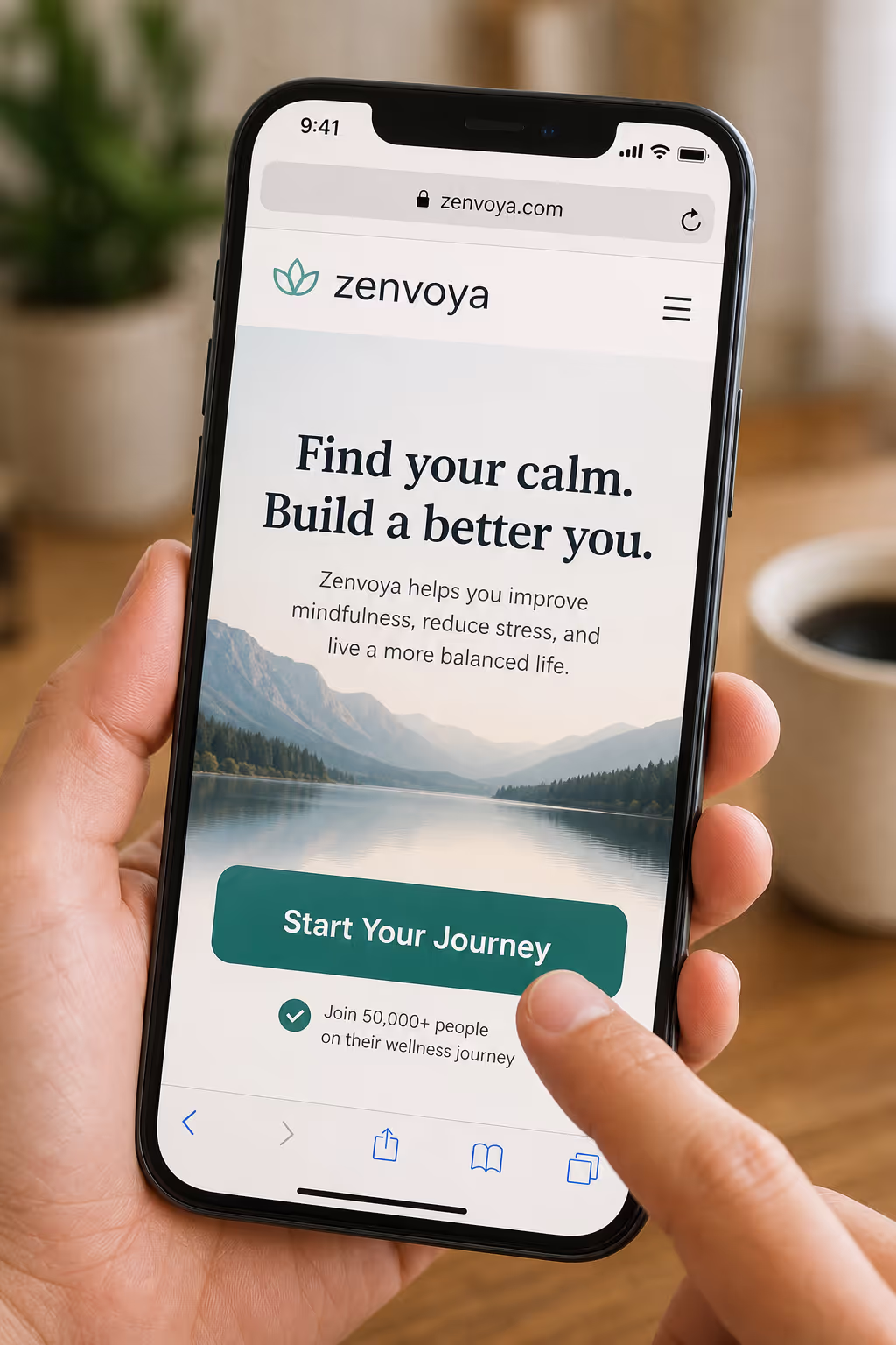
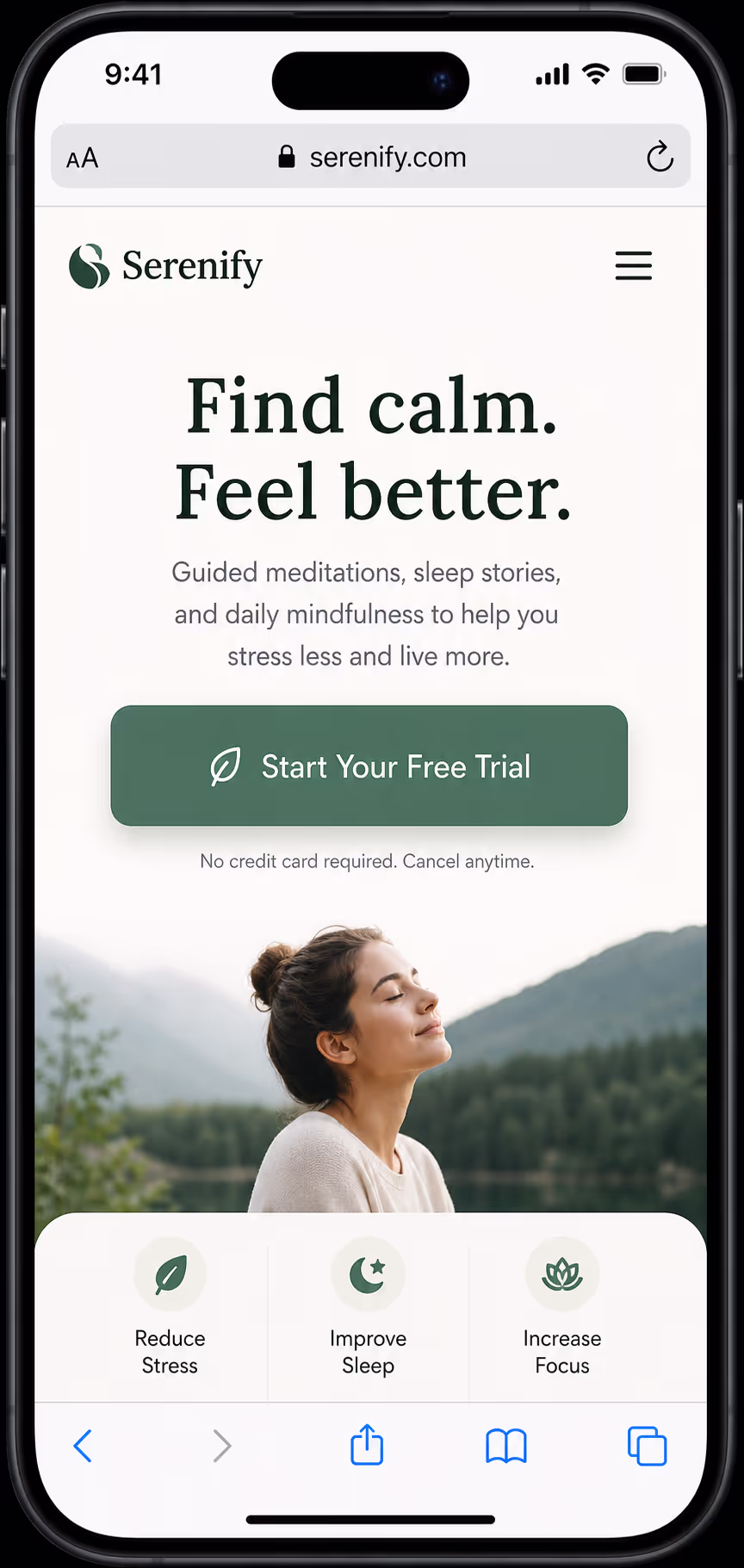
The words on the button outperform the pixels around it. Switching from second-person to first-person framing - "Get my free audit" instead of "Get your free audit" - lifts clicks by 30-40% in recent tests, because the copy reads as the visitor's own voice.[1]
Specificity beats cleverness. "Submit" describes the form's job; "Start my 14-day trial" describes the visitor's reward. Lead every label with a verb and name the outcome. Examples 1-10 isolate copy alone:
1. "Get my free audit" - first-person ownership
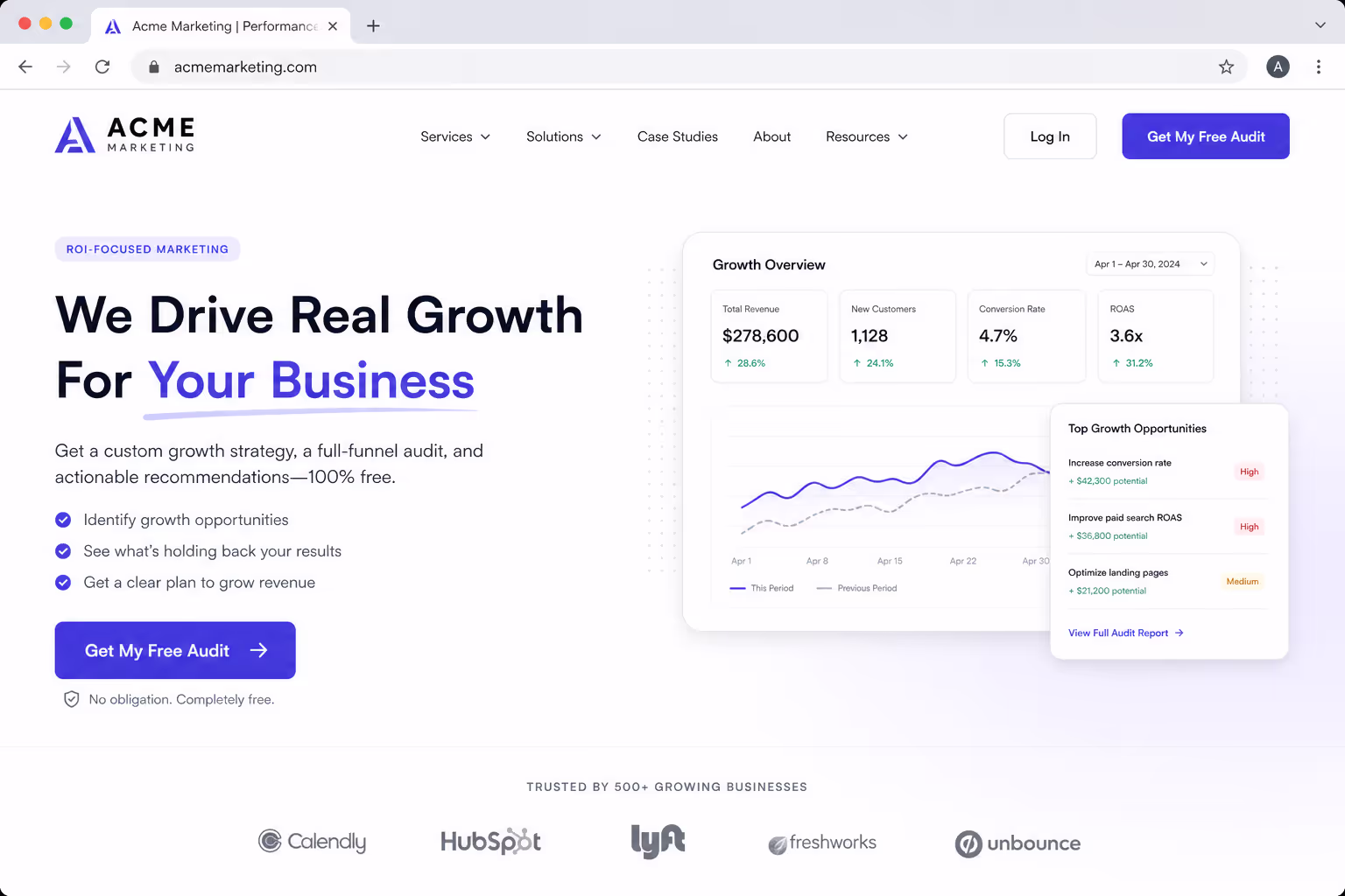
Swap "your" for "my" so the label reads in the visitor's own voice. Screenshot: the button rendered with first-person copy beside the form.
2. "Start my 14-day trial" - names the timeframe and the reward
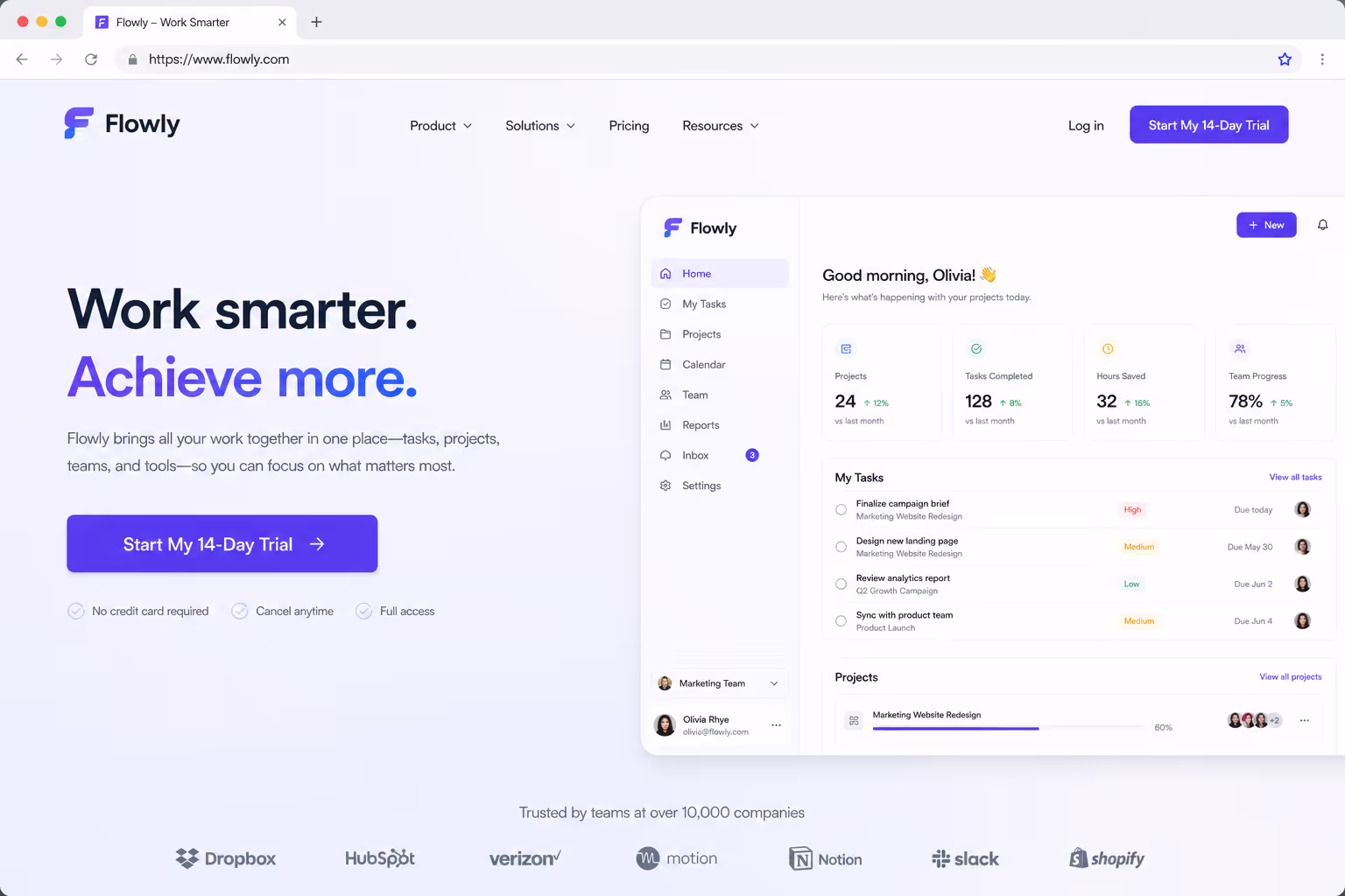
Stating the trial length removes the "how long am I committing?" hesitation. Screenshot: trial CTA showing the explicit duration.
3. "Send me the template" - reframes a download as a gift
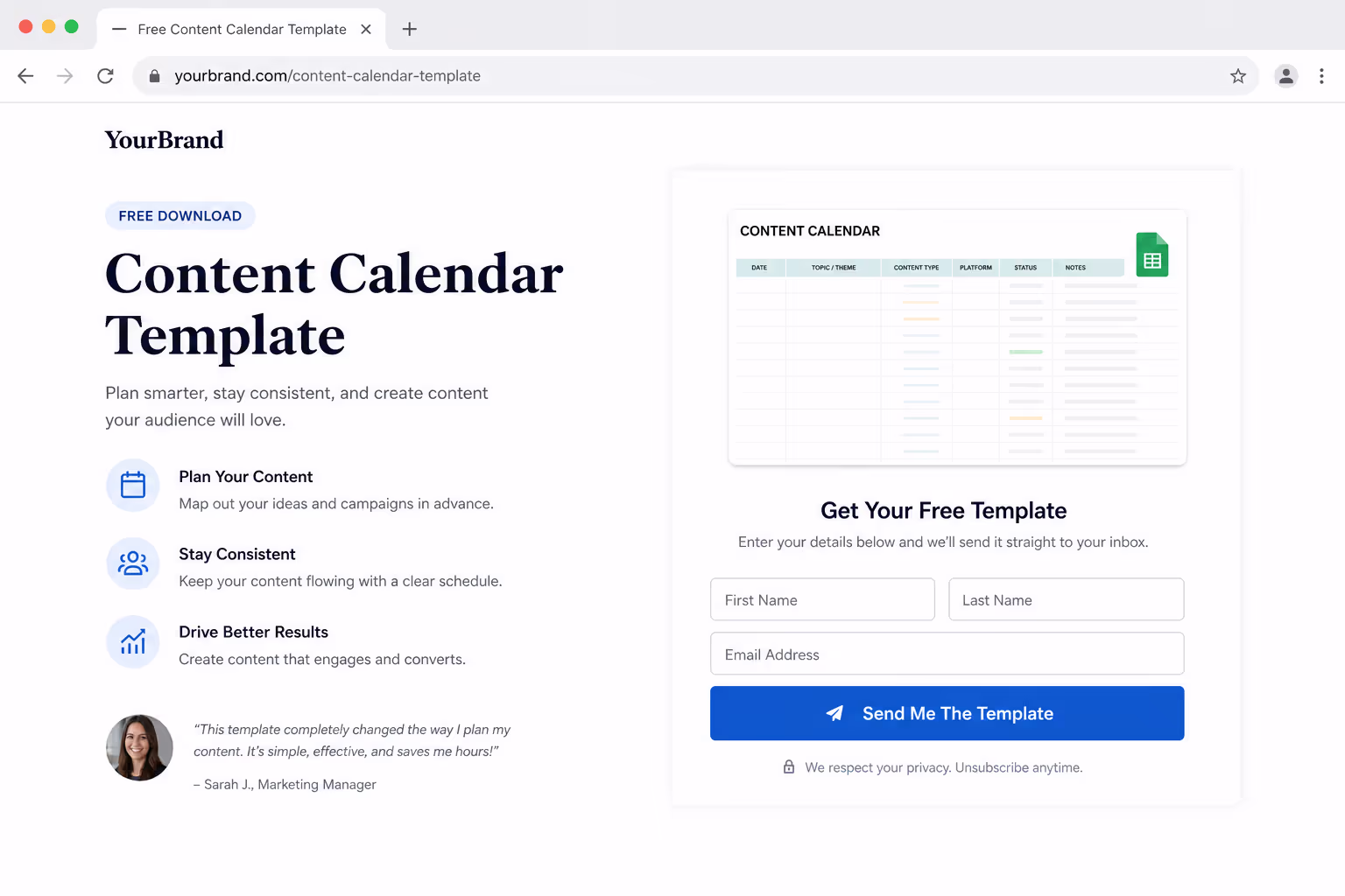
Position the asset as something handed to the visitor, not a chore they submit for. Screenshot: lead-magnet button on a resource page.
4. "Show me the pricing" - low commitment, high intent
Pricing-intent visitors want a peek, not a sales call. Screenshot: a soft pricing CTA that does not demand a form first.
5. "Claim my 20% off" - possession plus a concrete number
A specific discount plus "claim" makes the offer feel already owned. Screenshot: promo button with the exact percentage.
6. "Book my demo" - first-person scheduling
Frames the demo as the visitor's calendar action rather than yours. Screenshot: demo-booking button above the scheduler.
7. "Reserve my spot" - scarcity without a fake timer

Implies limited capacity honestly, no countdown gimmick. Screenshot: event or webinar registration button.
8. "Build my plan" - action verb, personal result
Pairs an active verb with a personalized outcome for configurator flows. Screenshot: button leading into a plan-builder step.
9. "See it in action" - curiosity for product-led pages
Curiosity copy works when the product sells itself in a demo. Screenshot: button next to a product video or interactive tour.
10. "Yes, I want fewer no-shows" - outcome-led toggle copy
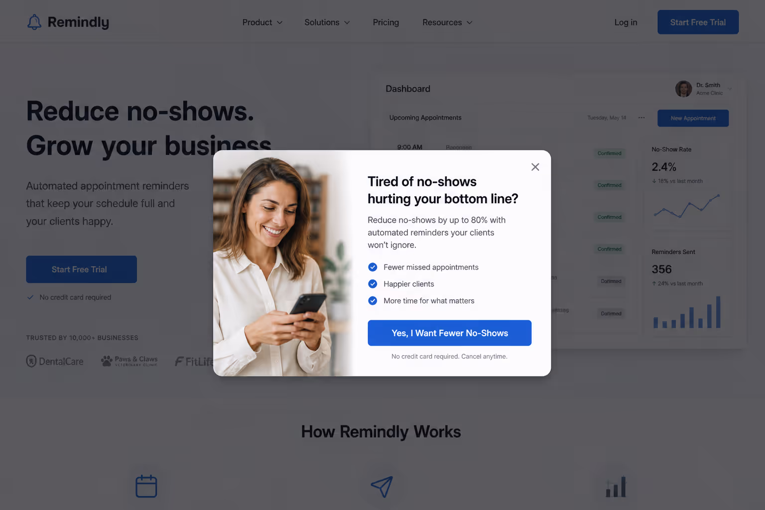
Stating the benefit as a first-person "yes" raises opt-in rates. Screenshot: two-option toggle CTA on a popup.
Run these against a plain verb baseline before touching anything visual. Copy tests are free to ship and they isolate cleanly, which is exactly what disciplined CTA button design needs.
Color and contrast: Stop Testing Hex Codes
Color is the most over-tested and least decisive variable in CTA button design. One widely cited 2025 study found a red button beat green by 21% - but only because the page background was already green, so red carried the contrast. The lesson is contrast, not chroma.
Color is the most over-tested and least decisive variable in CTA button design - only about one in seven color tests even reaches statistical significance.
When a color test does win, the average lift is roughly 49%, which is large - but the one-in-seven hit rate means you will burn most of your testing budget on noise. Spend it on contrast and hierarchy instead. Examples 11-17 isolate the visual layer:
11. A single saturated button color used nowhere else on the page
Reserve one bold color for the primary action only, so the eye has nowhere else to land. Screenshot: page where the CTA is the lone saturated element.
12. Ghost or outline styling on the secondary action so it recedes
Demote the secondary button to an outline so it never competes with the primary. Screenshot: filled primary beside an outline secondary.
13. A 4.5:1 minimum text-to-button contrast ratio for WCAG legibility
Hit the WCAG AA ratio so the label stays readable for everyone. Screenshot: contrast-checker result on the button text.
14. Whitespace padding instead of a louder color to draw the eye
Surround the button with empty space rather than reaching for a brighter hue. Screenshot: CTA isolated by generous padding.
15. A directional cue — an arrow or gaze - pointing at the button
Use an arrow or a person looking toward the CTA to direct attention. Screenshot: hero image whose subject's gaze leads to the button.
16. A sticky button that keeps its contrast as the background scrolls
Ensure the CTA stays legible against every section it floats over. Screenshot: sticky button holding contrast mid-scroll.
17. A visible hover or active state that confirms the button is clickable
A darken-on-hover or slight lift signals interactivity before the click. Screenshot: button shown in its hover state.
Size, spacing, and the mobile tap target
Mobile is where weak CTA button design quietly leaks conversions. Buttons sized at a minimum of 48×48px with at least 16px of surrounding whitespace earned 49% higher tap-through than undersized alternatives in 2026 mobile testing.
The fix is mechanical - measure, do not eyeball. Examples 18-23 isolate size and spacing:
18. Set the tap target to 48×48px or larger on every breakpoint
Meet the minimum touch size so thumbs hit it first time. Screenshot: mobile button with the 48px target overlaid.
19. Reserve 16px of clear space so adjacent links cannot steal the tap
Padding around the button prevents mis-taps on neighboring links. Screenshot: button with 16px spacing measured.
20. Make the full button clickable, not just the text label inside it
Extend the hit area to the whole pill, not only the glyphs. Screenshot: full-bleed clickable area highlighted.
21. Keep the primary CTA above the thumb line on common phone sizes
Place the action where the thumb naturally rests on a phone. Screenshot: CTA positioned in the lower-reach zone.
22. Scale label text to at least 16px so it reads without a zoom
Sixteen-pixel type avoids the pinch-zoom that kills conversions. Screenshot: mobile button with legible 16px label.
23. Use a full-width CTA on mobile to maximize the tap zone

Stretching the button edge-to-edge gives the largest possible target. Screenshot: full-width mobile CTA.
Placement and count: one screen, one decision
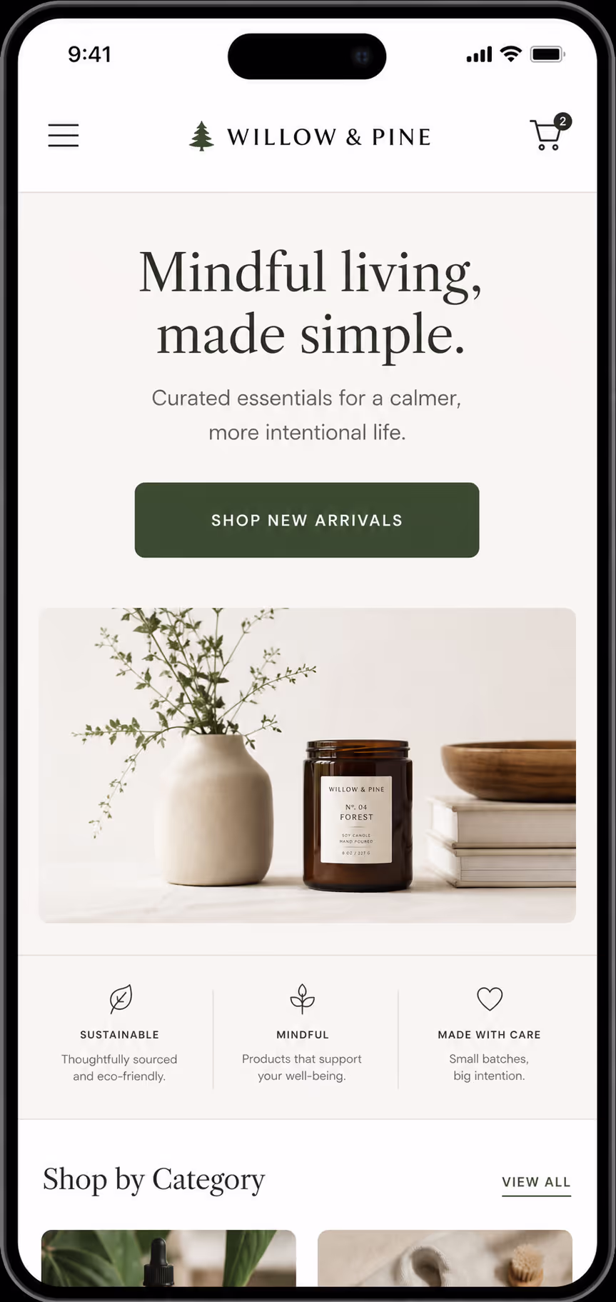
The most expensive CTA button design mistake is offering too many choices. Every extra button splits attention and drags the whole page toward that 10.5% floor.[1] One primary action per screen is the rule; everything else is a link or a de-emphasized secondary.
Placement then decides whether that single action gets seen. Examples 24-31 isolate position and count:
24. One primary CTA in the hero, repeated after social proof
Lead with the action, then restate it once trust is built. Screenshot: hero CTA and its repeat below testimonials.
25. A second instance after the pricing or feature section, not before
Place the repeat where the visitor has the context to decide. Screenshot: CTA directly under the pricing table.
26. A sticky header or footer CTA on long-scroll pages
Keep the action reachable no matter how far the visitor scrolls. Screenshot: persistent bar CTA on a long page.
27. Exit-intent as the only interrupt-driven CTA, used once
Reserve the one interruption for the moment of leaving. Screenshot: exit-intent popup with a single action.
28. Zero competing primary buttons in the same viewport
Never show two equally-weighted primary actions at once. Screenshot: viewport with exactly one primary button.
29. A CTA placed immediately after the testimonial or proof block
Strike while the social proof is still on screen. Screenshot: button sitting right under a review block.
30. An inline CTA at the natural decision point in long-form content
Drop the action where the argument peaks, mid-article. Screenshot: inline button within body copy.
31. A single end-of-page CTA recap for visitors who read to the bottom
Reward the engaged reader with one clear closing action. Screenshot: end-of-page CTA after the final paragraph.
That is 31 isolated examples across five variables — each one a test you can run this week without a redesign.
What this means for your stack
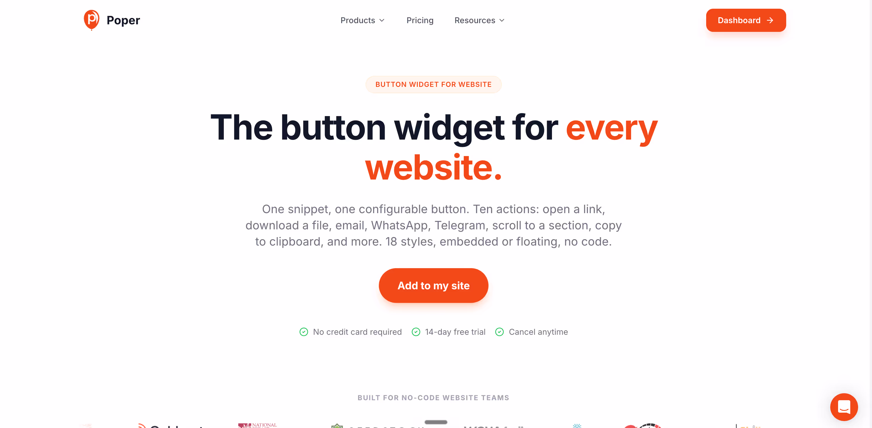
You do not need a developer to run any of these tests. Poper's Button widget lets you set copy, color, size, and placement in a no-code editor, then A/B test variations and pick the winner on statistical significance rather than opinion.
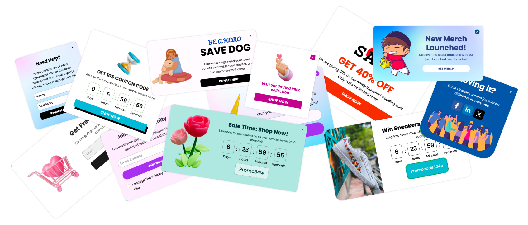
Pair it with the rest of the widget library - exit-intent popups, quizzes, and forms all expose the same button controls, so the CTA button design rules above apply everywhere you ask a visitor to act. Set the tap target, write the first-person label, keep one primary action per screen, and let the data confirm the lift.
The bottom line
The best CTA button design is not a color you copy from a competitor. It is a sequence of single-variable tests, run in order of impact: copy first, count second, contrast and size after. The 2026 data is consistent - first-person copy, one clear action per screen, and a properly sized mobile tap target return more than any hex-code experiment ever will. Test one thing, measure it, and keep the winner.

