
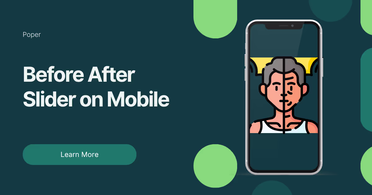
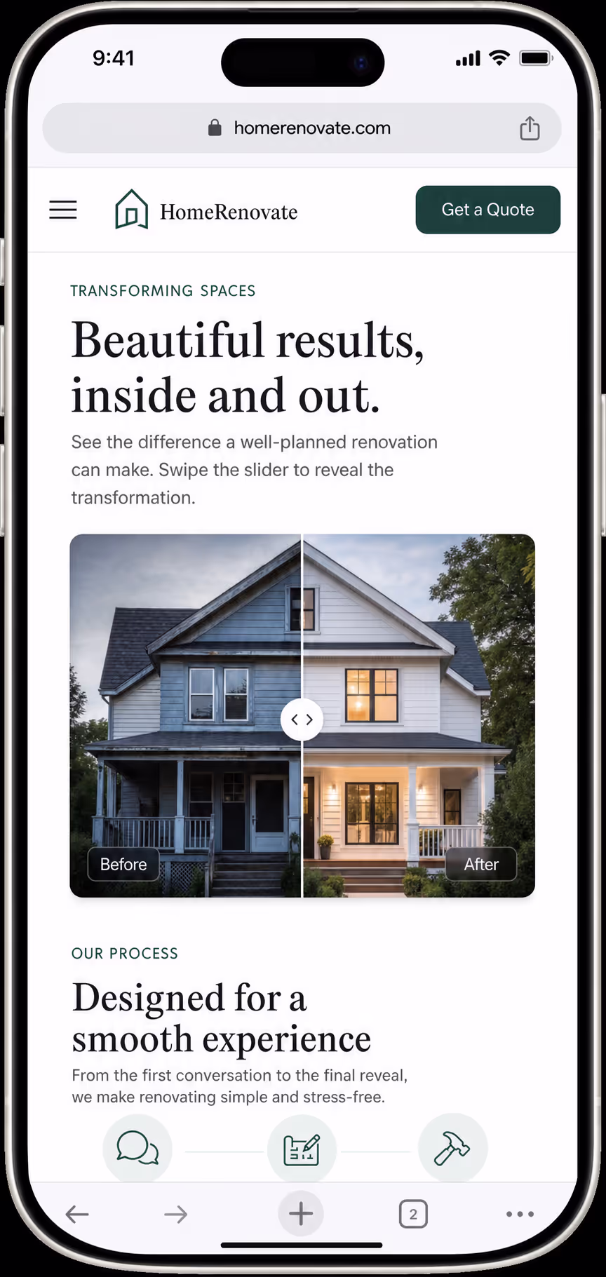
I still remember the first time I watched a real visitor try to use one of our comparison sliders on a phone. She was on a renovation page, she put her thumb on the divider, and the whole page jumped sideways while she was trying to scroll down. She frowned, tapped a few times, then left. That tiny moment taught me more about a before after slider mobile experience than any design article ever did.
So I want to talk through this with you like a teammate, not a textbook. We have shipped a lot of these sliders, broken a few of them, and slowly learned what makes a before after slider mobile interaction feel natural instead of frustrating. The short version is this: the slider has to earn the gesture, never steal it.
Why Mobile Changes Everything About a Slider
On a desktop, a comparison slider is easy. The mouse pointer is tiny and precise, so it can grab a thin divider line without any drama. A phone is a different world. A thumb is wide, it covers part of the image, and it often moves in a small diagonal curve instead of a clean straight line.
That difference is the whole reason a before after slider mobile build needs its own plan. The same code that feels perfect with a mouse can feel sticky and confusing under a thumb. When I design a before after slider mobile layout now, I assume the user is half distracted, holding the phone in one hand, and scrolling fast.
This matters because mobile is not a side audience anymore. StatCounter Global Stats reported that mobile made up about 51% of the worldwide desktop versus mobile web share. If our before after slider mobile pattern feels broken, then more than half of a typical audience may see the weakest version of our proof.
The One Rule I Never Break: Scroll Always Wins
If you remember nothing else from this post, remember this. On a phone, vertical scroll should always win unless the visitor clearly grabs the handle. I treat that as the first law of any before after slider mobile design.
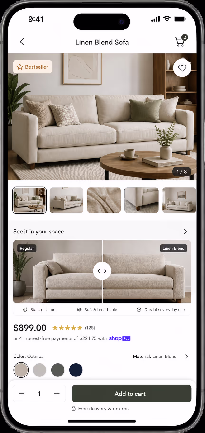
The mistake I made early on was turning the entire image into a horizontal drag zone. It sounds helpful, because the user can start dragging from anywhere. In practice it turns every small thumb wobble into a fight between scrolling and sliding. A good before after slider mobile pattern limits horizontal dragging to the handle and a narrow strip around the divider, so the rest of the image stays a safe place to scroll.
The browser actually gives us a tool for this. The MDN Web Docs guide to the touch-action CSS property explains that we can tell the browser which gestures the page wants to handle before any script runs.
For a before after slider mobile build, that usually means we allow normal vertical panning on the page and only claim horizontal movement once the handle is engaged. When I started using this on purpose, the scroll-stealing complaints almost disappeared.
Size the Handle for a Thumb, Not a Cursor
Here is a small thing that makes a big difference. A thin, elegant divider line looks great in a design file, but it is a nightmare to grab on a phone. The visible line can stay slim, but the area that responds to touch needs to be much larger.
The W3C gives us a clear floor here. The WCAG 2.2 guidance on target size describes a minimum of 24 by 24 CSS pixels for interactive targets. I treat that as the absolute minimum, not the comfortable size. For a real before after slider mobile handle, I usually give the grab area around 40 to 48 pixels of width, because a thumb is imprecise and partly blocks the screen while it moves.
A few habits keep our before after slider mobile handles easy to grab:
Keep the visible divider narrow, but wrap it in an invisible touch area about 40 to 48 pixels wide.
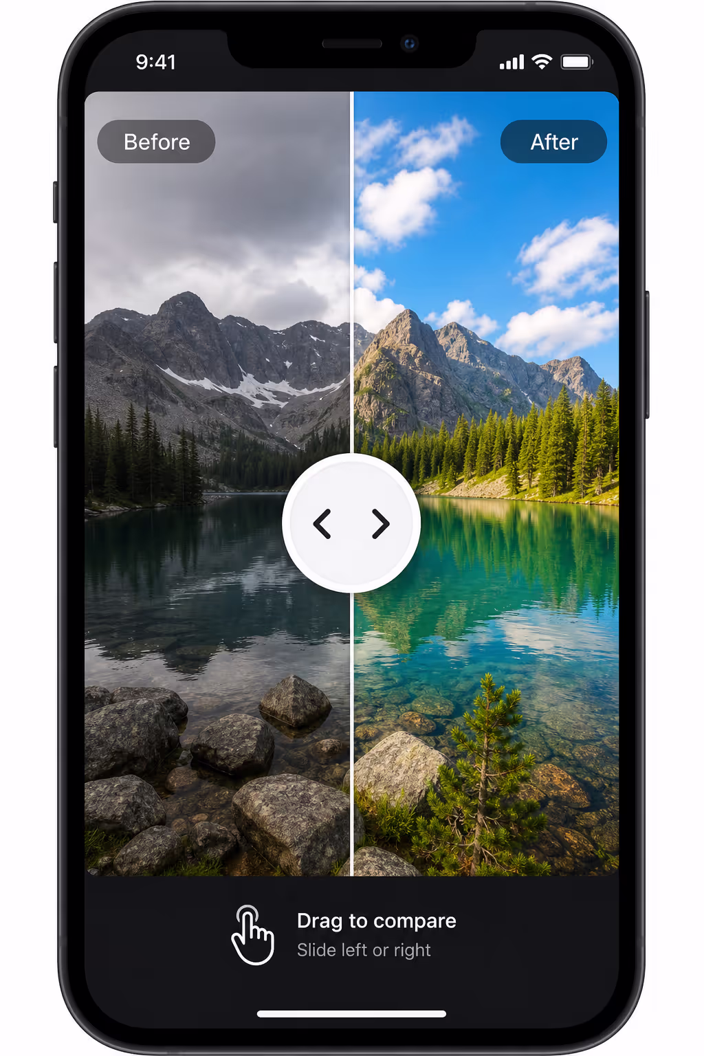
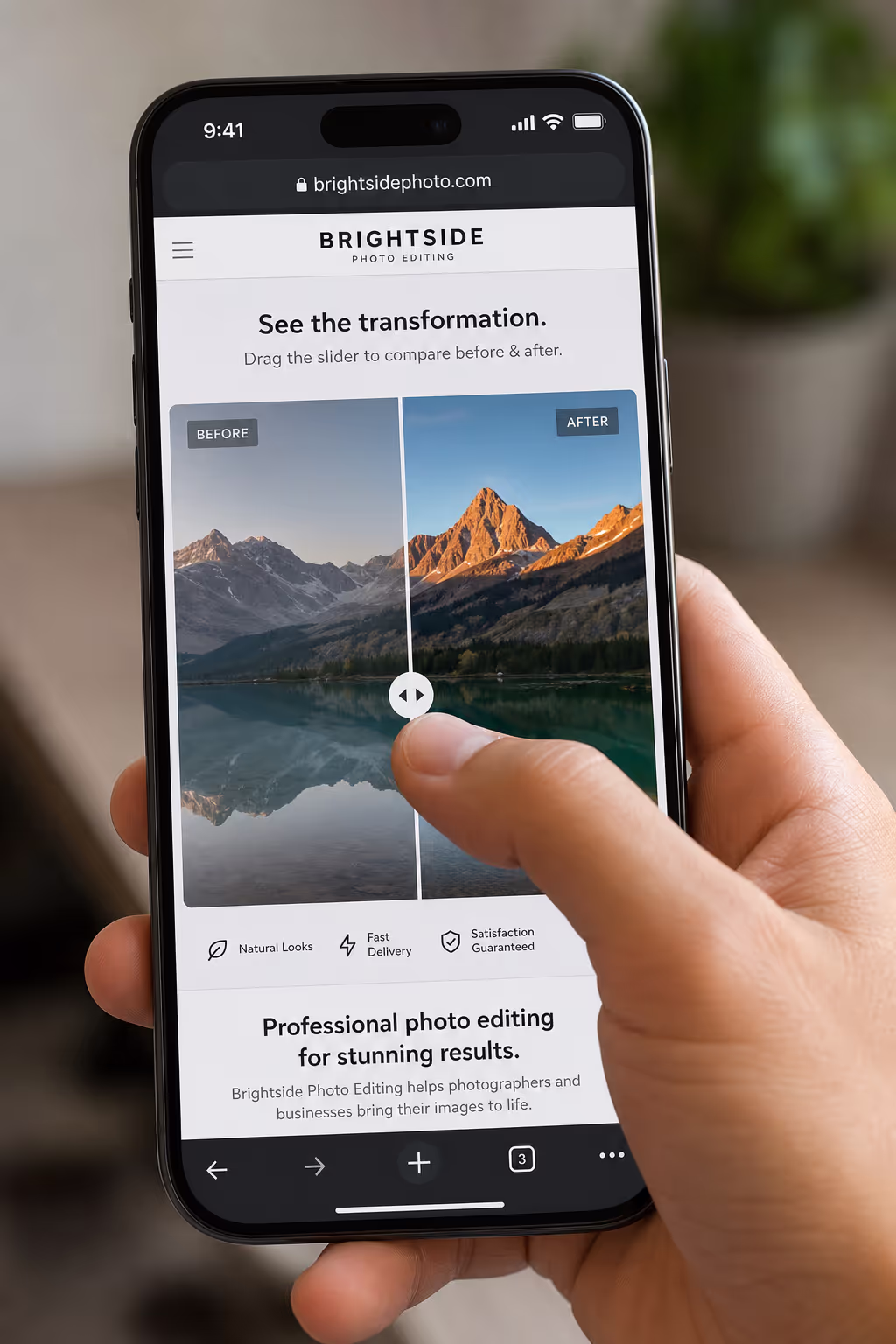
Use a clear round or pill-shaped grip in the center of the divider so the eye knows where to aim.
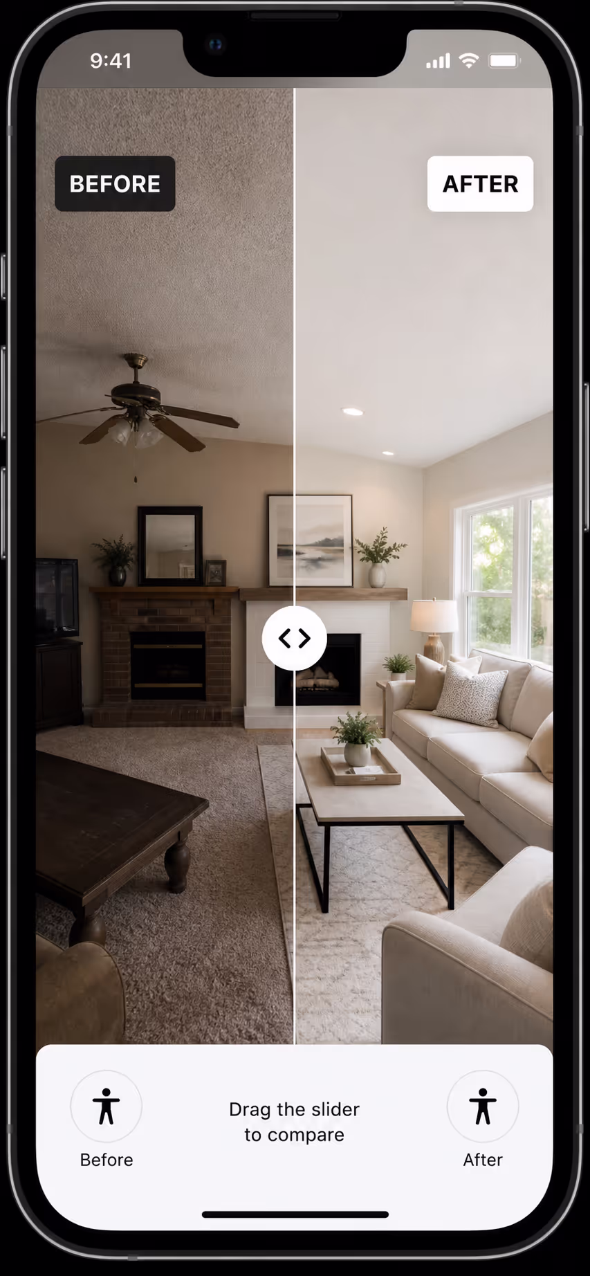
Push the Before and After labels into opposite corners so the thumb never covers them.
Start the handle near the middle, unless one side of the story needs more context first.
The goal is not a loud control. The goal is a before after slider mobile handle that a tired thumb can find and move on the first try.
Keep the Reveal Fast Under a Real Thumb
A before after reveal is really just visual feedback. The moment the thumb moves, the image should move with it. If the divider lags behind, jumps in steps, or waits for a script after every drag, the comparison loses its magic and the visitor stops trusting the page.
Speed is measurable now. The web.dev team treats Interaction to Next Paint as a stable Core Web Vital, and they mark 200 milliseconds or less as good responsiveness. That budget covers taps and touches, which puts a before after slider mobile reveal in the same group as menus, buttons, and checkout taps. A laggy reveal does not just look cheap; it quietly tells Google the page is slow.
To keep our before after slider mobile reveal smooth, we lean on lightweight transforms and avoid heavy layout work during the drag. The page updates the clip or mask while the main thread stays free. I also test on a mid-range phone, never just the desktop responsive view, because a fast laptop hides the exact lag we are trying to kill.
Avoid Gesture Fights in Busy Pages
Comparison sliders rarely live alone. They sit near carousels, product galleries, tabs, sticky buttons, and accordions, and every one of those elements wants to own the touch. A before after slider mobile component cannot let all of them win at the same time.
This becomes a real problem in shopping pages. The Baymard Institute, which has run large-scale ecommerce UX research across thousands of site elements, repeatedly shows how product images and swipes shape the mobile shopping path. In that crowded space, a before after slider mobile widget needs a narrow job: compare one pair, and nothing else.
So I avoid nesting a before after slider mobile inside a swipe carousel whenever I can. If there is truly no other layout, I pause the carousel swipe while the handle is active and turn it back on the moment the drag ends. Otherwise the visitor tries to inspect the transformation and accidentally flips to the next slide, which is exactly the kind of small frustration that sends people away.
Here is a quick map I use to pick the right format for a phone, because a draggable slider is not always the answer.
| Pattern | Mobile Risk | Best Use |
|---|---|---|
| Static side-by-side | Images shrink too much on narrow screens | Simple comparisons with low detail |
| Tap-to-toggle before and after | Less control, but no scroll conflict | Very small screens or low-stakes proof |
| Draggable before after slider mobile | Can hijack scroll if the gesture rules are weak | Detailed transformations where control matters |
| Carousel of before and after pairs | Competes with horizontal swipe | Multiple projects or case studies |
Design the Labels for a Covered Screen
Mobile labels have to survive a thumb sitting right on top of them. I keep the Before and After tags in opposite top corners, hold the contrast high, and keep important text away from the handle. When the images are medical, cosmetic, fitness, or renovation proof, I add a short honest caption under the slider instead of stuffing claims onto the photo itself.
Accessibility belongs here too. A before after slider mobile experience is touch-first, but it should never be touch-only. I treat the handle like a range control with a clear label, such as "Reveal the after image," so keyboard users and screen reader users can still move through the comparison.
One more honest point. A before after slider mobile pattern cannot rescue weak photography. If the crops do not match, the lighting shifts, or the angle changes between shots, the slider only makes that mismatch easier to spot. If you want the capture side of this, our guide on why before-after photos convert walks through the shooting discipline behind a trustworthy pair.
How We Handle This Inside Poper
You do not need a heavy custom build to ship a strong before after slider mobile experience. You need four things working together: clear gesture ownership, a generous handle, a fast reveal, and labels that stay readable under a thumb. Once those four are in place, the rest is just good photography and honest copy.
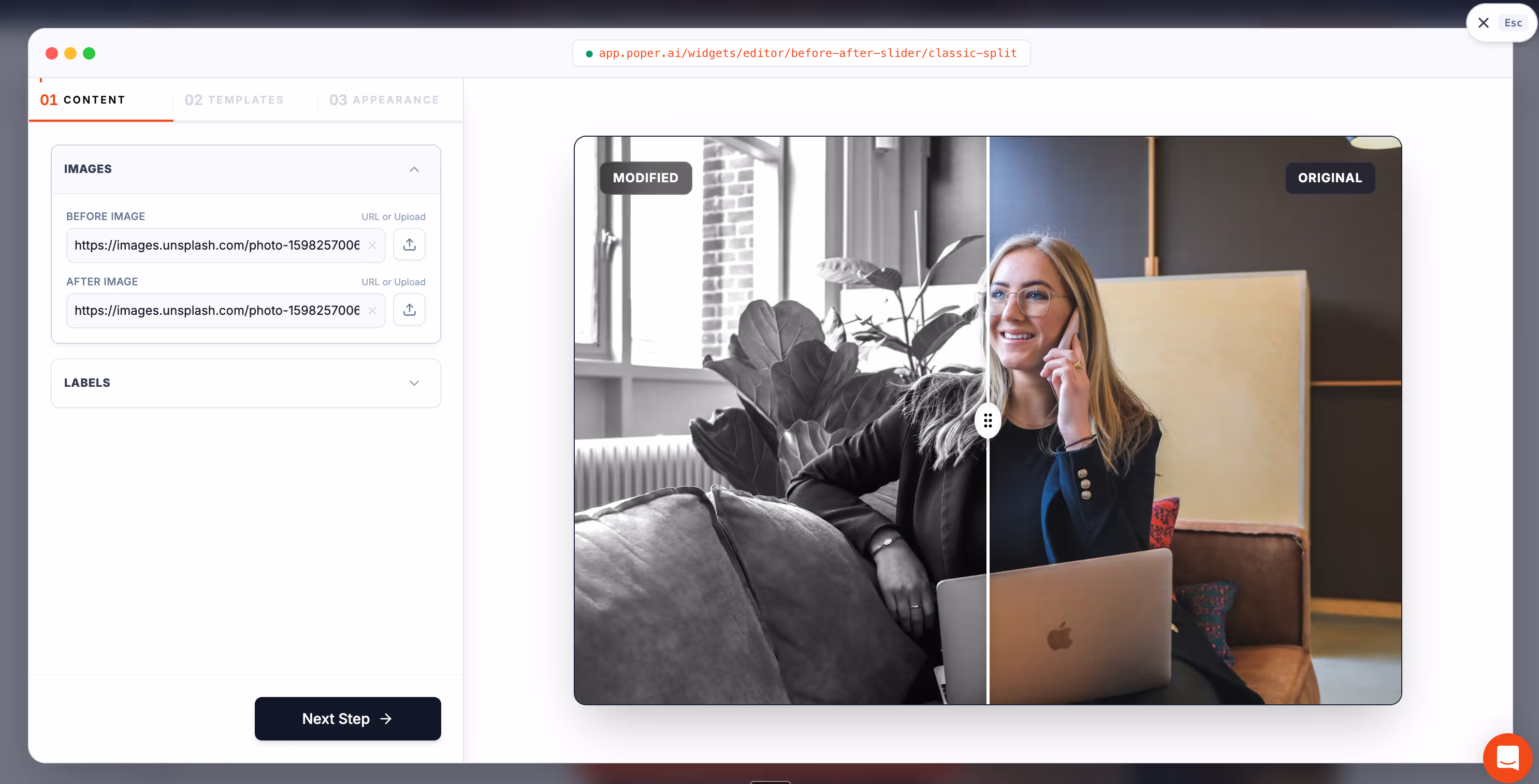
Our no-code Before-After Slider is built for exactly this kind of comparison, and it drops onto WordPress, Shopify, Webflow, Wix, Squarespace, and custom sites in a couple of minutes. If you want page-level inspiration before you build your own before after slider mobile section, our roundup of before-after slider examples shows where the format fits across real estate, cosmetics, fitness, and renovation work.
Putting It All Together
When I look back at that visitor who left the renovation page, the fix was never about fancier code. It was about respect. A before after slider mobile pattern works when it respects the page around it and the thumb on the screen. Let vertical scroll stay natural, make the handle easy to grab, and move the reveal the instant the thumb moves.
Get those three details right and the slider stops feeling like a gimmick. It becomes calm, controlled proof that your visitors can explore on their own terms. That is the whole point of a good before after slider mobile design, and it is well within reach for any site owner who is willing to sweat the small stuff.

