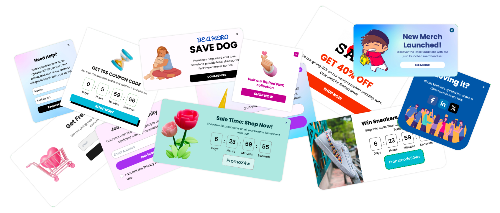
The first time I dragged a before-after slider on a client's renovation page, I watched a flat list of photos turn into a tiny game. People grabbed the handle, pushed it left and right, and stayed. That small moment is why I keep collecting before after slider examples. A good one does not just show a result. It lets the visitor feel the change with their own hand.
So in this guide, I am not lining up pretty screenshots for the sake of it. I want to walk through before after slider examples that solve a real problem: how do you prove a transformation when a single static photo never quite lands? A skeptical buyer wants to compare, not be told.
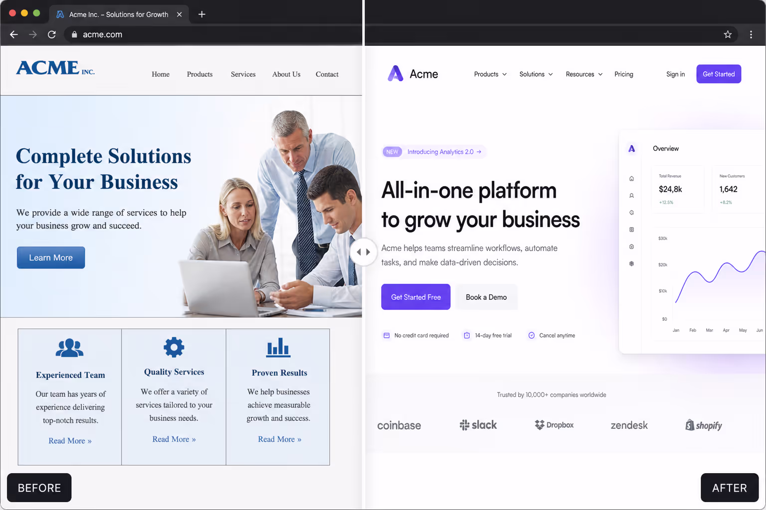
We build Poper for exactly this kind of moment. Our no-code Before-After Slider widget lets you drop a draggable comparison onto any site in minutes. But before we talk setup, I want to show what strong before after slider examples look like in the wild, and how I think about them when designing a page that needs to convert.
Why Before After Slider Examples Matter Right Now
Visitors trust what they can inspect. A before-after slider hands them the controls, and that interaction is the whole point. According to Demand Metric and the Content Marketing Institute, interactive content can generate "2x more conversions" than static content. A draggable slider is interactive by design, which is why these before after slider examples tend to outperform a plain image grid.
The proof is strongest in industries built on visible change. In a real estate photography roundup, SellFastPhoto reported that listings with professional photos "sell 32% faster". When the story is renovation or staging, before after slider examples turn that photo quality into a side-by-side argument the buyer controls.
Memory matters too. HubSpot has long noted that people are far more likely to remember information paired with strong visuals, and a ecommerce benchmark from Rewarx found shoppers "evaluate product images before reading any description". That is the frame I use for before after slider examples: they should reduce doubt, not decorate the page.
20 Before After Slider Examples Worth Borrowing
Below are 20 before after slider examples I would consider for a service business, ecommerce store, clinic, agency, or portfolio. I am grouping them by industry so you can match the pattern to your own page fast.
Real Estate and Property
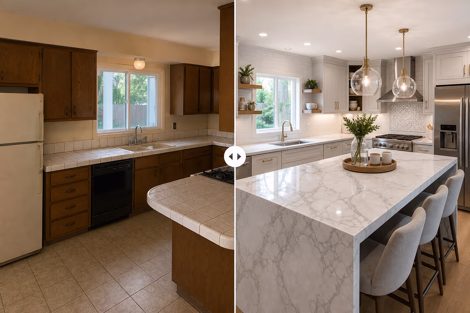
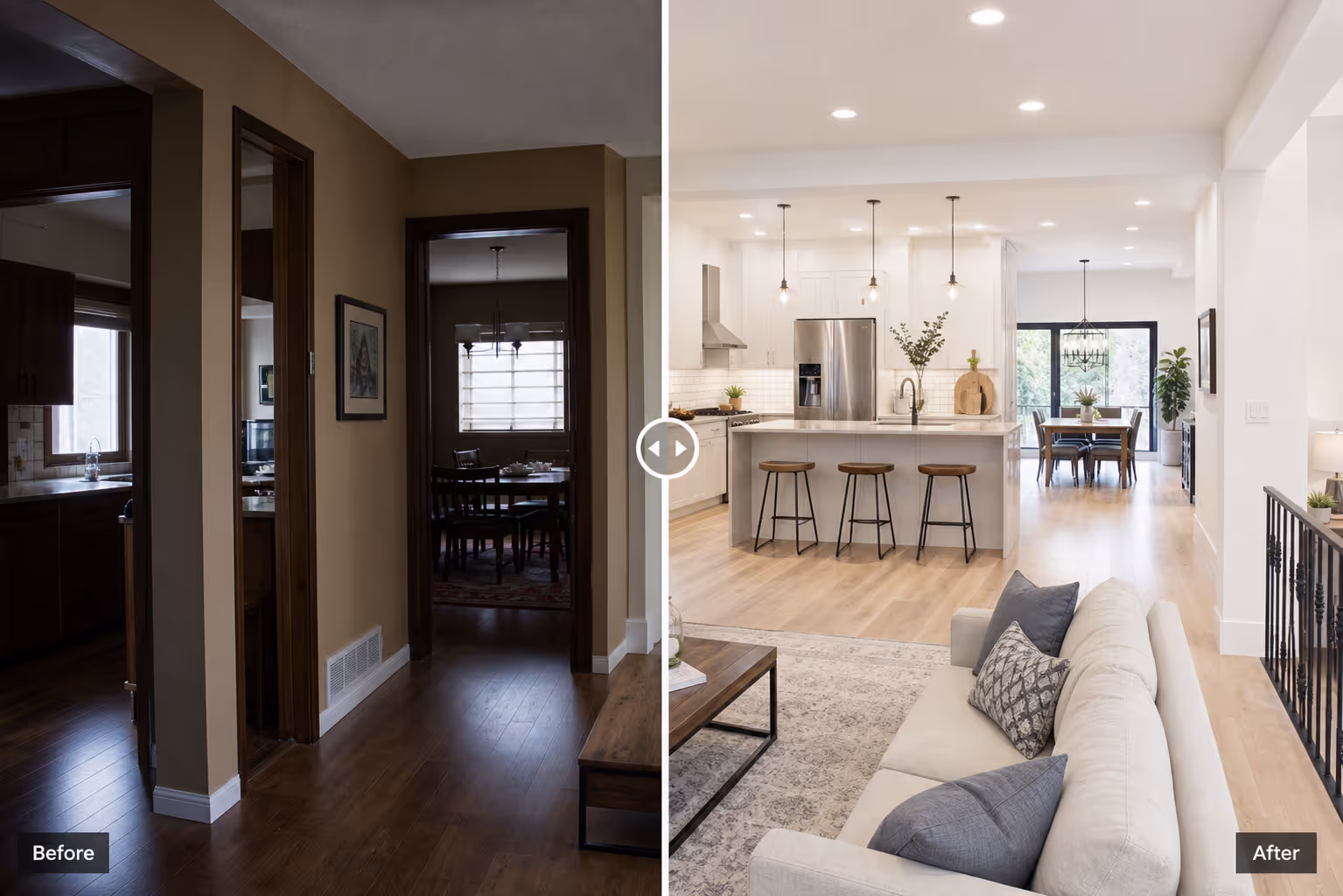
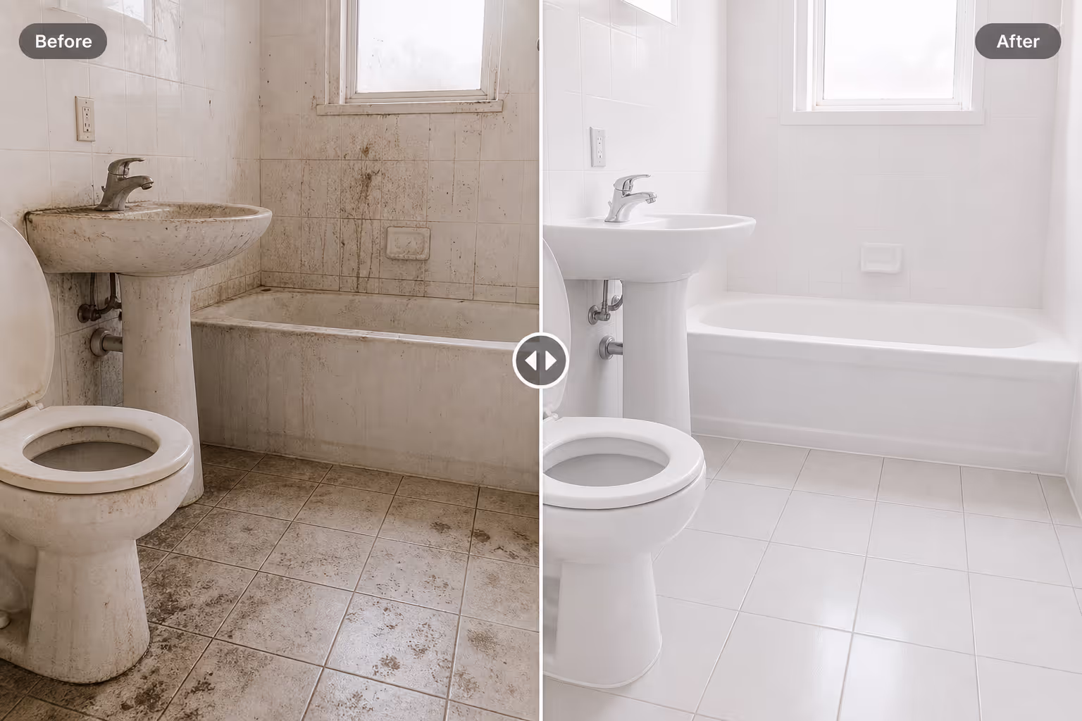
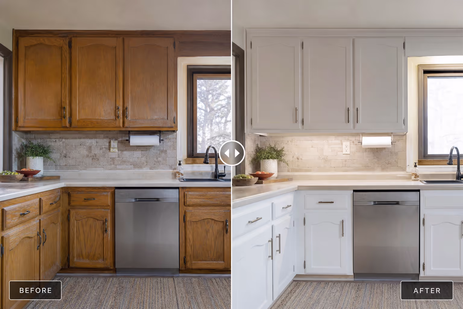
1. Renovation reveal. The classic of all before after slider examples for property. Old kitchen on the left, finished kitchen on the right. It sells the renovator's skill better than any caption.
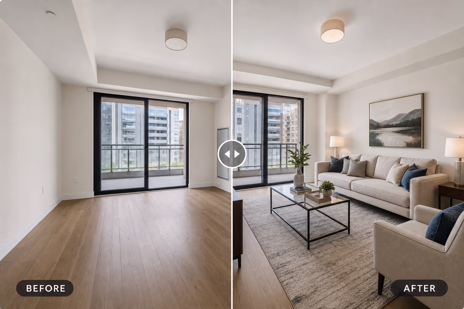
2. Virtual staging. Empty room versus staged room. These comparisons help buyers picture furniture and scale without a physical staging budget.
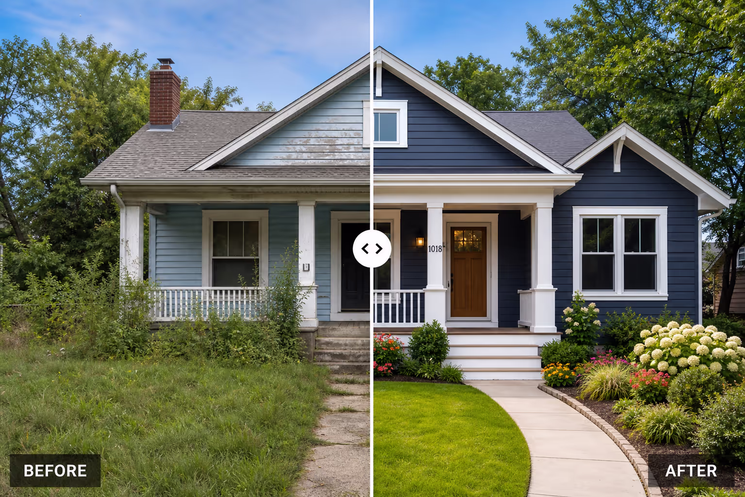
3. Curb appeal. Tired exterior versus fresh paint and landscaping. Buyers judge homes in seconds, so this comparison sets the tone above the fold.
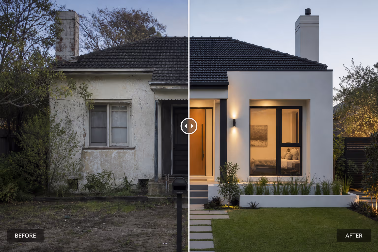
4. Fixer-upper potential. For investors, a slider that pairs a distressed property with a projected result makes the upside feel real.
5. Floor plan transformation. Walls removed, light added. These before after slider examples work well when the layout change is the actual product.
Cosmetics, Skincare, and Beauty
6. Skincare progress. Week one versus week eight. These before after slider examples are the backbone of skincare landing pages because the change is the promise.
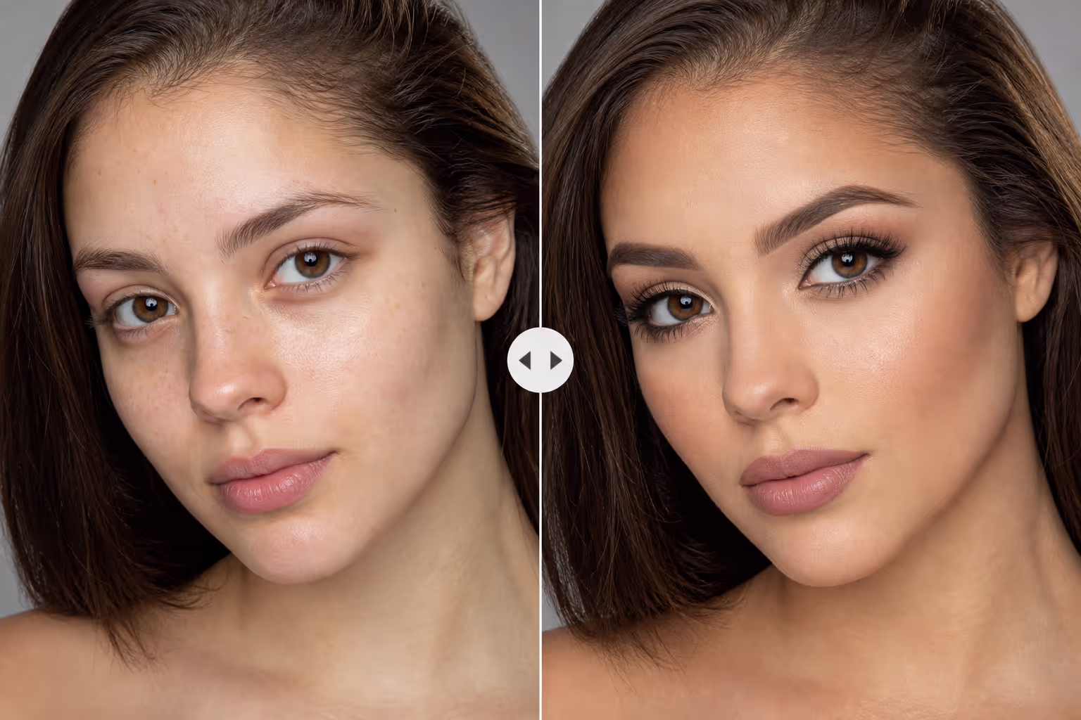
7. Makeup application. Bare face versus finished look. A strong slider here doubles as a tutorial and a product demo.
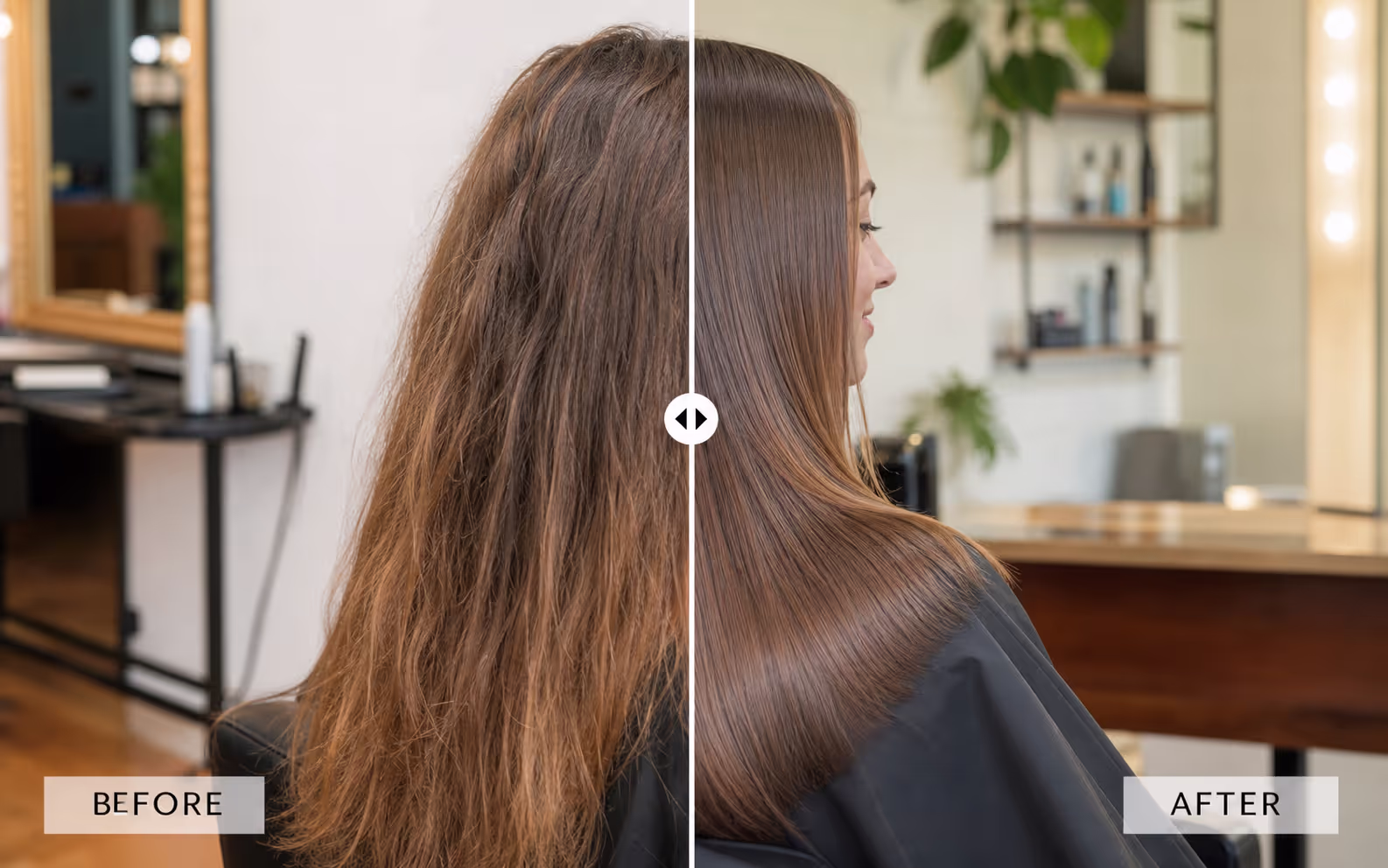
8. Hair color or treatment. Dull versus glossy. Salons use these comparisons to justify premium pricing.
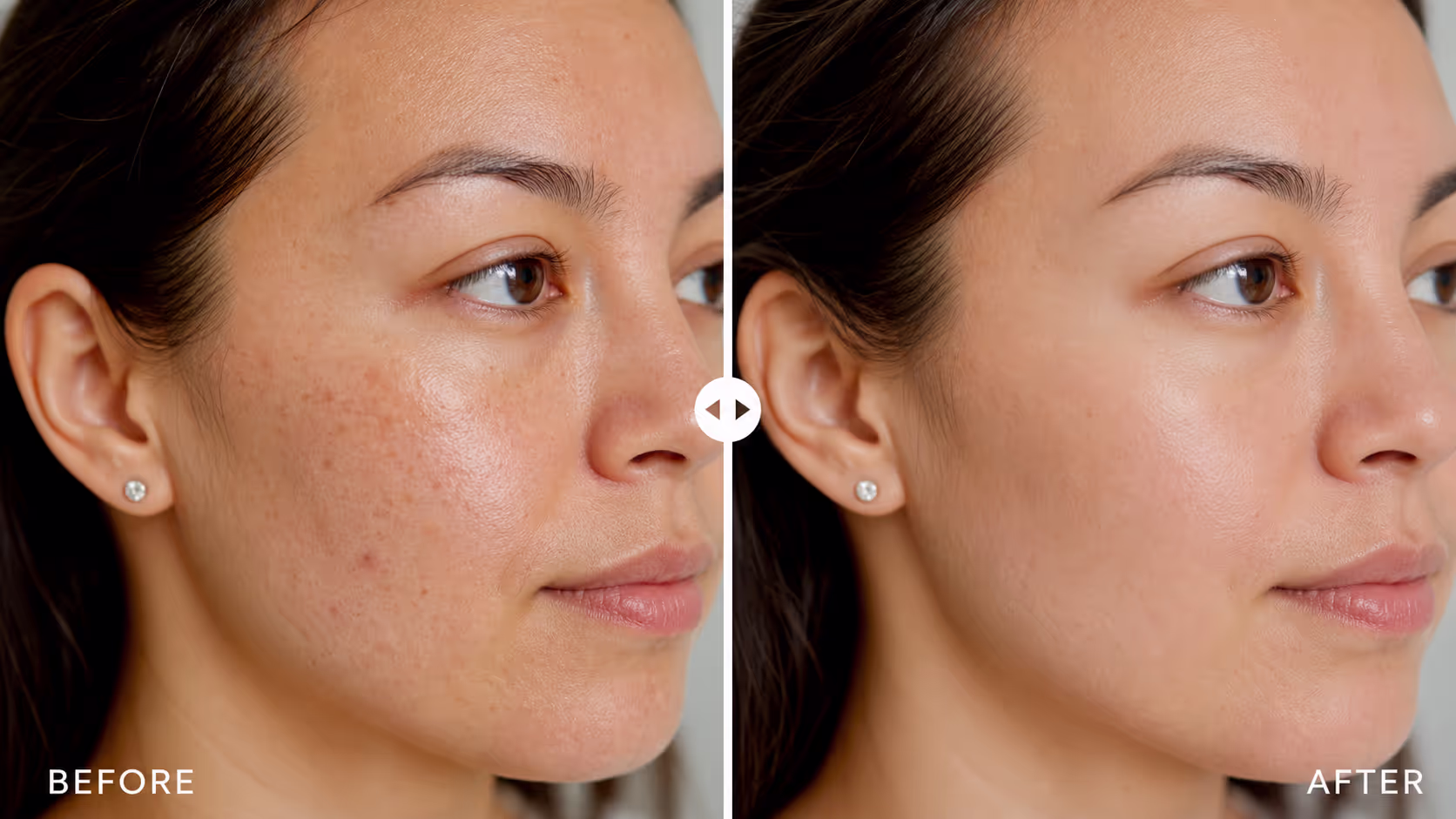
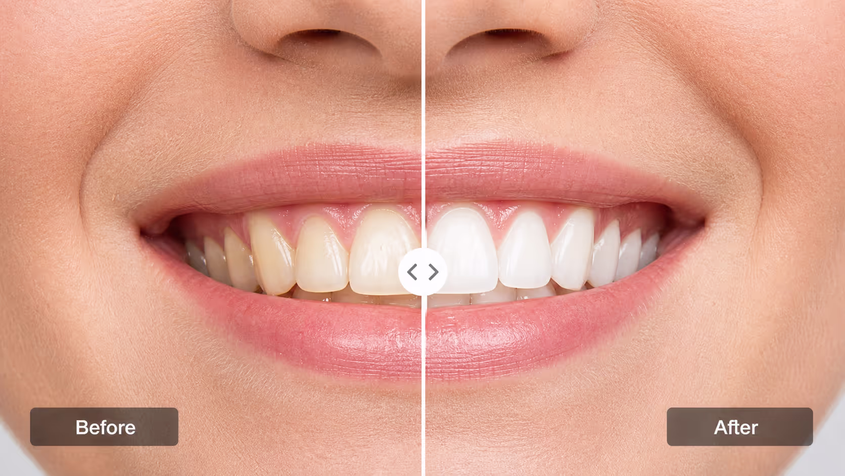
9. Teeth whitening. Shade before versus shade after. A clinical comparison like this needs honest lighting to keep trust intact.
10. Cosmetic procedure result. For aesthetic clinics, this pattern must respect privacy and consent, but when done right it answers the buyer's biggest question directly.

Fitness and Wellness
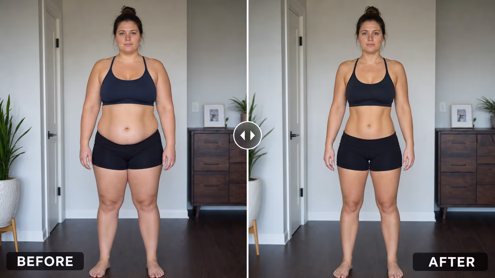
11. Body transformation. Day one versus twelve weeks. These before after slider examples power most coaching and program pages.

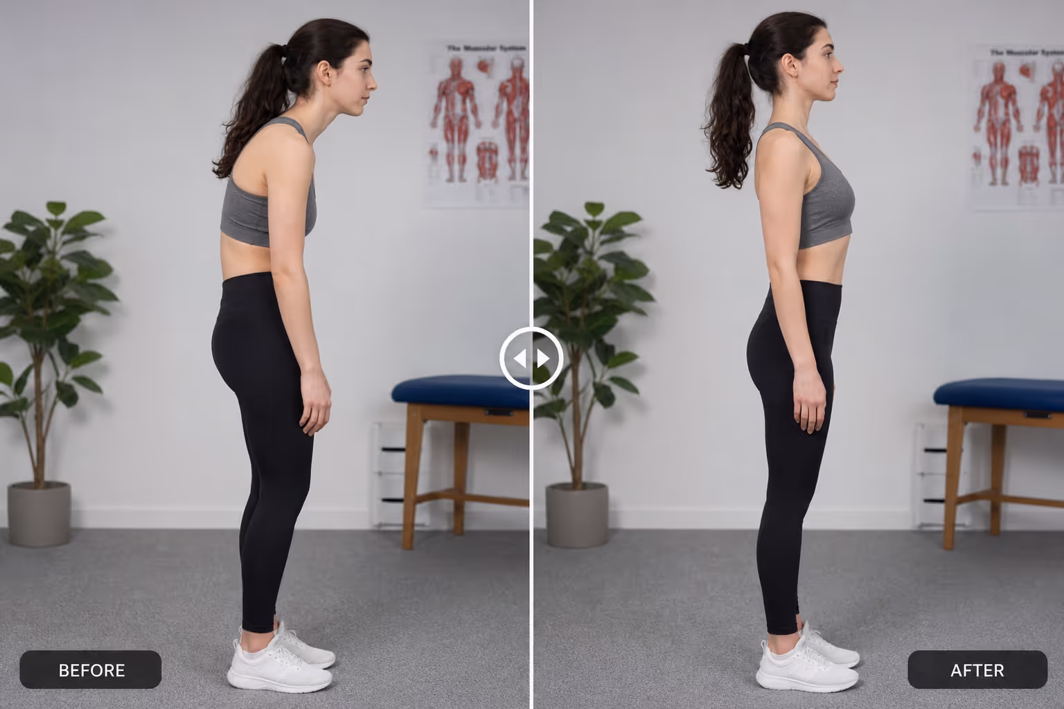
12. Posture correction. Slouched versus aligned. Physiotherapists and trainers use this comparison to show outcomes that words struggle to capture.
13. Meal plan results. Pairing a client photo with a timeline makes a nutrition slider feel achievable, not extreme.
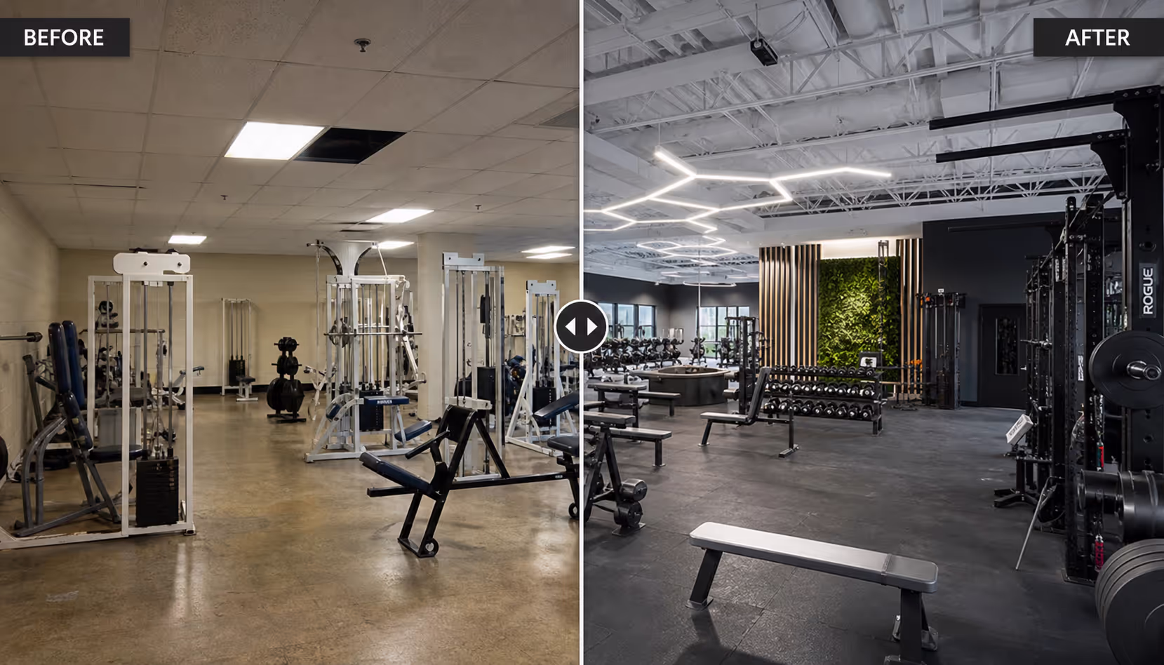
14. Gym or studio renovation. Even fitness brands use a property-style comparison to show a refreshed space and attract new members.
Home Services and Renovation
15. Deep cleaning. Grimy versus spotless. Cleaning companies live and die by these before after slider examples.
16. Painting and refinishing. Faded versus restored. A slider makes the quality of the finish obvious.
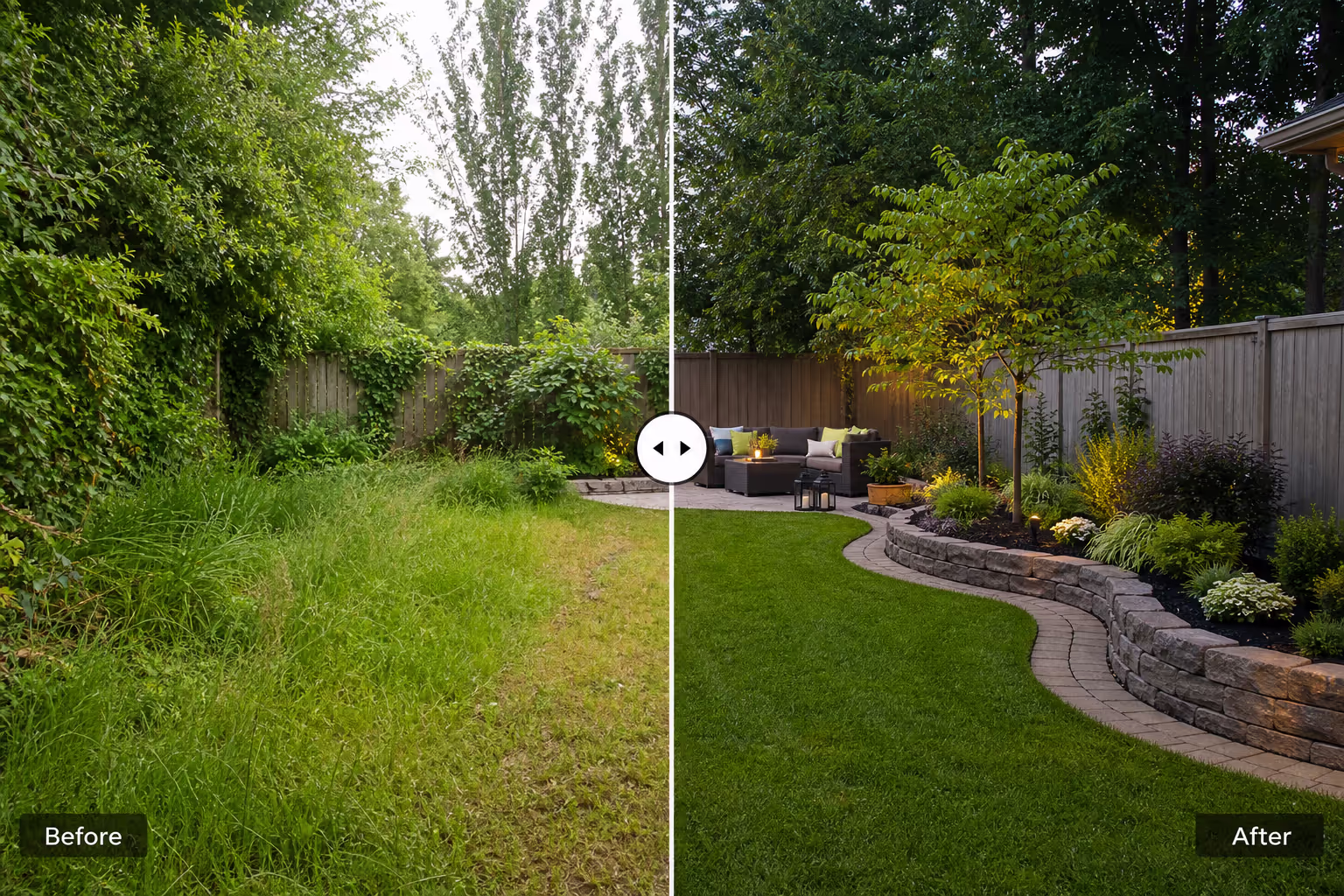
17. Landscaping. Overgrown versus designed. A seasonal comparison works well in galleries and quotes.
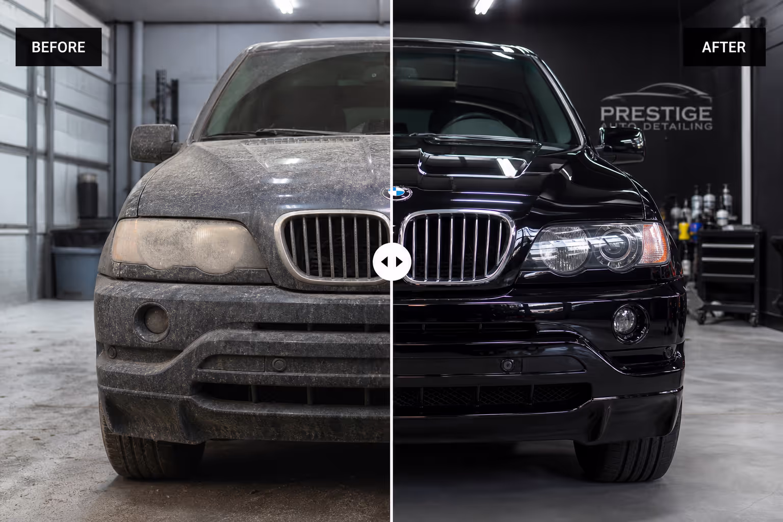
18. Restoration and detailing. For cars, furniture, or floors, this pattern turns a craft into a visible result a customer will pay for.
Digital and Creative Work
19. Photo editing and retouching. Raw versus edited. These comparisons are the cleanest portfolio proof a retoucher can offer.

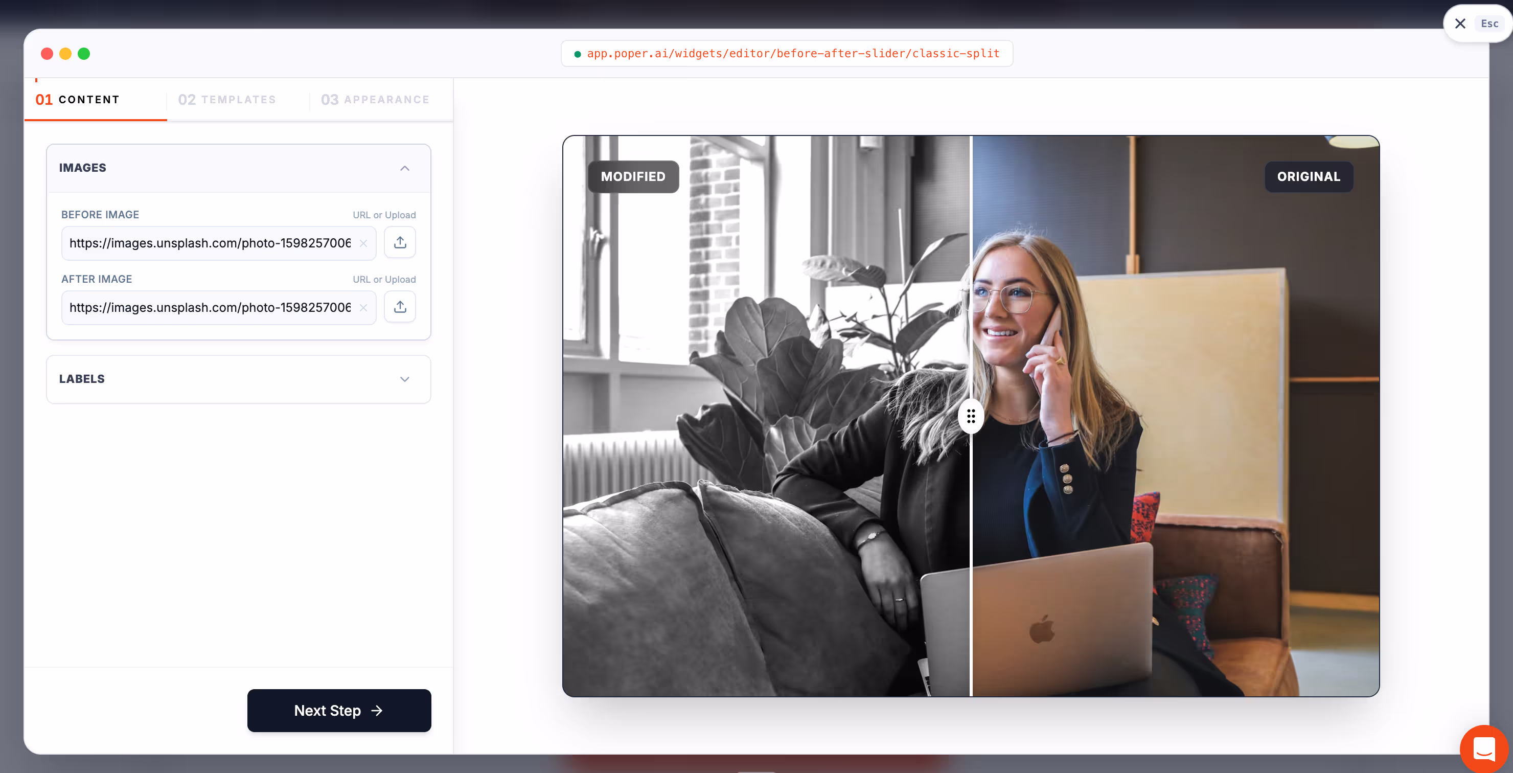
20. Web or graphic redesign. Old site versus new site. Agencies use these before after slider examples on case study pages to anchor the value of a rebuild. With Poper's Before-After Slider widget, you can build any of these without code.
What the Best Before After Slider Examples Have in Common
When I review before after slider examples, I look for a few things. First, the two images must align. Same angle, same crop, same distance. If the camera moved, the comparison breaks and the visitor stops trusting it.
Second, lighting should be honest. The strongest sliders avoid dramatic lighting tricks that make the "after" look better for the wrong reason. Trust is the asset you are protecting.
Third, the handle should be obvious. Good comparisons invite the drag with a clear divider, a grabbable knob, and a hint of motion. If people do not know they can slide it, the magic never happens.
Fourth, the slider should work on touch. A Rewarx benchmark found image evaluation climbs even higher on mobile, so any comparison that fails under a thumb loses most of its audience.
When Not to Use Before After Slider Examples
I would skip before after slider examples when there is no meaningful change to show. If the two images look nearly identical, a slider only highlights how little happened.
I would also avoid them when the comparison could mislead. In health, fitness, and cosmetics, results vary, so I pair the slider with an honest disclaimer rather than implying a guaranteed outcome.
Finally, do not stack too many sliders on one page. One or two strong comparisons beat a wall of them. Past a certain point, the interaction stops feeling special and starts feeling like work.
How I Would Build Before After Slider Examples in Poper
If I were building these before after slider examples in Poper, I would start with one transformation that matters most to the buyer. I would shoot both images from the same spot, upload them, and place the slider near the decision point, just above the booking or buy button.
Because Poper is no-code, we can ship the slider fast, then improve it with real behavior. If visitors drag one comparison far more than others, that result deserves the top spot. If a slider gets ignored, the images may be too similar or the placement may be wrong.
For a service business, I would put before after slider examples near pricing and contact. For ecommerce, I would place them inside the product gallery. For a portfolio, I would lead the case study with the single most dramatic comparison I have.
Before After Slider Examples Checklist
Use before after slider examples only when the change is genuinely visible.
Match the angle, crop, and distance across both images.
Keep lighting honest so the comparison stays trustworthy.
Make the drag handle obvious and easy to grab.
Test every slider on a phone before publishing.
Place the slider near the buying or booking decision.
Add a clear disclaimer for health, fitness, and cosmetic claims.
Limit each page to one or two strong before after slider examples.
Review analytics and lead with the comparison people drag most.
Final Take
The best before after slider examples are not clever because they slide. They work because they let a visitor prove the result to themselves, with their own hand, in a second or two. That tiny act of dragging does more than a paragraph of copy ever could.
If your page is built on a transformation, start with one comparison. Use Poper's Before-After Slider widget, align two honest photos, place it near your call to action, and publish. Then watch what people drag. Their behavior will tell you which before after slider examples earn their place, which to move up, and which to retire.