Last month I watched a friend demo her new meditation app, and the thing that stuck with me was not the content, it was the player. She had recorded beautiful sessions, but the play button was tiny, the scrubber jumped around, and on her phone the whole thing felt fragile.
People were not pressing play, and she could not figure out why. We spent an afternoon rebuilding just the player, and her completion rate climbed within a week. That afternoon is why I care so much about audio player UX, and it is exactly what I want to share with you here.
So in this guide I am going to walk you through the audio player UX patterns that I lean on every time I help someone get more plays. I will keep it practical and grounded in how people actually behave 2026, because audio player UX best practices change as listening habits change.
By the end you should have a clear mental checklist for audio player UX that you can apply to a podcast page, a course, a meditation app, or a simple track on a landing page.
Why Audio Player UX Decides Whether People Hit Play
Audio is not a side dish on the web any more, it is a main course. According to Edison Research's Infinite Dial study, about 79% of Americans aged 12 and over, roughly 228 million people, listen to online audio every month, and that figure is expected to reach 81% in 2026. When that many people are listening, the player is no longer a small detail, it is the doorway. Good design opens it, a weak player slams it shut.
Speed is the first part of audio player UX that people feel. Research compiled by NitroPack with Google found that even a 0.1 second improvement in load time can increase conversions by up to 10.1%. A heavy, slow player fails before anyone even sees a control. So the first audio player UX best practice is simple: the player has to be light and load fast, or none of the other patterns matter.
Pattern 1: Make the Play Button Impossible to Miss
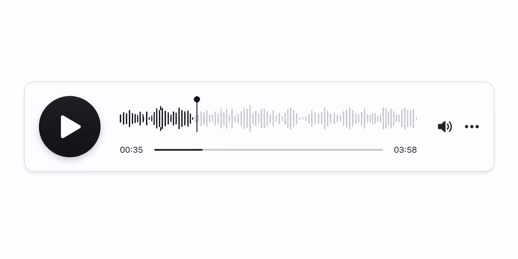
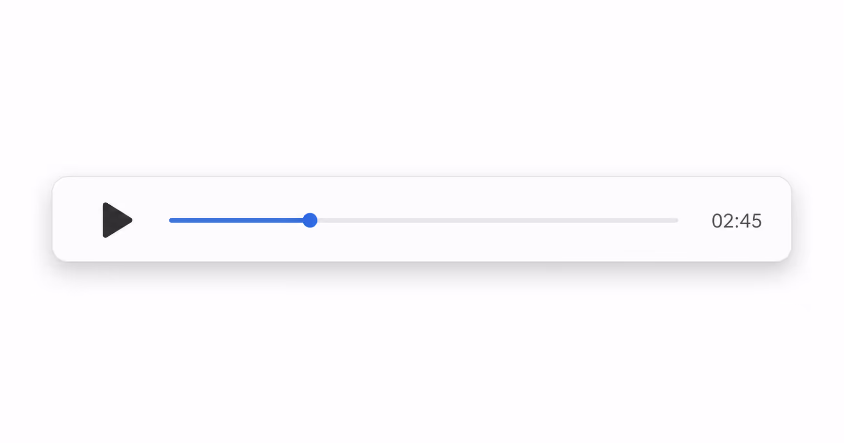
The single most important part of audio player UX is the play affordance. People scan a page in a fraction of a second, and if the play button is small, low contrast, or buried, the player has already failed. I make the play control the largest, highest contrast element in the player, with a clear triangle icon that everyone recognizes. Strong design treats that button as the hero, not an afterthought.
This matters even more on mobile, where the majority of audio listening now happens. Touch targets that are too small are one of the most common audio player UX mistakes I see. A good player gives the play button a generous tap area, at least 44 by 44 pixels, so thumbs find it on the first try.
Pattern 2: Keep the Controls Minimal Until They Are Needed
Cluttered players are weak audio player UX. When you crowd the screen with ten controls at once, you raise the cognitive load and people freeze. The best practice here is progressive disclosure: show the play button, a progress bar, and the time, and tuck speed, volume, and chapters behind a small menu. A clean player feels calm, and calm players get more plays.
I learned this the hard way on a client project where we shipped a player with visible equalizer sliders. It looked powerful, but it confused people, and plays dropped. We hid the advanced controls, and the audio player UX scores from user testing went straight back up.
Pattern 3: Show Progress People Can Trust
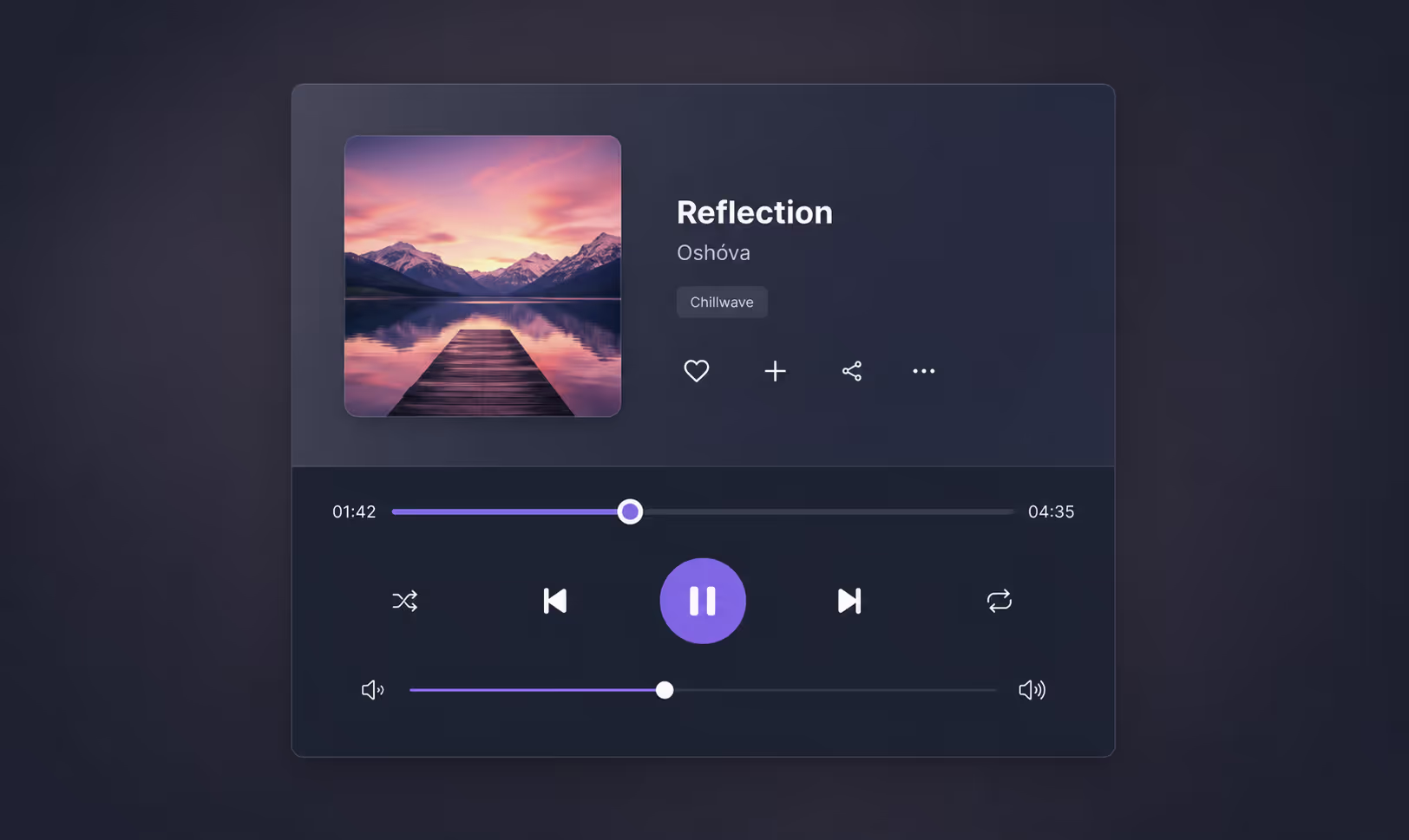
A reliable progress bar is core audio player UX. People want to know how long a track is, where they are, and how to jump around. Jumpy or laggy scrubbing is the kind of flaw that makes a whole site feel cheap. A good player gives a smooth, draggable scrubber and a visible duration so listeners always know what they are committing to.
Pattern 4: Design Audio Player UX for Accessibility First
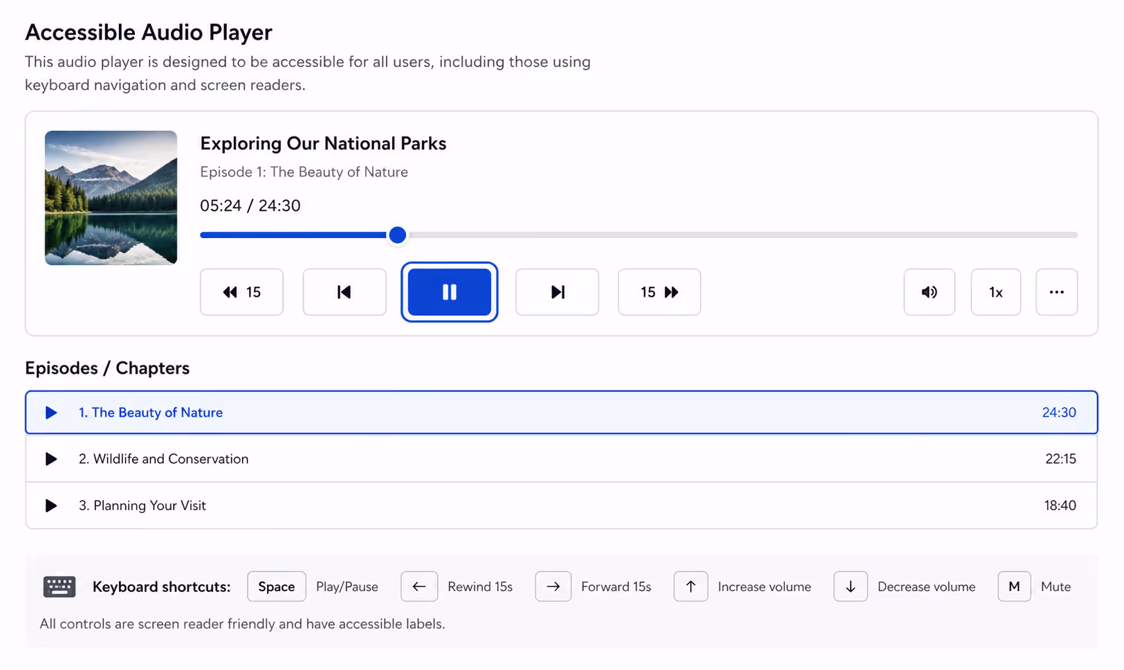
Accessible audio player UX is not optional, it is the baseline. Strong audio player UX starts with keyboard navigation, so a listener can tab to the play button and press space to start. It includes screen reader labels on every control, clear focus states, and readable contrast. When you build it this way, you help everyone, not just people using assistive technology.
Captions and transcripts are part of accessible audio player UX too. Offering a transcript beside the player is one of the audio player UX best practices that also helps your SEO, since search engines can read the text. So accessible audio player UX is a rare case where doing the right thing and the smart thing line up perfectly.
Pattern 5: Never Autoplay With Sound
The fastest way to ruin audio player UX is to autoplay with sound. Modern browsers block it for a reason, and listeners hate being ambushed by noise. The best practice is to let the human press play. Respecting that choice is what separates a thoughtful player from the kind that makes people slam the back button.
Pattern 6: Remember Where the Listener Stopped
Resume playback is an advanced audio player UX pattern that pays off for longer content. If someone listens to 12 minutes of a 40 minute episode, good audio player UX brings them back to minute 12, not minute zero. This single audio player UX touch can lift completion rates noticeably on podcasts and courses.
Pattern 7: Match the Player to Your Brand
Generic players are forgettable audio player UX. When the player matches your colors, type, and tone, the audio player UX feels intentional and trustworthy. I am not saying decorate for the sake of it, I am saying that consistent audio player UX signals quality, and quality signals get more plays.
Pattern 8: Add Speed Controls for Spoken Word
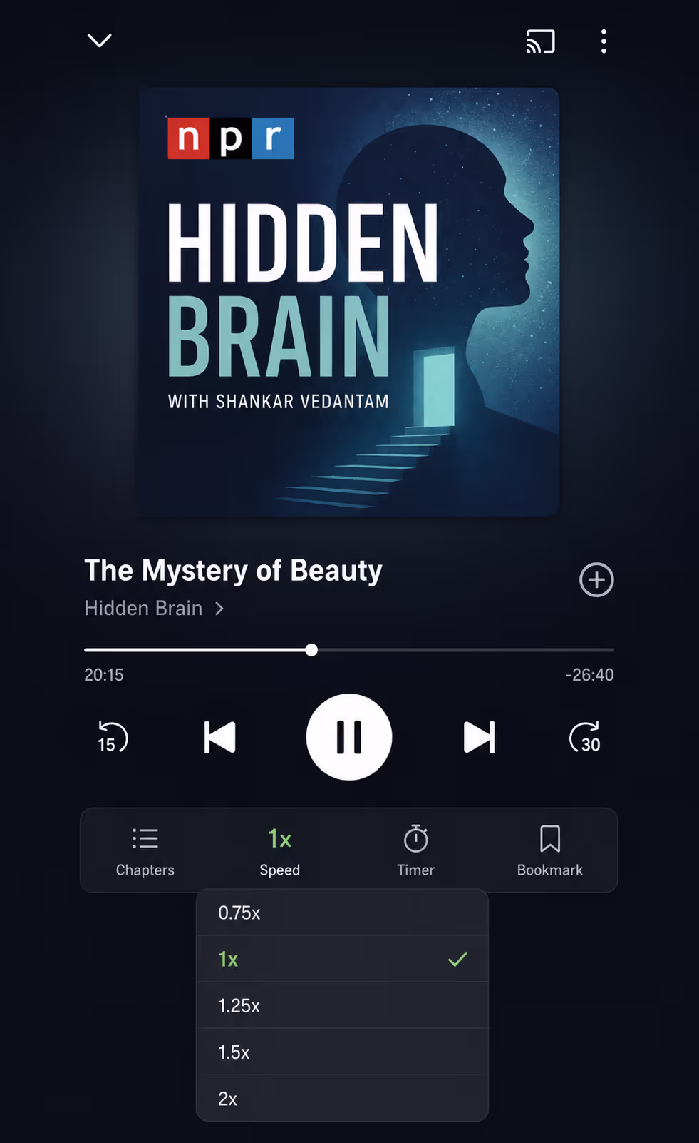
For podcasts, courses, and audiobooks, playback speed is a quiet audio player UX win. Many listeners run spoken word at 1.25x or 1.5x, and offering that control is an audio player UX best practice that respects their time. Keep it tucked away so it does not clutter the main view, in line with the minimal audio player UX from Pattern 2.
Pattern 9: Test Your Audio Player UX on Real Phones
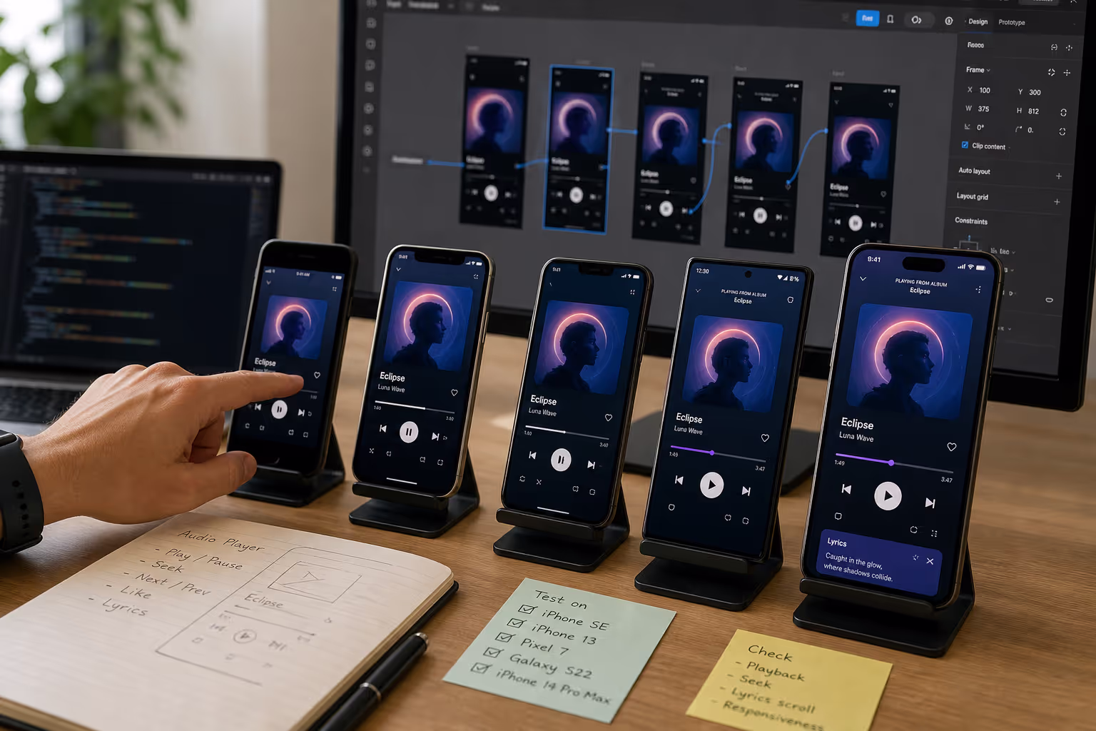
The last audio player UX pattern is a process, not a feature. You have to test audio player UX on real devices, because what looks fine in a desktop preview can fall apart on a mid range Android phone. I keep a couple of older phones around just to pressure test audio player UX, since that is where weak players reveal themselves.
An Audio Player UX Checklist I Actually Use
When I audit audio player UX, I run through the same short table. It is the fastest way I know to turn fuzzy audio player UX opinions into concrete fixes.
| Audio Player UX Element | Weak Version | Strong Version |
|---|---|---|
| Play button | Small, low contrast | Large, high contrast, 44px tap target |
| Controls | Everything visible at once | Progressive disclosure |
| Progress bar | Jumpy, no duration shown | Smooth, draggable, duration visible |
| Accessibility | Mouse only, no labels | Keyboard, screen reader labels, transcript |
| Autoplay | Plays with sound | User presses play |
| Load speed | Heavy, blocks the page | Light, lazy loaded |
How Poper Helps You Ship Better Audio Player UX
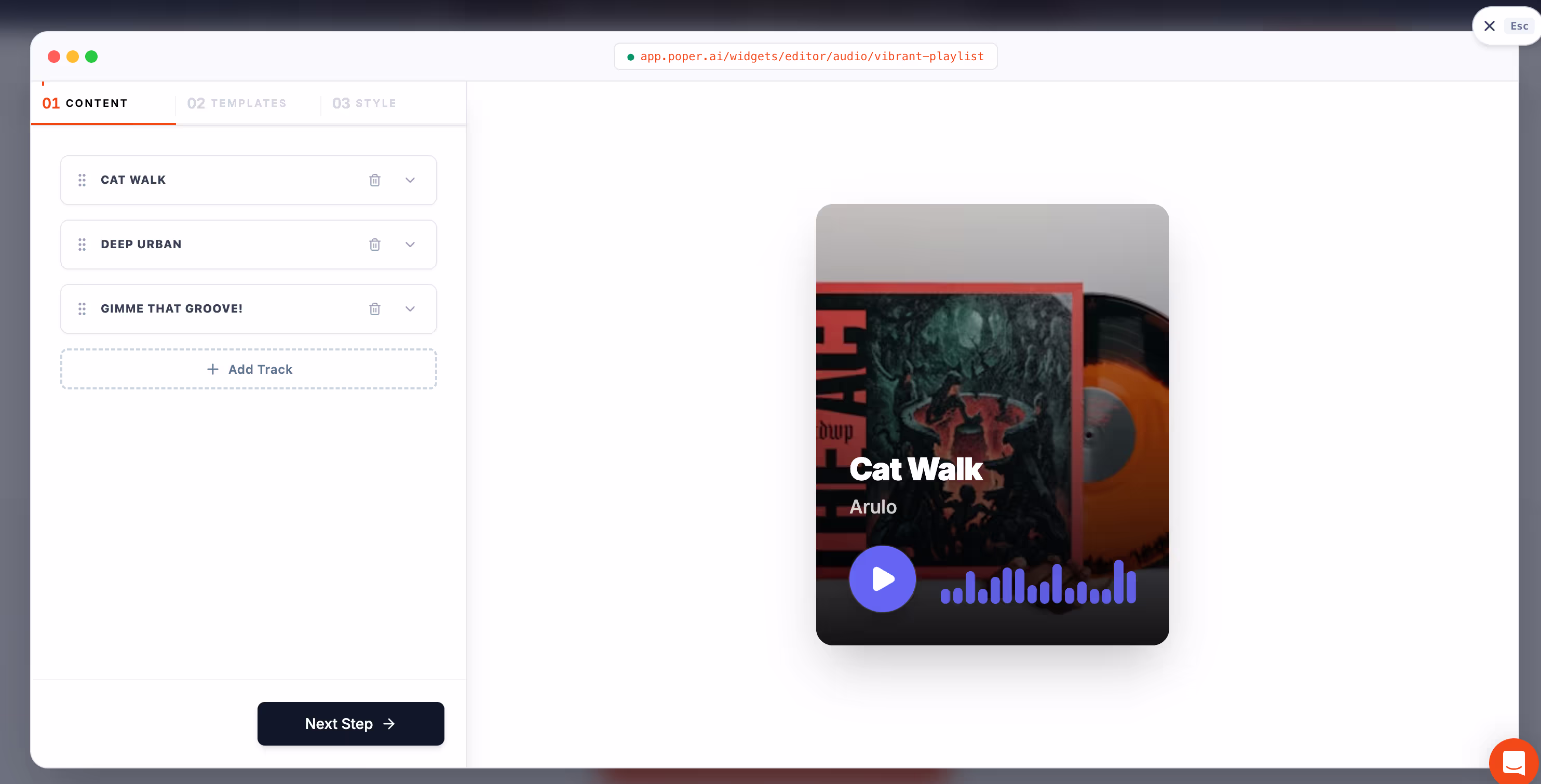
If you want strong audio player UX without wiring it all by hand, this is where a tool like Poper fits. Poper is an AI powered engagement platform, and its Audio widget gives you a clean, responsive player with the audio player UX patterns above already built in: a clear play button, minimal controls, lazy loading, and mobile friendly layout. You upload a file or paste a link, drop it on the page, and the audio player UX is handled for you.
What I like is that it keeps audio player UX consistent across platforms. The same widget behaves the same way on WordPress, Shopify, Webflow, Wix, and Squarespace, so your audio player UX does not break when you change site builders.
If you want the deeper technical side of embedding, our guide on how to embed audio on a website walks through HTML5, SoundCloud, and Spotify in detail.
So Where Should You Start With Audio Player
If you take one thing from this guide, take this: audio player is about removing friction between a curious visitor and the play button. Start with a big, obvious play control, keep the rest minimal, make it accessible, never autoplay with sound, and test it on a real phone.
That short list of audio player UX best practices covers most of the gap between a player people ignore and one they actually use. That is the same path I walked with my friend's meditation app, and within a week her audio player UX was doing the quiet work of turning visitors into listeners.