I once watched a friend hover over a yoga studio's website for almost four minutes before closing the tab. She was ready to book. She had her credit card on the desk. She had already told me she wanted that Tuesday class. The site just said "Contact us to reserve your spot", and she stared at it, then sighed, then quietly moved on with her day. The studio lost a paying customer because of a sentence.
That is the moment I really understood appointment scheduling psychology, because nothing on that page was broken, except the small mental gap between wanting a slot and being allowed to take one.
So in this post I want to walk you through the appointment scheduling psychology behind why showing your real available slots beats a "Contact us" button almost every single time. I will pull in fresh 2026 behavioral data, share what is going on in a visitor's head as they look at your booking page, and end with how I would actually rebuild a calendar so the psychology works for you instead of against you.
By the end you will see that this is less about software and more about how human brains handle decisions, and once you understand that, the page almost designs itself.
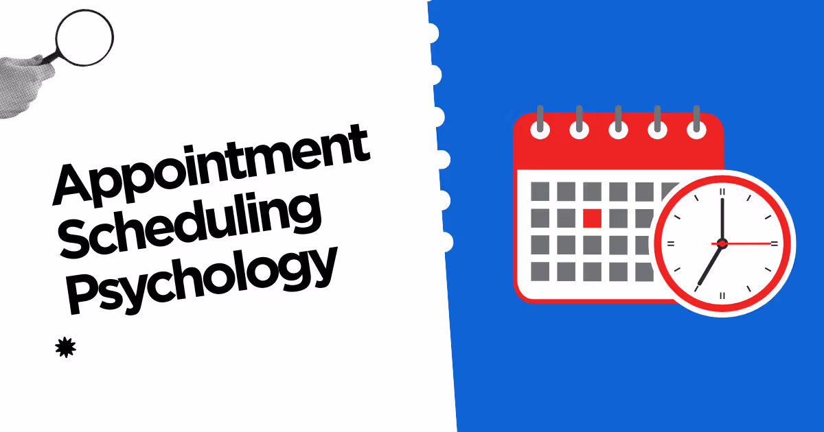
What Appointment Scheduling Psychology Actually Means
Let me put a clean frame around appointment scheduling psychology before we go deeper. It is the study of what happens inside a visitor's head between the moment they decide they want an appointment and the moment they confirm one. That stretch is shorter than people think, often less than a minute, and almost every booking page either honors it or breaks it.
The reason appointment scheduling psychology matters now is that consumer expectations have shifted. According to 2026 data compiled by Zippia, 94% of consumers say they are more likely to choose a provider that offers online booking, and 70% prefer to book online rather than call. A "Contact us" button is no longer a polite invitation, it reads as a closed door. The visitor's brain has already decided that booking should be self serve, so the moment your page asks them to write an email instead, they feel friction they did not budget for.
That friction has a price tag, too. A SchedulingKit report on online scheduling found that 48% of consumers have switched to a competitor because of a poor booking experience. So when I talk about appointment scheduling psychology, I am really talking about closing the gap between a ready buyer and the calendar, before their brain has time to talk them out of it.
Why “Contact Us” Quietly Drains Conversions
Here is what I have learned from sitting next to friends, family, and clients while they try to book things on the internet. The "Contact us" button is not neutral. In appointment scheduling psychology, it is a small but real act of mental load, and it triggers three reactions that quietly kill conversions.
The first reaction is uncertainty. A 2026 article on decision fatigue and choice architecture from Sequence Health makes the point that when a scheduler presents an open form rather than a clear set of slots, "patients make selections rather than commitments, and selections get canceled while commitments get kept". A "Contact us" link forces the visitor to imagine, in their head, what the conversation will look like, who will reply, when they will reply, and whether they will be pressured to buy. That is a lot of cognitive load for one tiny click.
The second reaction is delay. The visitor thinks, fairly, that they will need to wait for a response. In appointment scheduling psychology, any felt delay is an exit ramp. People are great at intending to come back later and almost never doing it. A 2026 piece in The Daily Explainer reports that chronic decision fatigue now affects roughly 34% of adults, particularly people juggling work and family decisions all day.
Those visitors are not going to circle back at 9 pm to re-engage with your booking flow. Their brain is already too tired.
The third reaction is doubt about value. When the slots are hidden, the visitor cannot tell whether you are popular or empty, available or impossible to reach. That ambiguity tips appointment scheduling psychology the wrong way, because the brain protects itself from possible rejection.
So instead of risking a polite "we are fully booked" email, the visitor just closes the tab. Showing real slots removes that doubt in one move, because the answer to "can I have this Tuesday at 3" is right there on the page.
The Behavioral Data That Backs Up Showing Slots
I want to put the numbers in one place, because appointment scheduling psychology has gotten a lot more measurable in the last two years.
Here is the table I use when I am explaining to a service business why hiding their calendar costs them money. Every line is from a 2026 source.
| Signal | What the 2026 data says | What it tells us about appointment scheduling psychology |
|---|---|---|
| Online booking preference | 94% are more likely to choose a provider with online booking, 70% prefer it over calling | Visitors expect to self serve; "Contact us" feels like a step backward |
| Switching cost | 48% have switched to a competitor over a poor booking experience | Friction does not just delay, it sends the buyer elsewhere |
| Decision fatigue | ~34% of adults report chronic decision fatigue in 2026 | Any extra mental step risks losing tired buyers |
| Selection vs commitment | Hidden slots produce selections that cancel; visible slots produce commitments that stick | The act of picking a real time creates psychological ownership |
| Field-level drop-off | Each form field past 6 adds ~3.1% drop-off across 430M checkout sessions | Slot pickers convert better than open contact forms because they ask less |
| Phone field damage | Phone fields cause ~37% abandonment, the highest of any field | A scheduling page that requires a call is psychologically worse than one that asks for a name |
What I read into this table is simple. Appointment scheduling psychology is not soft science any more. Hidden slots break commitment, long forms break attention, and phone first flows break trust. Visible slots fix all three in one move, because the visitor can see, choose, and confirm without ever wondering what happens next.
What Is Actually Happening in a Visitor’s Head
Let me slow down and walk through the moment, because appointment scheduling psychology really comes alive when you imagine the visitor as a person, not a metric. Picture someone landing on your page after clicking an Instagram ad. They are on a phone, on a couch, half watching a show. They have maybe 20 seconds of attention.
In the first three seconds, their brain asks "is this what I clicked for". If the page shows a calendar with open slots, the answer is yes. If the page shows a wall of marketing copy and a "Contact us" button at the bottom, the answer is unclear. Unclear is the worst outcome in appointment scheduling psychology, because the brain defaults to leaving rather than investigating.
In the next five seconds, the visitor decides whether the experience will be worth it. Here, appointment scheduling psychology bumps into a finding from Build Grow Scale 2026 data: 81% of mobile users abandon forms they perceive as too long, and the average checkout has 23.48 form elements when the optimal number is closer to 12. The visitor has been trained by a hundred bad forms to expect pain. A calendar that asks for a slot, a name, and an email reverses that expectation in one screen.
In the final ten seconds, the visitor commits or escapes. This is the moment that research highlights, that booking and checkout forms see over 80% abandonment overall, but a tight slot picker plus three fields can land far above that average.
The brain wants to feel like it has already booked, and a real slot on a real calendar gives it that feeling earlier than any "we will get back to you" message ever can.
Designing a Booking Page That Respects Appointment Scheduling Psychology
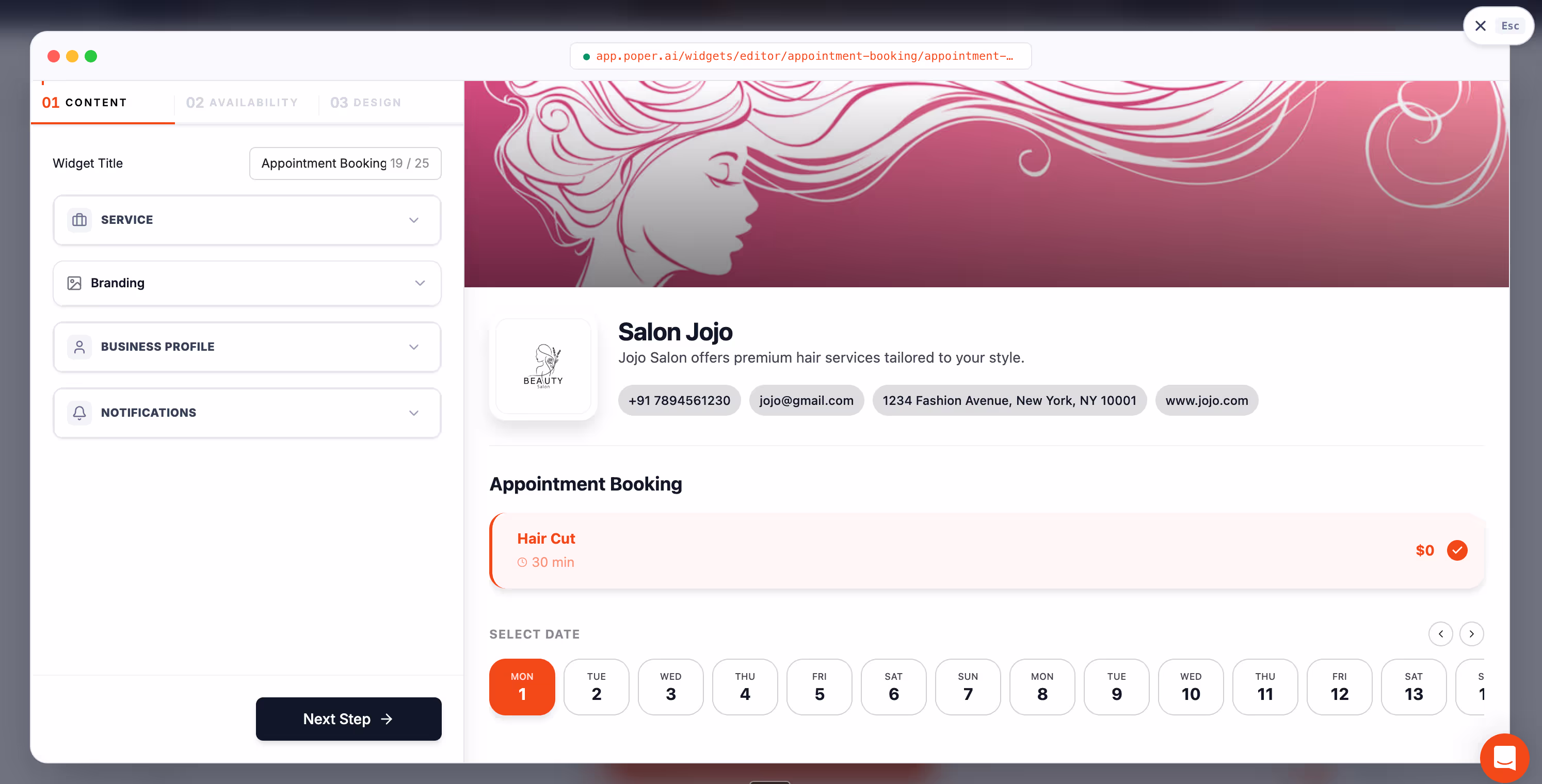
Once I had appointment scheduling psychology in my head, I started redesigning booking pages with a different goal: do nothing that adds mental load, and do everything that creates a feeling of commitment. The pages that win on this principle share a few moves, and I want to walk you through them in plain language.
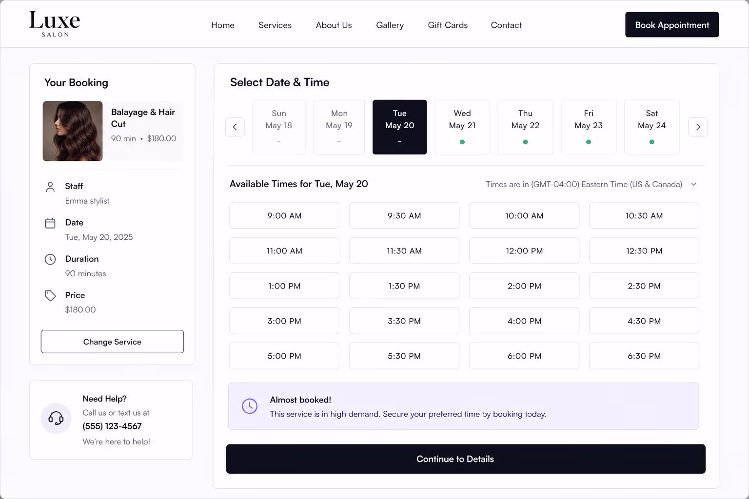
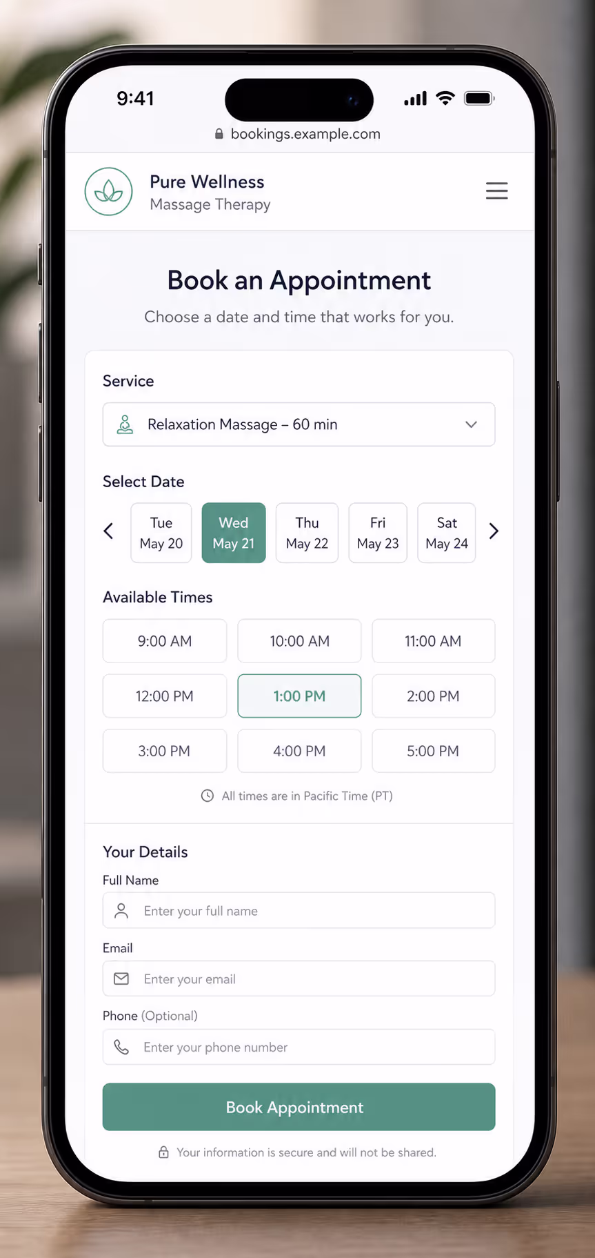
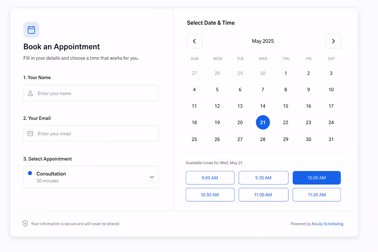
The first move is to show real, live availability above the fold. Not a contact link, not a "view our calendar" button, the calendar itself. The brain handles a small set of clearly available choices much better than an open ended invitation, which is the central insight from Sequence Health's 2026 piece on choice architecture in scheduling. Three to five visible slots beat thirty hidden ones every time.
The second move is to keep the form short. Buildgrow Scale's analysis of 430 million sessions found that each field beyond six adds about 3.1% drop-off, and that phone fields alone trigger up to 37% abandonment.
So appointment scheduling psychology says ask for the name, the email, and the reason for the visit, and collect everything else after the booking is locked in. This is also where the famous Expedia story still matters: a single removed field on their booking form, the company name, reportedly added $12 million in annual profit, as referenced in form abandonment research.
The third move is to add tiny commitment cues. A line under the booking button that says "no charge until your appointment", or "join 2,400 happy clients this month", does enormous work in appointment scheduling psychology. It lets the brain feel safe and social at the exact second of doubt. These cues do not pad the page, they earn the click.
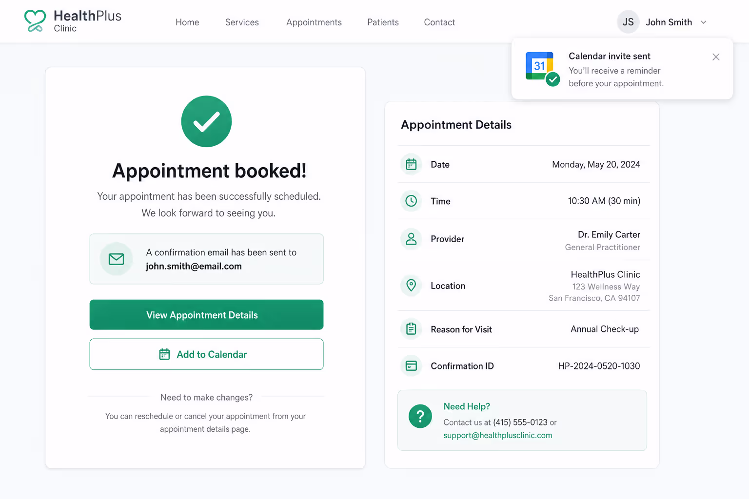
The fourth move is to confirm instantly. Appointment scheduling psychology completes its loop when the booking flips from a wish to a fact. An instant on-screen confirmation, a calendar invite, and a reminder a day later, all close the gap between intent and identity. The visitor stops being someone who tried to book and starts being someone who has an appointment, which is exactly the mental state that prevents cancellations.
How a Tool Like Poper Makes Appointment Scheduling Psychology Easy
If you want to put all of this on your own site without wiring up a developer, this is where I would point you toward Poper. Poper is an AI powered engagement platform, and its Appointment Booking widget is built around the principles of appointment scheduling psychology, since it shows real time slots, keeps the form short, and lets the visitor commit on the same page they landed on.
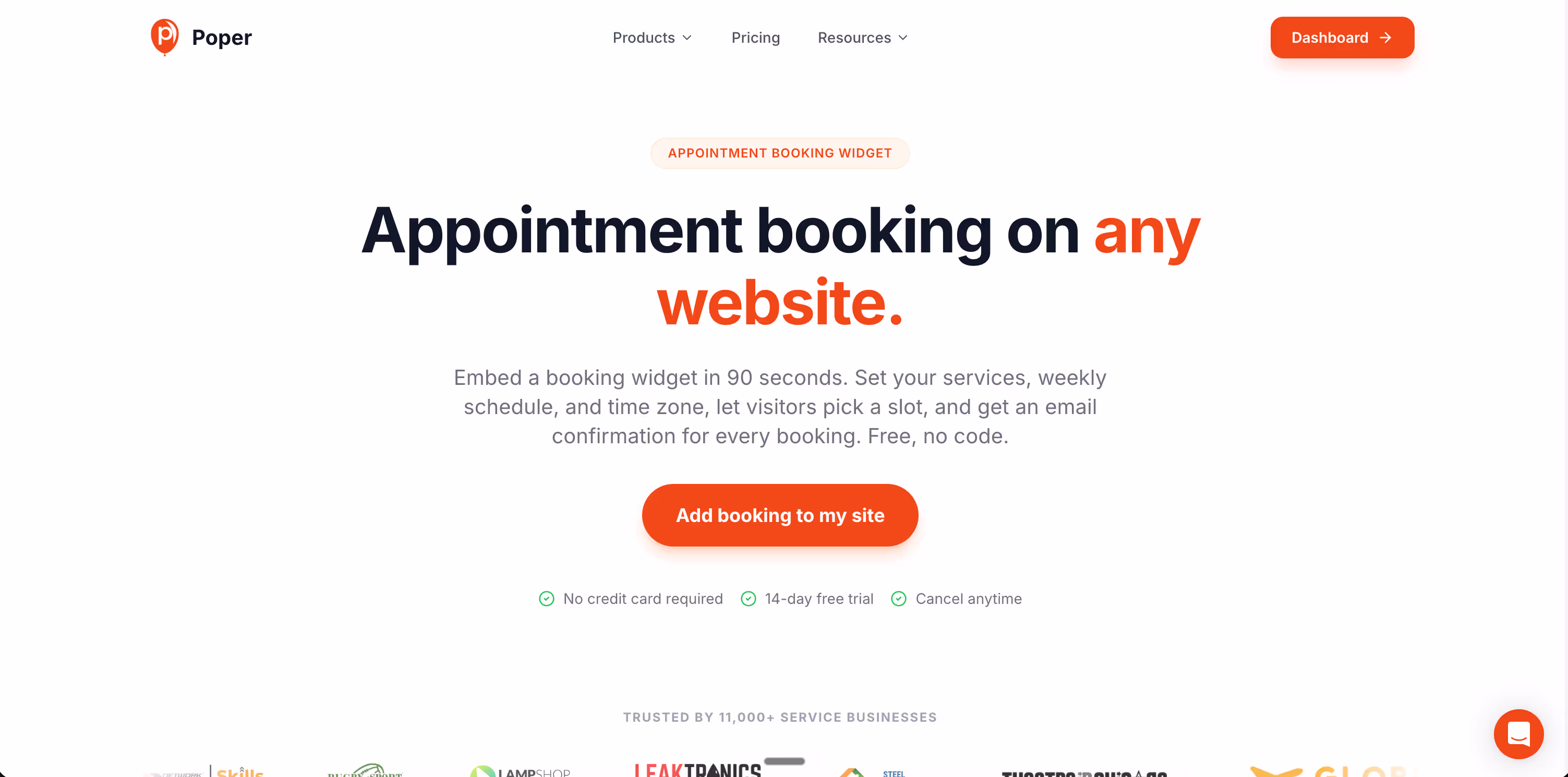
What I like about it is the speed of setup. You can drop the widget into WordPress, Shopify, Webflow, Wix, or Squarespace in a few minutes, embed it directly on the page where the visitor is hottest, and use Poper's targeting rules to surface the booking prompt at the right moment, like after a pricing page view or on exit intent.
The form stays tight, the slots stay visible, and the brain stays in commitment mode. There is a real free plan, so you can prove the psychology works on your traffic before you scale it across your whole site.
A Short Reality Check Before You Call Your Booking Page Done
So if you take one thing from this guide, take this. Appointment scheduling psychology says that buyers do not need persuasion at the moment of booking, they need permission. They have already chosen. They just need to see a Tuesday at 3 they can claim with two clicks. Every "Contact us", every extra field, every hidden calendar is a quiet way of taking that permission back, and the 2026 data shows that almost half your traffic will simply leave when that happens.
Open your own page like a stranger. Can you see real slots in the first three seconds? Is the form three or four fields, not eleven? Is there a tiny line of reassurance near the button? Does a confirmation arrive before you have time to second guess? If yes, you have engineered your booking page in line with appointment scheduling psychology. If not, you have an afternoon of small fixes that may pay for themselves by next week, the same way my friend's yoga studio did after they finally turned their calendar on.