
I want to start with a small confession. When I first started shipping product pages, I treated the choice between accordions, tabs, and dropdowns like a style decision. I picked whichever one looked cleanest on the mockup and moved on.
That mindset cost me a few thousand dollars in lost conversions before I sat down and worked through accordion vs tabs vs dropdowns the way I should have done from day one.
This post is the framework I wish someone had handed me back then. We will walk through what accordion vs tabs really means in modern interface design, where each pattern wins, where it quietly hurts you, and how to decide quickly without holding up your launch.
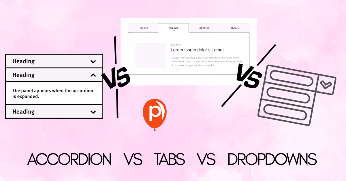
What the Accordion vs Tabs vs Dropdown debate is actually about
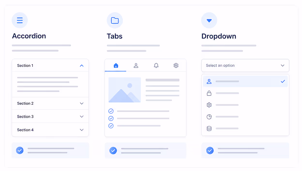
Accordion vs tabs sounds like a UI flavor war, but at the core it is a question about cognitive load and discovery. An accordion stacks sections vertically and lets the reader expand one at a time. Tabs lay options out horizontally and swap content in the same panel. Dropdowns hide everything behind a single trigger until the user opens it.
So when we talk about accordion vs tabs, we are really comparing three things: how much content stays visible, how the reader scans the page, and how many clicks it takes to reach what they need. None of those answers are universal, which is why accordion vs tabs keeps showing up on UX forums year after year.
The Nielsen Norman Group has published several pieces on this pattern in the last two years. Their 2024 guidance on accordions for mobile concluded that long pages with dense supporting text often perform better as accordions because users can scroll, scan, and decide without losing context. That is one data point I lean on whenever I think about accordion vs tabs for any content-heavy page.
Where each pattern wins
Before we get to the decision framework, I find a short side by side really helpful. Here is how I summarize the accordion vs tabs vs dropdown trade-off when I am sketching a layout.
| Pattern | Best for | Avoid when | Typical click cost |
|---|---|---|---|
| Accordion | FAQs, mobile-first long pages, sequential reading, support docs | Users need to compare sections side by side | 1 click per section |
| Tabs | Parallel content of similar weight, dashboards, product detail panels | You have more than 5 to 7 options, or labels do not fit on mobile | 1 click, no scroll cost |
| Dropdown | Rare actions, secondary navigation, settings menus | Content is core to the page and should be discoverable | 1 click + scan inside menu |
The reason accordion vs tabs gets confusing is that both patterns can technically hold the same content. But holding is not the same as serving. A 2025 Baymard Institute review of e-commerce product pages reported that users completed key tasks notably faster when long support content was placed inside accordions instead of tabs, mostly because mobile users already expect to scroll rather than jump.
The decision framework I use
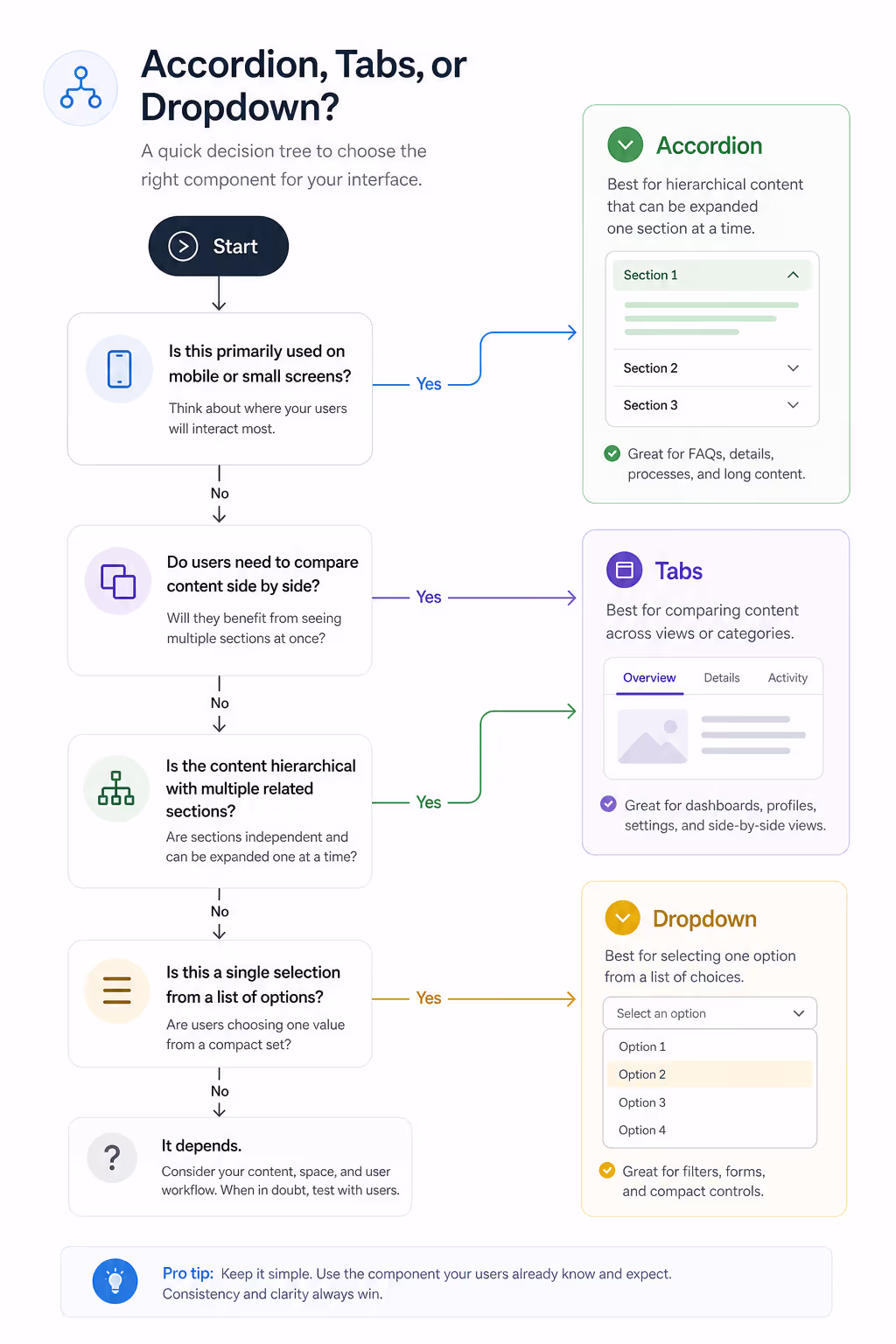
When the accordion vs tabs question lands on my desk, I run three quick checks. I want to share them in the order I actually ask them so you can copy the flow.
1. Are the sections equal siblings or sequential ideas?
If your sections answer different questions about the same thing, such as Specs, Reviews, and Shipping, they are equal siblings. Tabs handle that well. If your sections are a journey, such as a series of FAQs or onboarding steps, accordion vs tabs tilts toward accordions because readers build understanding as they expand each block.
2. Will the user need more than one section open at the same time?
Tabs force one panel at a time. Accordions can stay open in parallel. If your readers compare two pieces of content, the accordion vs tabs choice is basically already made. Accordions win because the comparison stays on screen.
3. How does it feel on mobile?
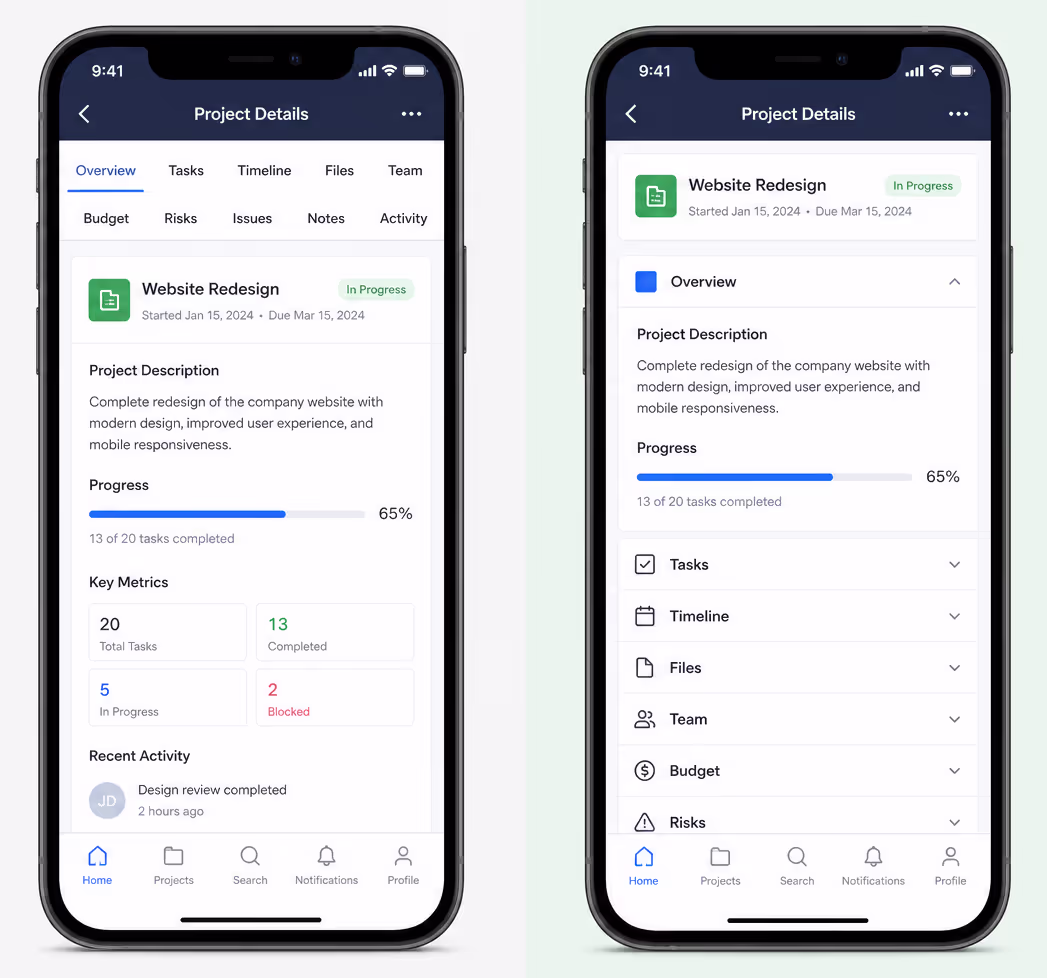
This single test ends most accordion vs tabs debates. Mobile traffic now sits above 60 percent on most sites we have audited at Poper in 2025. Tabs often break on narrow screens because labels truncate or wrap onto two lines. Accordions stack naturally. If the page is read mostly on mobile, the accordion vs tabs winner is usually accordions.
SEO and the hidden content question
A lot of teams worry that accordion vs tabs has an SEO penalty because content sits behind a click. Google's search relations team, including John Mueller, has addressed this directly more than once through 2024 and 2025. Hidden content rendered with HTML and CSS is fully indexed as long as it lives in the initial DOM. So if you are debating accordion vs tabs purely for SEO reasons, you can relax. Both work.
What matters more is whether your content gets read at all. A 2025 column on Search Engine Journal reported that FAQ pages using accordion patterns held users on page significantly longer than tabbed FAQ pages. That dwell signal helps rankings indirectly. So for content marketing, accordion vs tabs often comes down to dwell time, not crawlability.
Accessibility checks you should not skip
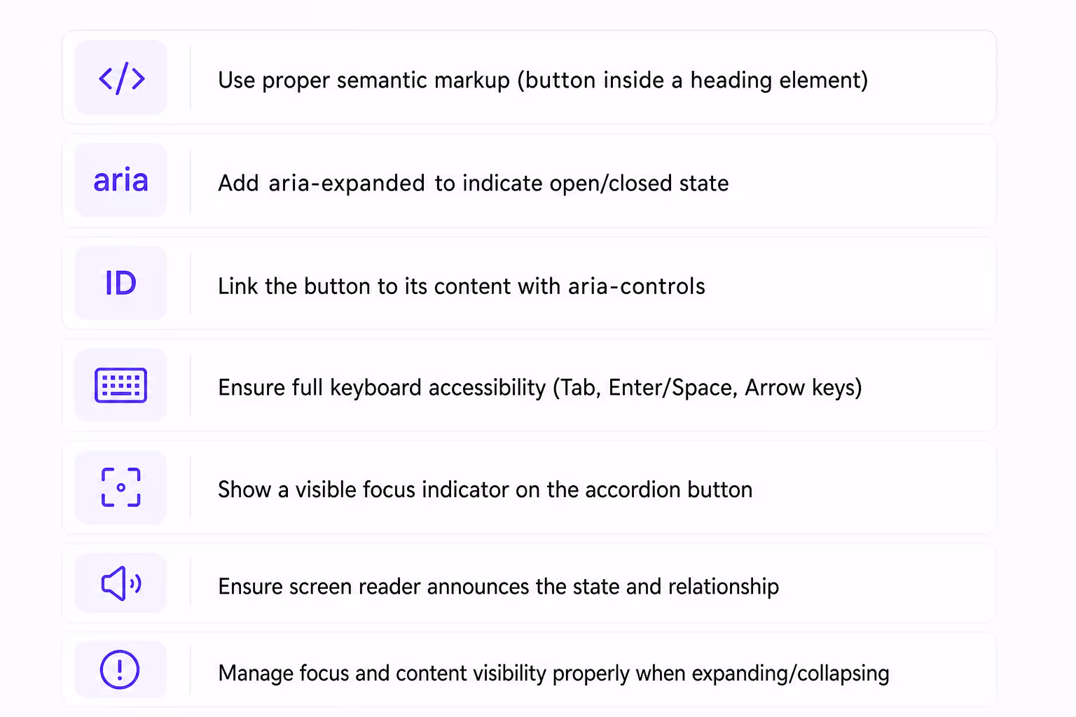
Accordion vs tabs both have well documented accessibility patterns under WCAG 2.2 and the WAI-ARIA Authoring Practices Guide updated through 2025. The short version: accordions need a button element for each header, an aria-expanded state, and unique IDs linking each header to its panel. Tabs need a tablist role, individual tab roles, and proper keyboard navigation with arrow keys.
I learned the accordion vs tabs accessibility lesson the hard way on an enterprise project. We shipped a tab component without arrow key handling, and the audit flagged it as a blocker the same week. If you are not sure your component library handles these patterns out of the box, choose accordions. The default keyboard model is simpler, and screen readers handle the expanded state predictably.
When dropdowns enter the conversation
Dropdowns are the third option that usually loses the accordion vs tabs comparison, but they have one job they do better than either. When the action is rare, such as switching account settings or picking a region, dropdowns keep the main page clean. The mistake I see most often is teams using dropdowns for content people actually want to read. Anything important that hides behind a dropdown gets skipped by most users.
So the accordion vs tabs vs dropdown question is really tiered. First decide if the content is core to the page. If yes, you are choosing between accordion vs tabs. If no, a dropdown might be the cleanest path.
How we think about Accordion vs Tabs at Poper
At Poper we ship both an Accordion widget and a Tabs widget. The reason we keep them as separate building blocks is precisely because accordion vs tabs is not a swap, it is a different content philosophy.
Our Accordion widget is built for FAQ-style content where users scroll, scan, and tap.
Our Tabs widget is built for product pages and dashboards where users compare panels of equal weight.
When a customer asks us how to choose, I send them this same framework. The accordion vs tabs decision becomes almost mechanical once you answer the three questions above and look at your mobile share. We have seen support tickets drop by double digits on pages where teams switched from a tabbed FAQ to an accordion FAQ, simply because answers became easier to find on phones.
Final take on Accordion vs Tabs
Accordion vs tabs is one of those design questions that never goes away because the answer genuinely depends on context. I hope this framework saves you the same headaches I picked up the slow way. If you want a head start, you can drop a ready made Accordion widget or Tabs widget onto your site from Poper and stress test both in real traffic before committing to one pattern.
The next time accordion vs tabs comes up in a design review, run the three questions, check your mobile share, and look at whether users need parallel comparison. The answer almost always falls out on its own, and the team stops arguing about UI flavors and starts shipping content readers can actually use.
