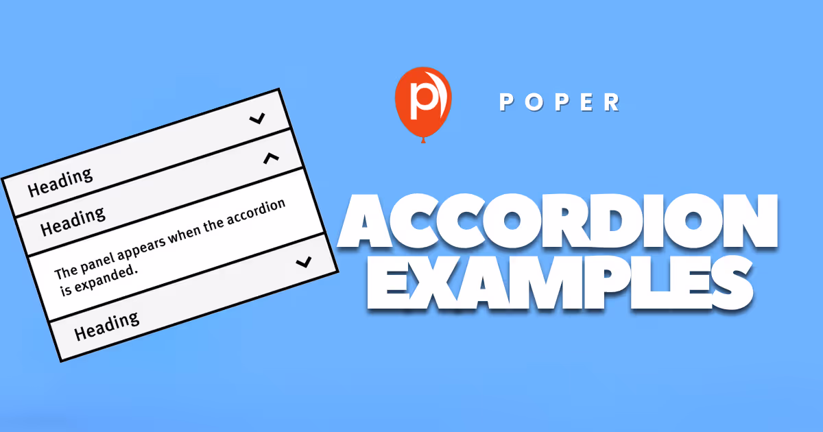
I like a clean page, but I do not like a page that hides the one thing I came to find. That is the tiny line we have to walk with Accordion UI examples. A good accordion helps people scan, choose, and move. A weak accordion turns useful content into a guessing game.
So in this blog, I am not just collecting pretty Accordion UI examples. I am walking through accordion ui examples that solve a real problem: too much information, too little attention, and a visitor who wants the next answer fast.
We build Poper for this kind of moment. Our no-code Accordion widget lets you add clean, responsive sections to any site without touching code. But before we talk about setup, I want to show what strong Accordion UI examples look like in the wild, and how I would think about them when designing a page.
Why Accordion UI examples matter right now
Modern pages carry more content than ever: FAQs, specs, pricing notes, feature comparisons, policy details, reviews, help text, onboarding steps, shipping information, and mobile-specific explanations. The accordion pattern survives because it gives readers control.
Recent research supports that need for better structure. In Baymard's 2025 ecommerce navigation benchmark, Baymard reported that "67% of mobile sites" have mediocre-to-poor navigation performance. That does not mean every page needs an accordion. It means we should treat Accordion UI examples as information architecture decisions, not decoration.
HubSpot updated its accordion design guide in 2025 and describes the pattern as "ideal for breaking down longform or complex content". LogRocket's 2024 update says the key benefit is to "reduce cognitive load and ease navigation". And the W3C ARIA Authoring Practices Guide, updated in 2026, warns that "Testing code based on this example with assistive technologies is essential".
That is the frame I use for Accordion UI examples: they should reduce work, not hide work.
25 Accordion UI examples worth borrowing
Below are 25 Accordion UI examples I would consider for a business website, SaaS page, ecommerce store, course page, service site, or help center. I am using simple names so you can quickly match the pattern to your page.
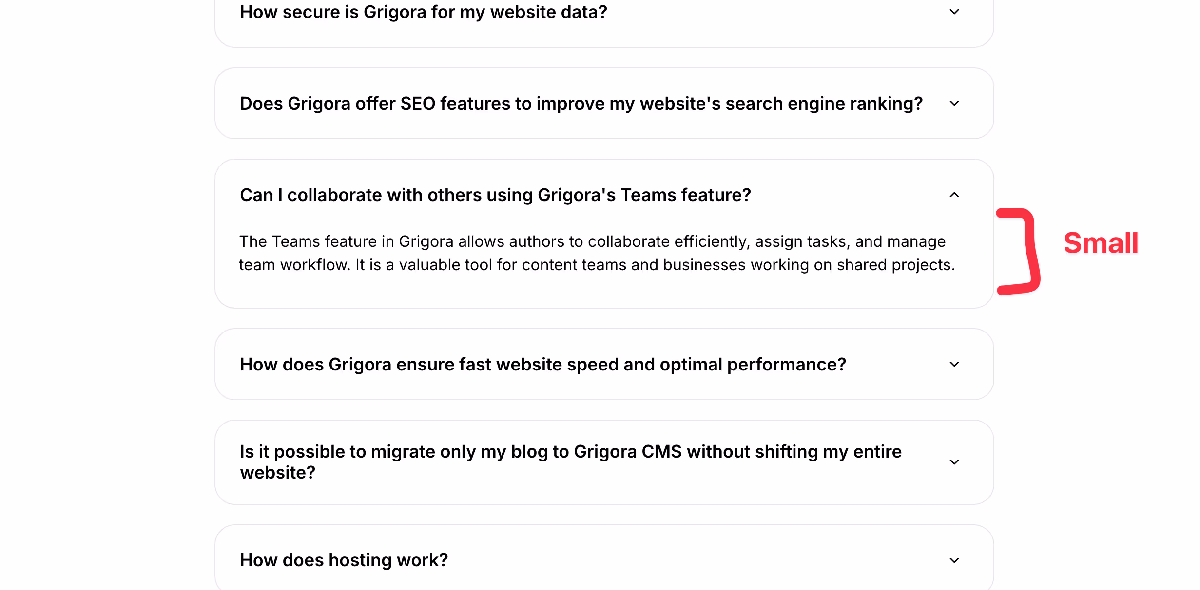
1. FAQ accordion for high-intent questions
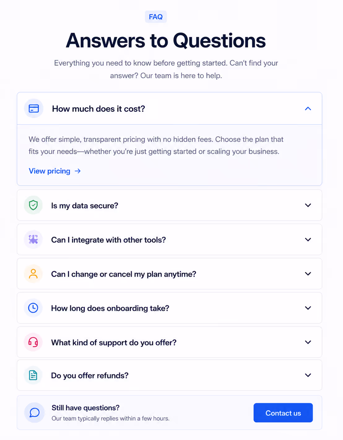
These are the classic Accordion UI examples, and they still work when the questions match what visitors actually ask before buying. Put the money questions first: pricing, setup time, cancellation, integrations, shipping, or support.
2. Product specification accordion
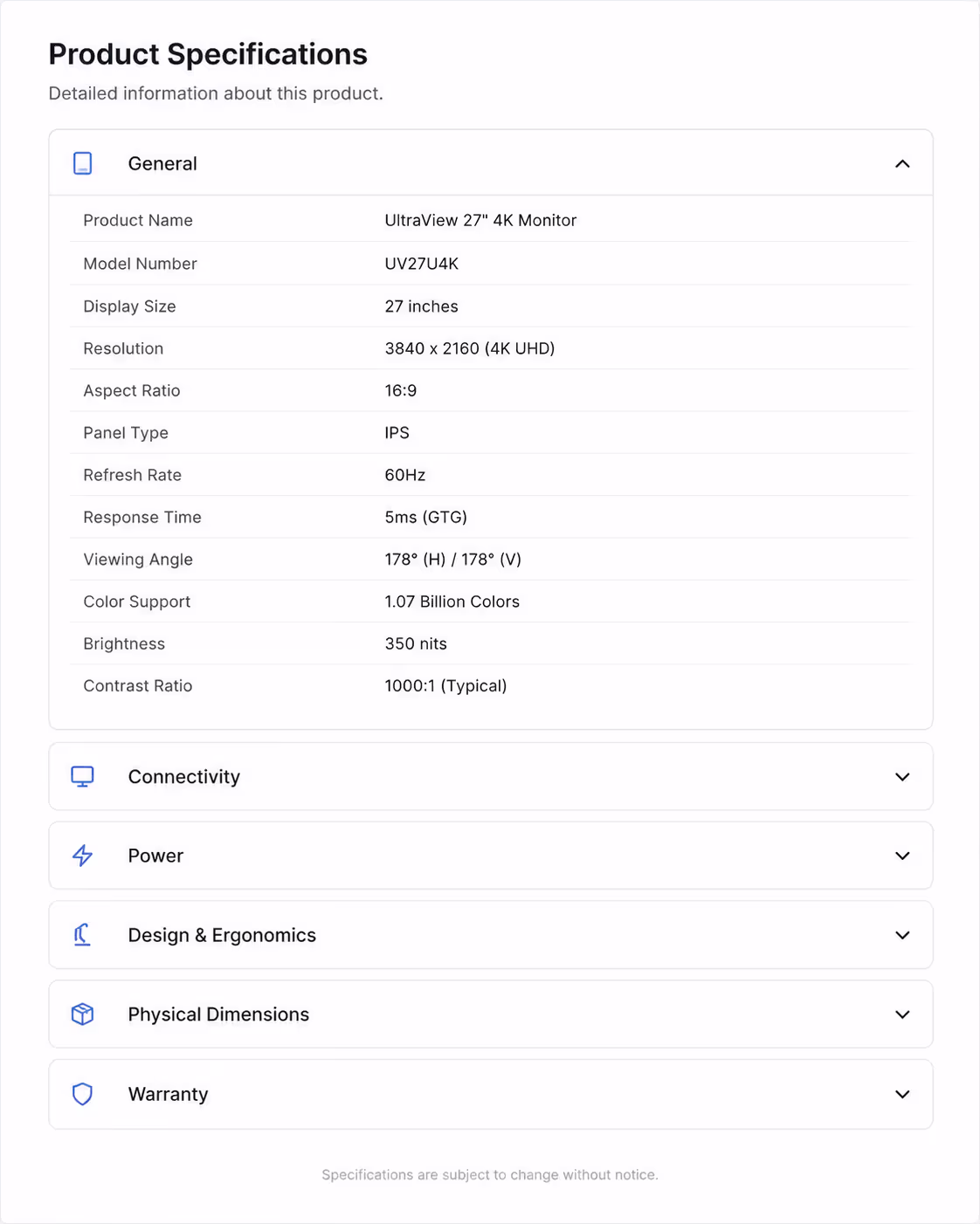
For ecommerce, product detail pages can become crowded fast. Accordions for specs work best when each panel has one clear category, such as dimensions, materials, care instructions, warranty, and returns.
3. Pricing plan details accordion
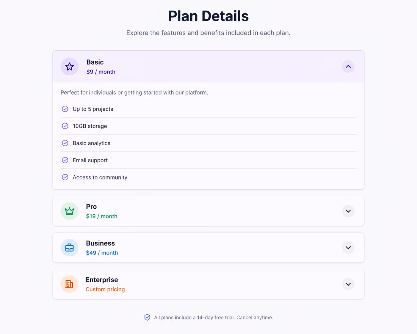
Pricing pages need clarity. Accordion UI examples here should reveal advanced details only when needed, such as usage limits, add-ons, billing rules, and team permissions.
4. Feature comparison accordion
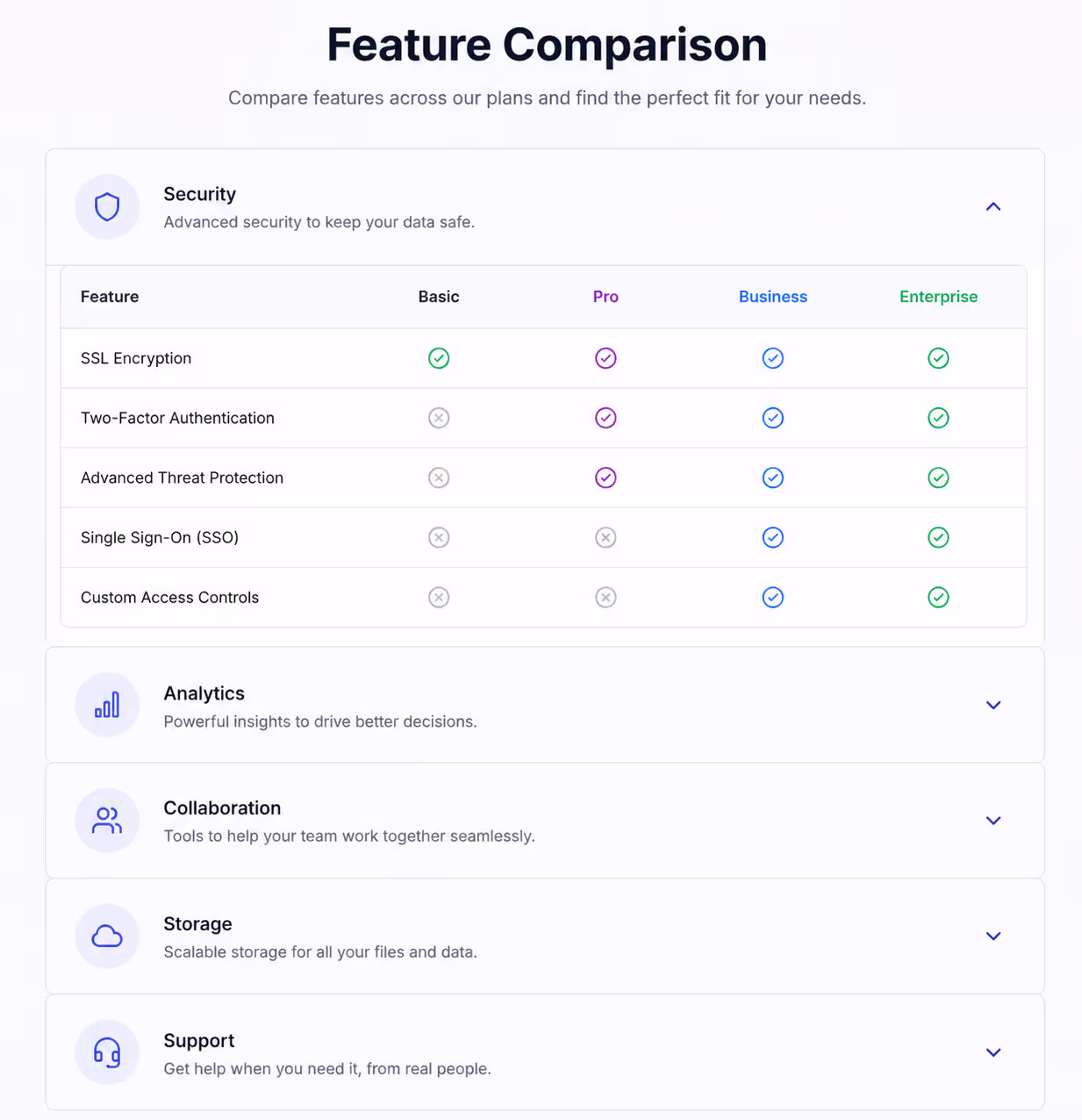
When a comparison table gets too wide on mobile, Accordions can group features by theme. Use sections like automation, analytics, integrations, security, and support.
5. Mobile menu accordion
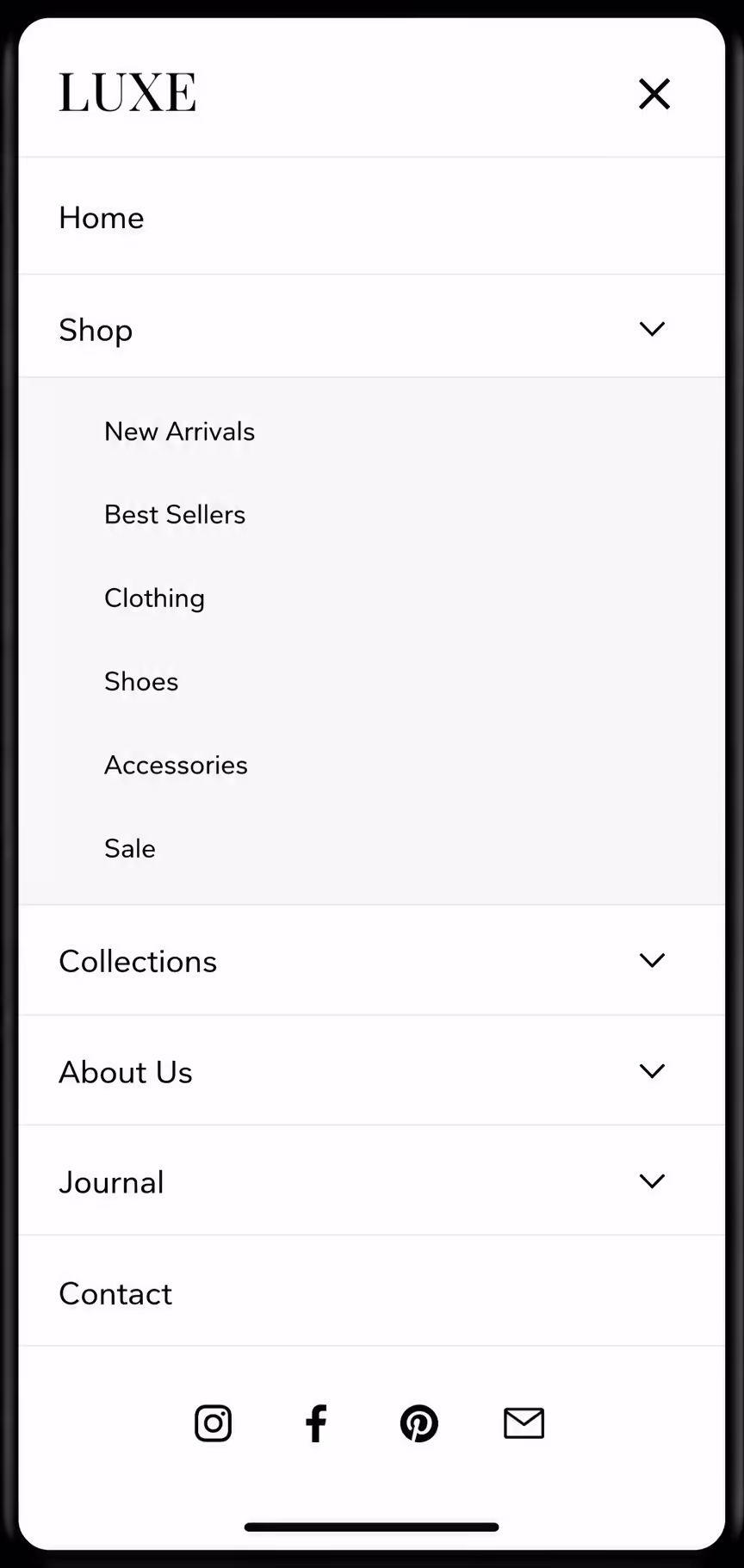
Mobile navigation is one of the strongest use cases for Accordion UI examples. Keep top-level labels short and do not stack too many levels. If visitors have to open three panels to find one link, the design needs a rethink.
6. Help center category accordion
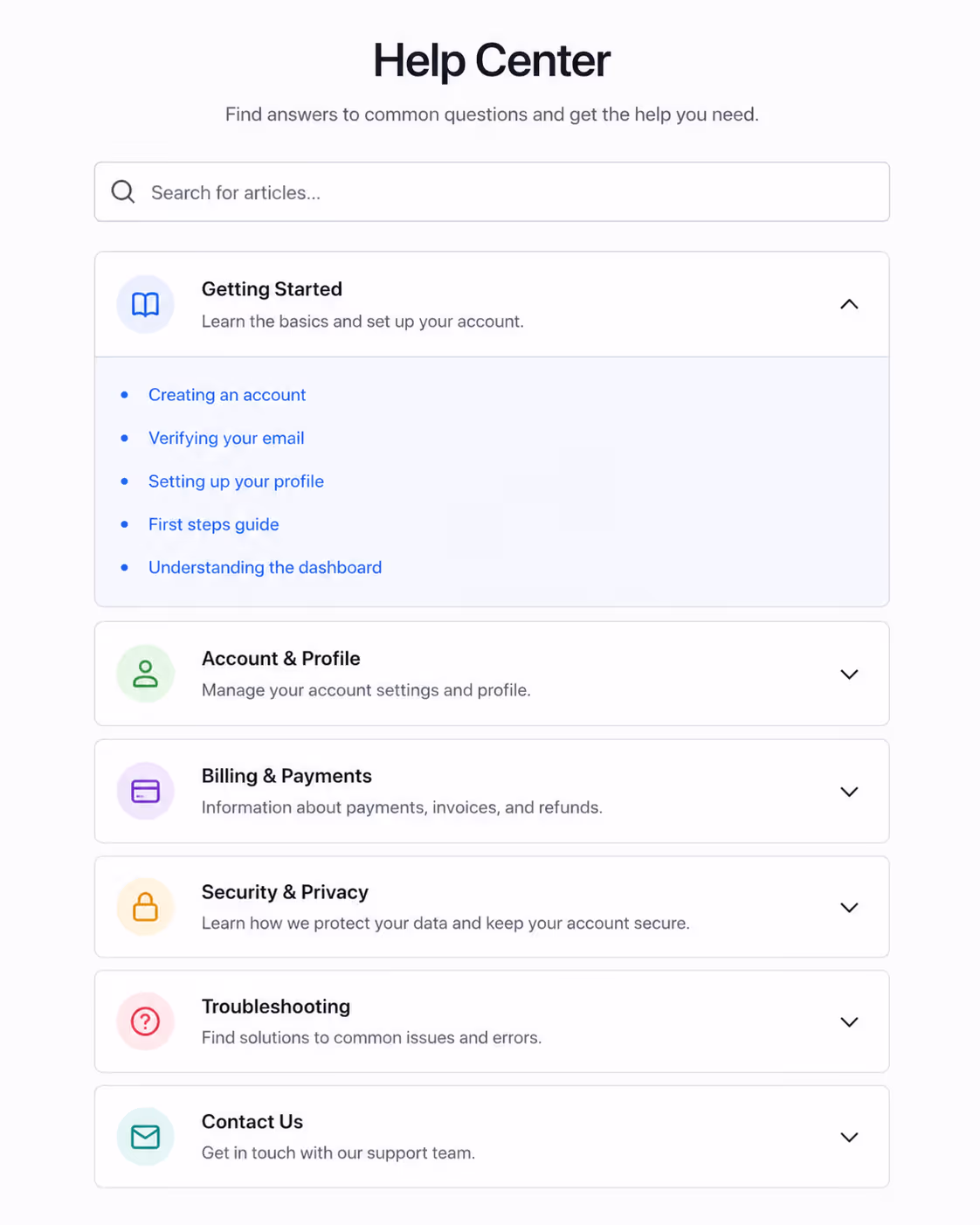
Support pages often need Accordion UI examples because users arrive with different problems. Group answers by account, billing, installation, troubleshooting, and integrations.
7. Onboarding checklist accordion
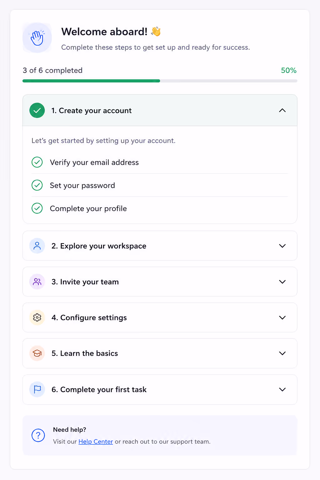
For SaaS products, Accordion UI examples can turn a long setup guide into small steps. I like this pattern when each panel ends with one clear action.
8. Checkout policy accordion
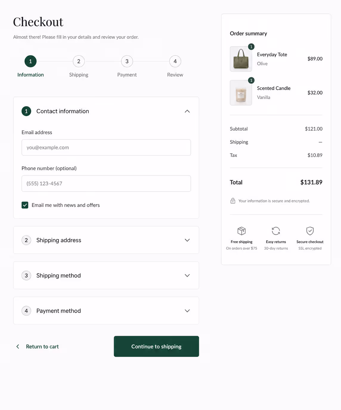
Shipping, taxes, coupons, return windows, and delivery estimates can crowd checkout. Accordion UI examples keep policies available without pushing the payment button too far down.
9. Course curriculum accordion
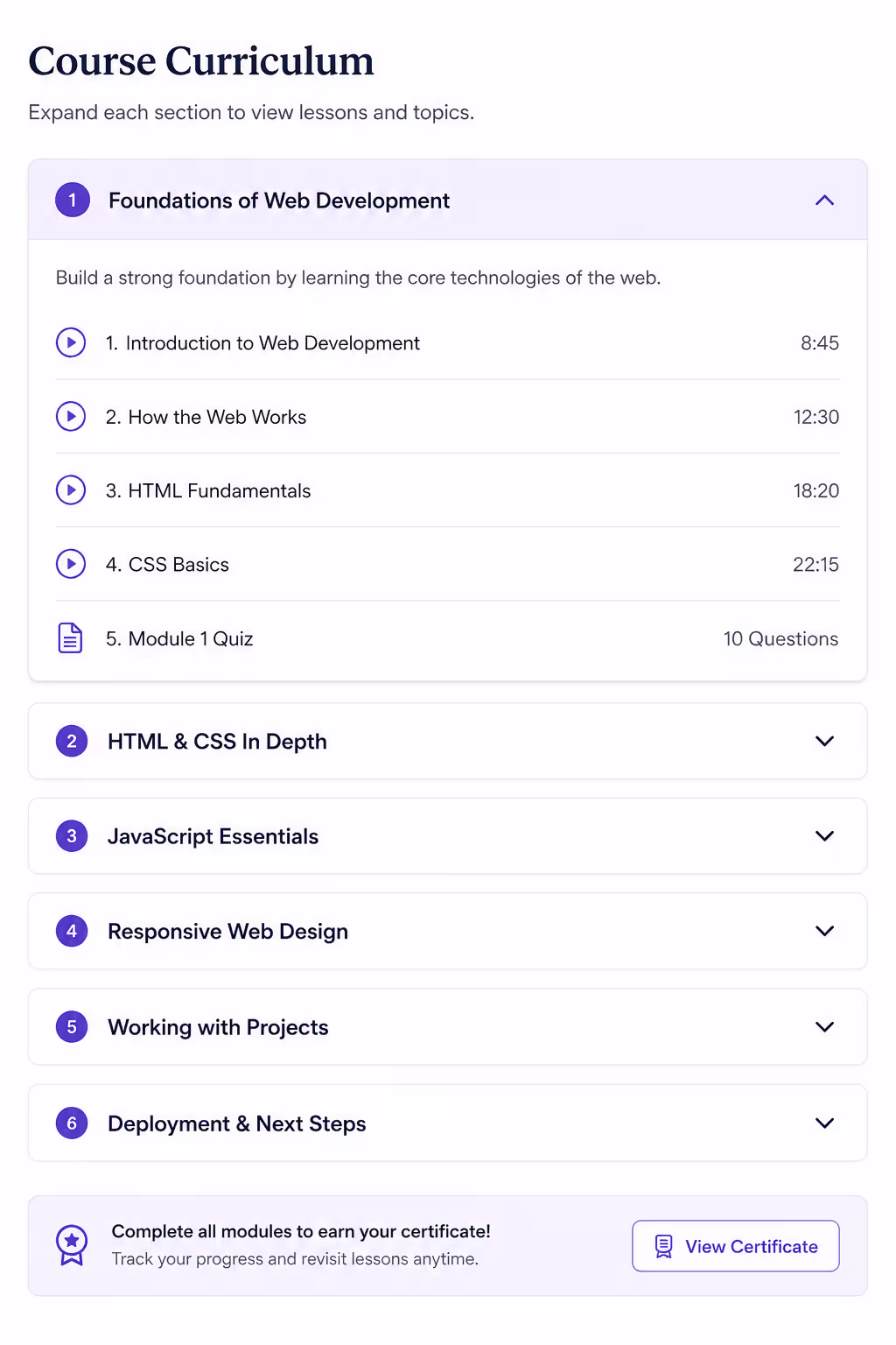
Course creators use Accordion UI examples to show modules, lessons, bonuses, and outcomes. It works because people want to inspect the offer without reading a full syllabus at once.
10. Service package accordion
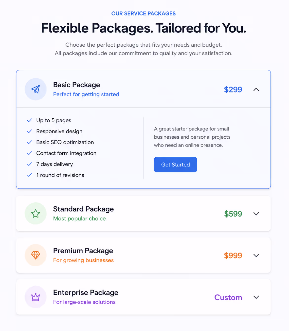
Agencies, salons, clinics, and consultants can use accordion ui examples to explain what each package includes. The key is to make every header specific, not vague.
11. Legal and compliance accordion
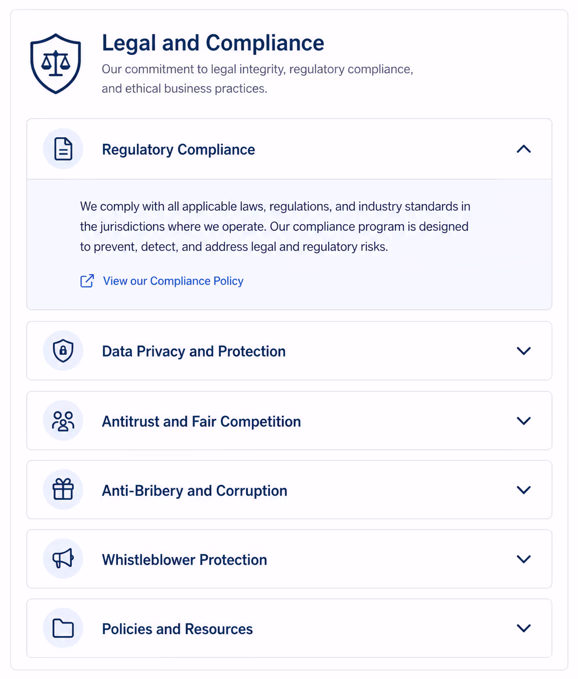
Privacy, consent, data storage, and compliance details need to be findable. Accordion UI examples help here when the reader needs one section, not the entire legal page.
12. Job posting accordion
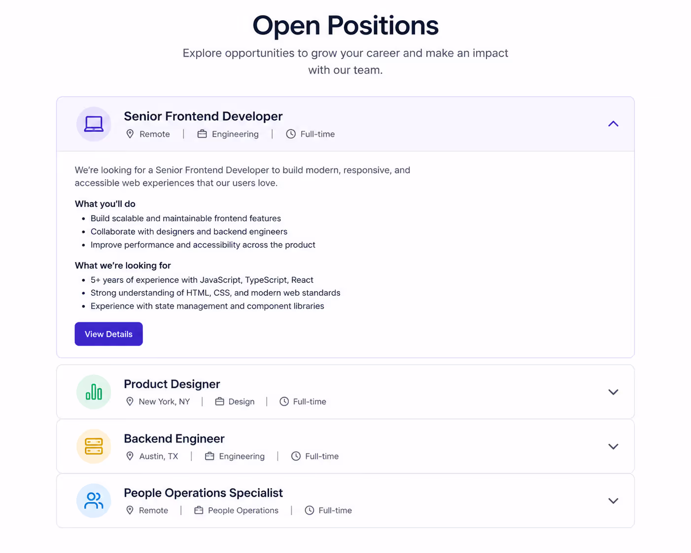
Hiring pages can use Accordion UI examples for responsibilities, requirements, benefits, process, and salary range. This keeps the role easy to scan.
Note: We have a dedicated widget for Job Posting in Poper that automatically handles the SEO schema.
13. Event schedule accordion
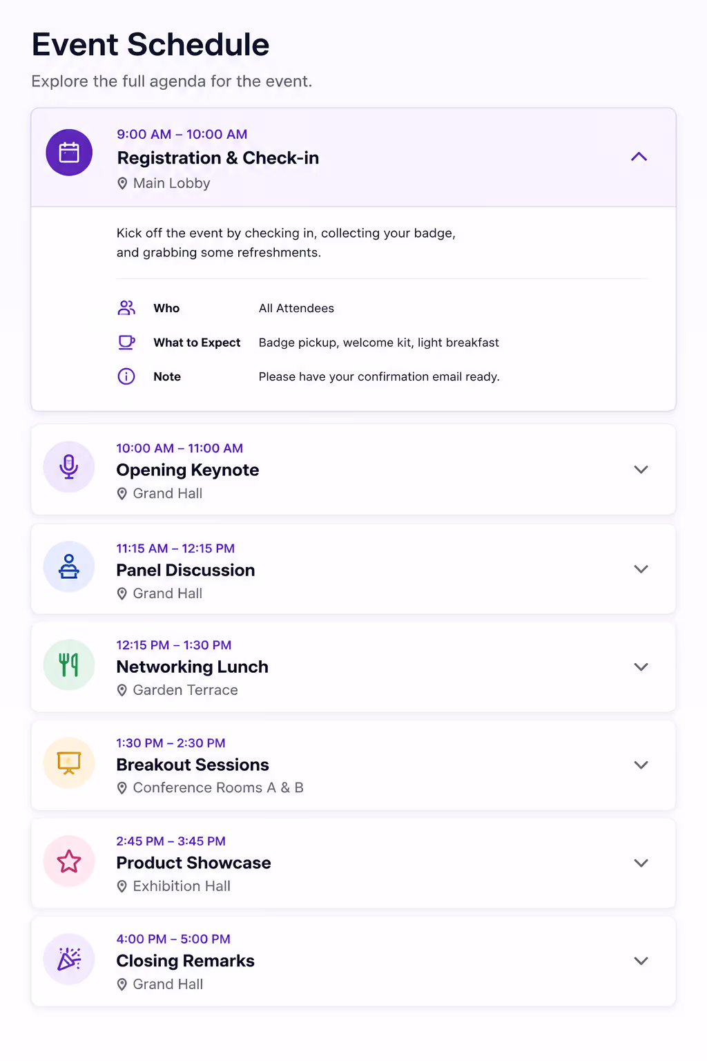
Accordion UI examples work well for conferences, webinars, and workshops. Each panel can hold a session description, speaker bio, time, and room link.
14. Restaurant menu accordion
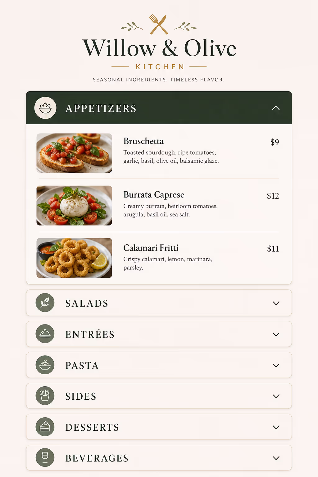
Restaurants can use Accordion UI examples for breakfast, lunch, dinner, drinks, desserts, and allergens. On mobile, this feels much better than one long PDF.
15. Real estate listing accordion
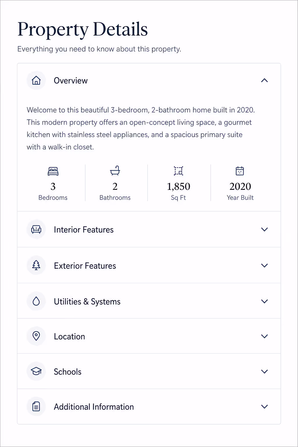
For property pages, Accordion UI examples can separate overview, amenities, neighborhood, floor plan, financing, and inspection notes.
16. Healthcare service accordion
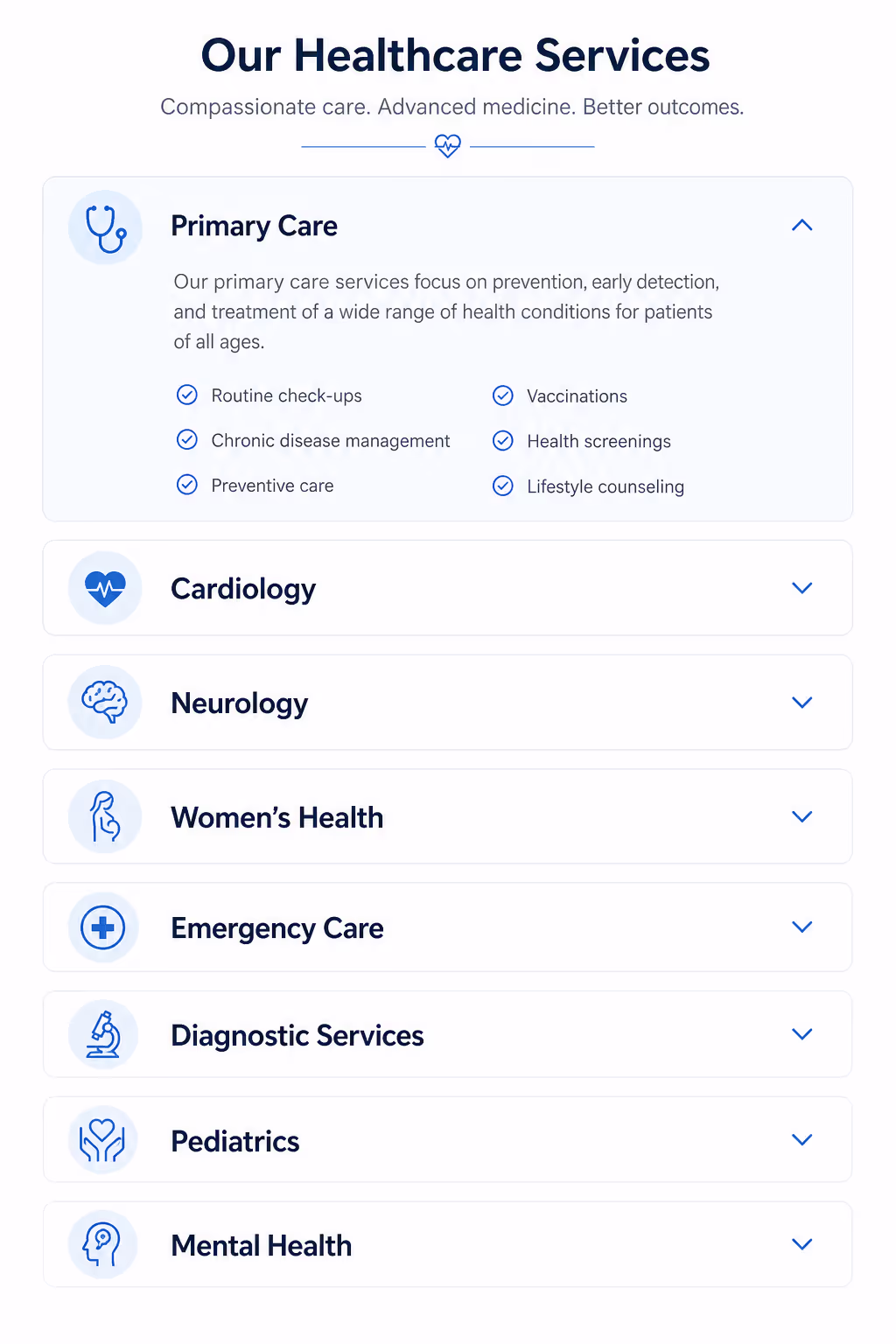
Clinics can use Accordion UI examples to explain symptoms treated, appointment flow, insurance, preparation, and aftercare. Keep the language calm and plain.
17. Product recommendation quiz result accordion
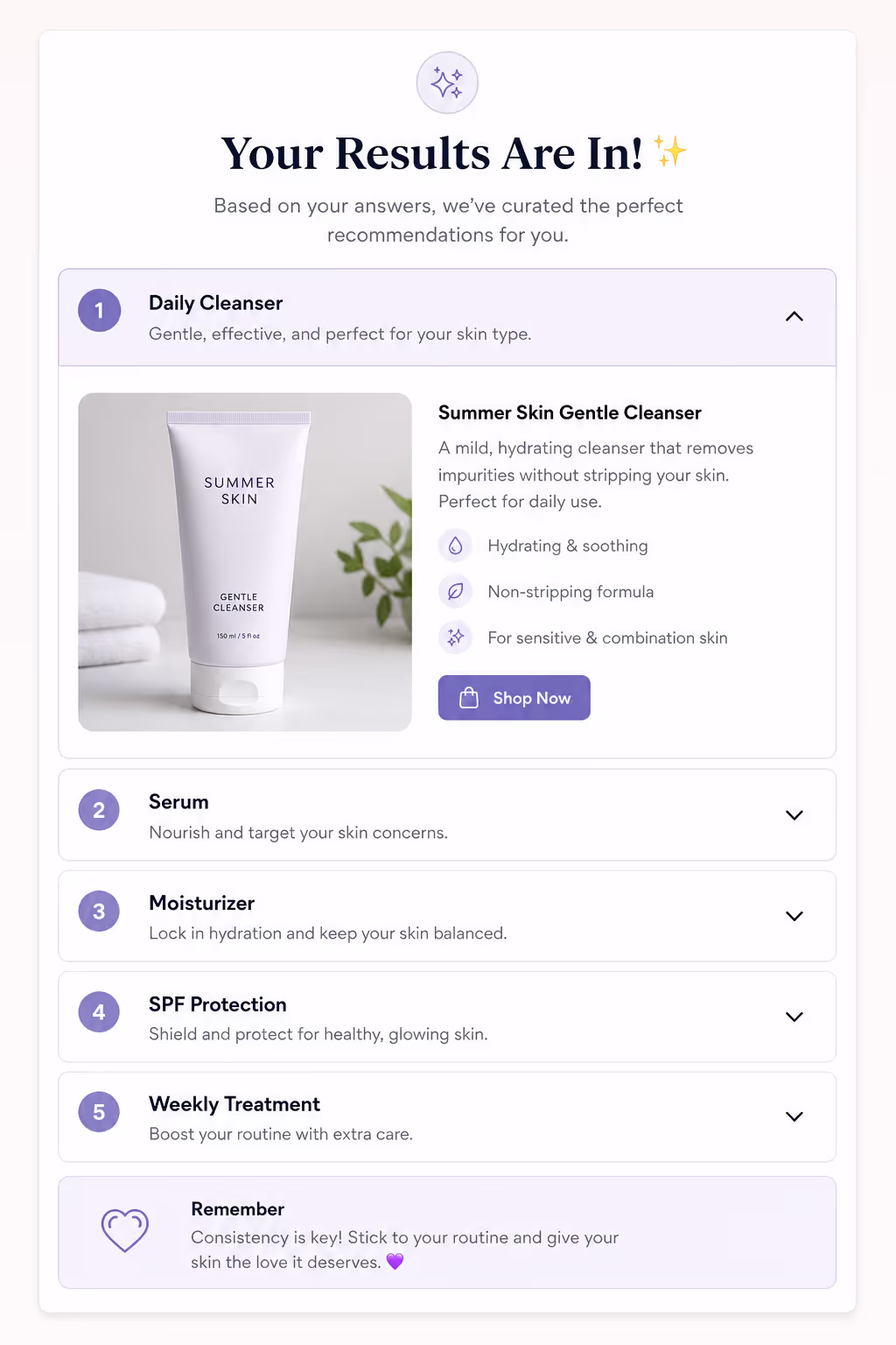
After a quiz, Accordion UI examples can explain why a product matched the visitor. This can increase trust because the recommendation feels transparent.
18. Testimonial detail accordion
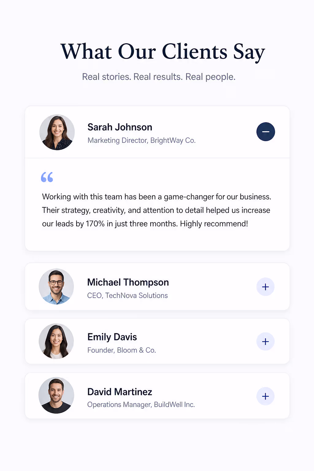
Short reviews are easy to scan, but detailed stories can get long. Accordion UI examples can show the headline first, then expand into the full customer story.
19. Integration setup accordion
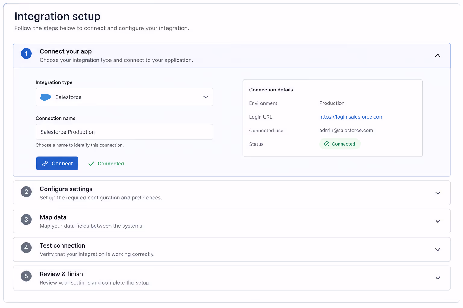
SaaS tools often need integration instructions. Accordion UI examples can split the steps by platform, such as Shopify, WordPress, Webflow, Wix, and Squarespace.
20. Troubleshooting accordion
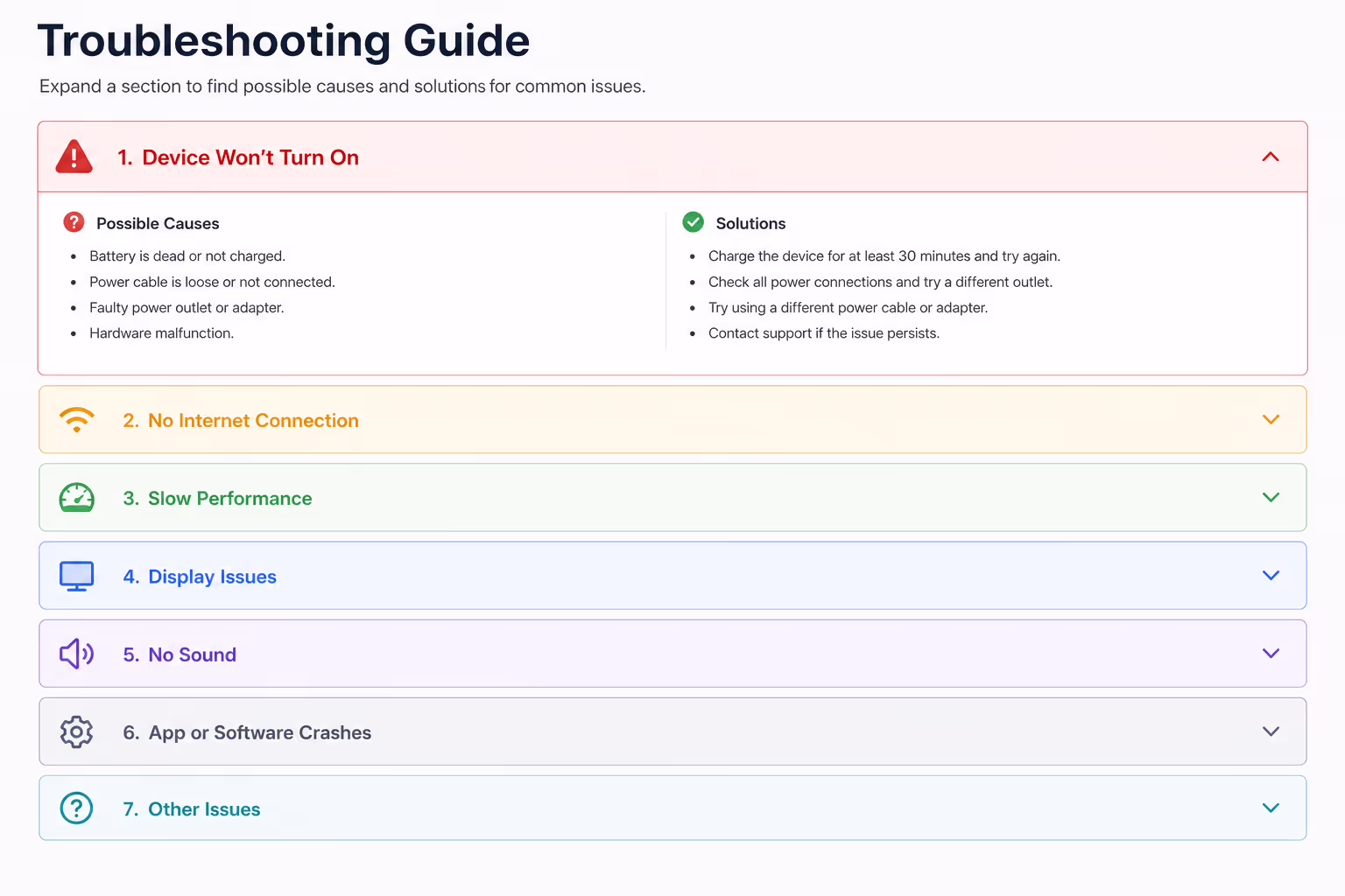
These Accordion UI examples work when each header names the symptom: popup not showing, script not loading, form not submitting, or analytics not tracking.
21. B2B security accordion
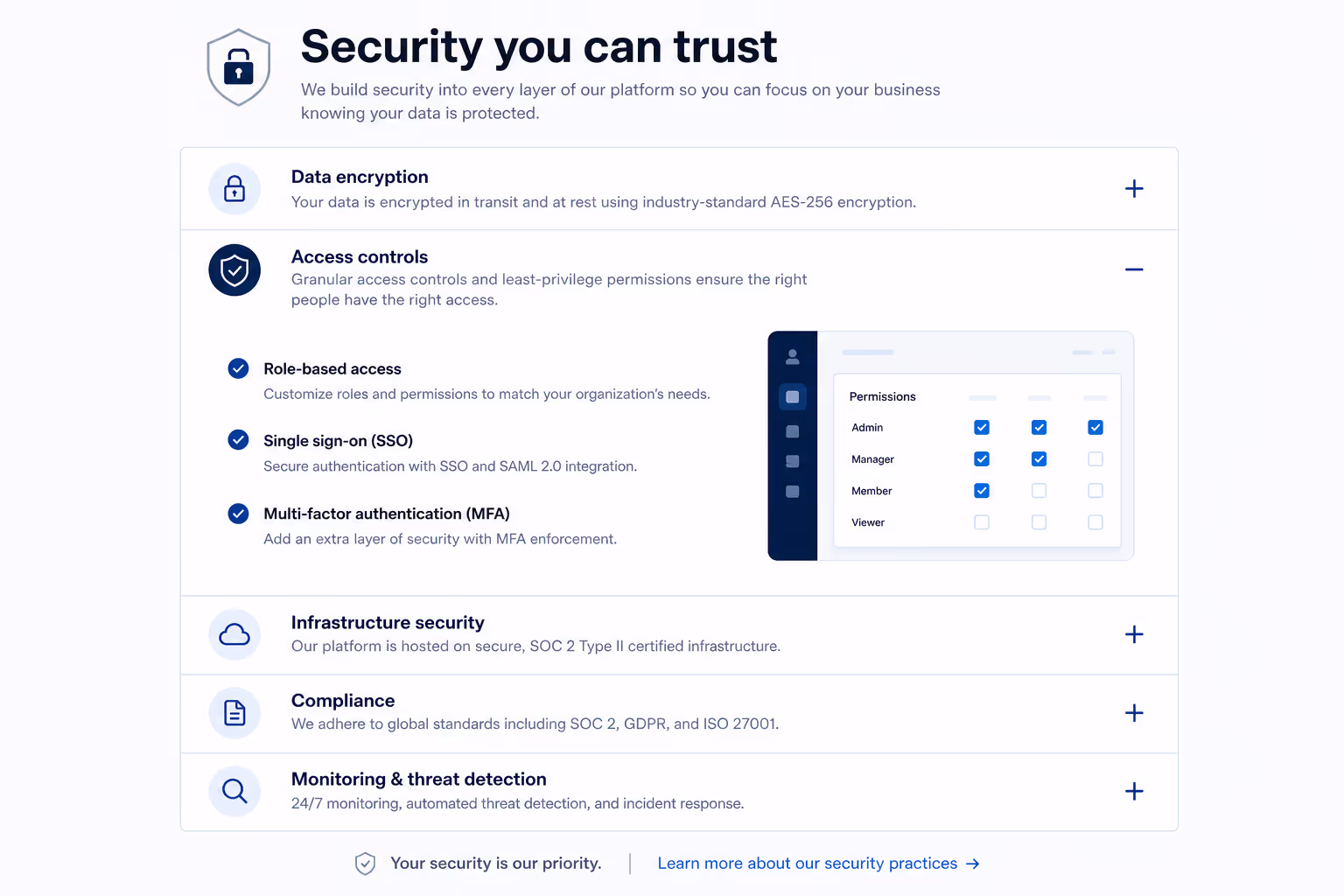
Enterprise buyers want detail, but not every visitor wants a security essay. Accordion UI examples can separate encryption, access control, audit logs, data retention, and compliance.
22. Product update accordion
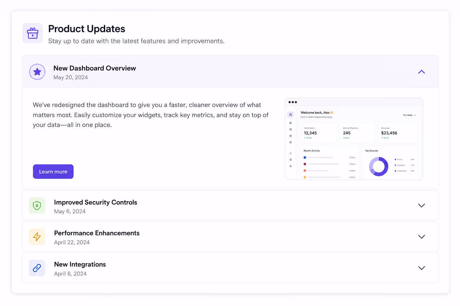
For changelogs, Accordion UI examples can group updates by month or product area. This makes the page useful for both new and returning users.
23. Comparison landing page accordion
When a visitor compares tools, Accordion UI examples can handle the deeper details: migration, support, pricing, features, and limitations.
24. Donation or nonprofit FAQ accordion
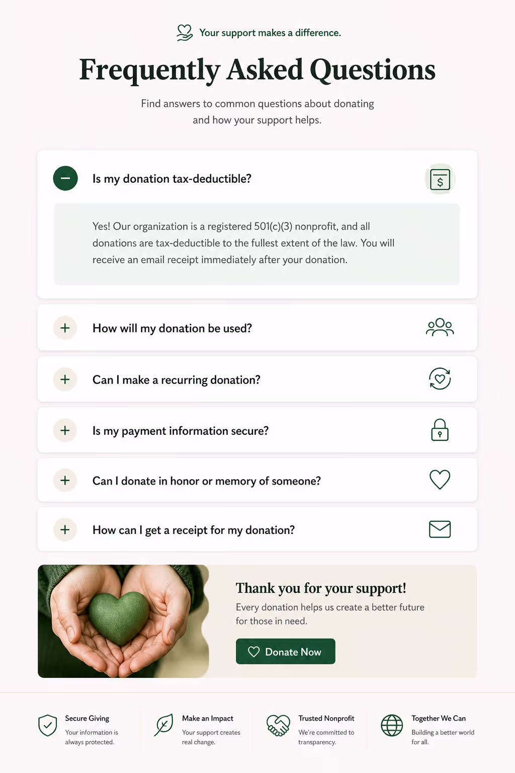
Nonprofits can use Accordion UI examples to answer donation security, tax receipts, fund allocation, volunteer steps, and recurring gift questions.
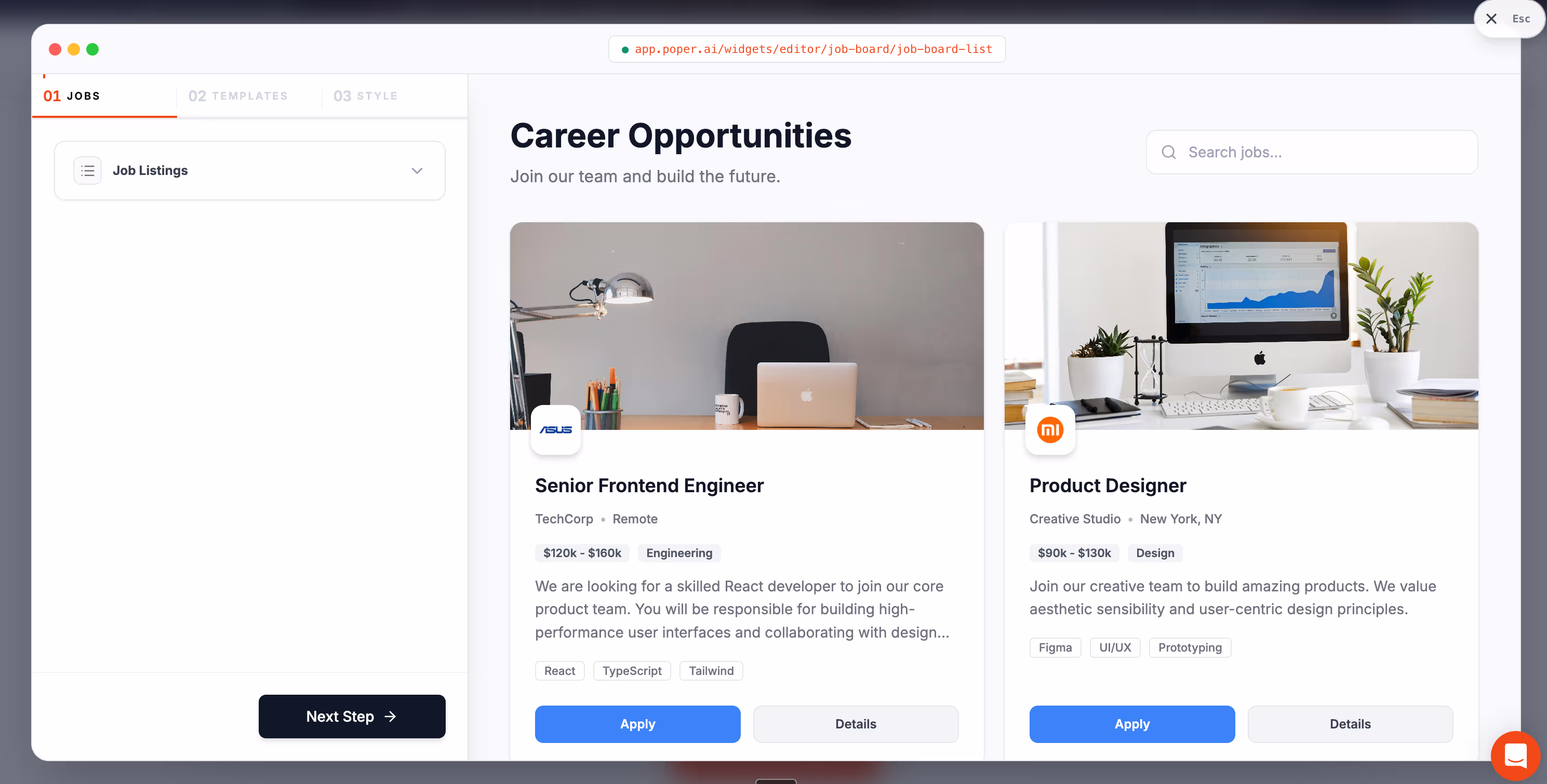
25. Poper Accordion widget example
With Poper's Accordion widget, we can create Accordion UI examples for almost any website in minutes. We can customize the panels, match the site style, and embed the widget without code.
What the best Accordion UI examples have in common
When I review Accordion UI examples, I look for five things. First, the headers should answer the reader's scanning question. A header like "Details" is weak. A header like "How long does setup take?" is useful.
Second, the content inside each panel should stay short. Accordion UI examples fail when every panel hides a full article. If one answer needs 700 words, it probably deserves its own page.
Third, the icon should be obvious. Most Accordions use a chevron, plus sign, or arrow. The exact icon matters less than consistency. If it opens, it should look open. If it closes, it should look closed.
Fourth, Accordions should work on keyboard and screen readers. Use real buttons, clear focus states, and correct expanded states. If the accordion only works for a mouse user, it is not ready.
Fifth, Accordions should not hide the primary conversion path. If the answer helps someone buy, book, subscribe, or contact you, keep it visible or place it in the first few panels.
When not to use Accordions
I would avoid Accordion UI examples when the reader must consume every section in order. Legal instructions, tax forms, onboarding flows, medical instructions, and long procedural tutorials can become confusing when the next step is hidden.
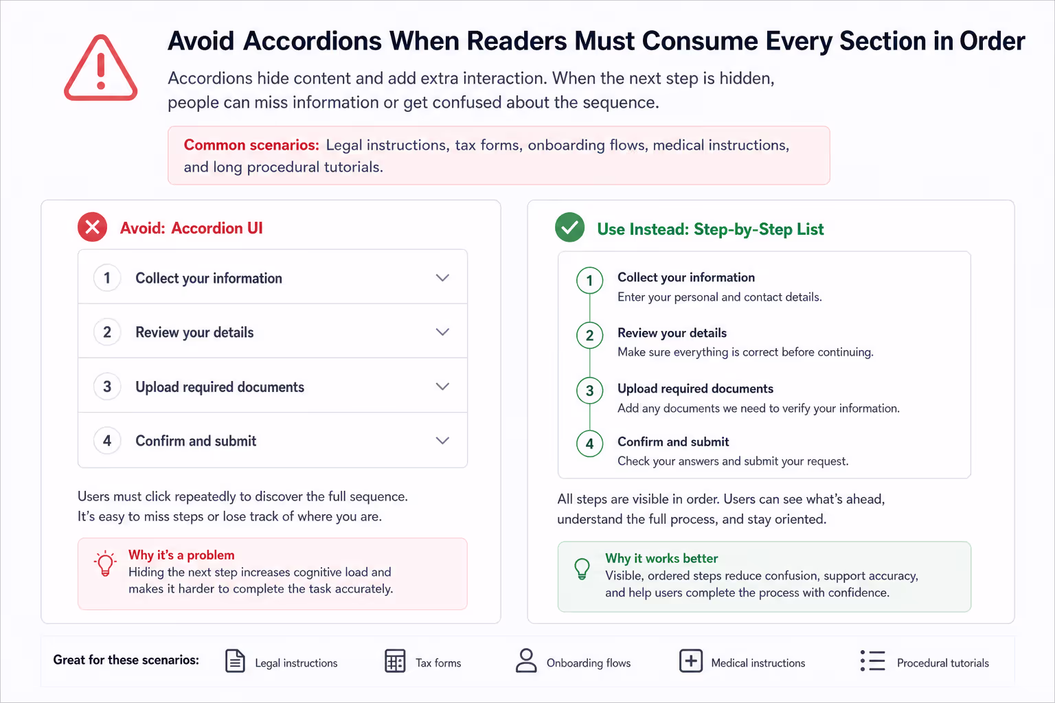
I would also avoid accordions when the page has only three short paragraphs. In that case, plain text is faster. Accordions add interaction cost. They earn their place only when they reduce more friction than they create.
Another warning: do not nest too many accordion ui examples inside other accordion ui examples. One level is usually enough. If your structure needs two or three levels, a table of contents, tabs, filters, or a dedicated help center may be better.
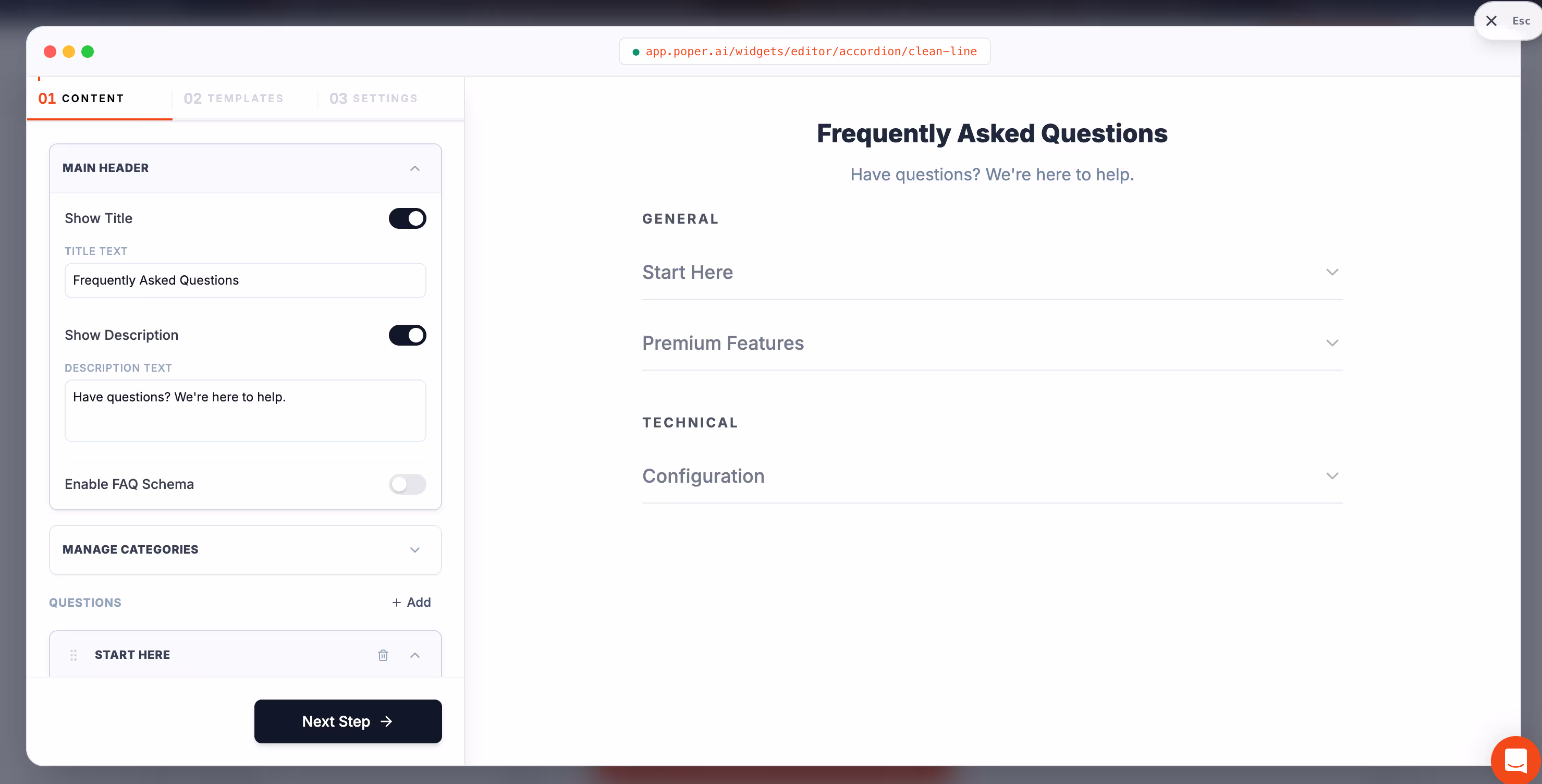
How I would design Accordion UI examples in Poper
If I were building these Accordion UI examples in Poper, I would start with the reader's top five questions. Then I would write headers in the visitor's own words. I would keep each panel under 80 words where possible, add links for deeper reading, and test the page on mobile before publishing.
For a SaaS landing page, I would use Accordion examples near the bottom, just above the final CTA. For ecommerce, I would place accordion ui examples near product details. For a service business, I would use accordion ui examples near pricing, booking, and contact sections.
Because Poper is no-code, we can ship the accordion fast, then improve it with real behavior. If visitors keep opening one panel, that answer may need to move higher on the page. If nobody opens a panel, the header may be unclear, or the content may not matter.
Accordions Checklist
Use accordion only when the page has enough content to organize.
Write headers that promise a specific answer.
Keep the first few accordion focused on buying objections.
Make icons and open states visually clear.
Keep panels short, direct, and easy to scan.
Use keyboard-friendly buttons and visible focus states.
Test accordion on small screens before publishing.
Add a "show all" option for long FAQ pages when possible.
Do not use accordion examples to hide weak content.
Review analytics after publishing and reorder panels based on behavior.
Final take
The best accordion ui examples are not clever because they collapse. They are useful because they help people choose what to read next. That is the job. Strong accordions make the page feel calmer without making the reader hunt.
If your page feels crowded, start with one small accordion section. Use Poper's Accordion widget, write five strong headers, keep the answers short, and publish. Then watch what visitors open. Real engagement will tell you which accordion deserve to stay, which should move up, and which are just taking space.