
I have shipped a lot of accordions, and I have also broken a lot of them. The pattern looks simple from the outside: a header you tap, a panel that opens, a header you tap again, a panel that closes. The moment we add a screen reader, a keyboard, or a low-vision user into that flow, accordion accessibility stops being a nice-to-have and starts deciding whether the page is usable at all.
So in this blog I want to walk through accordion accessibility the way I think about it when I am building one for a client. We will look at what WCAG 2.2 actually requires, the ARIA pattern that screen readers expect, the keyboard interactions people rely on, and the small mistakes that quietly destroy accordion accessibility on otherwise polished pages.
We build the Poper Accordion widget with accordion accessibility baked in, but I want this post to be useful even if you never touch our tool. The goal is simple: by the end, you should be able to look at any accordion on your site and judge whether its accordion accessibility holds up.
Why Accordion Accessibility matters right now
Accordion accessibility is not a niche concern anymore. It sits at the intersection of two trends I keep seeing: pages are getting heavier, and the legal environment is getting tighter. Both push accordion accessibility from "design polish" into "core requirement."
According to the WebAIM Million 2025 report, "94.8% of the top 1 million home pages had detectable WCAG 2 failures," and the average page now contains 1,257 elements, up 7.1% in a single year. More elements per page means more pressure to use disclosure patterns like accordions, and more chances to get accordion accessibility wrong [1].
The legal pressure is just as real. EcomBack's 2025 ADA report recorded 3,948 ADA web accessibility lawsuits in 2025, a 23.84% increase over 2024 . A mid-year analysis reported a 37% surge in the first half of 2025 alone. When auditors look at a defendant site, accordion accessibility is one of the easiest patterns to test, and one of the most common to fail.
The W3C ARIA Authoring Practices Guide is direct about it. The official accordion pattern warns that "No ARIA is better than Bad ARIA," which is the single most useful sentence I have read on accordion accessibility this year.
What WCAG 2.2 expects from Accordion Accessibility
WCAG 2.2 added several success criteria that touch accordion accessibility directly. None of them are surprising, but together they raise the bar. I am going to focus on the criteria that change how we build accordions today.
Focus Appearance and Focus Not Obscured
WCAG 2.2 reinforces that focus indicators must be visible. For accordion accessibility this matters in two places: when a keyboard user tabs onto an accordion header, and when a panel opens and pushes content. If a sticky header or a fixed footer covers the focused accordion button, you have failed Focus Not Obscured. The fix is small: keep enough scroll padding so the focused accordion header is never fully hidden.
Target Size (Minimum)
WCAG 2.2 sets a minimum target size of 24 by 24 CSS pixels for interactive elements. Most accordion headers already hit this, but I have seen accordion accessibility fail when designers shrink the chevron icon and treat only the icon as the click target. Make the entire header row tappable. That fixes accordion accessibility on touch and improves conversion on every device.
Dragging Movements
This one rarely applies to accordion accessibility, since accordions do not require dragging. But if you replace your accordion with a swipeable card stack on mobile, you may quietly break this rule. Keep accordion accessibility predictable: if it expands and collapses on desktop, it should expand and collapse on mobile too.
The ARIA pattern that drives Accordion Accessibility
Most accordion accessibility problems come from people inventing their own ARIA. The W3C accordion pattern is short, well-tested, and deliberately boring. I follow it without modification on almost every project. Here is how the pieces fit.
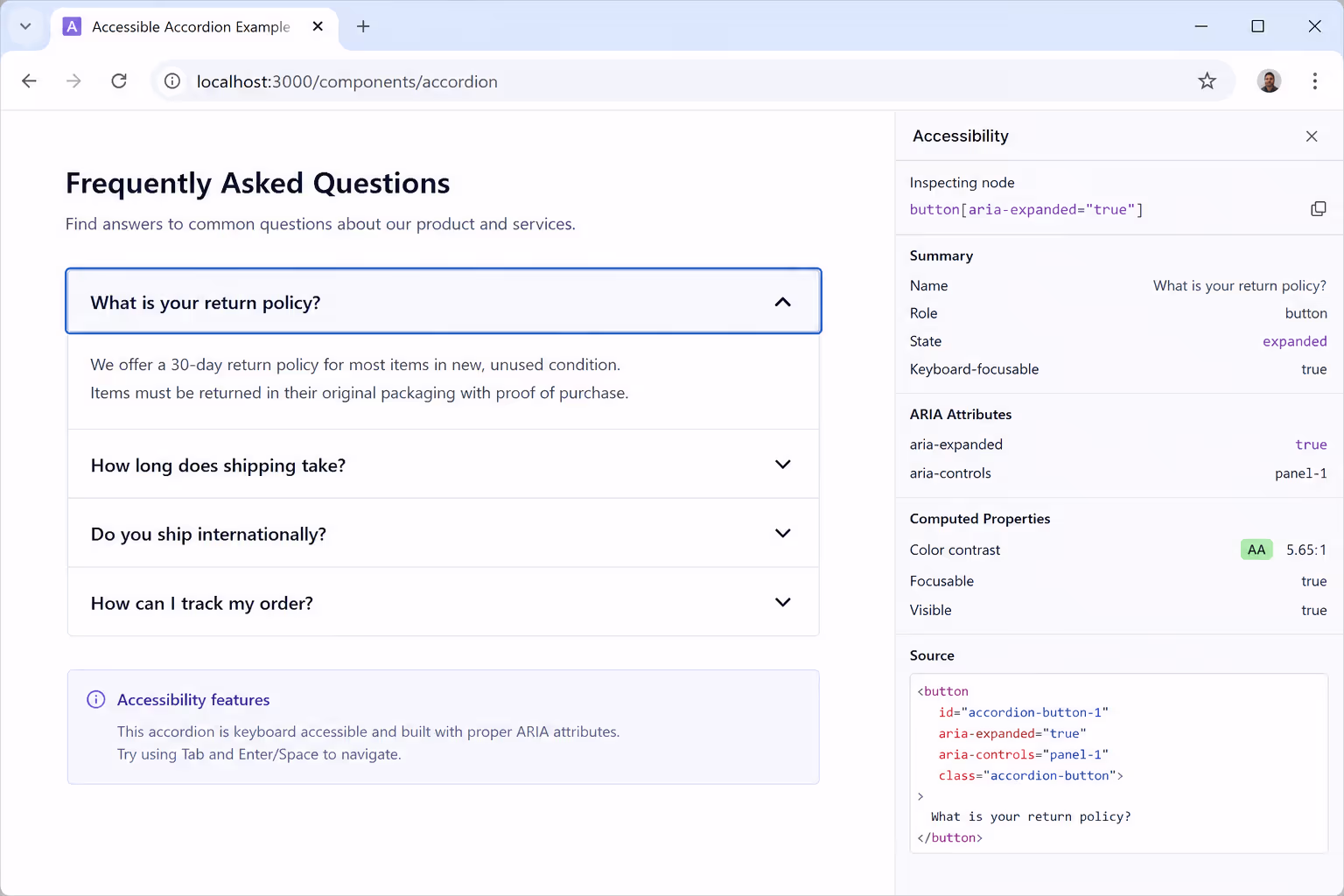
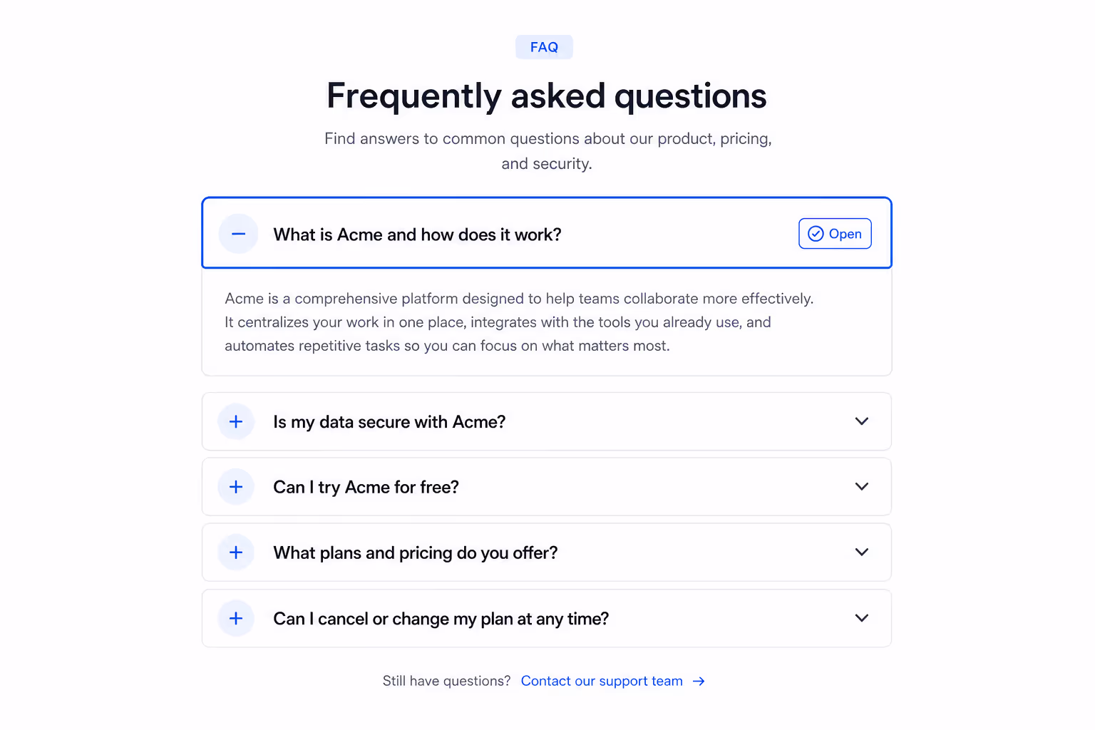
Each accordion section has two parts: a header that acts as a button, and a panel that holds the content. The header button toggles the panel. The panel knows which header controls it. That two-way link is what makes accordion accessibility work for screen readers.
For a quick scan, here is the contract I use when reviewing accordion accessibility on a site:
| Element | Role / Tag | Required attribute | Why it matters for accordion accessibility |
|---|---|---|---|
| Header wrapper | h2, h3, or h4 | Real heading tag at the right level | Lets screen reader users jump between sections with heading shortcuts |
| Header button | button | aria-expanded="true|false" | Announces the open or closed state on every focus and click |
| Header button | button | aria-controls="panel-id" | Connects the button to its panel for assistive technology |
| Panel | div or section | id="panel-id" and aria-labelledby="header-id" | Tells screen readers which header introduces the panel content |
| Panel | div or section | hidden when collapsed | Removes collapsed content from the accessibility tree, which protects accordion accessibility |
That table is the entire ARIA story for accordion accessibility. If you can point at each cell on your live page, you are in good shape. If any one of them is missing, accordion accessibility is broken in a way assistive tech will notice immediately.
Use a heading wrapper, not a div
Wrapping the accordion button in a real heading tag is the single biggest accordion accessibility upgrade most teams skip. Screen reader users navigate by headings far more often than they navigate by tab.
A page with twelve accordion sections wrapped in plain divs forces those users to tab through every single header. Wrap the buttons in h3 tags, and accordion accessibility improves without changing a single visual style.
Prefer details and summary when you can
The native HTML5 details and summary elements give you accordion accessibility for free. They handle keyboard, focus, and screen reader announcements without ARIA. I reach for them whenever the design allows, and I only fall back to a custom ARIA accordion when I need fancy animation or grouped behavior.
Keyboard interactions that protect accordion accessibility
Keyboard support is where most accordion accessibility audits go wrong. The W3C accordion pattern defines the expected behavior, and assistive technology users have memorized it. Anything else feels broken to them, even if it works visually.
Tab moves focus to the next accordion header. Shift plus Tab moves focus to the previous header. Enter or Space toggles the focused panel. Those three are non-negotiable for accordion accessibility. If the panel contains links, Tab continues into the panel content when it is open, which is exactly what users expect.
Optional but recommended: Arrow Down moves focus to the next accordion header, Arrow Up moves to the previous one, Home moves to the first header, and End moves to the last header. These shortcuts are not required by WCAG, but they raise the ceiling on accordion accessibility for power users who navigate long FAQ pages by keyboard.
One trap I see often: developers attach the click handler to a div with a tabindex of zero instead of using a real button.
I've done this myself before 😭
That choice silently destroys accordion accessibility. Space does not toggle the section, Enter behaves inconsistently, and screen readers stop announcing the role correctly. Always use a button element. The native button gives you accordion accessibility for free.
Screen reader behavior to verify
Real accordion accessibility shows up the moment you turn on a screen reader. I test every accordion with VoiceOver on macOS, NVDA on Windows, and TalkBack on Android. The same three checks apply across all of them.
First, the header button should announce its name, the role "button," and the expanded state. A correct announcement sounds like "Pricing, button, collapsed." That single phrase is the foundation of accordion accessibility because it tells the user what the control is and what it will do.
Second, opening the panel should change the announcement to "Pricing, button, expanded," and the new content must be reachable in the reading order. If the panel content does not appear in the screen reader's flow after expansion, accordion accessibility is broken.
Third, the user should be able to jump between accordion headers using their screen reader's heading shortcut. On VoiceOver that is Control plus Option plus Command plus H. On NVDA it is the H key. If those shortcuts skip your accordion, you almost certainly forgot the heading wrapper, and accordion accessibility will suffer in long pages.
Common mistakes that quietly break Accordion Accessibility
A lot of accordion accessibility issues do not look like accessibility issues at first. They look like styling choices, animation tweaks, or framework defaults. I want to call out the ones I see most.
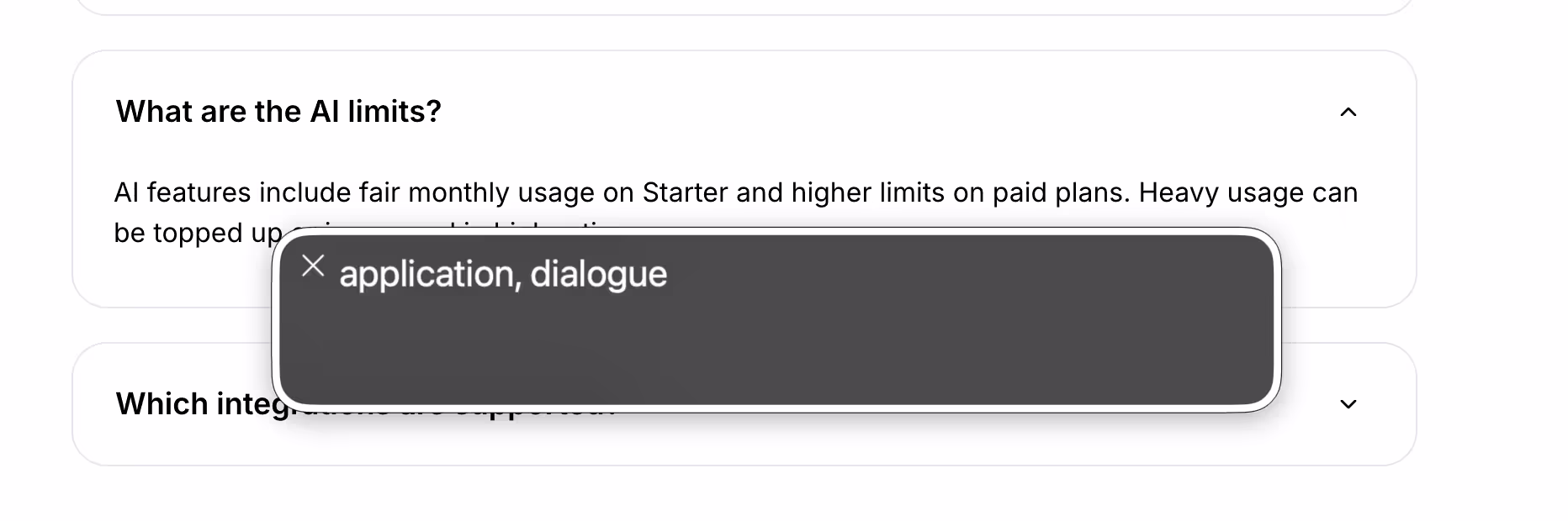
Hiding panels with CSS opacity or visibility instead of the hidden attribute is a frequent accordion accessibility mistake. Screen readers still announce visually hidden content, which means a "collapsed" section is still spoken aloud. Use the hidden attribute, the inert attribute, or display none, and accordion accessibility immediately improves.
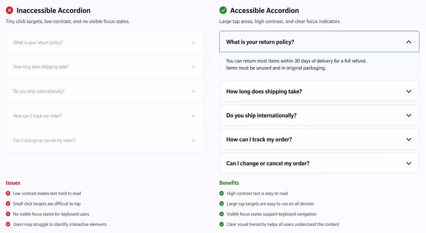
Animating accordion headers with transform that breaks focus order is another. If your animation moves the focused button off-screen during expansion, keyboard users lose their place. Keep the focus stable and animate the panel only.
Removing the chevron icon and leaving only color as the open or closed cue fails accordion accessibility for low-vision and color-blind users. WCAG requires that information not be conveyed by color alone. Pair every state with an icon rotation, a text label, or both.
Nesting accordions three or four levels deep is rarely an accordion accessibility win. Screen reader users get lost, keyboard navigation gets exhausting, and the heading hierarchy collapses. If you find yourself nesting accordions, the page probably needs an information architecture rethink, not better accordion accessibility.
How I test accordion accessibility before shipping
My accordion accessibility test routine is short, repeatable, and finds about 90% of issues before code review. I run it on every accordion I ship.
Tab through every accordion header. Every focus state must be clearly visible, and Focus Not Obscured must hold even with sticky elements present.
Press Space and Enter on each header. Both must toggle the panel.
Open the page in VoiceOver or NVDA. Confirm the announcement includes the role, the name, and the expanded state.
Use the heading shortcut to jump between sections. Headers must be reachable by the H key.
Run an automated check with axe DevTools or Lighthouse. Treat any accordion accessibility error as a blocker, not a warning.
Resize the browser to 320 pixels wide. Tap targets must still measure at least 24 by 24 CSS pixels.
Six steps. About ten minutes per page. That routine alone is enough to lift accordion accessibility above where most production sites land today.
How Poper handles accordion accessibility for you
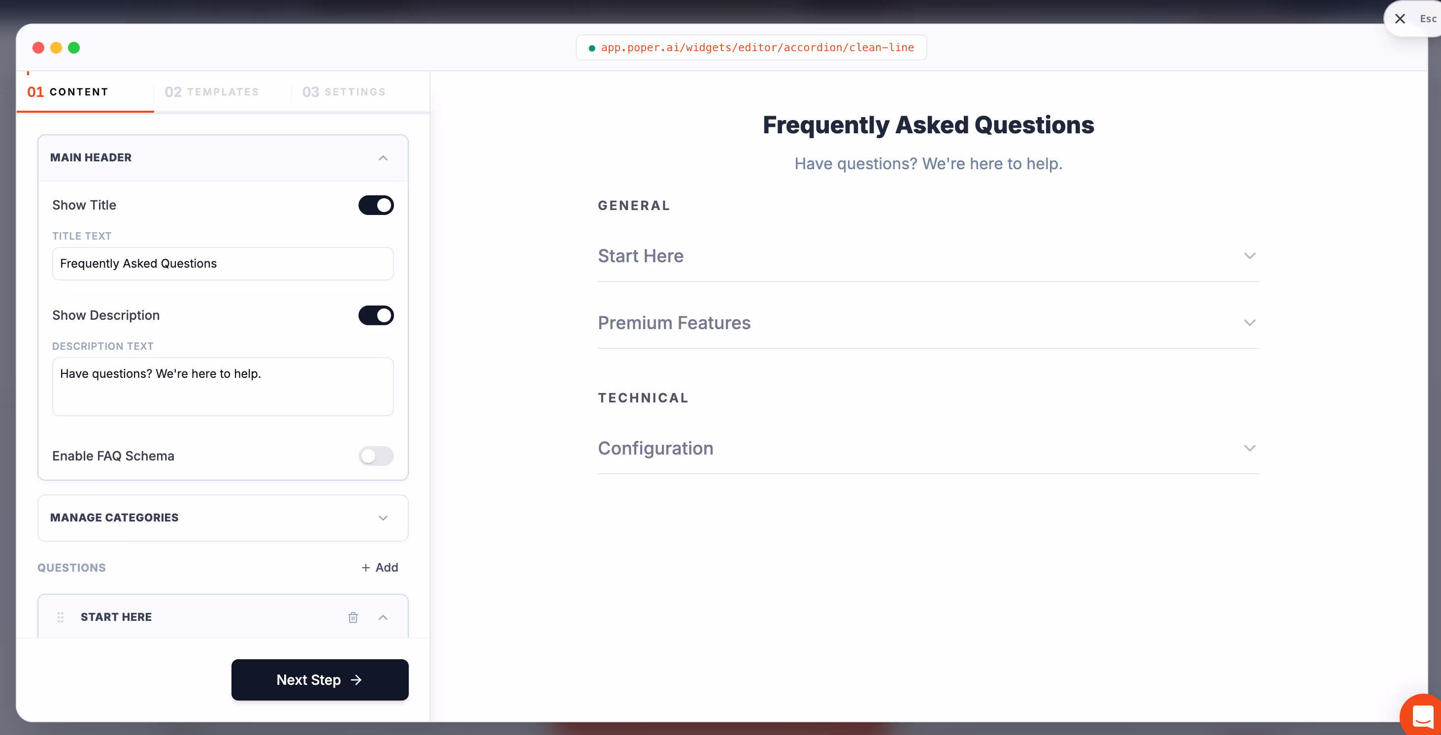
The reason we built our Accordion widget is the same reason this post is so long: accordion accessibility is easy to describe and hard to ship consistently. The Poper Accordion widget uses real button elements, real heading wrappers, the hidden attribute on collapsed panels, and the full ARIA contract from the W3C pattern. Keyboard interactions, focus appearance, and screen reader behavior all follow the spec by default, so accordion accessibility is not something you have to remember to turn on.
You can drop our Accordion widget on any site without touching code, and the accordion accessibility behavior travels with it on Shopify, WordPress, Webflow, Wix, Squarespace, and plain HTML. If you want to see how the widget renders, the Poper Accordion widget page shows the live patterns.
Wrap up: Accordion Accessibility is a discipline, not a feature
If I had to leave you with one idea, it would be this: accordion accessibility is not a checklist you complete once. It is a discipline you apply every time you ship a new section, a new style, or a new framework upgrade.
The patterns are stable, the WCAG 2.2 rules are clear, and the testing routine takes ten minutes. Skip them, and accordion accessibility becomes the cheapest lawsuit a plaintiff firm will file against your site this year.
Apply the ARIA pattern, use real buttons and real headings, follow the keyboard contract, hide collapsed content with the hidden attribute, and verify with a screen reader before you ship. That is accordion accessibility done well, and it is the standard your visitors quietly expect.

